Your Custom Text Here
Tusculum House
Creative Interior plan
Andrew and Brett,
Your beautiful Potts Point terrace is set for a makeover and I am honoured to be a part of the process of realising your much planned and awaited dream home. With council approvals already in place, this is the time for action and I hope that the following CIP will get the juices flowing and that we can get underway without further delay.
The following document is based on the approved plans, but I have thought long and hard and will, if I may, make a couple of comments regarding slight adjustments or alternatives. If nothing else, these suggestions may challenge your ideas and strengthen them, or you may elect to adopt the alternatives. Either way, testing any plan is a valuable process.
You have an opportunity here to create a truly exceptional and impressive home that you will feel immensely proud of and I am certain that with a comprehensive approach to its renovation, we can achieve that goal.
So let’s get started!
Downstairs:
I think of a home in an wholistic way - I am not very good at sectioning it and so my process begins here - at the front gate! The entry point to a property is the very first impression of what lies within, and so it is important to consider that when planning any upgrade. Budget will determine the extent of what you commit to in terms of your priorities, but an overall vision for your home will help you with figuring out a master plan that can be staged and incrementally implemented.
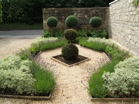
I think we can greatly enhance the frontage of this house by addressing the style of the garden.
I love the wide arch - it’s as though the whole house is welcoming you in! And I love that you’ve focussed on a green garden, but I think you could do more to build that sense of the oasis. This house has a certain grandeur and formality to it that I love, and I think it is not complimented by a little patch of lawn. Don’t shoot me!
I’m thinking a structured parterre garden similar in vibe to the images below. The gravel, the dark green foliage, white flowers, a bird bath or fountain all work together to make a style statement - and we haven’t even opened the front door.
As the space to the right of your path is narrow, I would suggest long, raised planters in which you could plant a line of a taller shrub, a treatment that would integrate well with the parterre approach.
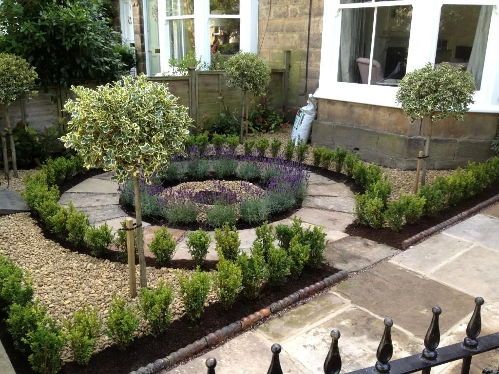
The above image is the kind of formal parterre layout I think could look fabulous. I envisage buxus hedge plants in a ring layout, with white flowers in the centre.
This isn’t as lush, but the fine gravel on the ground is fabulous and really shows off the deep green of the planting.
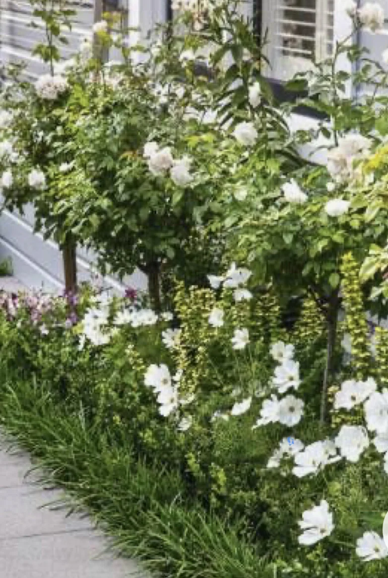
White flowers on the left - divine.
I know you guys are gardeners, so this is well achievable. Annie Wilkes is a great friend of mine and a garden designer beyond compare. She’s be thrilled to be invited to draw up a plan and either undertake the planting, or just provide the plan for you to execute yourselves.
Let’s move inside.
Entry hall:
Again, I know you haven’t asked me for advice at this end of the house, but it is impossible for me not to see the house as a whole. So please bear with me.
We spoke about the colour of the downstairs and I know you think I’m splitting hairs here on my choice, but I think we need to get sample pots so that you see what I mean and the impact it will make!
The colour I’d much prefer for you is one by Porter’s Paints, developed for use in the Art Gallery of NSW, called Drift. I suggest you paint the hall and sitting room this colour and for the dining room, I’d suggest a darker colour because all dining rooms need to be moody!!!! Given the architecture, it would be easy to paint the three walls of the dining room this beautiful rich colour, Cinder, and it would be a stunning feature as you enter the house.
I suggest Dulux Natural White for all woodwork and trim as it is a beautiful warm white without being cream.
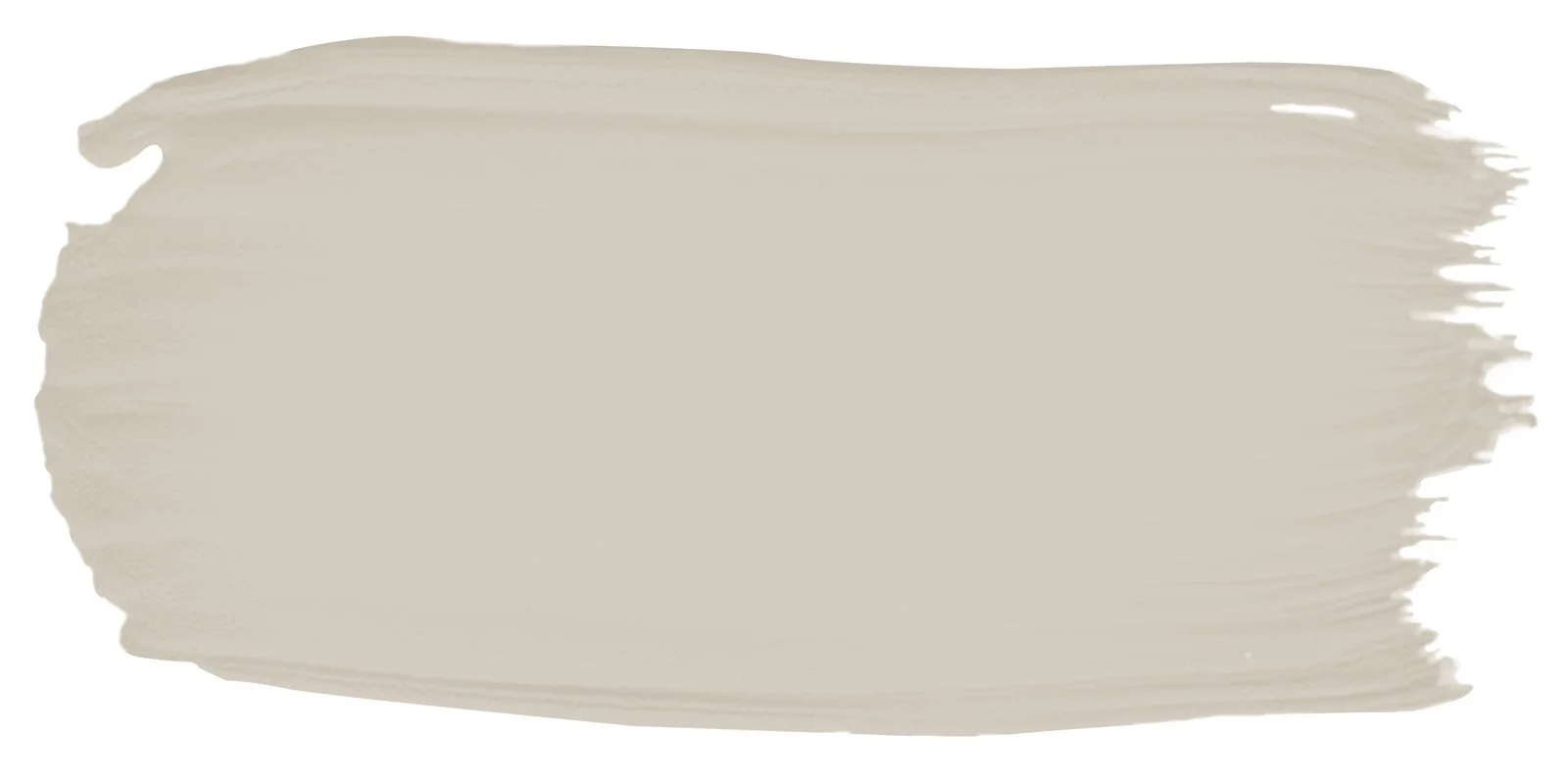
Porter’s Drift

Porter’s Cinder
By keeping a sense of consistency throughout the interiors, you enhance the sense of deliberate design and I think that’s what you’re after. The downstairs area will feel cohesive and warm, and the colours will also tone down the honey colour floor boards yet retain their beauty and warmth.
The hall runner is only temporary…. but will for the rest of its existence at Tusculium St… tone in!!
Drift will then of course travel up the staircase into the upper halls as well.
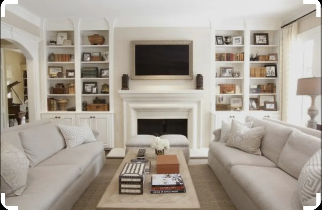
Sitting room:
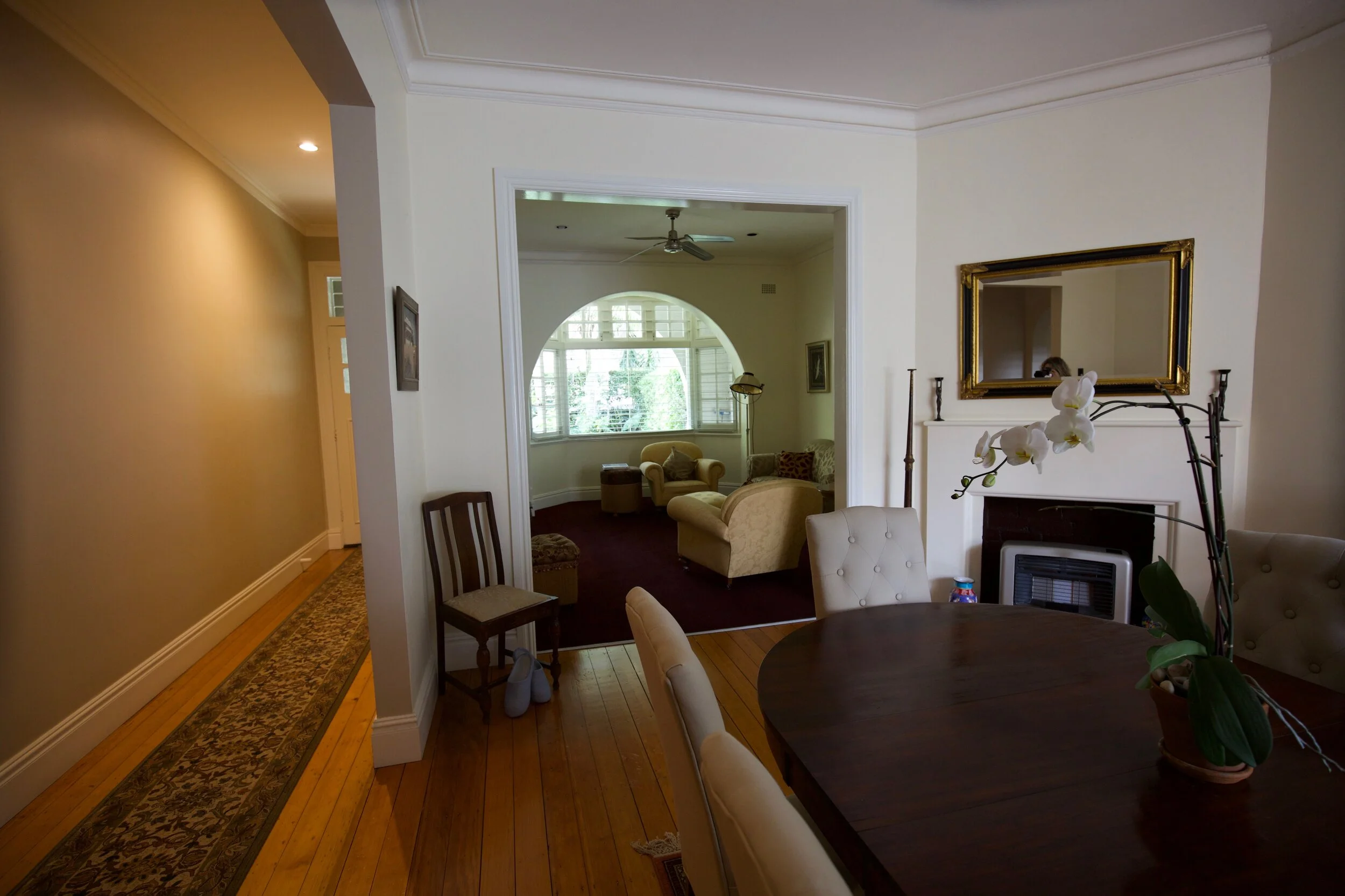
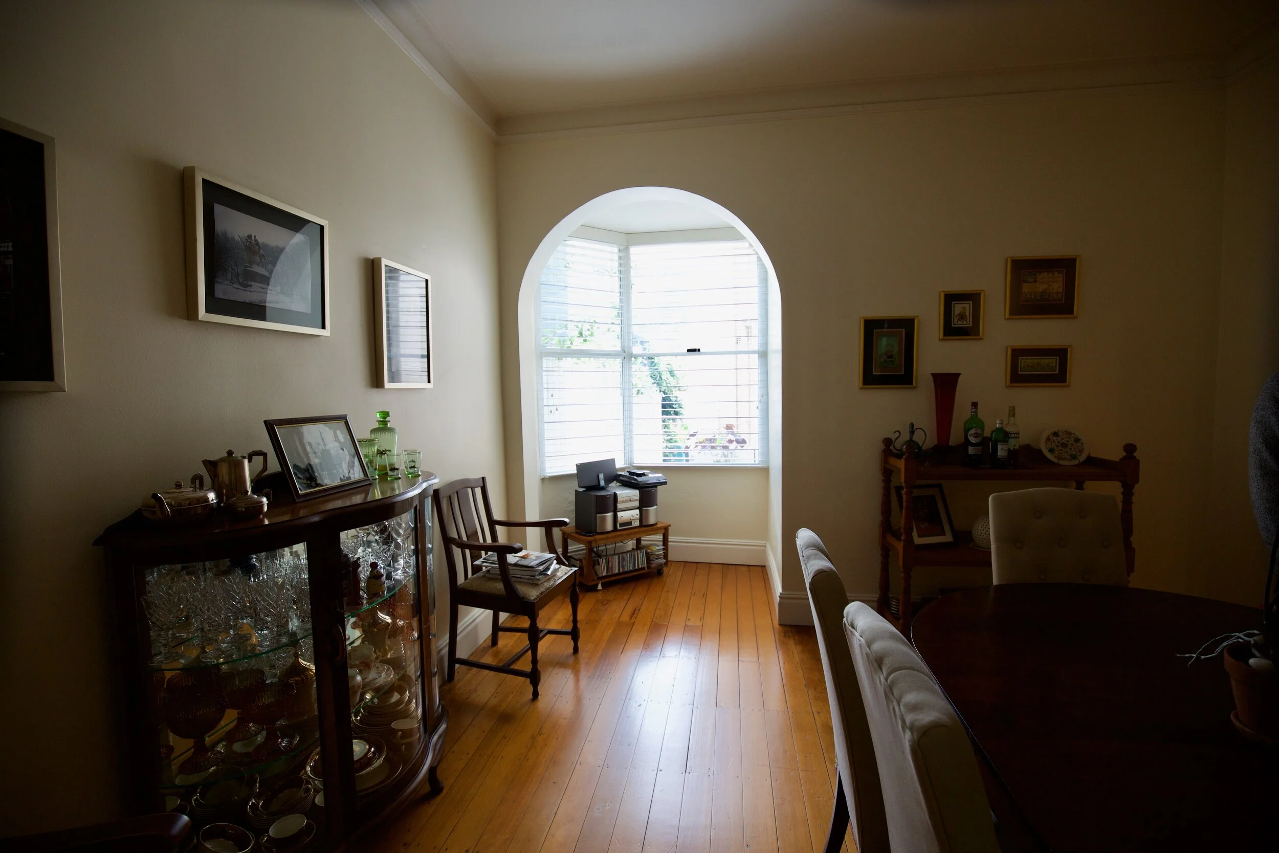
This photograph doesn’t exactly do the room justice as the angle is not right, but my observations are that there are some changes we could make to enhance the room and make it feel more connected to the rest of the house in terms of style.
The lovely high ceilings of the house might be better highlighted if, for example, we swapped out the mirror above the fireplace here with a taller one with a brass edge and arched top. A tall mirror here would make the room feel higher, grander, more bold.
Small changes like this are relatively inexpensive but have such massive impact.
A mirror like this can be custom made by a company I deal with in northern NSW - so the measurements are exactly right, as well as the finish on the edge. I’d go brass, but you may prefer black.
The mirror you have in this space currently would be well deployed in hall at the bottom of the stairs, hung vertically, or upstairs in one of the bedrooms. It’s a lovely mirror but I don’t think it is quite right where it is.
The colour of the carpet in this room is a little challenging, but I think it could work with the stronger colour suggested for the dining room walls.
More urgently, the furniture layout needs to be addressed.
I have two options: replace or re-upholster. Harsh but fair.
The furniture in this room is arguably too big - it isn’t a big room and I feel the furniture tends towards overwhelm. My suggestion is that you consider replacing it with a more contemporary style that is more relaxed, thereby giving the room the intimacy and warmth that will connect it to the rest of the house.
If you’d rather re-upholster, I would suggest a taupe linen - similar in colour to this linen by Mokum. Although it has a herringbone pattern, the linen would add a more casual look, much more contemporary and inviting. I love old style furniture, but again, it’s a matter of figuring out what suits a space best.

The fact is, in this throw-away world, it is often cheaper to buy new than to re-upholster. An option could be to take this big generous suite to the farm to replace what you have there. My recommendation would be to buy replacement pieces smaller in scale and in addition, I’d like to see a low central coffee table as it gives a better structure in the furniture placement that small side tables.
My recommendation would be these pieces from Coco Republic, a store I believe has the right aesthetic for your home.
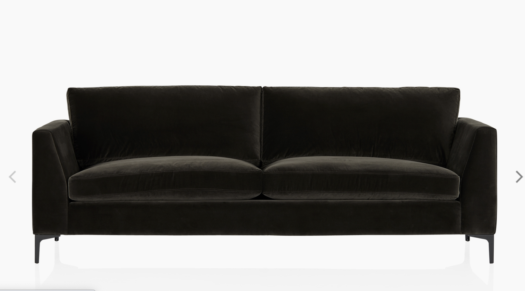
CoCo Republic Vermont sofa 2.4m x 970 x 850mm
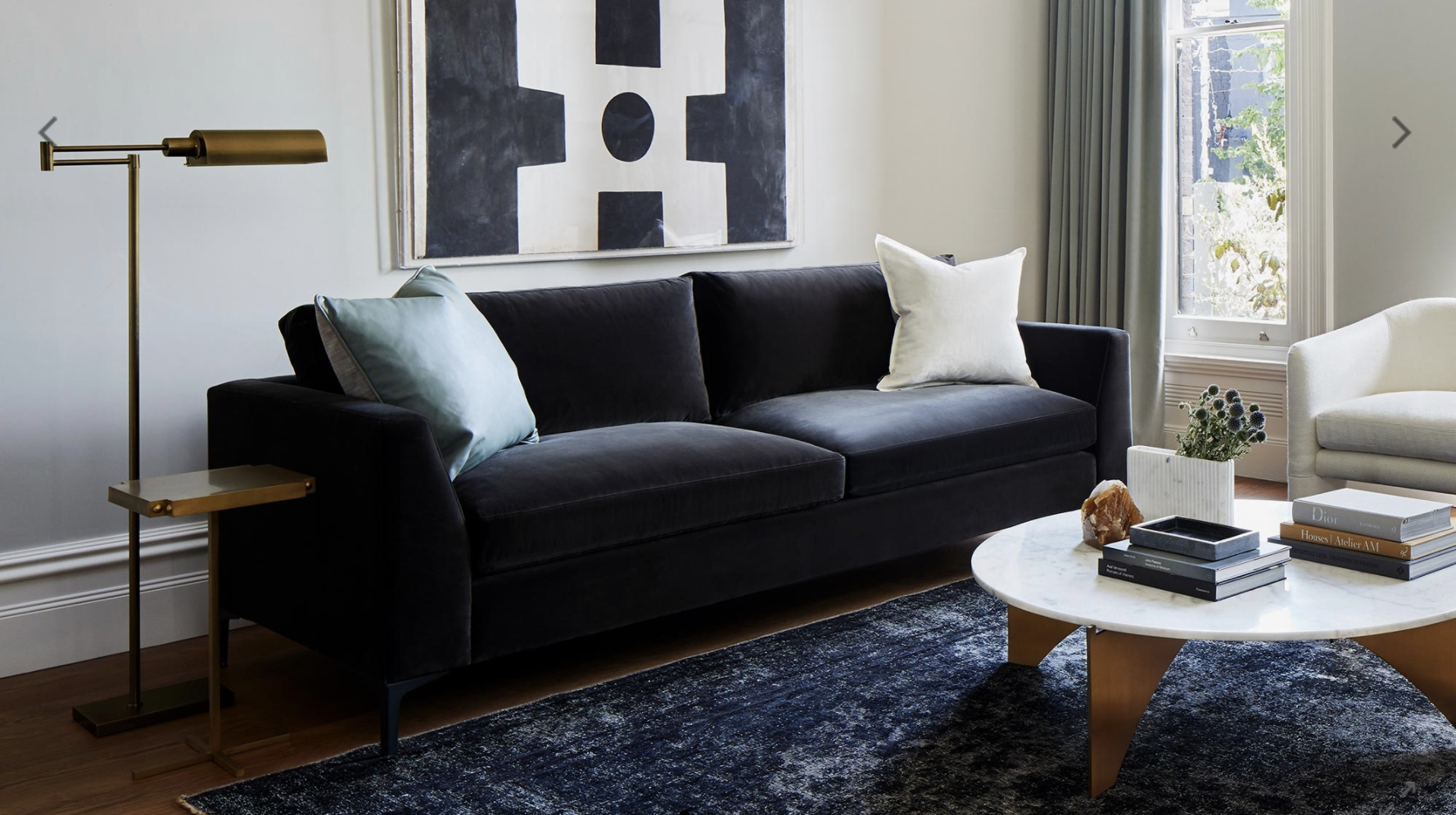
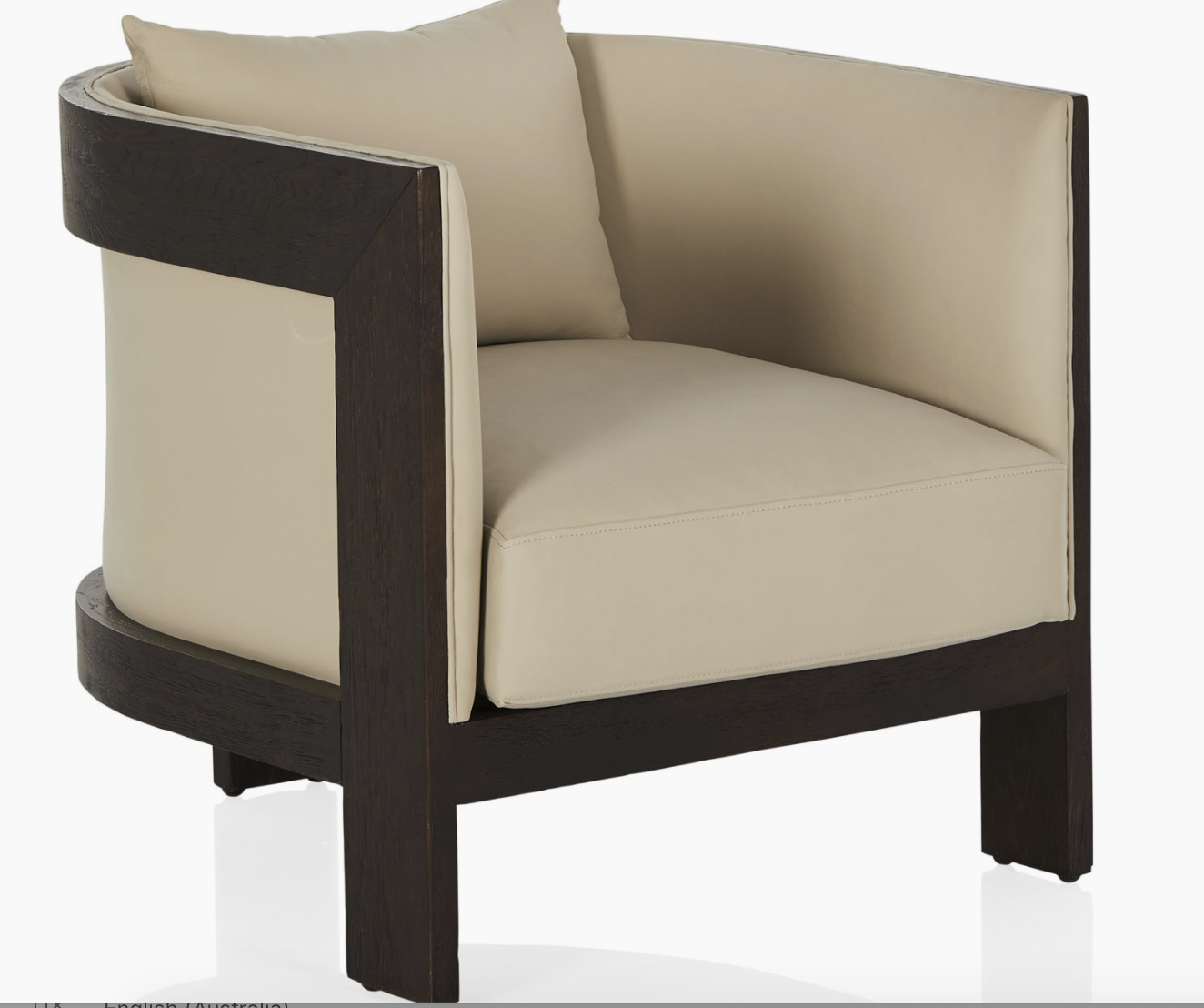
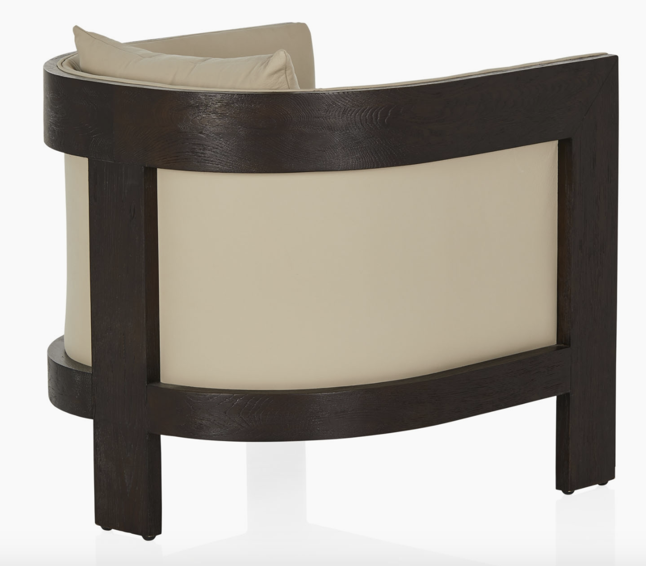
This sofa is called the Vermont and the velvet has such a richness, and whilst the proportions are generous, it is a sleeker profile than the sofa you currently have. It would be centred under the window, and paired with two club chairs, as I think club chairs are the epitome of the style I see for your house - masculine, sophisticated, understated and beautiful. Currently, these ones, called the Poho (!!) are on sale at CoCo Republic!
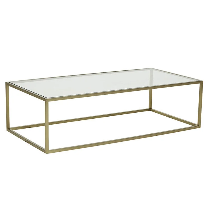
A coffee table like this would compliment the furniture and not add weight to the room - again, trying to counter the less than ideal natural light available in the room. I would then remove the small occasional tables you have there currently.
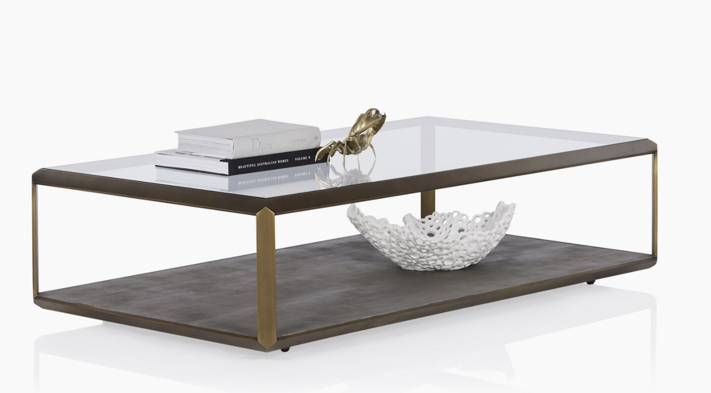
CoCo Republic Max glass coffee table 1.4m x 810 x 355mm
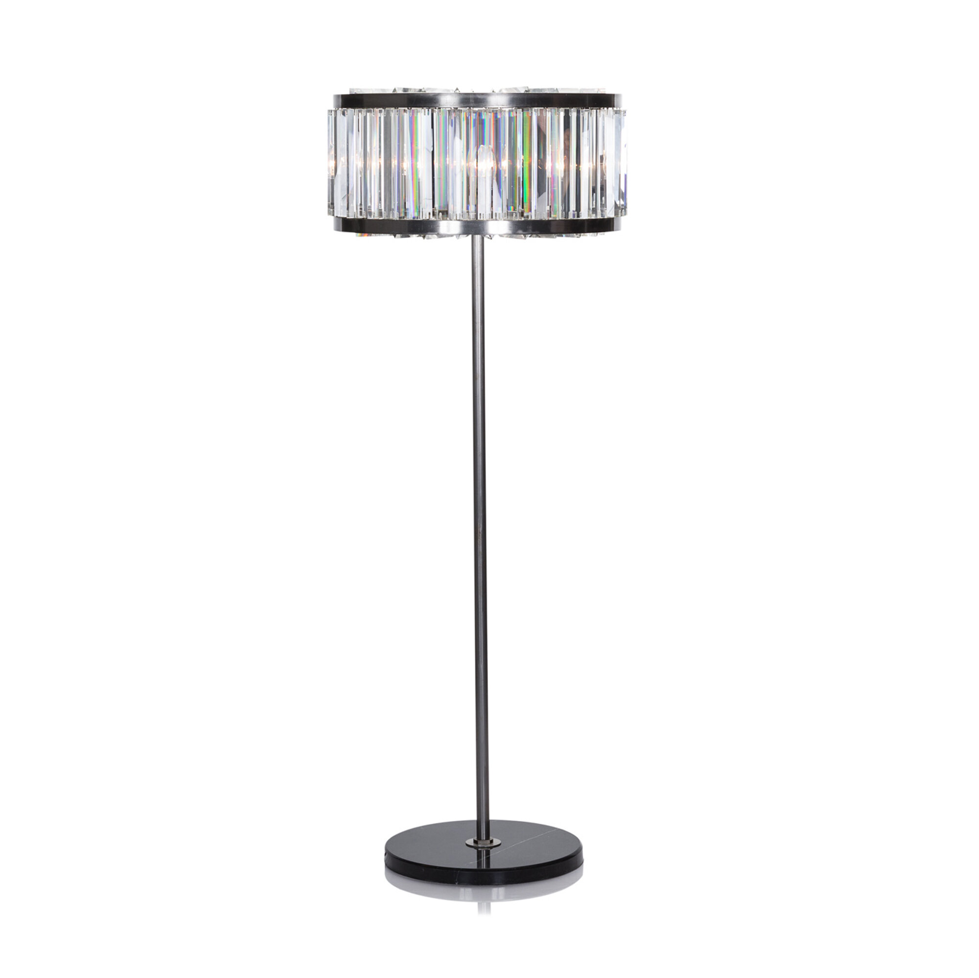
The quality of light in every room is EVERYTHING! So lamps are boss. A beautiful feature standard lamp like this one is again contemporary but classic and the light it gives is fabulous. Something to consider!
Crazy Alternative #1
Just a thought…. I know that you’re reluctant at this point to put in an ensuite upstairs, but that you don’t enjoy sharing the bathroom with guests - and rightly so! I wondered how much you’ll use this sitting room once the new space at the back is built, and so I thought an idea could be to fill in the wall between dining room and sitting room and use the sitting room as a guest bedroom. That way, they could use the downstairs bathroom and you’d have upstairs to yourselves. It’s just an idea - but it’s one that could save you a lot of money if you elect not to put in the ensuite!
Dining Room:
On my shopping expedition to CoCo Republic, I saw this vintage photograph and instantly it gave me tingles! The play of light on the sails and the men is so spectacular - the piece just leaps out and I think if it were placed in your dining room, it would be an utterly stunning focal point. It was taken off the coast in the UK in the early 1980s when wind surfing really was at its peak. The image is framed in black timber and measures 2180 x 1670 - impressive size! I would hang it where your glass fronted cabinet currently is, and I’d move that piece to be adjacent to the bay window.

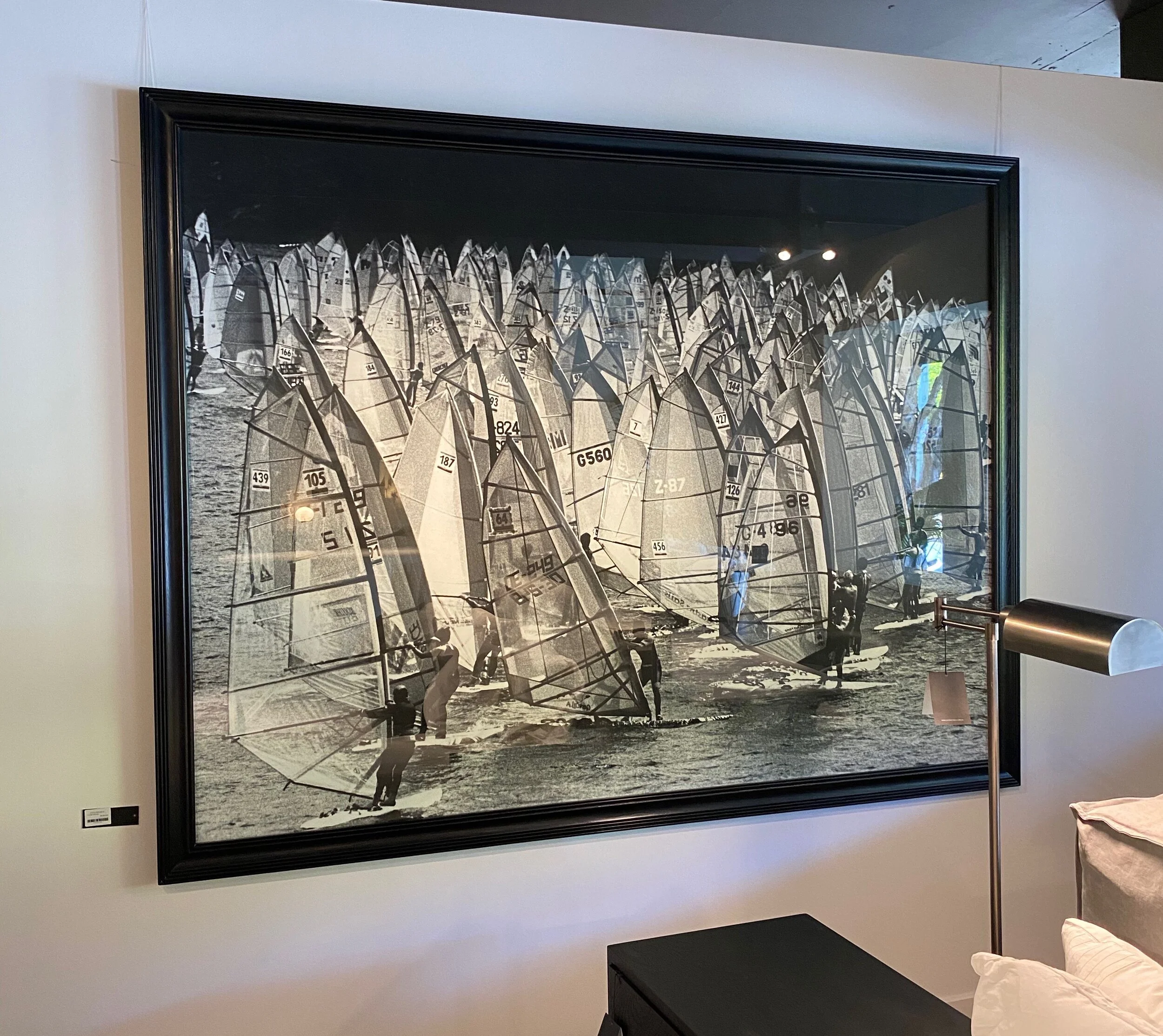
By shifting the cabinet, you can move the table to be a little more central to the room, which would be a subtle reworking of the space, improving the aesthetics and the general flow of the room as you move through the house.
I would add a console table, to sit underneath the Windsails photograph, matching the coffee table in the sitting room - to use for serving, wine, etc.
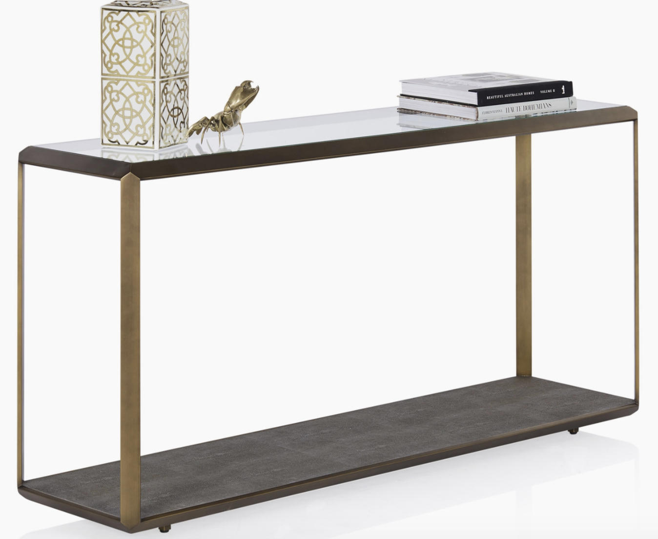
CoCo Republic Max glass console - 1.6m x 400 x 760cm
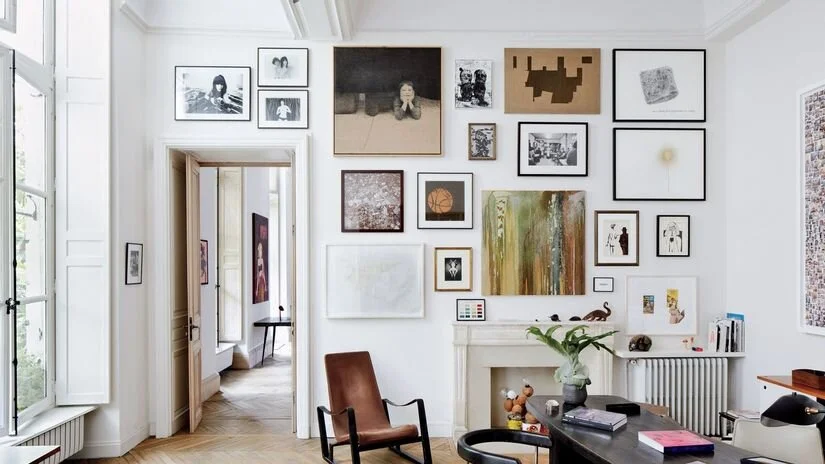
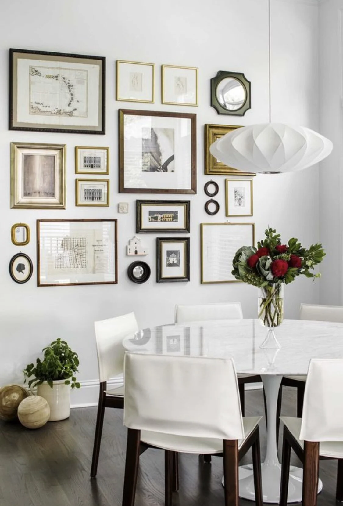
I would like to salon hang the art that is in this room already, meaning I’d arrange them into a more intense grouping above the newly placed cabinet, where they’ll read as a second large art placement. I love this style of art hang - it’s super dynamic and impactful. It also gives you an opportunity to add more pieces you’d like to hang.
Richness and texture are two major drivers in my design aesthetic.
I believe a home is a collective - memories, taste, attitudes and aspirations are all the major players in determining the overall style, and so we need to organise them to play their part with punch!
An art hang that groups disparate images is a fun challenge as it allows you to get together all the smaller pieces you have to create a piece that is bigger and full of impact. Full of memories, importance, the essence of you!
And Andrew, don’t think it will look messy - it won’t! It will be well planned and executed, and look amazing. Brett I’m confident I’ll have your support on this!
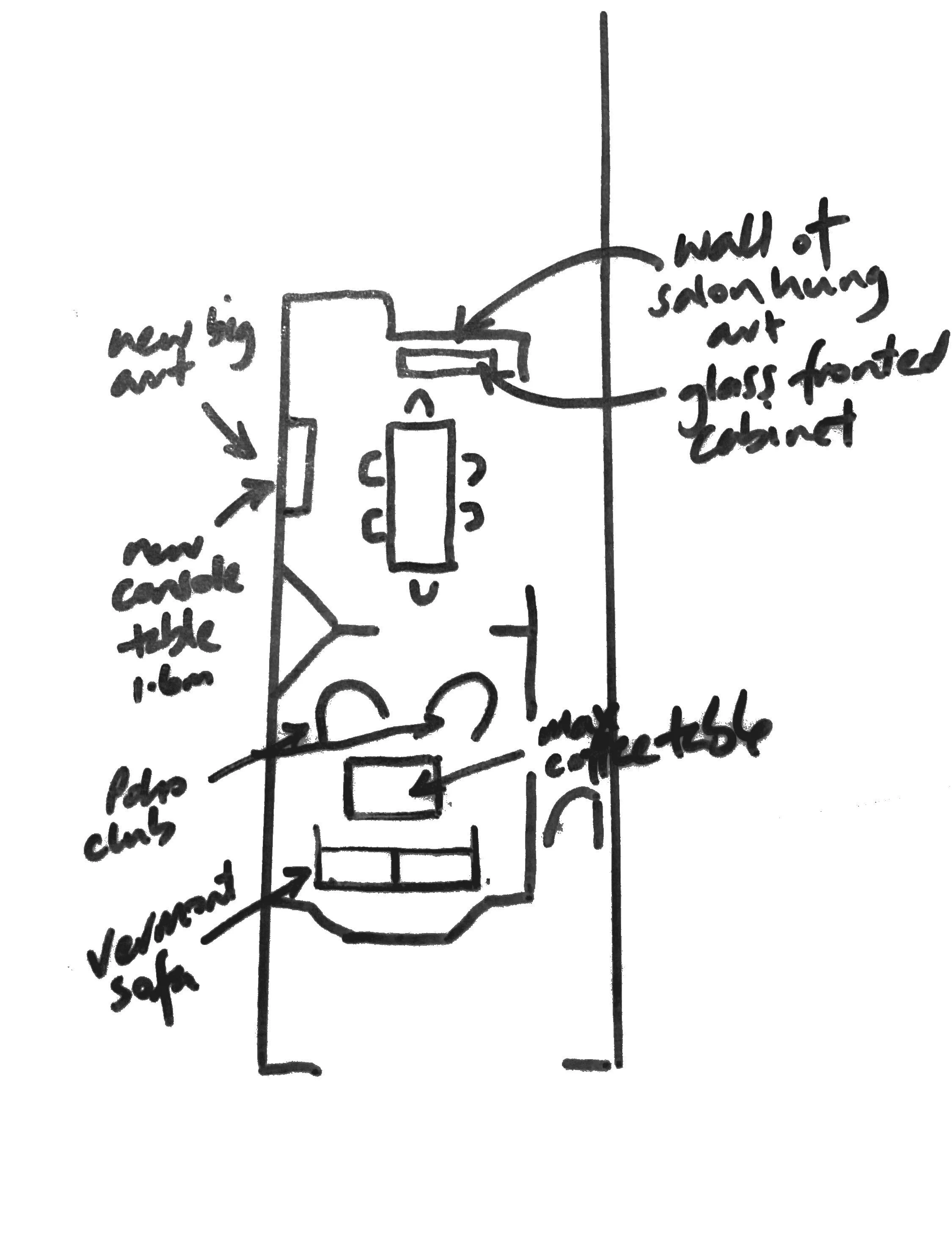
This little diagram shows the new layout - moving the existing glass fronted cabinet to a new position and replacing it with a console and large art print above.
The other piece of furniture currently in this spot should be removed and relocated to the new living room where it may be useful as a drinks trolley, especially when you’re entertaining outside!
Also note the new layout in the sitting room - with a new couch under the window and two smaller club chairs facing it and rectangular glass coffee table between.
And I’d love to see a new brass edged, arch top, tall mirror over the dining room fireplace!
The dining room needs a rug under the table for warmth and sound dampening and I think the best choice would be to have one made and bound from the same carpet as is in the sitting room as this will give the cohesion I am after. We can have the colour matched and even if it is not exact, it will be far enough away with floorboards in between so we will fool them all!!

Lastly, I would recommend in time that you re-upholster your dining chairs in this Mokum alpaca velvet - a reasonably priced fabric that has all the warmth and richness we are looking for, while also being a practical fabric for use in this context, as it is easy to clean and far more forgiving than a flatter napped linen or like.
The colour of this one is Mauve.
Note - This may be well down on the list of priorities for the moment, but I think when all the major works are completed, it would be nice to revisit this issue because the velvet is so lush and it would make a valuable contribution to the new house look.
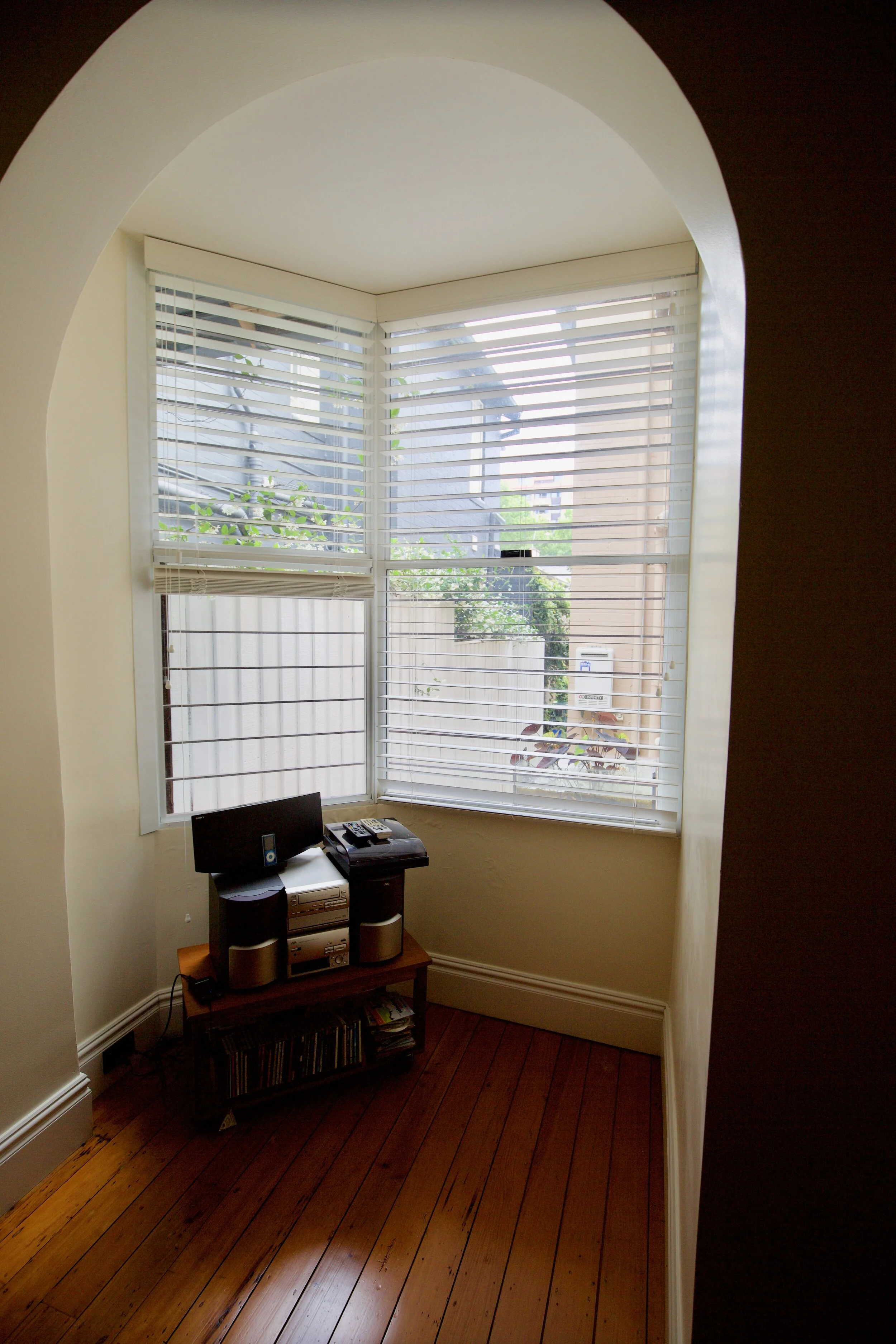
The bay window…
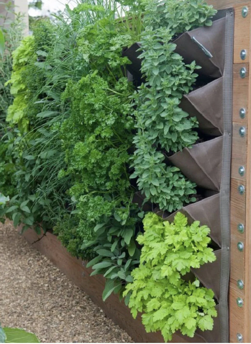
This vertical herb garden is dual functioning - feeding us mentally and gastronomically. Green thumb anyone?!
To do or not to do! I understand your desire for the added amenity here, as well as your reluctance to do that work now as it is very disruptive. However, if you are going to do it, would be cost efficient to do when the builders are on site and you’re suffering the disruption already.
My suggestion would be not to do it. I think it is one of a number of options for this area and certainly the more expensive of them. Instead, I would create an additional parterre area in the alley outside, using greenery and gravel. The priority is aspect - what you see from the inside, rather than the ability to go out there into that small space, that is the motivating factor. In an ideal world you could replace the window with one that was more attractive - perhaps a casement window, but to put in doors I think is unnecessary. If the view of the clothesline is going to be a problem for you, you could always use trellis and planting to hide it.
The design and implementation of this area could be done at the same time as the general garden plan for the front and back gardens and would be a superior choice, in my humble opinion!
I have spoken with Pascal on this and his view is that it the damp problem can far more easily and cheaply be solved than installing doors. Food for thought.
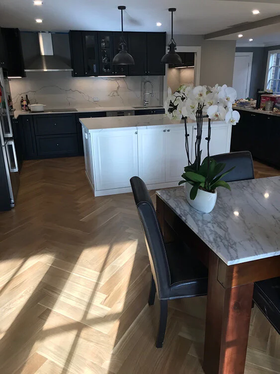
The Kitchen:
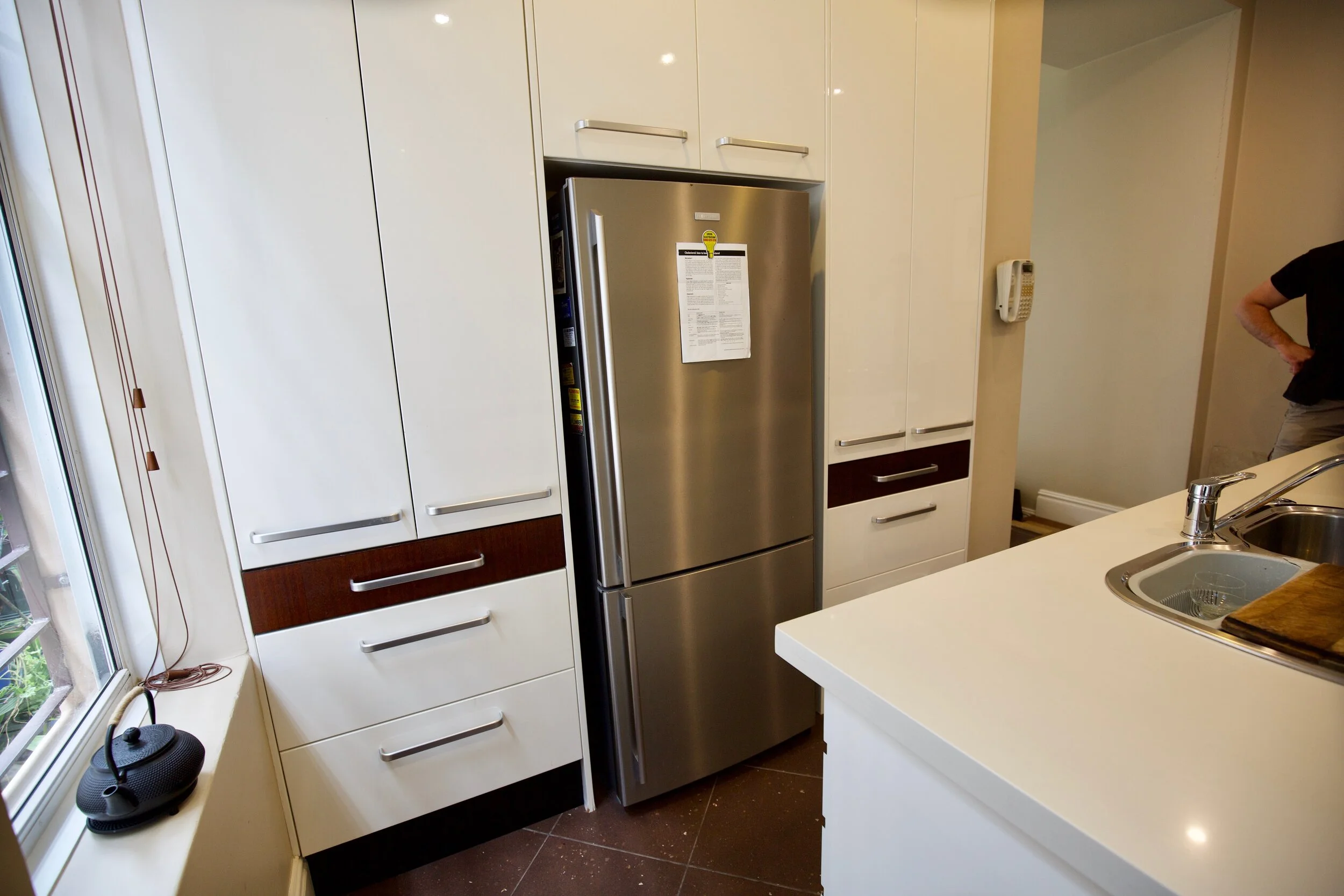
Mmmmm…. much head scratching. After some agonising, my strong advice is that to try to preserve the kitchen, minus the half wall, minus the brown stripe, minus the old floor, plus trying to match the caesar stone, plus saving you money…. could be difficult and not give you the result you hope for. There it is, I’ve said it.
This is entirely a matter for you to decide and again, I am respectful of the fact that we all have a budget. But in circumstances where the kitchen needs these changes in order to open it to the new room beyond, and given the connection between this room and the new room is going to be very clear, I think that to try to keep it is going to be less than ideal.
I would suggest instead that we replace the cupboards and bench tops, leaving the layout as it is. At least we could get it costed. We can retain the appliances and see if we can retain the carcasses, but often kitchen companies and builders alike don’t like to fit new doors to old carcasses.
By pulling out what is there, we can give the builder much easier access when replacing the flooring and it would also delete the risk involved in removing 15 year old panels and replacing them after the floor is laid. Matching materials is never easy because over the years, the original colour and finish ages and so it is pretty difficult to achieve a viable result that doesn’t resemble a patchwork quilt!
Having said that, I stress again that I am very aware of the B word (budget) and will respect your decision. It would be hard to over capitalise on such a valuable property, but everyone has a personal limit to how much they let Henrietta spend!!!! But you do need to know that there is unavoidable risk, headache and expense in trying to preserve existing cabinetry. And there is also the question of the contrast of old and new - not unlike wearing a new suit with a frayed tie or scruffy shoes…
So my alternative to preserving existing would be a contemporary and serene timber look and feel, much like the vibe in these images. Warm, earthy tones, minimum grout lines to do your heads in, no door handles, just simple and sleek design. Lighting is integral to achieving this look, too, and this discreet strip lighting works so well for ambience, as well as giving focussed lighting to the bench tops so you don’t chop your fingers off.
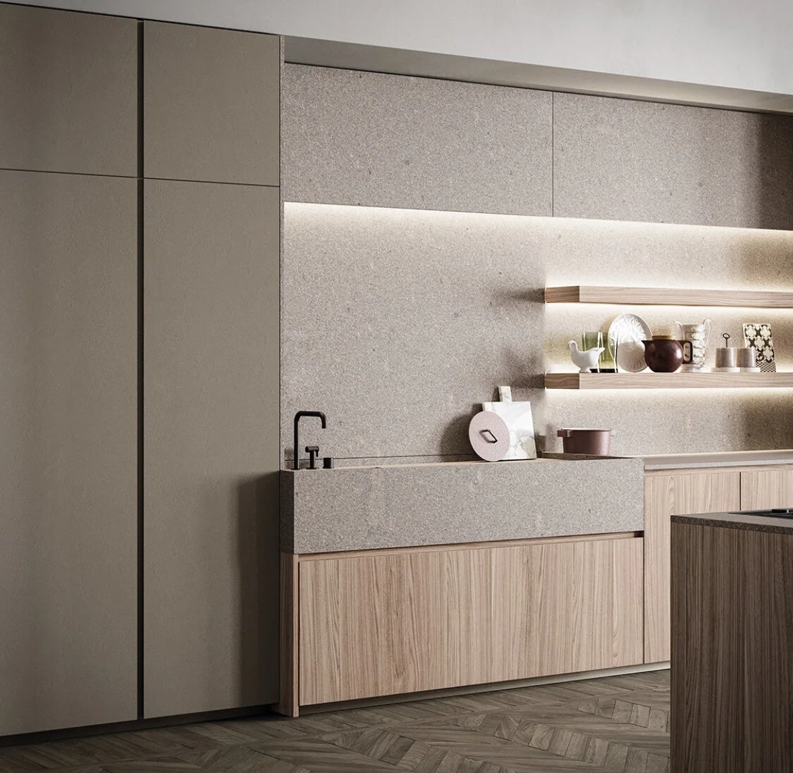
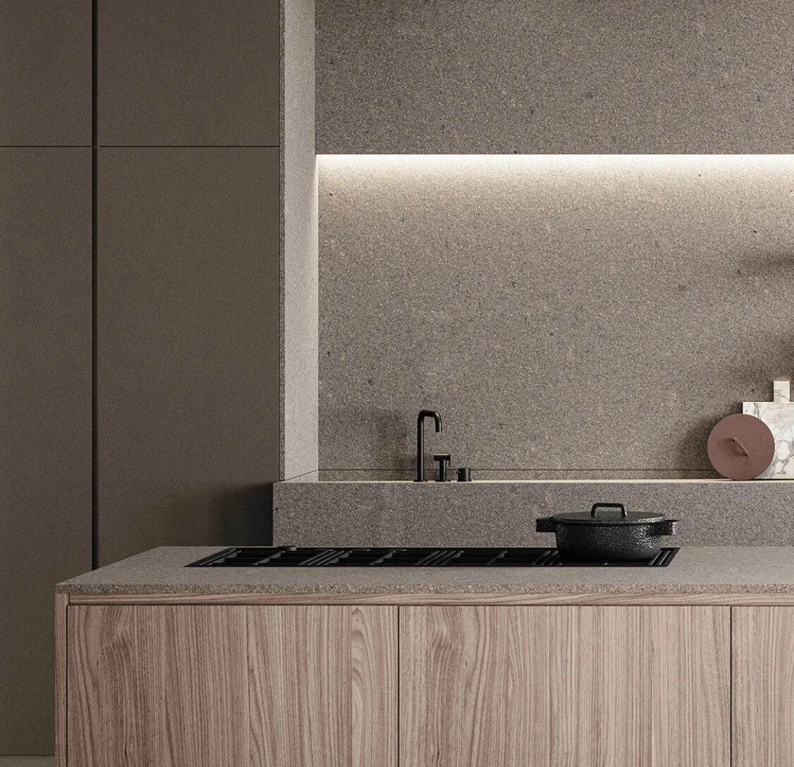
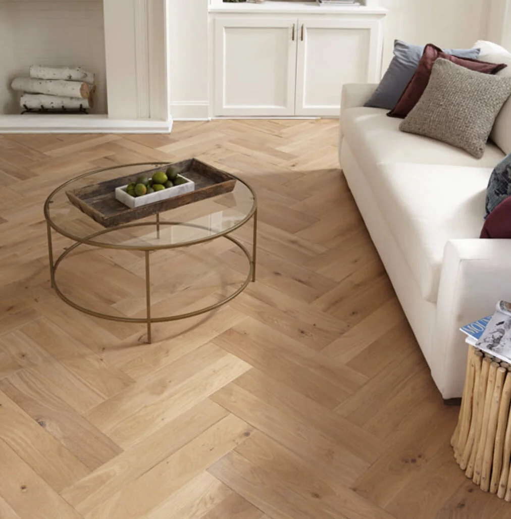
You’ll note that part of what attracted me to the above images is the parquetry floor. This is what I would specify for you - for the kitchen and the new room. It is stately in a way that fits with the era of the house, and it is just so luscious and luxe.
French oak parquetry
A timber floor is by far the superior finish for a kitchen/living space as the tile alternative is noisy and harsh. I am NOT a fan of tiles anywhere but bathrooms, laundries and institutions! And bearing in mind the honey colour of the floorboards in the original part of the house, I think a french oak finish is the right choice for the sense of flow.
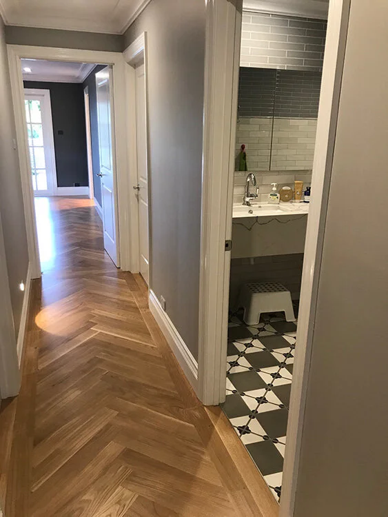
The rationale for using parquetry is a bit like replacing the kitchen - to get the perfect match is very difficult. The story of life!! Parquetry is a classic finish, it’s timeless and manages to bridge the gap between the original features of a house like yours, and a fresh, contemporary reimagining. Big fan.
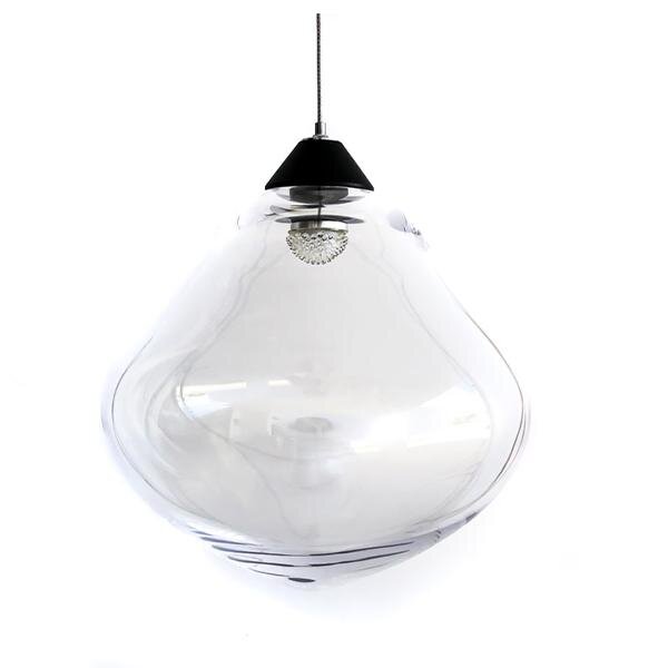
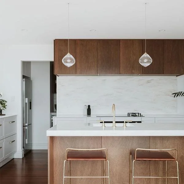
Kitchen lighting
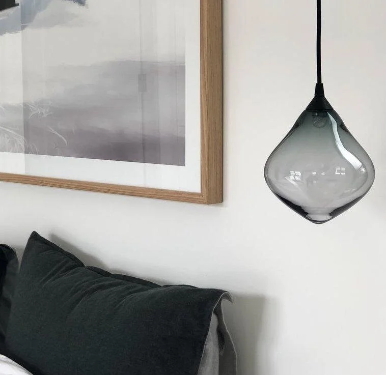
We agree that pendants are the go and I have found these amazing ones! They are available in a couple of colours, either clear glass or the smokey alternative. The fittings are available in black, brass or chrome. I would suggest clear globes with black fittings for the kitchen, and a single smokey globe with black fittings for above the dining table in the new room.
I love the simple elegance of these - let me know what you think.
The New Room!
This room is going to be the rock star room. Why? Because you are going to so love the increase in size and the way it opens both to the kitchen and to the garden, with lovely glass doors and a whole new perspective for living in, entertaining in, dreaming in.
I have concentrated my design around the orientation of the various elements; furniture, colour and curtaining. Added to that is the heat source, tv placement and again, sense of cohesion with the rest of the home. The images below are to help you visualise what I am describing - Pinterest images are a great source for inspo shots, but of course they can never be exacting. But this is very worthwhile…
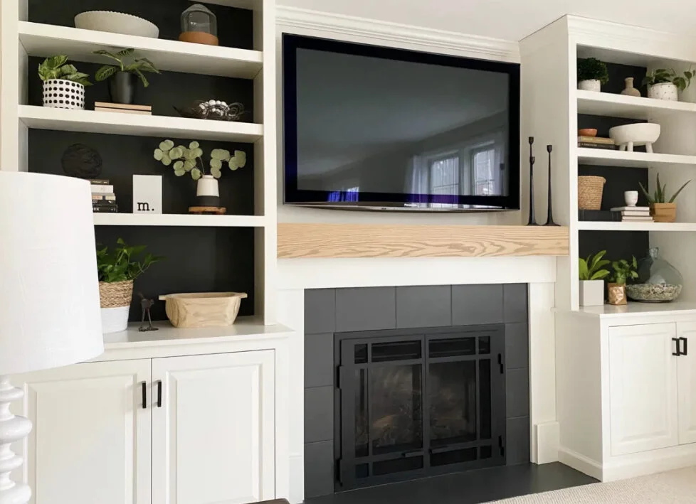
The images above show the basic structure I have in mind - a gas fireplace being central in a wall of shelving over cupboards. The television is directly above the fireplace, but could, if you’d prefer, be to the left hand side and on a shelf above the lower cupboards. I know that the placement of the tv is important for watching the races in the afternoon and I think that by placing it above the fireplace, we can avoid glare from the light source of the back doors.
At our meeting, we discussed the colour of this room and I said I thought it should be Drift as it is all a continuum. I have since revised - slightly! Again, in the interests of continuity, I would like to paint the back boards of the shelving either side of the fireplace, Cinder.
This will create a further point of richness and interest to the room and it will enhance the look of the things you decide to display here.
Whether it is books, treasures or photographs, the warmth of the colour will be a great backdrop and give character without detracting for the lightness of the room more generally.
This is a great idea!! God I’m good!!!
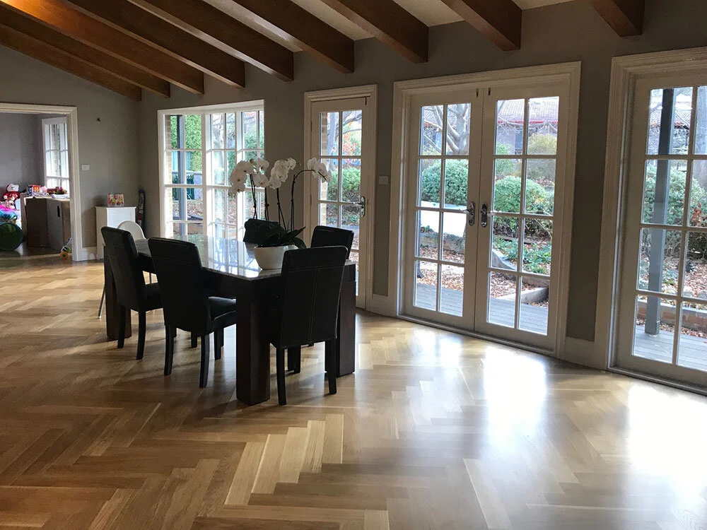
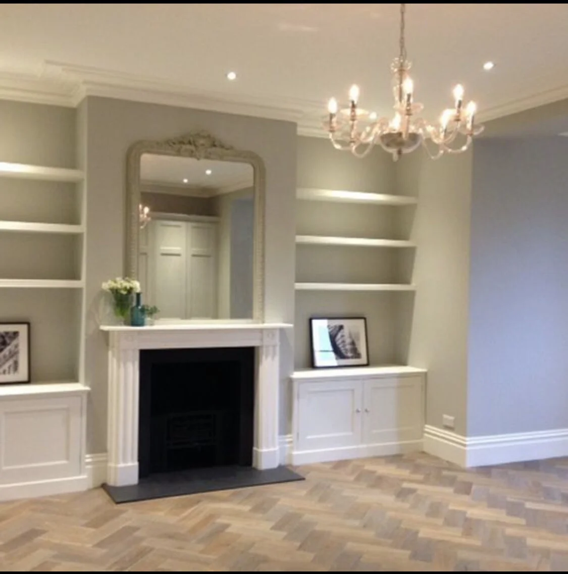
The images below are further examples of parquetry strutting its lovely stuff in a living area and showing the beautiful warmth it brings to the room.
The furniture in this new room needs to be casual and relaxed. I have chosen matching linen couches from MCM House, from the Joe range. The linen is beautiful and 100% washable - so if and when it gets dirty, it’s easy to pull the covers off and either launder them yourself, or send them to the cleaner. They come back looking good as new.
The couches will face each other in front of the fire which is the best arrangement for entertaining friends or each other (!!) and it’s also the best arrangement for taking one couch each, stretching out full length, feet before the fire, watching telly!!!!
I have specified the Joe range many times over the years as I think it is value for money and it never seems to go out of style. It’s hugely popular despite MCM House never really managing to photograph it well on their website!! Pop in to the store on Oxford Street and see it for yourselves. I have a piece in my study - and I put it to work!!!

The colour I just love is Khaki. It’s a very gentle colour and will go beautifully in this room with its great natural light and warm floor colour.
If you elect a modular couch, which you may do, then the Joe range do this format as well. I would recommend two separate couches because I think it looks better and I also think you can each be just as comfy when watching tv!!
I also think your argument that one of you has your back to the garden isn’t strong - unless you face all seats to the garden, and that would be odd!!!
I would suggest a coffee table between and have selected this one above from Globe West with its brass frame and glass top, measuring 1.3m x 650 x 360.
For the small dining table, this one below is again from CoCo Republic and would be utterly perfect. It’s made from South American hardwood and it is sleek and organic and I’m in love with it. Two chairs like these would ‘round’ it off!!
Curtains - ah!!! In the front rooms of the house, I elected to leave the plantation shutters as I think your choice there was right for the space. Curtains would clutter the sitting room, given the beauty of the arched window, and the controversial dining room window has no room for curtains either.
So now is my chance!!!!!
I think linen curtains here will truly set the entire room off! And of course it has to be linen - because this is the rock star room. I love the use of contrasting linens where the top, dominant portion of the drop is a lighter colour, and the small bottom section a darker, as illustrated here -
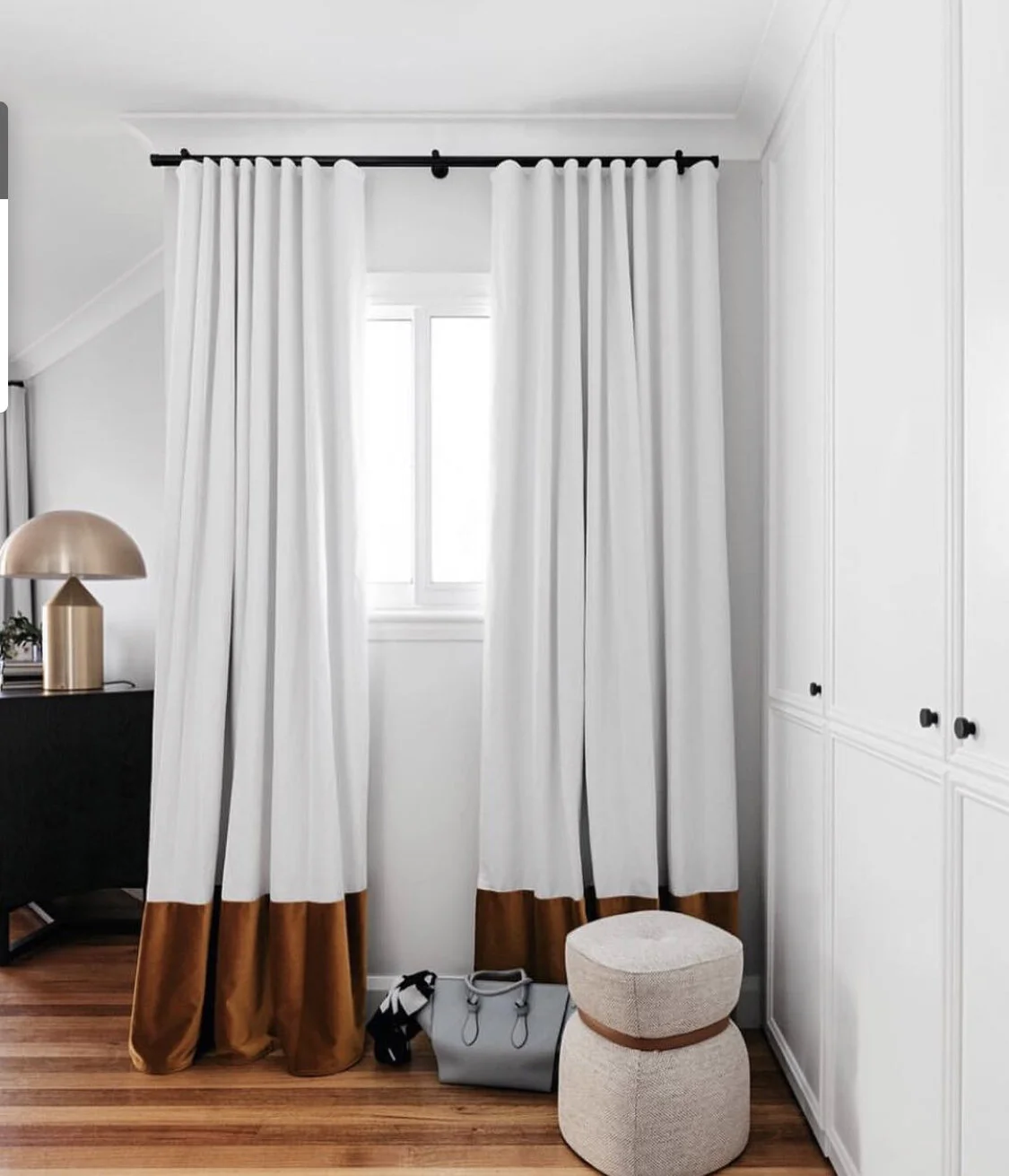
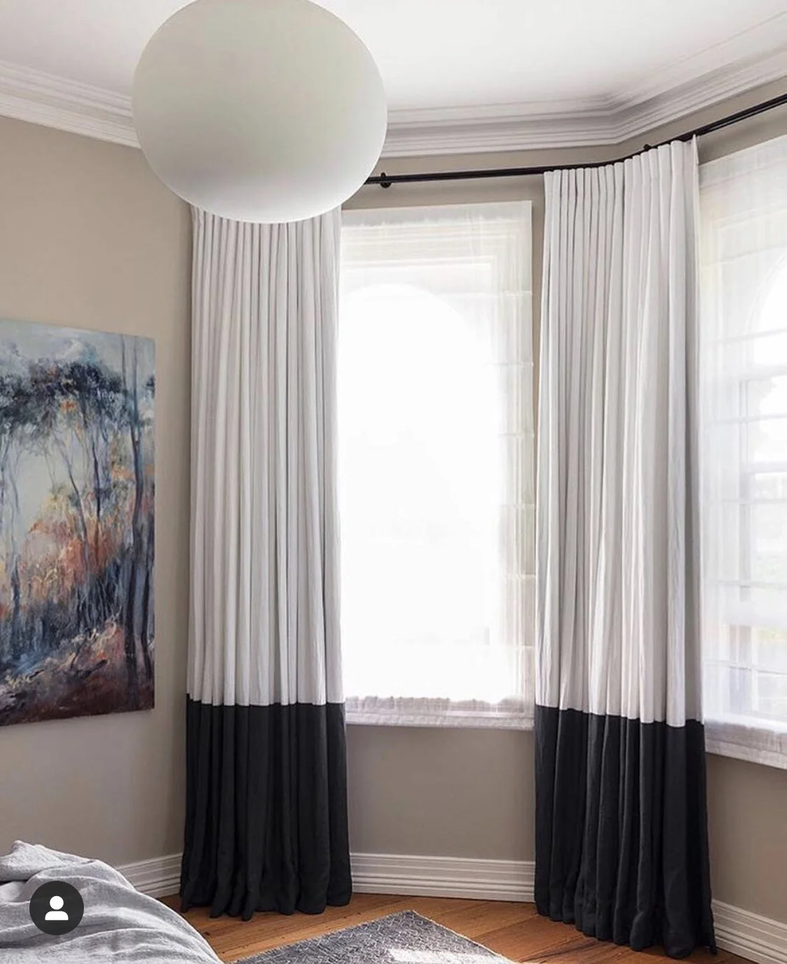
The colours I have chosen from Mokum are Linen for the top and Riverstone for the bottom. These will sit nicely with our palette and be a lovely threshold for the garden beyond.

Wall colour should be Drift, as it flows from the hallway and there is enough difference and contrast with other elements of this room’s design without changing the wall colour!
I suggest a sisal rug, with a turned and stuck edge, to compliment the setting. I selected this particular one because it will tone beautifully colour wise, and also match our relaxed and cosy feels.
To turn and stick the edge means that no fabric border is necessary - and a think underlay is added to give the rug a soft tread.
Sisal is fabulous product - I love it for its understated look which is at once totally chilled and full of character!
And importantly, I have a really excellent provider who has been manufacturing this product for decades.
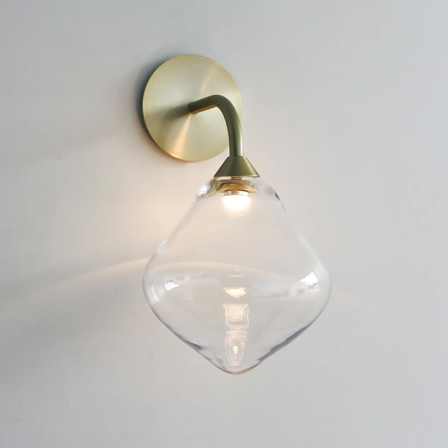
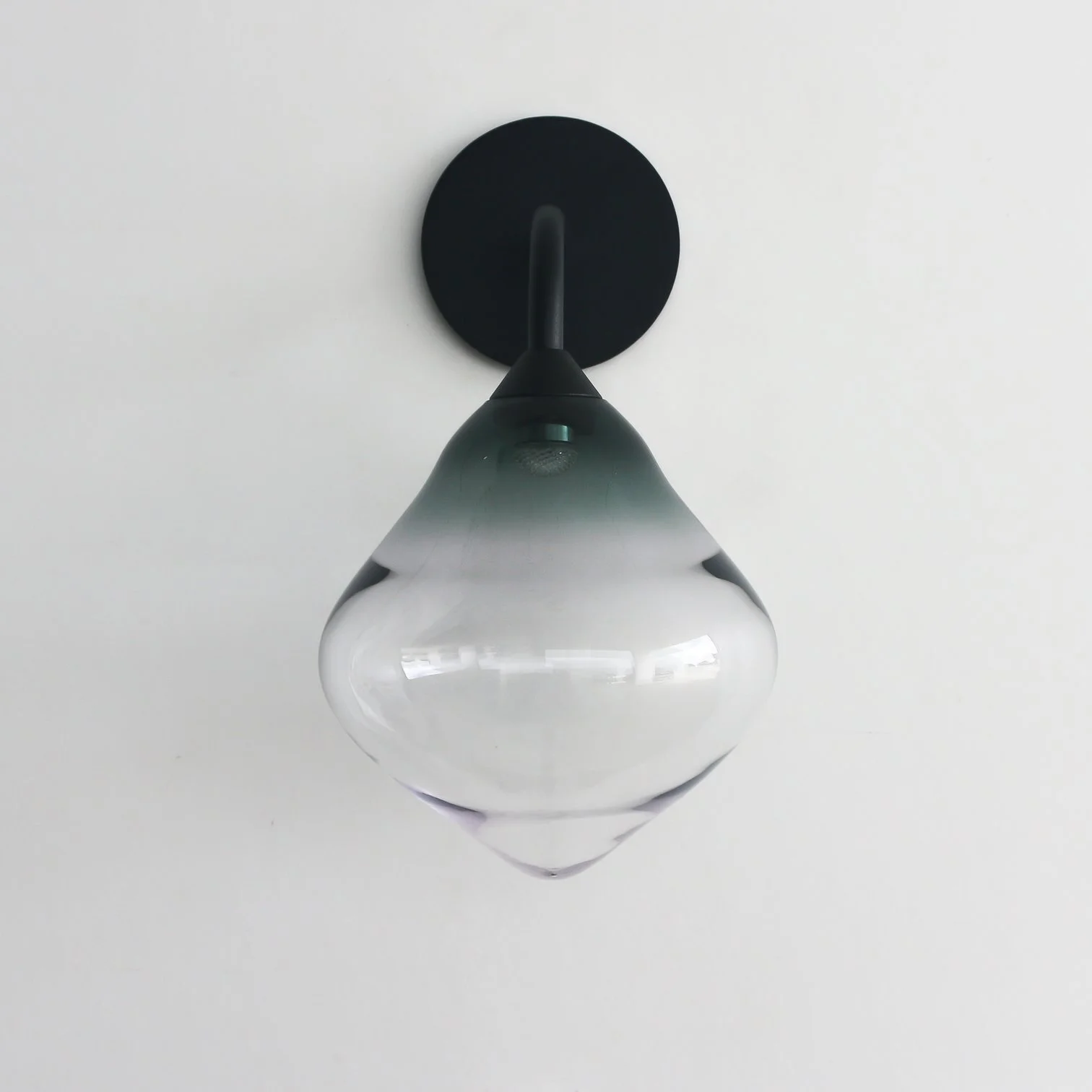
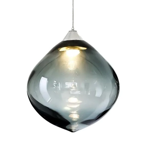
As newly mentioned, this Ollo light has really caught my fancy and I think the continuity of having it in the alternate colour glass in this room would be perfect. The dimensions of it are 16cm x 16cm - hand blown in Currumbin, Australia.
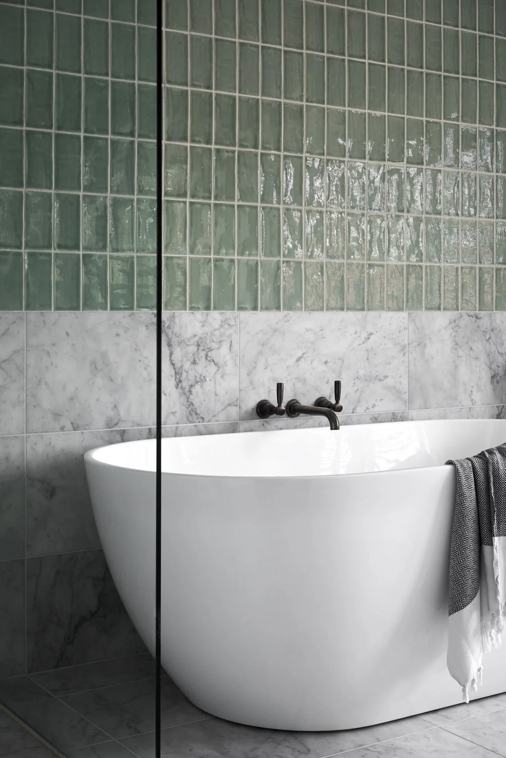
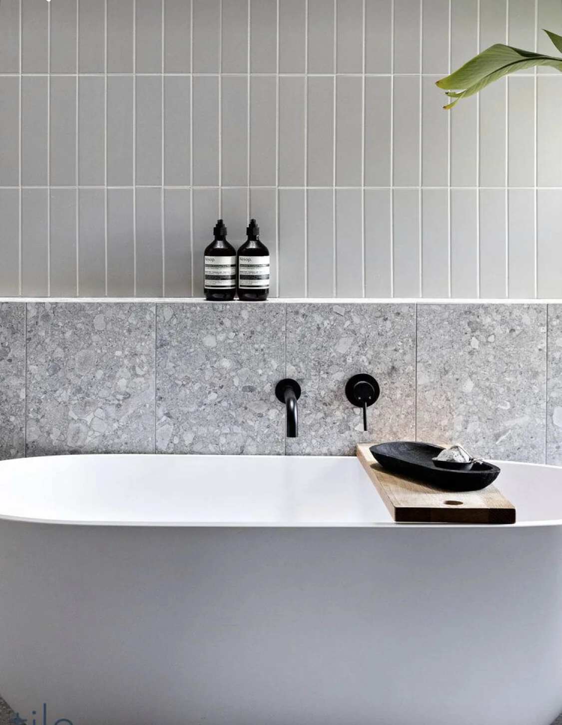
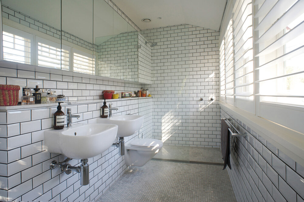
Main bathroom
The design ethos for this newly expanded bathroom will be sophisticated, masculine chic. I have taken my cues from what you’ve shown me you like, but I am challenging you a little!
This is a question I have to ask… Is a bath 100% necessary? It’s fine if it is - we will of course cope!! I know that you have already bought it. But if it’s not something you personally use a lot, and if it is something that you ‘re installing for resale value, then I would question as to why we are allowing it to take up so much room in a small space. There - question is out.
Crazy Alternative #2
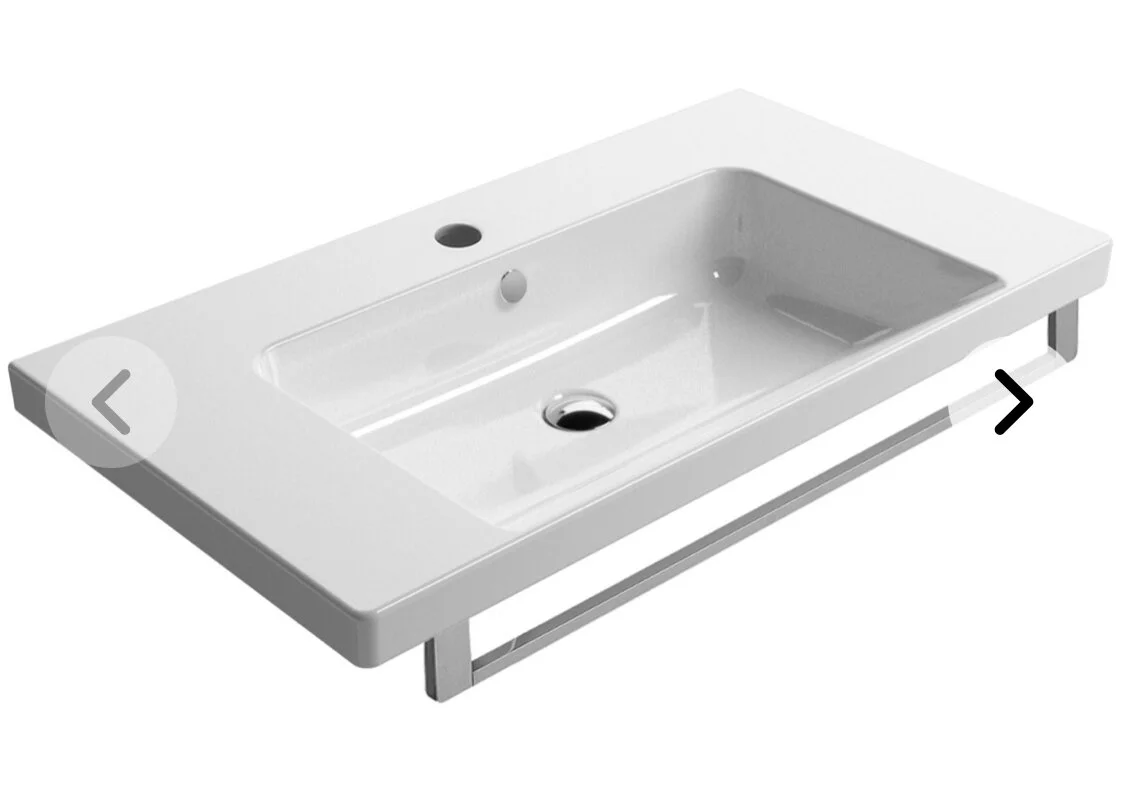
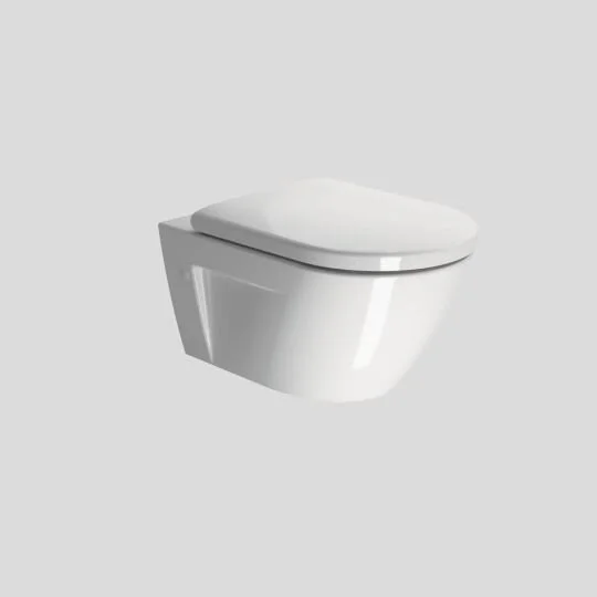
If the bath were deleted, I would replace it with a generous vanity and I would put the loo where the basin is in the plan, thereby allowing for a very large double headed shower along the wall parallel to the bedroom behind.
For the moment, I will be a good girl and detail the architect’s plan.
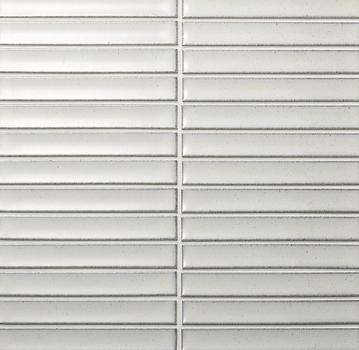
The architect has included a skylight, so the quality of light is going to be great. The tile that I have selected is a Japanese porcelain made by INAX with a textured surface, which will capture the top light coming from above and look amazing.
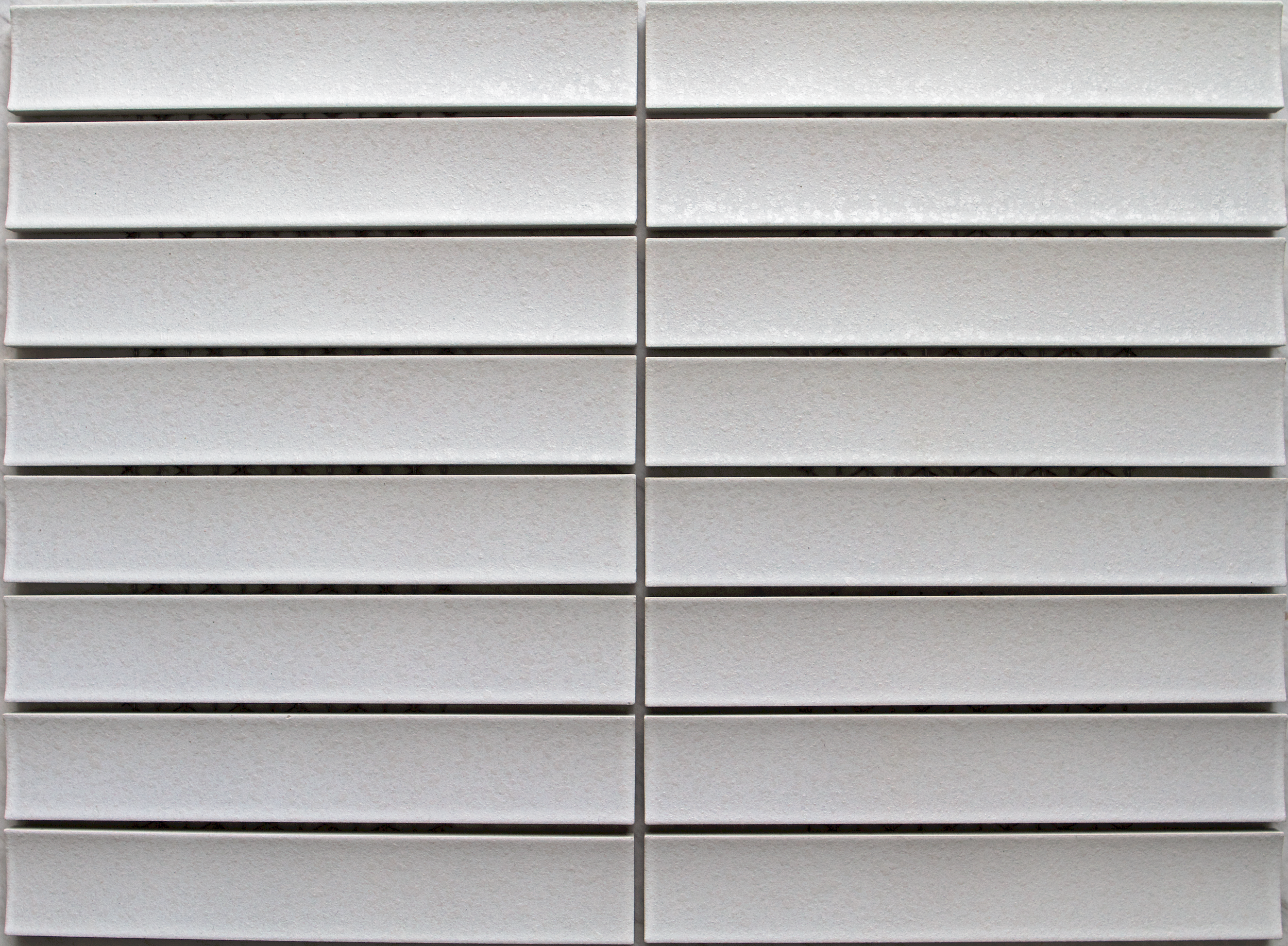
The ceramics are baked for longer than standard tiles, making them more durable and hard wearing. The look is very contemporary, but I can’t see that it would look any less chic in 20 years time. The slightly Japanese aesthetic will do that!
I propose laying the tile vertically, not horizontally as I think this enhances a feeling of space.
These images from the Artedomus website give an indication of the beauty of the tile, but neither will adequately convey the effect in your bathroom!
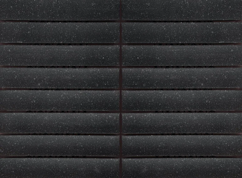
I propose the white for the three walls, excluding the wall with the door, the loo and the basin. This wall I would propose doing in the dark tile.
Why? Because it gives the room a further detail that is all about design! There will be mirrored shaving cabinets on that wall too, so there is not a major expanse of the dark, just enough to imbue it with some serious style.
And for the floor?
We talked about terrazzo, which I adore and think would go beautifully with the wall tiles.
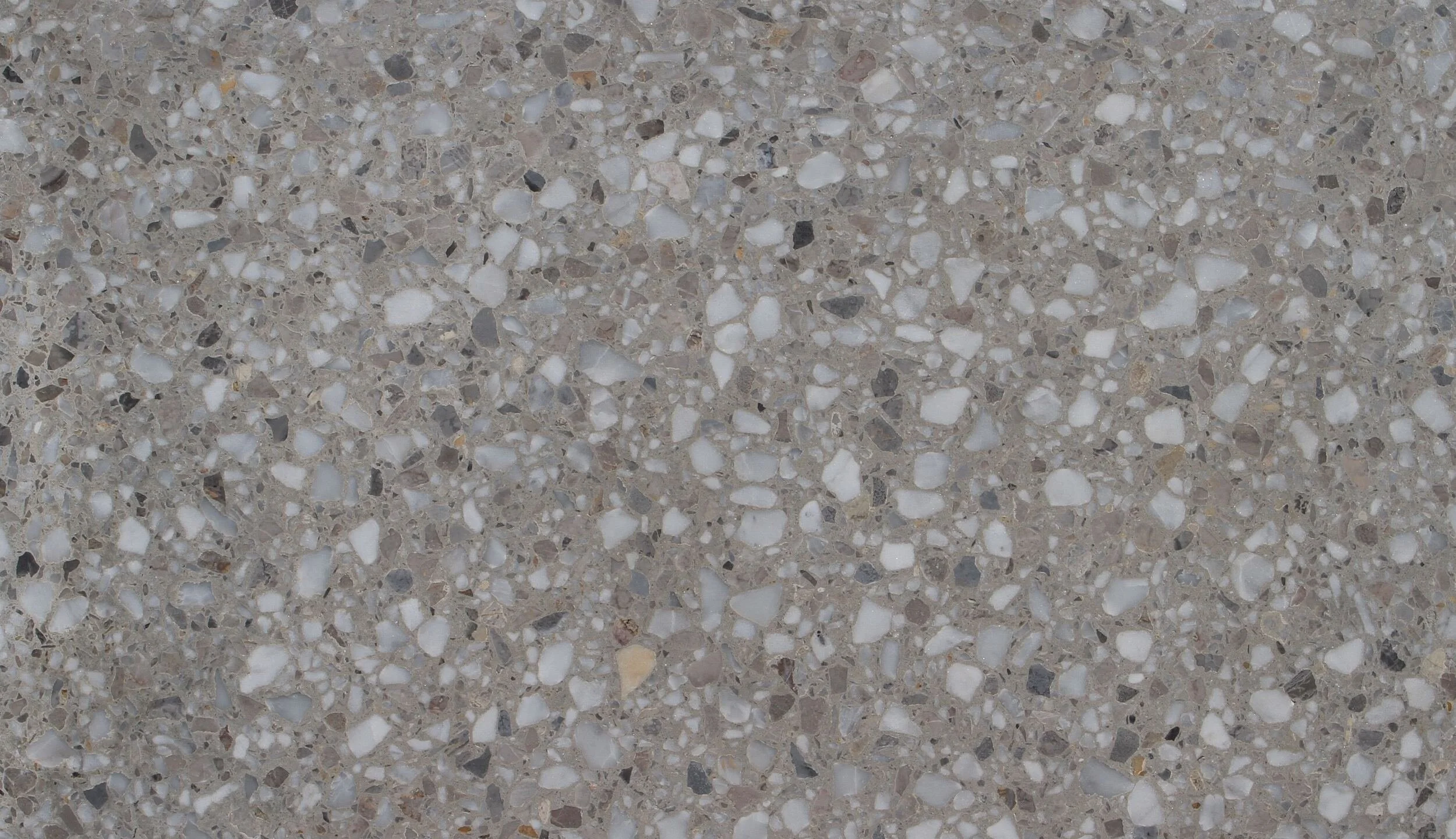
Terrazzo Assisi
After our meeting and showing you the samples of the above tiles, I detected some resistance. Perfectly alright!!! I am going to go back to the drawing board - and am adding new tiles and tapware, but I think the bathroom with the bath layout is strong. I would prefer no bath, but Andrew, I am hearing you!!!!
I thought you may prefer a larger format, dark tile like this one below. It’s almost a granite looking fleck running through it and the finish is not glossy, but rather a soft matte. With the wall tiles, I felt that the terrazzo didn’t work as well, and so I went for something simpler.

Marquina larger format floor tile