Your Custom Text Here
pearson house cip
Leonie and Tony,
The following Creative Interior Plan (CIP) is intended as a storyboard to help you envisage the transformation of your home as I have designed it; the style, the furniture, light fittings, colour schemes, art, floor coverings…. it can all be a bit overwhelming to digest without supporting imagery, so I source this from suppliers and manufacturers to approximate the result I have in mind. I welcome your engagement with all aspects of this, your feedback is by far my greatest resource!
Consider the CIP as a guidebook that you are authoring - this is your home and the centre of your world, so it needs to feel utterly authentic to the two of you. I’m a facilitator, an inspirer, a challenger - between us we will achieve the home of your dreams.
So let’s get cracking!
Henrietta x
Interiors
The entrance hall:
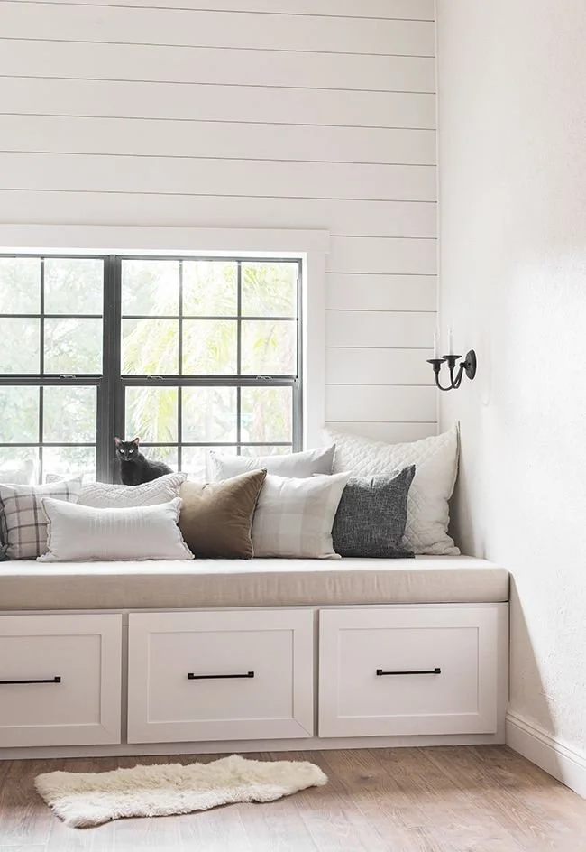
Over the threshold we go. The entry to a home is so important - it’s that first smell, that first glimpse as you come through the door that checks you in - you’re home. I always say, love your home and it will love you back, it will embrace you as you come through that door, welcoming you back and whispering to you to stay….
I am going to suggest here that all the furniture currently in this hall - should not be whispered such things. By removing it, we have an opportunity to simplify and beautify by adding a couple of new pieces that fit with the new scheme and work to create a sense of harmony and style.
We will start with the fundamentals:
The colour I’d suggest for the walls is by Porters Paints and is called Dun, chosen for its earthy warmth which will compliment well the schemes for the rooms on each side, namely, the library and master suite.
Porters Paints, Dun

The woodwork here, and throughout the house, will be painted Dulux Natural White, also chosen for its warmth. White is not generally a warm colour and in fact, can be quite cold! But I found this Dulux white to reflect the warmer tones and give a much nicer result as a consequence. It is my ‘go to’ white - very much a first world notion!!!
The entry hall is really the spine of the house and so it is super important to imbue it with the texture and flavour of the rest of the interior scheme, so that we achieve a comprehensive and cohesive design.
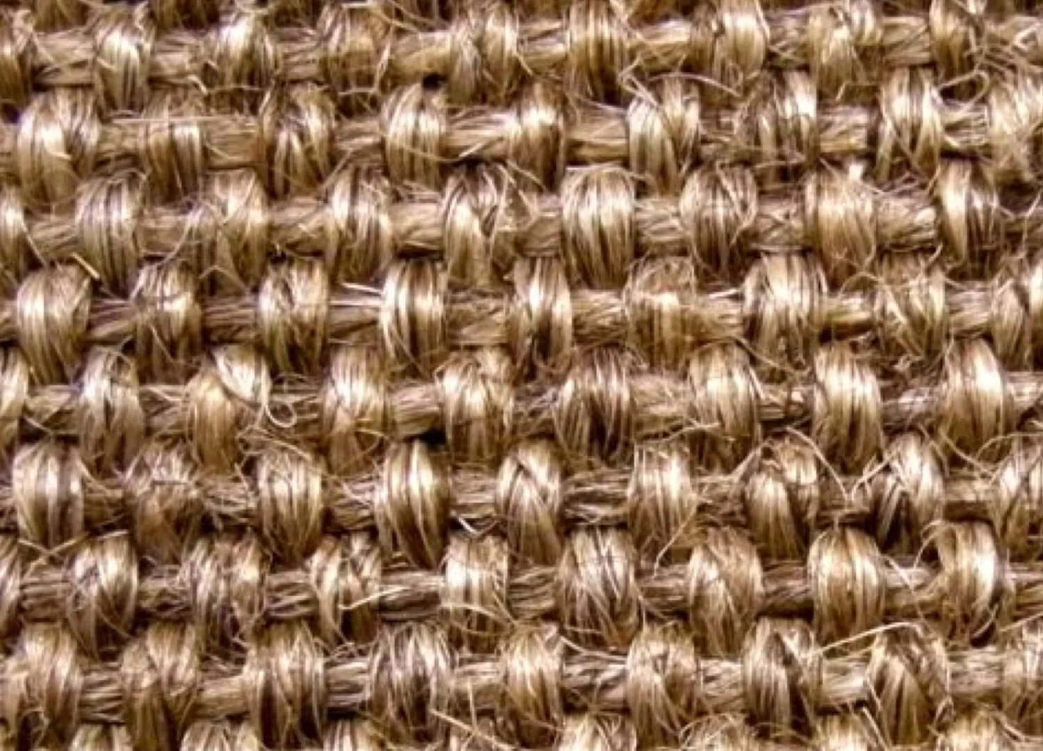
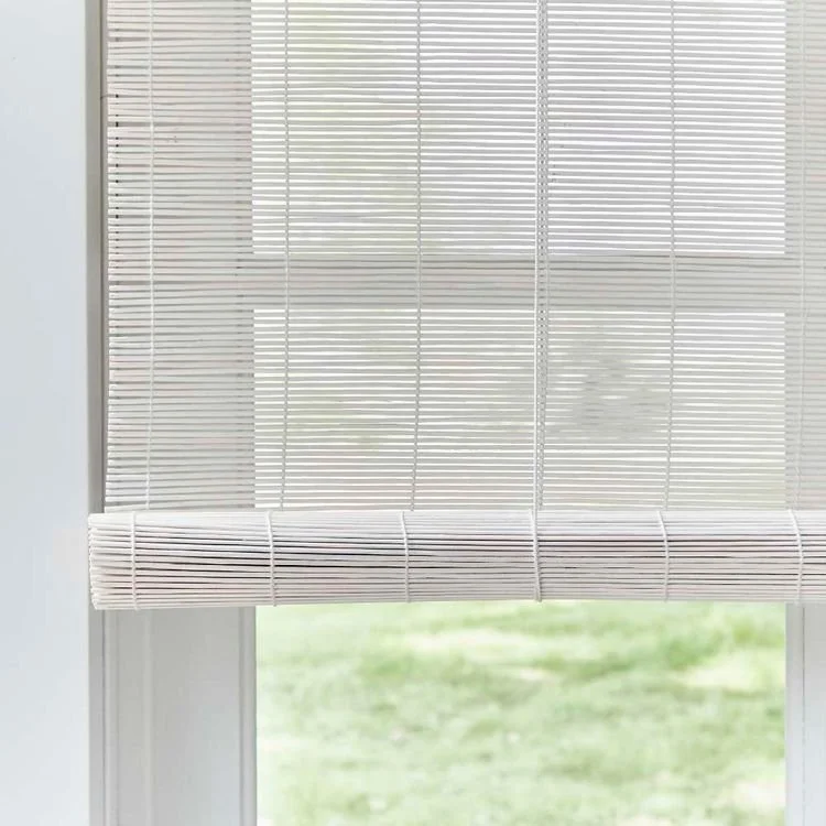
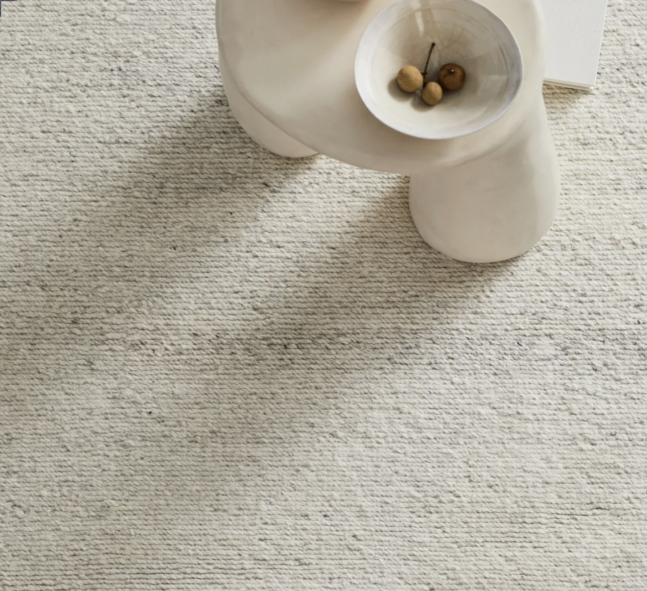
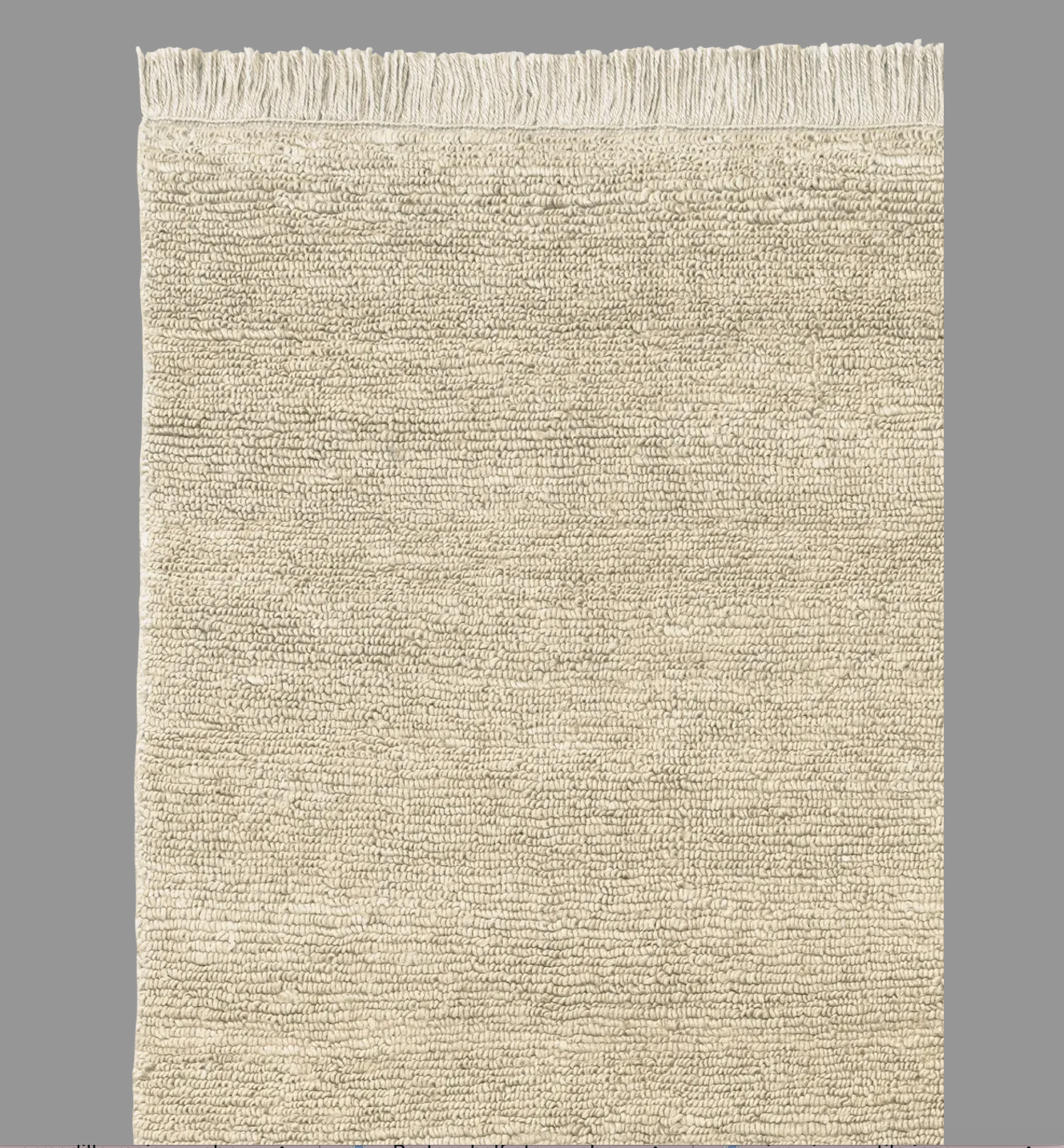
Next is the floor covering - I love jute, but I feel that in line with my comments above, the focus on this space is to create a sense of warmth and harmony, and as much as I love the floorboards here, a bigger, softer runner would make the area feel more spacious and inviting. A chunky pure wool will work with us here and by choosing a carpet, we can customise the sizing of it and have it generously fill its space. Spongy underfoot, the carpet will soak up the sound and really enhance the opening ceremony vibes!
To the left is a pure NZ chunky wool carpet that can be custom cut to fit the space as a runner. The colour, new york woven wool, will be lovely on the floorboards.
The carpet is cut to size and either bound with a linen or overlocked. The ‘turn and stick’ method this company use for sisal is not possible with the thicker wool carpets, but the benefit of the qualities of wool justifies the less seamless edging.
The Natural Floor Covering Centre rep will come and explain…
The floorboards in the home are beautiful and what I love about this carpet is that it will compliment, not compete with the softness of the colour of the boards.
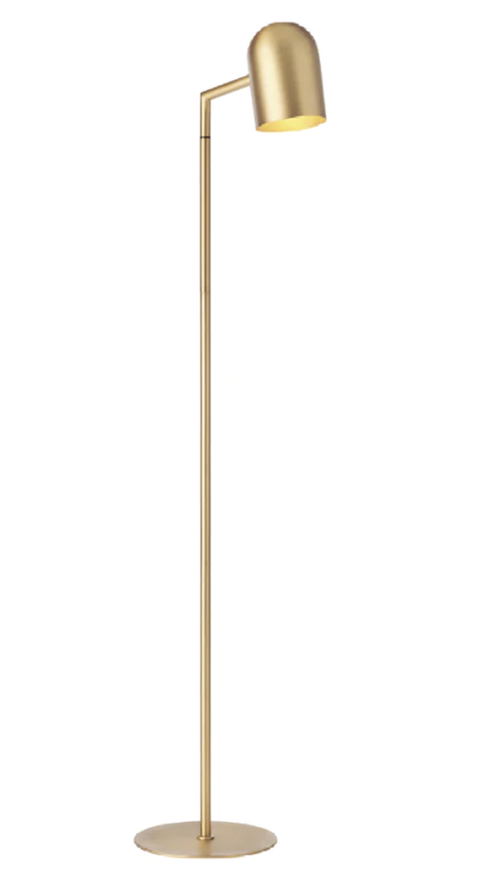
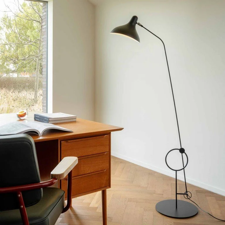
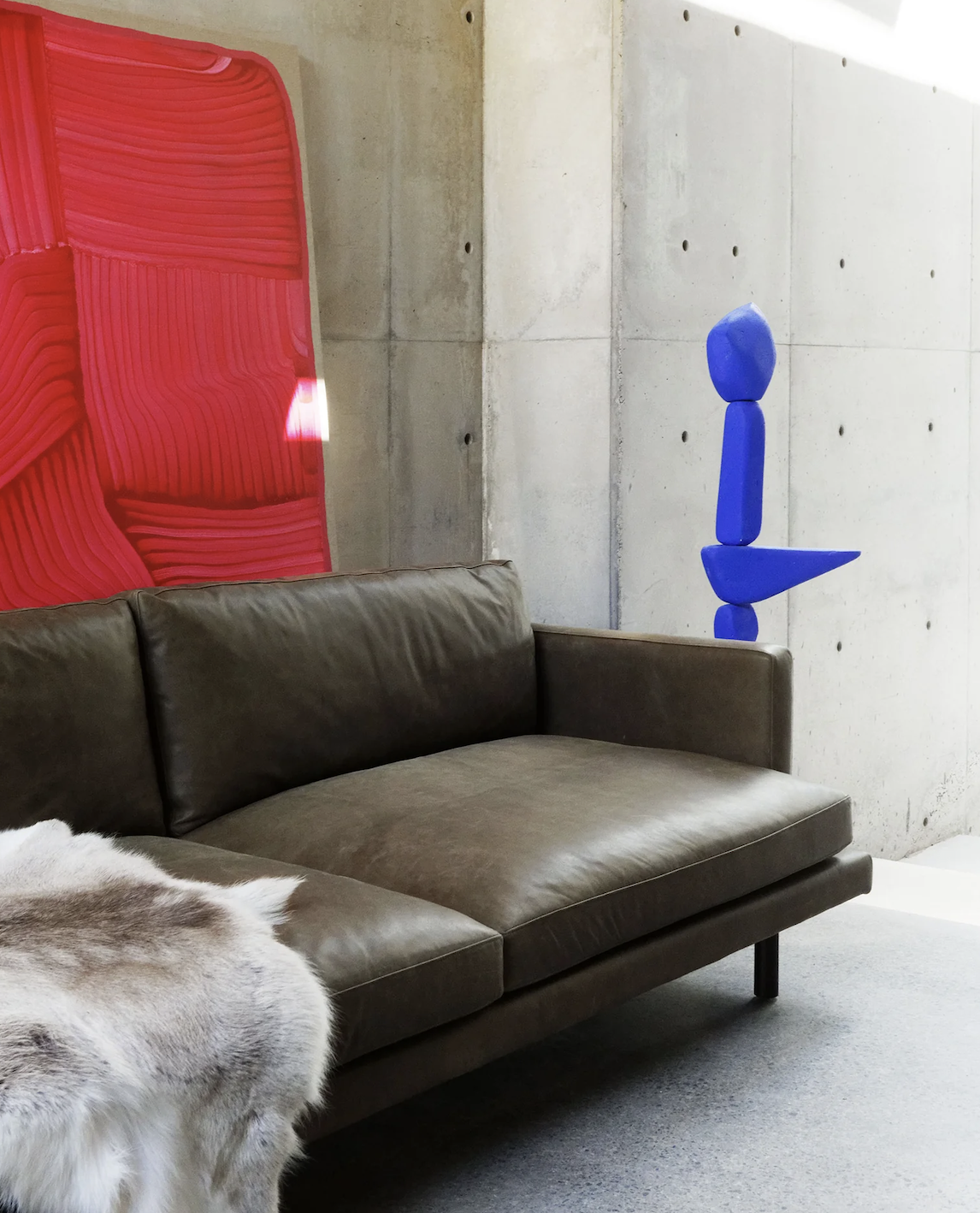
A sconce light is a lovely addition to an entrance hall and this one is particularly beautiful, measuring 300mm x 400mm high and cast from gunmetal bronze it is no surprise that it weighs 10kgs! Made in Sydney by Studio Henry Wilson, the light is so unique, it really is a work of art. It would replace the large painting of the beach scene currently in the hall, as positioned here, it would fill the space with a lovely glow and draw the eye the length of the hall from the front door. This would increase the sense of space too, and enhance the mood dramatically.

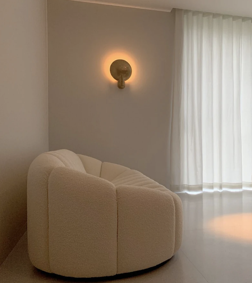
The light source projects on to the bowl of the bronze behind, reflecting the light on to the opposing wall and radiating goodness.
As time passes and we live for years in a house, we tend to stop thinking about cohesiveness in design and concentrate on the practical. And so it is that we accumulate mismatched pieces of furniture that, although perfectly functional and attractive in their own right, have absolutely no conversation with neighbouring pieces or the setting around them. We end up with a bunch of strangers speaking different languages and making no sense to one another and the result is a furniture abyss.
I know you guys are aware and that you’re willing to move on! So, having got rid of all the furniture currently in the hall, these are my suggestions for renewal.
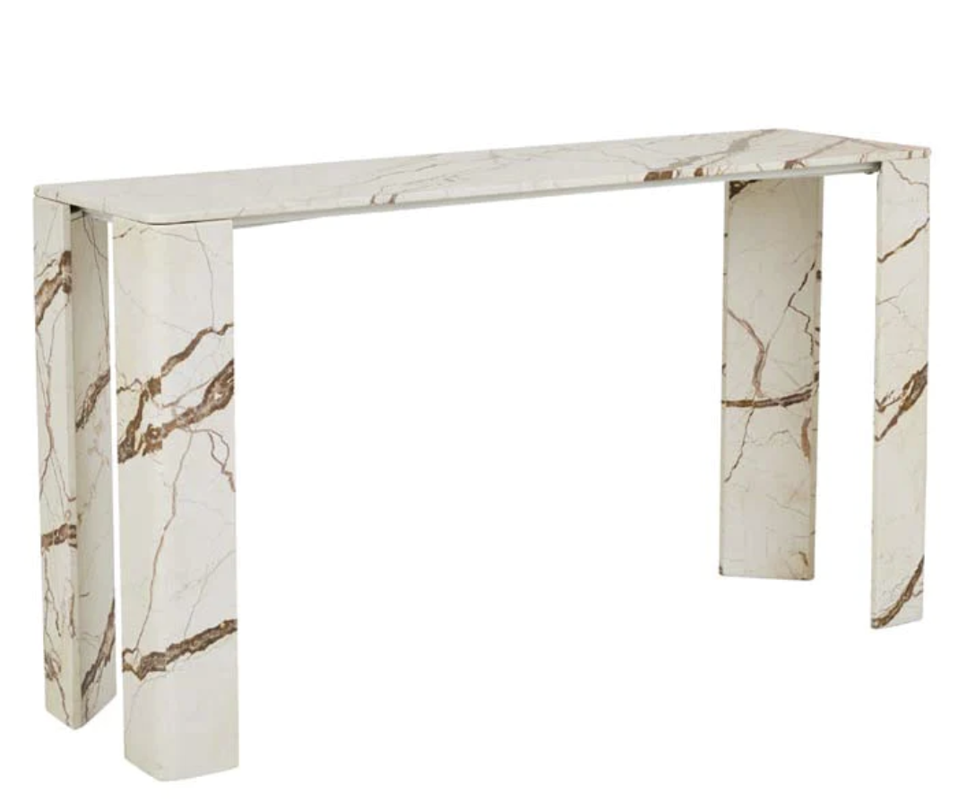
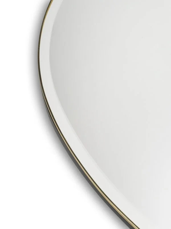
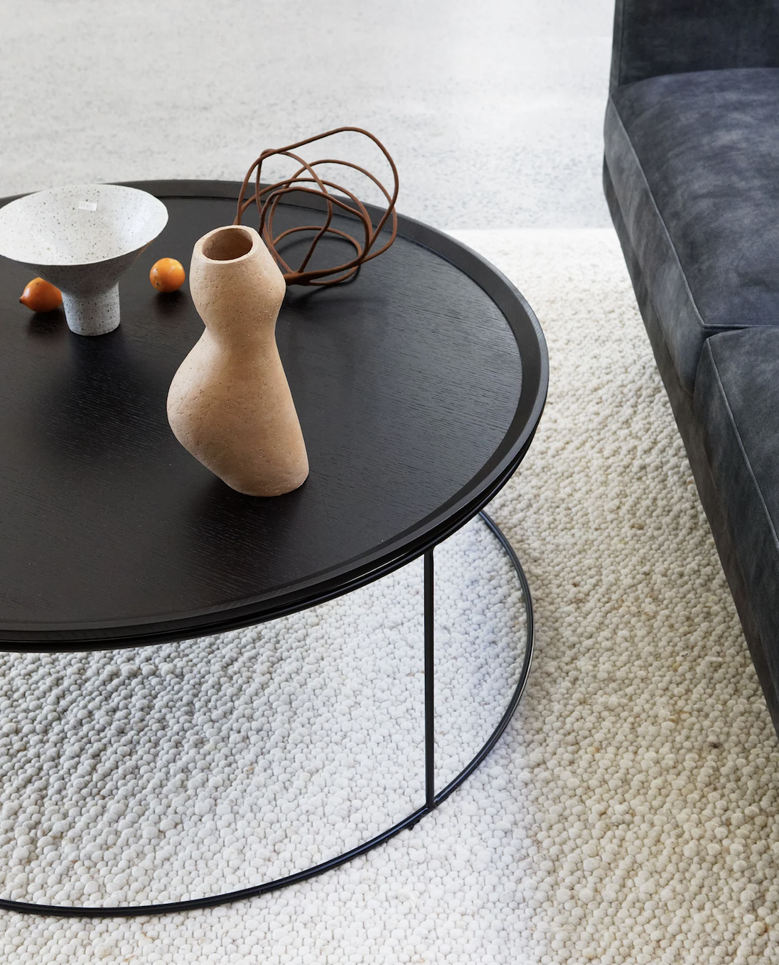
The rich gold veins of the marble console above are stunning and would pick up the brass glow of the sconce, and also of the rim of the brass mirror, pictured below, hanging above!. At 1.4m long and 40cm deep, the console is a decent size - enough for a large glass vase full of greenery, and a brass bowl for car keys. It is replacing two consoles but is a more substantial item than those and it will look really beautiful.
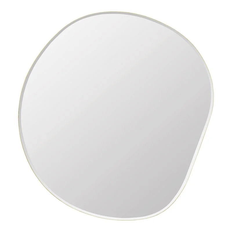
The mirror here is called a pebble mirror, a Scandinavian design said to be inspired by the unpredictable movements of flowing water!!!!! I love it for its irregular, irreverent shape that makes it as much a wall mirror as an artwork. It measures 92cm x 87cm and can be hung whichever way looks best in situ.
Further, my advice for furniture here is 100% relocate the beautiful timber chair your father crafted Leonie. It is so unique it really does need to be a feature! It will sit below the sconce light so that the light from the sconce washes down on it.
The point here is a seating option, not another console collector of ‘clutter’, and this chair fits the bill perfectly
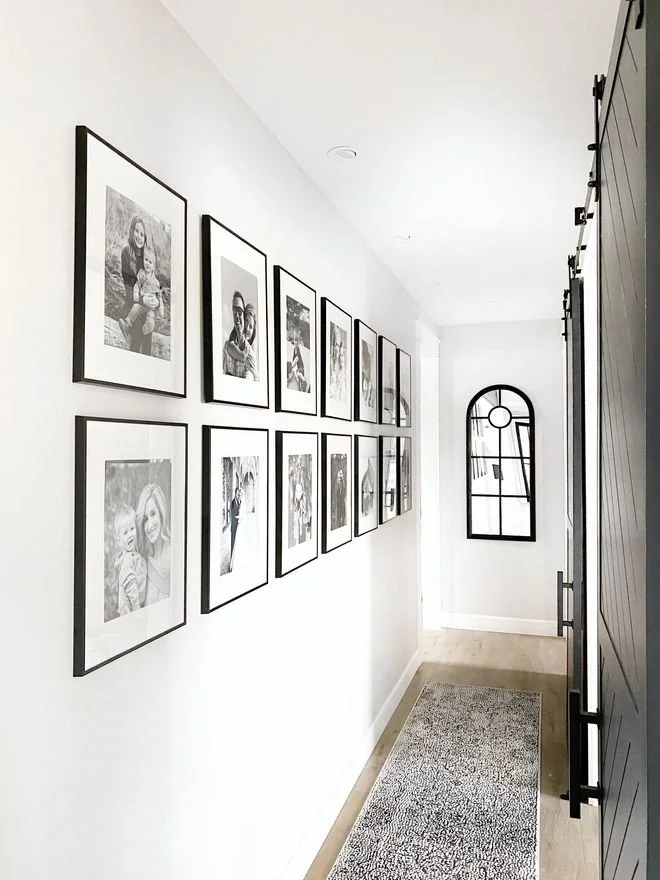
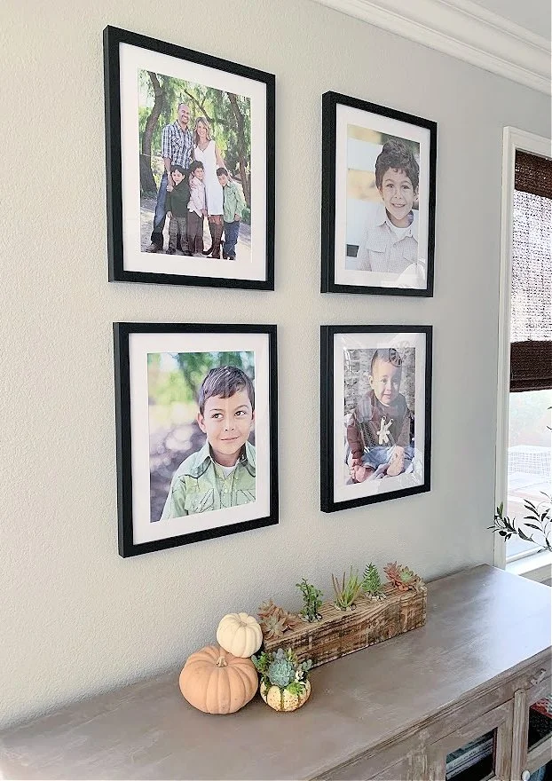
Art in the hallway is so important - and a favourite approach of mine is to do a gallery wall. This I would suggest on the staircase wall - opposite the mirror and console. Nothing feels more like home than a reminder of who lives here, or who has lived here and remains central to family life. Please think about this - I will give you plenty of guidance, but essentially, you choose a selection of say, twelve family portraits. We have them edited, printed on archival paper, and framed so as to be a set. We then hang them grouped closely together and they form an artwork of the very best kind. Let’s discuss.

The hallway, or spine of the house, is important to get right so to set the tone for the rest of the house.
The Library
Such a posh term for such a cosy snug of a room we are going to create here! But I love the the notion of a dedicated quiet room meant for reading or for conversation or for watching tv, a room lined with books and treasures, with seating so comfy you don’t ever want to leave . As I said in the scope, your living room layout is being corrupted by the placement of the tv - and when you are entertaining, it’s there, rampant, like a big hairy black spider. I say we squirrel it away in to the LIBRARY where it doesn’t have to feel like the social pariah that it is, and instead, it can add its hefty weight to the pedagogical zone of the house!!!!!
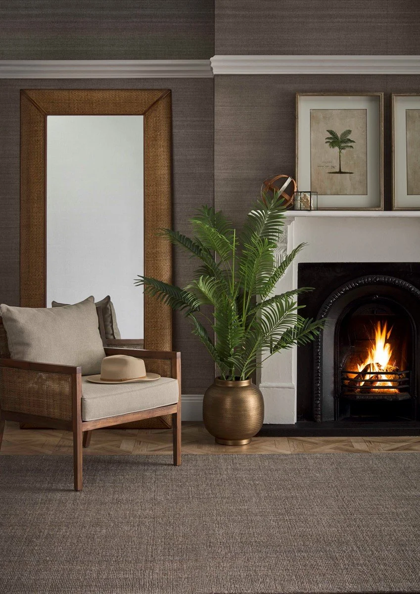
First things first - the walls. Porters Paints do a range of wallpaper called grasscloth - and I’m mad for it. Having used it now in a number of houses, I am never disappointed by the character and style it imparts. For your library, I have selected a colour called Silverback.
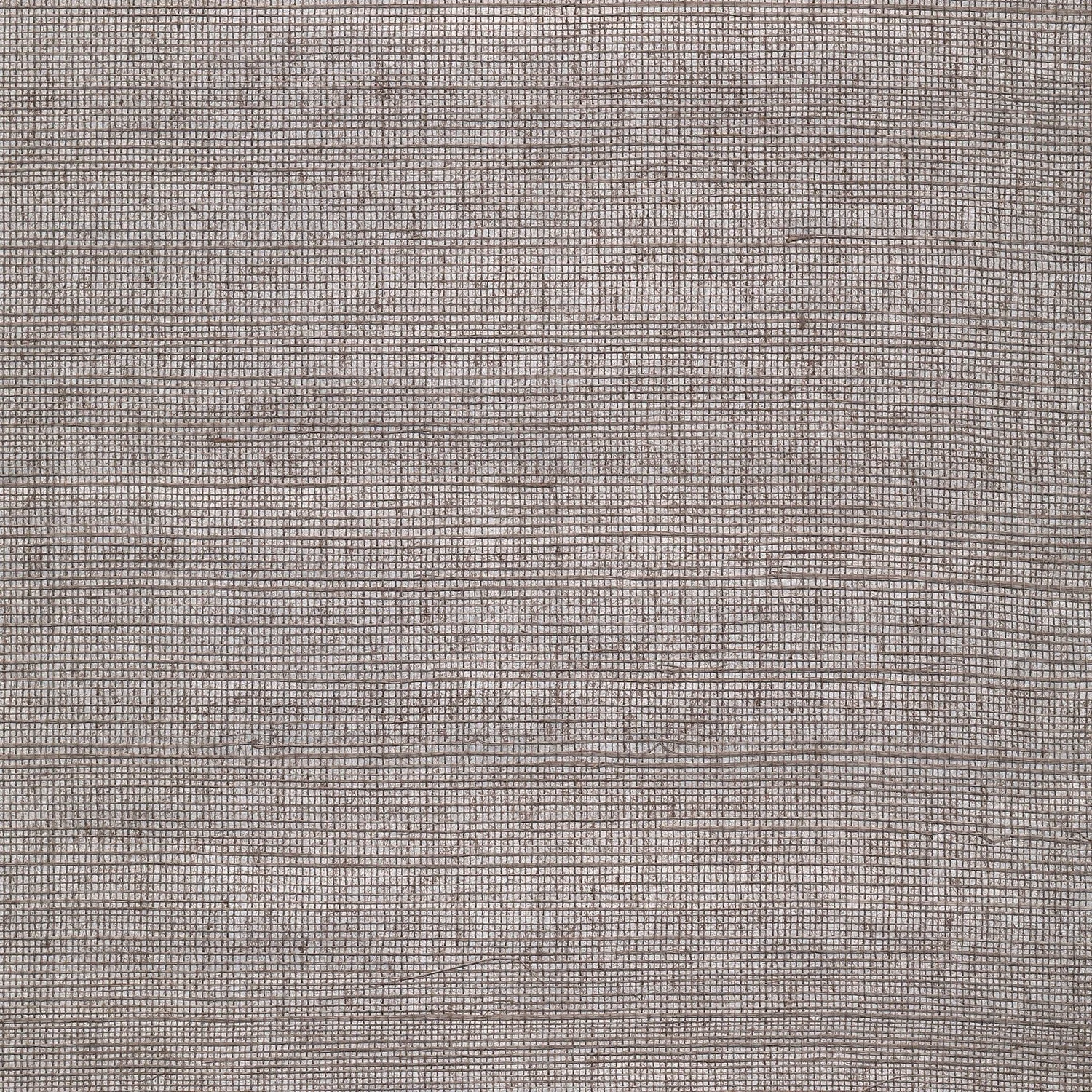
If you’re worried it is dark, don’t - as you’ll see from the sample, it has an almost reflective light to it, and as this is a room that will be lamplit and good for watching tv, the fact that it is on the darker side is so much the better.
With light linen curtains and light furniture, there will be a lustrous balance, I promise!
I know that you have shutters on the window in this room, but I’d like to suggest either replacing them, or even just adding long sheer linen curtains to add the softness I think the room needs. The colour I’d choose for this is from a James Dunlop Textiles range called Kyoto, colour Linen 102
Again, to bring more light to the room and add to its cosy glow, I would suggest a lighter coloured chunky rug. I love this one from Armadillo. It is made of wool, is available in various sizes and it is well priced; a 2m x 3m is $2100 before trade discount.
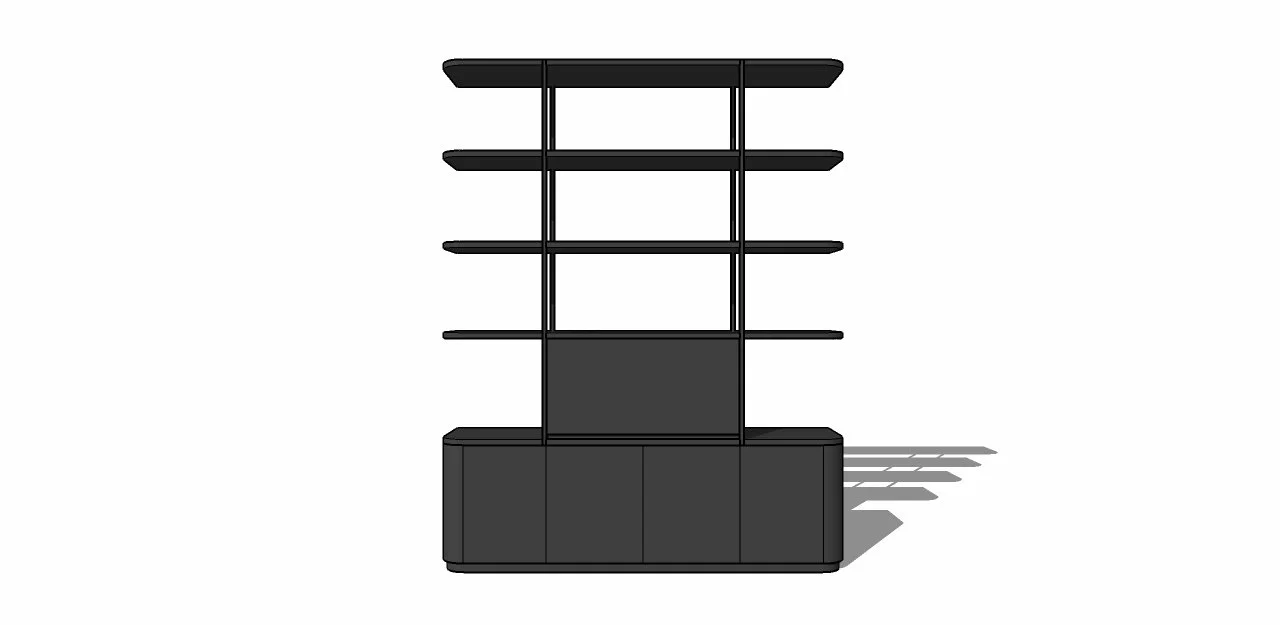
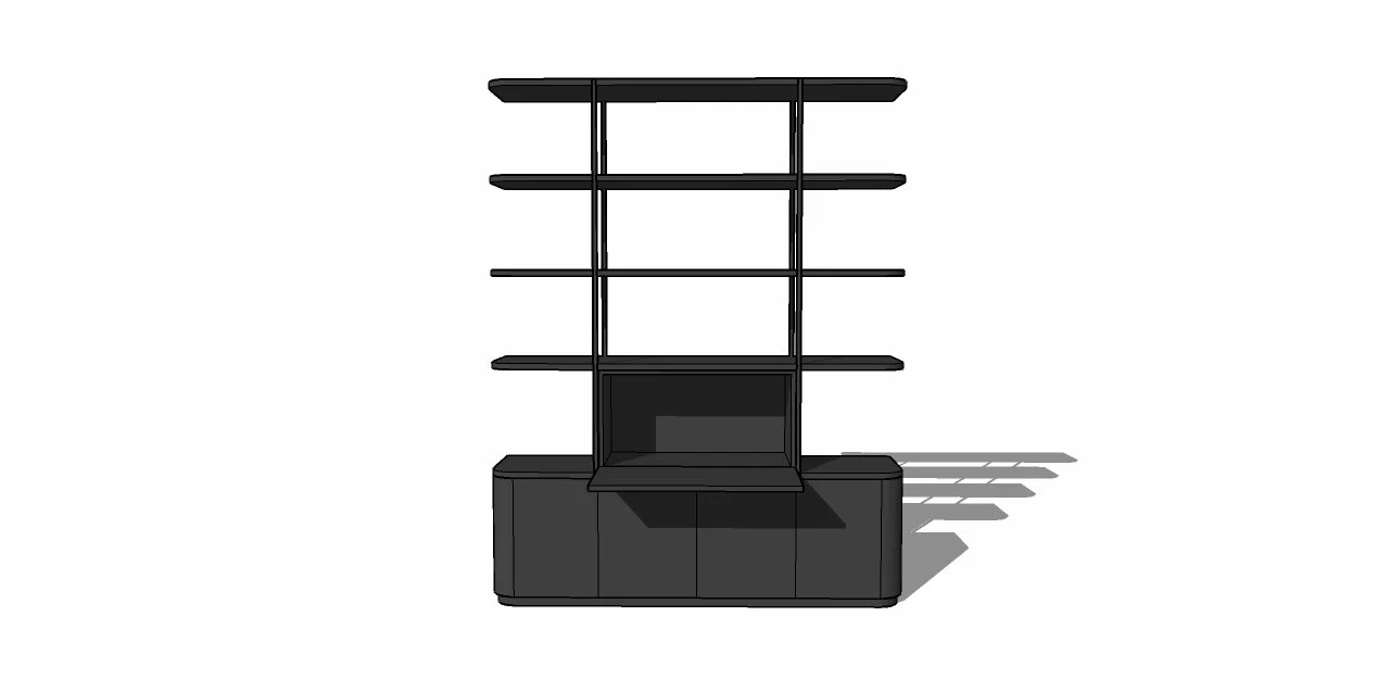
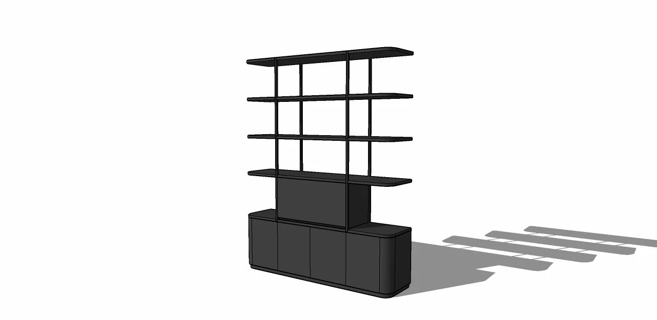
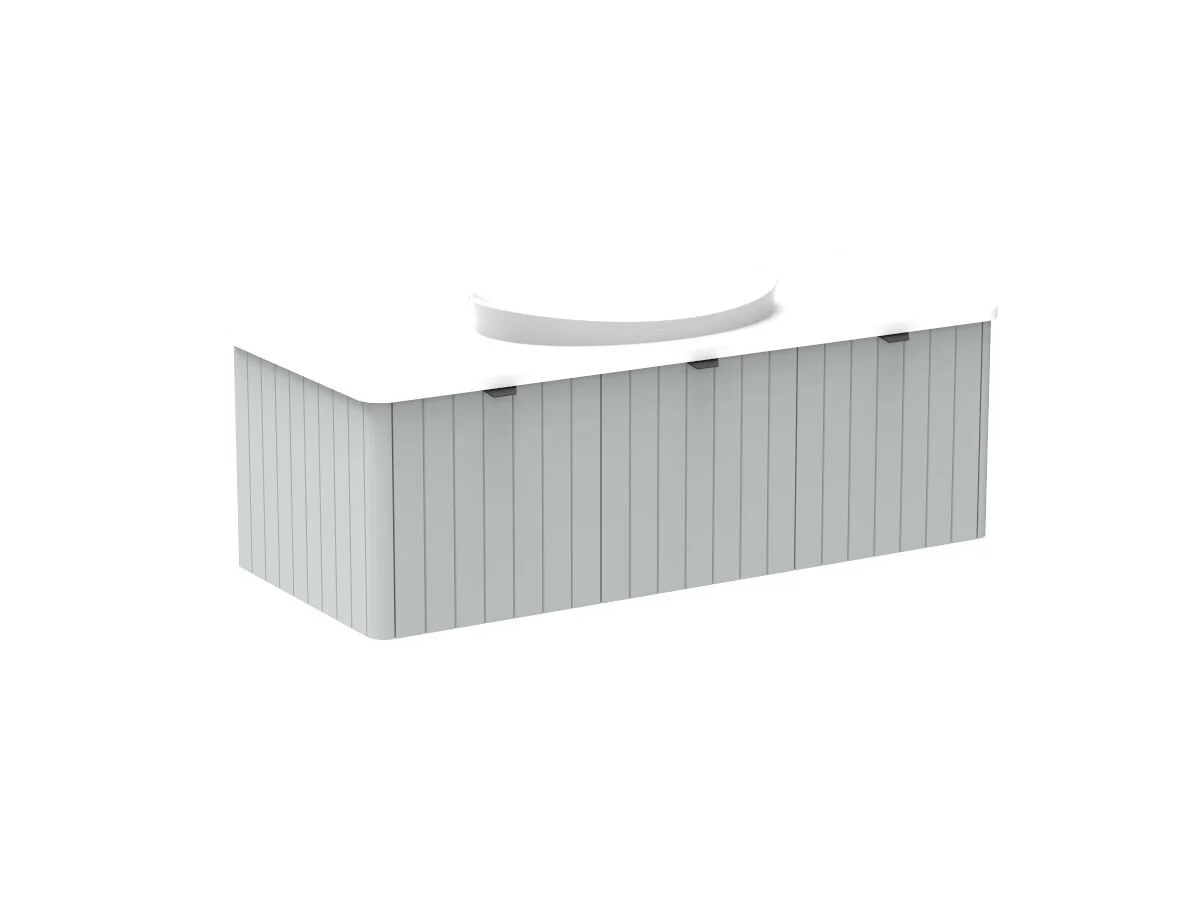
The next major move here is the joinery. Because the room is long (ish) and the door is at one end, I propose custom joinery that would run along the south wall for books, treasures, and the television, and in an ideal world (books are life!!!), I would have the shelving return the length of the east wall. Additionally, another unit would be on the west wall, or to the left as you enter, incorporating a desk that would be nearest to the window, the best light source.
The sketches here are of a smaller commission recently completed for clients in an apartment un Bondi Junction. You can see the fold away desk idea, which was necessary due to space constraint, but it gives an idea of what we can achieve. I do like the idea of a writing desk that can be shut away when not in use, but equally, a built in more commodious desk that doesn’t fold away is also an option for you guys.
Note the open shelving here - this was done to reduce the overall mass in a small space, but I love doing this when using wall paper as it is so much more stylish to see the paper behind the shelf and it visually lightens the load of the shelving.
The unit below is clearly much narrower than we’d plan for you, but it gives an idea.
This then becomes a book-lined and beautiful library retreat, where you can watch tv, read, write… or just relax.
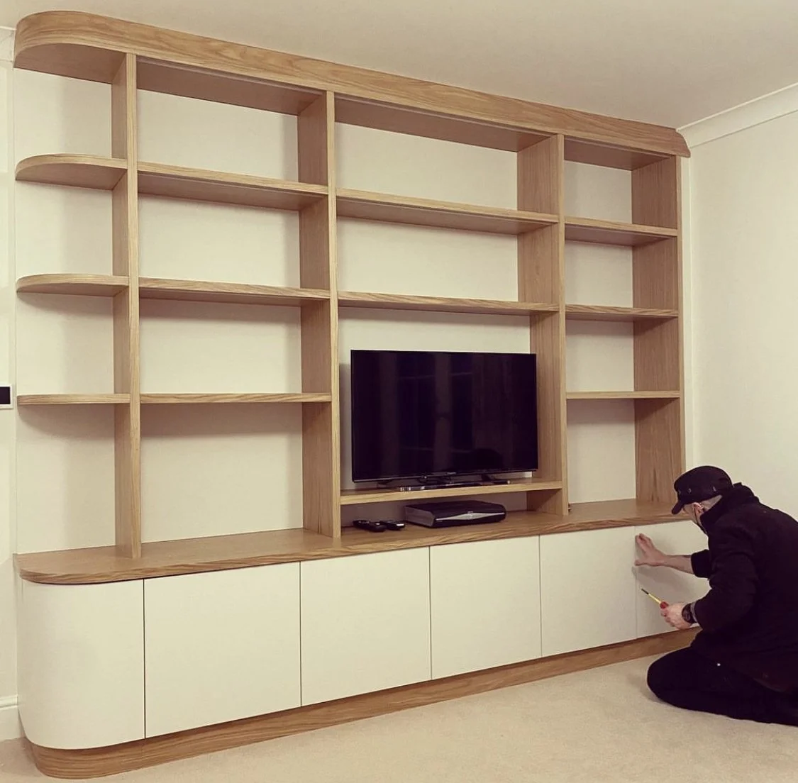
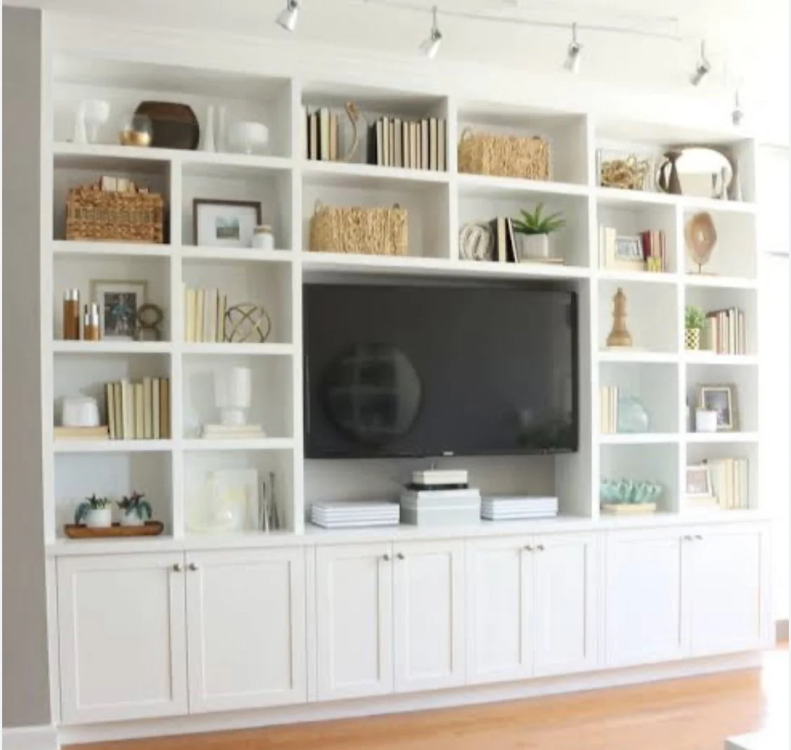
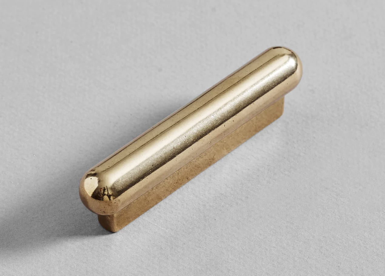
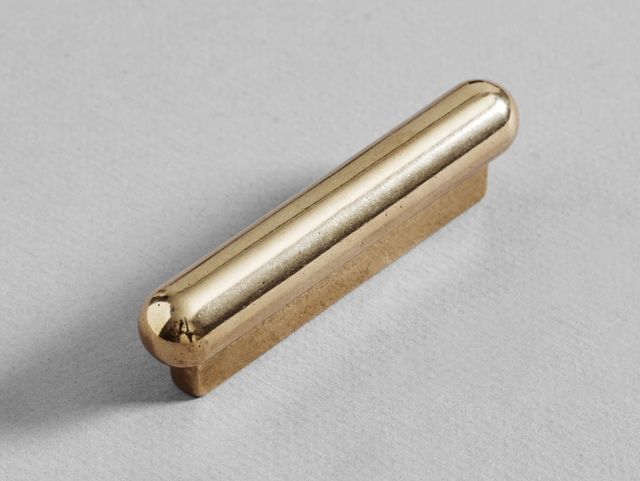
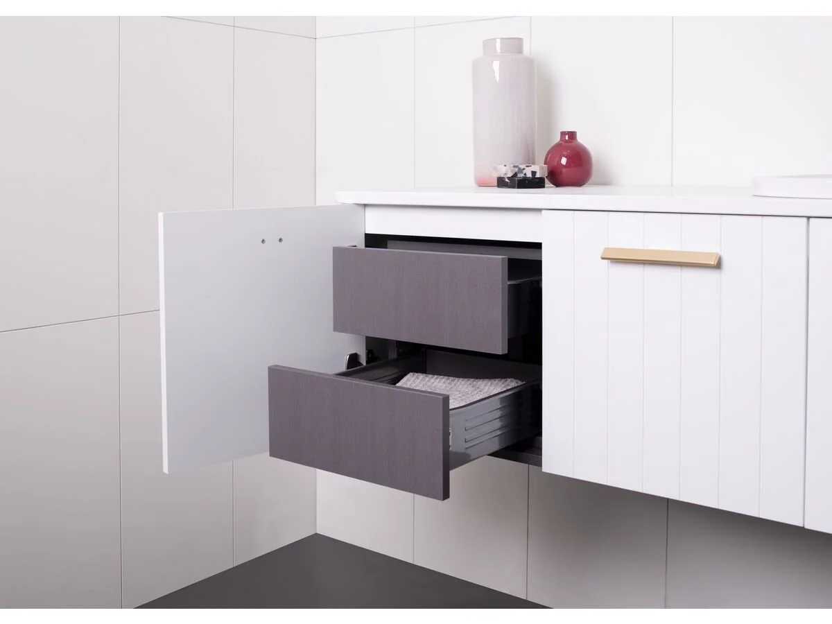
All the joinery would comprise cabinets beneath bench height, and open shelving above, as per the images above here. These beautifully handcrafted handles, or pulls, by Studio Henry Wilson would lend such a depth to the design of the joinery and carry through the brass motif from the hallway. They have that lovely organic look and feel - they’re simple but they add so much.


Custom joinery is easily undervalued as a concept, largely because of the cost to install it can seem high. But the impact of a room with designed and crafted shelving cannot be underestimated when you consider the amenity it affords and the structure it formalises. Stand-alone shelving units never look as good and more often than not, do not satisfy the fundamental requirements: to display enough, to hide enough, and to look fabulous enough! And besides, by the time you buy equal shelving meterage in the form of stand alone units, you can find the cost of that gets close to custom, but without the finesse.
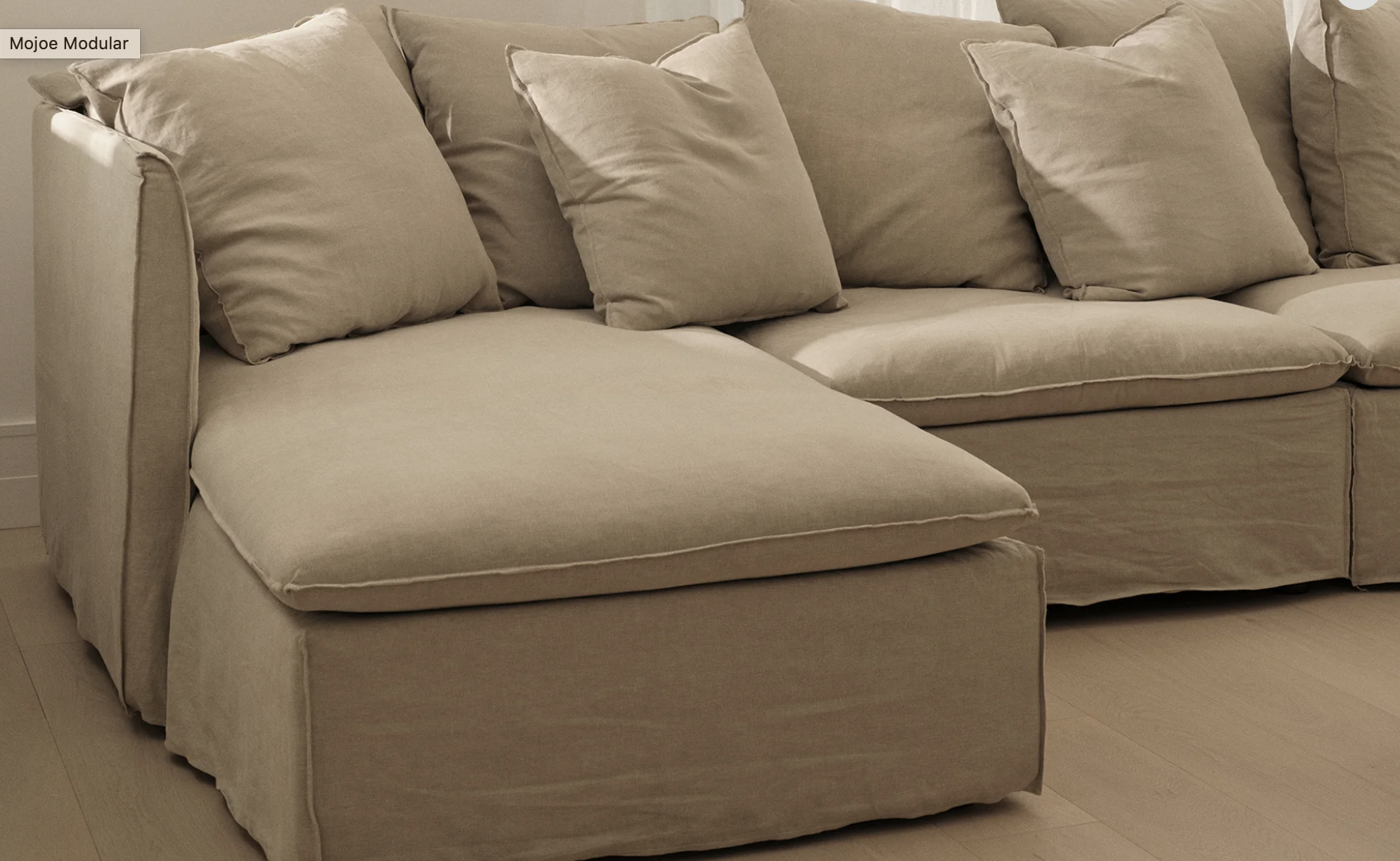
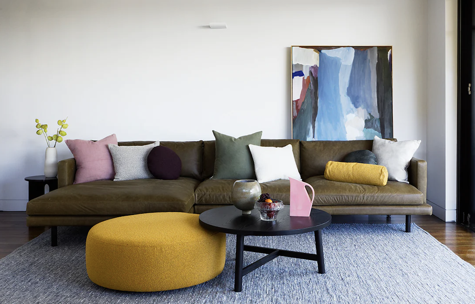
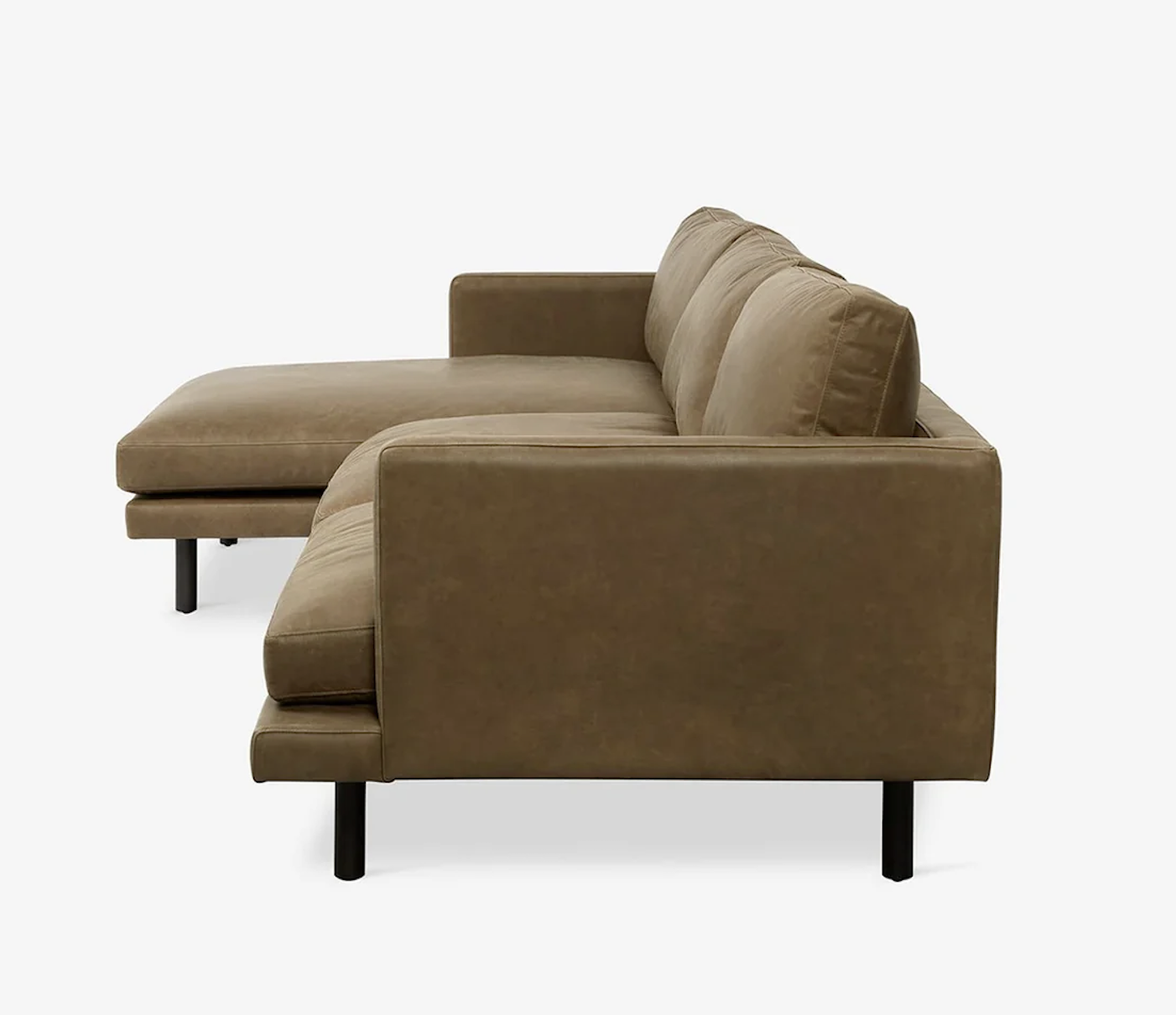
To furnish, I would suggest a modular lounge and MCM House have some great options that are well priced and practical. The covers on the Mojoe are made from Belgian linen and are removable for cleaning, and I recommend buying a second set of covers to allow you to swap for a lighter or darker alternative, depending on the season, etc.
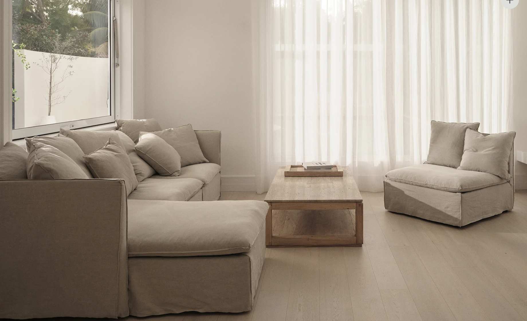
A chaise is available, as pictured above, or you can opt for the square ottoman which allows flexibility un the arrangement, allowing you to to use it to form a chaise, or to separate it and use as an ottoman/footstool. There are component parts that you can choose, depending on preference but with all of them, the look is stylish, relaxed and comfortable. I look forward to us going to the store to see it.
I would recommend you buy the second set of covers at the same time as they offer 20% discount on the second set but only if ordered at the time of purchasing the modular.
I would suggest Buck (above) and Khaki (right).
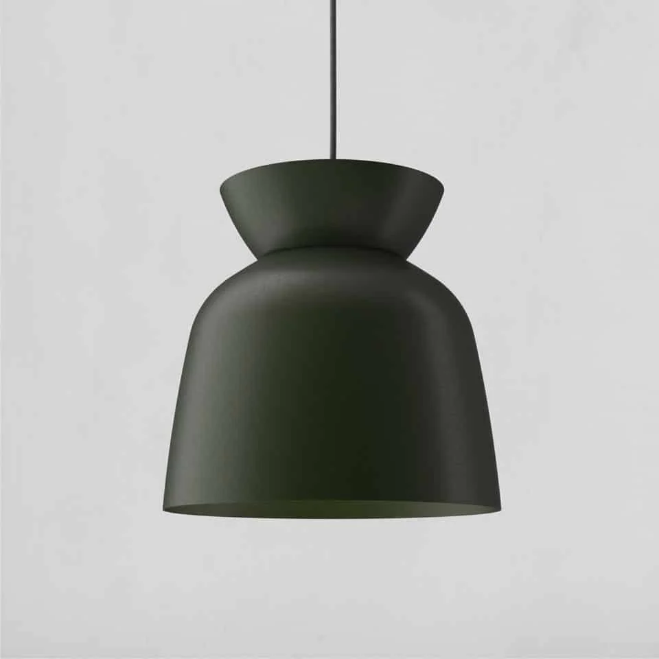
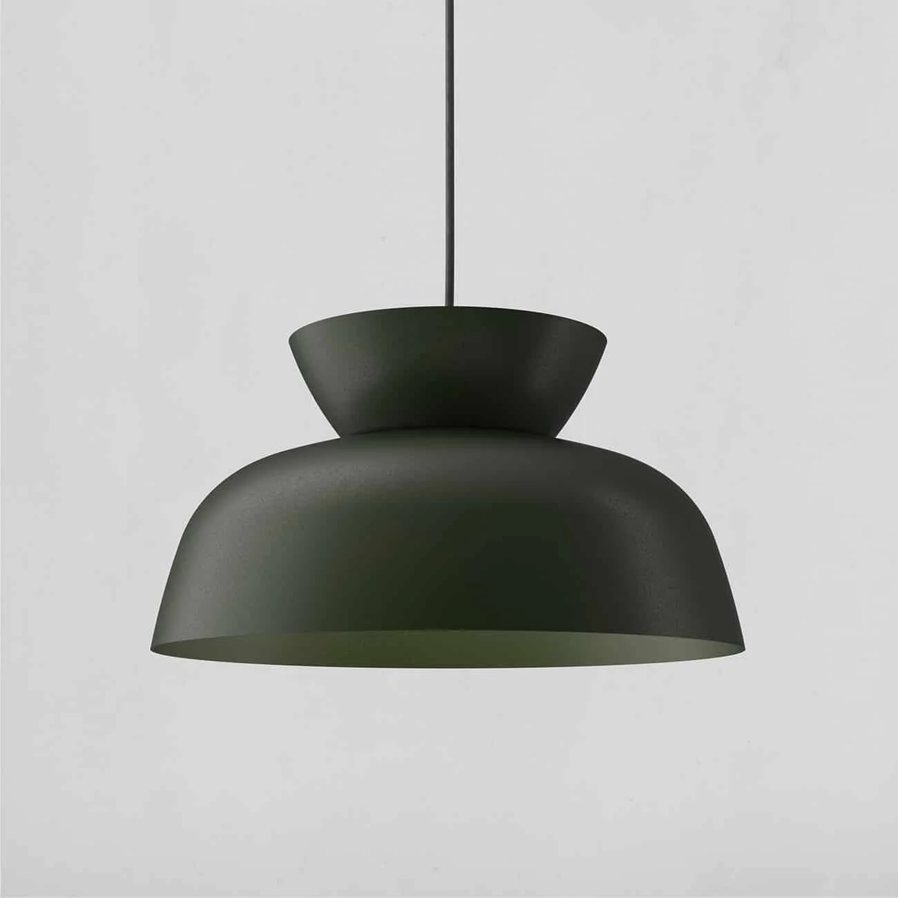
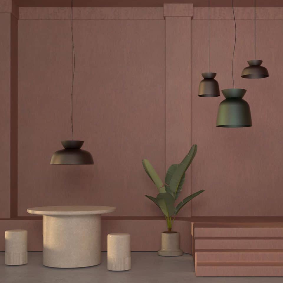
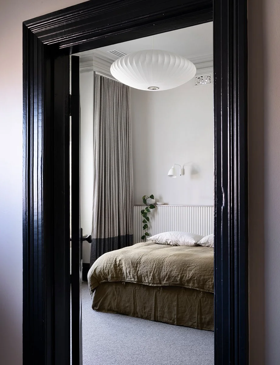
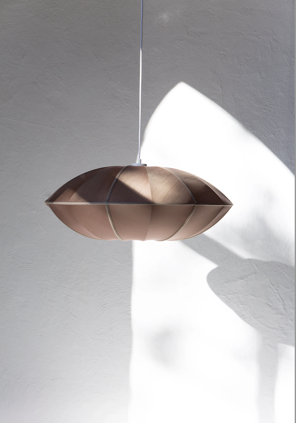
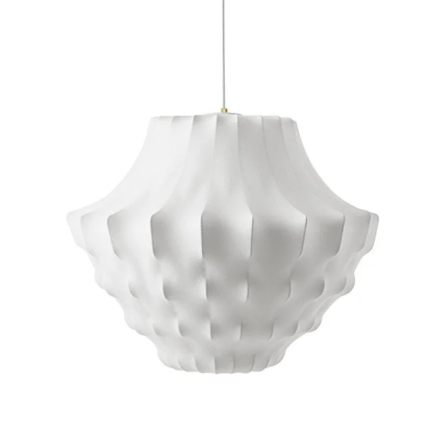
Lighting in this room is so important because - well because lighting is ALWAYS the most important element in any room! I’d like to know more about the pendant light that hangs in here - whether it is original to the house or if it is more recent. If it needs to be replaced, I’d like to use a Scandinavian design, the Nelson saucer. At just under 90cm wide, it makes a statement but it’s depth of 35cm modifies the profile.
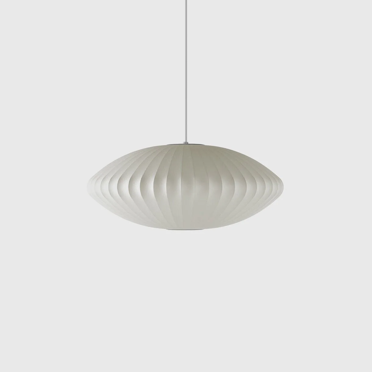
It’s a gracious fitting that bridges the gap between the age of the house and a more contemporary style. Funnily enough, George Nelson designed it 1952 - so it sort of sits smack bang in the middle!
I would suggest using a variation of this light in the hall outside the library and over the staircase, if we can.
At 80cm wide and 44cm deep, it is a rather spectacular fitting that would be fabulous in this room.
Lastly, lamps. Lamp light has a very different feel to overhead light - they’re both essential of course, but for mood setting, you can’t beat lamps.
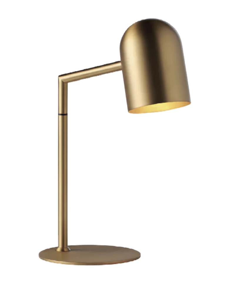
As already mentioned, brass is a wonderful addition to our palette because it brings that organic pop of colour and all the warmth.
These lamps are very well priced - I found them in Manyara Home in Mosman and I love that they come in both a floor and a desk lamp size.
One of each would be the recommendation - the floor lamp in the corner behind the couch and the desk lamp - you guessed it, on the desk.
Selecting art from your collection will be fun - if you take my suggestion and let books be the major source of decoration, then we may not have masses of wall space left. But I’m sure we can find the perfect pieces to hang in here, to complete the look.
The Master Suite:
As I suggested at a site visit, it makes total sense to move your bed into this front room, so the you can have a walk through robe, or dressing room, in the room behind, and ease of access to the ensuite beyond. I think we are all on the same page!
So the first thing to do is to remove the built in wardrobe that is currently there (potentially salvaging the doors to re-use in the dressing room), as this is where I would place your bed. It will make the room feel considerably larger and given the cupboard capacity in the dressing room, it becomes surplus to needs.
A bedroom is a place of rest - it needs to be totally serene and feel like a sanctuary. So i’ve gone back for more wallpaper magic. This is the only other room we’d paper and the colour I’d suggest is Maple.
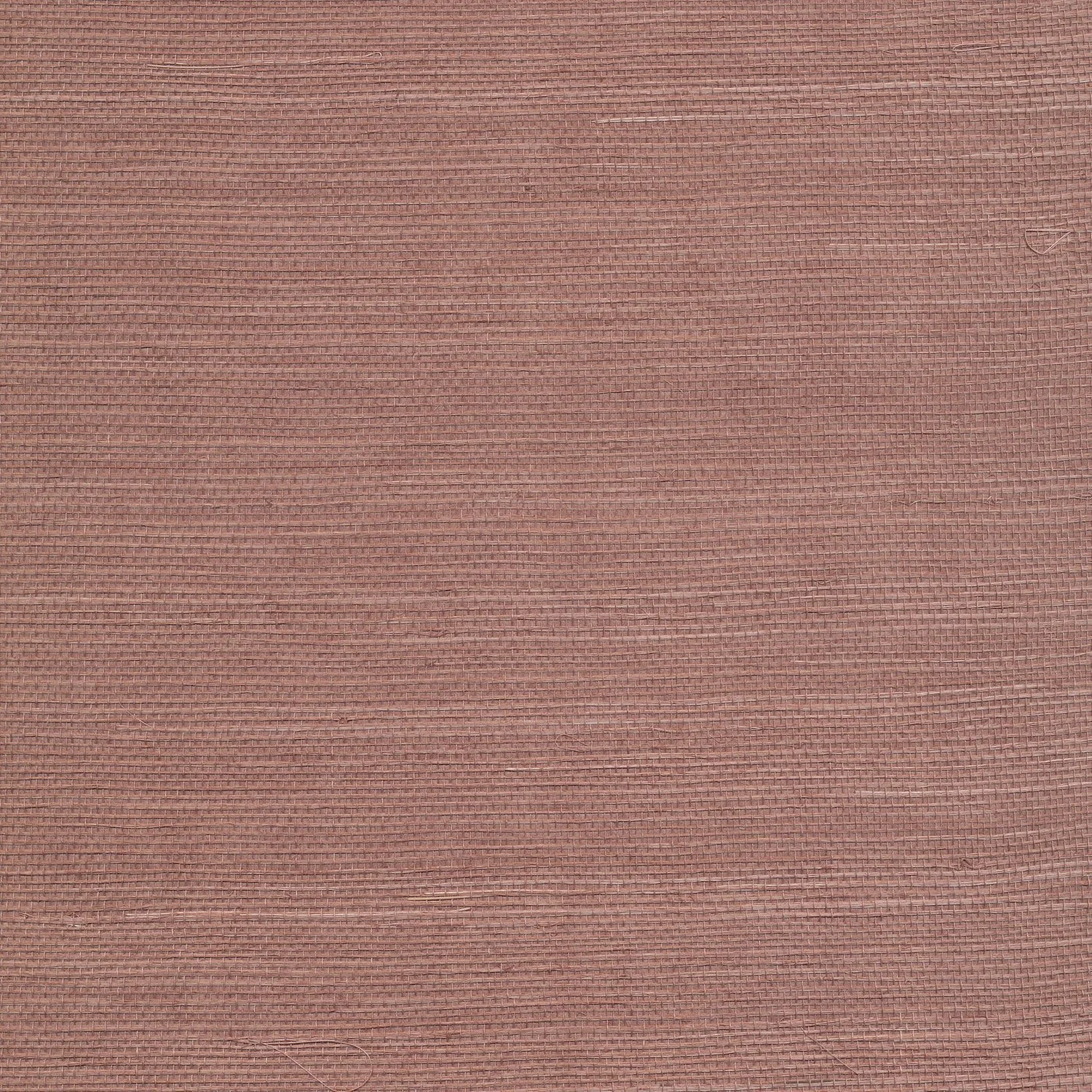
Again, you may feel concerned that this is on the dark side, but you actually get good natural light in this room and the benefit of this beautiful rich colour may not allow surgery to be performed here … but it certainly allows for style and beauty!!!
The wonder of grasscloth wallpaper is not only un the colour and texture, the very nature of it means that each roll leaves it’s track on the wall - there is no neat matching up of a pattern and resultant seamlessness. No - this is way cooler.!
I have used this colour in two other houses in recent time and both clients were completely thrilled with the result. For one it was in a living room, and for the other, a bedroom and they both really look sublime.
You’ll see from the sample in your pack that it is not as dark as it pictures here - there is a certain luminosity to it that brings in the light. This is a modern take on a classic wall treatment that is so much more than paint!
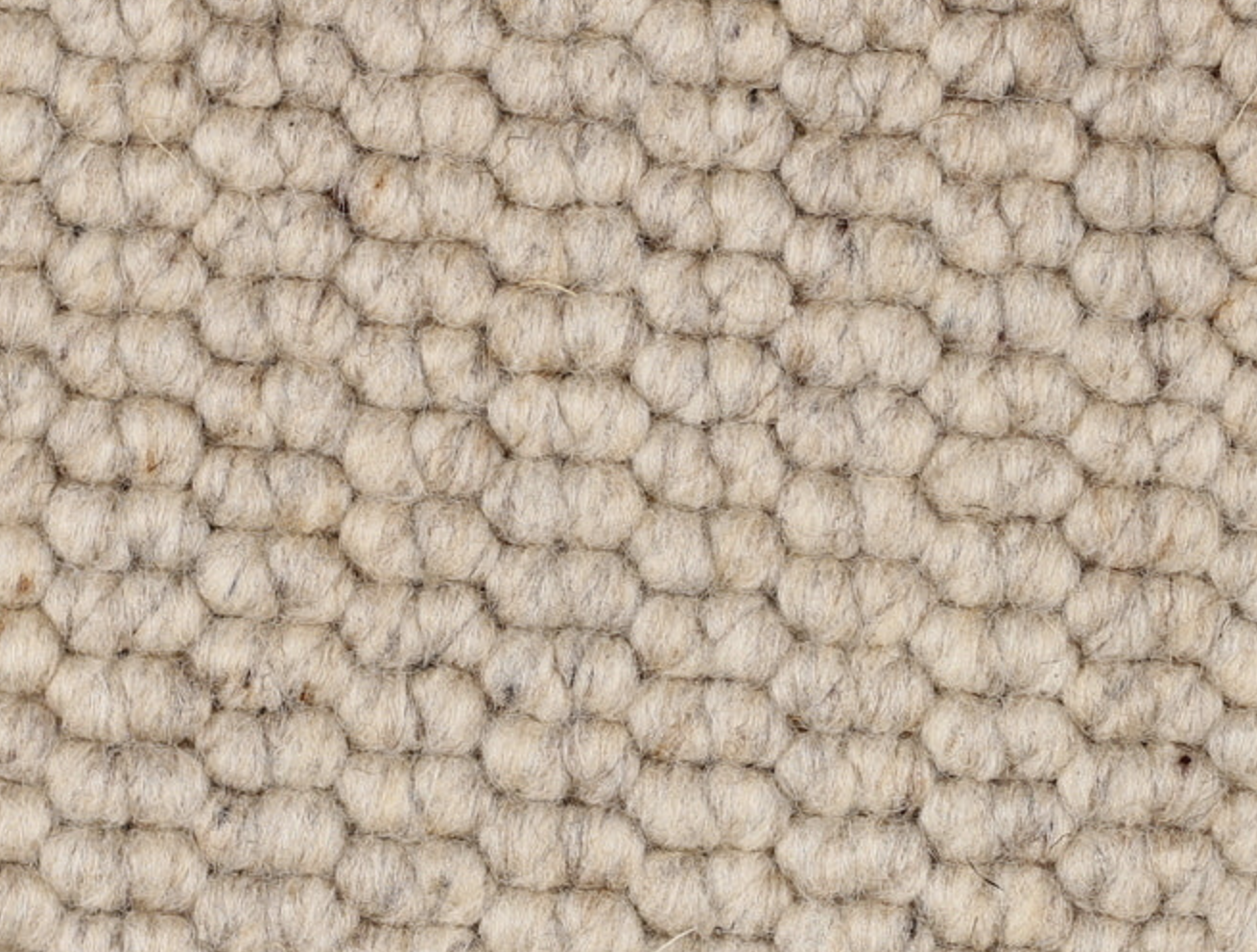
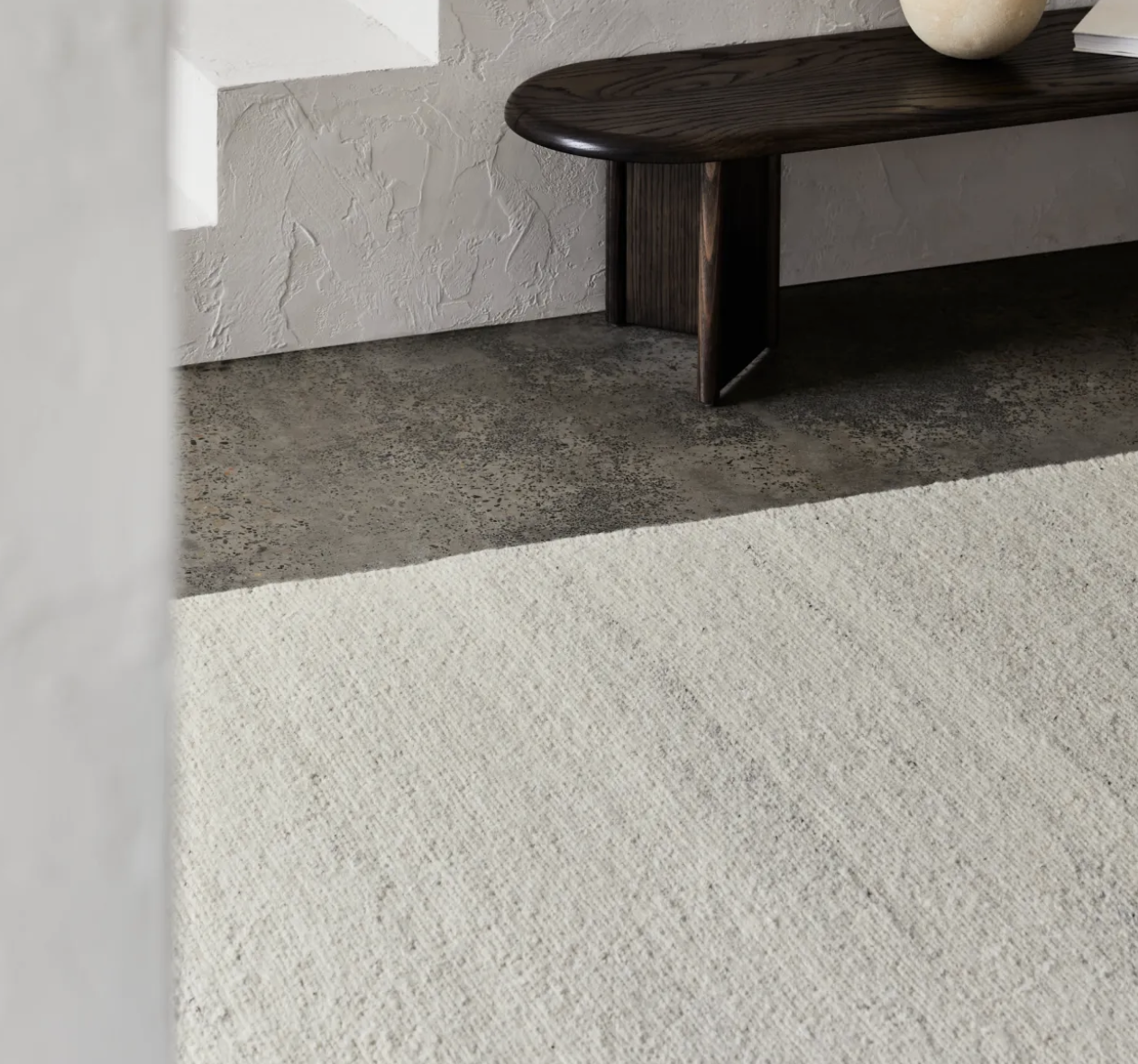
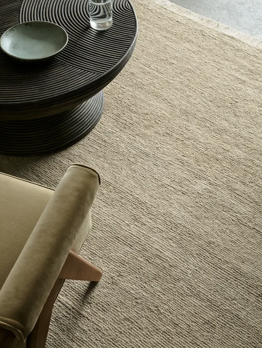
For this room, I would again suggest a pure wool wall-to-wall carpet from The Natural Floorcovering Centre to replace existing if you decide it’s necessary (or just preferable!).
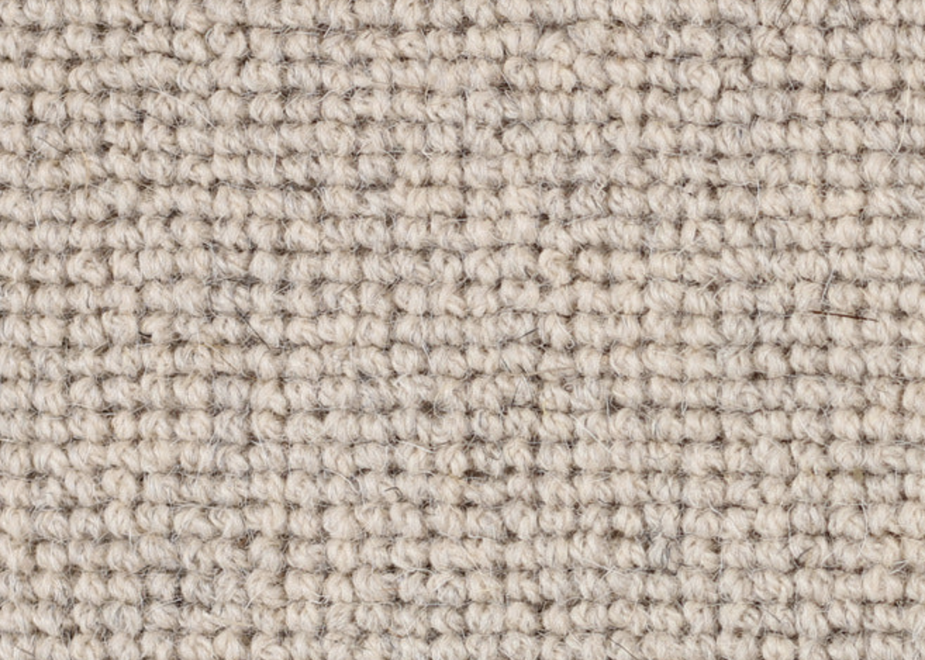
It is a very similar colour, mountain cream wool, to the one in the library and hallway, but a more refined weave that is nicer for the bedroom. As mentioned, it is a pure wool carpet from New Zealand - so it must be good!!!
So we’ve wallpapered and carpeted you - now for furniture. Hold on to your hats….
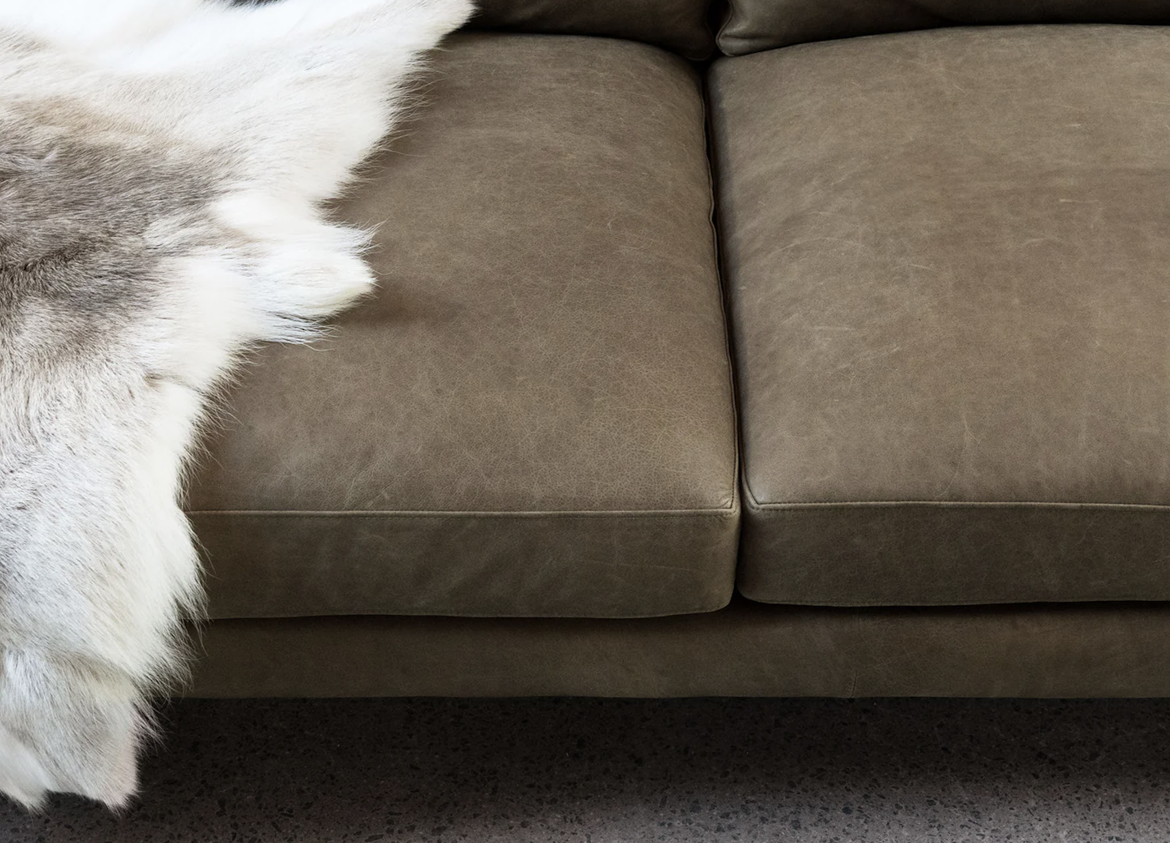
A new bed - I designed the bed to the right here because I could not find it anywhere else except in my own head!! I wanted something that could be attached to a standard queen or king ensemble, that was organic and soft, made of either shearling or hide - and that would knock the socks off any other bed around. Bingo,
Working with a local upholsterer, we devised a bedhead that met with the above mentioned criteria and I have sourced the hide and shearling from a Sydney supplier.
THe lead time os about 4 weeks and the price at this stage, is very reasonable. When they go viral, we’ll hike the price, but in the meantime, we are covering costs.
The upholsterers are ex Parker Furniture and are craftsmen and I’ve been really happy with the quality. I have selected a hide in a champagne colour, should you wish to proceed.
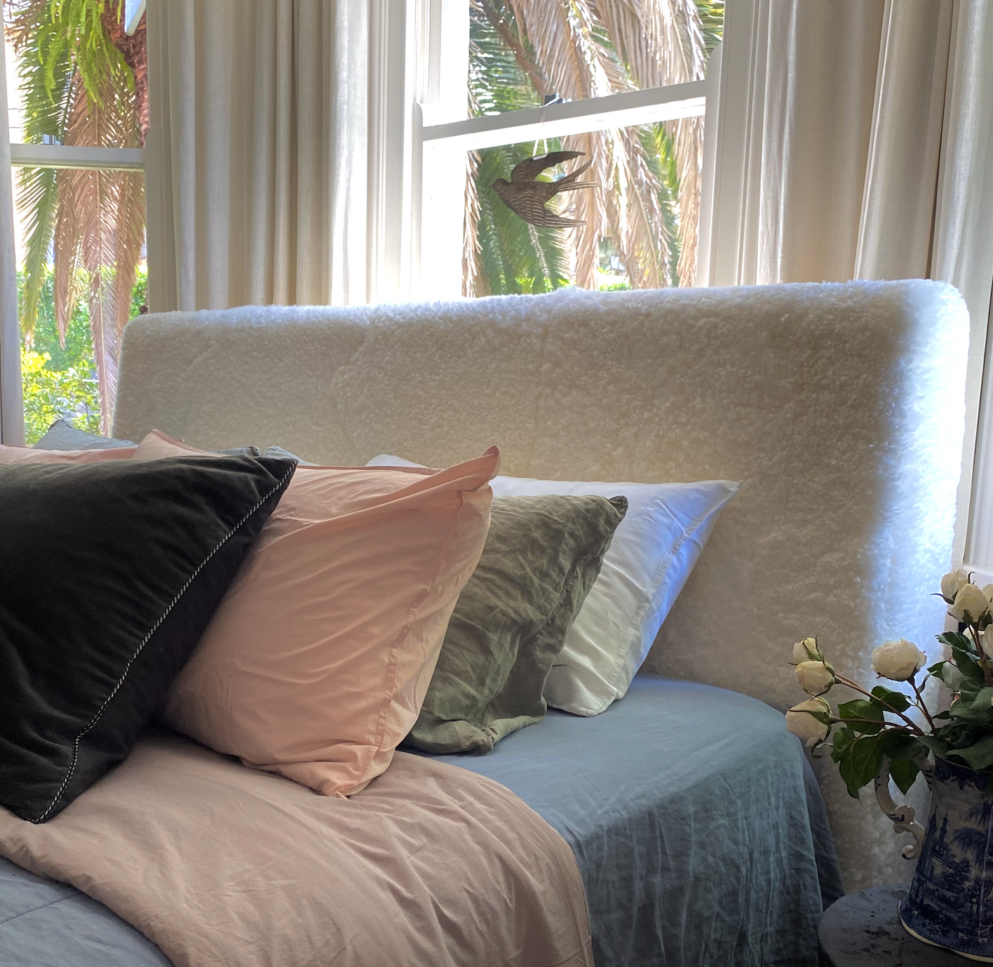
Sheepskin is universally loved material - we lie babies on it, we cover floors with it, we love furniture made from it. It’s super durable and easy to keep clean with a good vacuum. Equally, hide is a lower profile material, but has all of these same qualities and is wonderfully stylish.
I want a beautiful bed, bedsides and lamps because this room is uncluttered - it will have no wardrobe or clothes storage of any kind and so the items in here will have all the attention and they need to look amazing..
It will be serene and beautiful.

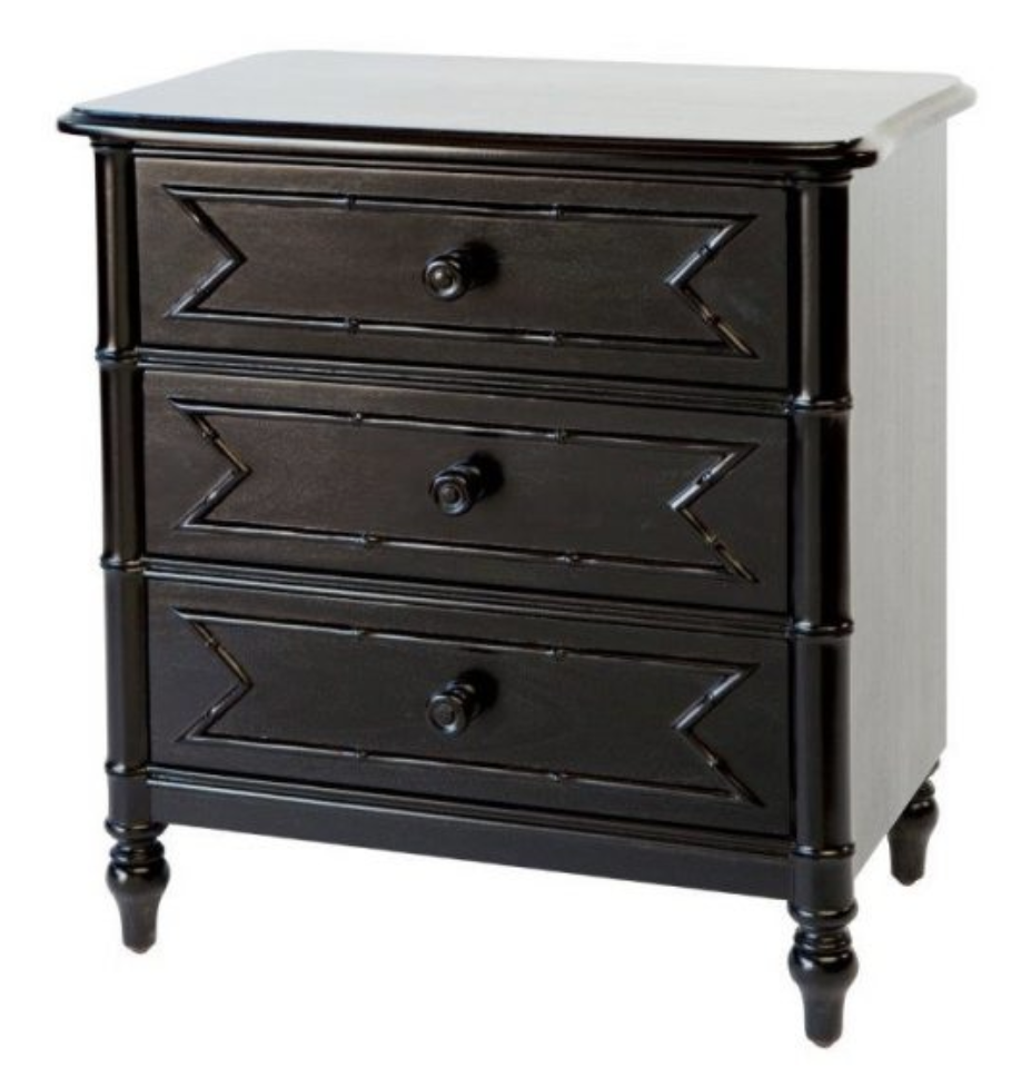
These bedside tables are from the Raffles range, available through the same local supplier as the four poster. I think the dark timber of them would look sensational with the colour scheme and the detail on the fronts will really add to the texture of the room. They’re made to go with the four poster, but would be just as fabulous with the shearling or hide bedhead.
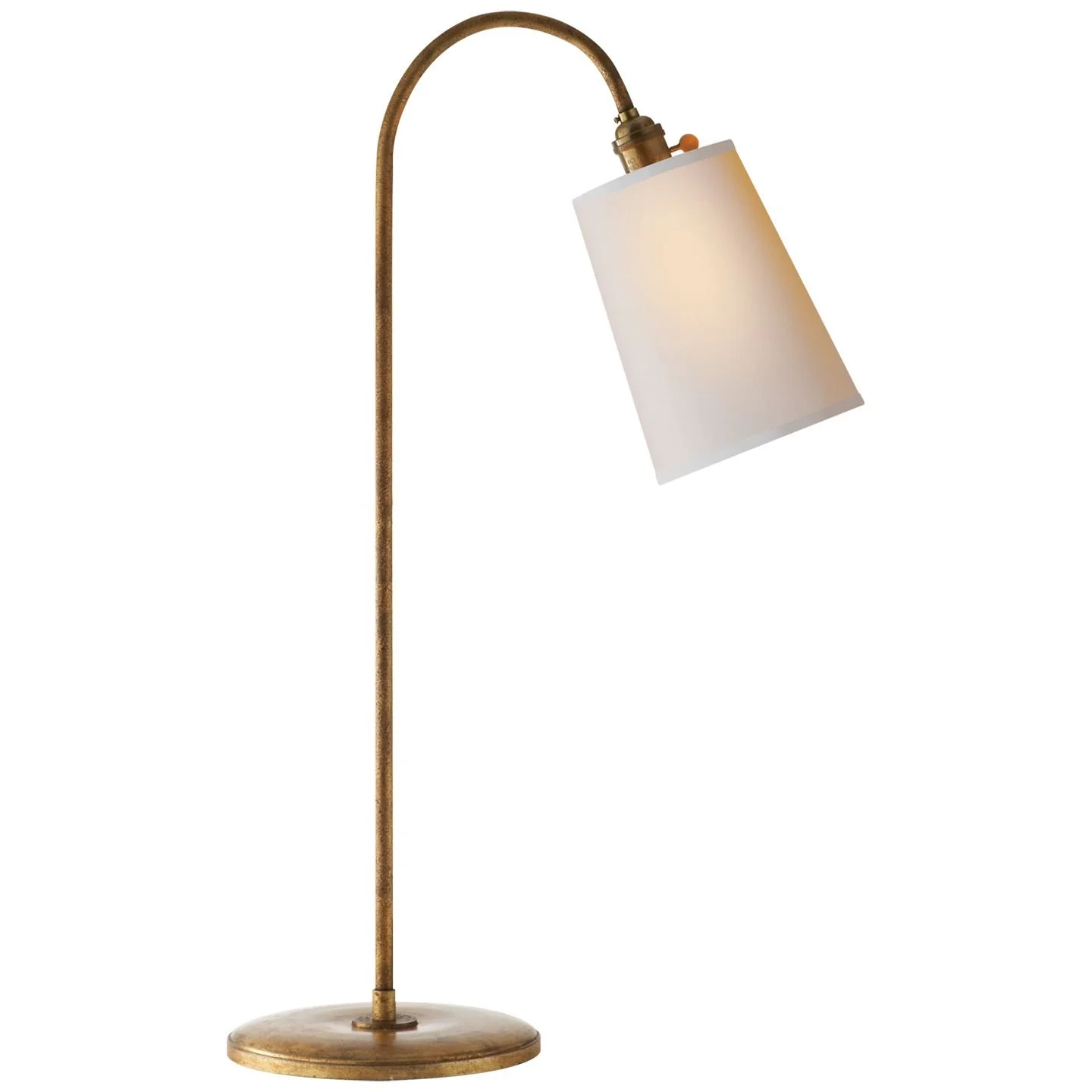
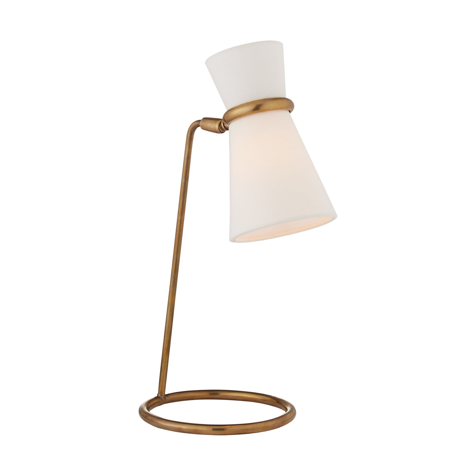
Lamps! These are the ones I would suggest because they’re simple, yet elegant. They’re also a good height at 72cm high, and the base is 21cm wide so won’t take up too much real estate.

A pendant light that fits with the lamps and with the general look and feel of the room - I have selected one from a Byron Bay supplier who sources them from Vietnam. They’re silk and a beautiful tonal match with the wallpaper and curtains. It is critical ALWAYS to have all ceiling lights on dimmers and always with a warm globe.

For consistency, we would hang one of these in the bedroom and another in the dressing room.
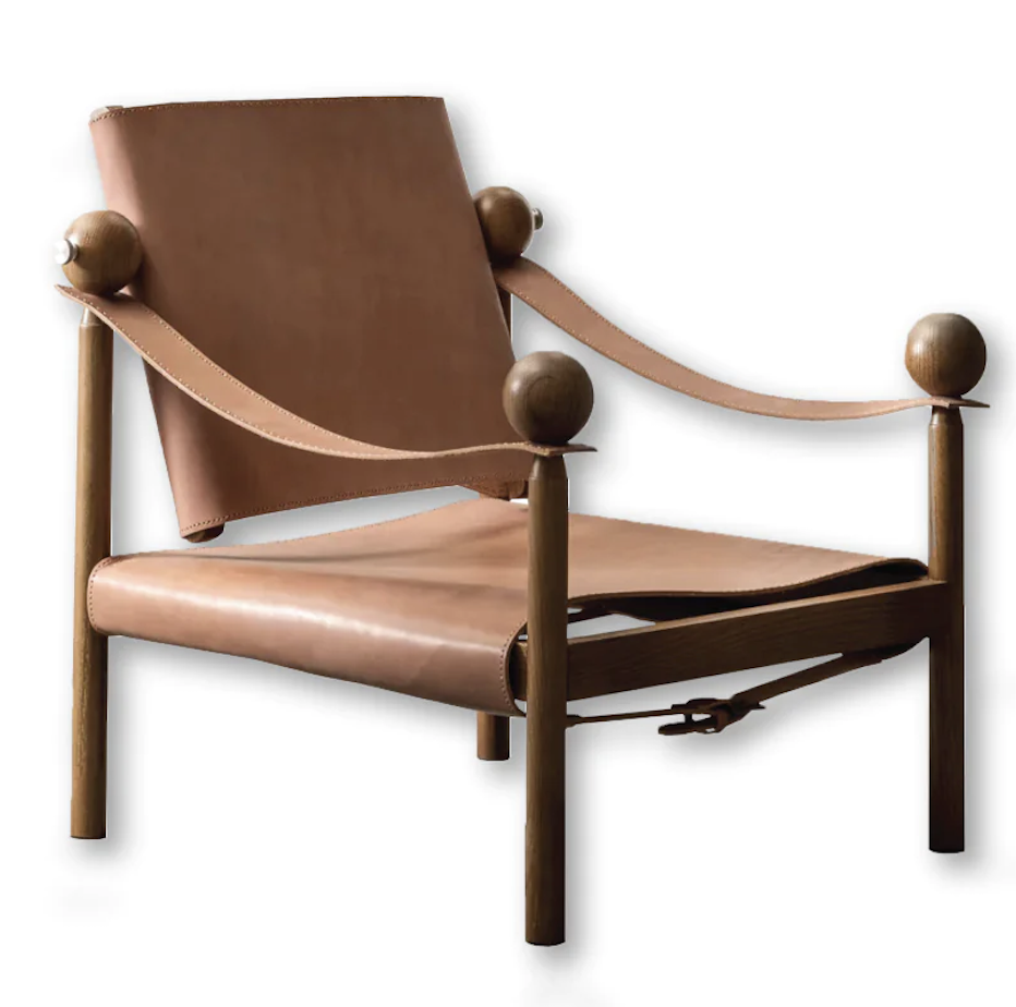
The one last thing for this room, is an armchair. Again, because the room will have only the bed and bedside tables, I think it could take a chair in the corner on the wall to the right as you enter. But rather than buy a new one, I would like to explore the possibility of having the one you currently have in the library, re-upholstered. It’s a nice shape, from memory, and could look really fabulous covered in an alpaca velvet.

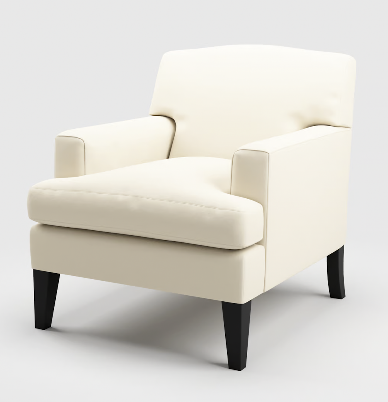
You’ll see from the sample in your box that alpaca velvet is more textural than standard cotton velvets. It’s softer, more lush. The creamy colour, vintage white, will look very lush with the earthy tones of the wallpaper etc.
Finally, bed linen. People often make the mistake of underestimating the importance of the bed covering. It’s actually a large expanse of fabric and so it is important that the colour and texture
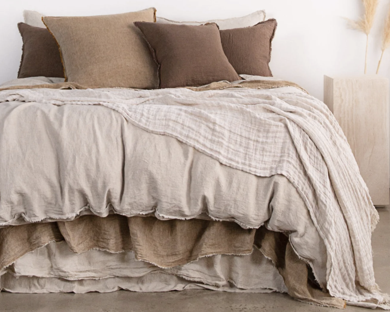
Sheets, pillows, quilts, rugs, throws… The combinations of colour are divine.
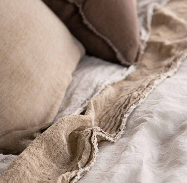
Hale Mercantile are an Australian company specialising in beautiful linen. There are many other companies doing the same thing, but i have found Hale to be a quantum better than all of them for quality of product and service. You don’t have to love the art of the messy bed - that tends to be the rage now for advertising linen!! But you see from these photos, the colours and textures of the sheets and quilts are lovely - a massive leap forward from the standard white sheet days!
Again, the question of art. I think this room needs to be seen finished before we decide what to hang in here, but my inkling is to keep it simple. That way, we let the linen and the wall paper really shine.
I would suggest that the old timber bed you currently have be relocated to the spare room to replace the one in there.
The dressing room:
This room is an extension to your bedroom, and so the treatment is the same - wallpaper, light fitting, carpet, etc.

We want the flow through from the bedroom to be seamless - so any available wall area not covered in wardrobe doors, is wall papered in the same Grasscloth in maple.
The outside door is a bit clunky and maybe we could just remove it? You don’t use it and it’s a security weak point - arguably!! Why don’t we just brick it up???
My advice would be to have the wardrobes planned by the experts, hopefully incorporating the salvaged doors from the room next door, and maximising the space around the perimeter of the room. We repeat the use of these Henry Wilson handles too, for consistency.


One of the first tasks will be to get this quoted by the experts.
A large ottoman in the centre of the room would be a handy and stylish addition to this room, covered in the same alpaca velvet as the chair in your bedroom.
Designed to include storage - or not!
We can have one made to our specifications, but I would suggest it measure about 1600mm x 800mm. It needs to be significant, but not too big so as to get in the way, It’s what yo sit on to put on your shoes, put the clean washing on until it’s put away, or just for sitting on wondering what on earth to wear!
A short term option could be to re locate the ottoman from the living room.
I would suggest mirrors on the inside of the cupboard doors rather than hanging. It looks less noisy!!
The ensuite:
Having consulted with Simon, he assures me that your concern about moving the internal door between the dressing room and the new ensuite is not an issue. So if that is correct, and I have no reason to doubt him, the below is a sketch of the layout of both the new hall cupboard and the ensuite.
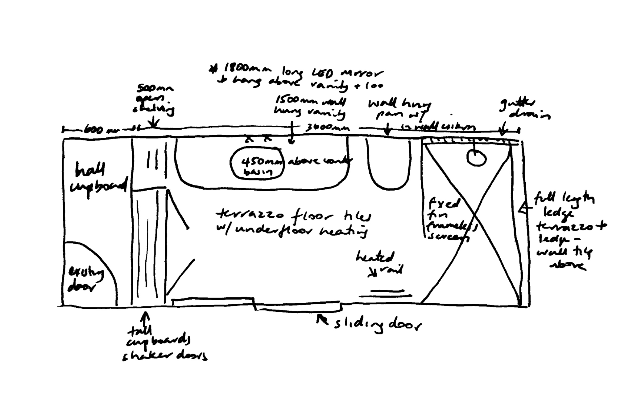
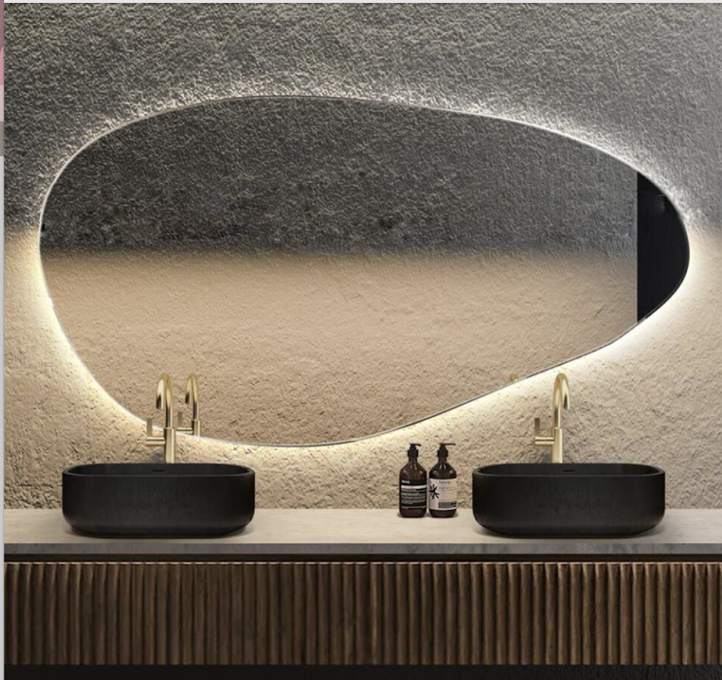
As we won’t need a shaving cabinet, given the ample storage in the tall cupboards and in the vanity, this mirror has been sent from heaven just for us! It has LED lighting behind, as you see in the photo, which means we are getting fabulous mirror AND a feature light all in one. I love the irregular shape - in the same vein as the one in the hall, and it really fits with the theory about bathrooms being organic and intimate - NOT operating theatres!!
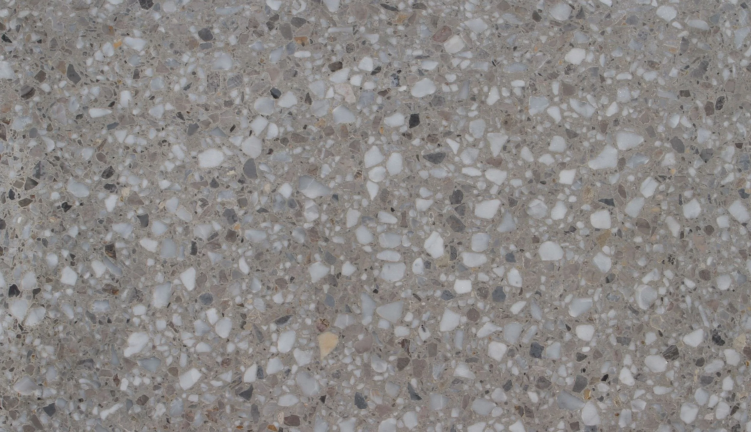
Terrazzo dreams…. this is by far my absolute favourite and it coordinates beautifully with the scheme in the master bedroom and dressing room.
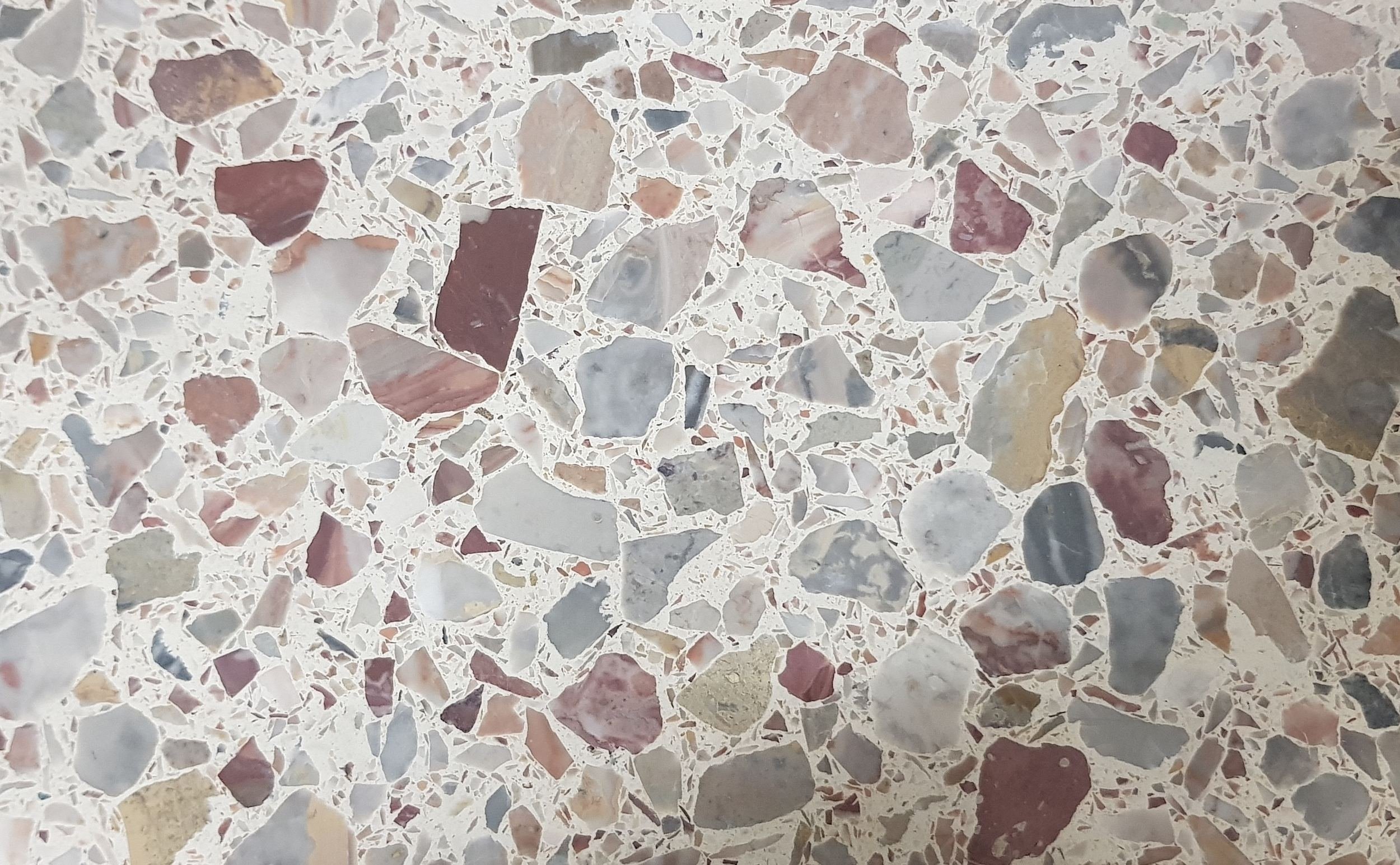
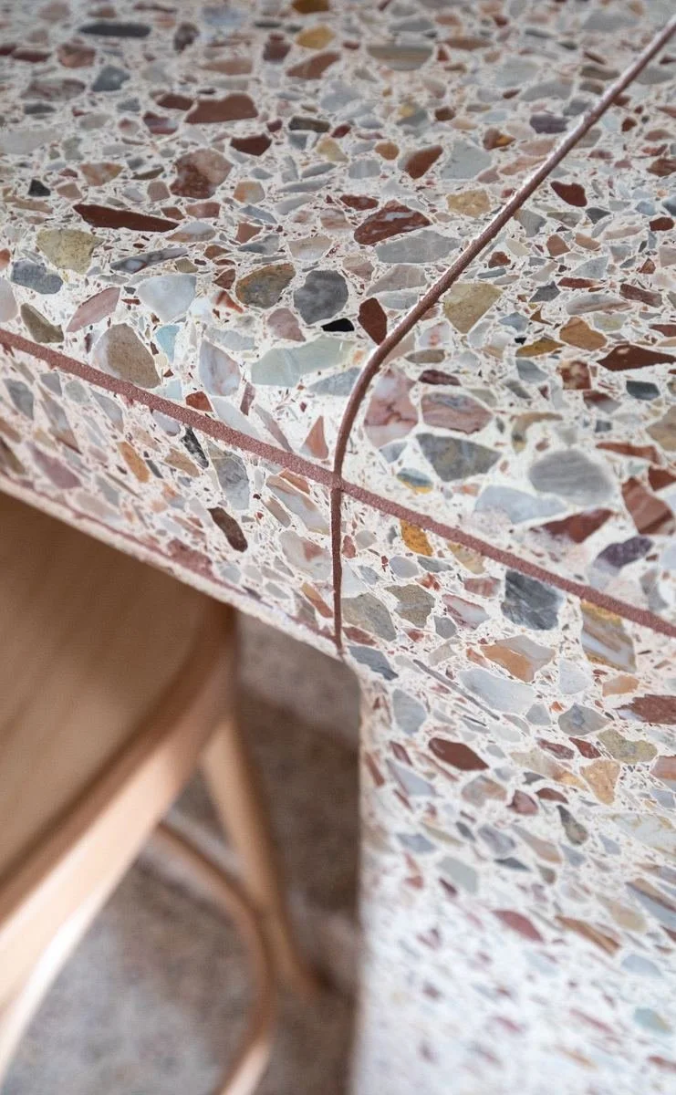
For the floor, Rosaio from Artedomus is the bomb. It has warmth and softness, which works well in the bathroom - that most intimate place where we are at our most vulnerable! I would also suggest running the rosaio up the shower wall behind the on the east side to the top of the ledge at 1200mm (check onsite) and continue the wall tile above. The wall the shower head is on will be the light wall tile.
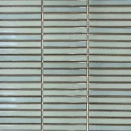
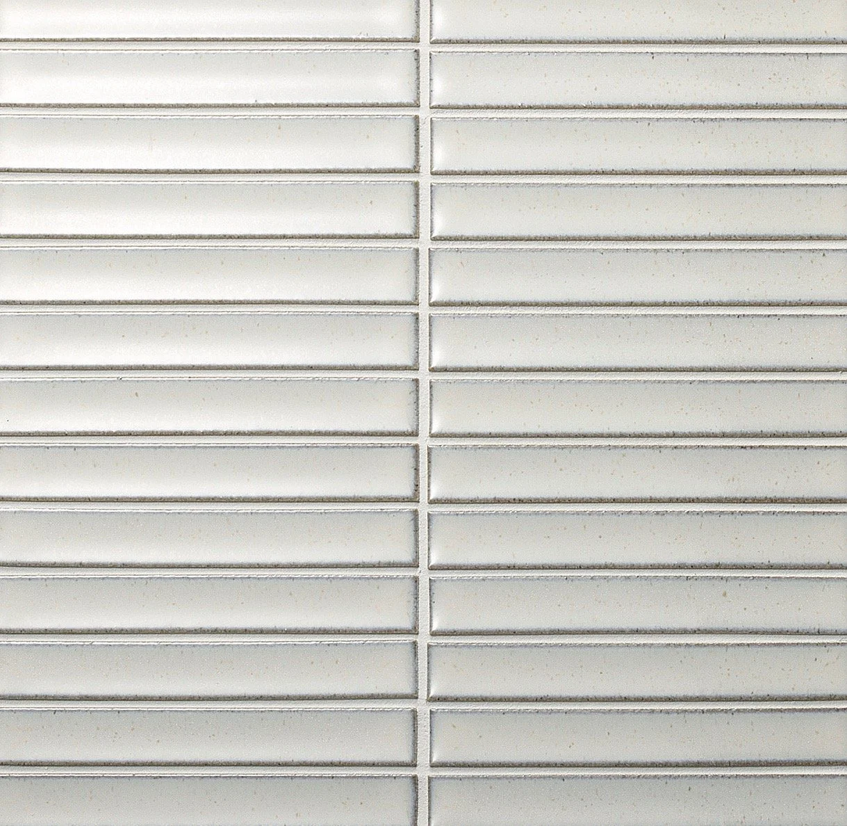
And for the wall tiles, the Yuki Border YKR1 matchstick tiles, laid vertically (not horizontal as in the photo. The combination of these two works to keep the bathroom light, yet soft.
For the areas of wall not covered with tile and for the ceiling, I would suggest Dulux half clay pipe, and for the woodwork, Dulux natural white.
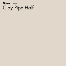
Not really captured in the swatch above is tne earthy pinkish tone of this otherwise neutral colour. The photo on the right does a better job of showing you the hue, but best of all, the sample pot in you box will be your guide.
It’s all about warmth and serenity in here - as it is everywhere!! But the combination of the tile, terrazzo and wall colour really do the heavy lifting here.


For tapware, I love Brodware because it’s high quality and Australian. I also love the finishes they do and have selected brushed nickel for your bathroom. I have an absolute aversion to chrome and shiny white tiles - anything that makes a bathroom look cold and brittle bright like an operating theatre… like I said, this is the room you get naked in - and let’s face it, the better the lighting, the better the view!!
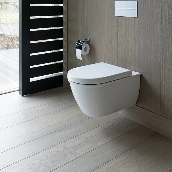
An in-wall cistern is also a must - they’re so much more attractive and contrary to times gone my, they’re easy to service.
A wall hung pan makes for easier cleaning and again, that lower profile for something unbeautiful but necessary - is a win!! The one here is by Duravit, available through Candana Bathrooms.
We’d put the same loo in the powder room, with the same in-wall cistern.
A wall hung vanity is another brilliant invention and this one from Reece can be customised. I would specify a white cabinet with discrete ‘blade’ handles that run along the top of the cupboards. We have the more expensive option to use use the same Rosaio terrazzo on the vanity top, or to have a top direct from the manufacturer - I would suggest the colour raw concrete, a swatch of which you’ll find in your sample box. The reason for this choice is that it is a soft grey, a colour you’ll see in the terrazzo.
As I mentioned earlier, it is sometimes frustrating when a supplier has every combination photographed on their website EXCEPT the combo I want! I will take you to Reece to see this unit before you decide, but having used it before, I rate it. They can do cupboards or drawers, or both as pictured on the right, and they have cleared it for the terrazzo top, which we would get the stone mason to cut and fit, should that be your choice.
Given that the only storage so far is in the vanity, I would suggest a deep shaving cabinet above the vanity and loo as mentioned. That way, you’ll have plenty of space. I have a great guy who makes shaving cabinets to order that do not cost the earth.
The shower screen is a fixed fin, which means that it doesn’t swing out as you have enough room to avoid the hassle of hinges. As I’ve sketched it, the shower is a decent size which always feels quite luxurious. Running the terrazzo up the all inside the shower, on the south wall also adds to the luxe look. We would then use the Yuki Border tiles beneath the arched window, returning onto the north wall inside the shower.
Coat cupboard:
The best possible use for this area is a coat cupboard. Every house should have one! It can be a good enough size and it solves the problem of this doorway, given we have deleted the powder room idea.
Spare Room:
Giving the spare room some love is being thorough! I suggest a paint job, your old timber bed and possibly bedside tables and new lamps. We can add new linen in navys and creams - when you’re ready.
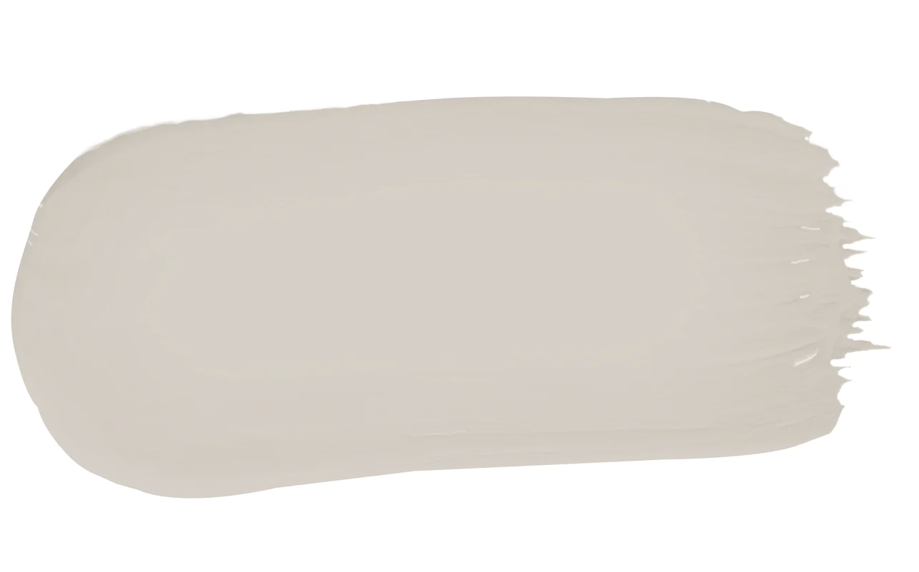
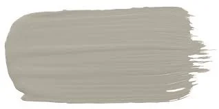
The colour I suggest is Porters, old stone wall another absolute favourite. I’ve used it a bit lately and find I often have to convince clients in to it. BUT! When they see the colour on their wall, they fall in love too.
The lamp to the left here is called the Clarkson and it’s shade balances the brass perfectly. lovely against the wall colour!
Having a lovely guest room is such a good thing - it needs to be as stylish as the rest of the house, even if it is just your kids who occasionally use it!! The door to this room is left open, and so what you can see through the door from the hall is enough to warrant this minimal effort.
We could add linen curtains if you were keen.
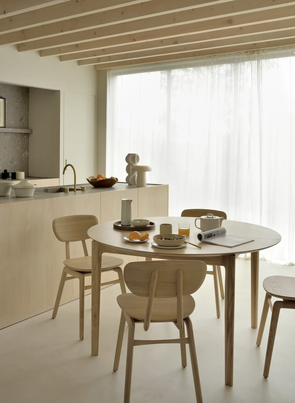
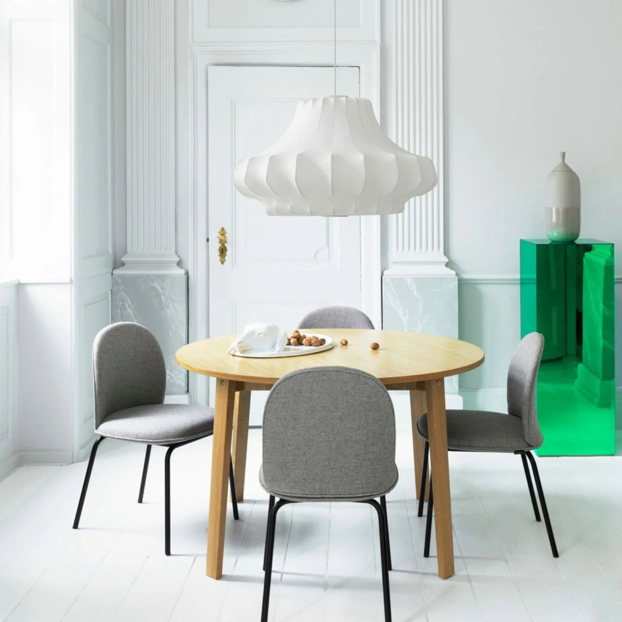
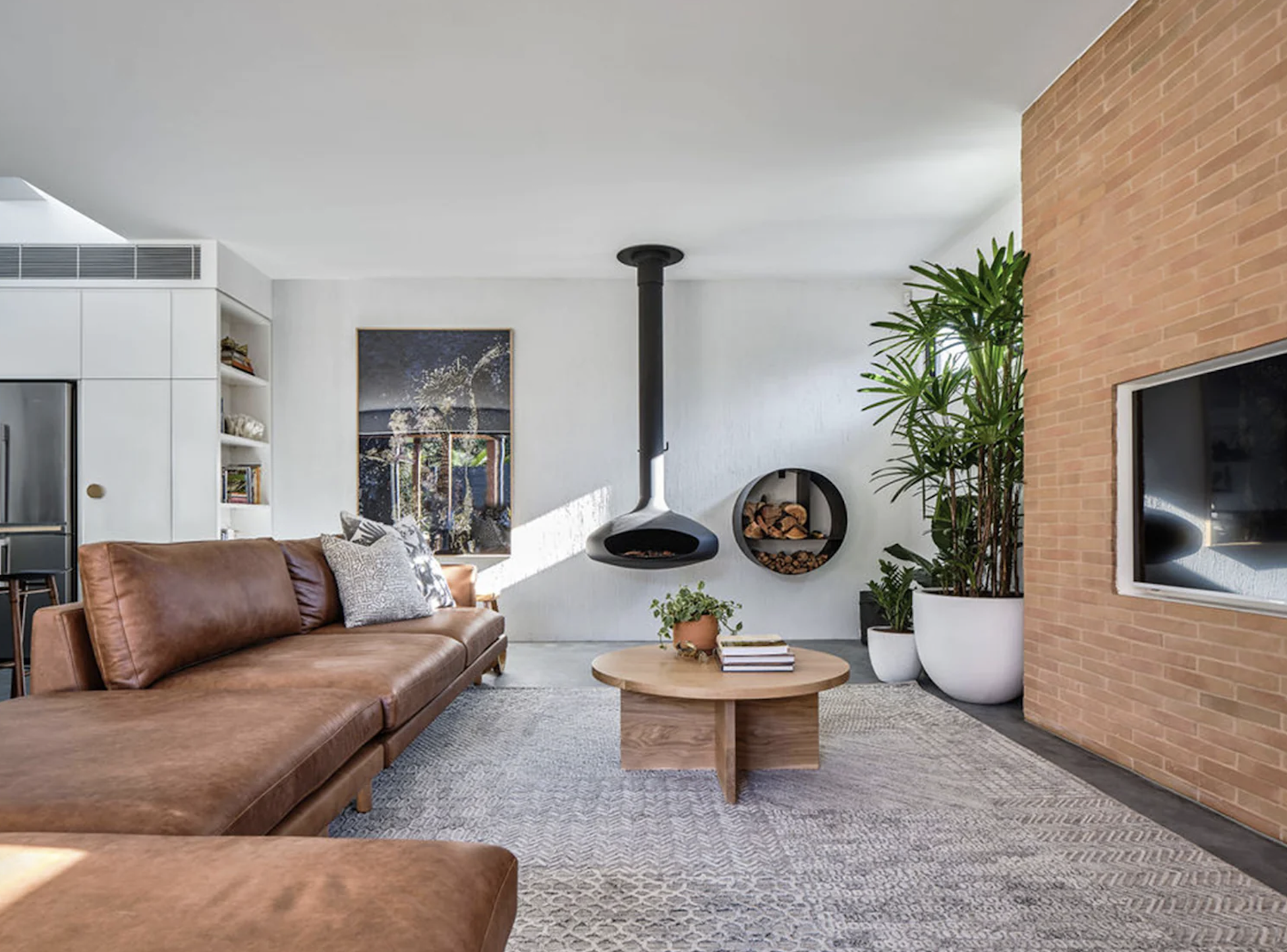
Dining Room/ Living room:
I want to treat these rooms as a single space, because by doing so, we make the area feel more open and connected. Having banished the television, we can select furniture that will help to achieve a better connectedness as we are no longer slaves to the positioning of the seating relative to it.
So, for the wall colour in this entire area of living, dining, and kitchen I would suggest a Dulux colour - spanish olive. Porters are now owned by Dulux so when I was in at Porters, they mixed the sample pot for me that you’ll find in your pack. I love it because it will tie in so well with the existing kitchen tile, which is very much central to our scheme for the entire house. It too, is a neutral, soft colour that will be lovely to live with. As we add layers to the space, this colour will be a characterful backdrop that doesn’t compete, but is at the same time, not a nothing!


The woodwork colour is Dulux natural white, seen here in all its warmth and glory! It’s interesting to get the perspective of how much warmer it is than stark white through the contrast both with the white computer screen, and the spanish olive.
Rugs…. we’ve gone jute. New generation jute is softer underfoot and Armadillo have recently released their new and fabulous Mojave. I have chosen cashew for this room as I think it is full of light and warmth and like the rest of the scheme, has a neutral, earthy feel.
You’ll see from the sample in the box how gorgeous this rug is - and I love that it is so durable. It comes in 4 different sizes and I suggest purchasing two - one for the living area and one for the dining.
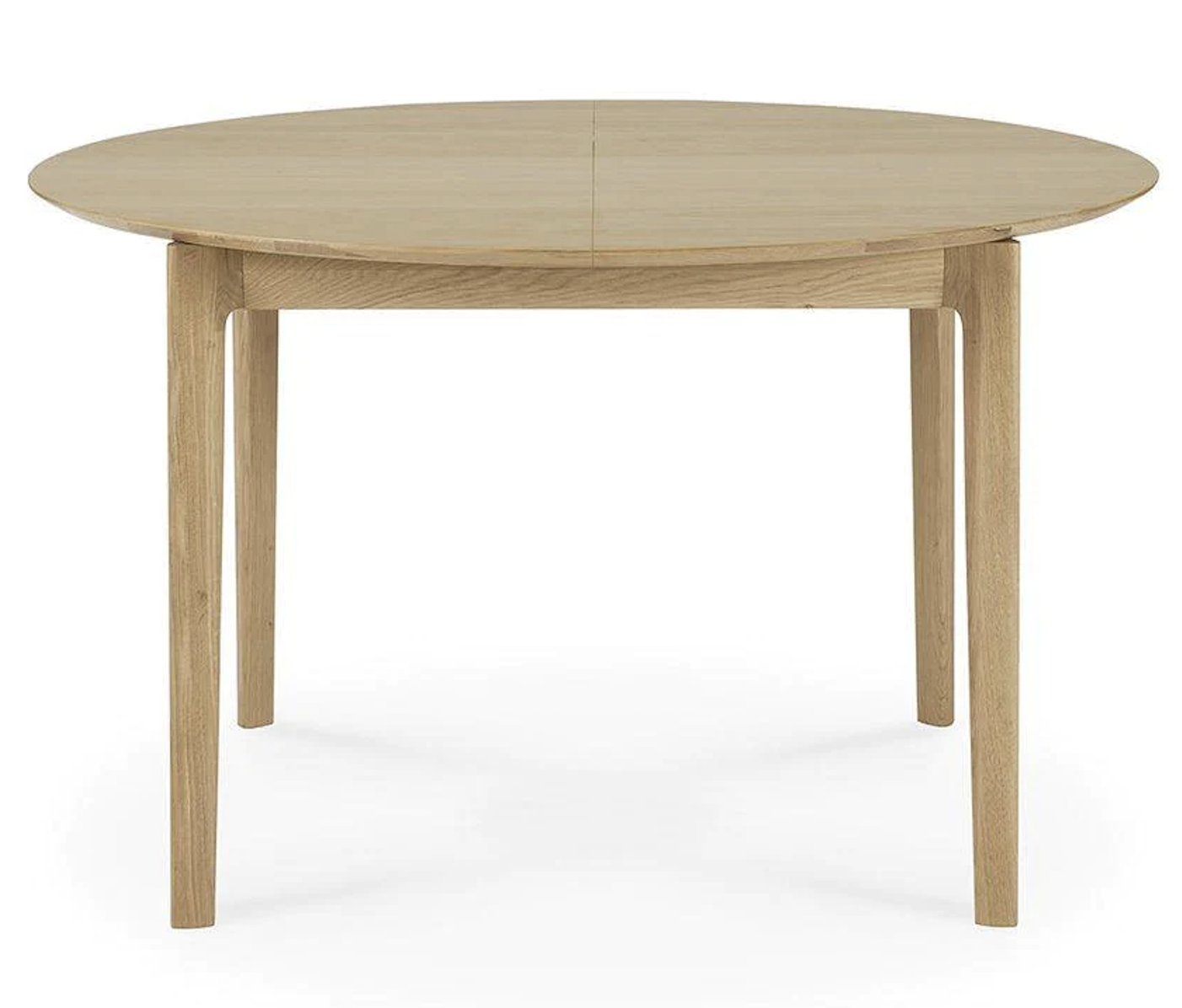
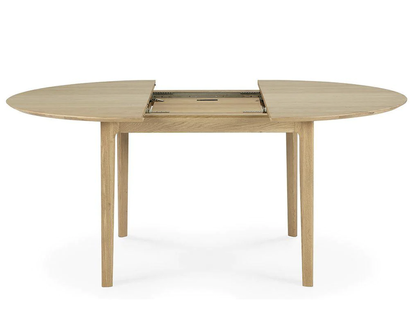
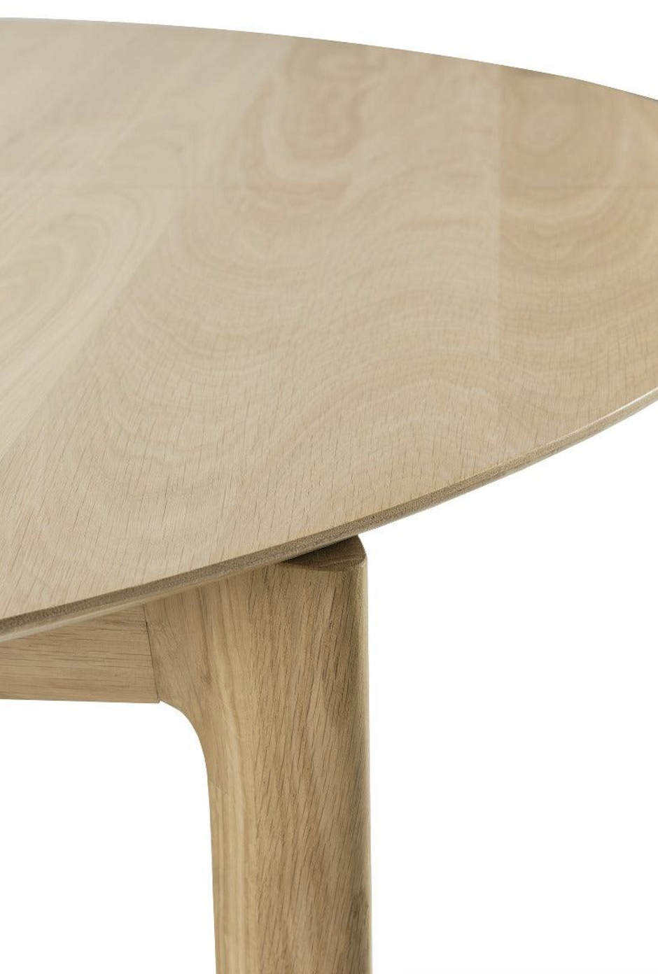
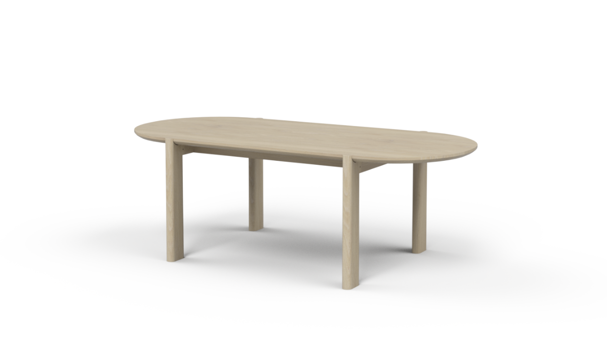
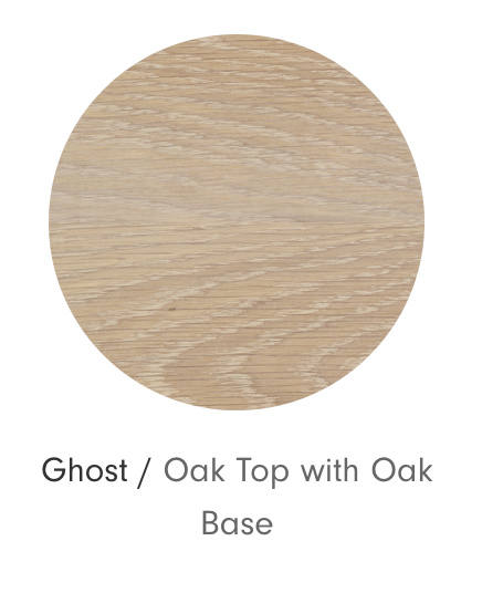
The dining table is next. I have looked at a few different options and have landed on one from Jardan. It is called the Otis and the colour I’d suggest is Oak -
Jardan furniture is made in Melbourne and they’ve been around for I think around 30 years. They’re products are highly reviewed for their craftsmanship and design and I often specify them because of this - and the fact that they’re fabulous.
They have a beautiful showroom in Paddington, (as well as in other capital cities) and I will look forward to going there with you to explore the range.
I like the Otis because it is solid, yet still manages to look refined with its curved top and the oak colour is perfect for our scheme.
There are a number of different lengths - you might consider either the 2200mm or the 2400mm. The room can certainly take the bigger size and with your kids and their partners and grandchildren in the future no doubt, the bigger table might be the go.
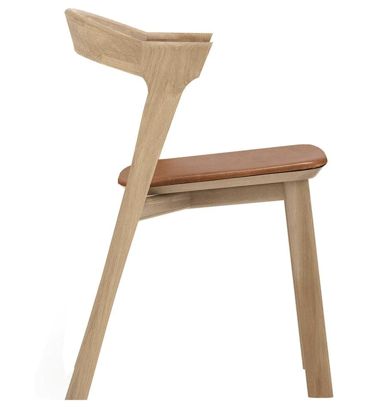
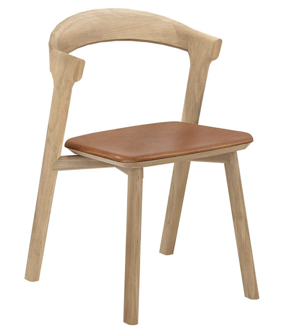
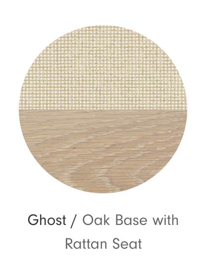
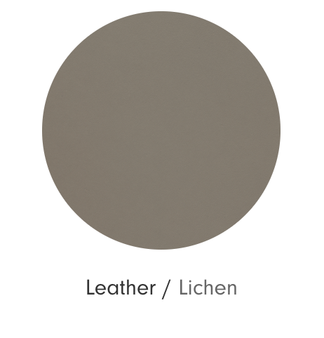
They do a range of different dining chairs too, but the best option has to be the Brooklyn. It has a leather sling back and a rattan seat.
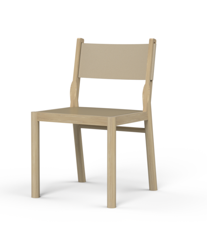
There is a range of leathers you can choose from for the sling, but the one I’d go with is lichen, probably for obvious reasons of it fitting so well with our scheme!
The leather is quite a heavy gauge and therefore quite structural. It gives a contemporary edge to the chair and really lifts the mood of the room.
The timber choice would be the same ghost oak.
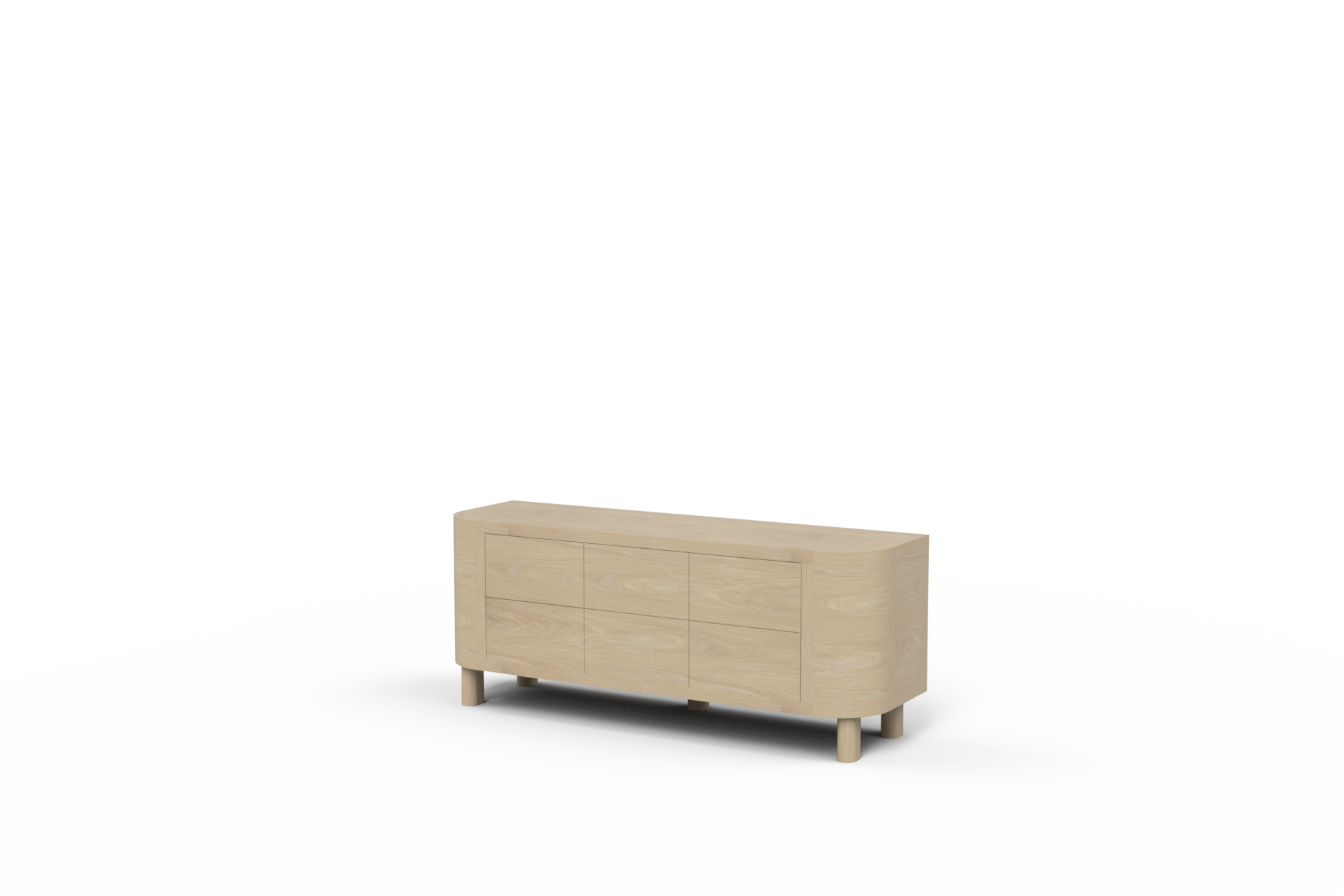
Completing the dining room suite, I think you’ll want a sideboard. Jardan has one that feels like a brother to the Otis - it’s called the Preston and comes either with six drawers, or a slightly cheaper option, three doors. There is no real difference in the look of them, it just depends on what configuration would suit you. It is available in two lengths, the 1850mm would fit where your current sideboard is.
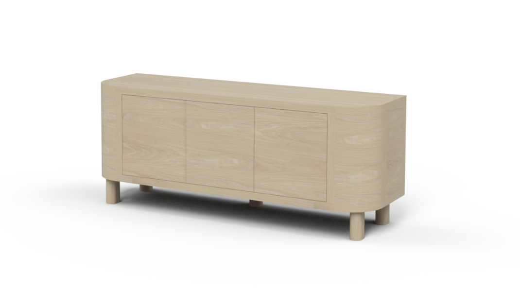
not quite sure why this image is bigger, but you’ll see the 3 doors here and 6 drawer version to the right.
Hanging above the sideboard, a mirror might be an obvious choice, but I actually think we are better placing a large mirror above the fireplace and above the sideboard, we hang the painting from the hallway - the beach scene. The colours of that piece would be lovely in this room with the oak furniture and soft palette.
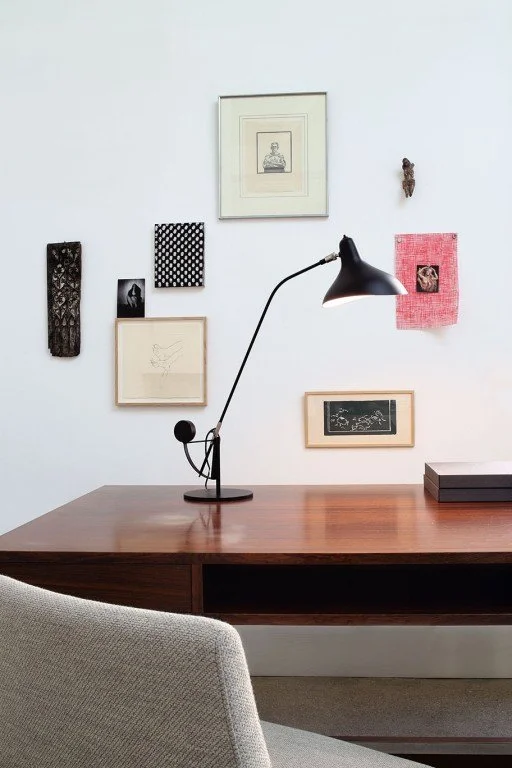
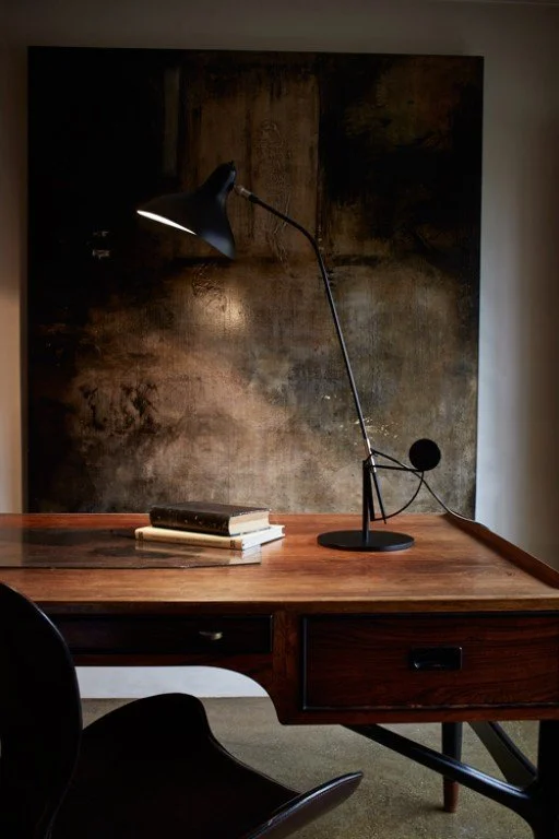
A lamp on the sideboard would be well placed for giving that unique lamplight ambience. The one below is by a french company called DCW Editions and they’v been around for more than a hundred years. This table lamp is the perfect solution for your sideboard because it doesn’t compete with the pendant - but slides seamlessly in with it!
The light fitting above the table needs to be a feature and I’m loving the Norman Copenhagen Phantom. It comes in three sizes but I like the medium for above the dining table, and the large for the living room. Cannot get over how in love with them I am….
The medium is pretty much designed for a dining table, its flatter shape best suited for this position, measuring 80cm across and 44cm deep.
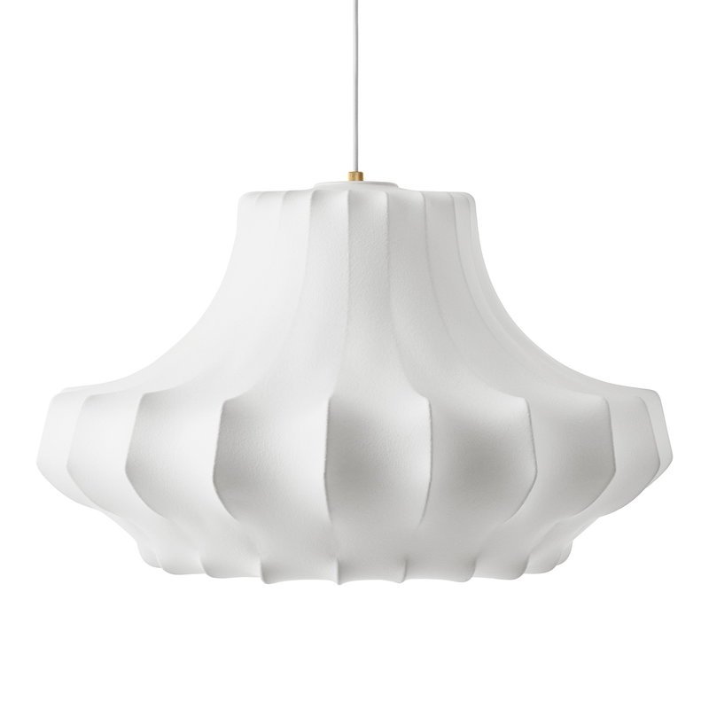
The one below is the large - measuring 81cm wide and 64cm high and made of environmental flame-retardant resin on a steel frame. It’s ideal for the living room.
These lights are dimmable (essential!) and would be fitted with a warm globe for that softer, warmer glow.
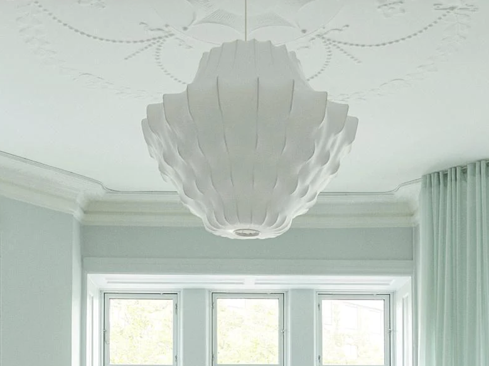
Having the two hung in adjoining spaces makes them even more spectacular and as you see in the image above, the large looks wonderful against an ornate ceiling.
Using the same logic as with the pendants, I suggest a DCW Editions floor lamp for the living room - it’s graceful profile contrasts with the softness of the pendant above and pairs beautifully.
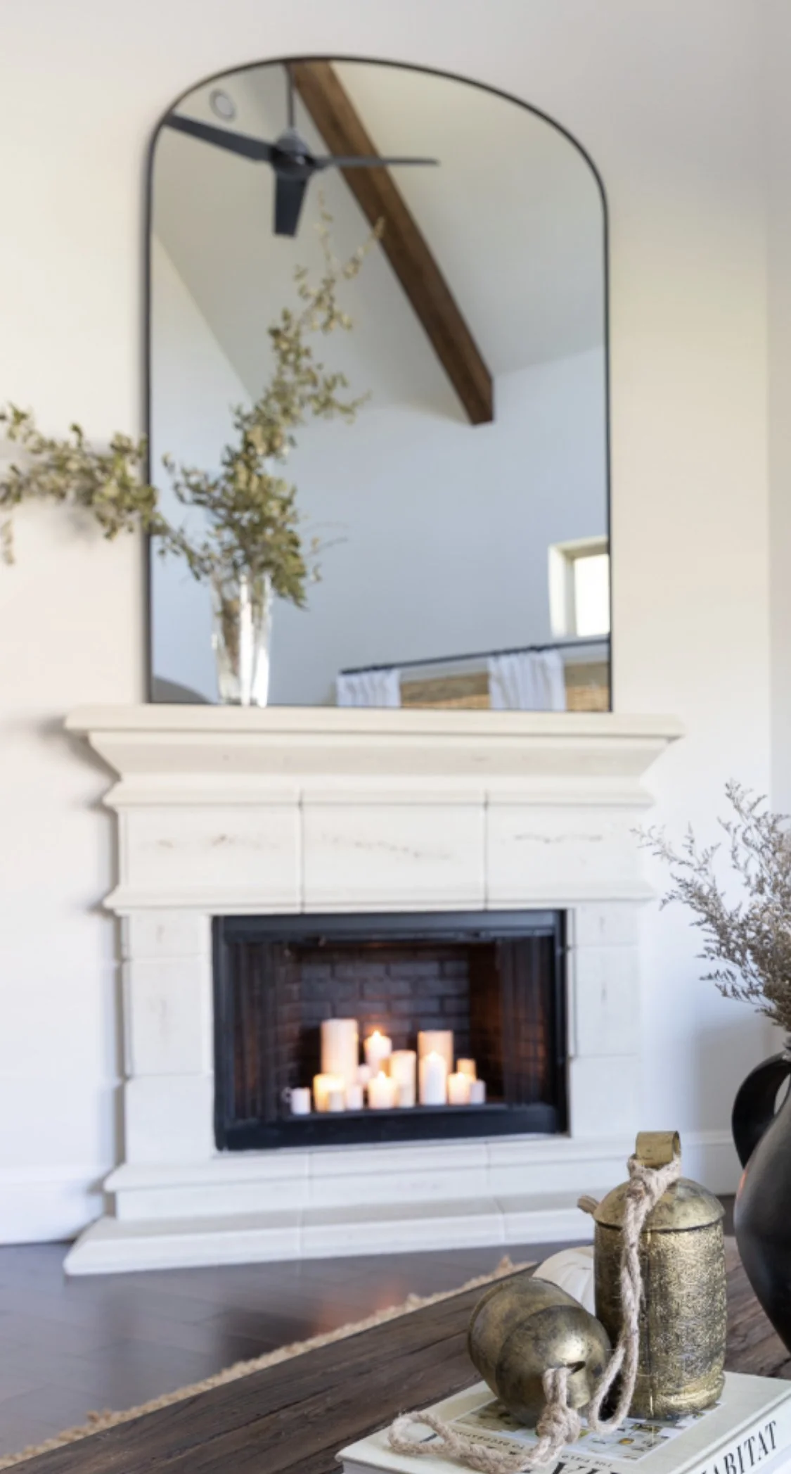
If we were to get Glass and Mirror, my trusted manufacturer, to make a mirror for the powder room, I believe a similar but much larger brass edge arch mirror would be divine above the fireplace. As you know, mirrors are great reflectors of light, but the one you currently have in this spot is not really doing a lot for the room as it is too…something!!
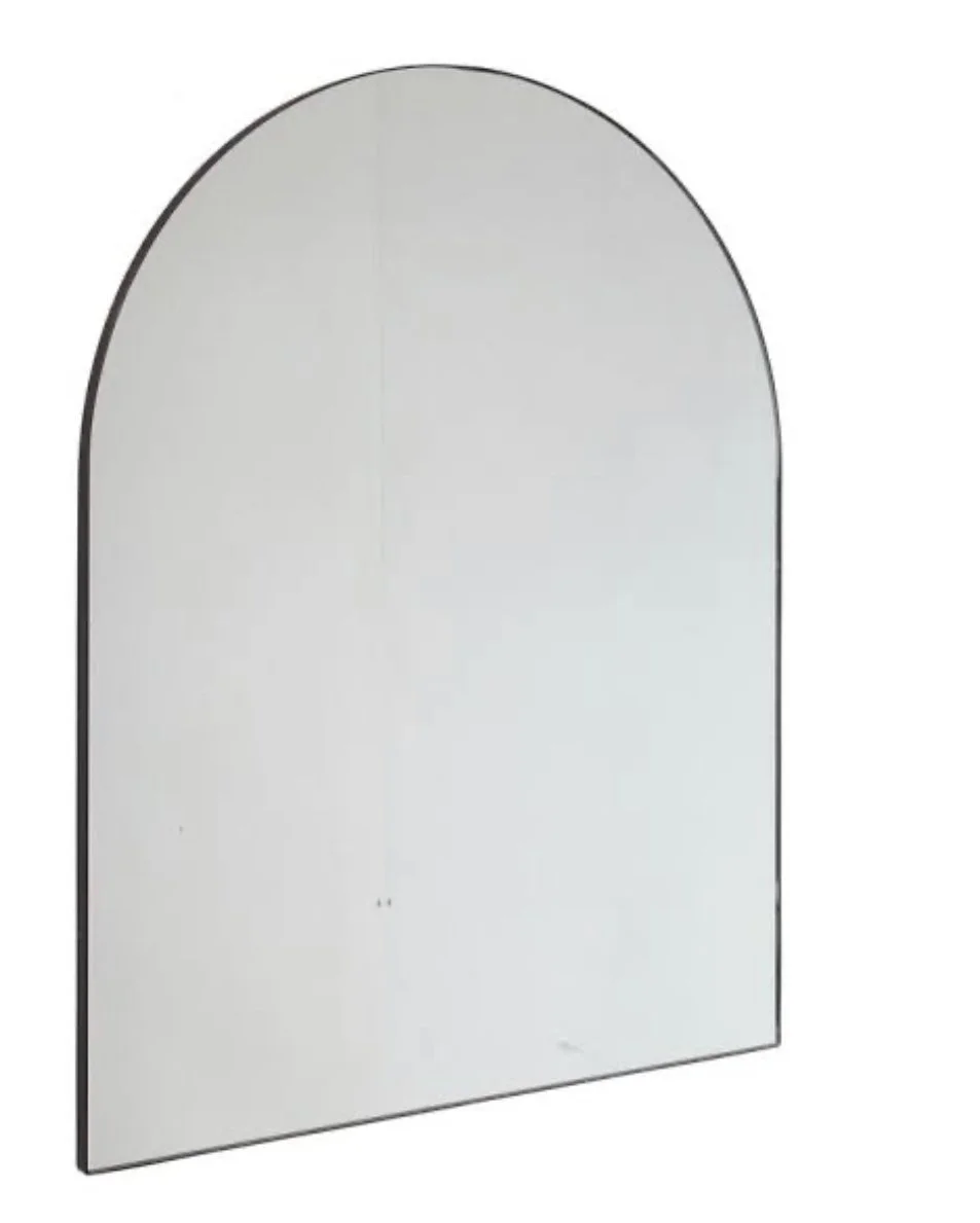
The edging on the mirror above is perfect - the brass adding a contemporary note to the classic mirror shape.
I also love the shape of the mirror on the right, it has more grace than a standard arch and it feels more appropriate for the position it holds as a focal point above the fireplace.
Mirrors are available everywhere you look, and at any pricepoint. My argument for having them custom made is that you can be assured of the quality - especially with a material like brass, cheaper versions of which can tarnish irreversibly in a short time.
As we all agreed (I hope I remember that right??!!) the mantlepiece definitely needs to be painted. As it is, it sucks light from the room and gives little in return. In painting it, the room will feel bigger and lighter. Dulux natural white - take a bow!
Speaking of price point… we haven’t spoken about budget and lounge room furniture is a big ticket item! I want to show you two options, both are Australian made and both are reasonably priced relative to what is on the market around town. If you buy quality, you buy once, but if you buy Freedom, you mostly do not get your money’s worth as ultimately, the product doesn’t stand the test of time and you buy twice!
The first option is the Orb sofa. a new addition to the range at Manyara Home. It’s a lovely richly textured fabric in a colour that is perfect for us here.

Available in its component parts, it may be better to have two armless pieces so that it can run the east wall, and one corner piece to return the second armless unit along the south wall. Then a single swivel chair or a pair, depending on preference and space.
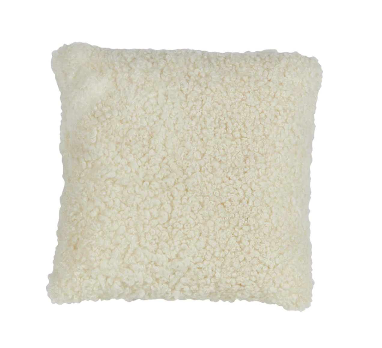
We could add shearling cushions to these which adds again to the texture and keeps the palette very soft.

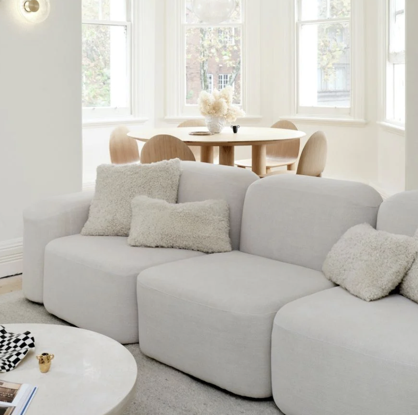
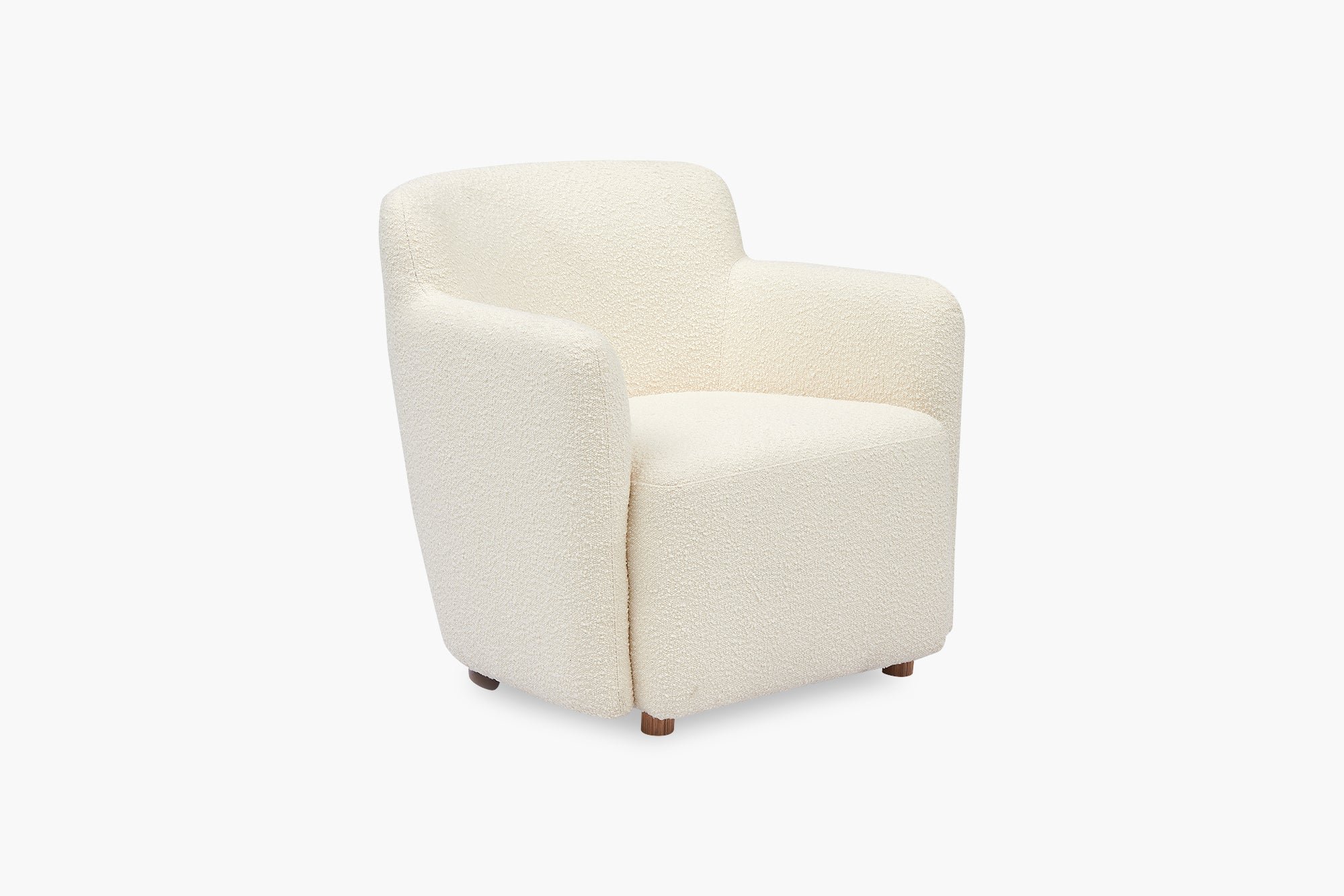
The modular gives flexibility in how it can be arranged and by adding an additional armchair or two, we have even more flexibility in arranging. The options could be the Berlin swivel chair in the same fabric the left, or the Tulla from MCM House, seen below n cream boucle.

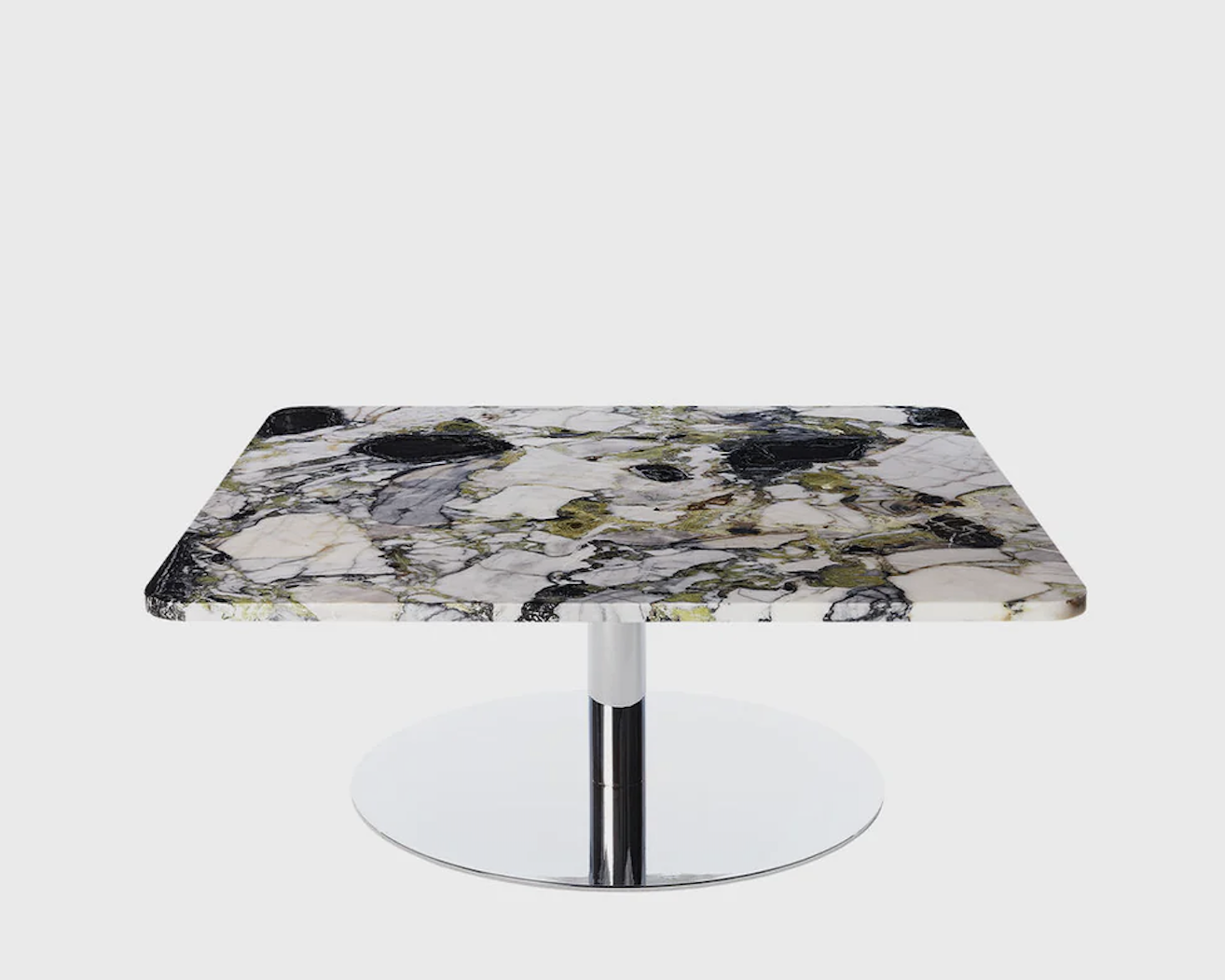
I would add a coffee table or two - and these by Tom Dixon are divine, their marble tops with the hint of green will be wondrous in our scheme.

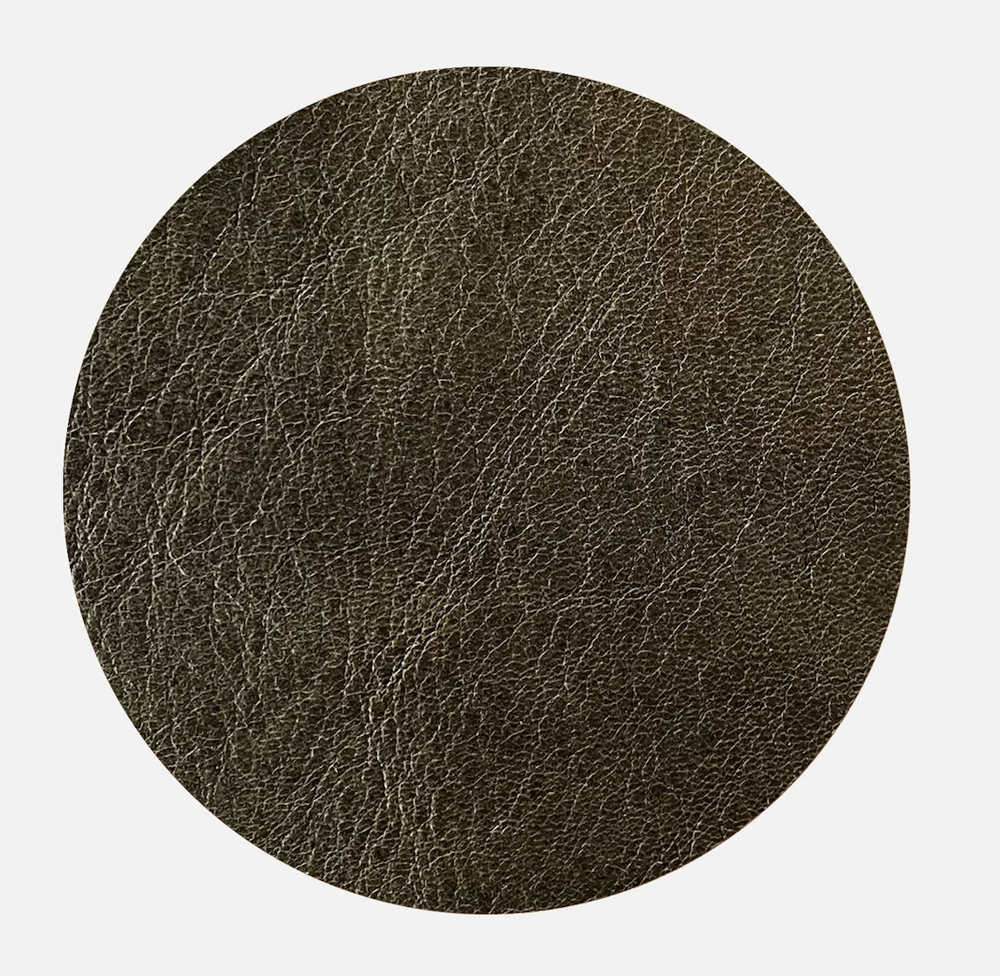
The second sofa option I want to put to you is from another local, Sydney based supplier called Franka. I specify their products often - I’m a great supporter because I love what they do and think the price is very reasonable. But…. the price does go up for leather and up again for the grade of leather that I’m going to suggest! I will show you the different options, but I do think leather would be a fabulous choice. There are two colours I like you to consider, olive and nuss.
The olive is so divine and so different. It would be dreamy in your living room, customised to fit. It doesn’t cost more to customise - they make the components to suit both your space, and to keep proportions within the setting correct.
The detail is fabulous, as you’ll see in the following.
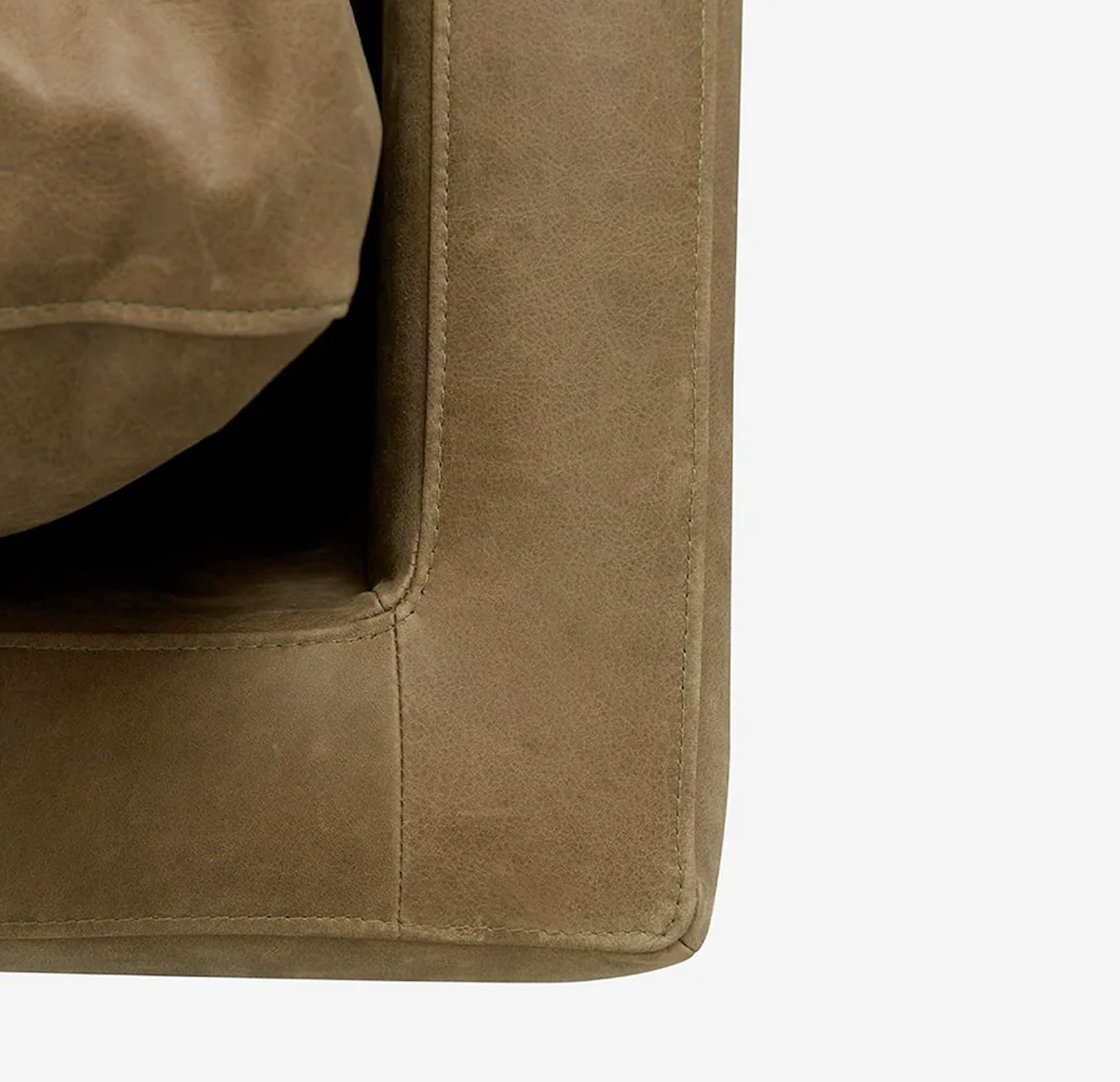
Beautiful stitching and proportions, the customising includes the fabric or leather, shallow or deep seat, the length of each component, and the leg type and finish.
the photo above shows the variation, and to the left, the chaise component
Franka also make lovely coffee tables you might consider -
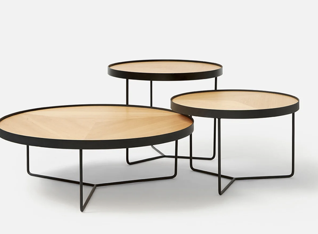
The Sia table is available in three different sizes and heights, and in black, walnut or ash, as in the photo above. They can be placed whichever way suits, I like a the large and medium together like a tiered central coffee table, with the taller, smaller diameter one used as a side table beside a sofa or chair.
The table on the right is the Frida table, also available with an ash top, and it measures 1 metre across.
I also love these side tables from Trit House and if you chose the Frida table, these would look fabulous with it. They’re wild! But the black stain gives them the edge and I love them because they’re slightly untamed - they bring a chilled out vibe to the room that is at once relaxed and sophisticated. And they’re very reasonably priced!
These are made of NZ pine and measure 400mm wide and 460mm high, weighing a solid 22kgs a piece!
Sunroom:
Hmmmm…. this one has been tricky to figure out. But this is where I have landed and I hope you’ll see the logic. But as always, I am up for all feedback!
Long and narrow, with two points of entry, this space is valuable to you guys as an informal, sunny and quiet spot to be. I want to keep it that way! It’s the most relaxed room in the house, but it is not the easiest to furnish.
But I have to say, without apology, that absolutely everything currently in the room needs to be redeployed at a different address!!! (so RUDE!!!!). None of it can stay.
Let’s start with the walls - yep, more of the spanish olive. Again, in using the same colour as the inner living spaces, we increase the sense of living space generally.


This colour will be dreamy, again with the natural white on all woodwork.
Cohesiveness is fundamental to my design approach - the old adage always ringing true that ,‘less is more’. Limiting the number of materials, textures and colours gives that feeling of comprehensive vision.
We discussed the idea of resurfacing the cork floor as it has yellowed badly in the sun. My enquiries into this leave little hope for restoration! Apparently the cork burns easily with sanding, but more troublingly, the coating that is required to preserve the cork is so toxic, it is banned in most places except here! This is what i am told by the King Cork in Willoughby. He says that if you want cork, the best path forward is to pay to have the existing and its base (maybe masonite, could be asbestos, depending on the age) removed and to start again.
So what to do? My suggestions are, from most economical to most expensive:
Turn a blind eye to the yellow cork and add sisal rugs, custom-cut
lay new cork over the old, which could leave a deficit at the thresholds
pull up what is there and lay a whole new floor