Your Custom Text Here
Day house
Emma,
The Federation era was a time of high aspirations for a newly minted nation, and the architecture of the time reflects exactly that. Lofty ceilings, generous proportions, gracious windows letting in the light of a new age… not surprising these houses remain eternally popular and loved by interior designers for their good bones and good graces, in equal measure.
The following is a Creative Interior Plan (CIP) that will be the roadmap to transforming your lovely Federation gem into a beautiful and unique home that reflects who you are and what you aspire to be in this next phase of your life. Style, energy, warmth and comfort are all descriptors we will aim for in the designing of this property - just as they might aptly describe the woman who chooses to live here!
So let’s open the front door and walk on in…
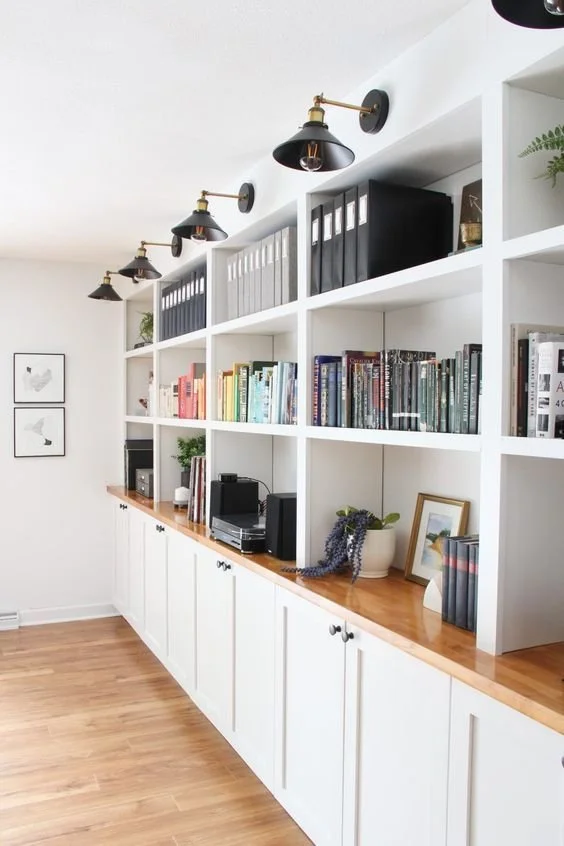
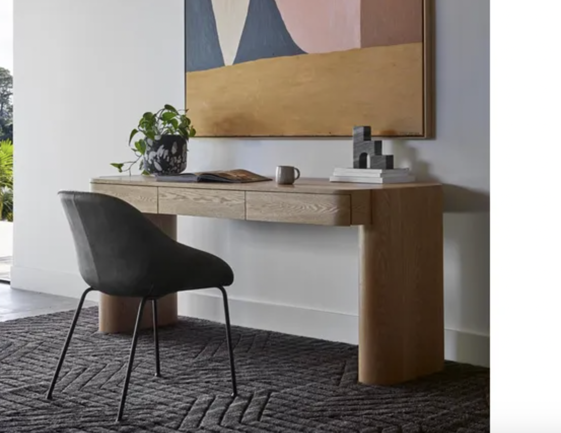
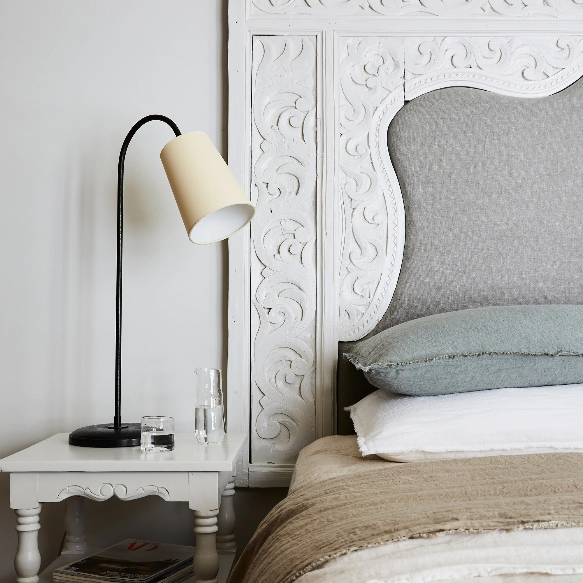
Entry Hall:
Because first impressions count! This space sets the tone for the entire house and so it is critically important that we get this right.
We have had to delete the dado idea - at least we gave it a red hot go!!
As we have eliminated the wallpaper too, I’ve had a rethink….
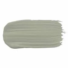
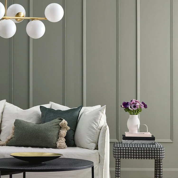
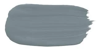
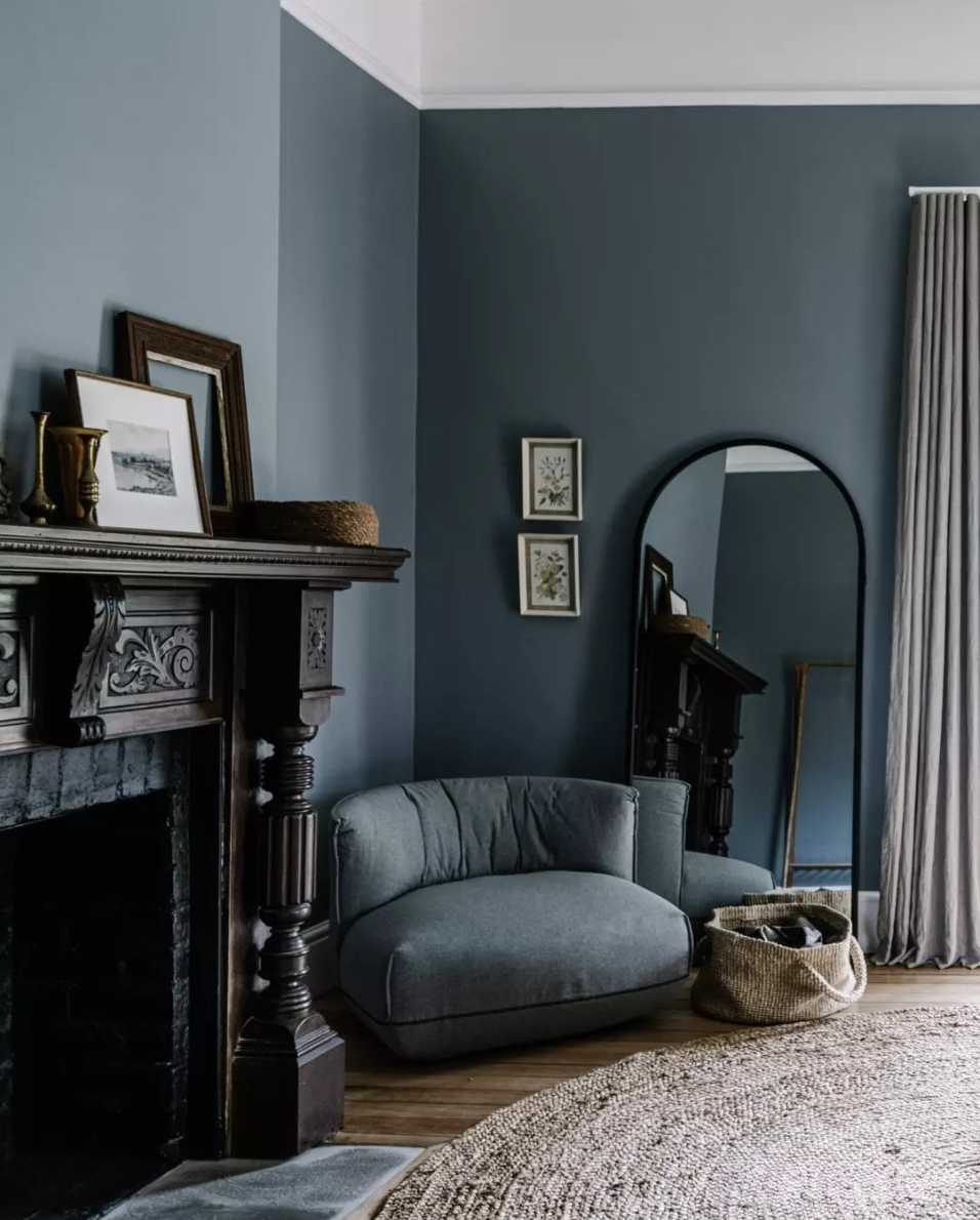
The colour below is by Porters Paints, called Duck Egg and as you’ll remember, I did have this earmarked for the second bedroom. But as you want to keep the bedrooms light and I think the hallway needs to pack a punch, I’ve swapped things around! Duck Egg has a warmth and an earthiness yet is still dynamic and vibrant which I think is so important in this spot. The brass of the mirror, the rug we’ve chosen, and importantly, the other colours selected for the bedrooms and study will all compliment it really well.
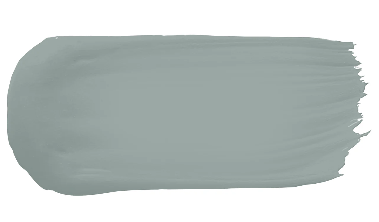
Porters Paints, Duck Egg

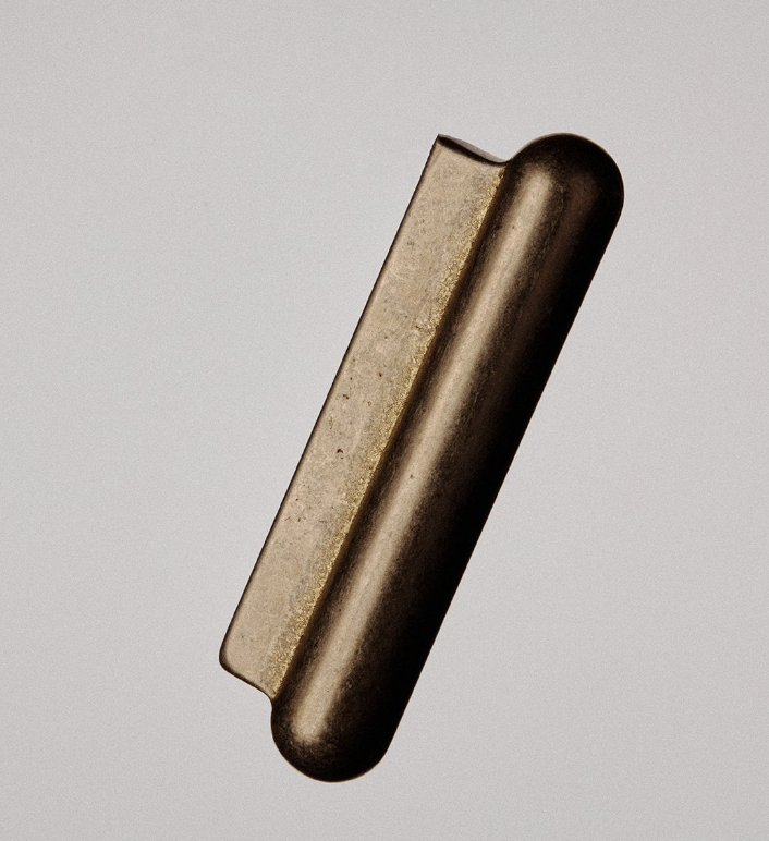
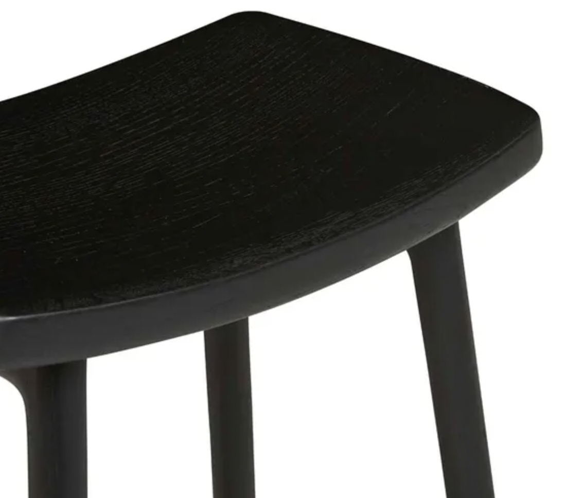
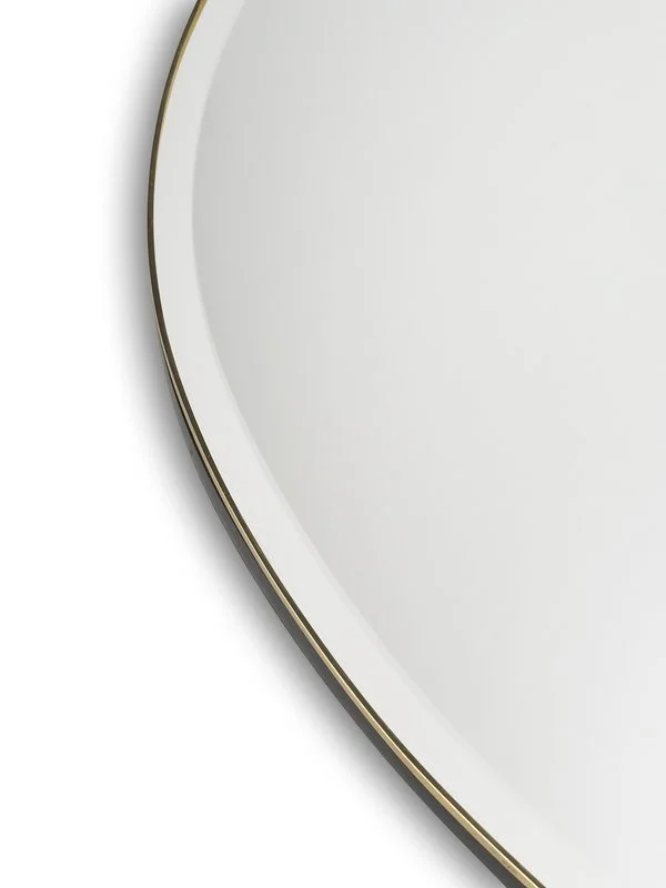
We recently agreed too, that we need a mirror and I think this is the queen.
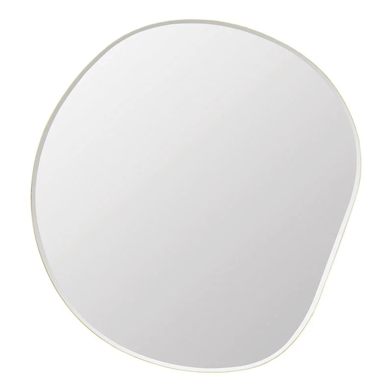
It’s irreverence makes me smile. It’s a decent size at 87 x 94cm (1.5cm thick) and it’s fine brass edge will be glorious on the wallpaper. It’s by Ferm Living, through DesignStuff.
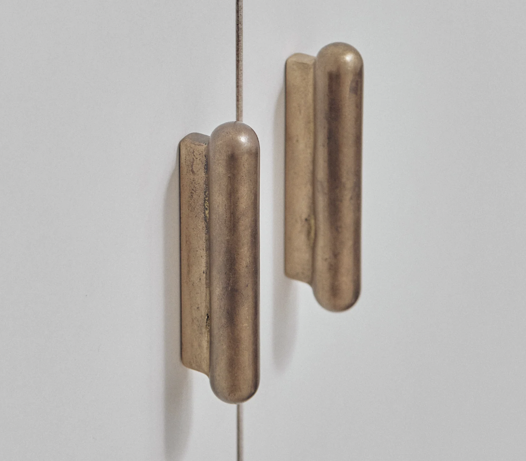
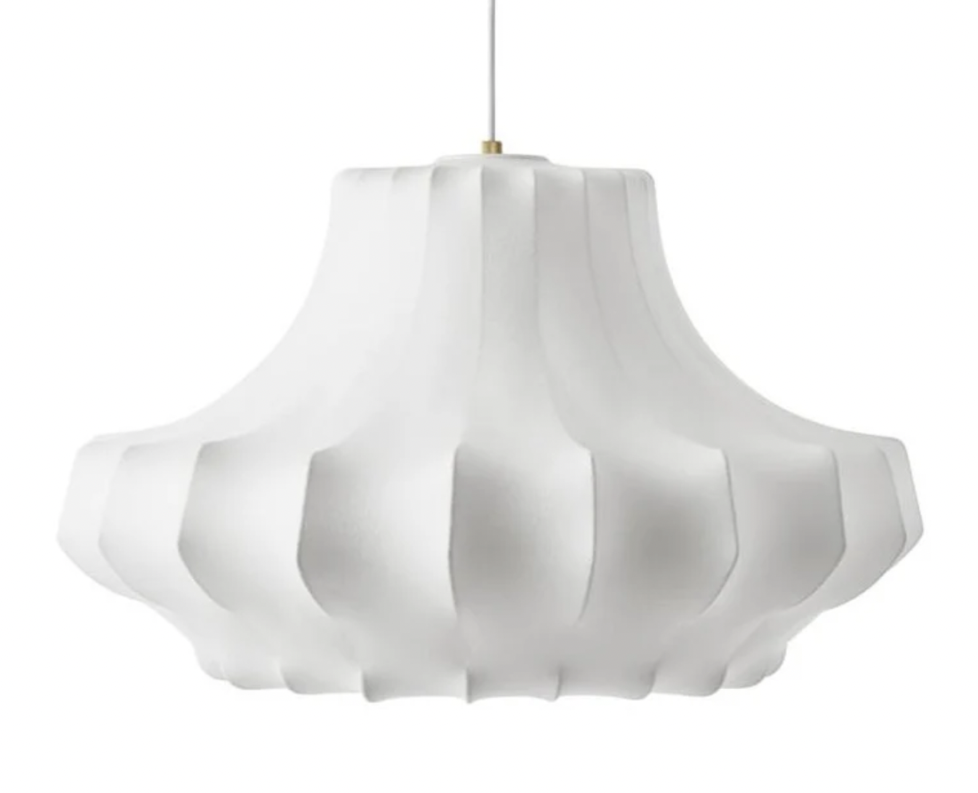
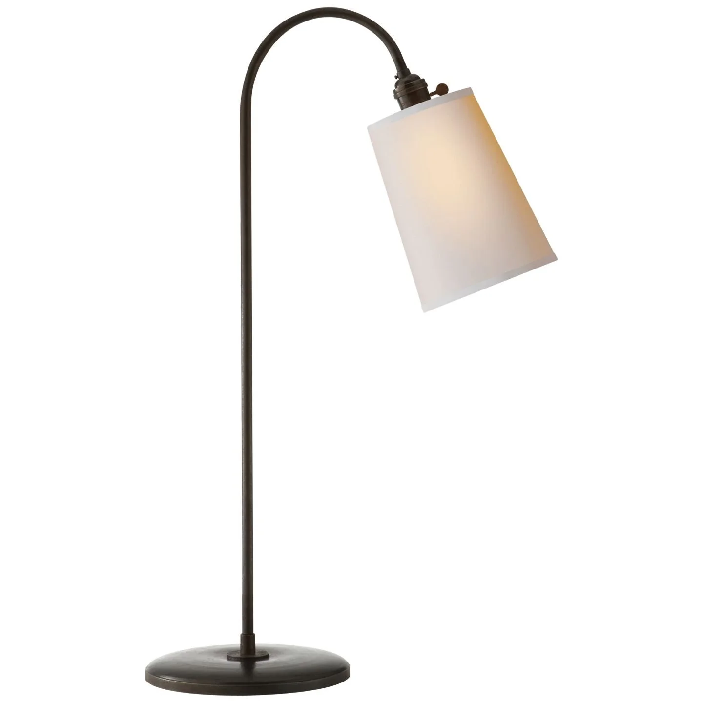
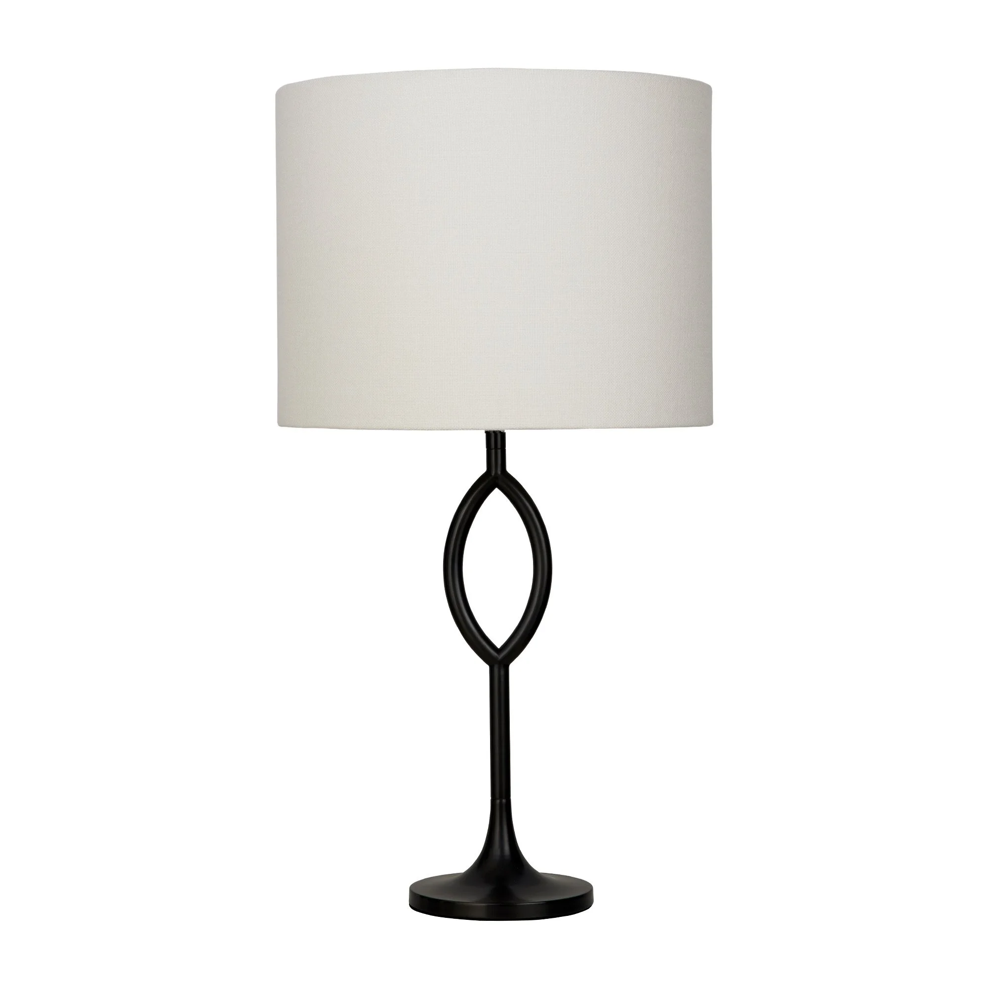
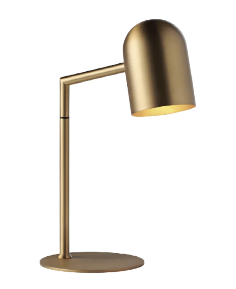
Next we need a light fitting. The brass and glass ones in this spot currently are undersized and therefore a tad insignificant. This one is a fabulous alternative as the whiteness of it against the blue wallpaper will add a soft relief and a quiet beauty. Two of these, please!
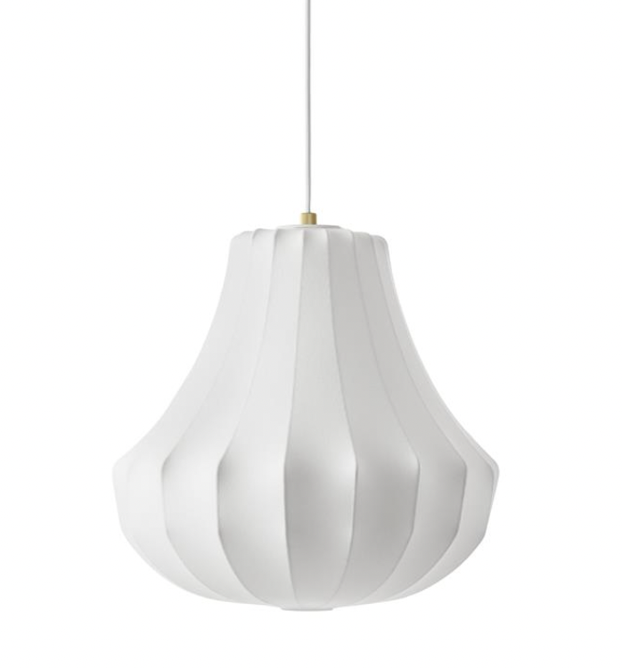
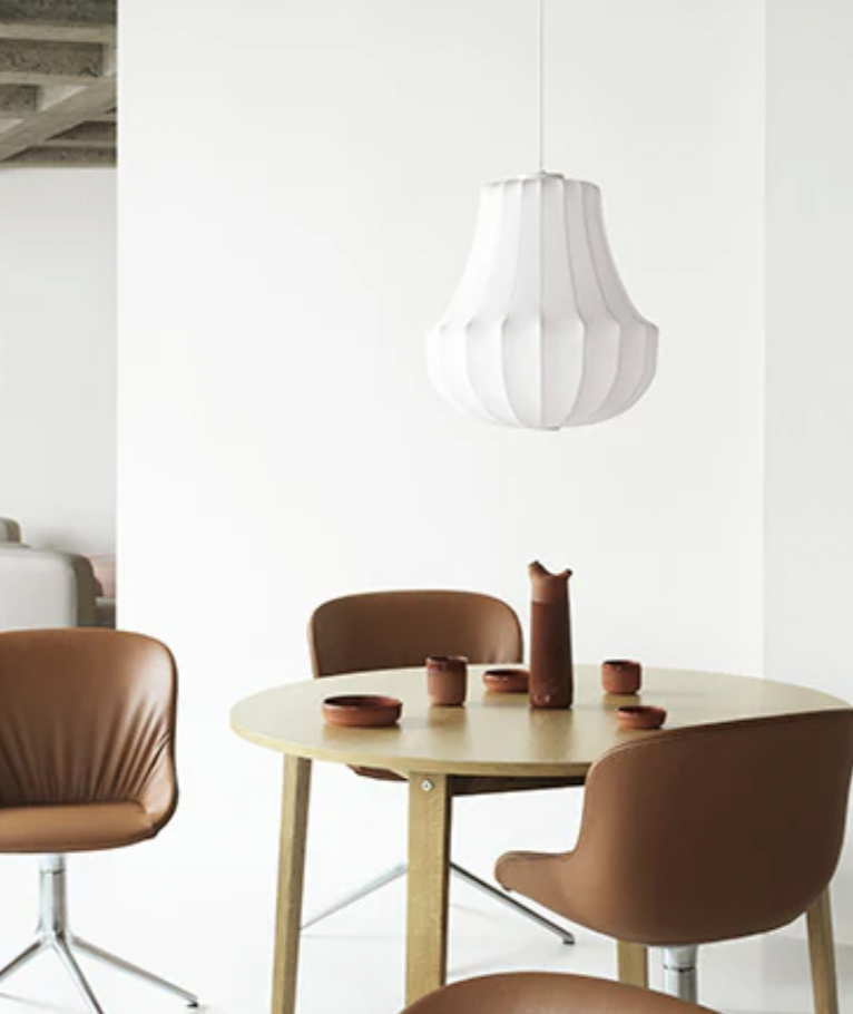
This is from the Normann Copenhagen range called Phantom. It is a high quality resin fabric stretched over a wire frame. I’ve chose two for you, the small for the hallway and the large for the dining area. With a warm white globe (always!) the effect is very muted and soft, candle-like in its light quality.
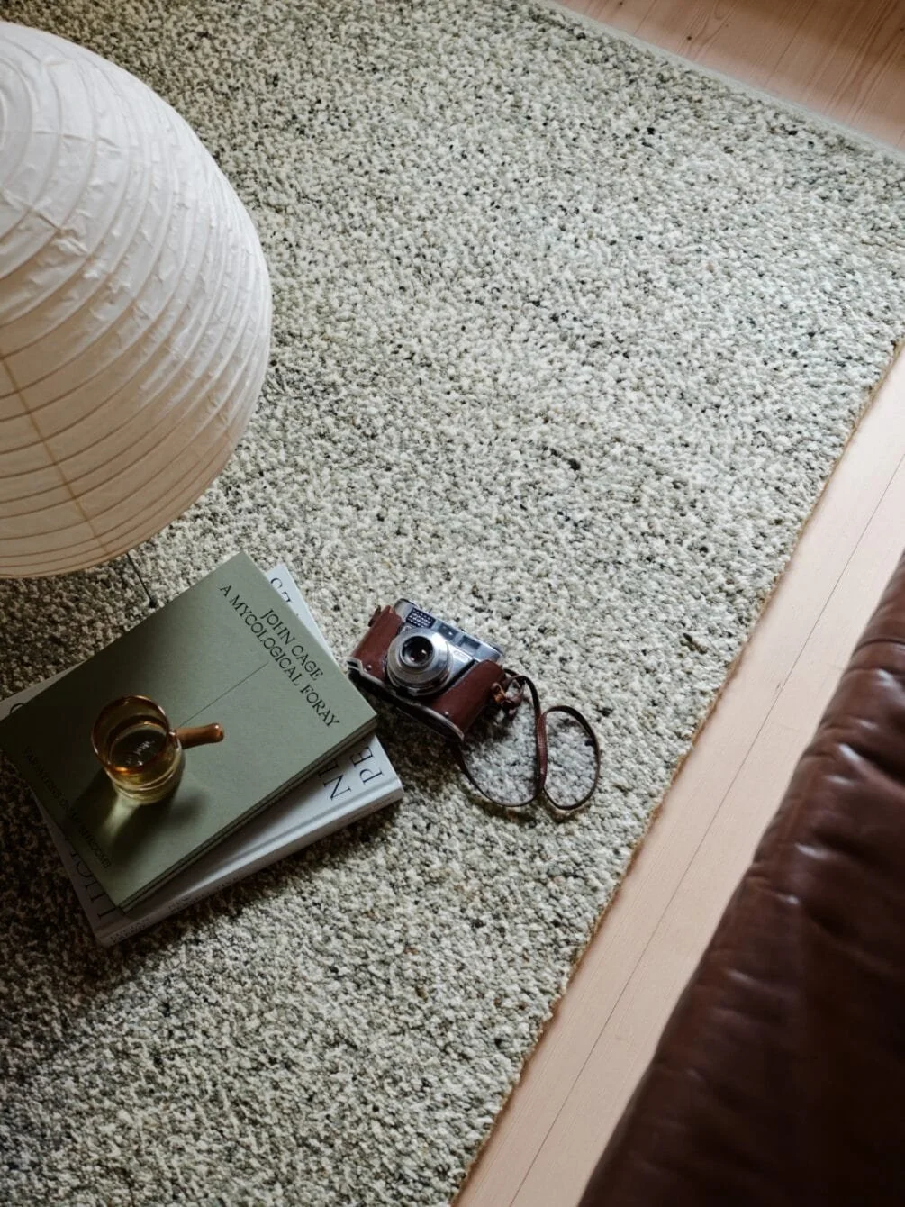
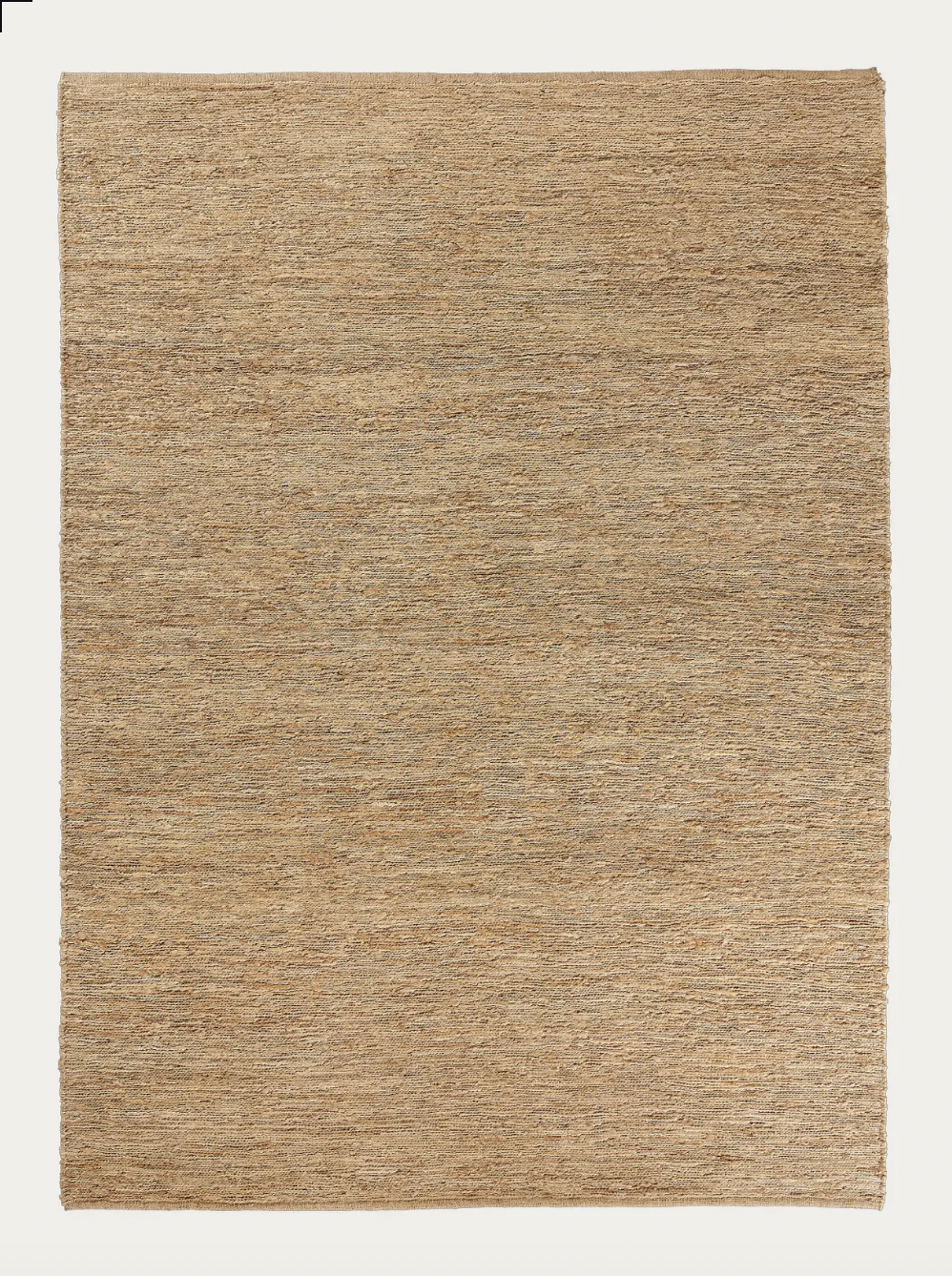
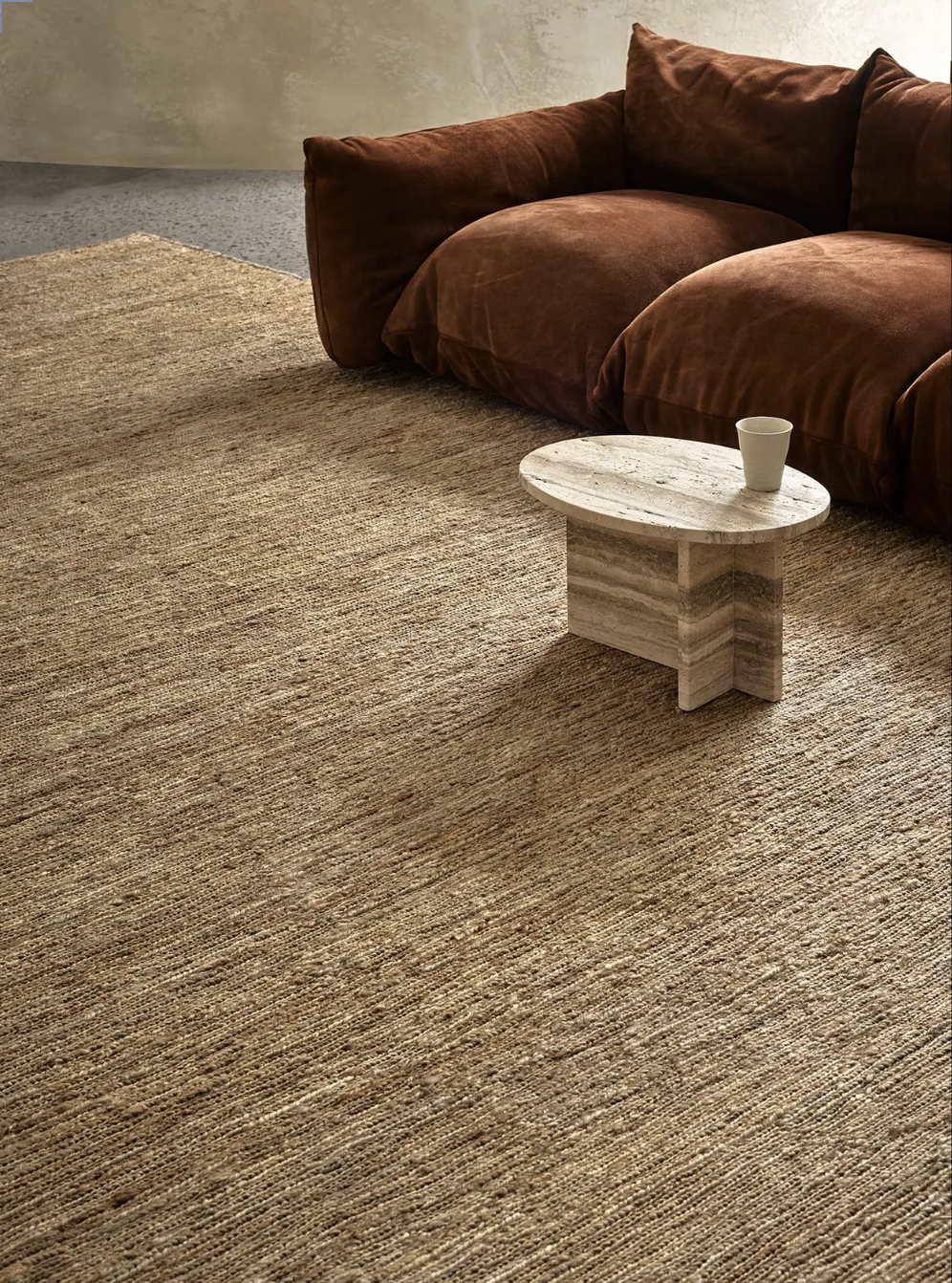
And of course - a runner is required, the purpose of which is to dampen sound and add warmth.
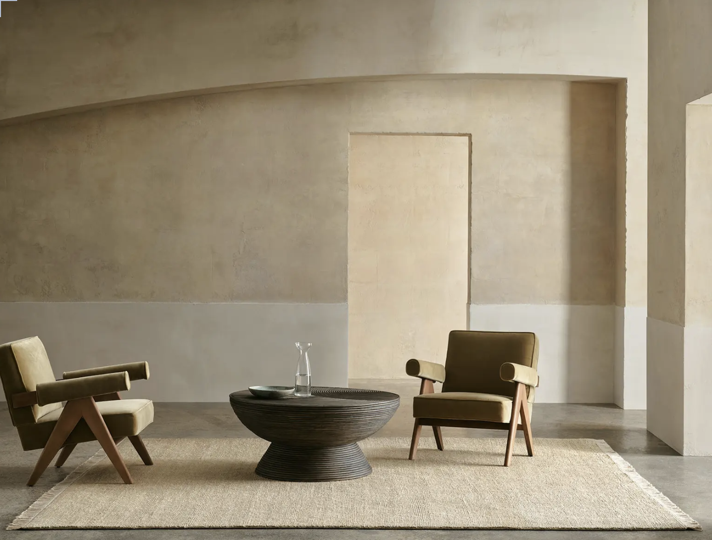
This one is by Armadillo called Mojave, made of a hardy jute, the practicality of which should be the reason I specify it!! But what I so love, apart from its practicality, is the texture.
The colour, Cashew, is a perfect counterpoint to the blue and white of this space and the effect really works to build the palette of natural fibres in a warm and luxe design.
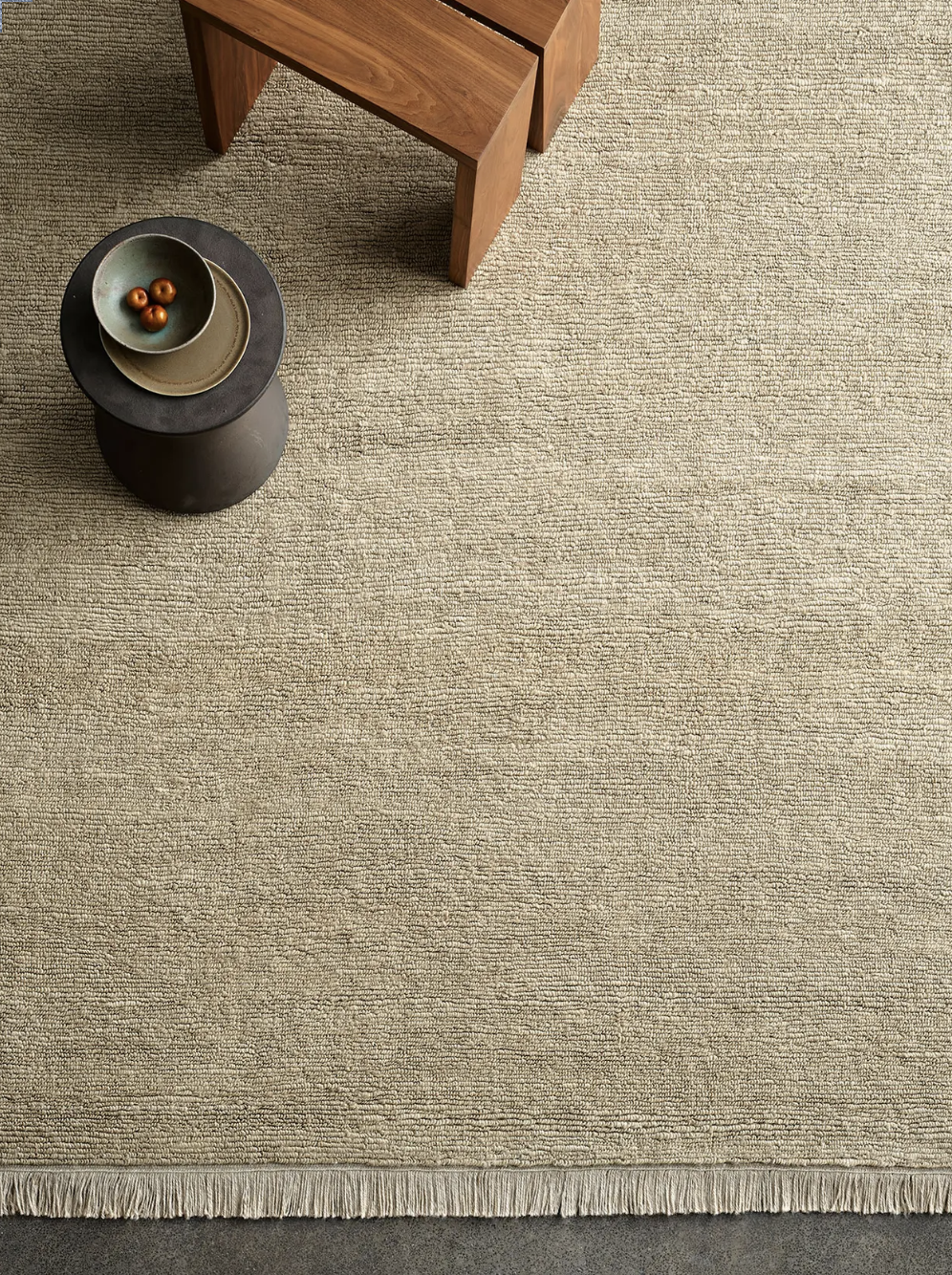
It’s hard to beat the price point, too, as it’s much cheaper than wool and much stronger, but like all things, there is a lead time.
As I have said already, the entry hall of any home should be the wow factor that sets the tone of the entire house - most especially, for the occupants.
When you put your key in the door Emma, I want you to open up to a home that really knocks your socks off! I’m very conscious that everyone has a budget - and perhaps spending money in a zone of the house that is in effect a thoroughfare, may not have been your first thought. But I hope that I have impressed on you the wisdom of taking this approach and that you’ll agree, this would be a pretty spectacular introduction to the interiors that lie beyond.
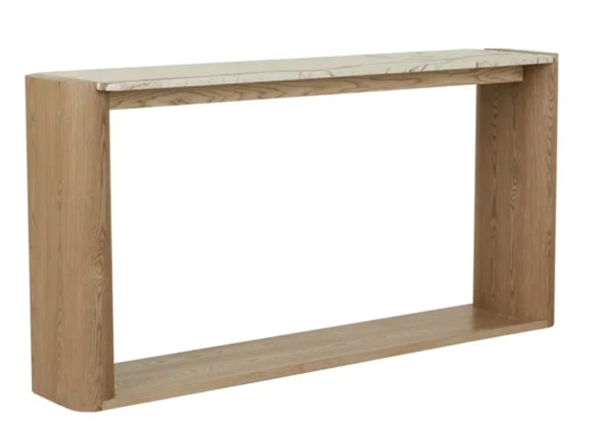
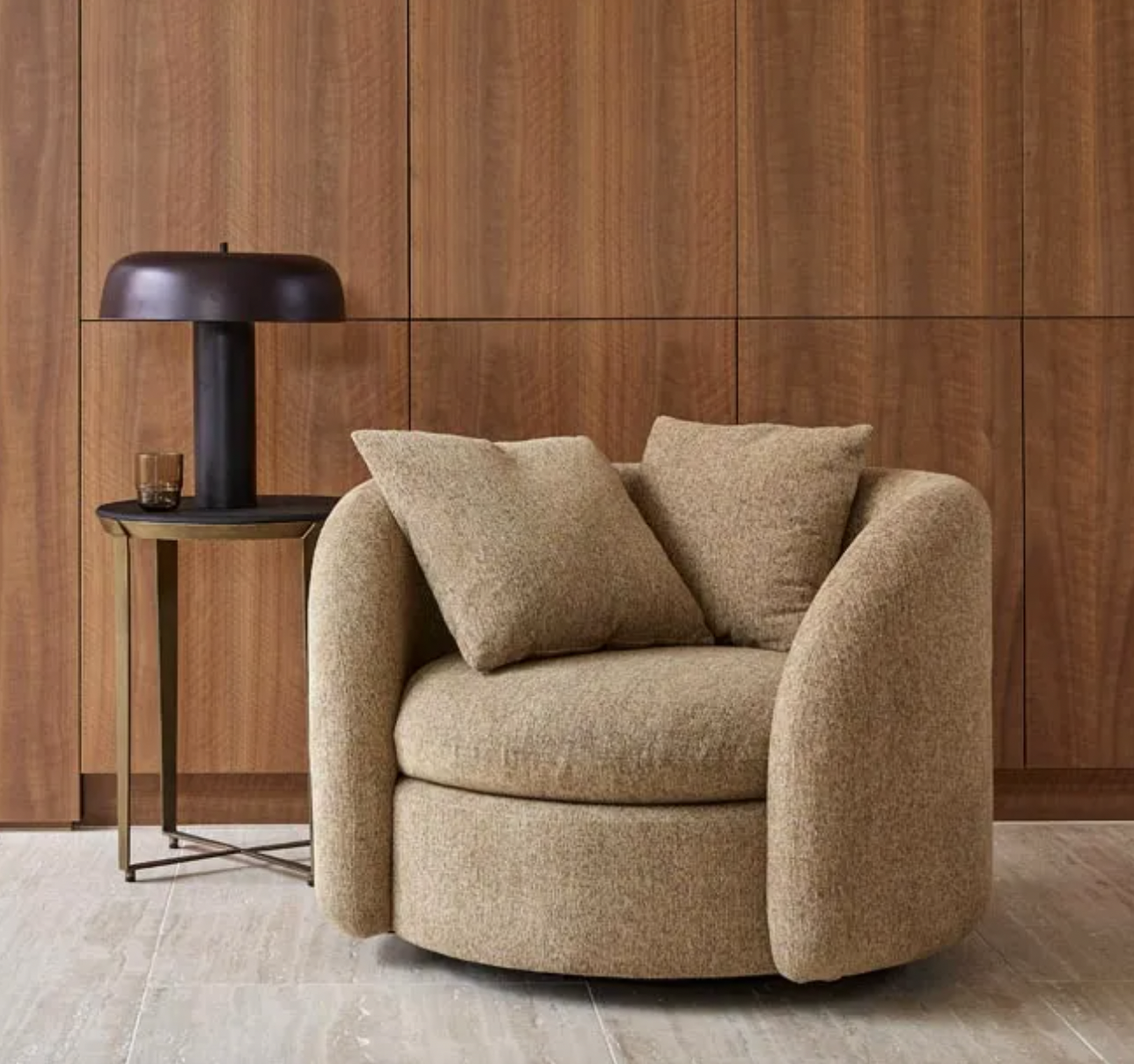
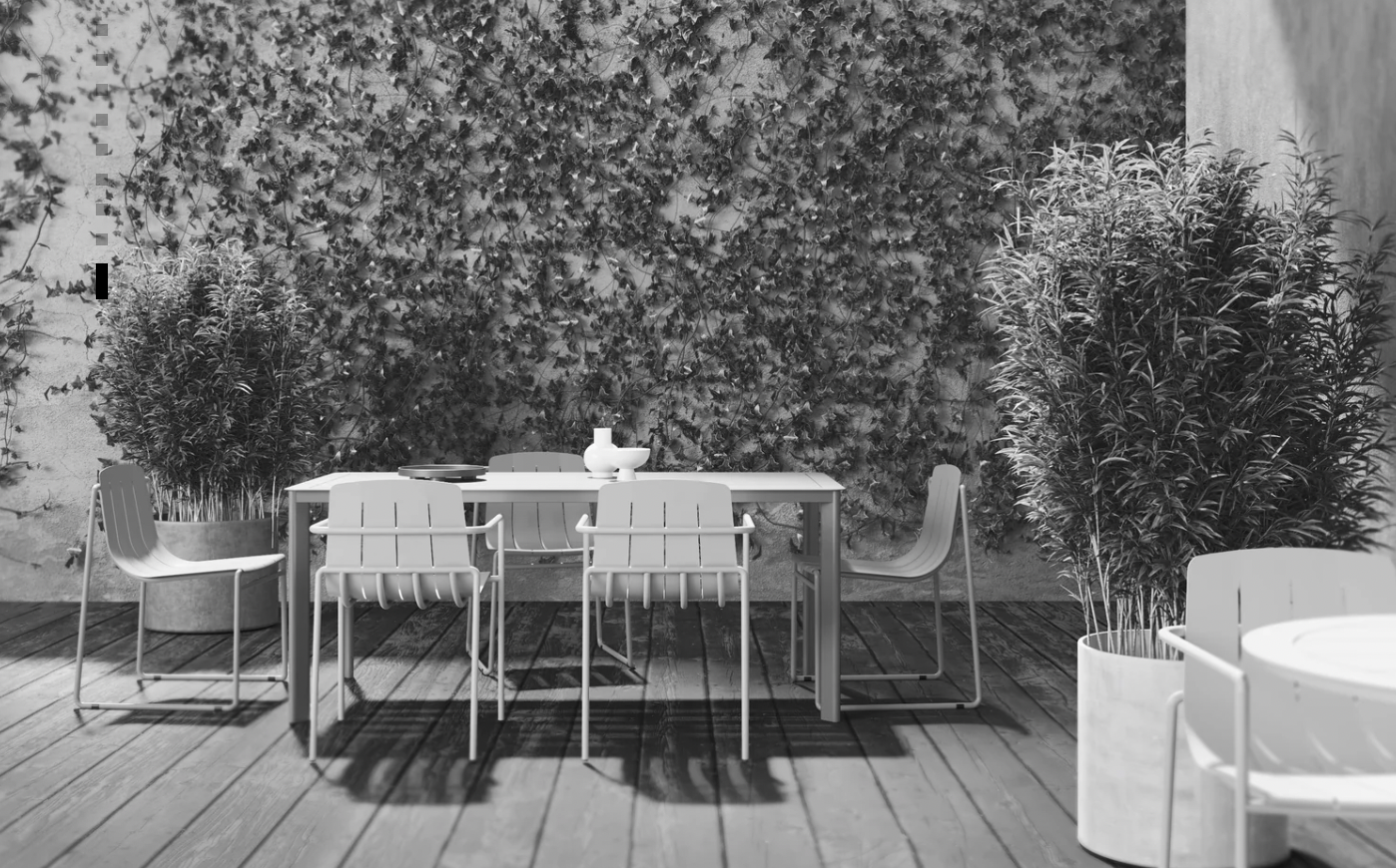
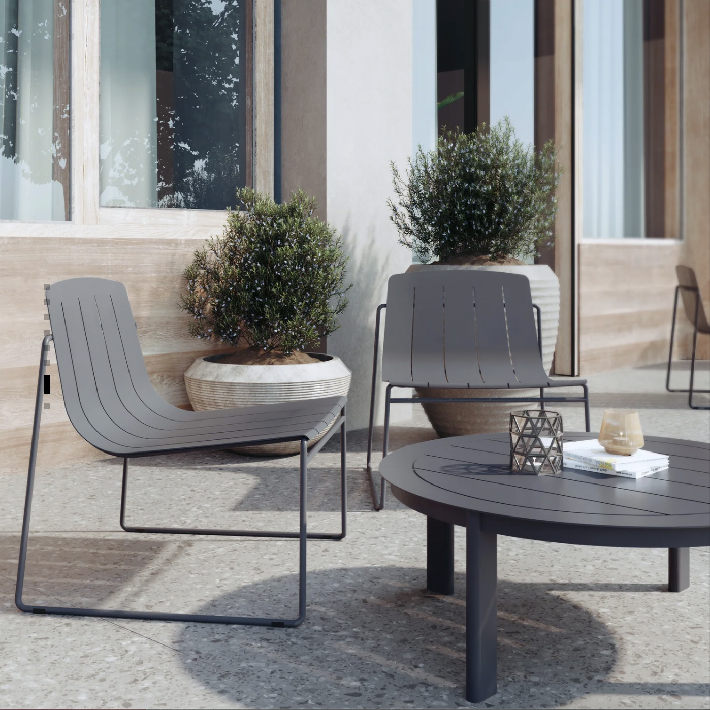
The Living Room:
This is a large and light area with a ton of potential. We want it to look and feel beautiful and relaxed, an area where you’ll love be and where you’ll feel good to entertain. But there are some larger budget items here.
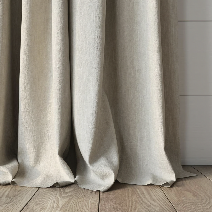
But to begin with, let’s get the wall colour and curtains right.
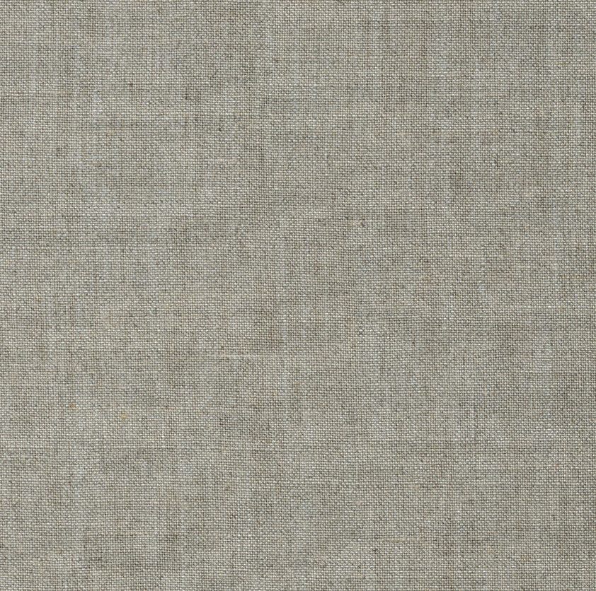
Coming in from the hallway, we want a paint colour that marries well with the blue but gives more light, so after some discussion, we have settled on Porters Paints, Duck Egg half strength. Sadly, there are no stock images of the half strength, so for the purpose of the exercise, the image below left will need to suffice!
You have the paint pot sample to play with and I strongly suggest you splash the colour around to be sure you love it as much as I do!

Porters Paints, Irish Linen