Your Custom Text Here
Broadbent House
Creative Interior Plan (CIP)
Emma and Adam,
I am honoured to be invited to assist you in taking your Bondi Junction apartment to a new level of style and elegance, whilst preserving and enhancing all the things that give you the warm and fuzzy feels! The following plan is a beginning of a whole new home.
So let’s get started.
Henrietta xx
Entrance Hall:
The apartment is compact - we want to be clever with what we add and subtract so that the end result is a feeling of a calm space, not a cluttered one. But that doesn’t mean we can’t build texture and interest on the walls, just not too much in the way of furniture!.
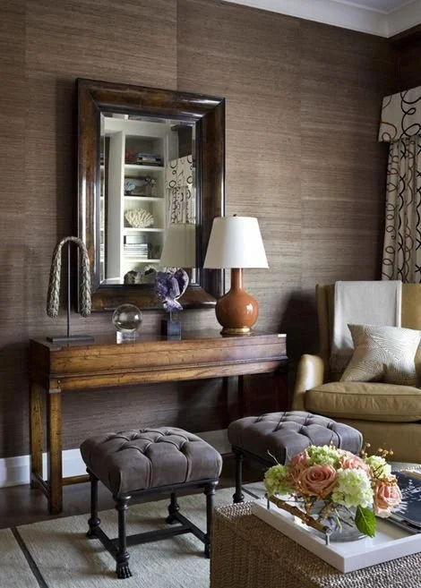
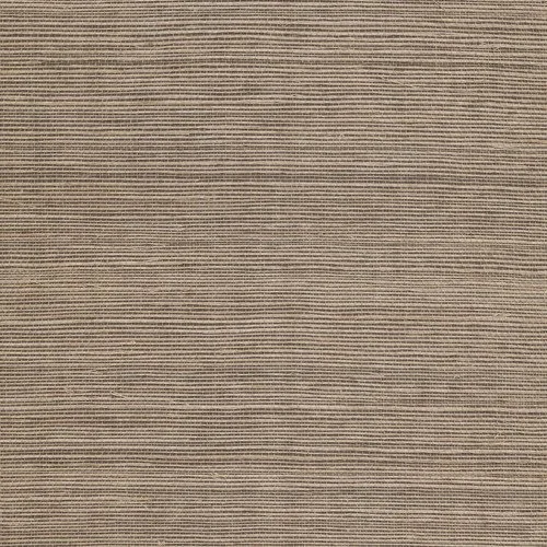
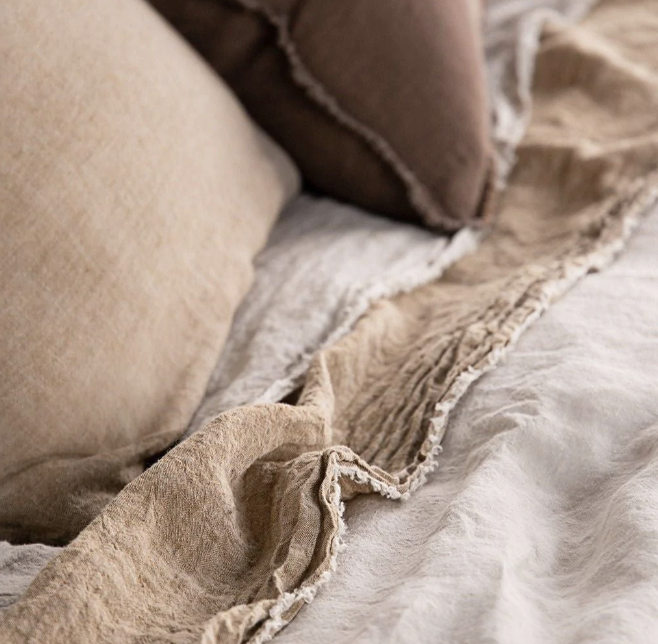
I am a huge fan of wallpaper and by using it in your home, I feel that we really beef up the texture that is lacking in this modern build. Porters Paints Grasscloth is what I’m all about and I would like to use two different ones for you.
The entrance foyer and the living space will be Hyena, oddly named but I promise, no scavengers!!

The vertical join lines are the feature - a rich, artisanal vibe that contrasts beautifully with the clean sleek lines of your apartment that make this a match made in heaven!
And then imagine…
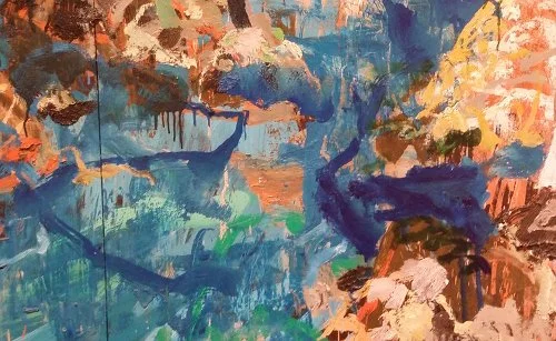
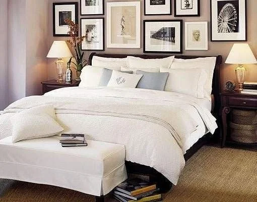
I propose that we take the Sciberras Painting out of your bedroom and hang it just inside the front door - it’s the first thing you’ll see as you enter the home - and how flash is that! Against the textured wallpaper in an earthy tone, the painting will really look spectacular. (I know, this is not your painting, yours is superior to the one above, but I have included as it is a similar colouration.)
The collection of smaller paintings, all gorgeous, we can then hang in your bedroom as a large (room for future purchases!!) grouping.
I do not propose a rug in the entrance hall as the flooring is very attractive and a rug would be a nuisance.
Now turn left!
Bedroom:
The walls of this room too, will be transformed with grasscloth wallpaper and clever art hang. I decided to move the Sciberras out of here for a couple of reasons - firstly, I know you say you can enjoy it from your bed - but no-one else can see it!!! Given its rich beauty, I think it will have maximum impact in your home by hanging it somewhere more visible. And secondly, being a landscape with colours that are so warm and ‘earthy’, and being an impressive size, it has the power to really set the mood for your whole house by being placed at the entrance.
Back to the walls in your bedroom!
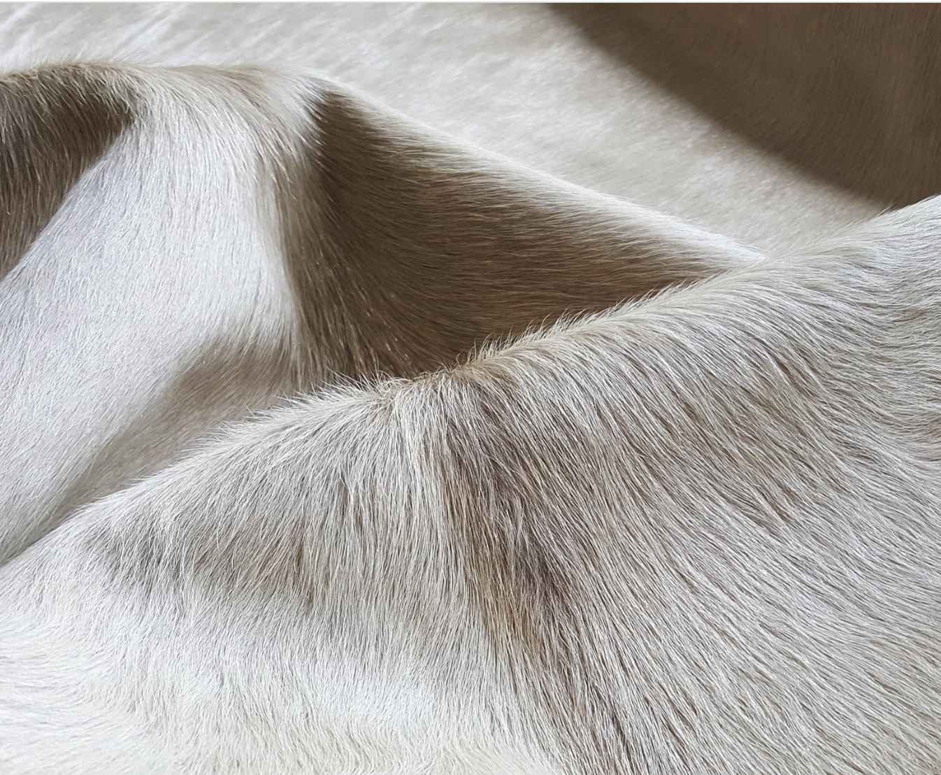
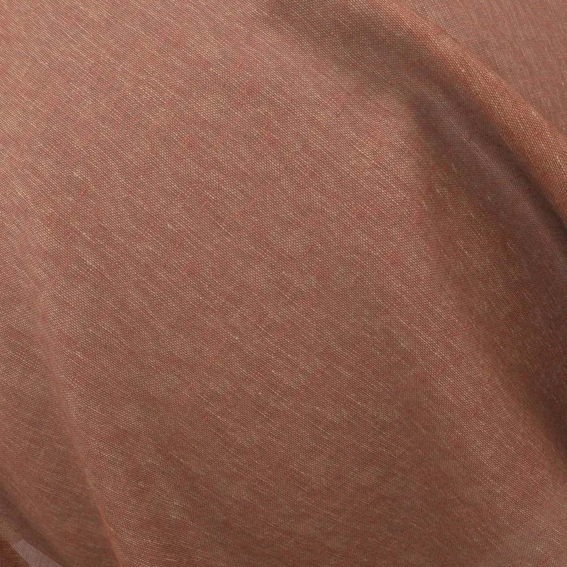
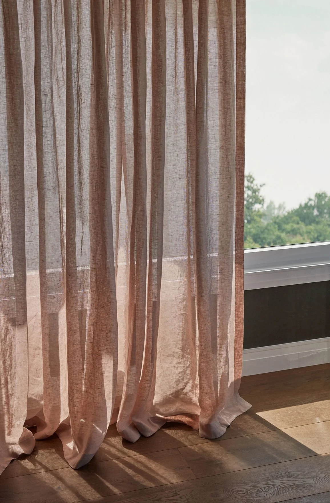
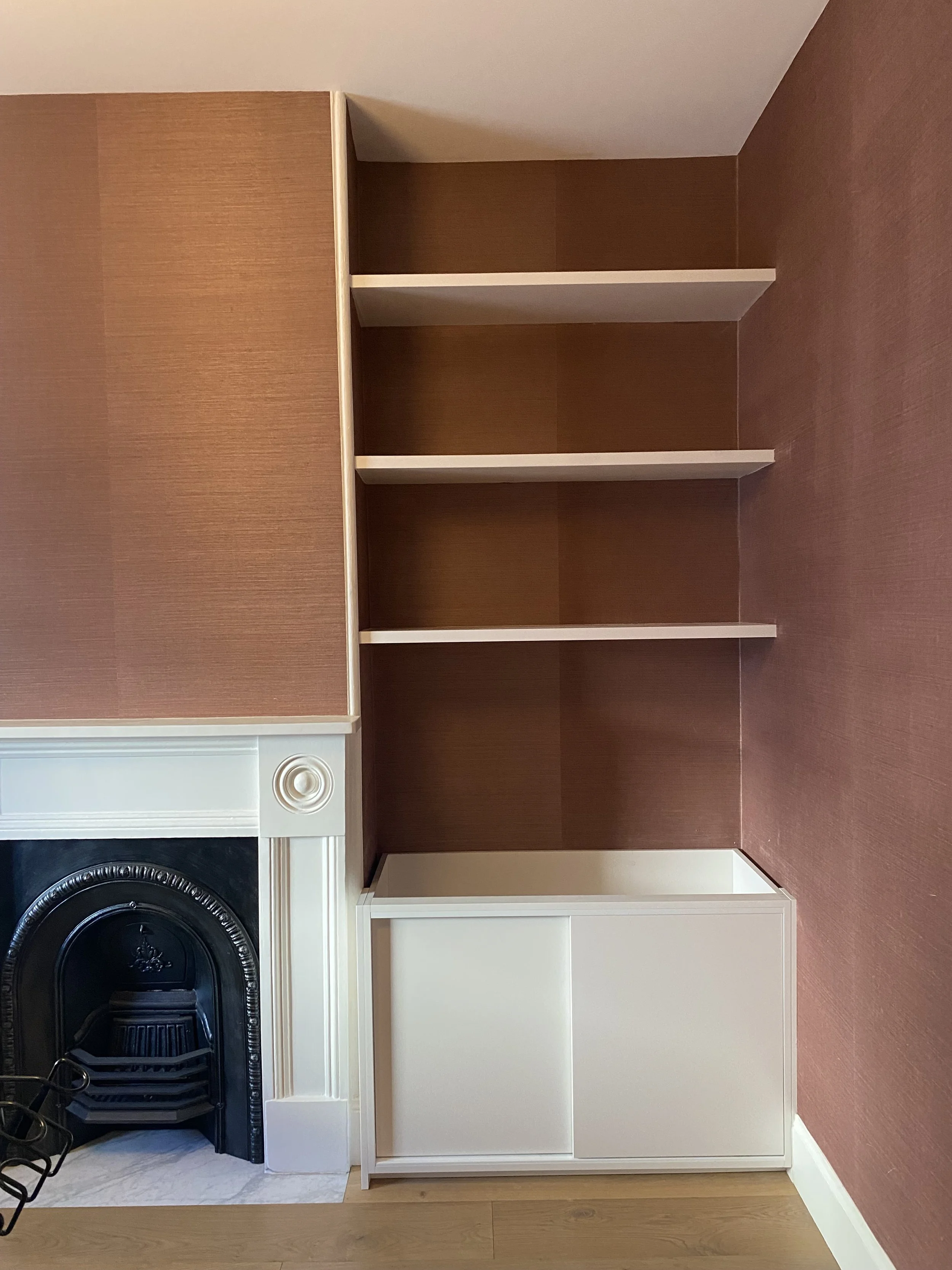
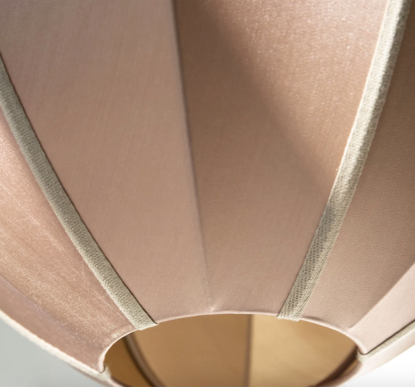
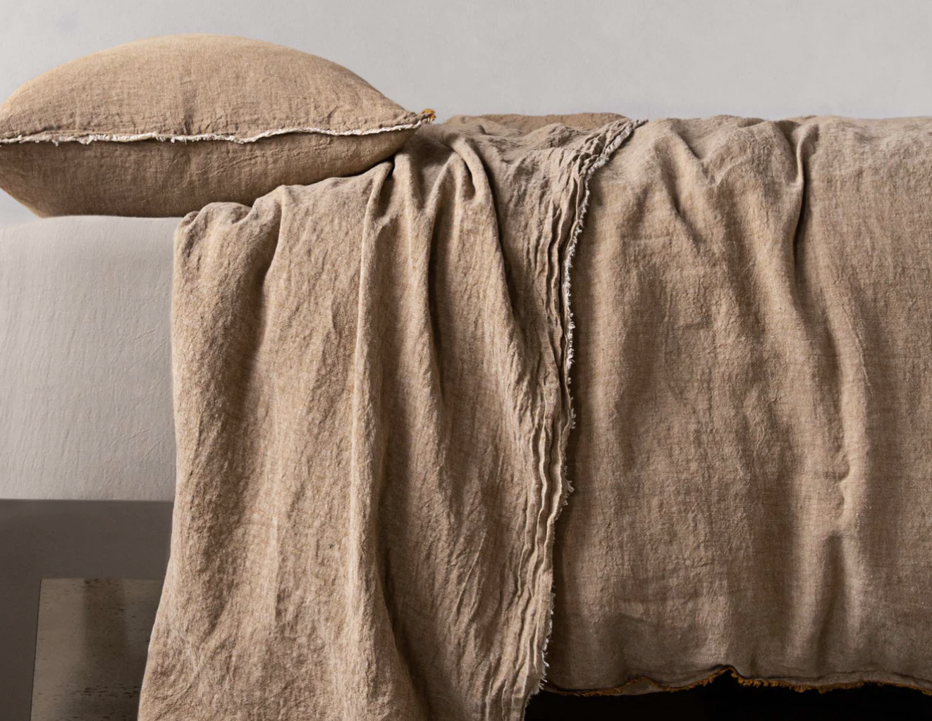
The grasscloth colour I have selected for you is maple, I’ve used it recently in a house in Balmain and I think it is my hero. I’m in love. There are not a lot of images available ion the internet, so I have included one from this recent install so that you can see how fabulous it is.
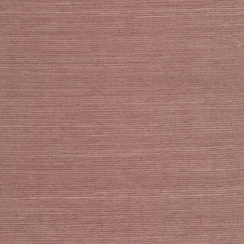
The colour is an earthy, muted pink full of character and style and you can see from the progress photo on the right, the vertical lines I mentioned earlier, as each roll of paper is deliberately not lined up or matched for a seamless finish. Yum.
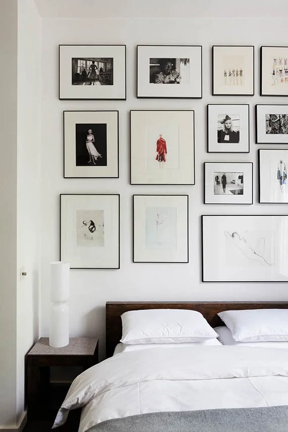
Now for the salon hang idea I mentioned…
I have included these images to help you conceptualise the idea of a wall of art behind the bed. It allows us to use all those gorgeous pieces you have already, and for future ones you can’t resist adding!! The effect is so eclectic and interesting - and it can grow as your collection grows.
As I mentioned, doing this totally over shadows the bedhead - it BECOMES the bedhead, and thereby extinguishes the need for replacement.
So we wallpaper with grasscloth, remove the Sciberras, install a gallery wall, add hooks - and paint the wardrobe doors Dulux Natural White (the existing grey is NOBODY’S friend!!!).
I have made it a priority in this plan to always look for more space saving or storage capacity - so, add three hooks!


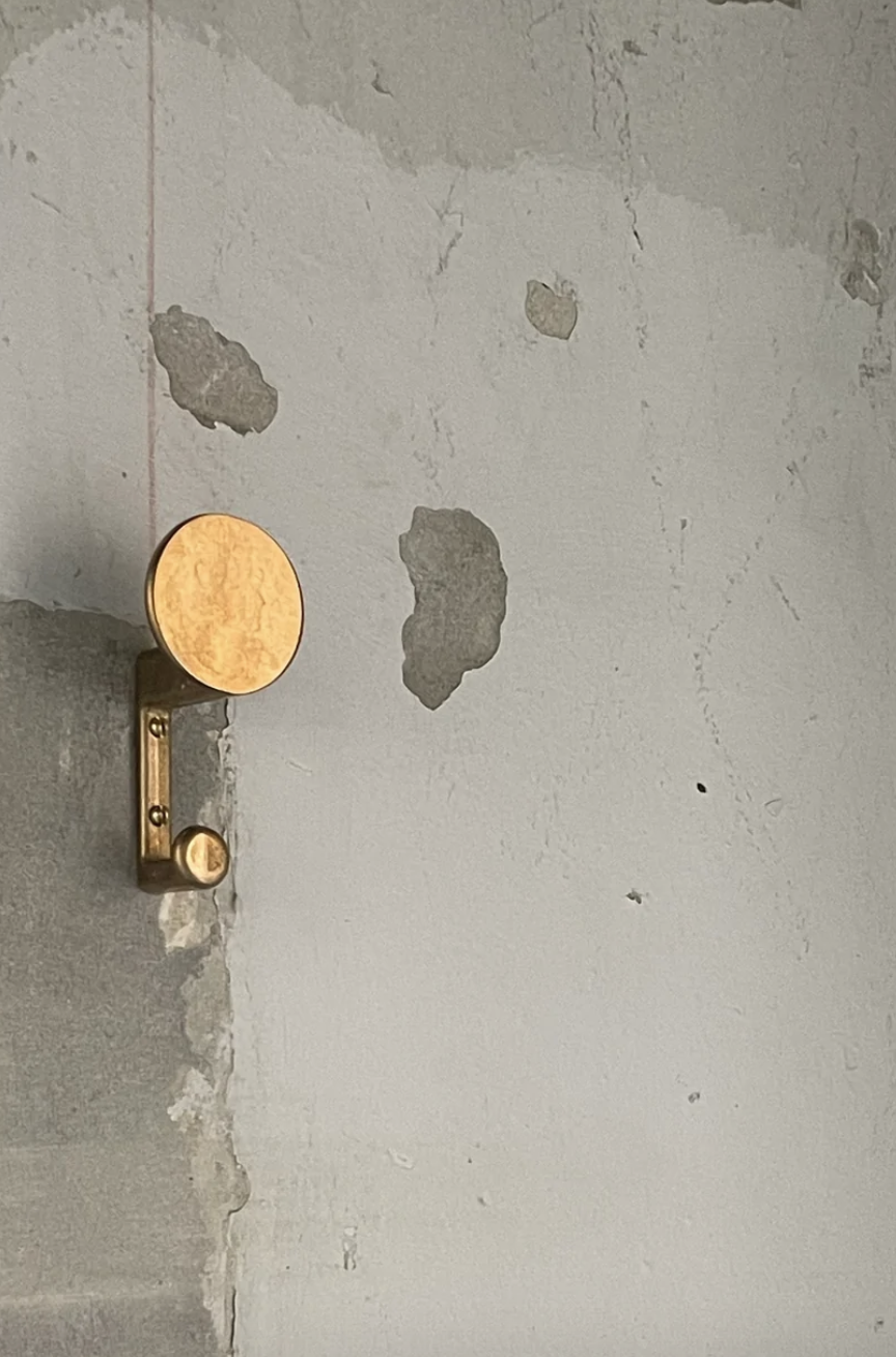
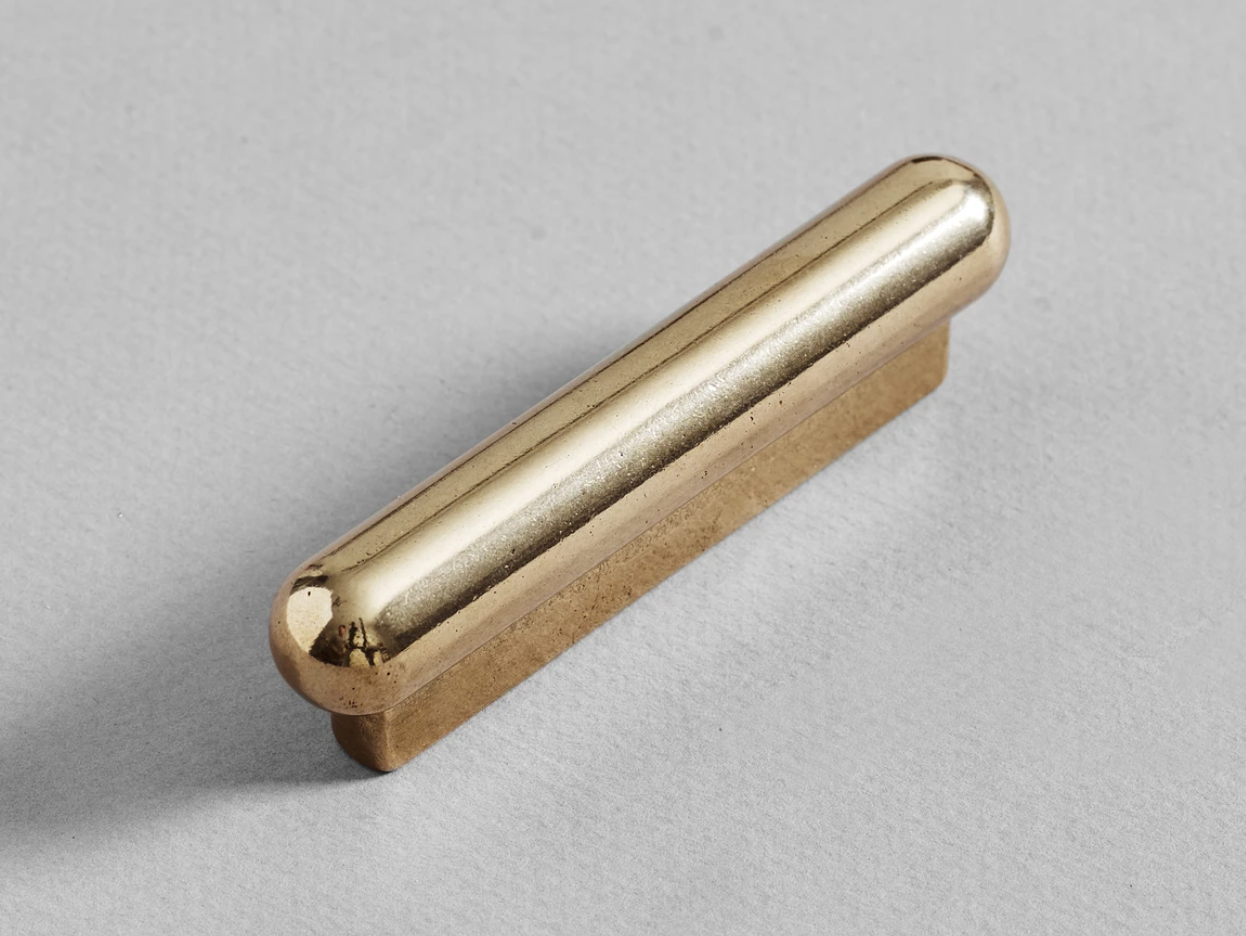
These brass beauties are made by Henry Wilson Studio in Sydney, I’m sorry the photo is a bit grunge…but I can assure you, all the HWS products are the very best quality. As you can see, they have a larger upper piece that can be used for a hat, or a coat, and a second smaller hook below it.
I suggest hanging them on the left as you enter.
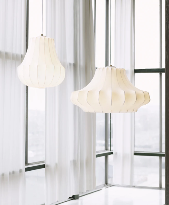
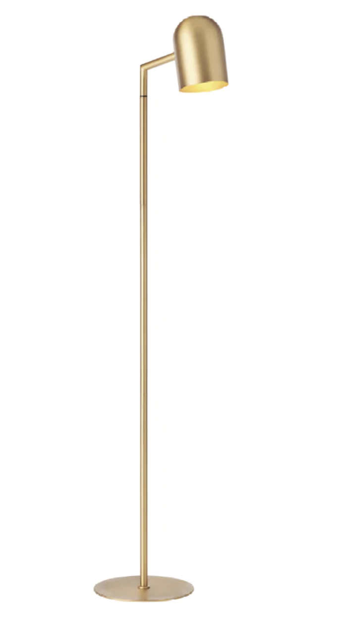
The lighting in this room is soooooo important - we want a romantic, cocoon vibe going on! The fittings below are absolutely perfect!
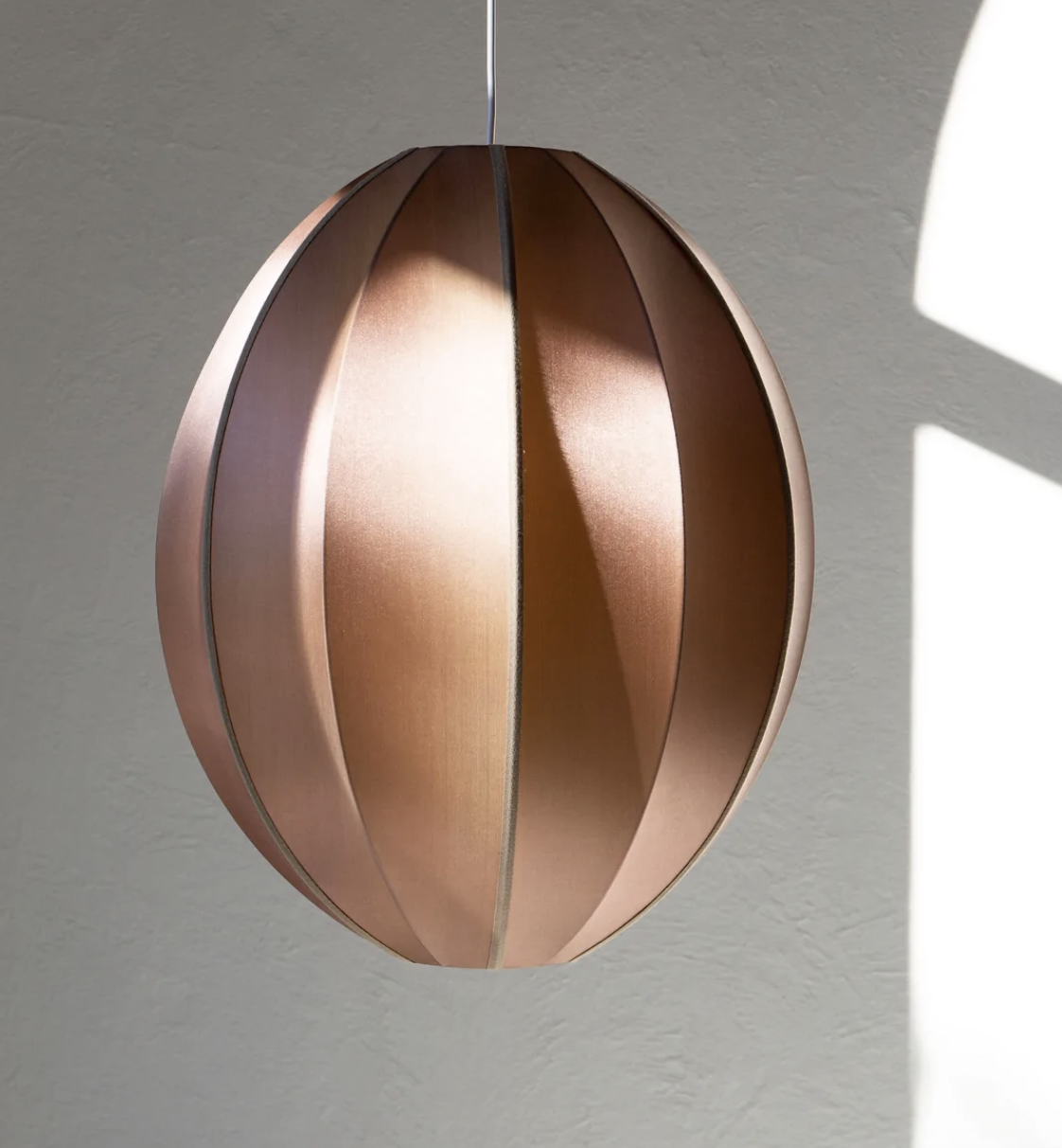
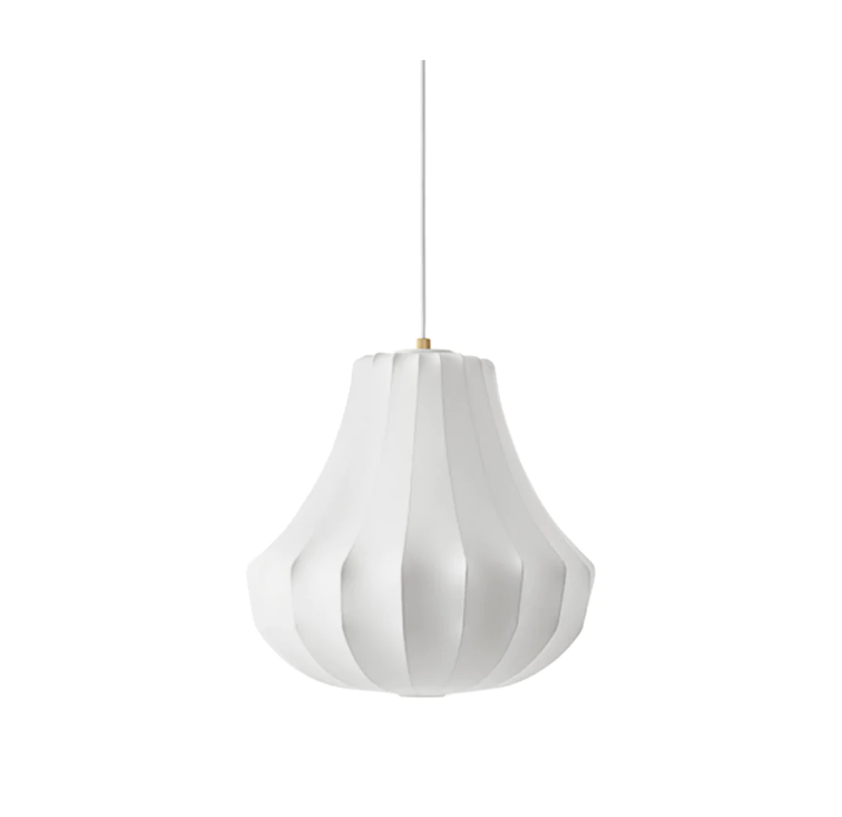
This silk pendant is a danish design, handmade in Vietnam and available through a stockist in Byron Bay.
A sublime compliment to the wallpaper, I propose hanging one of these either side of the bed, on a separate circuit to the downlights, with the switching either side of the bedhead. By using these, we eliminate the need for bedside lamps, which take up valuable realestate. The pendants measure 54cm long and 44cm wide.
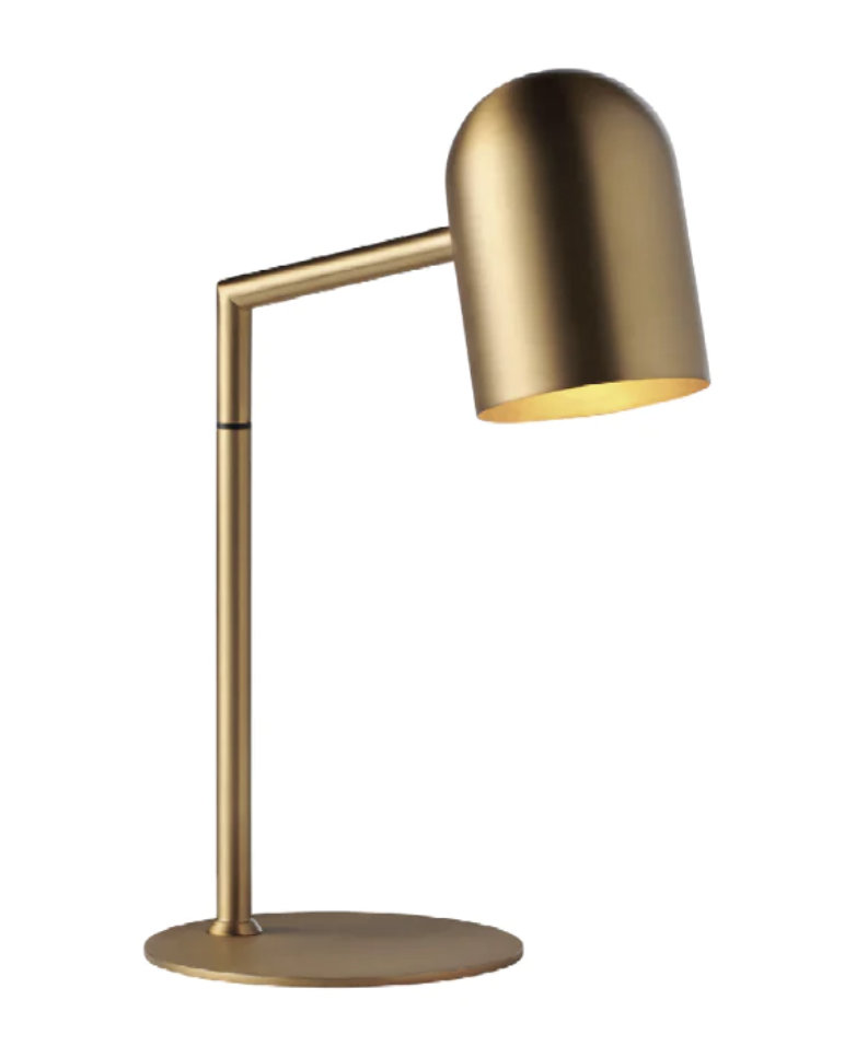
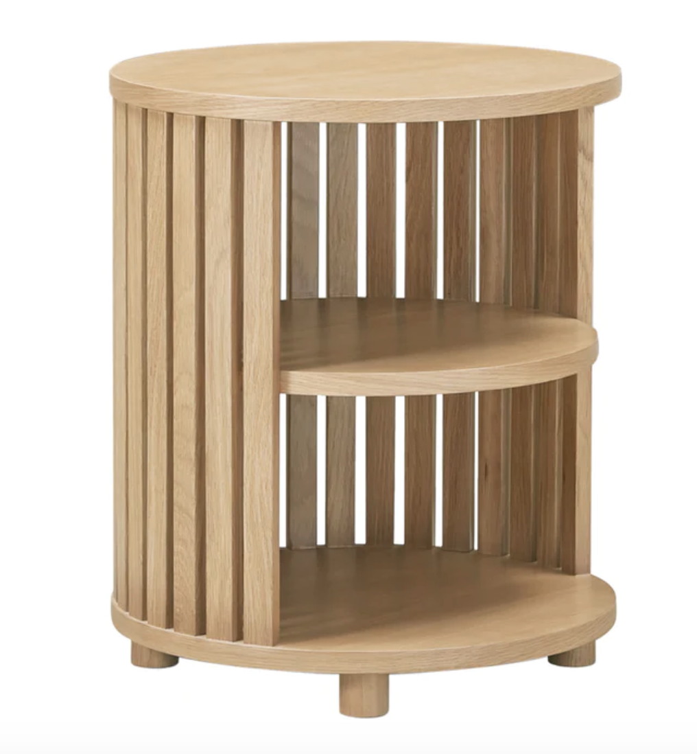
Storage is your biggest challenge, alleviated a little by the drawers under the bed, but i think we need to be ever aware of potential new storage opportunities. Emma, your bedside table is one of those moments! I suggest you replace with this unit from Life Interiors. It is under 80cm wide so could sit beside the bed and house your smalls, leaving more space for Adam in the wardrobe.
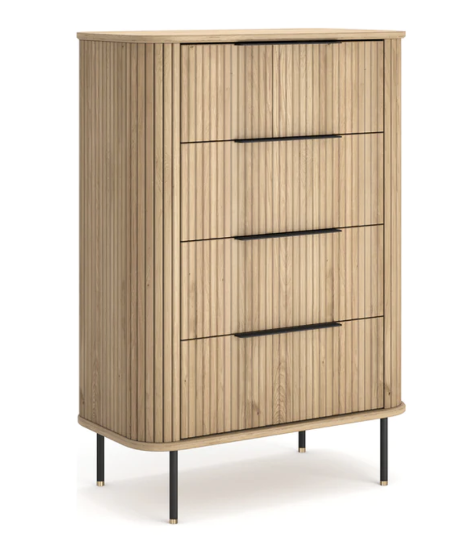
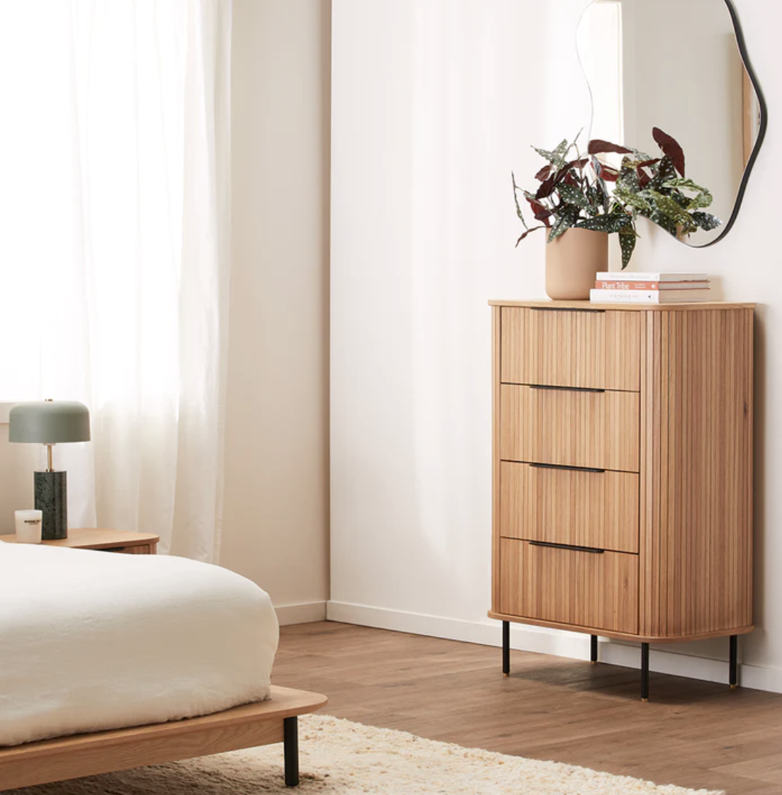
I like the warm colour of the timber and think it would look lovely against the wallpaper, with the pendant light above.
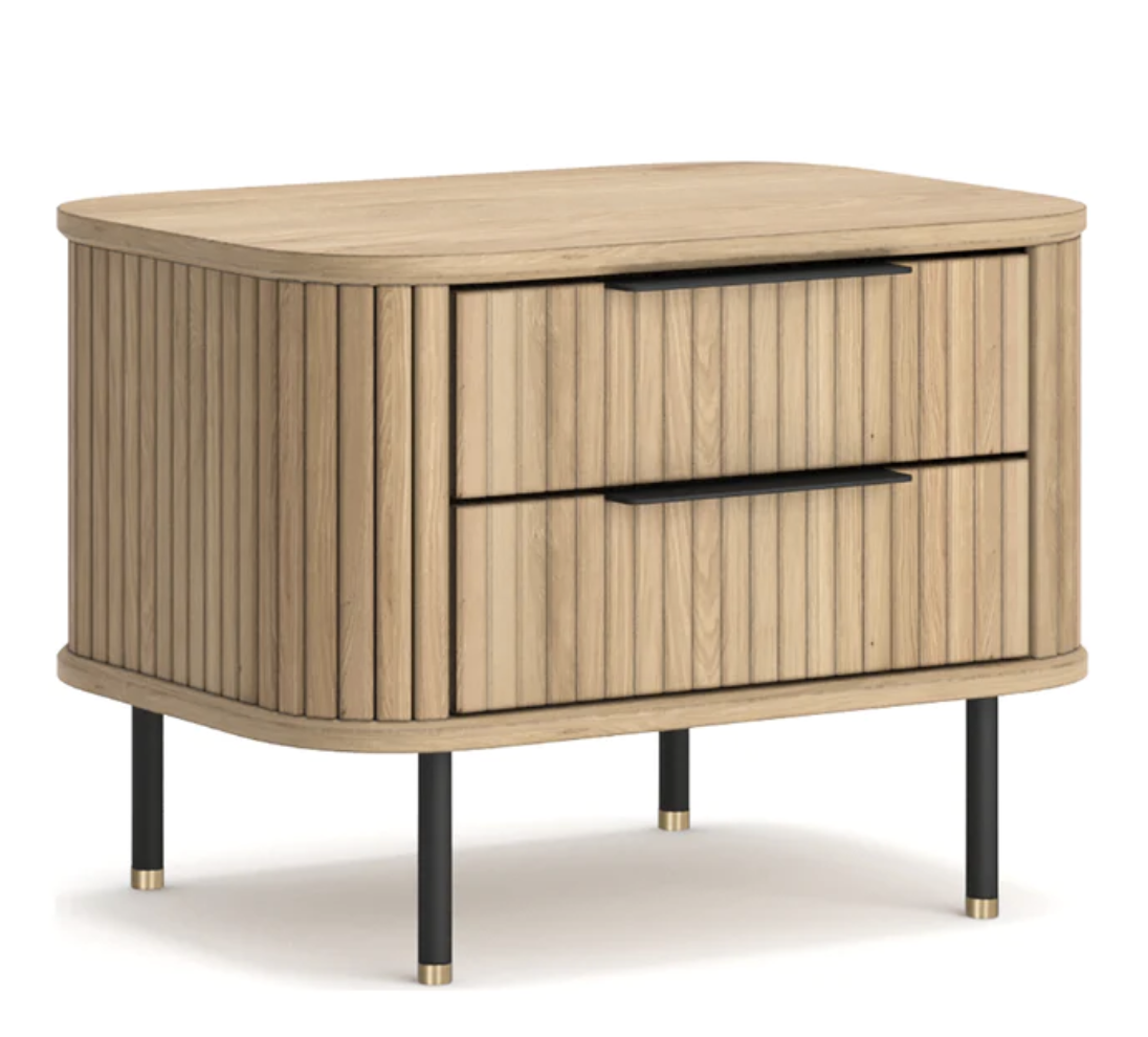
For Adam’s side of the bed, there are less options, as we have very little space to play with. I would definitely suggest replacing the existing unit with something a little more hefty, though. My preference is for the matching Rio, on the left below, which at 56cm wide may be space dependant, or alternatively, the Atlanta at 42cm below right, is a nice pairing.
A good alternative option here would be to place Emma’s dresser on the window wall, allowing us perhaps to move the bed slightly over to make room for the Rio bedside on Adam’s side. We can then place the pendants accordingly, which will then forgive the adjusted balance of the bed being shifted from the exact the middle of that wall.
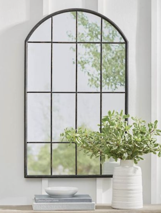
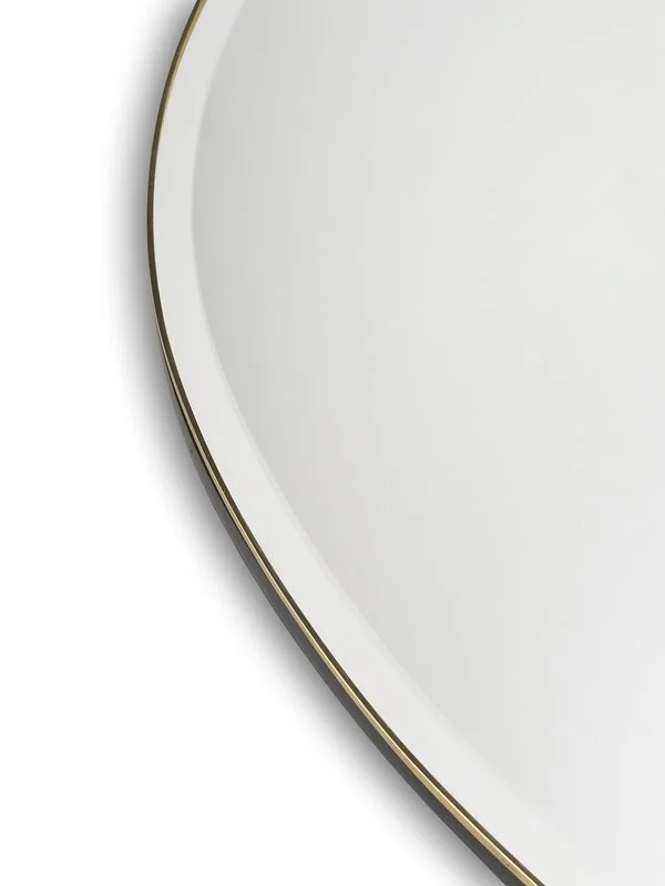
If we do this, I would place a mirror above Emma’s dresser -
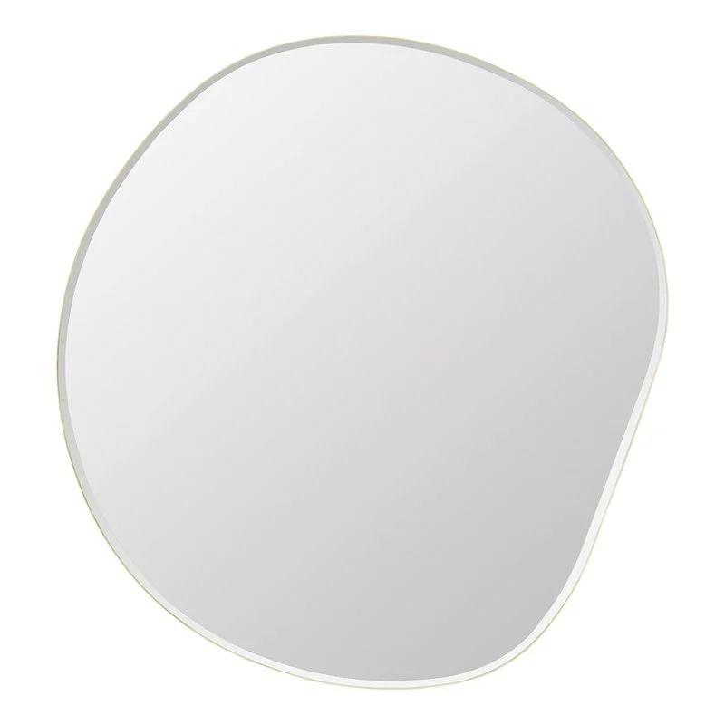
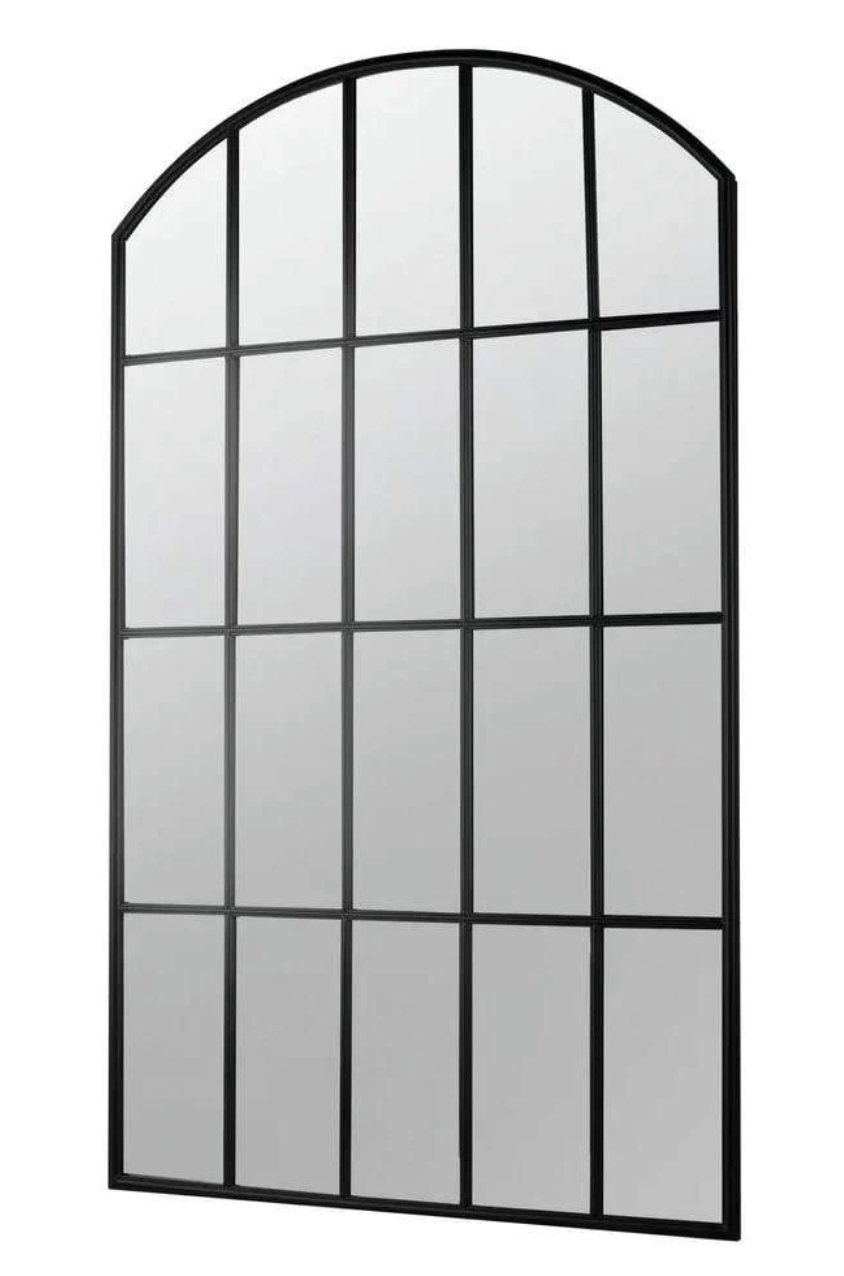
This is my fav - from the Finnish Design Shop, it is called the Pebble Mirror and I just love the brass edge! The organic shape is said to be inspired by the unpredictable nature of flowing water!!! We can hang it whichever way up that looks best in situ, but it too would look divine against the wallpaper.
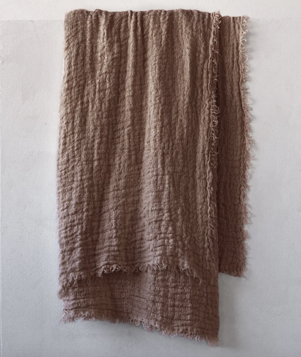
Bed linen is next. As much as love the colours of the linen you have, I think we need a softer and more earthy palette. I believe that like a good pair of shoes can justify a Bonds t shirt, a decent quilt or bedspread can justify sheet sets at a much lower price point. So we go hardcore with a bedspread and throw, and sheets from one of a plethora of online or in-store linen brands. Below is some images of colours I would recommend - these are from Hale Mercantile, which is a fabulous supplier, Australian made.
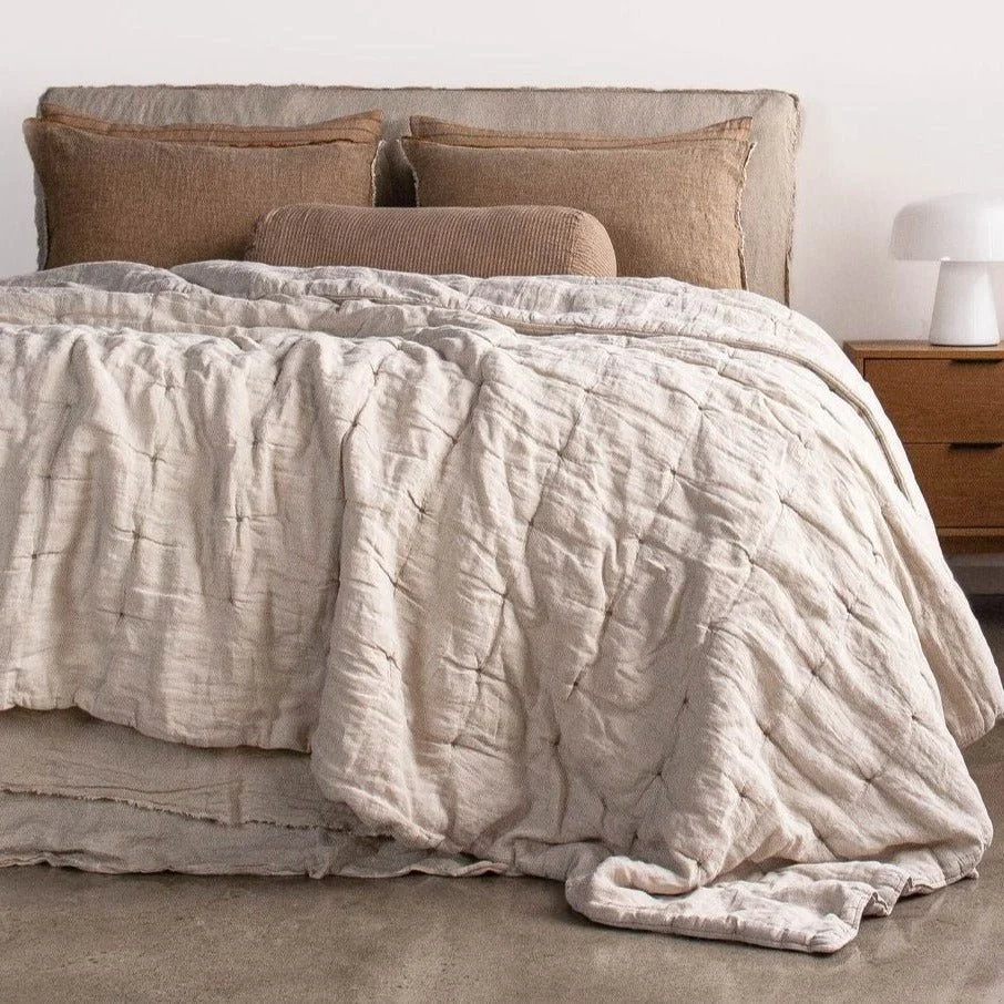
Sheets in warm, earth tones, quilt in a light colour and a throw for the end of the bed as a stronger feature. Mix and match all the earth tones!
I can’t wait to go shopping for luscious linens!
Dining Room:
From the entrance hall, the grasscloth hyena continues into the living space of the home. In the dining room, the only wall to paper is the window wall, but it is the foundation piece for the whole area and will be like a warm embrace!
My idea is to potentially add a narrow frame to the window boxes so that we can wallpaper to the edge and have a neat finish. The inside, or lining of the window box would be better painted for durability, and I propose using the Porters Paints colour Greythorn as it is a lovely match.

The existing grey of the laundry doors is soul-less, so I propose that in addition to the window box linings, we paint the laundry cupboards the same colour to minimise their visual impact and enhance the feeling of space in this area.
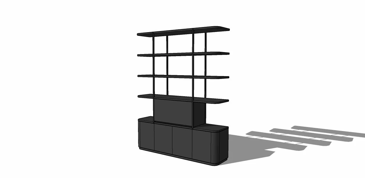
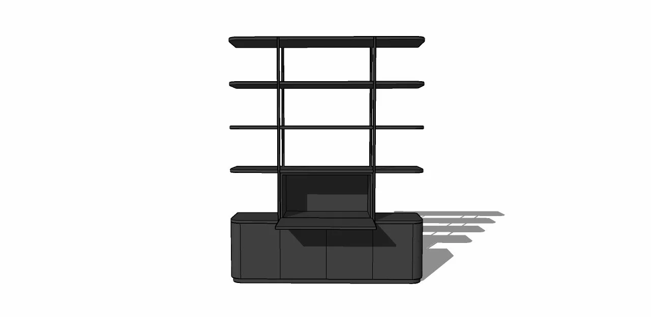
The dining room is more than just a place to eat! In your set up, it also doubles as Adam’s office, and so the challenge was to design a space that could at the snap of your fingers, change from one identity to the other - the Clark Kent of rooms!!!
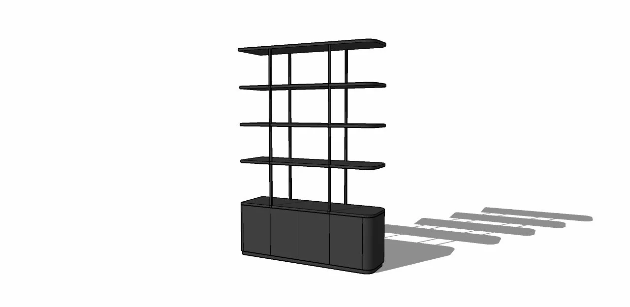
The unit above has been custom designed to fit the bill beautifully. The two cupboards underneath and nearest the window will be the storage for Adam’s computer and other work bits, and the adjacent two can be used for general storage, perhaps for dining table bits, like placemats and napkins, or glassware.
As you see from the sketch, the unit is relatively shallow so as not to impinge on the floorspace too much, and the open shelving above the cupboards allows for the placement of books and treasures without cutting down on the light or blocking the view through to the balcony and beyond.
This will also allow us to use a modular for the living room by providing a logic for doing so, but more on that later.
Using black material here may seem counter intuitive, but the rationale is that it actually reduces the visual impact of its presence, much like a pool fence!! It also adheres to my consistency in materials mantra - less is more! The precedent is set with the kitchen and the window and door frames, so this therefore is the right move.
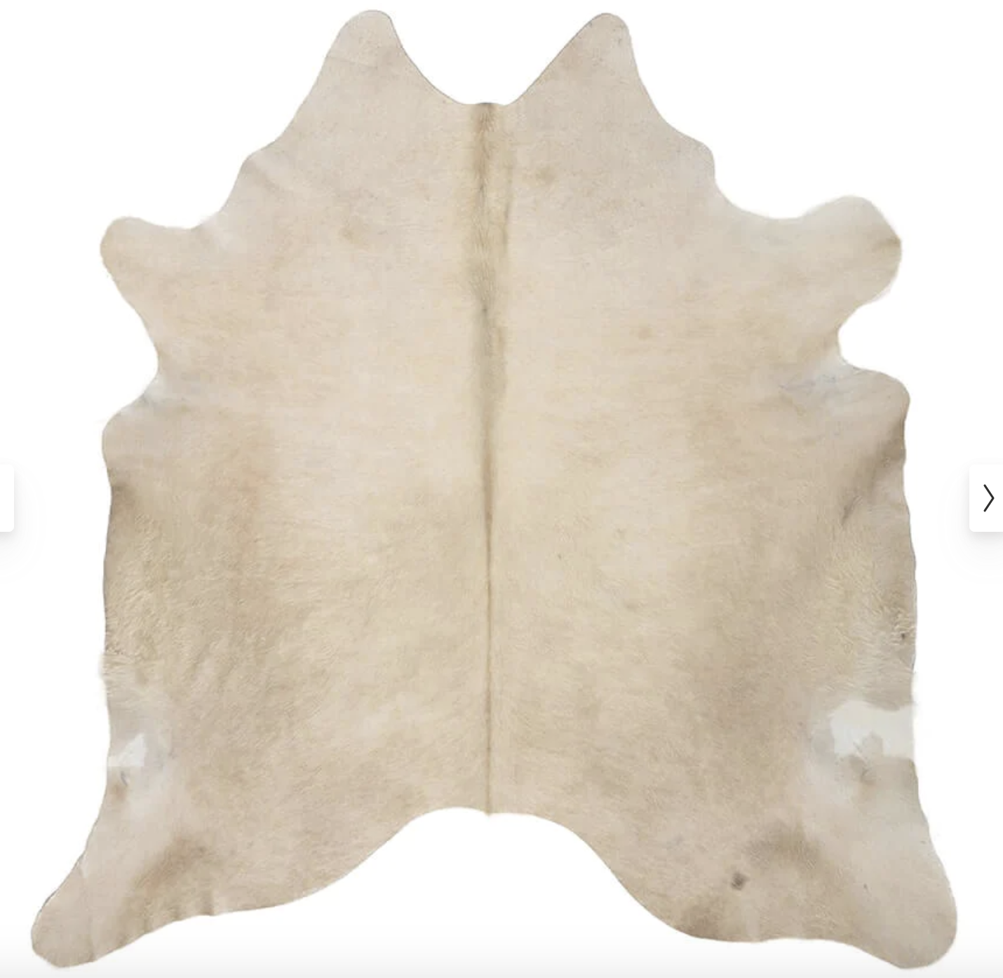
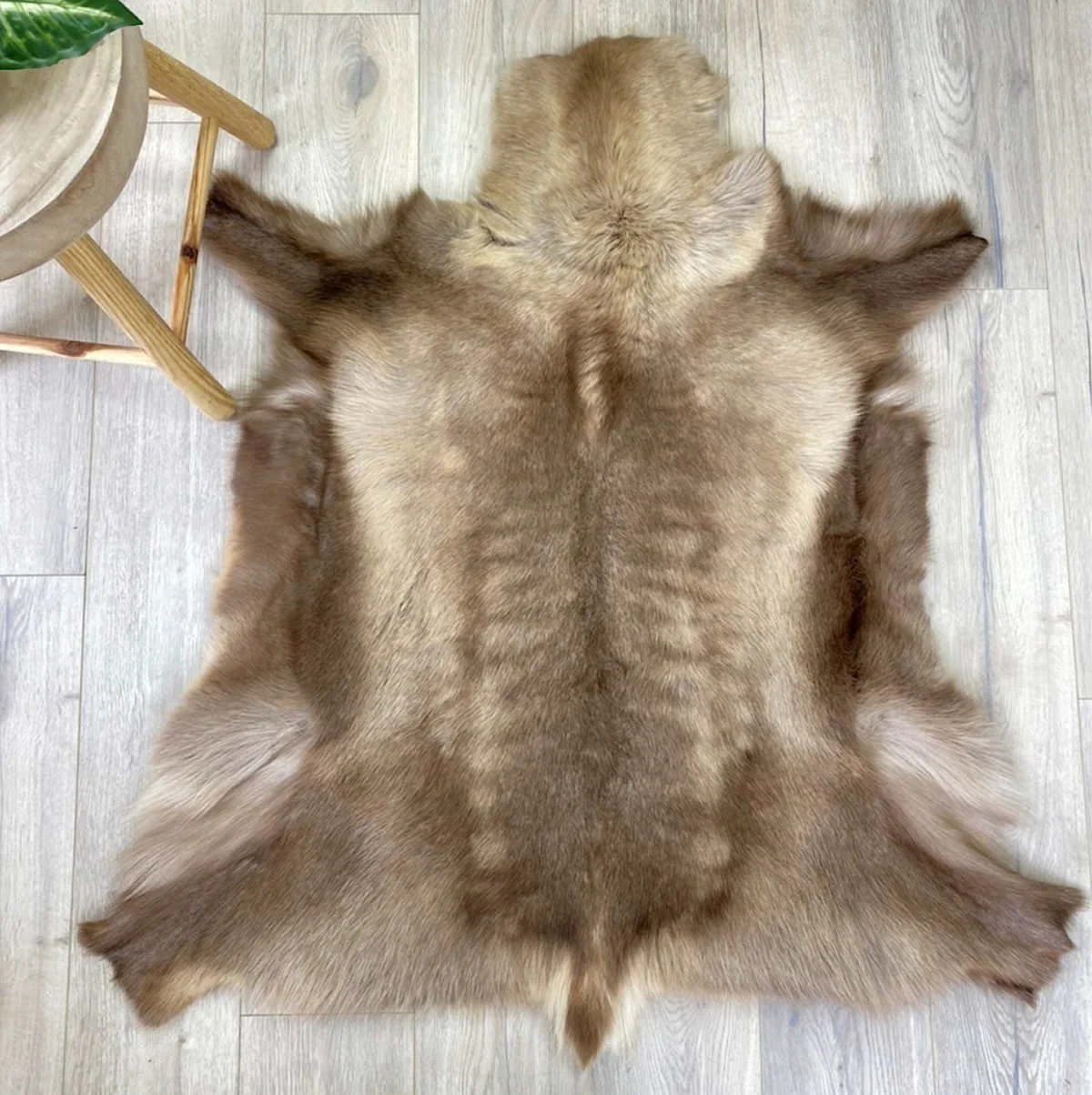
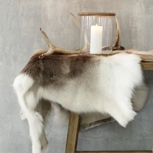
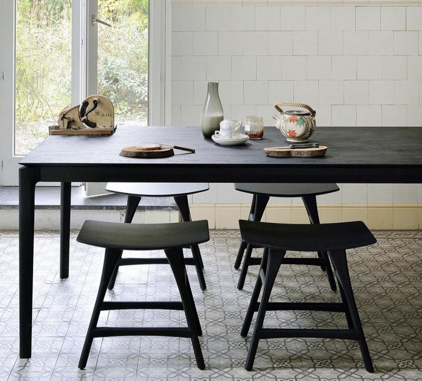
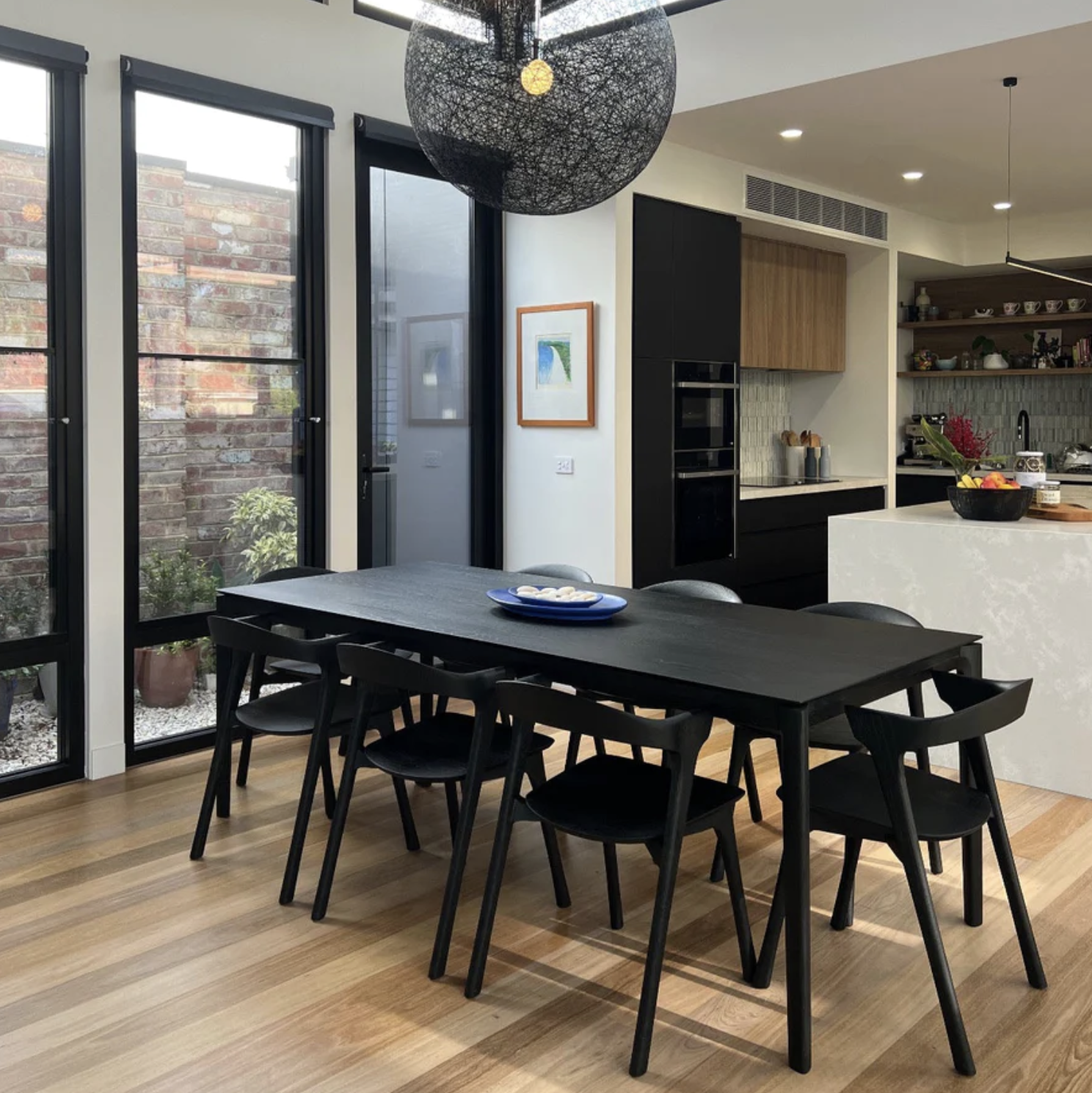
The table and chairs I have selected are also black, but they’ll sit on top of a champagne coloured hide.
The suggested components to consider are below;
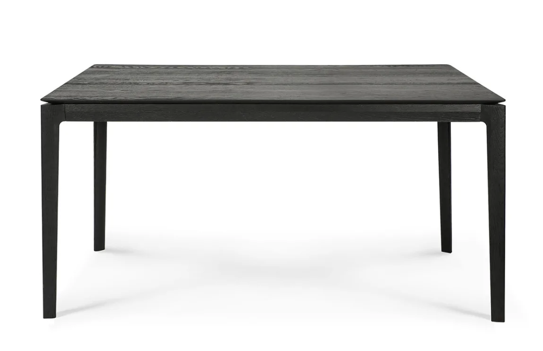
Ethnicraft, Bok dining table - 1600mm x 800mm
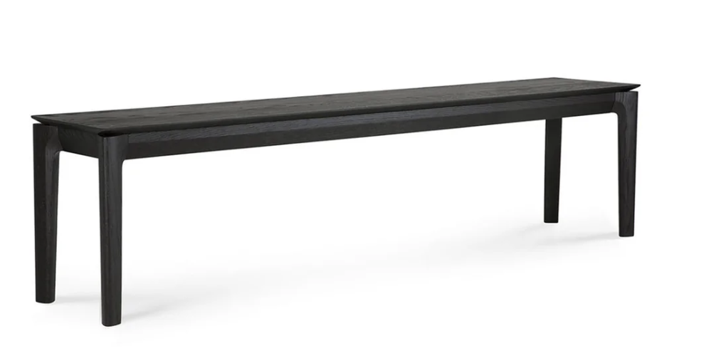
Ethnicraft Bok bench, 1440mm x 350mm
The bench is one option to save space, with two stools on the opposite side and then a chair either end.
That would allow for seating 6-7 people.
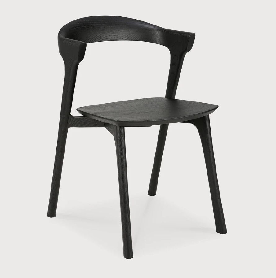
Ethnicraft Bok dining chair
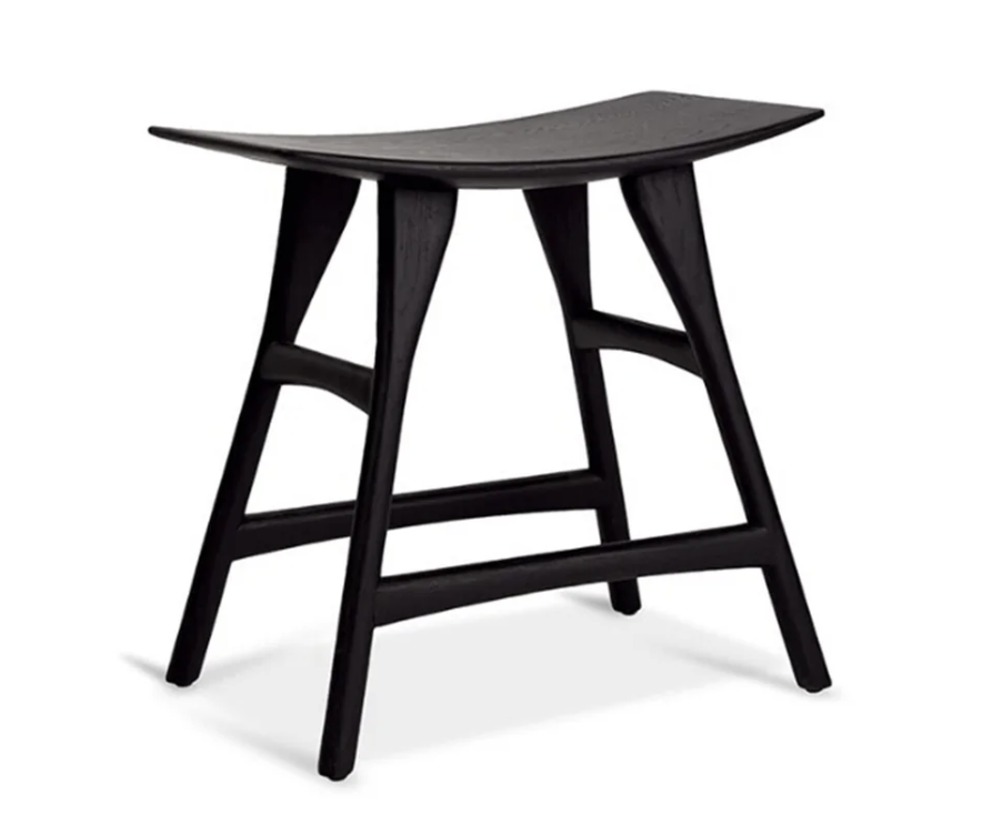
Ethnicraft Osso stool