Your Custom Text Here
Burgess-waites house
Kerrie and Andrew,
The overhaul of your house will happen in time - your time! I know it’s hard with kids coming and going, we have exactly the same thing going on at our place and no one can hurry the process (or for that matter, slow it down!), so we need to lean in and enjoy it for what it is.
For that reason, I am sending you this with the notion that we can achieve bite size chunks of overhaul at a gentler pace that considers four adults living under this roof, not two.
Have a read through, take a look at Simon’s quote, and lets get together and discuss when you have time
Hxx
Entry Hall:
Open the front door and voila - KerrieandAndrewVille. This is the first impression your house has on anyone - including the two of you!
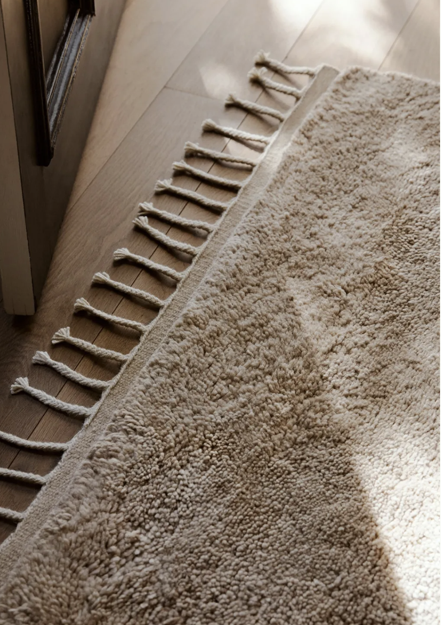
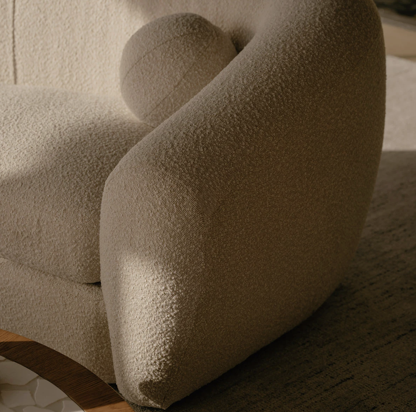
My strong suggestion is that we sand the timber floors and paint them with Japan black it’s contemporary and sophisticated and it’s a fabulous bang for your buck in terms of vibe renewal!
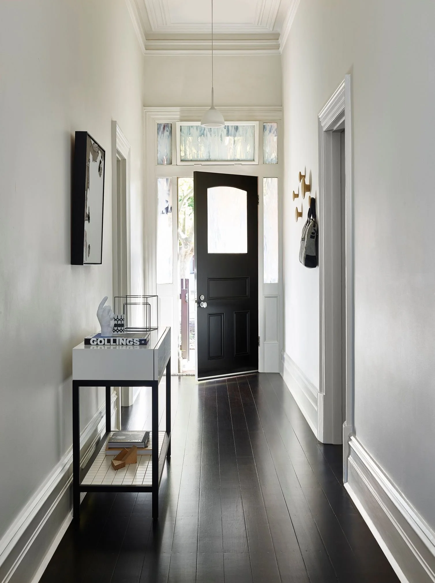
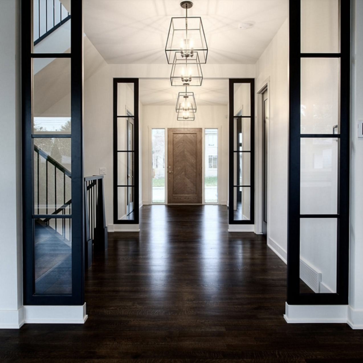
These images are good examples of the finish, which is more of a very dark stain than block black colour. Imagine the hallway right through and including the step down to the living room - all japan black.
The contrast of the blackened timber against the blondness of the travertine will be striking - really modernising the feel and booting out those yellowed boards. We all have an odd attachment to naked timber that the trees certainly don’t share. They cover it in bark!!
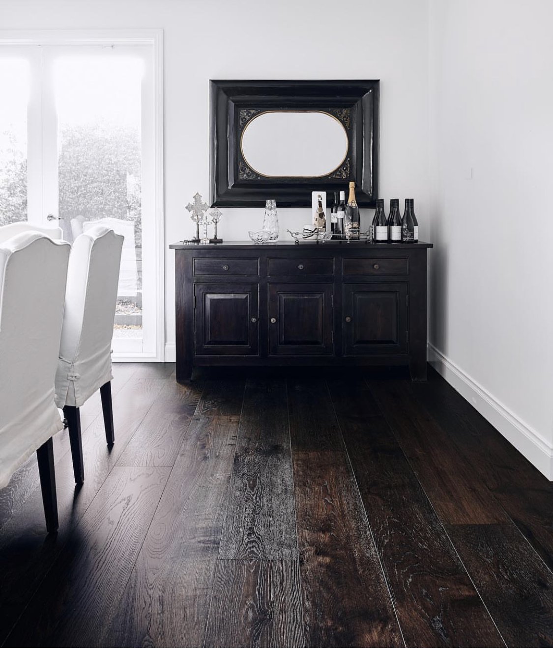
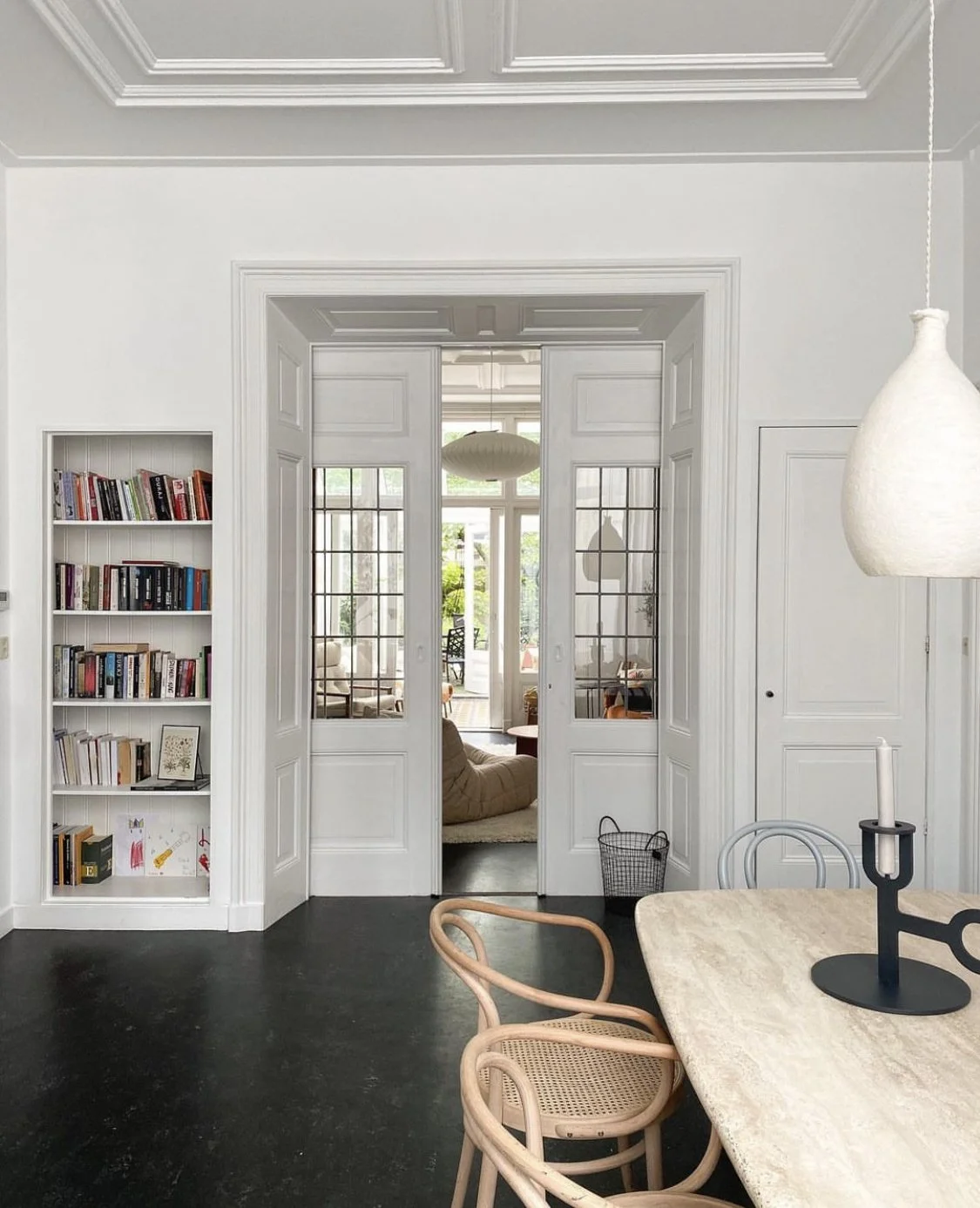
Carpet for thoroughfares is a mad idea, but so too are yellowed timber boards. The japan black has a depth of character that gives the sense of lovely timber, but with a ton more style. It is not expensive, it is totally reversible if you go off it, in fact it’s so good, I have it!!
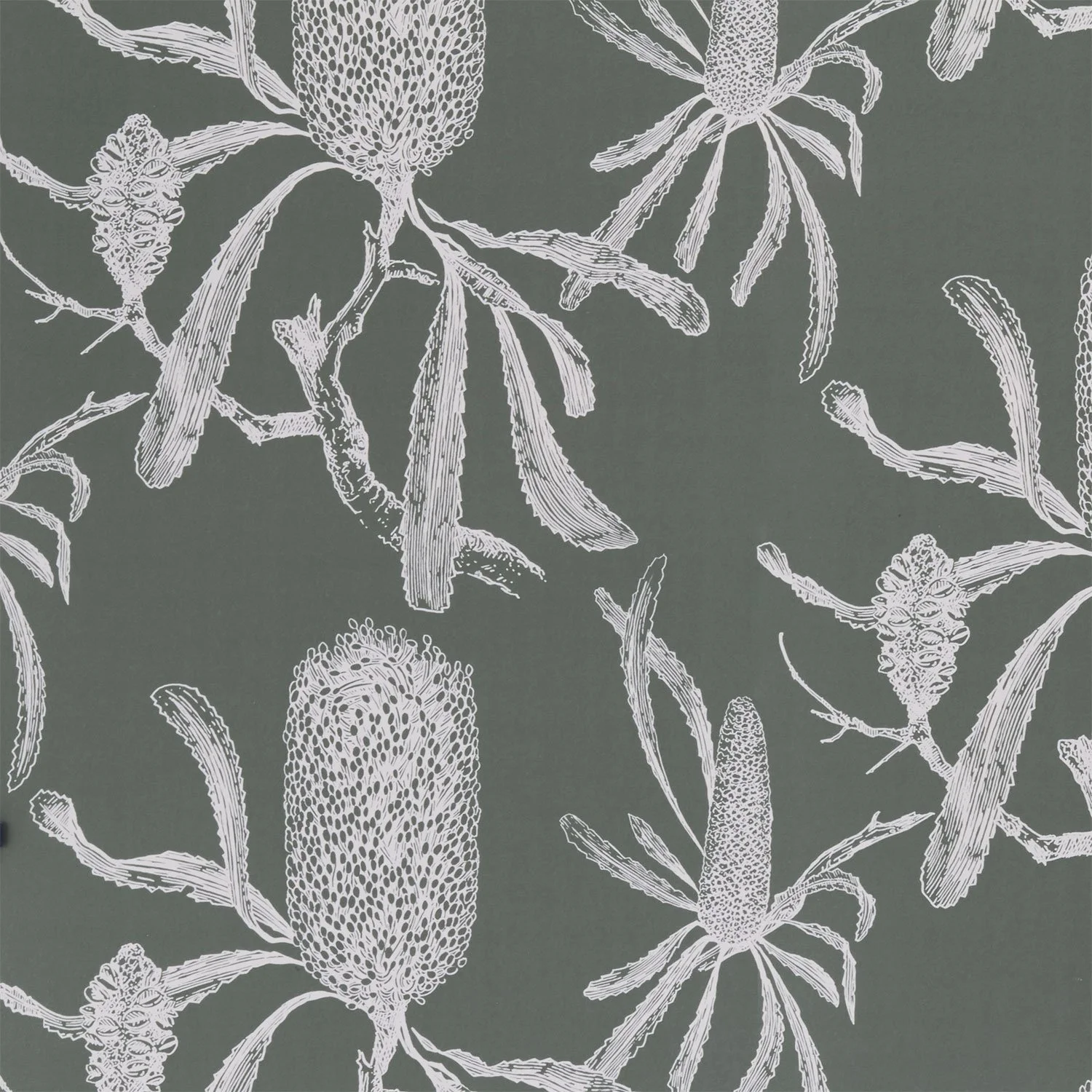
Next in the hallway, I’m getting radical… wallpaper.
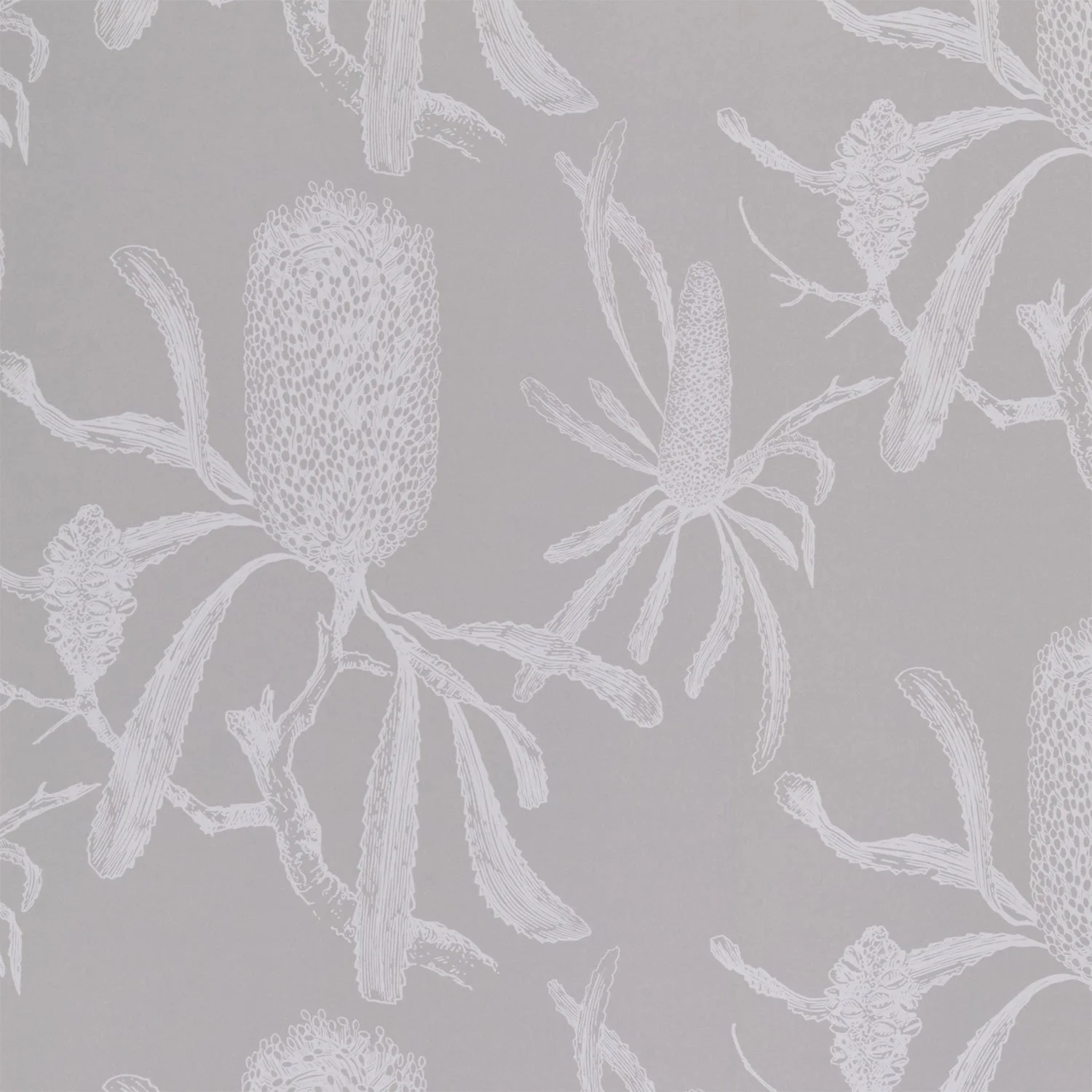
This paper is from Porters Paints and this pattern is Banksia in the colour Fog. Soft and subtle, the uniqueness of Australian flora is really captured and in your hallway, with the black floors, it will be sublime. All woodwork in Dulux Natural White.
I want to repeat the wallpaper in a different colour in the living room - but I’ll come back to that.
You’ve got some great black and white photos of family and I’d suggest grouping a bunch of them on the wall opposite the bathroom door where there are currently two already. Gallery walls are fabulous especially if the pics are framed well and I love the chunky black frames you’ve chosen.
You have a hall table but for the life of me, I cannot retrieve a photo of it - I know I took one, but story of my life, it’s sailed into the ether.
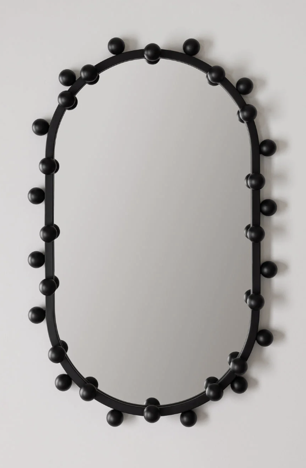
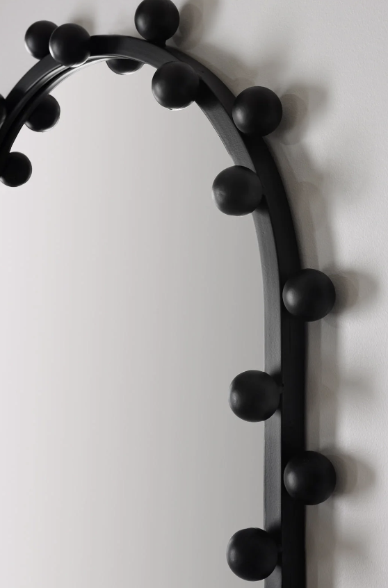
Above it. I’d love to see a mirror because that is the standard practice! Where would we be without a lippy check on the way out? I found this one and I think it’d go really well. At well under $1000, I think it’s a bargain for what it can add.
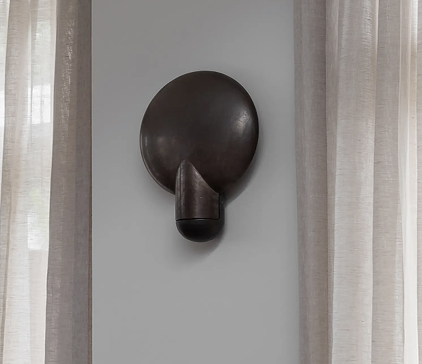
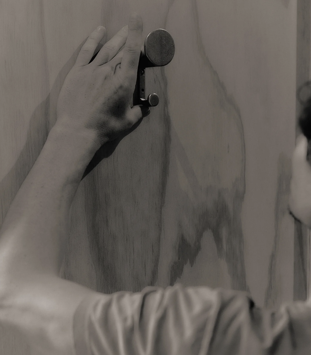
Your David Bromley painting is great, not sure it’s in the right spot but perhaps we could play around with its positioning. It would be good to add some coat hooks in the hall and these, from Studio Henry Wilson are hands down the best around.

Made of blackened brass, good for a hat and a coat! I’d go 3. Also good for dog leads!
Finally for the hallway, light fittings. I know you have downlights and that’s fine and very practical for the longer end of the hall, but for the entry part inside the front door, I’d suggest removing them in favour of something much more beautiful!
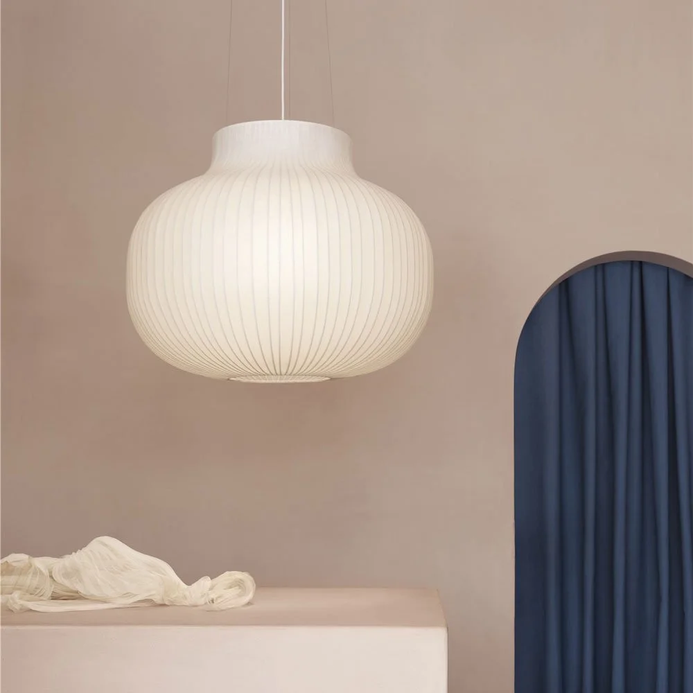
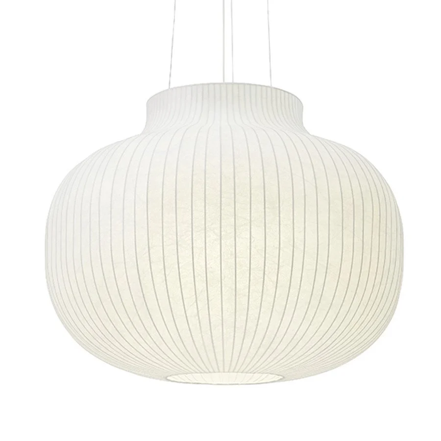
This is a scandi design by Muuto called the Strand pendant and I love for it's understatement!! It has a very contemporary, sleek look and it too, is reasonably priced! I just think that to have a pendant at the front door is so much more inviting than downlights.
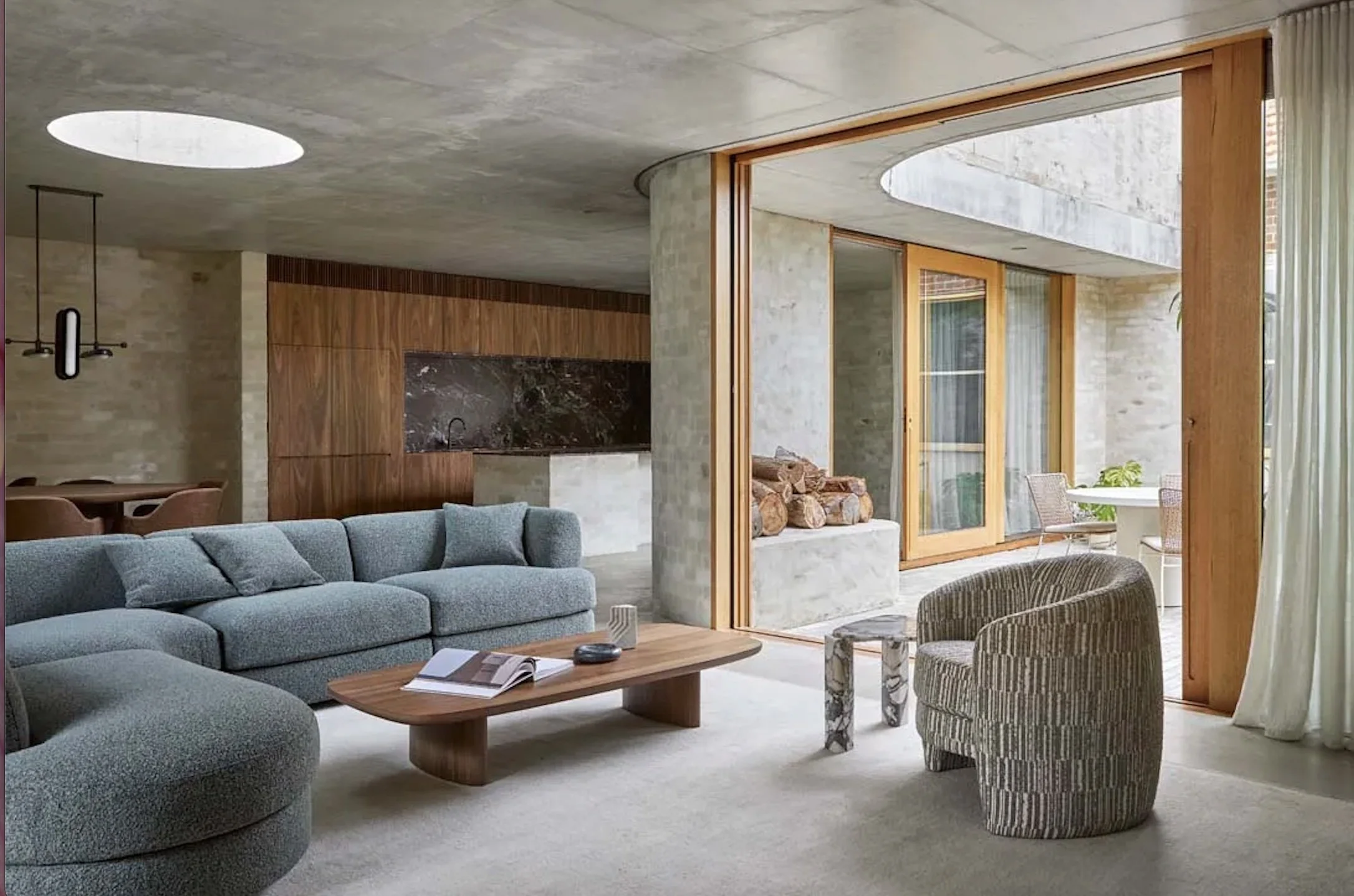
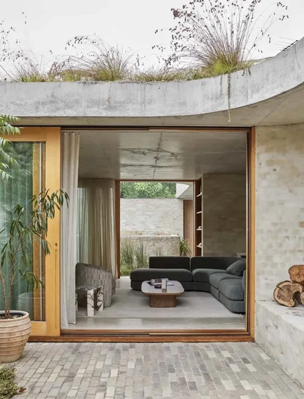
Living room:
The adage, ‘less is more’ came from design and it is never truer when applied to interior design. Repeating design elements, fabrics, colours, textures… throughout an interior scheme has the effect of a sense of cohesion, of purpose, a deliberate curation of important aspects of the whole. It also gives a feeling of flow and of harmony - and the way I look at it, we can all do with all the help we can get in this department!
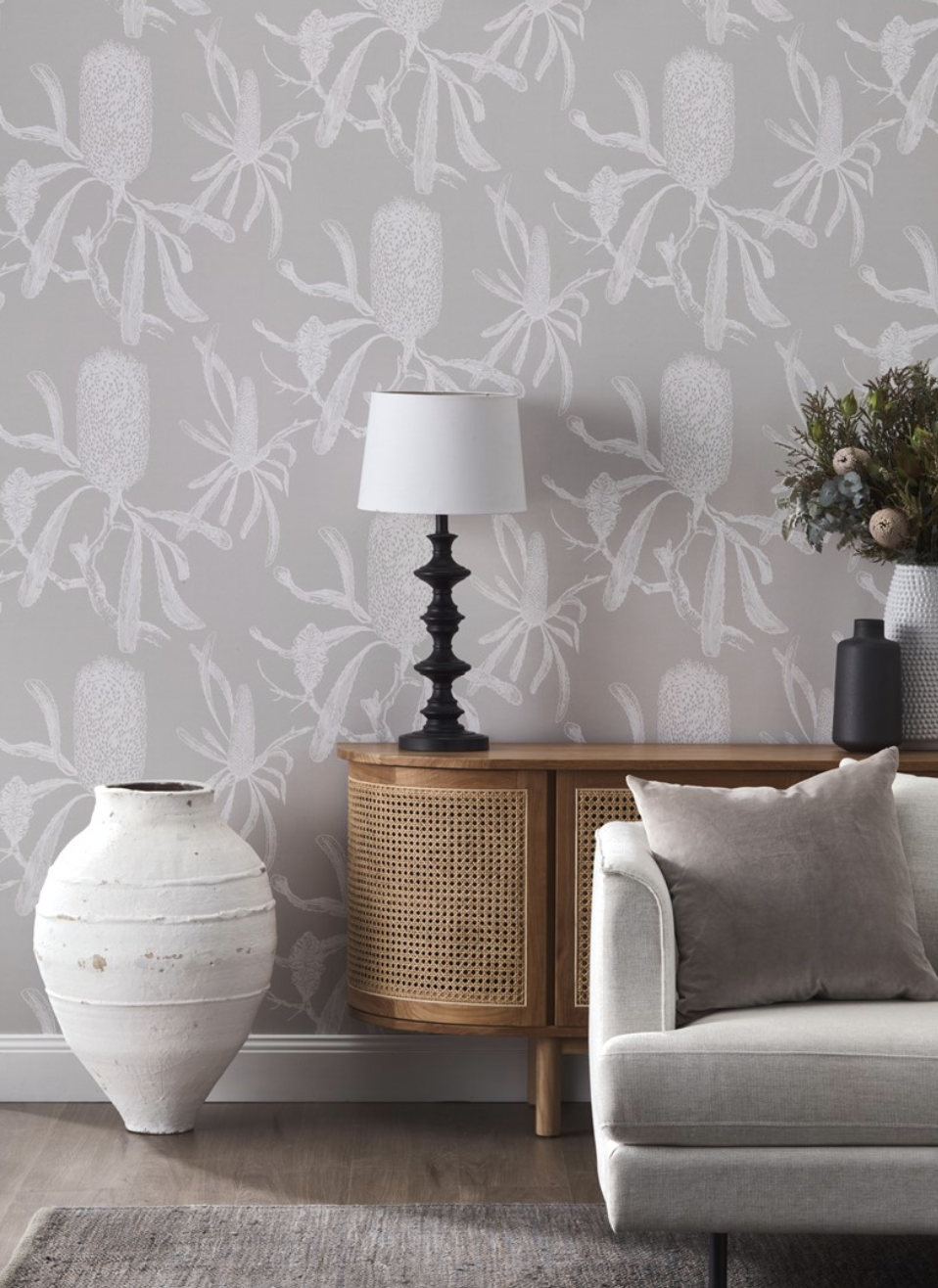
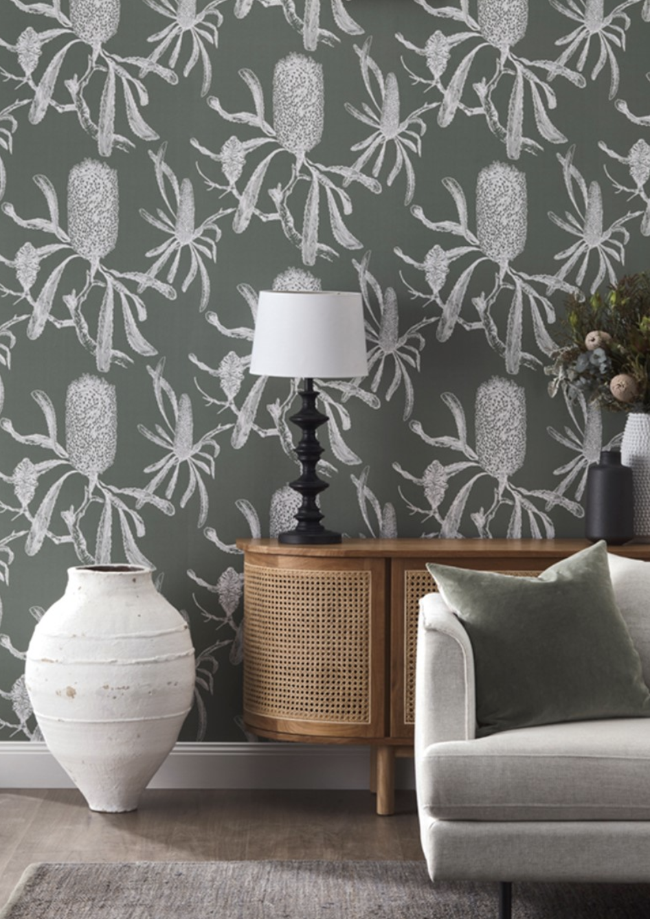
With this in mind, I propose we repeat the wallpaper on the living room back wall that is currently painted, but this time, it’s the same paper but in a different colour.
The room is filled with light and beauty coming in from outside and so it can well take the deeper colour of Bushland. What I love is that against the backdrop of the harbour in steel and blue, the banksia green offers a grounded counterpoint!
It will also be great with the black notes being suggested here,
Ideally, you’d remove the book case in here. There are other ‘reading rooms’ in this lovely big house that will be bookcase lined and screaming for you to lie in repose with nose in a book and so you don’t need the clutter in this room. This is a room for elevated beauty and reflection! (you like that??!!)
So let’s furnish it.
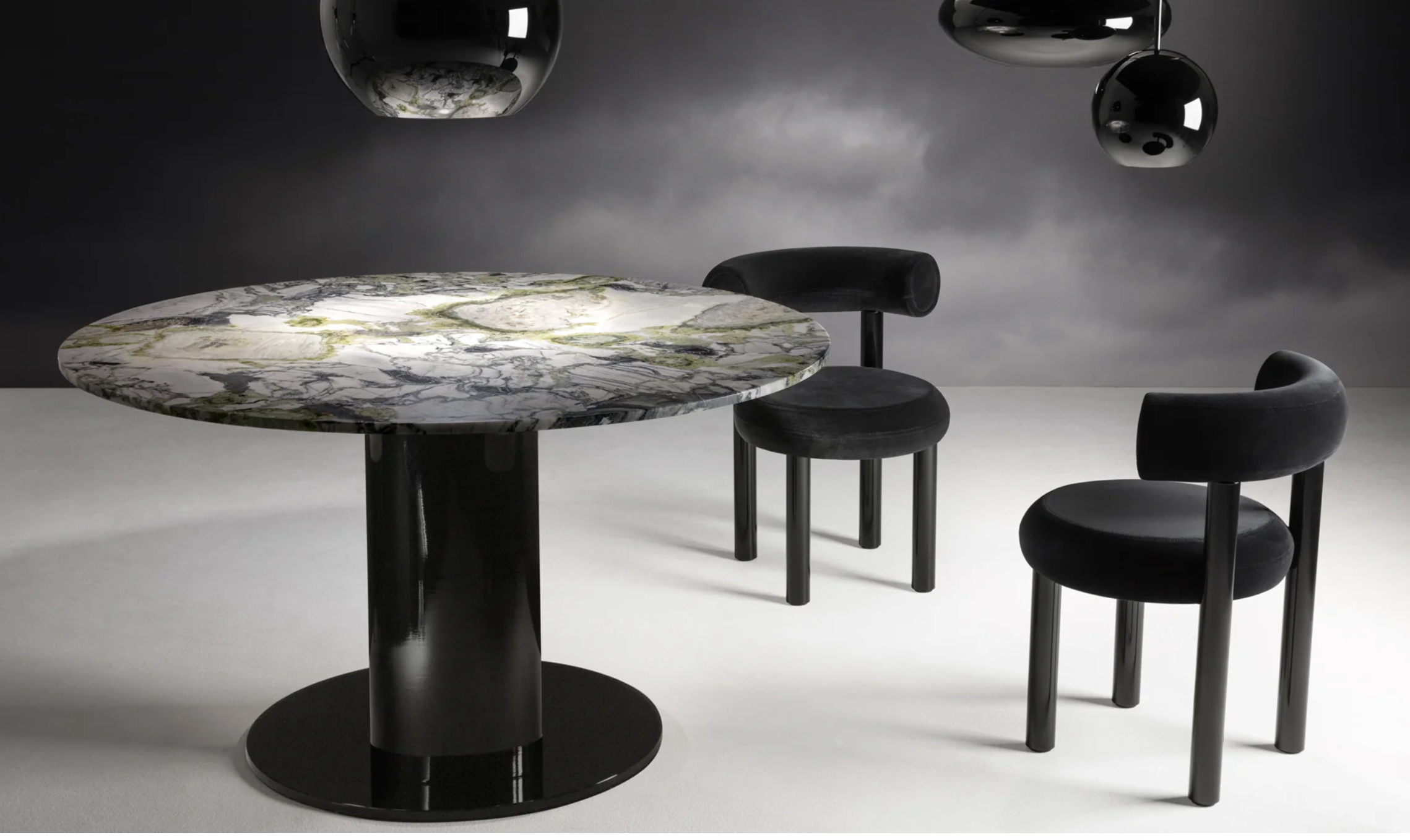
The first thing you see as you enter is the dining table. Shoot me if you need to, but the table and chairs have to go and no doubt, grateful and yet-to-furnish-their-own-house daughters will happily take them. We replace with this beauty. It’s called the Kin table and if you buy it from Manyara home you may lose a limb, but through Globewest with my trade discount, both ams are safe.
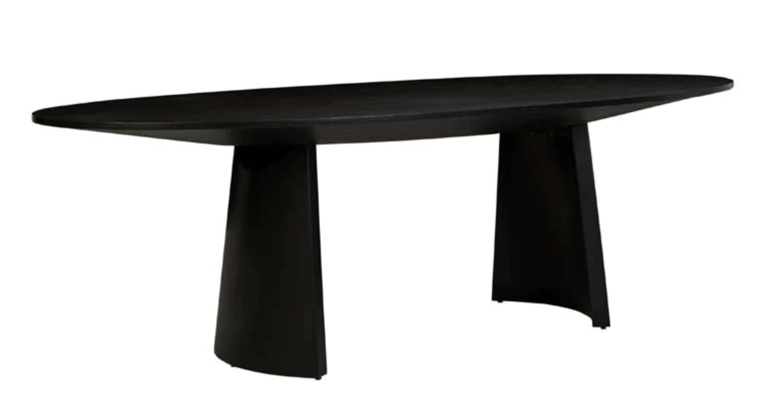
I think there is one on the floor at Manyara in Mosman, so I’d suggest you wander up some time and have a look. It’s beautifully made and the base pieces are far enough under the table not to get in the way if you need to seat more. It comes in a 2400mm and a 2700mm and it’s 1100mm across at its widest part. The elliptical shape is so graceful and the black ties well with the theme we have established in the hallway.
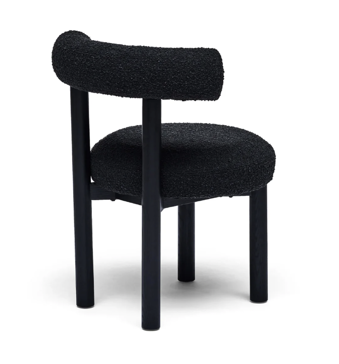
Dining chairs are next - I’m not mucking around. Top of the pops are the Tom Dixon (english designer) upholstered ones. They’re fabulous and the best part is that they’re so comfortable. But off come those arms. Exxy.
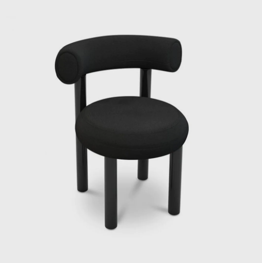
If you’re familiar with Tom Dixon, you’ll know his stuff is not cheap, but it is really divine.
There is an alternative - from Horgans. It’s a rip off of the Tom Dixon - a fact that might deter some (me included) but budget is an issue for absolutely everyone.

Above the dining table there should be another pendant as a means by which to create a sense of dining intimacy - lighting is absolutely everything and I reckon even a prison cell can be made 100% better with good lighting. (As long you don’t share it with a murderer.)
Furthering my theme on design cohesion, I’d suggest another white pendant but this time, by different Danish designer called Normann Copenhagen. This is called the Phantom, medium size 440H x 800W.
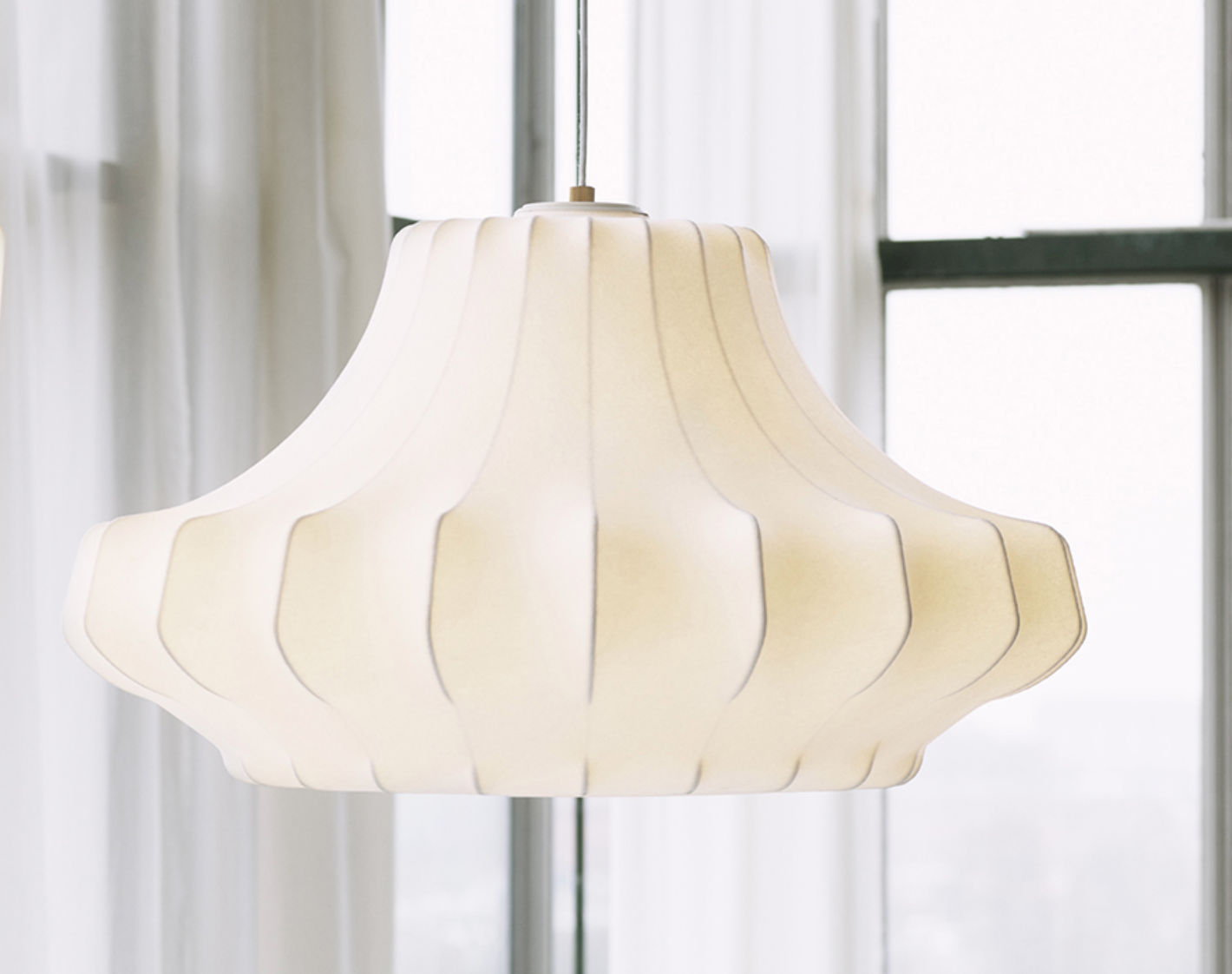
As you see, it’s more an ivory colour when lit, but the semi-transparent resin material with which they’re made has a clean and simple elegance that won’t compete with the view!
Under the table, a rug. Now I know you guys are keen on Persian rugs and if you don’t want to change from that, then I totally respect that. But as an alternative, you might consider these from Armadillo. The rug is hand-knotted from NZ wool and is chunky and fabulous - casual and relaxed in style and a lovely match for your tiled floor.
It’s a berber style rug with plaited tassel ends and it’s so thick and lush. I’d suggest one under the dining table and another the same colour but slightly different size, in the living room.
So we’ve wallpapered the living room, chucked out the bookcase and all items of furniture…. let the fun begin.
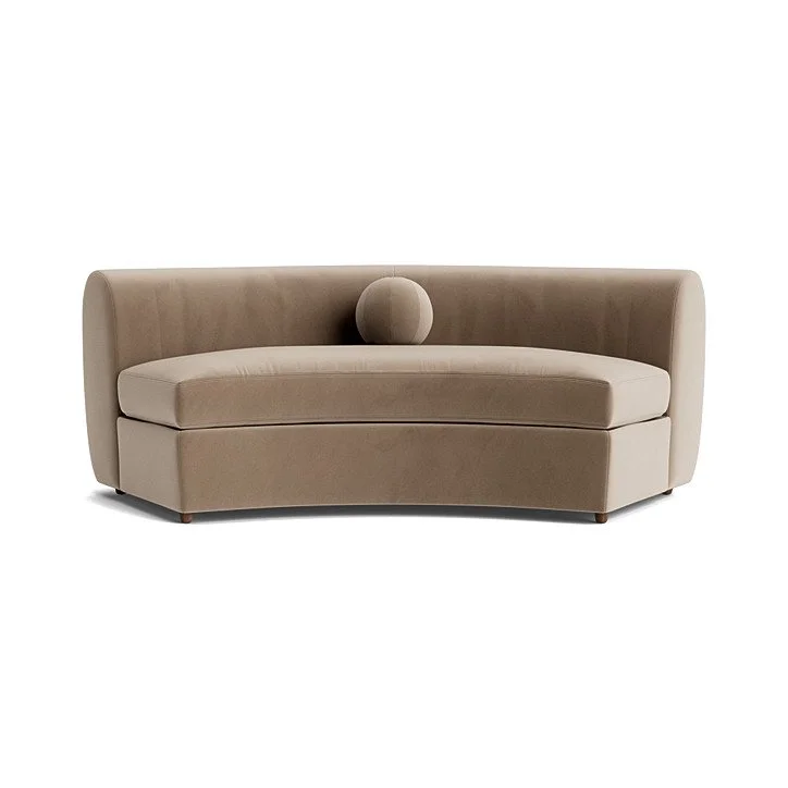
Option 1:
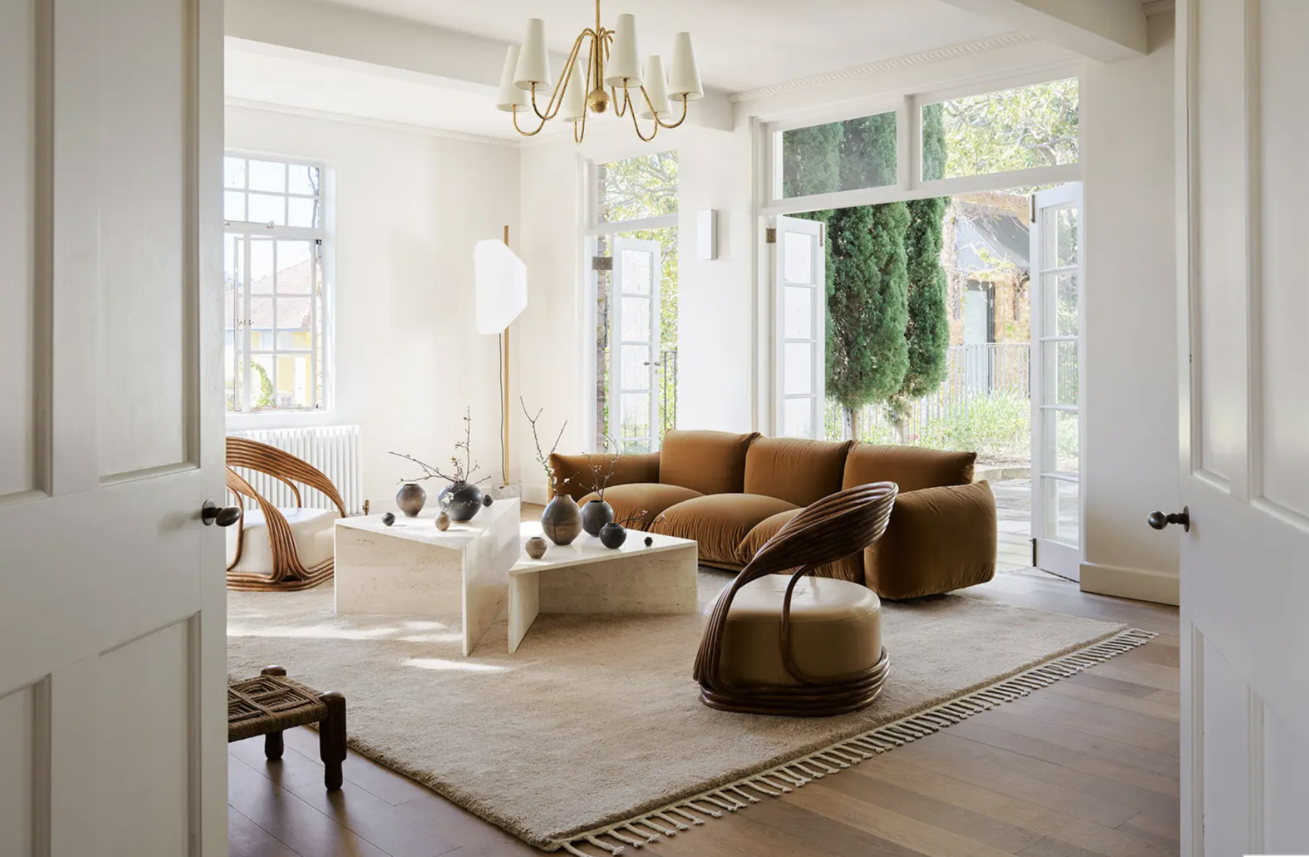
I love Jardan furniture because it is high quality and Australian made. The Lemmy is divine and I think would look amazing in your house.
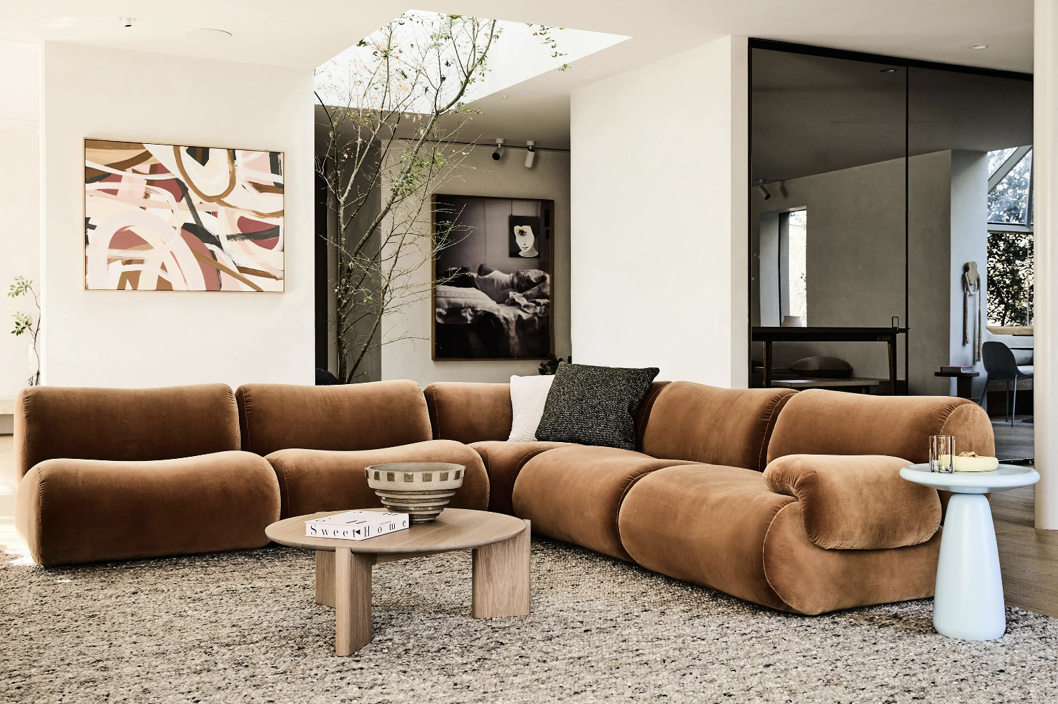
It’s modular and it’s ridiculously comfortable. You can select which configuration would suit you best, but I’d think the layout pictured above would be pretty ideal for you. By some brilliant stroke of luck, the Lemmy is also pictured here in the exact colour I’d suggest for you - Elk Velvet in the colour Copper. Velvet is so lush - being cotton it is reasonably easy to maintain and it has all the beauty of leather without the cost or the worry.
I recently dropped a swatch book of Jardan fabrics as I know you weren’t keen on the colour above. I need to collect that swatch book and return to Jardan at some point, but perhaps have a flick through and see if any others appeal?
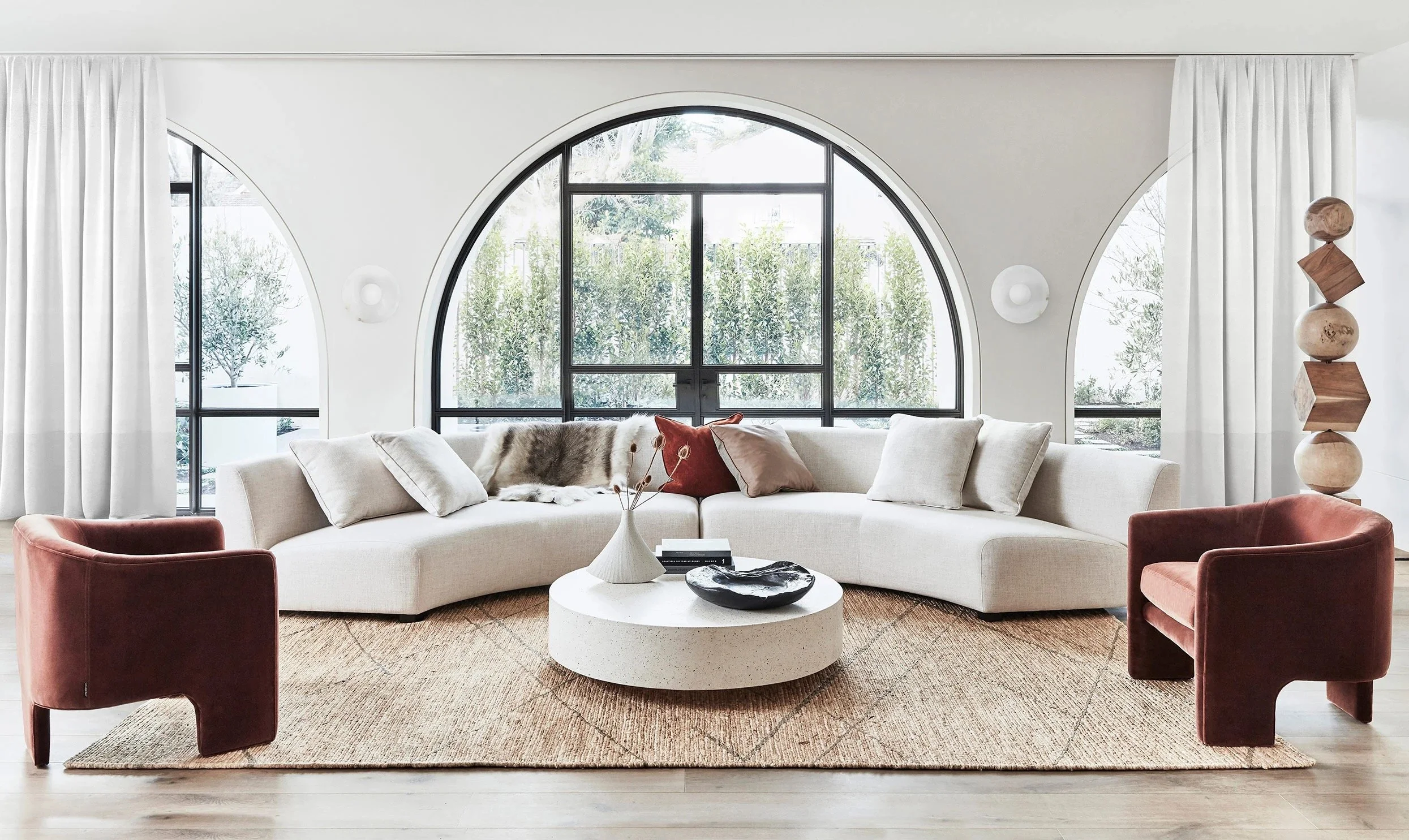
Option 2
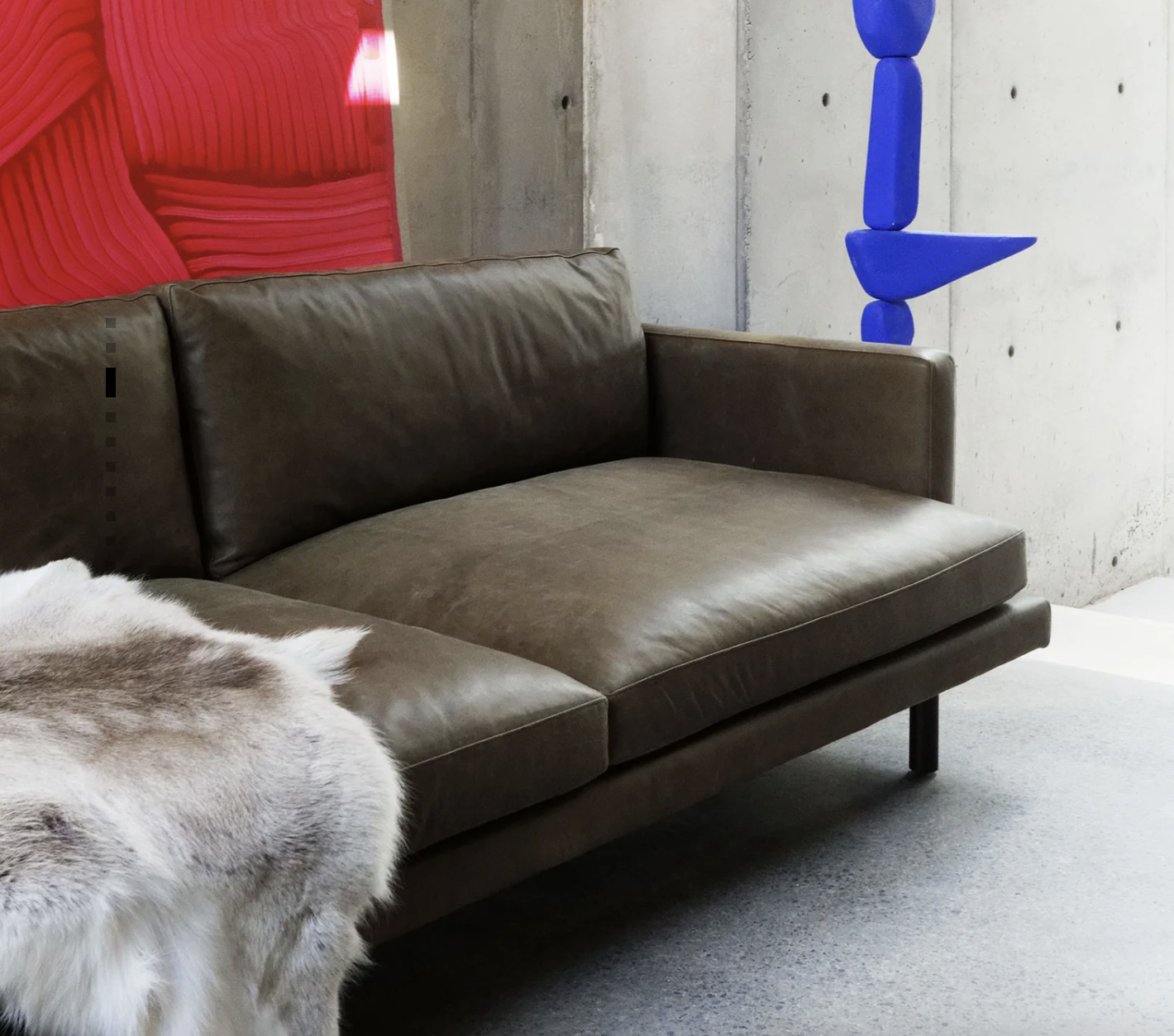
Franka is a local supplier, the furniture is designed and made here in Australia and there is a wide variety of fabrics and leathers to choose from. The range I suggest is the Lennon - in the Murano leather, colour Brunswick.
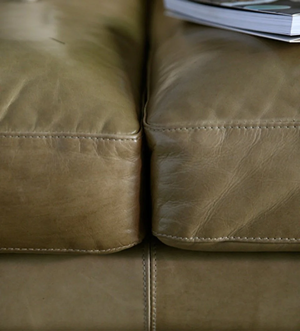
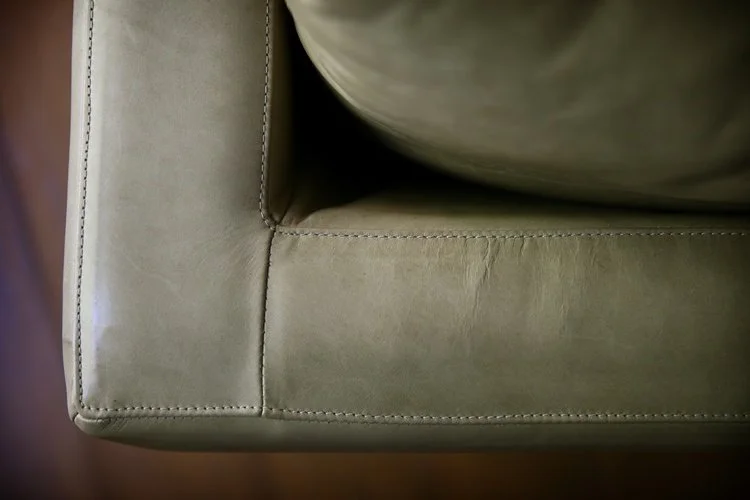
These close ups show the craftsmanship in the detail and you can feel the lovely soft texture of the leather in the swatch I have delivered.
The configuration is totally customisable, I’d recommend a modular that fits to your specific space with max capacity.
Option 3:
At a lower pricepoint, Globewest do a modular called the Madrid. I’ve included a swatch of the green that is really lovely, but there is another more neutral colour called Wheat coming out in September.

It’s very comfortable and can also be customisable to the space by selecting individual units - corner pieces as above, the chaise end, as pictured below, and the single units between.
I’ve included the picture below despite it being in the white (with subtle black fleck) as it gives a better idea of the piece than the location shots above. But like any of these suggestions, you really need to go and look and sit!!

A coffee table is required…. I think you need a couple because there is a lot of space and plenty of seating and it’s annoying not to have somewhere to put your wine glass!
Option 4
Coco Republic do a good job in lounge furniture and the one I’ve selected is called Atelier. I love the curves!
I love the colour Mushroom, but it’s also divine in the boucle for texture.
It will depend on what you prefer as to whether you add an armchair to the modular, it’s a nice way to circle the space when entertaining and it also adds to the cosy vibe. We need to first see what your reactions to the above options are before exploring chairs further.
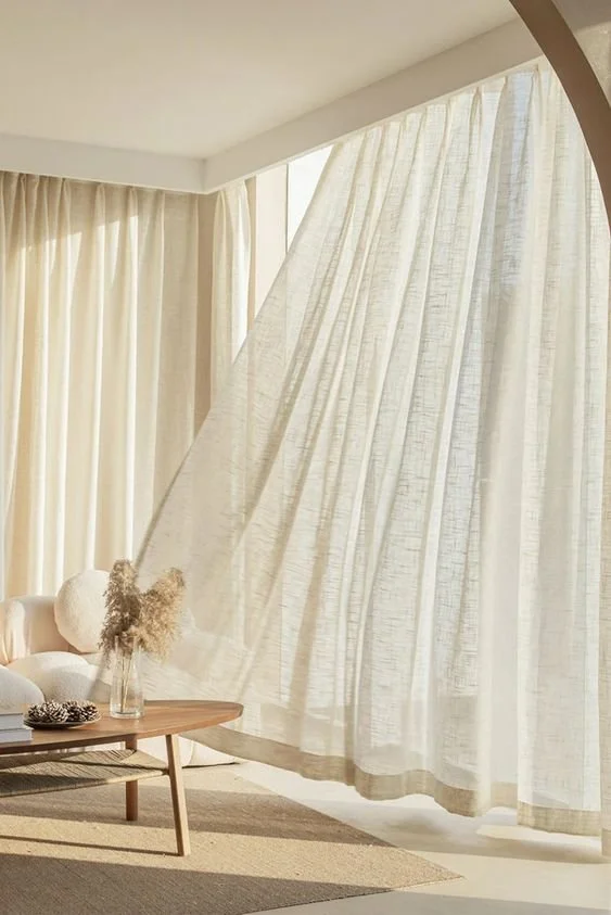
Curtains…. I’m a fan or a sheer because they add so much oomph to a room, character and warmth and softness - all the things I love. The more natural linen look is a good starting point, especially when there is such a stunning view beyond.
You have said you’d like blinds instead of curtains - I am investigating! More shortly.
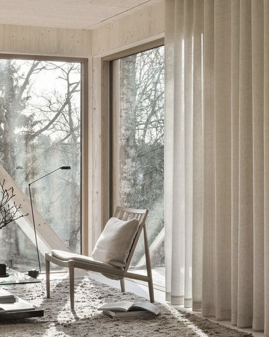
Cooling on a hot summer’s day, warming in the winter, I’d suggest sheer linen (NO PUDDLING) around from your living through to dining areas. (samples to come)
The rug is the same as in the dining room, as I have mentioned, but it is pictured below in a living room application - you see how the palette is building with warmth and light at one end of the spectrum, adding strong black contrasts for that contemporary, stylish look.
I’d love to help you source a large painting or diptych for this room, and I know we can find something perfect. But it is probably necessary for us to talk more about what you like before I jump to any conclusions for the purpose of this plan!
The last thing here is lamps. I’ve already punched two new holes in your ceiling and I’m thinking you may not have the appetite for a third. So as lighting is, as mentioned, the numero uno even for murderers, we are going standard lamps and these beauties are the beezkneez.
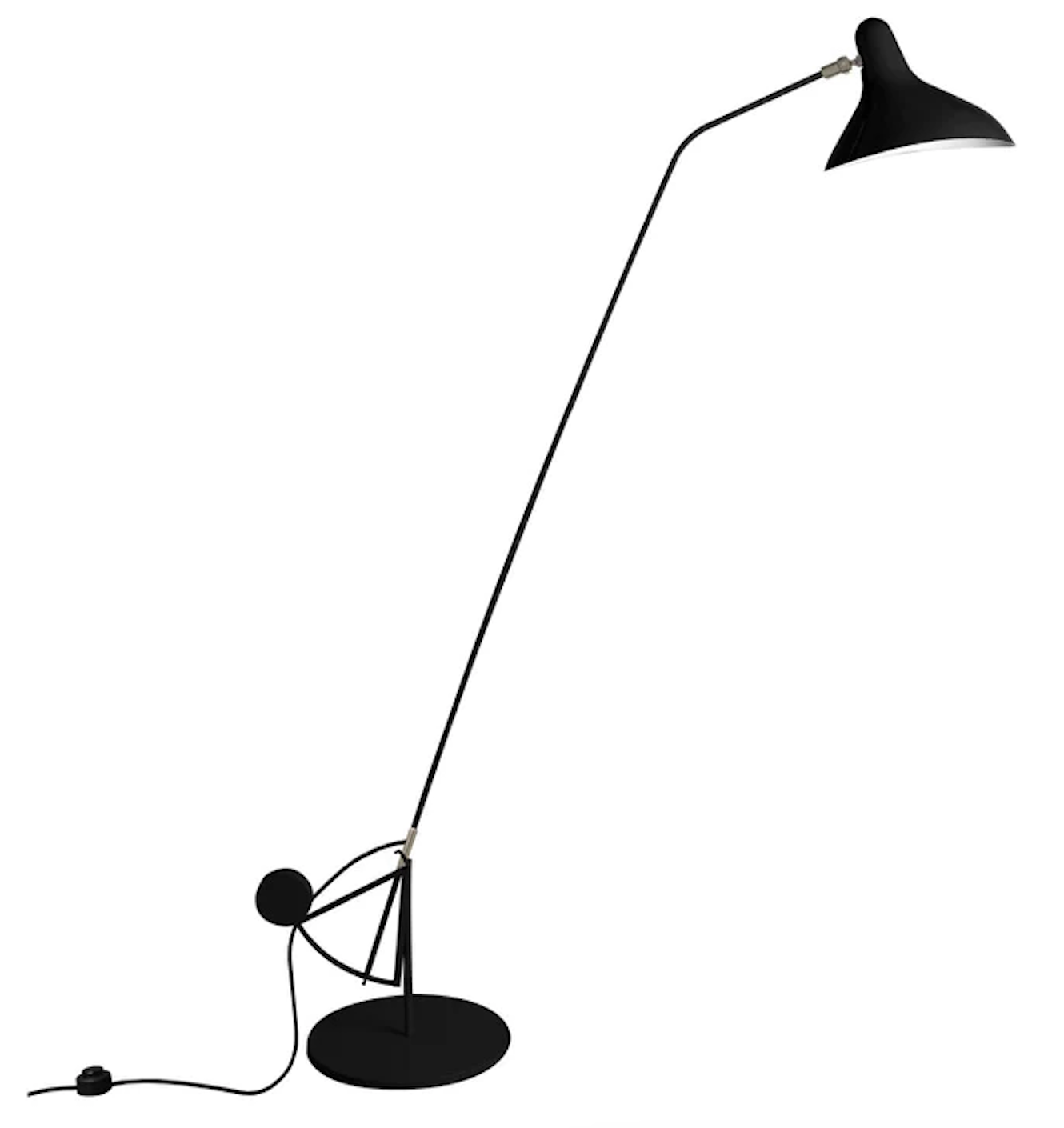
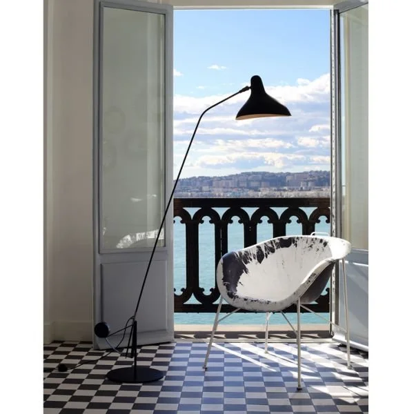
For all the reasons the white pendants overhead are perfect, these black floor lamps work too! They fit with the contemporary black floors and furniture, but they don’t make a fuss. Designed by Bernard Schottlander in the 1950’s in London, they’re super cool.
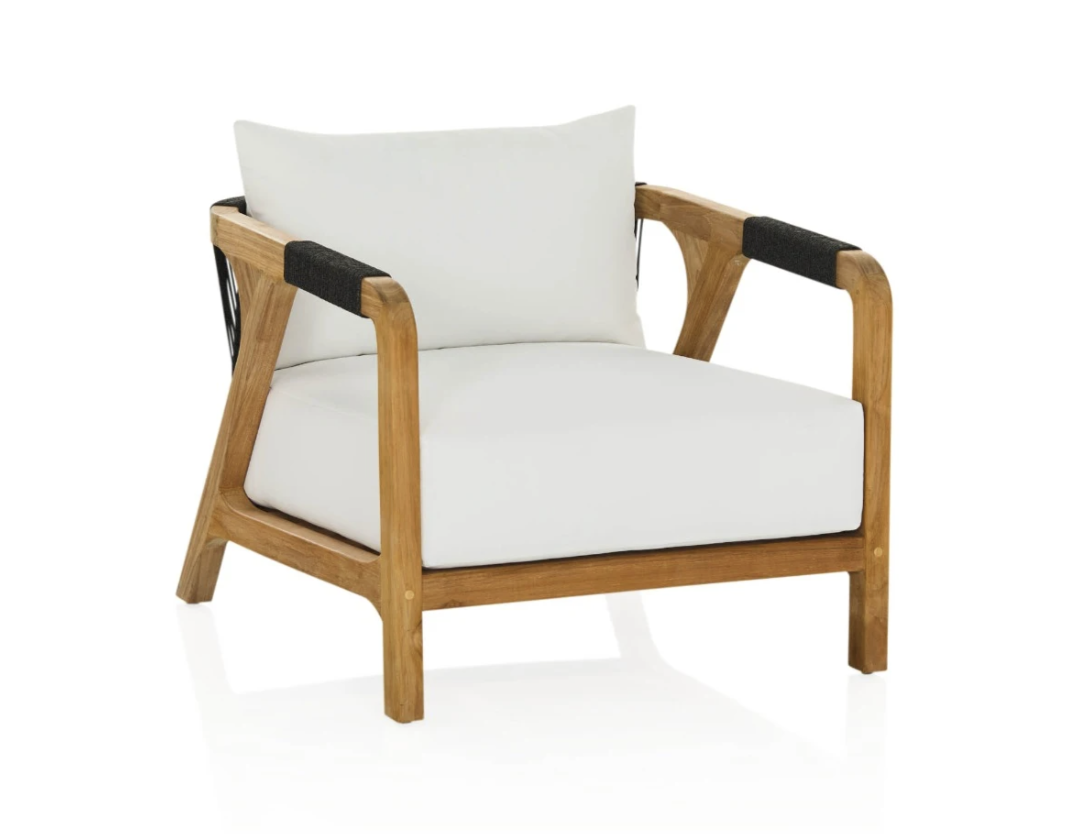
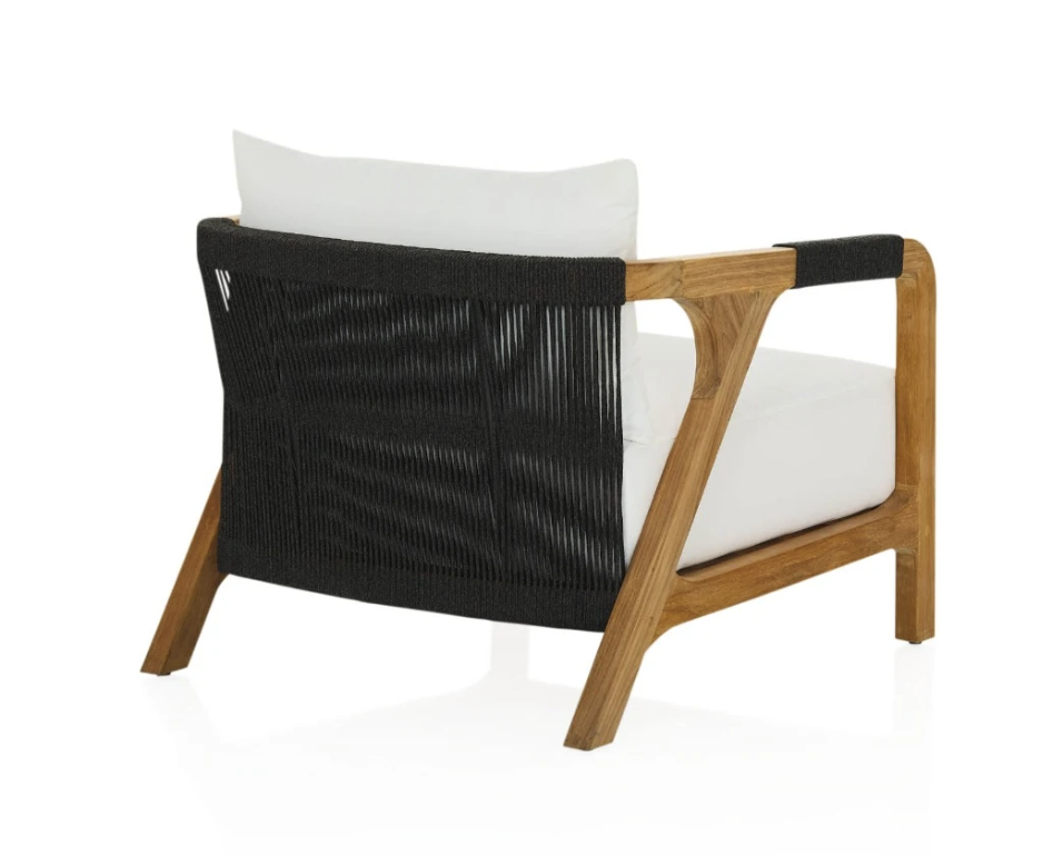
The patio:
I know you know my view on your outdoor furniture and you don’t probs need me to repeat it. I just think it makes a light place gloomy. With such spectacular views beyond, the furniture should really work with the aspect to highlight and accentuate all that nature!!
I can suggest two things: either replace it with something like this (currently on sale at CoCo Republic) or instead, buy some more reindeer hides and throw them over the grey furniture to add warmth and vibrance.
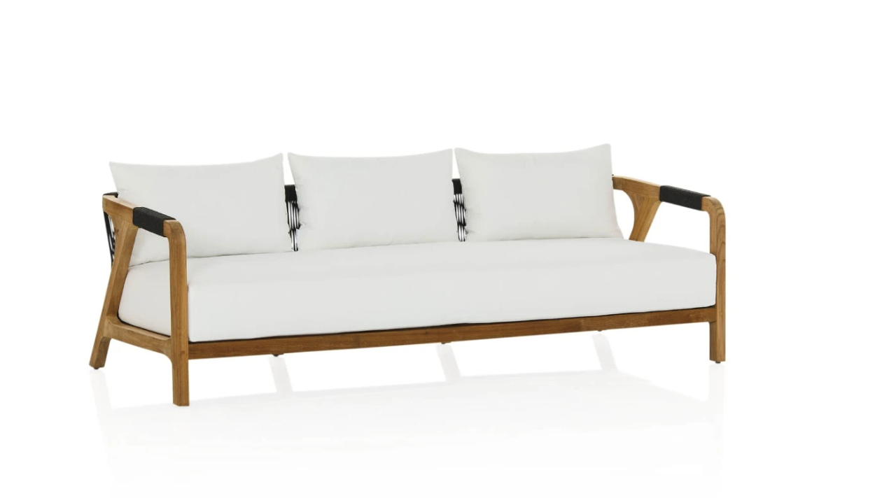
This is the Tuci range from Coco Republic - the sofa measures 2700W x 840D so you could potentially have either two sofas facing each other, or instead have a sofa and two armchairs. We’d need to measure it and see what fit best - who knows, we could even do two sofas and two chairs,…
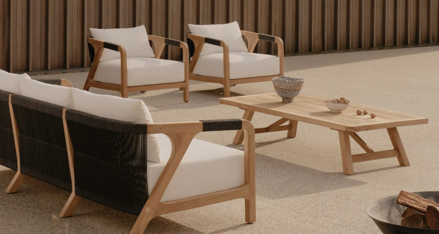
It has lovely organic lines and the minimal black detail is a continuum from the black inside, but the overall sense is one of light.
We could always add lighter reindeer hides here too, just like they do in Scandinavia!
Finally, some good advice, planning and implementing of potted plants is long overdue at number 20. You know it! I have a great person who could help you to properly plan, implement and maintain a gorgeous potted garden that would actually grow and not look like it lived a tragic life!!! Beautiful BIG pots in varying sizes planted with plants appropriate to your conditions would add so hugely to this area and you’ll wonder why you didn’t do it sooner.
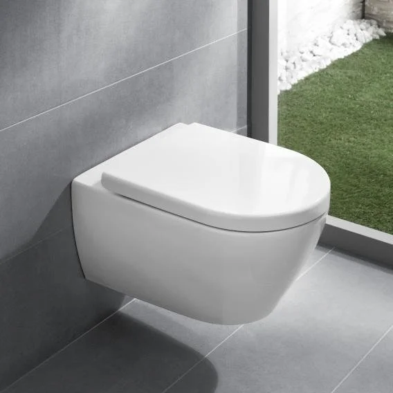
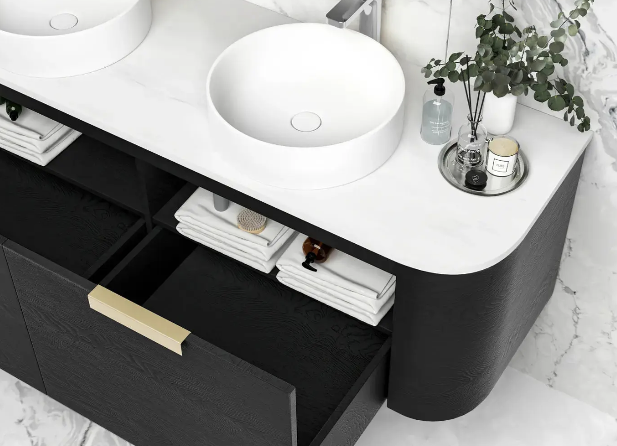
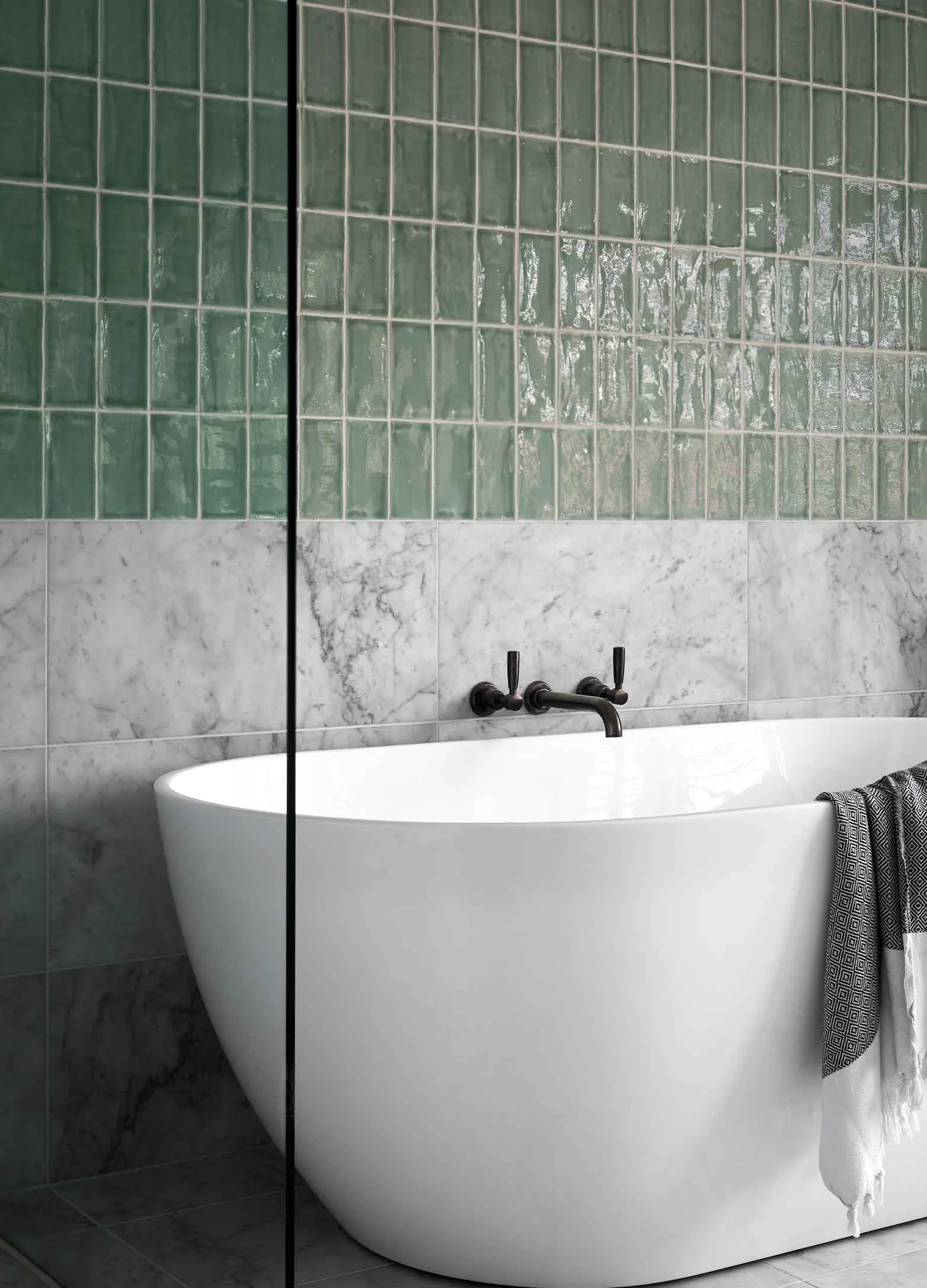
Main bathroom:
The image below is a rough sketch of the proposed new layout of the main bathroom. In this arrangement, we segregate a wet area from the vanity and loo, which are used more frequently in a day that the shower or bath. By putting the bath at the furtherest point, the window frame is protected from shower splash which is never a happy outcome for windows!
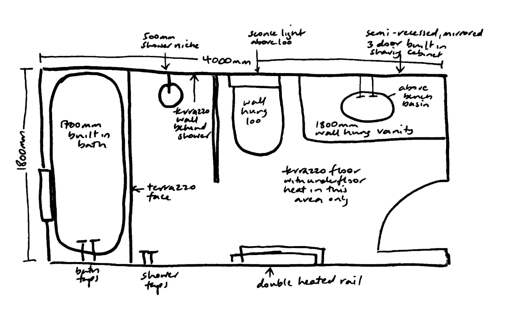
I have specified a built in bath because it looks so much more generous than a freestanding and it’s so much easier to clean without having to scrabble around behind!
A wide fixed-fin shower screen deletes the need for an articulated door, and by designing the fin to be black framed with fluted glass, we emphasise the demarcation of this so-called ‘wet area’. It also is a more pleasant showering experience to feel you’re a little enclosed, rather than showering in the middle of a room, which is the effect of a clear (and harder to keep clean) frameless screen.
On the floor and up the face of the built in bath, is terrazzo. We will also use it up the wall of the shower section behind the shower head. This demarcates the shower area in that space and again, accentuates the intimacy that feels so much nicer than being exposed!!!

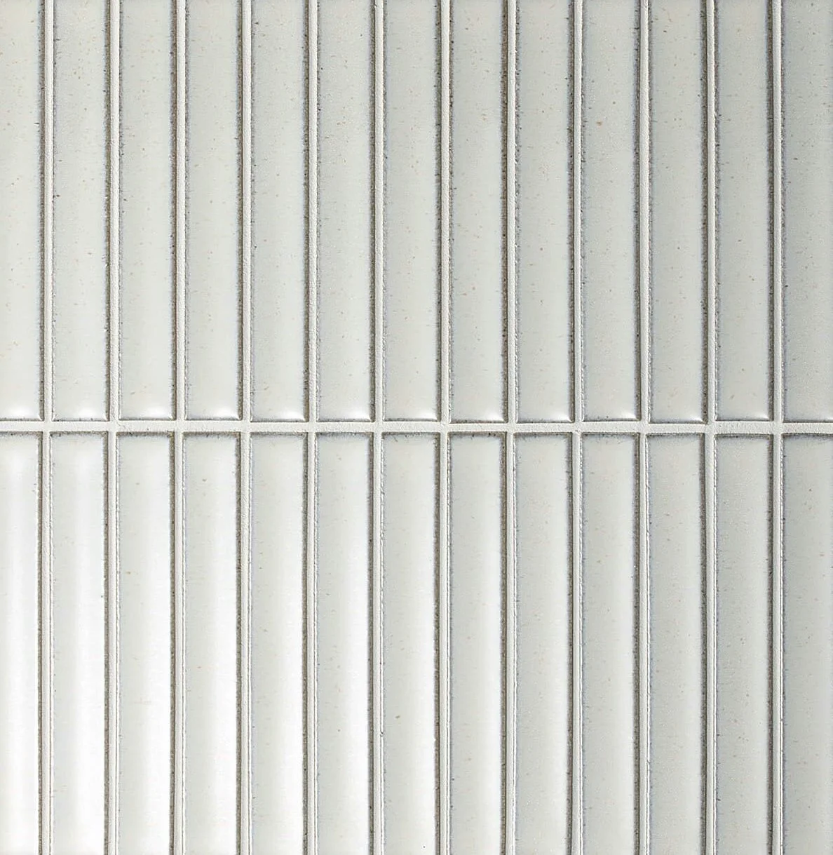
The tile colours don’t replicate well here, but there are samples in your sample box that are of course, far more accurate.
The vertical matchbox tile accentuates height, so it makes the bathroom feel loftier - always a plus! The soft grey grout accentuates the tiles, too.
On tapware - I absolutely favour Brodware, an Australian designed and made product that never fails to impress. The particular style I’ve selected for your consideration in the Manhattan, a contemporary range that still has a rather classic feel with smoothly curved lines that make the tap feel good in your hand. And the finish - no boring old school chrome! Instead, the weathered brass finish will pick up on the warm flecks in both the wall tile and terrazzo that gives a more earthy effect than the surgical grade bathroom look of old.

Brodware Manhattan collection
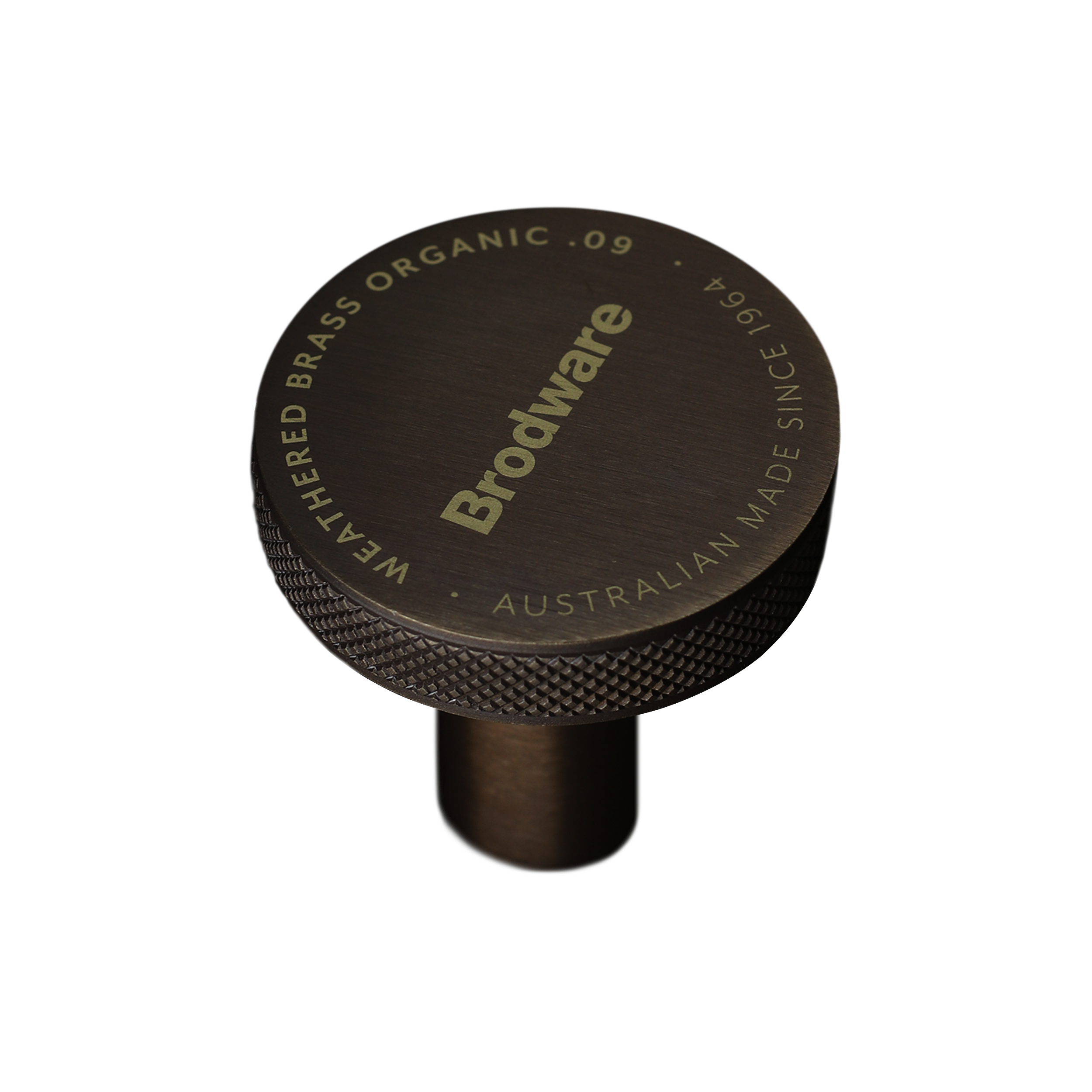
Brodware Weathered Brass finish