Your Custom Text Here
O’Halloran house cip
Deb and Tim,
Hallelujah for the Highlands - a beautiful weekend retreat destination for you both, where your family and friends can come and stay or where you can literally retreat alone to relax and unwind together.
The following is a Creative Interior Plan detailing the elements identified as being the priorities in the first instance, but also contains concepts for future consideration so that you can formulate a big picture in your minds of what we can and will achieve.
Let’s make it really special!
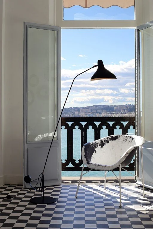
The Front door:
With it’s ‘confessional’ vibes and nasty yellow glass, I say we ditch the existing front door as soon as humanly possible!! Let’s replace it with something like this from Heritage Building Centre, painted in Porters Paints, Deep Forest green and with a beautiful bronze handle from Studio Henry Wilson.
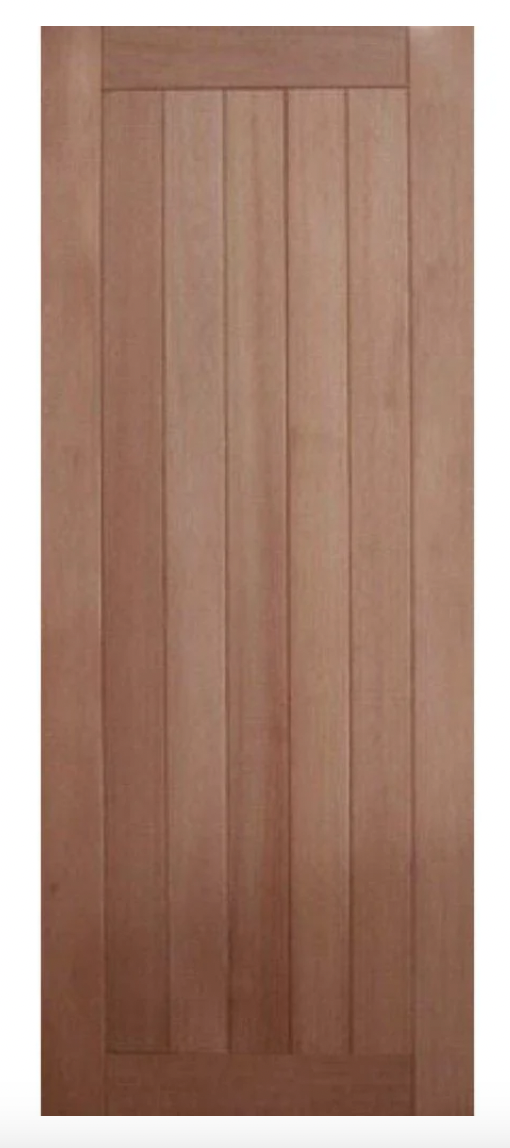
A solid front door in a fabulous deep green is a far more fitting entry to this home than a confessional!!
To make it even more fab, let’s add this pull handle.

Henry Wilson is a Sydney maker and his work is so beautiful - he does a range of hardware items as well as lighting and other treasures you can’t live without. The bronze is the perfect colour for your front door and the perfect welcome to this country house.
To be honest, Henry’s products almost always find their way into my projects - a signature dish of mine!!
The lock would sit beneath the pull handle.
Open the new front door and turn right.
Casual living:
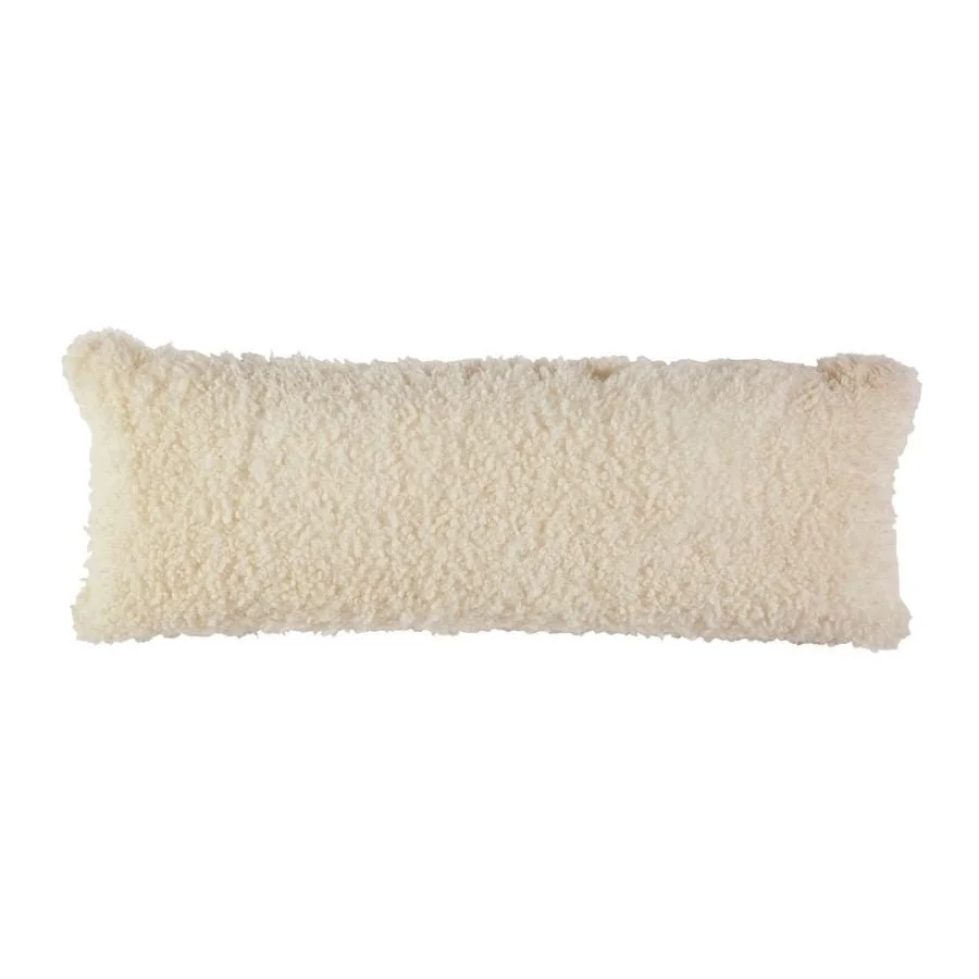
With your lovely sofa newly positioned under the window, we need to add a few extra elements to make this space feel super relaxed and stylish. Let’s start with the rug!
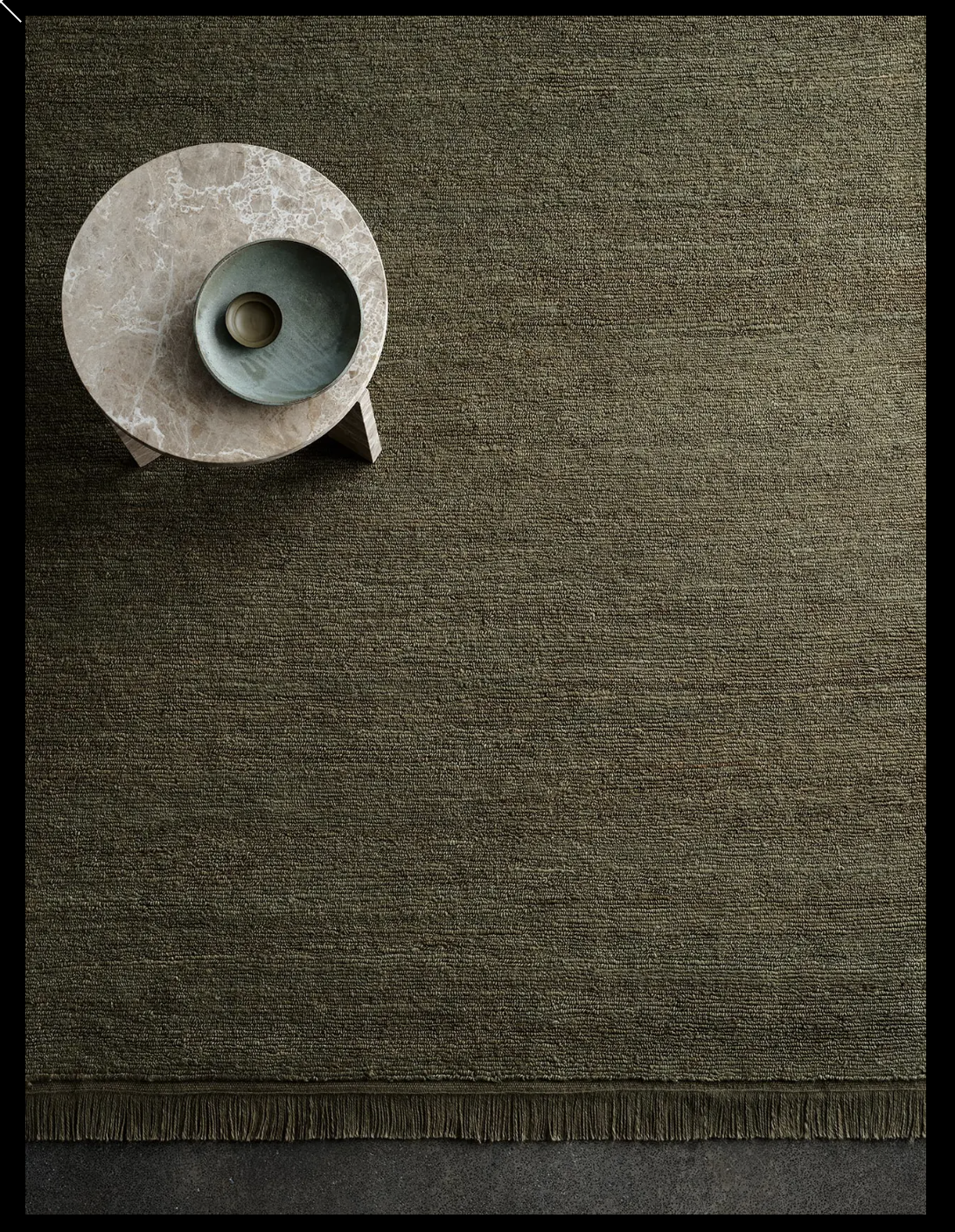
Armadillo, Mojave in the colour Laurel
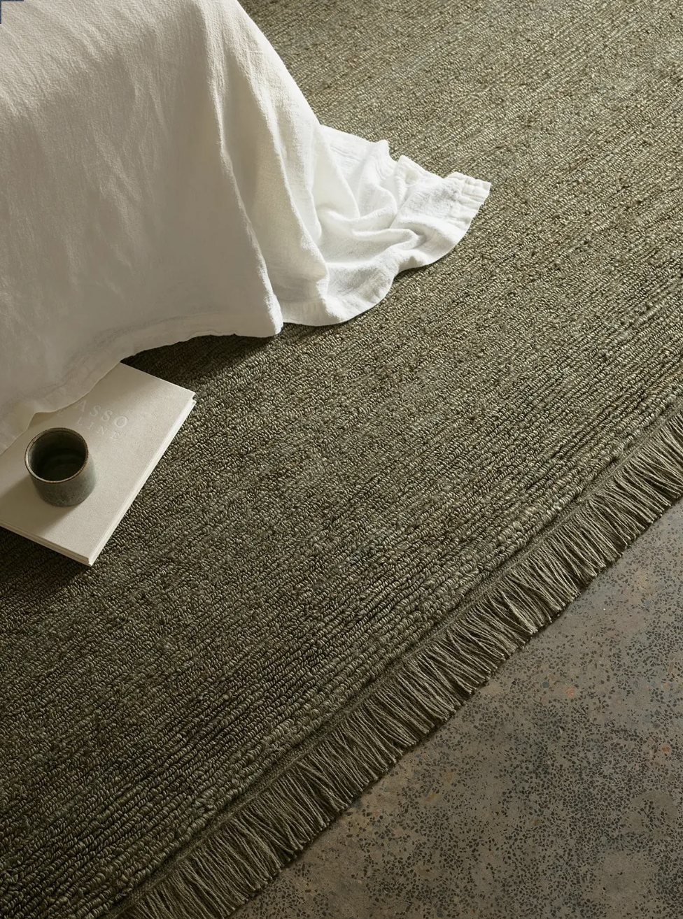
This is a jute rug, so it’s super hardwearing and practical, yet it isn’t that coastal vibe that we so often associate with jute. It’s more refined and the texture actually makes it look more wool than jute. The 2.4 x 3m would give the room definition, separating it slightly from the space beyond. With the white sofa and the natural floorboards, it will give a great contrast.
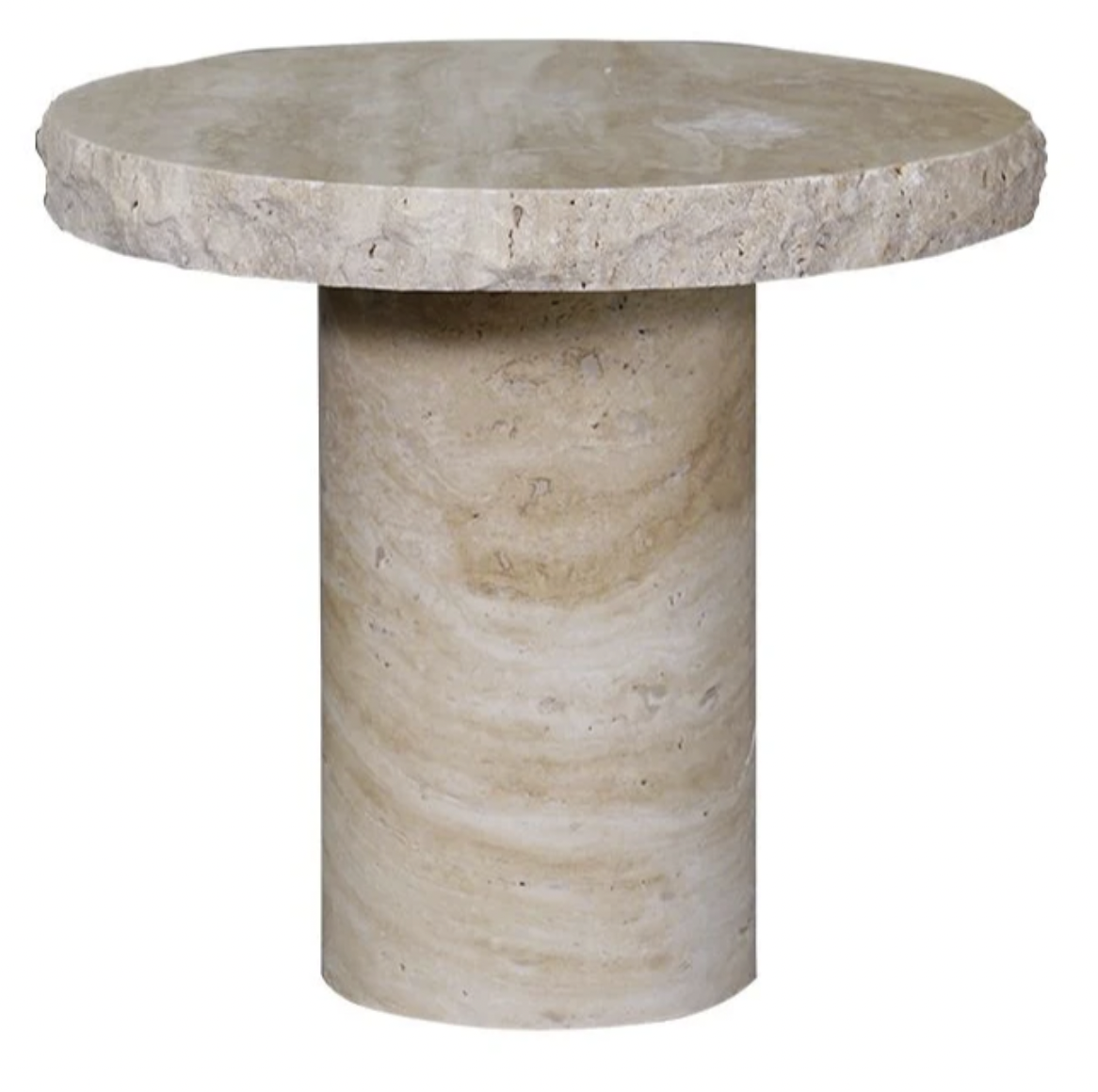

The travertine side tables above are from Trit House - I have selected these as they have beautiful texture and colour and won’t compete with the groovy coffee table you have. They’re super solid and heavy - one would sit beside the sofa and other beside the armchair.
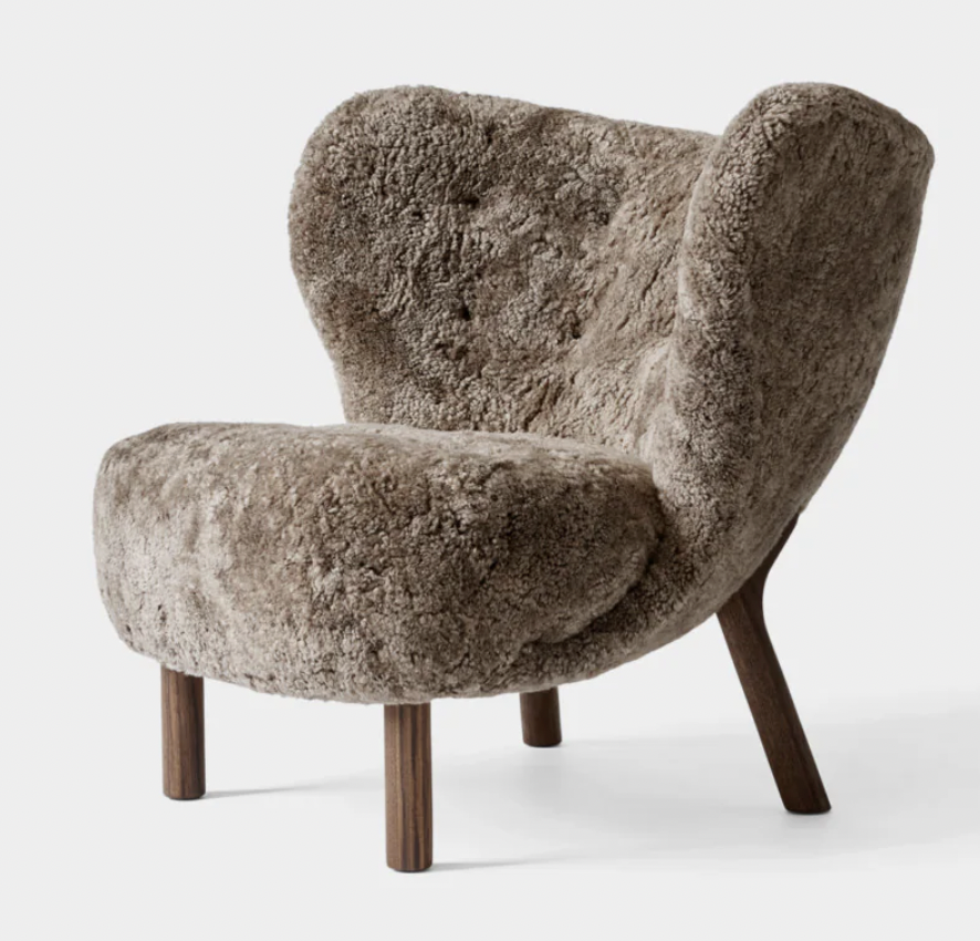
So let’s get an armchair!! I’m loving this one from BoConcept - it feels like your style is modern relaxed, but a curated kind of relaxed which is of course, numero uno in my books. So an armchair like this suits the brief; a totally understated signature piece that has the magic, organic nature of leather, in a classic and timeless design.

It’s customisable, I’ve selected cognac leather because it will be sublime with the palette of green and white. It’s Modernist inspired, it swivels, it’s super relaxed and a good partner to the sofa. like I said, understated - just like you!
The lighting requirement here is lamps - in my view there is never enough lamps in any house!! Lamplight is softer, it is adjustable in terms of where the lamps are placed, and with such an array to choose from, the possibilities style wise are multiple.
I love DCW Editions lamps, designed by a German guy called Bernard Schottlander in the 1950’s, they have quite an industrial aesthetic and would look really groovy here in this space. I would suggest placing this one beside the armchair, and the Kelly Wearstler table lamp, below right. on the side table next to the sofa.
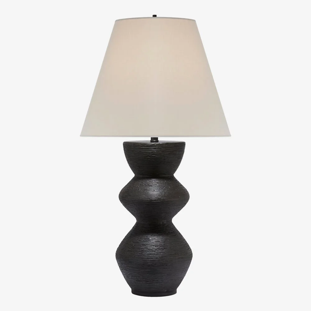
I’m loving the organic shape and the texture of the ceramic on this table lamp - in my view Kelly Wearstler can do no wrong! But it also contrasts well with the lighter profile of the floor lamp on the left, balancing out the room with lighting royalty!!
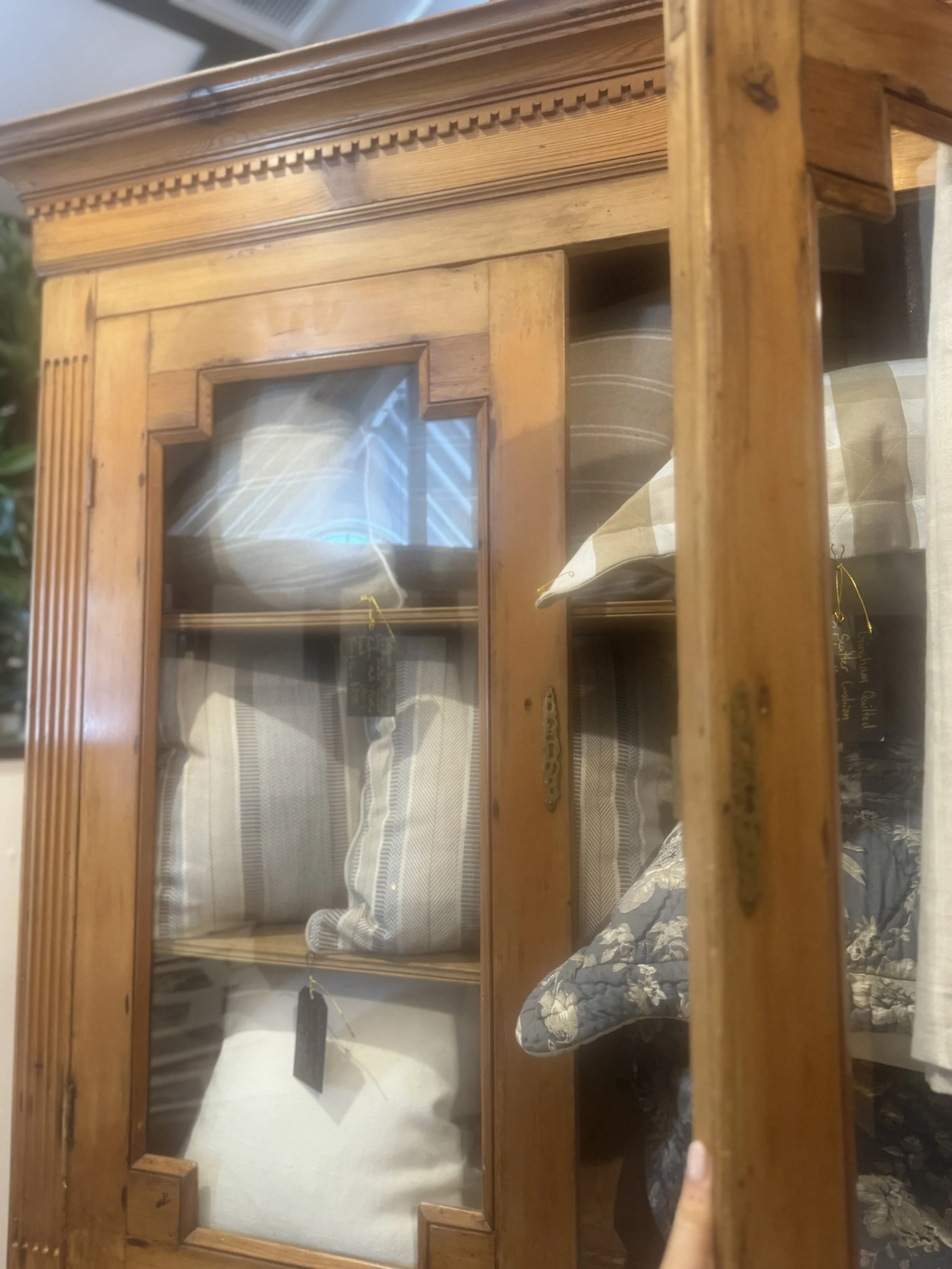
The built in shelves - it would be good to reconfigure the shelf heights so that we can graduate them top to bottom, but that might not be possible without pulling the whole unit out - so let’s discuss ways to give it more oomph. I think one of those indoor plants that trickle down could be cute, winding it’s way down past books and treasures. Julie will know what they’re called!!!
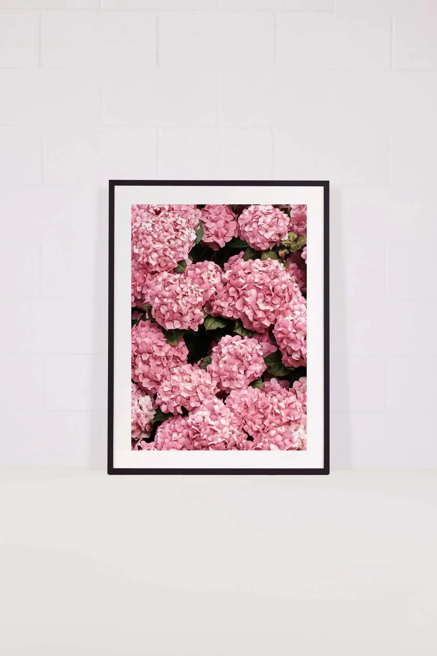
I’m so thrilled you’re a fan of Poppie Pack - I think she’s terrific and I know we spoke about putting the hydrangeas here. But I’m thinking these would be better - by a Melbourne photographer called Katie Carmichael.


These two look like they were taken in the highlands - so beautiful and evocative. Think too, of the greens in the rug and how these would link to the other living room (once you’ve had a chance to see what I’ve got in mind for in there). We look for these cues to connect each room and thereby make the house feel comprehensively considered as a whole, not just a series of rooms.
The other side:
How do you like that for a name of a space?? Really, it is a vestibule, a cloak room, a big old hall cupboard busted loose!!!
There are two delineated parts to consider in this area - we want a generous hanging capacity for an abundance of coats and hats, and we also want room for dog beds at the bottom of the stairs.
Coats and hats….


These hooks are also made by Studio Henry Wilson and they’re called F.Ace hooks. I’m thinking 8 of these - 5 on a top row and 3 offset a few centimetres beneath. They come in the blackened bronze as pictured above, or in the brass pictured below, which would speak to the front door pull and therefore be my choice. But tell me why the brass option appears on the website upside down and I’ll kiss your feet!!!!


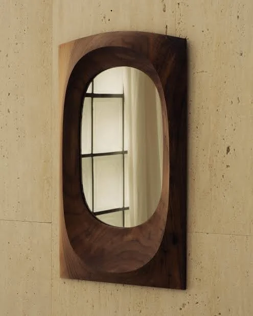
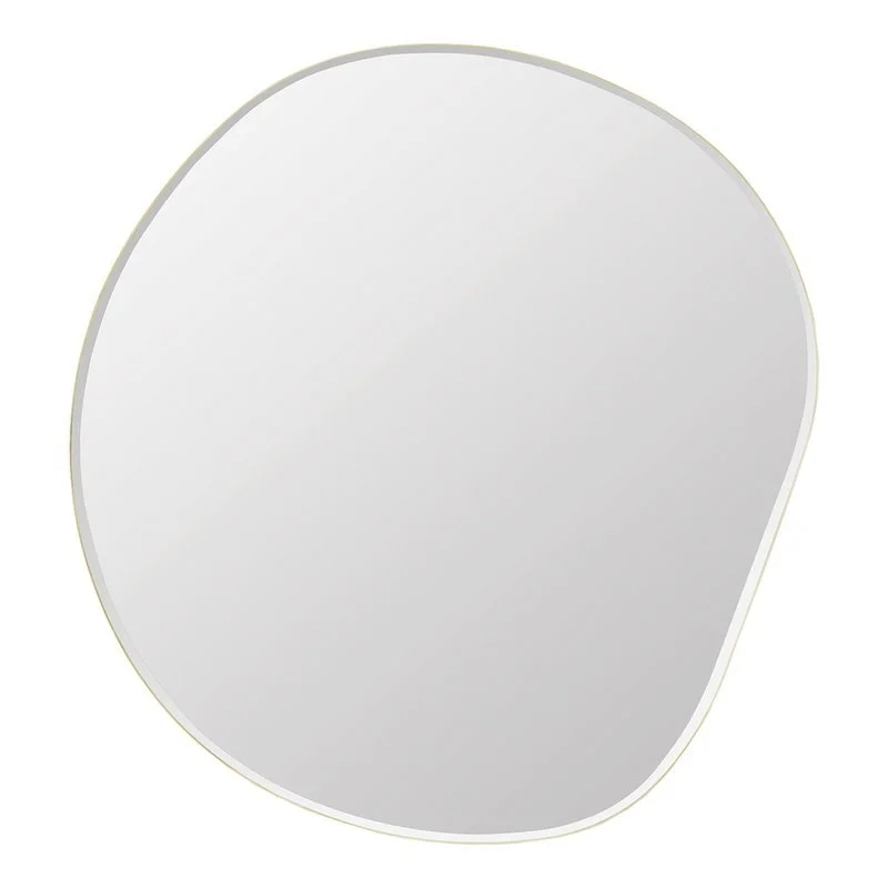
So we have hooks a go-go, Next to them, on the front door side of that wall of copious hooks, a mirror. THIS mirror because it is sublime and soooo fits with our vibes,
Just in case you’re wondering, the answer is ‘no’ I don’t work for Studio Henry Wilson!!! I pass on the entire trade discount I get directly to you. The truth is, I just totally love what he does and I specify his product a huge amount because it feels so right in so many different situations.
The mirror on the left here is new. It’s made of walnut and it is about 730cm high. Again, understated but oh-so-stylish. It also comes in metal and in glass, but both are more expensive and wouldn’t look nearly as fabulous here.
It is an accent on this wall, but a very practical one as it’s where you check yourself either when coming home and offing ya coat n’hat, or, before leaving the house.
And don’t forget, this may be a one sided cloakroom, but it’s very central to the house - it will be walked past on the reg - so we need to feel the special vibes are brewing right here, spilling out to the rest of the house with boundless high-fives.
On dog beds - the Barney is gi-normous and if that is fine by you, let’s do nothing. But if you’d like dense foam beds made to size and covered in hide that look super cool, let me know - I know this designer….!!!!
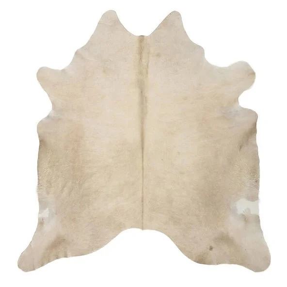
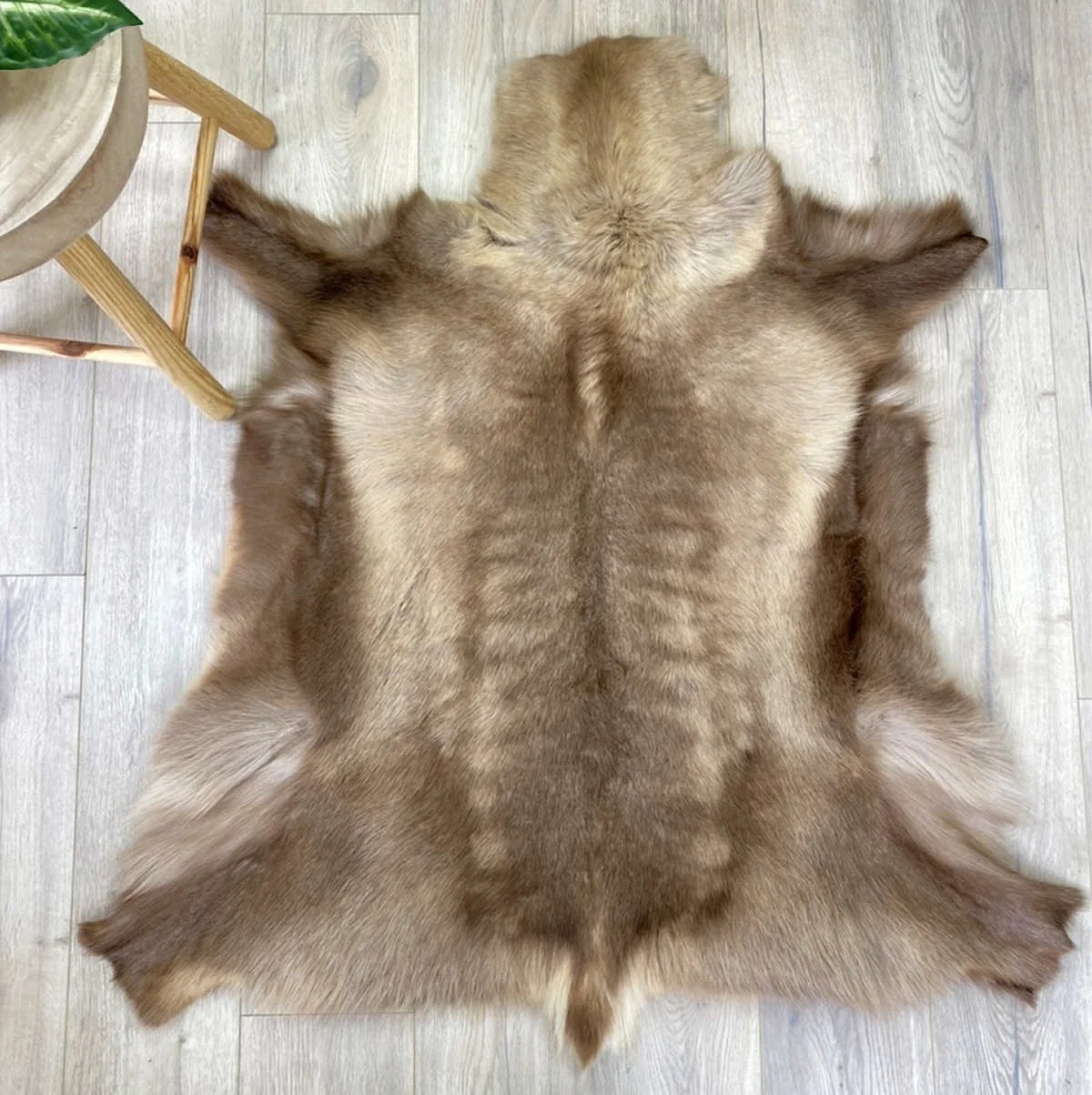
On the floor in the centre of the space, we need a large and hairy hide. As I mentioned to you, I would never specify cow splodge hides - I only do the one block colour and I’d select a champagne or beige. Remember too, that hide is incredibly durable - if wine is spilt or a dog vomits on it - or even both (not unreasonable!!!) then you take it outside and hose it down and leave in the sun to dry. You don’t see stained cows, do you! Totally practical and totally cool AND very very very reasonably priced.

Hopefully this gives you an idea of what I mean, but I will bring samples if you like the idea.
Window seat:
As you enter the front door and turn left, we want a built in seat. It’s a totally simple design - wall to wall and about 550mm deep. We will paint it white and once it’s done, we will get the same supplier who makes my dog beds, make the cushion for here, only this time we will have it made in shearling. This is a shorter pile sheepskin - it is inexpensive, durable and totally luxe.
Another option would be to have it made in leather and to have shearling cushions on top.
Either way, this will make such a beautiful feature of this space. To sit with your cup of tea or whatever in the late afternoon will be heavenly - but it will look so lovely too!
Rather than go to the added expense of building it as a storage unit with a hinged lid, I’d suggest having a couple of right sized baskets sitting underneath with shoes or whatever inside. This makes for the simplest solution and arguably, the best looking!
The idea to have it built in is that it means it’s super sturdy. Two people coud sit there, or you could stretch out with your book in the sun, propping a pillow under your head and the thing won’t move. Finding a ready made bench seat that fits that requirement may not be easy.
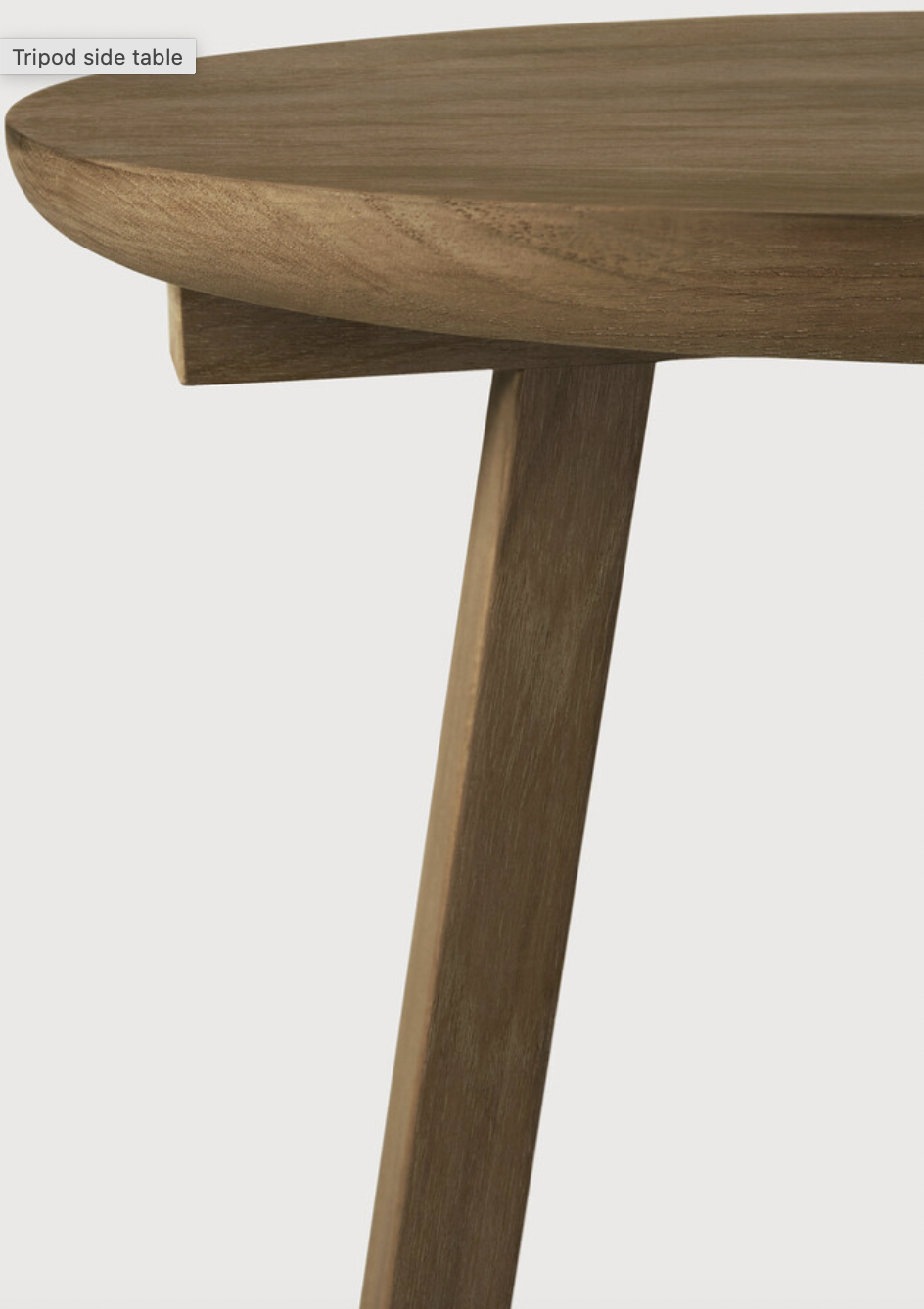
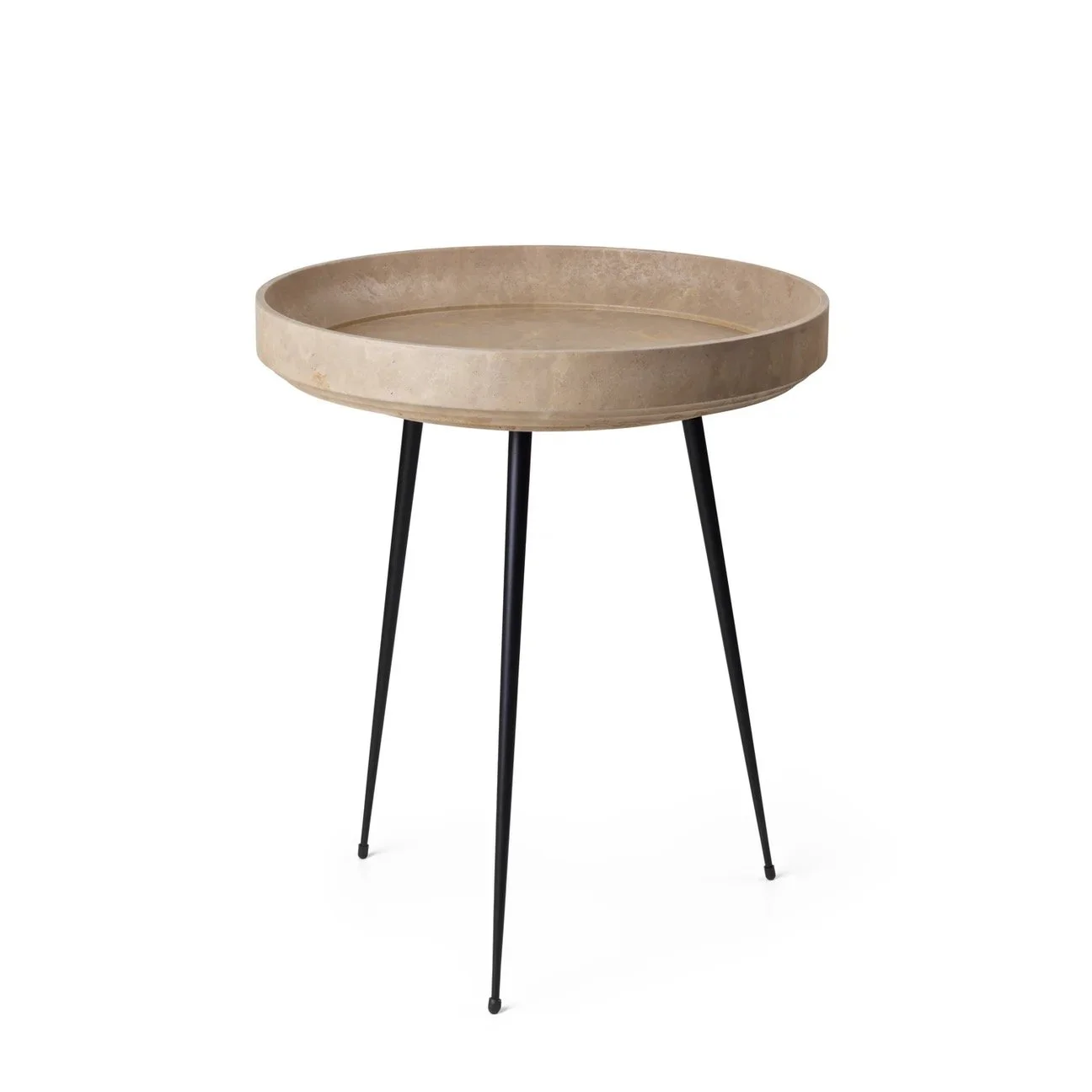
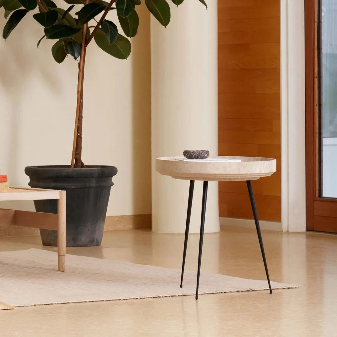
We’d paint the window seat the same white as the walls so that it looks like it was born there. But I’d suggest adding a little stool or side table to keep it company, a spot to put your cup of tea and your book!

With a hint of the walnut tone to tie it in the mirror across the hall, this table from Ethnicraft fits nicely.
Baskets for beneath the bench seat we can source once you’ve decided on the dimensions - we need to do that in situ!
Living room:
Having moved that dreadful unit, we now see the room in all its splendour. Massive improvement.
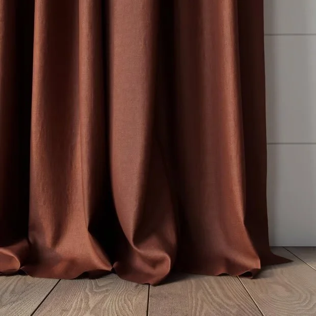
I’d love to do curtains in here but I know you’re not so keen. If you change your mind, however, this is the fabric I’d choose!!

It’s quite a heavy linen - it has a lovely weight to it that is sumptuous but still super relaxed and in this colour, Driftwood, it doesn’t compete or upset the balance of the room and it will be dreamy with your modular.
I’m not trying to convince you, but really I am…
I just think this room has a grandeur about it with its cathedral ceiling and the shutters just don’t do it justice. Shutters can be fabulous and in other rooms of this house, they’re the perfect option. But in a living room, in a cold climate, nothing feels more cosy and homely than curtains. They humanise.
They’d be lined for extra warmth, but on summer nights, you probably wouldn’t even close them. They complete a room, give it an identity that makes it feel like home.
Totally your call - I just thought I’d pop this in here for reference!
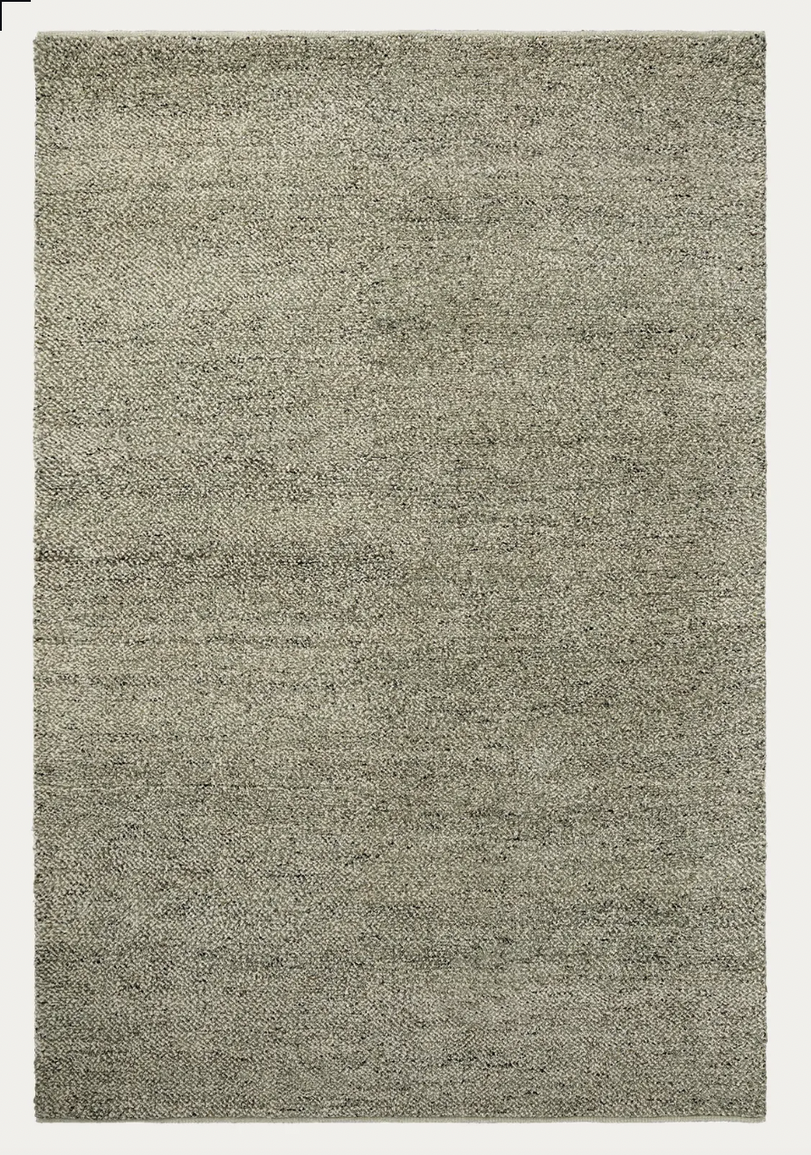
For the rug, I think this beauty from Armadillo. It’s a divine colour, Seagrass, which is green with flecks of dark through its deep 100% NZ woollen pile. It’s 70’s inspired (remember shag pile??) and it feels amazing underfoot. The room could easily take the 3 x 4m size which would look fab but also act as a noise dampener and would give a ton more warmth to the room in winter. It’s also well priced!
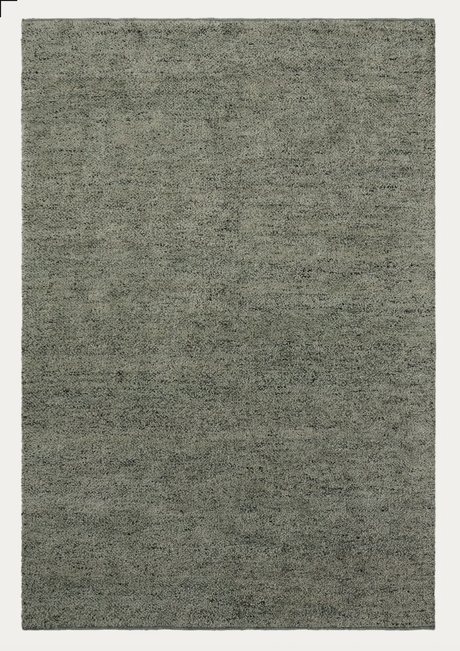
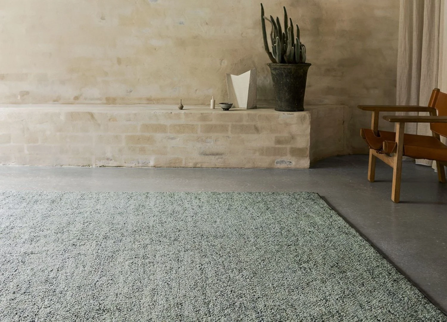
Your modular is a lovely, calm colour and with the white walls, I feel you need a stronger colour somewhere and in this instance, we are going to ‘floor’ it!!
And if you do end up buying that beautiful oil painting we saw in Few and Far, the rug could not be a more perfect complement.
This is a rug you wouldn’t need to feel precious about - it’s dense wool and colour would also be a forgiving combo.
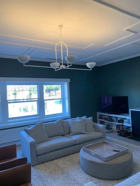
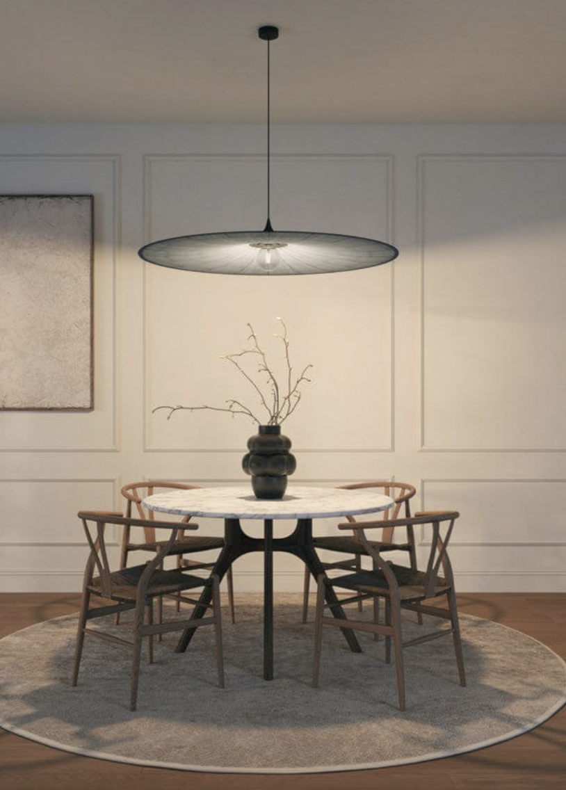
The light fitting I have selected for you to consider is wild. It’s made by a Melbourne woman called Anna Charlesworth who has really attracted a huge following. You may recognise it from the mags, but if not, this will be a treat to see for the first time! Unfortunately, the website is not a major selling tool!! I can promise you, these light fittings are so beautifully made, they have a lovely organic surface texture and being all white, the impact on any room is truly spectacular.
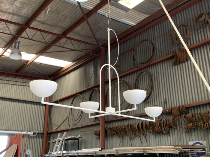
At least the corrugated iron workshop gives some contrast!! The image on the right is also trying to lend a marketing hand, but I think Anna is focussed on the making, not the selling. I haven’t used this particular shaped one before so I’m no good for pics either.
The reason for choosing this one from her range is that it would drop from the peak height of the ceiling and the top of the arch detail would sit beneath the truss and wold run length-wise following the shape of the room. It would really highlight the ceiling, making the most of it as a feature.
The Gitta Backhausen painting would set this room on fire, style wise. At 183cm wide and 167cm high, it would really own the back wall and with the whites and neutrals of walls and furniture, be utterly stunning
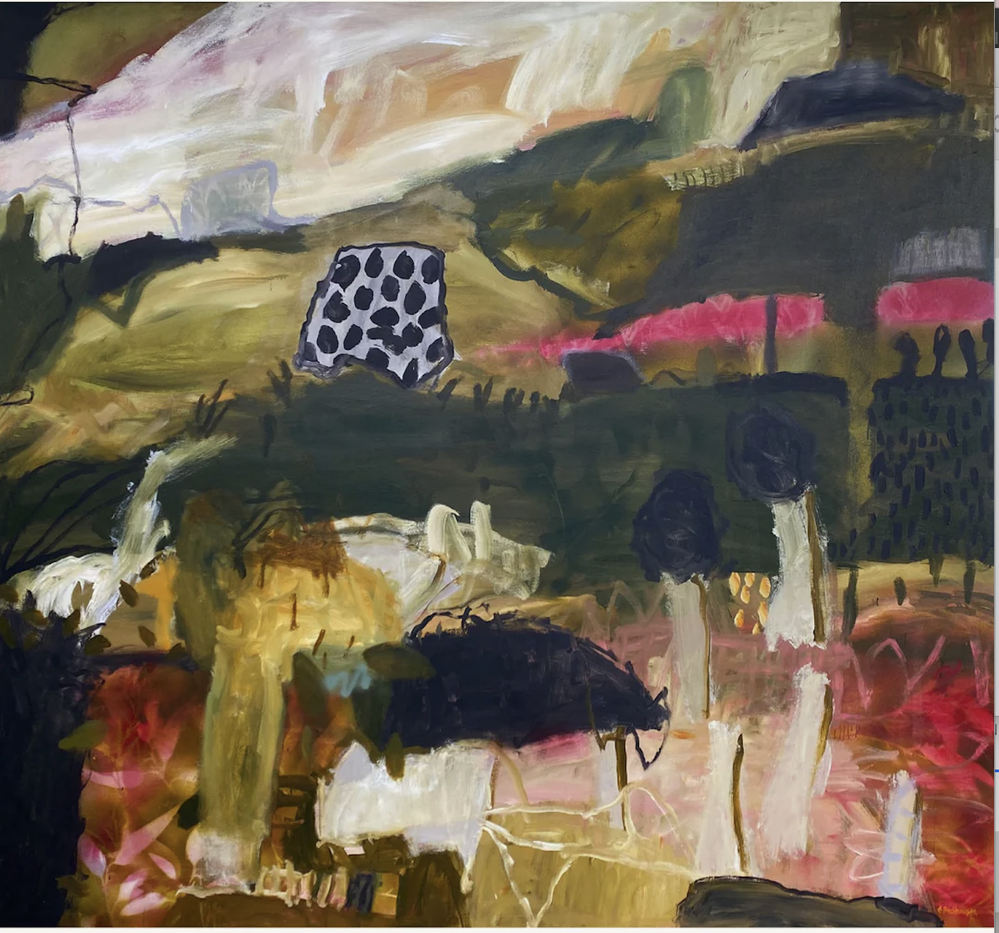
It’s full of our colours, it’s contemporary, not some ye olde worlde trope so common the pitfall of a southern highlands home decor!! If this piece doesn’t work out, we can find another, but I do think it is well worth thinking about as for an original painting, it is well priced and you’re supporting a local!
We talked through furniture placement, but just to recap - we put the console the tv is currently sitting on behind the modular on the back wall. It should be almost completely obscured by the sofa, thankfully!!, and it will give us a platform on which to place lamps, or a vase of flowers, or some treasure you will think of from your collection of many interesting treasures! It is also a handy spot to put a drink for those sitting in those seats.
We put three ‘units’ of the modular (not two as currently configured) along that wall so as to make the space feel more open, less linear. I know you’ve enquired about ordering an extra unit from MCM - let me know how you go. The tv needs to be on a bracket, and then we could add another armchair. But this would need to be an appropriately sized piece, not a chair that gets in the bloody way!!

This is the Jethro chair from Franka, a local supplier (Sydney) I have worked with a lot over the years. I include the detail shot above right so you can see how beautifully made it is. This chair too, is contemporary and chilled - it’s light enough to easily be moved into place if tv viewing by all is the go, or to move further towards the windows if the telly is off and folded back to the wall on its bracket.
Artwork along the long wall facing the window is an exciting prospect - I’m going to try to go to Sydney Contemporary this weekend and will very much have your house front of mind! I think line drawings - a trio of them to offset the strength of the oil painting.
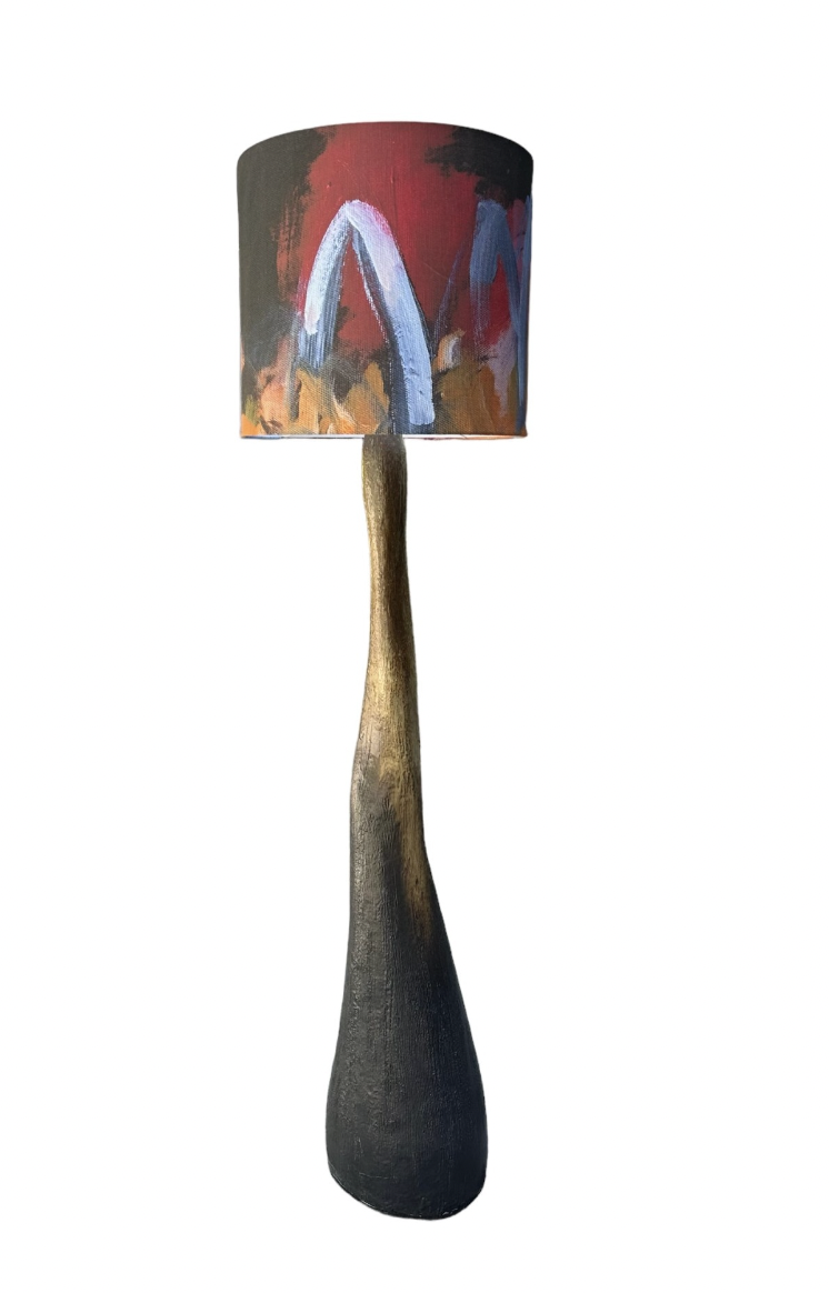
On lamps - OMG these are too fabulous for words. They’re from Becker MInty but they’re made by a guy called Michael Jones who is an artist from Mount Tambourine, Queensland. These are art!
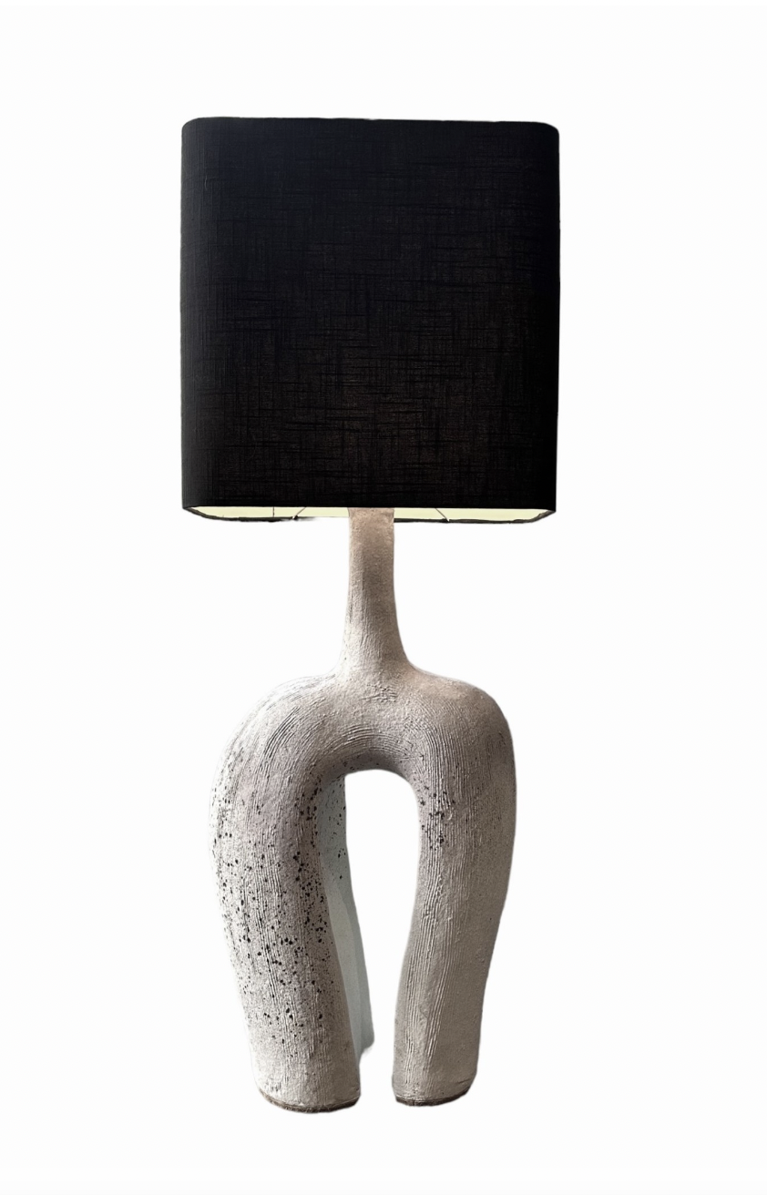
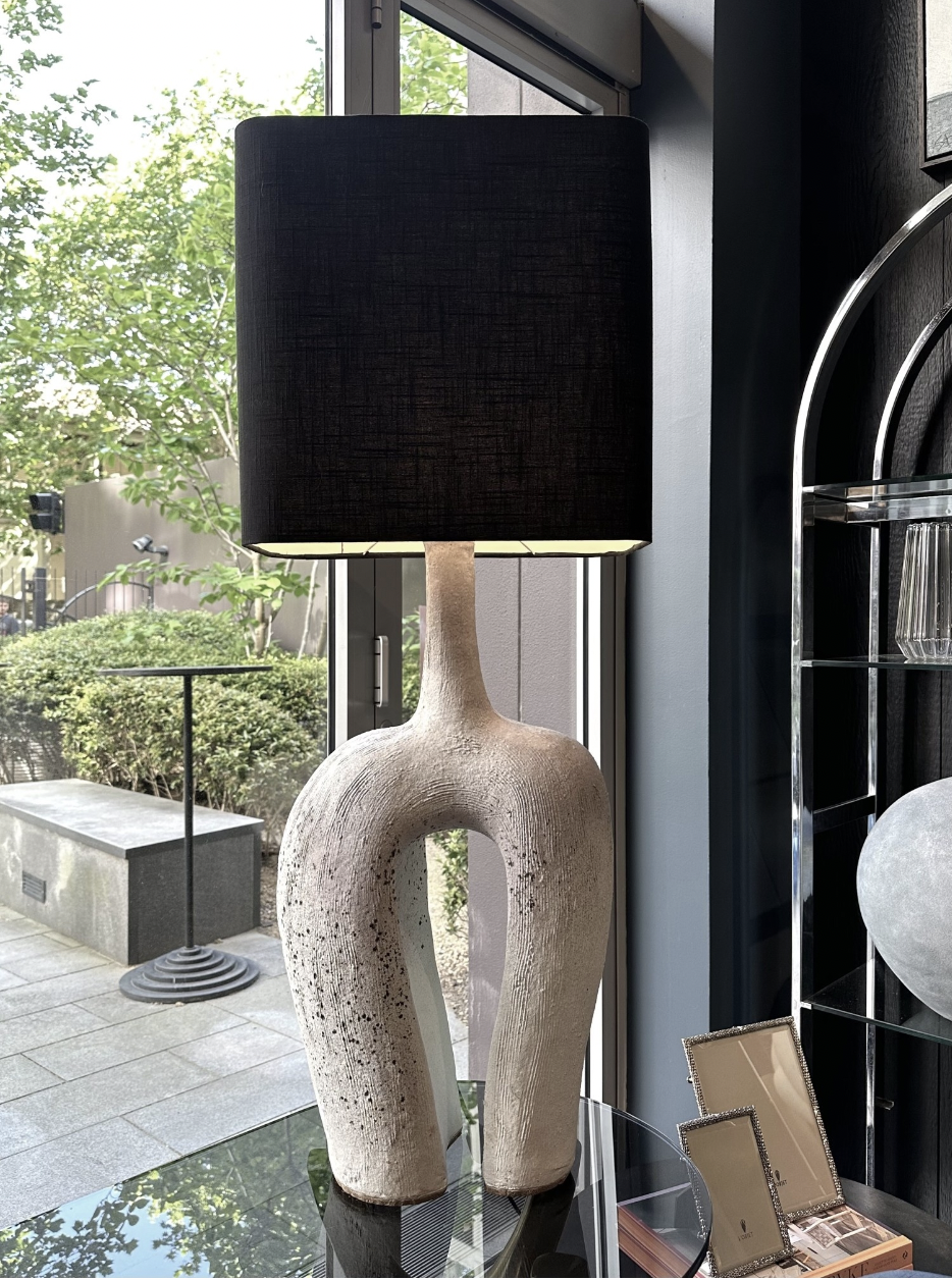
I’m loving the table top in the black and white because it would be near the painting, so it will stand out in contrast to the colours in the art, but its black shade will define it.
And then this beauty - same guy but different lamp!! What a perfect pair. The floor lamp will be a stand alone at the forward end of the modular, away from the painting - but it will be almost like the painting is coming forward with it!!!These are totally unique and I really do think they’re an artwork in themselves. And with the very light scheme (white walls, linen coloured furniture) they’ll be a really interesting addition. I’m so excited!!! I’ve asked for the quote and if you love them as much as I do, we will need to jump as they only have one of each.The artist has 40 years experience and Becker MInty are a fabulous supplier of really beautiful things!
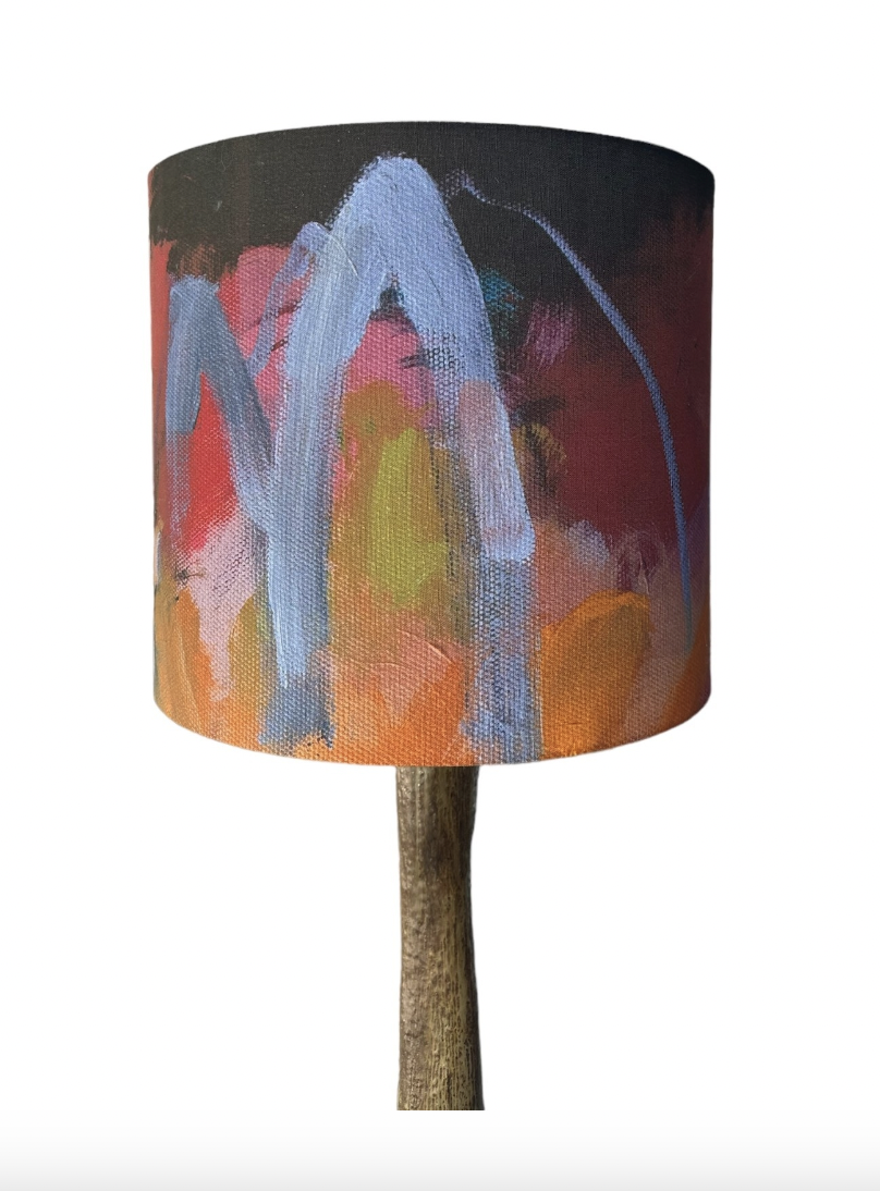
Above is the close-up detail shot of the shade - I want one!!!
Possibly the console currently holding the tv isn’t long enough - lets play around with it though, we could still make it work as I’m hopiing you really won’t see it behind the couch. I don’t therefore want to spend money on a new piece if we can solve with what we have. I’m very keen that console be removed from where it is because it’s not really our friend!!
The living room is a fabulous space - I think this is going to be a huge wow factor when we’re done. Just saying…
Dining room:
Here I am going to include the area in front of the fireplace, too. After our repeated failed attempts to contact the American replica supplier of this chair, I’ve gone to the source. Cult Design in Sydney.
Best chair in the history of chairs, is how I’d put it, but this may be a little more informative from the Cult Design website…
“Initially introduced back in 1938, Little Petra won instant praise at the Copenhagen Cabinetmakers Guild Exhibition, subsequently winning awards at exhibits in New York and Berlin. It’s one of just a few designs by architect Viggo Boesen, who became associated with Denmark’s signature design aesthetic in the 1930s called funkis style. Distinguished by a softer, more abundant, organic aesthetic that challenged the minimalistic approach of Bauhaus. Named after Boesen’s mother-in-law, Little Petra is indeed surprisingly petite, able to fit into all kinds of spaces, interiors and environments. Low to the ground, open and embracing, it embodies the essence of a lounge chair, allowing for all kinds of seating positions in any cosy setting imaginable. A lot of work has gone into ensuring the utmost comfort, from the seat to the upholstery. Respecting Boesen’s love of natural materials, the legs of the chair have been crafted in oak or walnut. The result is an endearing lounge chair that beckons you to stay.”
There are always knock-offs of classic designs in furniture, but how satisfying to know yours is the real deal. Two of these in front of the fireplace will be so divine - they’re so comfy it’s ridiculous - I’ve specified them in another home and the client still regularly thanks me for the introduction!! They’re not so heavy that you can easily move them to face whichever direction - towards the fire if cold, or outwards to the dining table or the kitchen or to the garden. And they’re not too big that they’d create a road block.
They are also available in the cream sheepskin, but I think this colour will look better in this spot and also be more practical. Like I said already, sheepskin like all hide, is really durable and practical.
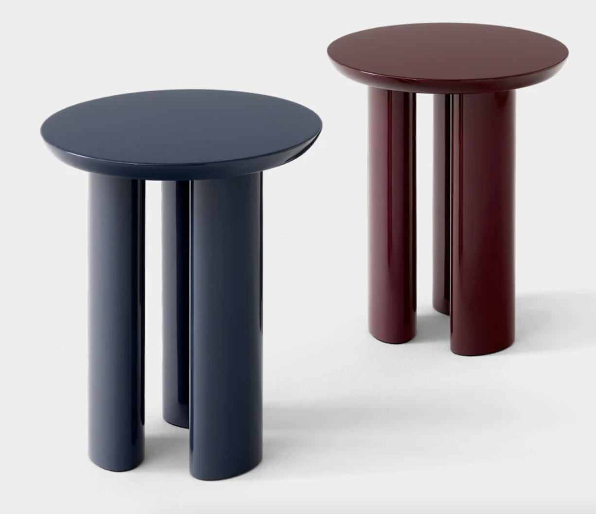
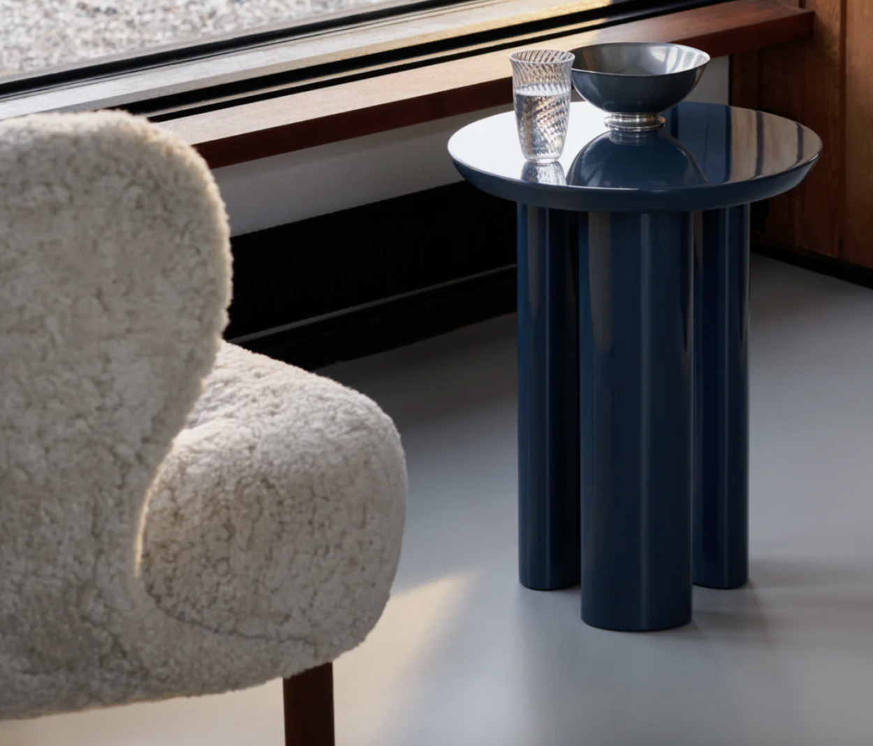
Side tables - two are better than one coffee table because again, you want to be nimble around them!! I just love the playfulness of these, also from Cult Design, their cute three legged base and these beautiful colours are great offset to the neutral base we’re running with. They weigh a little over 10kgs each, so they’re solid enough around the pooches,
On the floor here, another lighter coloured hide rug. Nothing beats them.
Above the mantlepiece, I think a mirror! We want the light reflection first and foremost, and I also think that an artwork would have to battle hard agains the beautiful business of the stone ‘crazy pave’. So this one, the Pond mirror is brass edged and quite heavy - but it’s lovely organic shape makes it super contemporary and YUM!
The close-up is bigger than the main photo!! But to give you an idea, the mirror is 94cm high and 87cm wide. It is made by Ferm Living and available through DesignStuff where trade discount applies.

Your dining table and chairs are great, but the silly light fittings above that aren’t even connected, have to go! I say we get the sparky in to connect these beauties - one either side of the divide.
These are super groovy - so totally informal yet contemporary and cool. They’re a Spanish design and made from a fabric and aluminium - from About Space. Love.
Defs this green, in the 60cm diameter, and at under $600 each I think they’re a total bargain.
The reason for going super casual on these fittings is that I know you want to keep the vibes relaxed. As you need two, I wanted to keep them simple and I really feel these fit the bill.
Above the kitchen island, I think something like this would be a huge improvement. What is there currently is a tired cliche - if I can be so bold/rude!! I worry that the island is wrongly sized, as I’ve spoken about before, so this fitting has a way of elongating the sense of it, if not the actual!!
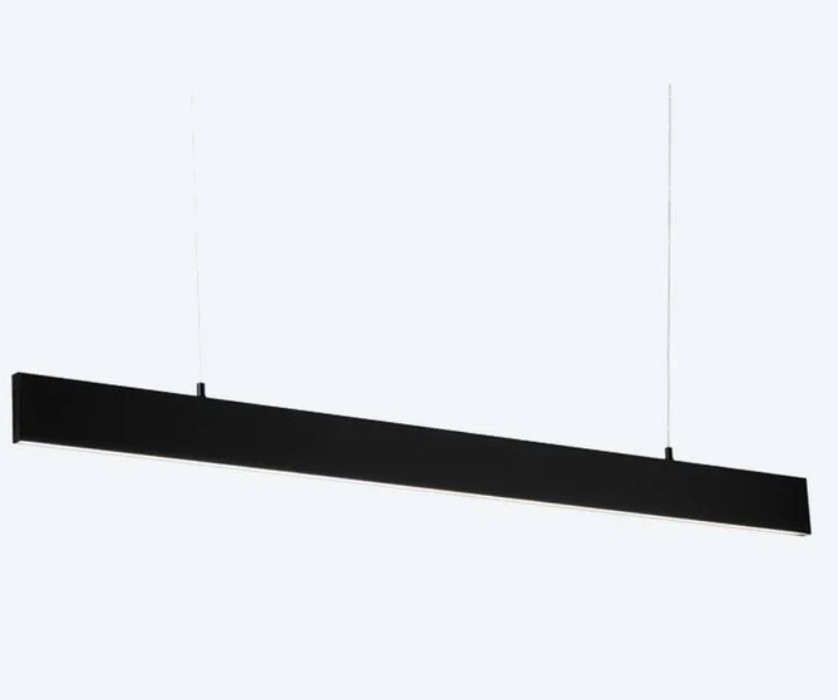
It is a simple, linear fitting tmade from aluminium and at under $500 is a strong contender.
It’s a good partner for the simplicity of the pendants over the table - it isn’t making a song and dance over itself, and as it’s dimmable, it can slip even further back into the atmosphere when dimmed low.
It is Australian made and is available in a range of sizes - I think the 1800mm wold be fabulous.
You know what’s coming next…. curtains.
I know that you were reluctant when I first mentioned them - but I am 100% confident that they will be utterly transformative to this space. Once we have those beautiful pendants up and the gorgeous chairs and the mirror and the everythings aforementioned, you are going to scream with the joy of it all.
This is the colour. It’s linen and the name of the colour is Forest. I’m leaving the image BIG so you fall in LOVE with it.

Two pairs of curtains - they’ll push away when not in use as there is room either side of both sets of doors. Imagine the lovely pale table and chairs, the subtle and groovy pendants above the table - all the lusciousness abounding.
And one more thing - I’m not going to suggest a rug for here - I’d rather curtains than a rug! I always think that a rug under a dining table is a punish - all those crumbs that get caught in the fibres, boring. Our rug is right there on the windows to be enjoyed and never to need vacuuming.
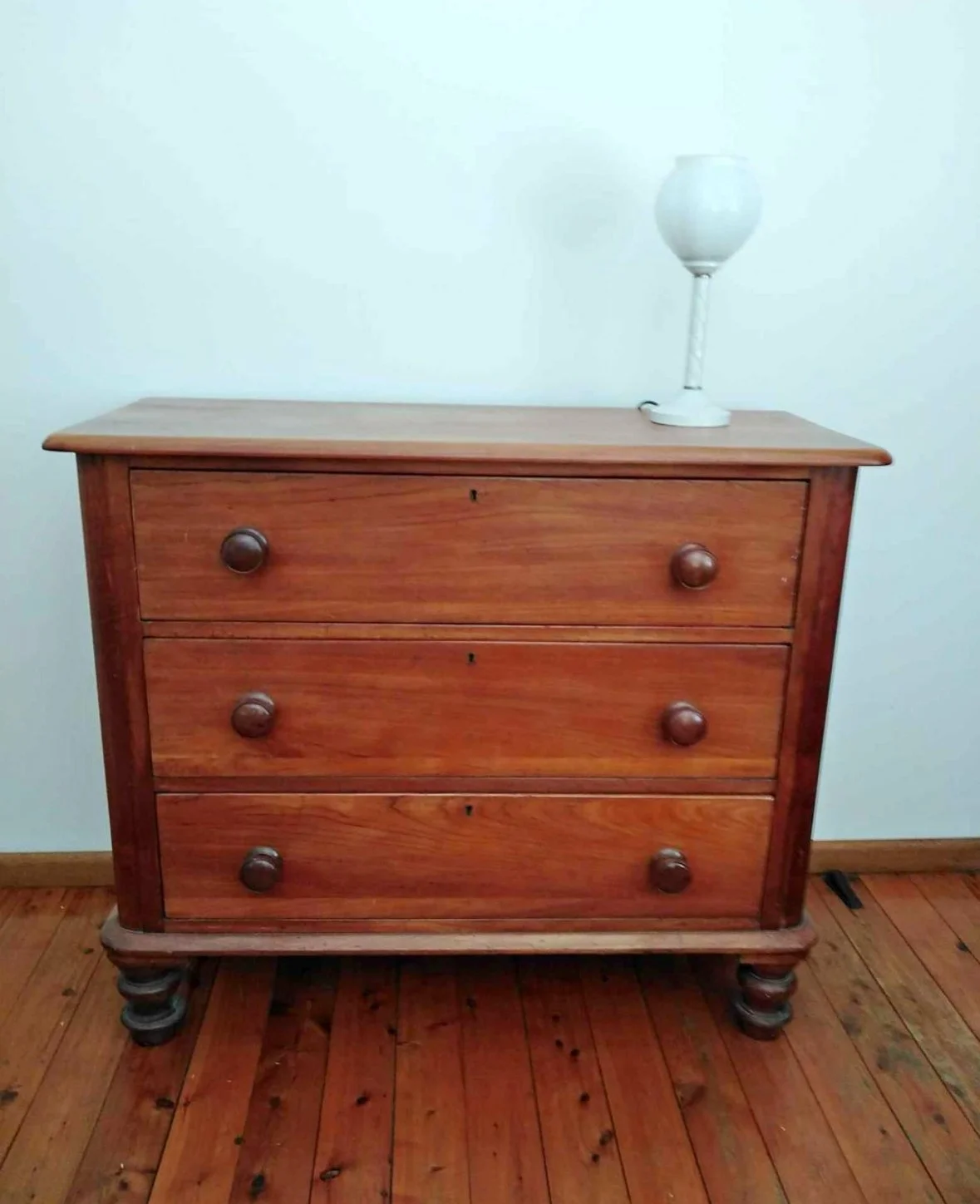
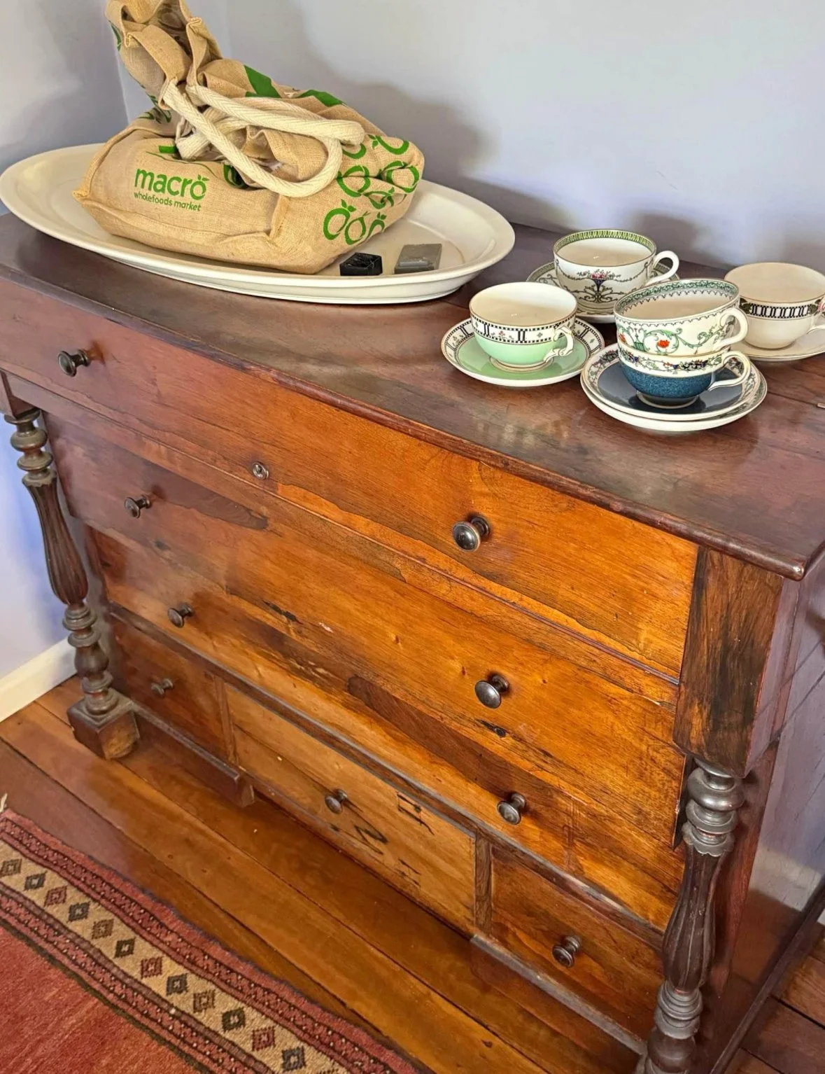
I’ve given much thought to the wall at the end of this room and despite hefting out all the sideboards/ dressers… whatever you want to call them, I do want to add one here. And excuse the slightly dodgy photograph, but I saw this one in a vintage shop in Bowral and thought, this is it!
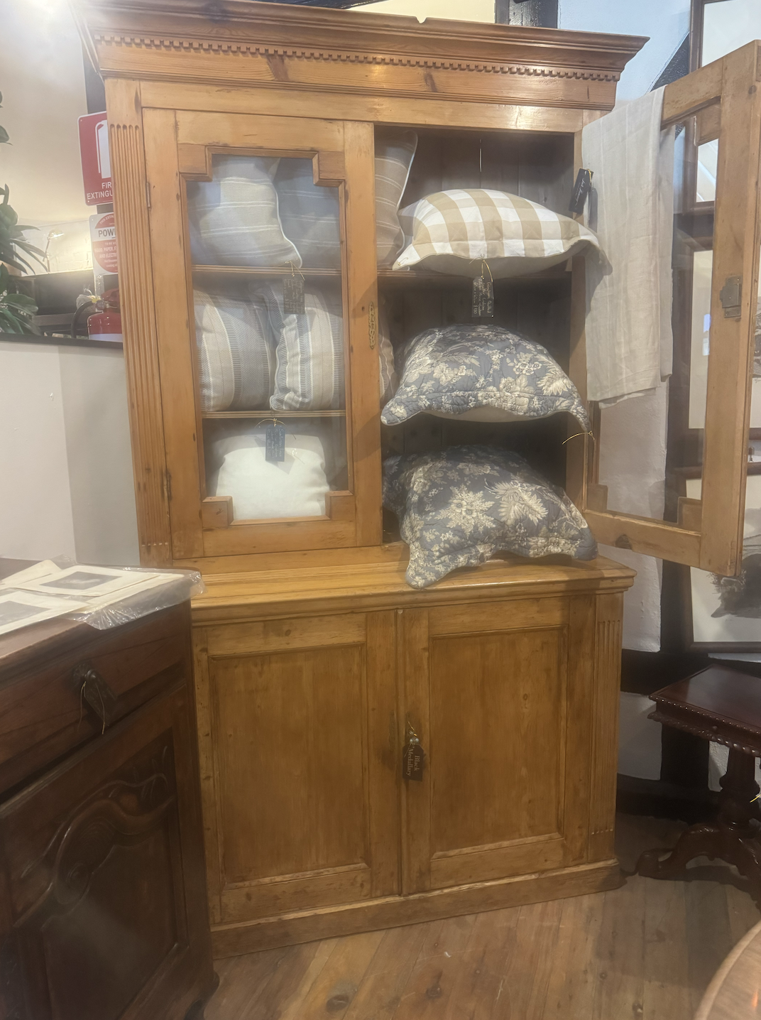
I’m as bad as Anna Charlesworth here - terrible photos!! (my excuse is that the screen protectors on my phone have not been protected - to say nothing of my composition skills!!!)
And you’re asking - WHY THIS DRESSER WHEN WE’VE JUST CHUCKED A NUMBER OF THEM OUT??????????
My answer is that this is a piece of baltic pine Victorian furniture circa 1880. It’s legit, as they say in the classics.
For glasses, wine carafes, water jugs, whatever you want to find a home for, this piece of furniture will take it AND look a million bucks. I think adding a piece like this to an otherwise modern approach really grounds the design concept and at the same time, adds the warmth of history and of story to the general ambience of the room.
It’s not what you expected, it isn’t where I imagined I land with this spot - but I think it is the right call. The price on it is $2100 which is a bargain and let me swiftly add, it is nothing like the dressers we’ve got rid of - it has the patina of time and style.
I know these are dud photos - but I really hope you’ll run with me on this. It’s in a shop near Few and Far with concessions or separate stalls inside.
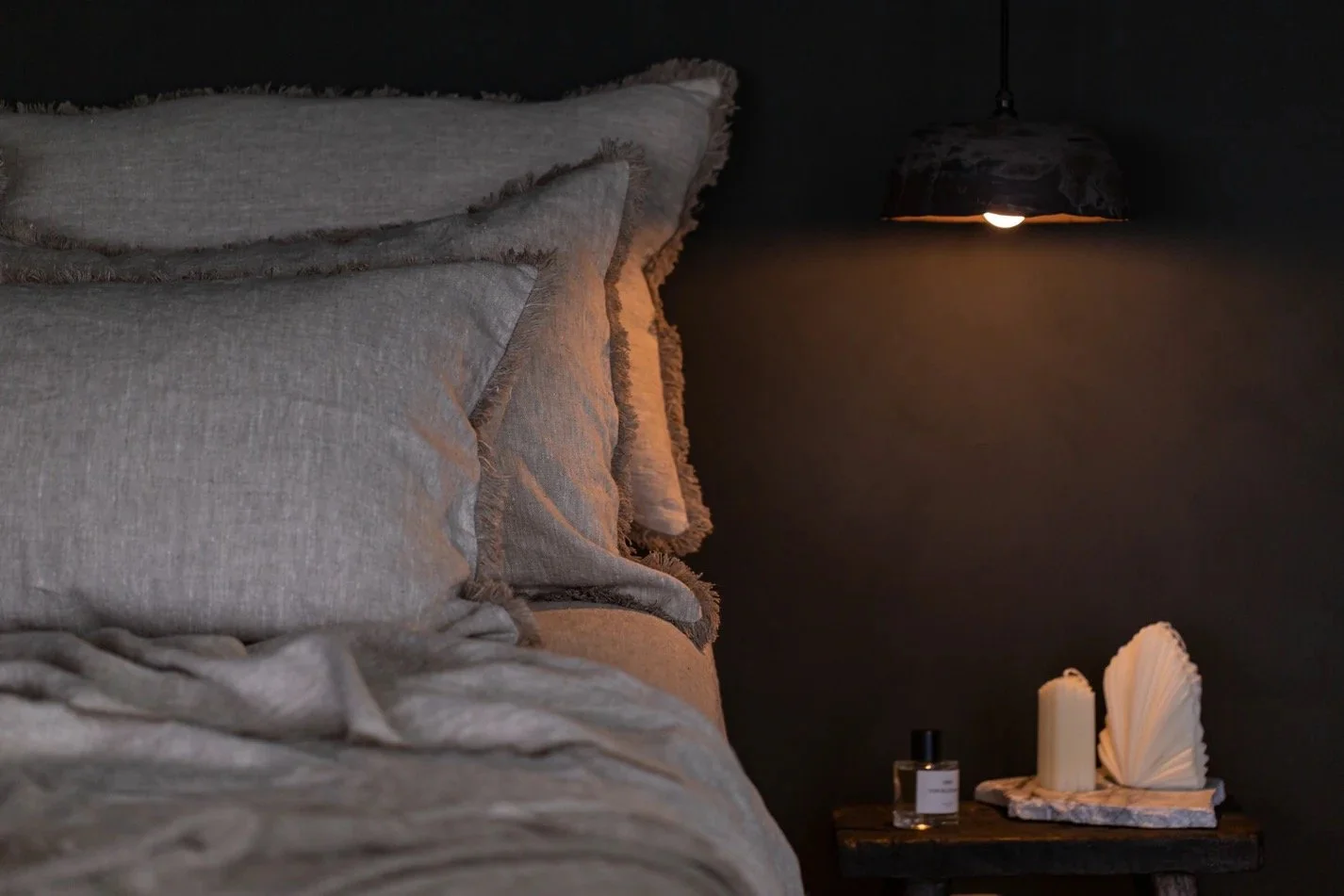
Master Bedroom:
Most important room in the house! This is a statement of fact and being such, requires appropriate respect!
So…. we start with the floor.
The flooring in here is bloody awful. But it’s not something we want to change at this point - it’s a for-later job, when you’ve decided what next steps may or may not happen. As this was a garage, there will be a concrete base that has been covered in a less that fabulous fake timber covering. We know it will be even and we know it will be freezing. So let’s go back to Armadillo.
Meadow, Pistachio.
This is the same as the living room, but in a lighter shade. It’s so thick and fabulous, as you’ll see by the sample and it’s going to really change the feel of this bedroom. And it’s still got that practicality you want in a country home, with dogs, dust and country air bringing in a smorgesbord of delights you don’t want to have to vacuum every two seconds.
The bedroom is 5.4 x 5.5m, meaning we will need the 3 x 4m rug, and the anteroom is 2.8 x 8m but a second Pistachio in here in a 2.5 x 3.5m would connect the two rooms and luxe them both up.
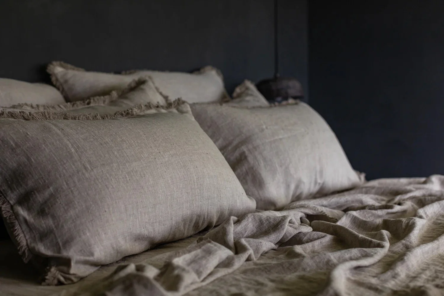
Your bedhead has arrived and it’s a neutral colour, not totally ideal but it will be fine. It’s what we put on top that is going to do the singing!!!
TA_DAAAA!!!!
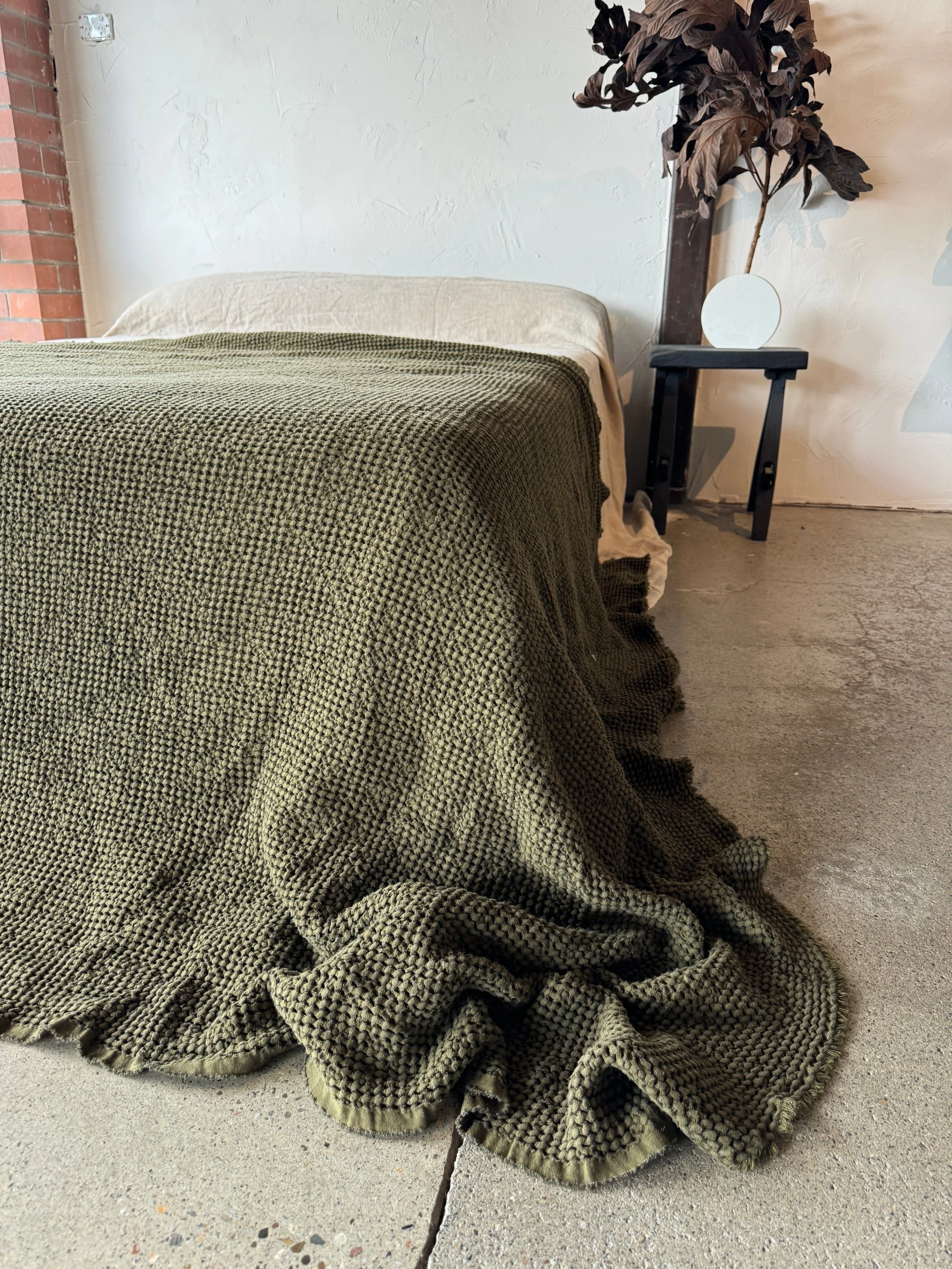
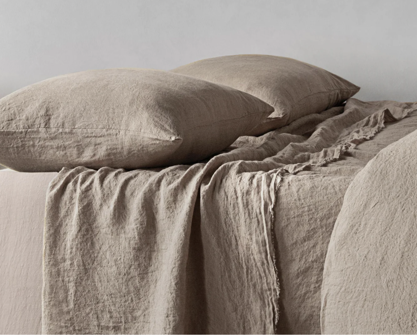
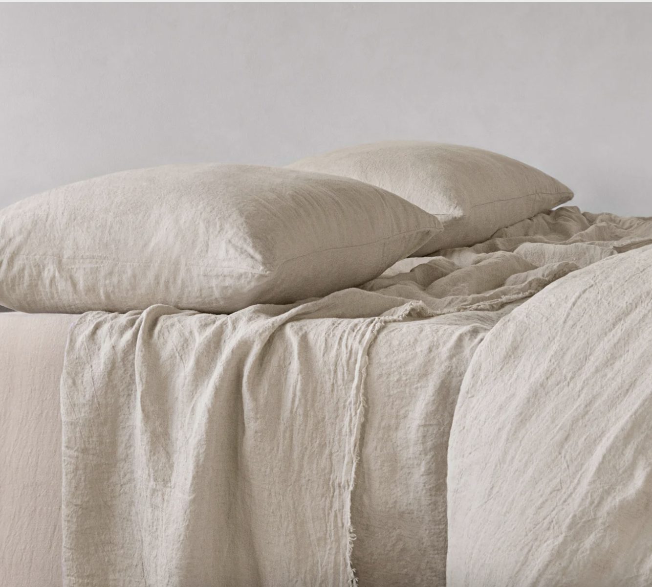
This waffle bedspread is from Bespoke Linen, a Byron supplier doing spectacular things. It’s a beautiful weight - great with just a sheet under it in summer and a doona under it in winter.
Sheets - we are doing something different for you than you’ve done for the other beds in the house - good move, not because the other linen isn’t fab, just because it’s adhering to the rule of the rulers!
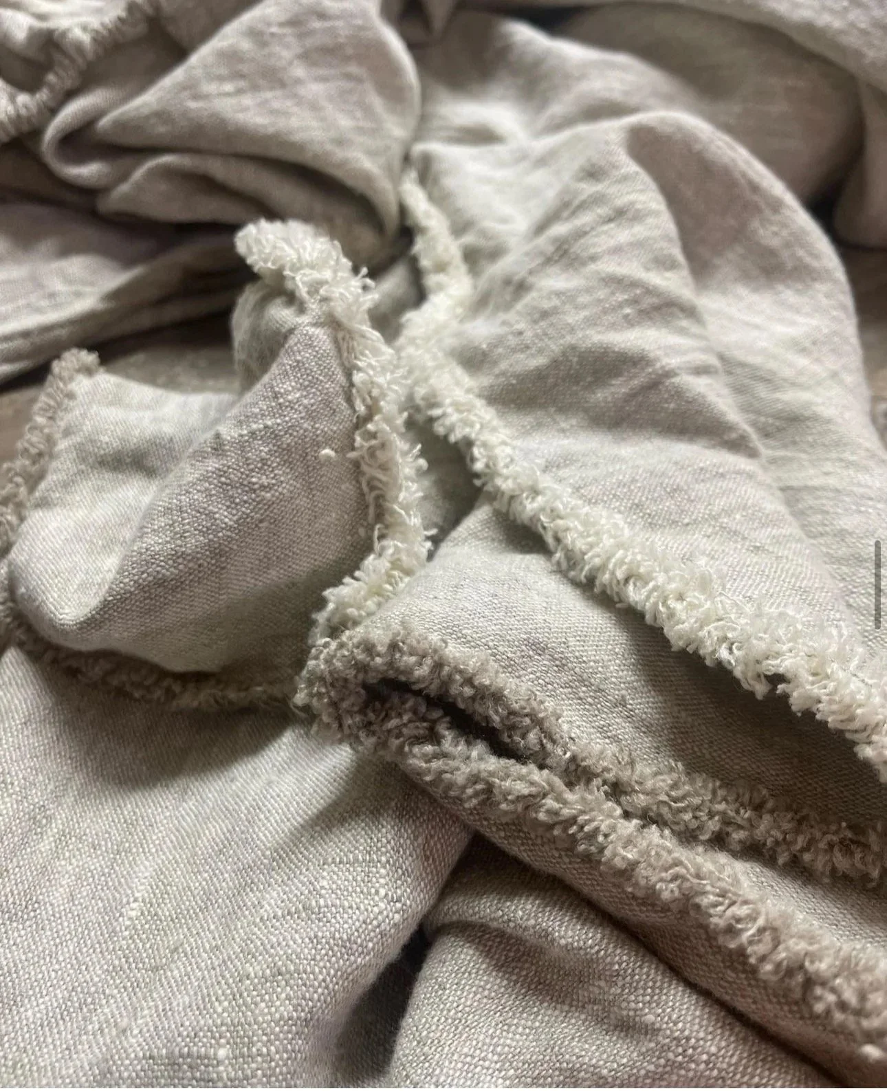
How heavenly are these… also from Bespoke Linen. They’re really special and so perfect for our vibe. Not wildly different in price from Hale Mercantile, but much more niche. Love.
Hale Mercantile does a great job and I love that they too, are Aussie. Here are some selections I’d suggest.
The sky is the limit really - it’s all gorgeous and buying a selection of sheets in complimentary shades is the best option. Don’t worry about sets - although I think whether you do one, two or three pairs of pillows, the pillowcases should be in pairs, so you can do three pairs of pillows, or six pillows, you have three pairs of pillow cases. Is that as clear as mud? All I’m saying is the colours need to be in pairs, but not all pairs need to the same.
We can add throws on the end of th bed too, for that layered and relaxed and sumptuous look. You want your weekender to look like the weekend!
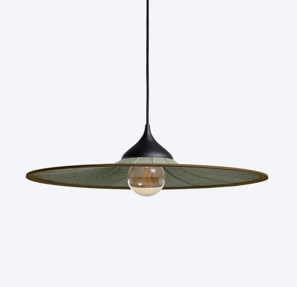
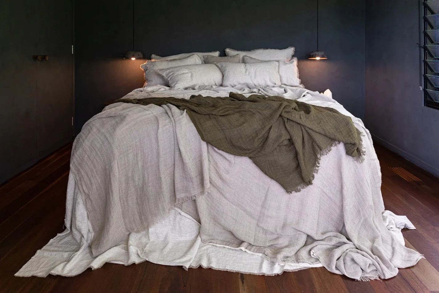
I’ve enjoyed looking for bedroom pendant lights to replace the hollowed out haystacks currently there. I think you can be a tad wild - after all, it’s the weekend…
I spotted this range last week in Cosh Living and I’m beside myself. They’re absolutely fabulous. There is not really a huge selection of photographs on the website - I think you really need to go into the store in Alexandria and see them in the flesh.
They’re called Monsieur Tricot and comprise a glass inner and an almost macrame weaving covering - they’re suitable as outdoor or indoor use.
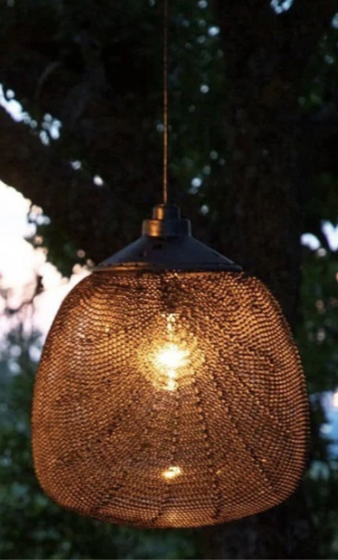
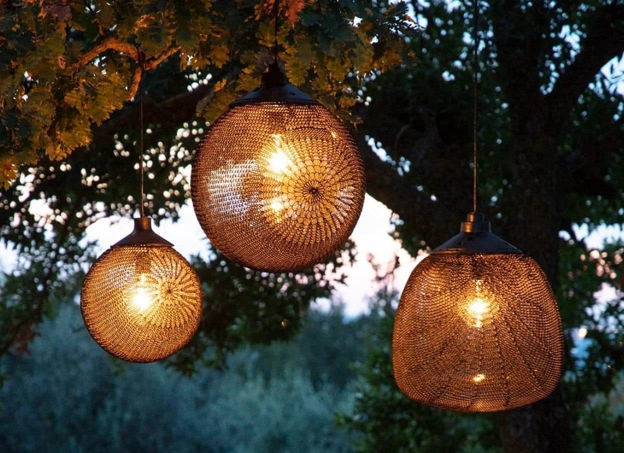
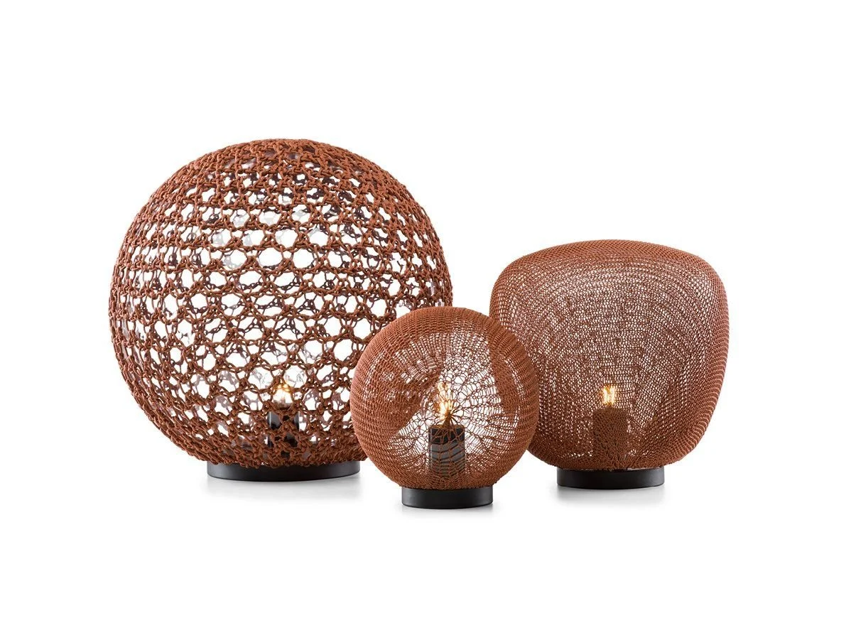
I have not been so excited by a pendant for qite a while - they’re just so fabulous. All the pics here are suboptimal - the light is available in an outdoor table top, which is the picture above left, showing all three shapes. It’s the one furtherest right I want for you, and in a pendant of course!
The brick colour is a fabulous counterpoint to the greens and it will really look rich and unique with all these elements complementing each other.
There is also a nice connector in that the woven cover is similar to the dining room pendants - variations on a theme!
Bedside tables are next - what about these for wow. They’re also from Cult Design and I love the shape and the fact thaty’re made from upcycled fiber waste material - whatever the hell that is. Sounds good.
As the light source is pendant, it means you don’t need a big bedside table that holds a lamp, and you also have the shelf on each side of the bed, so I thought to do something like this would be a lovely addition without weight and bulk.
Curtains in the bedroom and in the sitting room are, from a design perspective, essential. They just add so much.
This is, once again, from the James Dunlop Textiles range Mokum Eternal in the colour Marsala. It is full of warmth and earthy goodness that will be fabulous with the pendant lights as well as with the rich greens of the rug and with the bed linen. In the sitting room, also brilliant with the dark furniture additions and the bronze sconce light. I feel so good about all of it!!!
Poppie Pack is inviting herself in here - I think a massive one is the go, Wildflower portrait. The epic size is 1500 x 2100mm and a black frame and black mount woyld be spectacular. Flowers are feminine but size can really masculine-ise, if you don’t mind a made up word!!

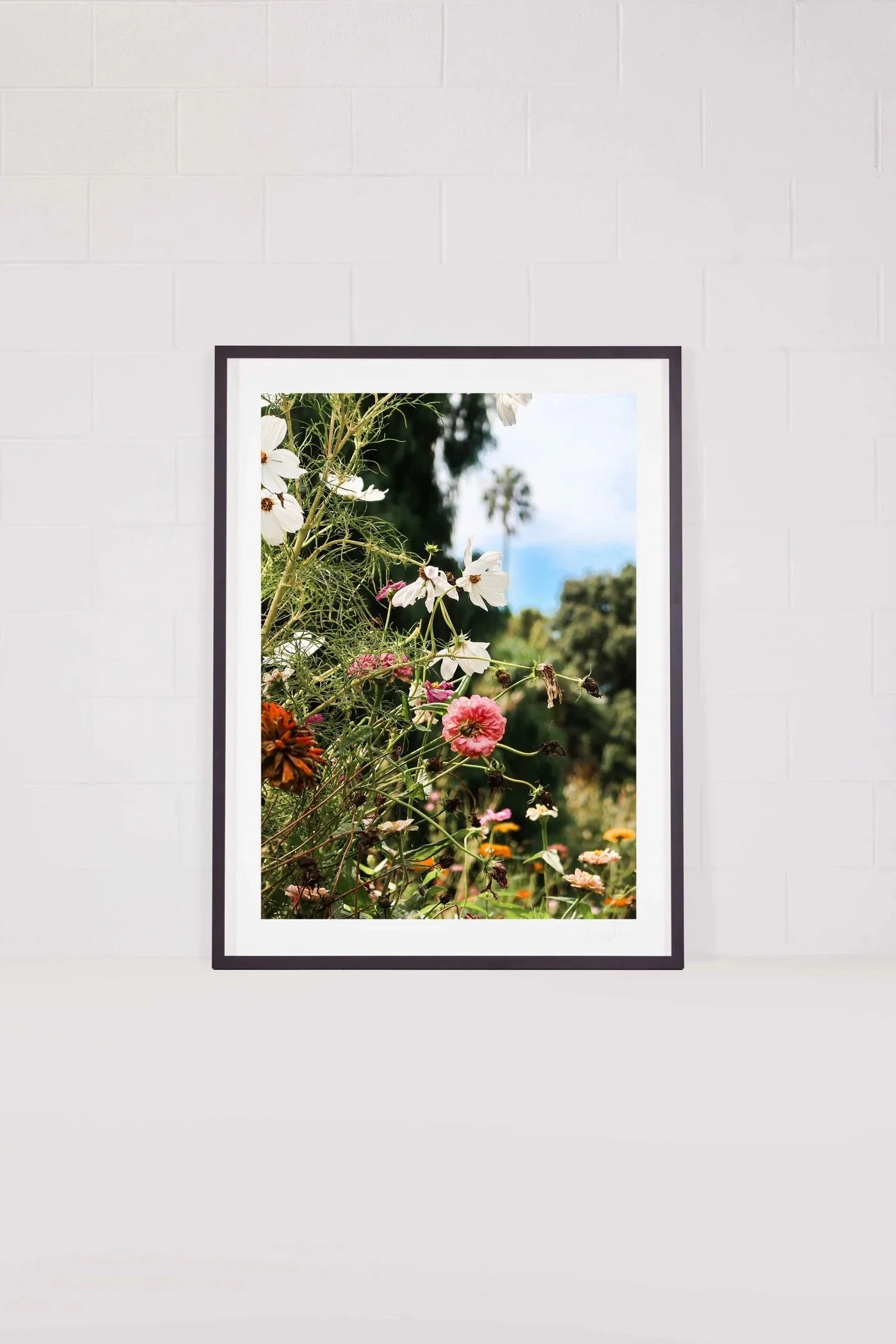
The colours are so perfect and it’s fresh and wild and free. But in the jumbo size, with a black matte, not white as pictured the image will really take on a new power.
Sitting room:
My polite advice is get rid of the heavy furniture from the sitting room - it’s no-one’s friend. Your MCM chairs are great, but I think we should get an alternate set of covers in a warmer tone. I love Moss, Malt and Sable for this room and I’d also add a round ottoman. Your little coffee table is good, too.
So here is the thing - this is a long room, how do you break it into separate and usable areas to enjoy without creating chaos and rebellion?
My solution is to put a small table and two chairs up the sink end, and a couple of chairs at the other end.

These are called Relax chairs - I’m serious. Designed by Yuzuru Yamakawa for Feelgood Designs, these chairs are sublime. I have them in both my houses! We throw a reindeer hide over the back of them - that will give our nordic alpine theme a good shot in the arm and you’ll absolutely love them. They’d face the french doors - they’re your sunny/outsidey vibes seating option - so when it is indeed sunny, throw open those doors and enjoy the light and the space right here.

And I think we repeat the same side table from Cult. I love the red here - i love that we have consistency coming through from kitchen and also from the pendant lights in the bedroom.
Above the fireplace, we can either find a groovy painting, imagine this by Kate Mackenzie (kiwi artist who I represent), or a sconce light..

Kate Mackenzie, Our Lake Runneth Over. Oil on canvass 2024.
The choices are infinite - but if you’re anything like me, I love original art and I think Kate’s work is exceptional and well priced. A piece like this would cost about $NZ8500 and would measure about 1003 x 1024mm framed. Just an idea.
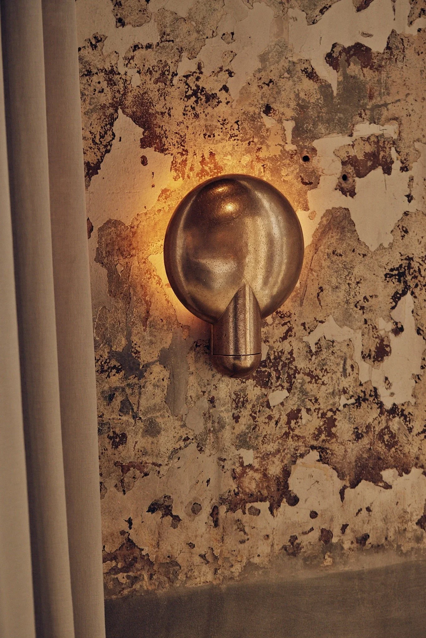
Another fabulous option would be a sconce light in bronze from Studio Henry Wilson. There is nothing like them.
This weighs about 10kgs and the light it throws is just so beautiful. It measures 300mm across and 400mm high and in the bronze, as pictured, it’s a work of art in itself.
My suggestion would be one of these above the fireplace and another Monsieur Tricot, pendant in a the round ball shape that is slightly smaller than the ones either side of the bed, suspended over the round dining table .
We delete the two chandeliers there currently.

Kate Mackenzie, Far Far Away. Oil on canvass 2023