Your Custom Text Here

 Merchant house cip

Robyn,

As I have already said, yours has to be the most interesting and charismatic house I’ve ever had the pleasure of working with. I cannot wait to see the transformation as you ‘re-inhabit’ the house in a new imagining. The bones of the house are beautiful and worthy of respect and preservation - let’s bring the house into 2024 in a dynamic and wholistic way.

Portico:

Nothing prepares one for what is behind this front door!! But maybe something SHOULD!

We talked about the pendant light being black wrought iron, but I’m wondering if that is too predictable? I love this one - it’s big and bold but not impolite!!

We’d put a warm globe inside, not a cool one as pictured. The measurement across is either 400mm or 500mm - both impactful and modern, without being a show-off. Available through a number of different suppliers.

We also need as big a jute door mat as will fit. No pattern or colour - just a big gorgeous jute - available from the hardware in Mosman!

Entry hall:

Robyn the carpet really needs replacing downstairs and I know you love blue! I found this beautiful carpet which is 100% NZ wool and the colour is a very gentle and inviting shade called Boho.

I almost didn’t include the stock image of the colour because it is so much darker than the real thing!

The swatch card is in your sample box so please rely on that not the image here for accuracy.

Having said that, it is of course darker than what is there currently, but I think this will really add style and pizzaz to the house and it will amazing. I see it replacing all carpet downstairs and on the stairs.

The entry hall, small though it is, needs to pack pizazz too, and I think a grasscloth wall paper would speak to the interior 60’s vibes, but also bring light and life to this zone. I’ve selected the colour Aura as it has a beautiful lustre to it but remains understated.

Always rely on the physical sample over images from the internet - but I have included the image on the right to show you the beauty of grasscloth. It is not a pattern to be meticulously matched in the hanging - the whole point is to see the join lines - makes it so interesting and unique.

We paint all woodwork that is currently white, Porters Paints Irish Linen which is a lovely warm white - my absolute go-to white.

SUCH a first world problem - but the issue is that if you don’t get the white right, you don’t get the light right. We want warmth and Irish Linen is a tried and trusted friend.

Robyn, I know this isn’t really in the brief, but I’d like to float this with you.

Both bedrooms could really do with a fresh start. I'd like to suggest, if I may, that you consider the option of moving into the other bedroom as you said there was a damp issue in yours?

It seems to me that the other room might be lighter and I’m thinking we paint both in this colour - Porters Paints Newport Blue.

Blues, like greys, are tricky as they’re not always warm. But I’ve used this colour before and the result was precisely what I’d hoped it would be - very calm and gentle and with the same Irish Linen woodwork, the effect is heavenly.

I would always specify curtains in a bedroom for the humanising and enveloping impact they have. I know you have shutters and may not wish to go this extra step, but the fabric I’d select would be a linen from Mokum, Eternal Ivory.

The pic on the right is from a shoot I recently did at another client’s house where we used Newport Blue in double strength. The contrast between the blue and the white is so lovely that I included for you to see. More photos will be available once the photographer has finished the edit.

But while we are on the subject, these bedside tables would also be divine for you!

They are made by Rachel Donath, a Melbourne supplier and the finish on them is really lovely and they’re very reasonably priced.

They’re a great size and look so beautiful with the blue and white.

Like I said, I know the bedrooms were not on your radar, but I’m working hard to convince you that beautiful new bedroom would be a treat.

We can look at bedside lamps etc in the near future if I am successful!

For now I will move on!!!!

Centre Room:

Hmmm… not much of a room title!! But this area is such an important style setter for the house as it is so central.

The book shelving here is really fundamental to the look of this area and by working on curating the shelves with books and treasures, we can completely change the impact you’re currently achieving. I know you’ve been south and a huge amount has happened for you in the last five years, but I know that you will have treasures and books, photographs, artworks - a host of things we can add to style up these lovely built in shelves.

With the new carpet completely changing the scene in this central room, we need to add luciousness worthy of it. I sent you a message a couple of weeks ago about the shearling couch at Studio Gardner.

It is a vintage piece that was meticulously refurbished in Belgium prior to import, and covered in shearling sheepskin.

I know you’re not a fan of mid century and nor am I, but this piece bridges the gap between contemporary and being slavish to the mid-century design of this home. We have to acknowledge the primacy of the 60’s heritage renovation - but we do not have to go Parker furniture!!!

At $12500 I think this sofa is well priced and will do a huge amount for this area - it is super comfortable, and it just looks so good. Shearling, or sheepskin generally, is very durable and is great for all seasons - as is everything wool!

Beside the sofa, we need a new floor lamp and side table I don’t want to take up space with anything too large, so these items below will be ideal.

From Cult Design, this little button of warmth measures 350W and 550H - enough for a coffee cup or wine glass!

Also from Studion Gardner comes this extraordinary light fitting. It was designed in the 50’s, so it too, honours the mid century without the cliche! The following is a lovely explanation of its origins -

In 1951, Isamu Noguchi created the Akari Light Sculptures, characterized by weightless luminosity. He chose the name “akari,” meaning “light” in Japanese, reflecting both illumination and physical lightness. During a visit to Gifu, Japan, Noguchi sketched his first Akari designs, eventually creating over 100 models. Each luminaire is handcrafted in the Ozeki workshop using traditional techniques. Bamboo rods are stretched across Noguchi’s original wooden forms, then covered with washi paper strips. The shade is folded and packed in flat boxes. The Akari Light Sculptures are marked with a stylized sun-and-moon logo, guaranteeing authenticity.

As an alternative, this one below is from Design Stuff, designed by Tom Rossau and it’s shorter at 150cm and is made of PVC. For me there is something more soulful in the Noguchi one, but I’ve included this as a comparative.

The idea is to hang it from the ceiling in the same spot where you currently have another paper lantern! But this one would really claim the space and give a grace and gravitas the room deserves. This would look best if we were able to remove the two pictures and tv. I would like to instal your ceramic ‘man’ currently stationed at the front door, as the single ornament on the cabinet - so much better than a tv!!!!!!

Robyn, we talked about new sconce lights to replace the existing. With the chandelier and the large pendant, I wanted to find a discreet but equally groovy piece that would complement our scheme, and the natural choice was Henry Wilson. I would like to use his door pulls as well, so there will be a link to this element in bronze.

This concial fitting is not very big - 120mm high and 196mm in diameter, it would be a subtle addition, but a stylish one! I’m thinking at least one, possibly two both downstairs and upstairs.

I spend my life telling people to hide their tvs and I spend my life being told ‘no’ on this score!! But this area is so vital - we need to do everything to maximise it and tvs are an (albeit necessary) eyesore!!

Could we discuss moving it to under the stairs perhaps?

The cabinet currently under the stairs… I know you’ve become fond of it but I think it’s in the wrong spot and actually, it could possibly find a new home altogether!! In a 1920’s bungalow with a 60’s renovation, there is already a lot going on without confusing the identity of the house further!!

Upstairs you have the perfect piece, a small sideboard in the modernist style that currently has a bicycle ornament on top of it. This is a much better spot for that piece. It would match the one the other one in this area and look great.

A lamp is another important element to consider for this space

This one is a DCW Editions lamp called a Mantis, and was designed by a frenchman, Bernard-Albin Gras, in the 1950’s. With its industrial aesthetic and fine profile, it is the perfect foil for the soft and voluptuous lantern.

Lamplight does so much heavy lifting in the general ambience of a room and creating that feeling of a warm hug. So getting the full benefit of clever lighting in this, the primary or central room of the house, really does matter.

It juxtaposes the lantern in a sensational way - and its practicality as an additional, directional light source makes this a strong choice.

You mentioned that you like BoConcept as it aligns with your scandi aesthetic. I popped in there looking for an armchair and I found this one, below right. It’s wildly comfortable and the leather is just gorgeous. The one below left is also Scandi, made by Hay and available (at the moment on sale!) through Cult Design.

The BoConcept chair above has an optional matching foot stool but I didn’t include as I think it might be a nuisance to work around in the this part of the house. You may beg to differ!!

BoConcept have emailed me to say there is an Imola chair and footstool currently available half price!!! Let me know asap if you’d like to see it.

What I’m loving about both is the high back - both chairs have presence and form without bulk.

The big column of white in the light fitting and an abundance of natural light allow us more latitude in terms of depth of colour in the furniture. Both of these options would look fabulous and both would help build a really unique and charismatic design.

Dining Room:

Here is the tough love - we need to restore the original dining chairs belonging to the table!! And we also need to ditch the side board in favour of one that matches the style of the table - and the house. The existing does neither of those things!!

The next BIG move for here is a light fitting for above the table. I was SO EXCITED to find this one because it is like an artwork - it fits with the respect piece on mid-century, but it’s Scandi in its inspiration. It’s from Copenhagen and it is so perfect it actually hurts…

This fitting will have a long lead time but I think it will be so stunning and well worth the wait. The brass shades are subtle - they flutter a golden lustre like autumn leaves - just beautiful.

The curtains you have are a really great colour but they need replacing. I don’t want to move too far from the colour though, as I think it was so right for this room. So I have chosen a similar shade but in a linen by Laconia Air (James Dunlop Textiles) in the colour Atlantic which will be lined for greater warmth in winter and heat protection in summer

The image above has the curtains ‘puddling’ which I am not a huge fan of. Linen has a bit of a mind of its own and even if when newly hung and they brush the floor, they will expand and contract according to the weather. We can tolerate a little extra length but we cannot tolerate them shrinking up like a man with his pants too short!!

The take-out is to be relaxed about a little bit of ‘puddling’ or excess length on the floor, though not as long as in the image.

A rug underneath the dining table is another way for a room to give a big hug!

The one on the right here is by Armadillo - a woollen rug from the Eden range, part of their Heirloom Collection, in the colour citrine.

It looks fabulous with the blue of the curtains and the will be divine with the brass chandelier, too.

As mentioned, the style of the sideboard here doesn’t fit with the scheme of the house. It is of a very different era in history and it’s carved front jars with the scandi / modernist style we are building in line with the bones of the 1960’s renovation. So it should be replaced!

Ethnicraft is a danish company who manufacture in Indonesia. Their product is Scandi and the price point is not! I love specifying it for these two very good reasons.

This sideboard below would be a lovely replacement. The detail is beautifully soft-edged and the timber used is FSC Certified solid oak, which means it comes from a forest that is being managed in a way that preserves ecological diversity, whilst sustaining economic viability AND benefitting the lives of locals.

That’s what Ethnicraft are all about.

It has a hard-waxed, oiled finish which gives it a lovely lustre and the light colour of the oak would sit nicely with the other timbers and veneers in the room.

The three cupboard option is 1740mm wide and 450mm deep and stands 850mm high. A lamp on the end will top it off!

Kelly Wearstler is a Californian designer who makes a fabulous range of lamps, among a plethora of other things! I love the lamps because they blend a modern design with a very organic aesthetic; ceramics, aged iron and linen commonly featuring. I have chosen a pair for upstairs and this single one for the dining room.

The Miramar lamp is 83cm tall and contrasts a sculptural base with a brass shade, a nice connection to the chandelier.

The palette here is warm and rich with the citrine rug, the different wood finishes and the blues and brass.

The brilliant thing about this project is that you don’t have to spend money or time redoing the kitchen and bathroom! It means that the budget can mostly be focussed on things that make the biggest impact.

Upstairs:

I know you’re agonising…. I also know this is very fixable! The trick is LESS IS MORE! I would advise you to remove most of what is there currently and get the feel of how the space would feel with a lot less furniture. By creating more breathing space with less clutter, you will achieve a more harmonious and calm vibe and the area will feel much freer and more spacious.

If you consider the mezzanine in four parts: a daybed area at one end, bookended by a tv ‘nook’ at the other, with a formal lounge or entertaining area in the centre and a small dining table on the left or the right front corner. We need to discuss which end is which!!

The daybed rationale is that this is a lovely place to be up here, and with the shape of the space as a total, we have room to luxuriate lying on a daybed, reading a book!! It could also be a guest bed, you might prefer a guest to here than in the second bedroom.

In your sample box you’ll find specs on Cult Design’s Zanotta William modular. This is our new best friend! I have been to see it, to sit on it and to look at available fabrics in which to cover it!

The strong point, apart from it’s comfort and style, is the slimline contours. By having the daybed and modular in the same range (and colour) gives the space a coherency that combats that sense of many different spaces living disconnectedly! I love the soft green - and have put a sticker on the back of the swatch.

None of the images have the range in the linen I have selected - so annoying! But I would love for you to go in to Cult Design in Chippendale to view what they have on the floor and see first hand what the optionality is,

Essentially, I think we do need a sofa that is capacious but not deep, and if you’re worried about it facing out to the view, we can swing it around and have it facing inward. I think you’ll find there is space - whereas, there is not space to create a generous formal entertaining area in the tv nook. So I’d suggest a daybed for the stairs end, and a longer couch and ottoman, which can be deployed when required for extra seating, and pushed out of the way when not.

The fabric I’d suggest, as mentioned, is a soft green linen and I’d suggest we add three armchairs. You gasp! I’d suggest we put two in the tv nook, and a third with the sofa.

This is a swivel chair from Globewest - ridiculously comfortable and at a great price point. I get a huge discount at this supplier which I pass on to you. The close up on the picture above right is the fabric choice, Caramel Latte.

The chair is a comparatively compact size which makes it easy enough to move around, and also prevents over crowding! And the swivel is always a joy…

Ignore the green above, I added this image for further perspective!!!

Coffee tables - In the tv nook, you can afford the space and I think these from James Lane are gorgeous as a pair.

Made of mango wood, they’re a beautiful shape and could be placed side by side, or split apart, depending on what works and when. The taller, smaller diameter one could alternatively be placed beside the sofa, or you could purchase two of these and one of the larger, shorter one. Miraculously, these too, are at a great price point. That’s a good thing - because the sofa is not!!

At one of the front corners of the space - and it could work at either, we want a small round dining table and 2 or 3 chairs.

The table below right is through Trit House and has a lovely walnut coloured base and a travertine top and at a meter in diameter, is the perfect size for this space.

The chair above left, is the Carlo from Globewest and is covered with recycled leather - legs and all! They’re a lovely looking chair, there is something so warm and inviting about them that I have specified them quite a bit lately - I’m a big fan. This tan is so perfect for your house and a lovely match with the table. I think three would look best as you also have the option of a fourth seat on the window seat.

Lamps for this space. I just love Kelly Wearstler’s lighting designs - they’re quirky yet classic and their organic materiality really draws me in. This one is called the Senso, and I especially love the website spin,

With its ziggurat form and monolithic scale, the Senso Large Table Lamp is a beguiling paradigm of ambiguous modern design. This table lamp features a ceramic base with a Crystal Bronze finish paired with a Linen shade and is topped with a brass diffuser.

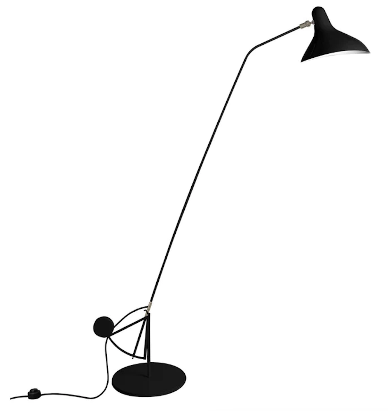
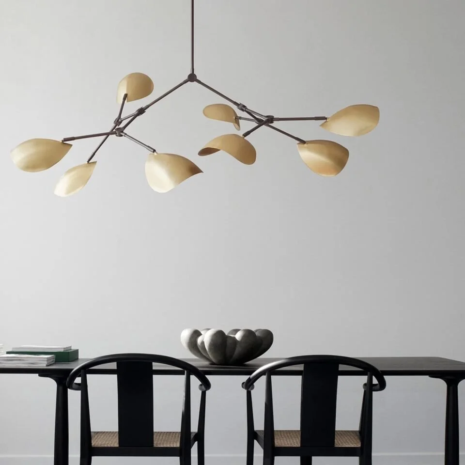
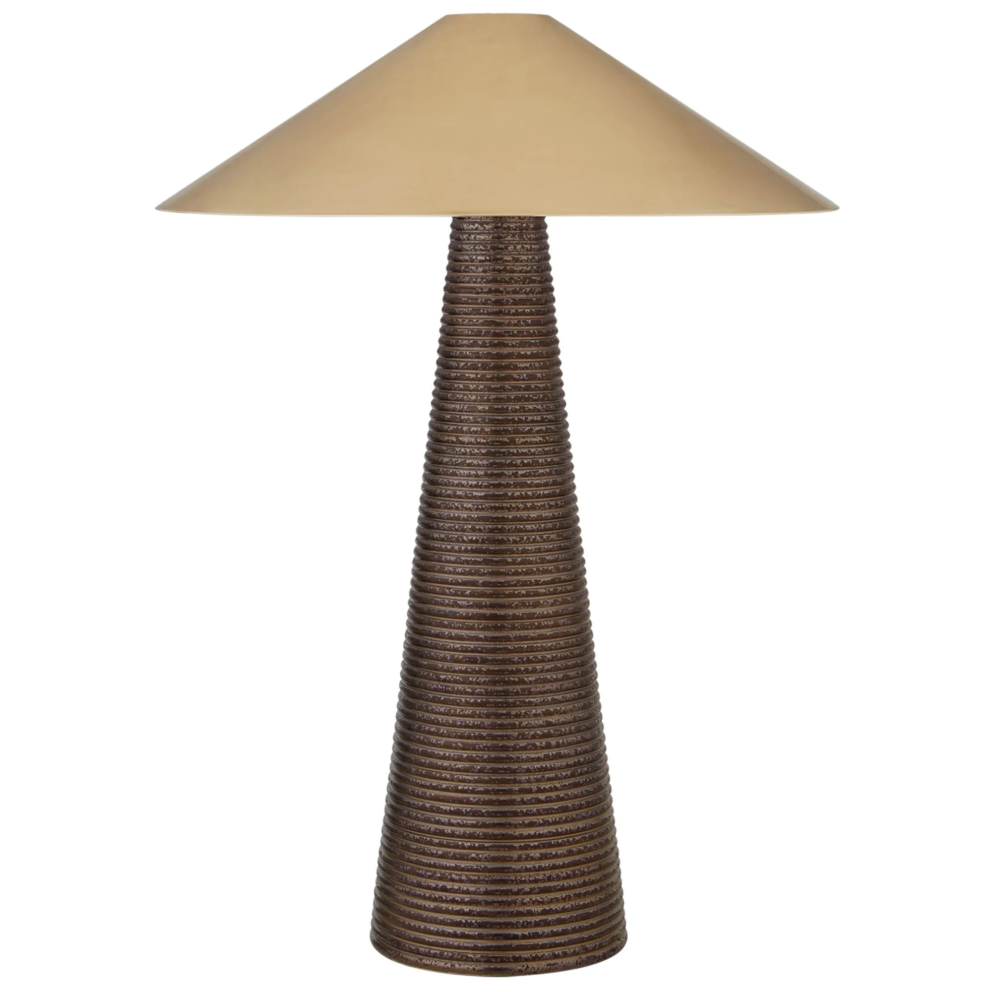
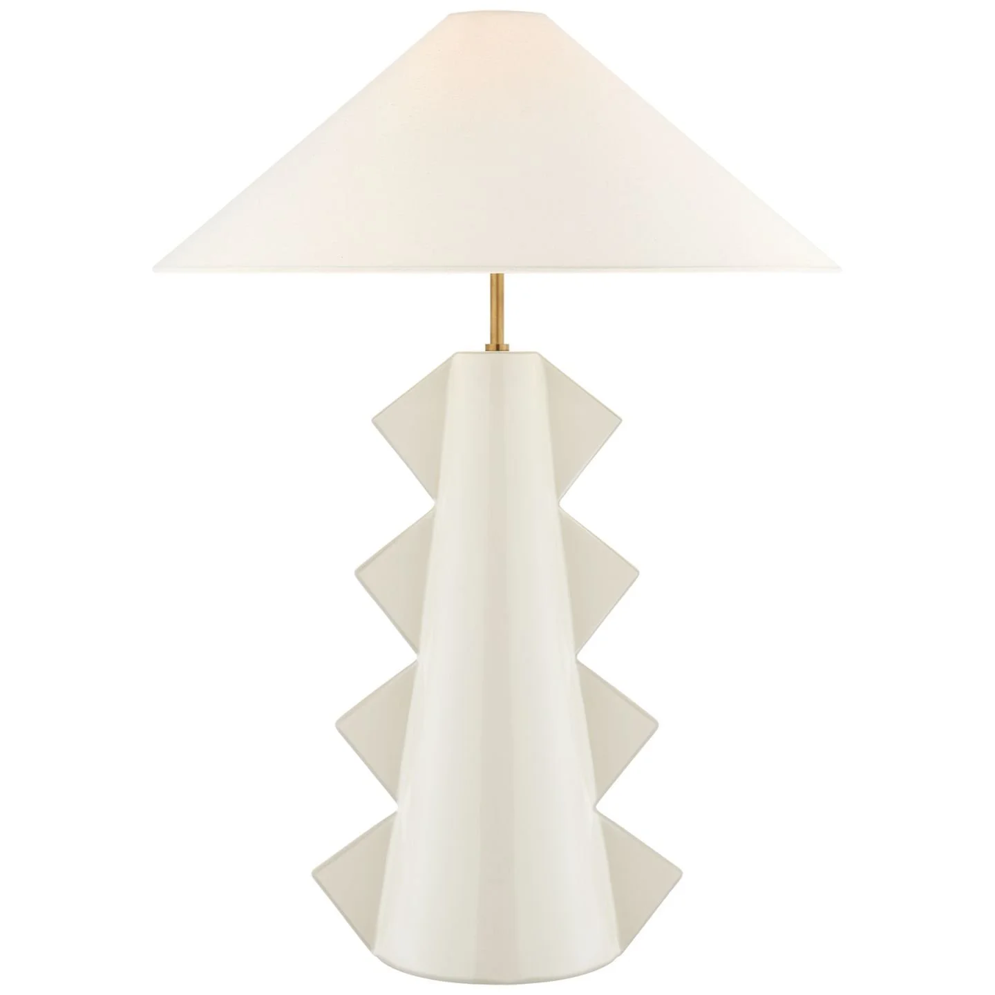
How could you say no?!! Regardless of the spin, they really are arresting. They stand 84cm tall, so they intend to be noticed! One can be placed next to the television as a replacement for the one that is there, and the second could sit on a side table near the sofa.

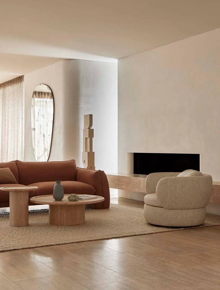
If you wanted to add another standard lamp, I would recommend repeating the DCW Editions Mantis lamp as consistency in a design mantra. By repeating element throughout the home, we build that feeling of cohesiveness and rationale, which enhances harmony.

The back deck:

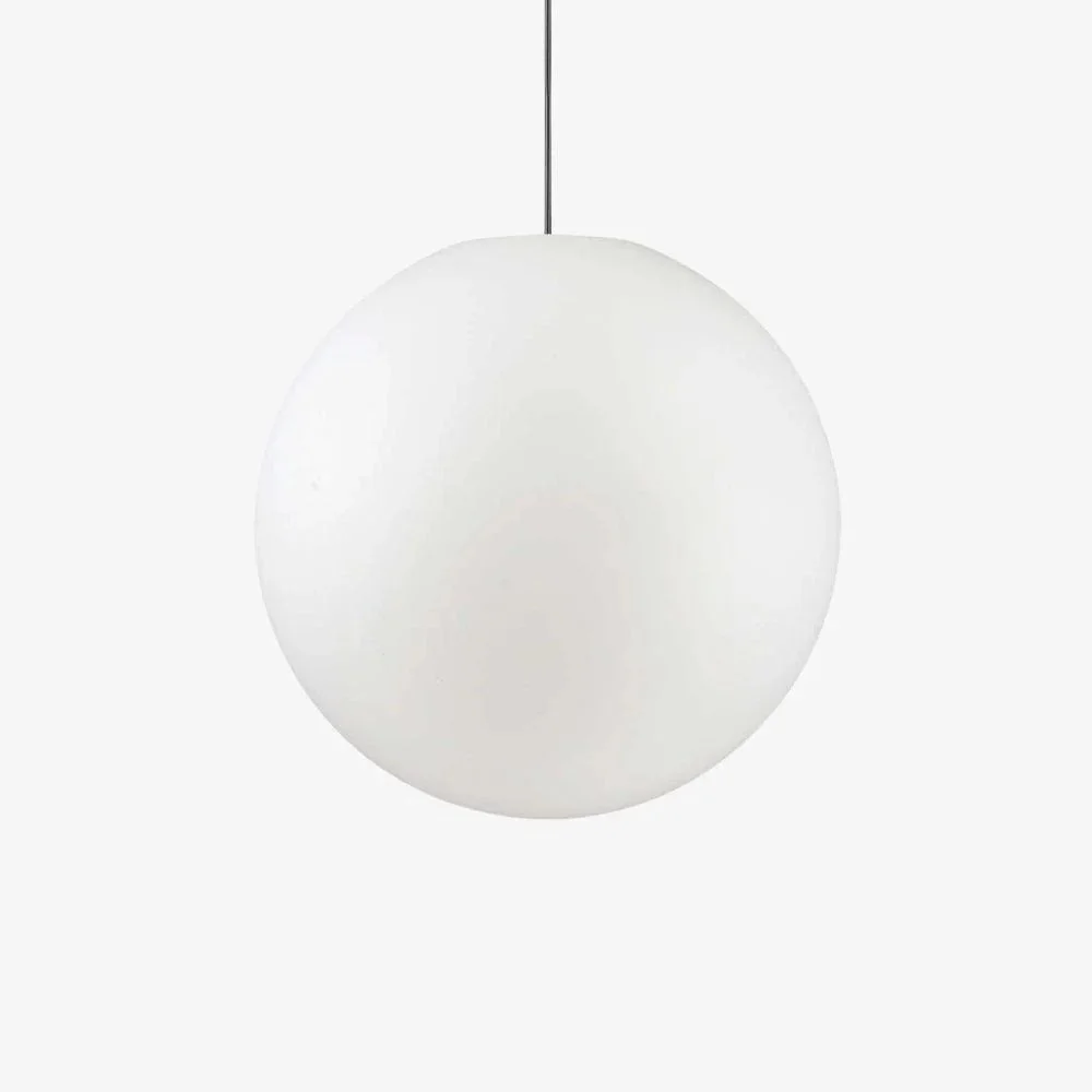
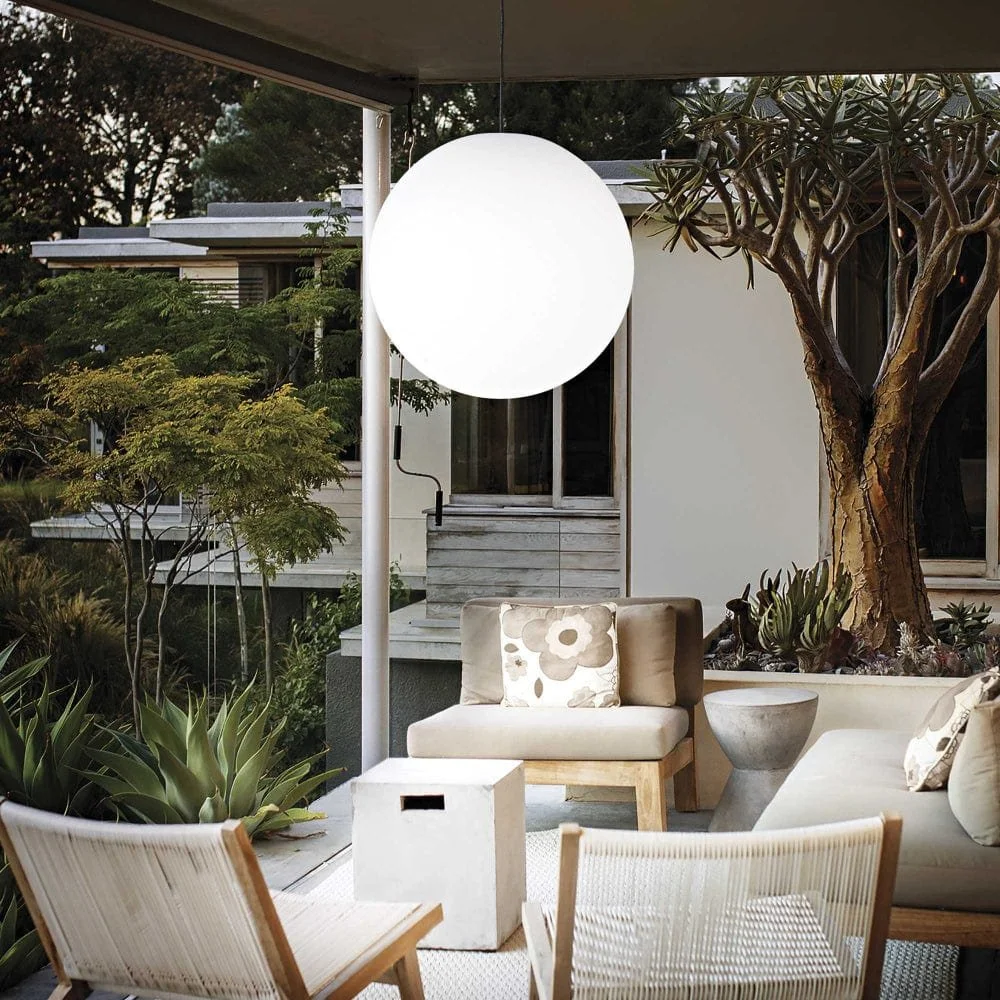
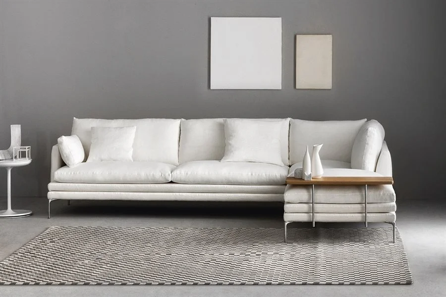
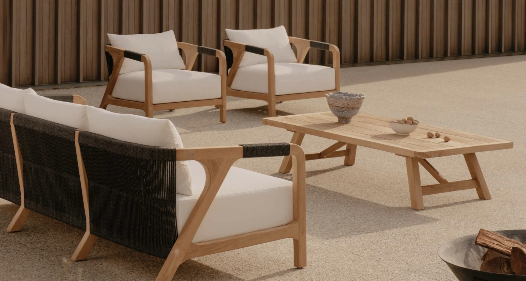
With spring now sprung, I’m sure you’ll be keen to get the garden sorted, notwithstanding your sore shoulder! It’s such lovely garden and with the warmer months now beginning, I’m sure you’ll get it in shape in no time. Furniture on the back deck needs to be comfortable so that you’ll be drawn out there to admire the garden!!!

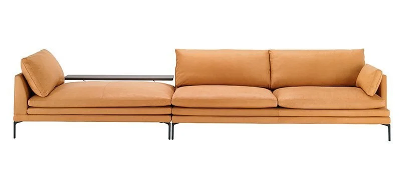
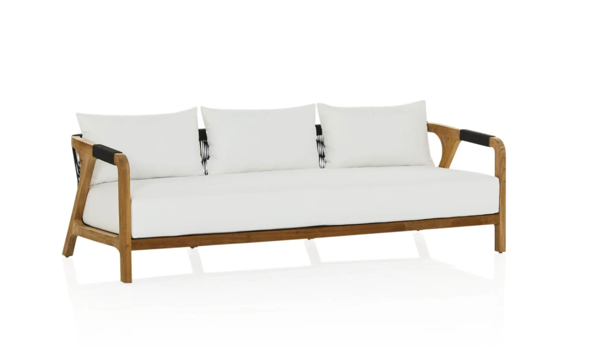
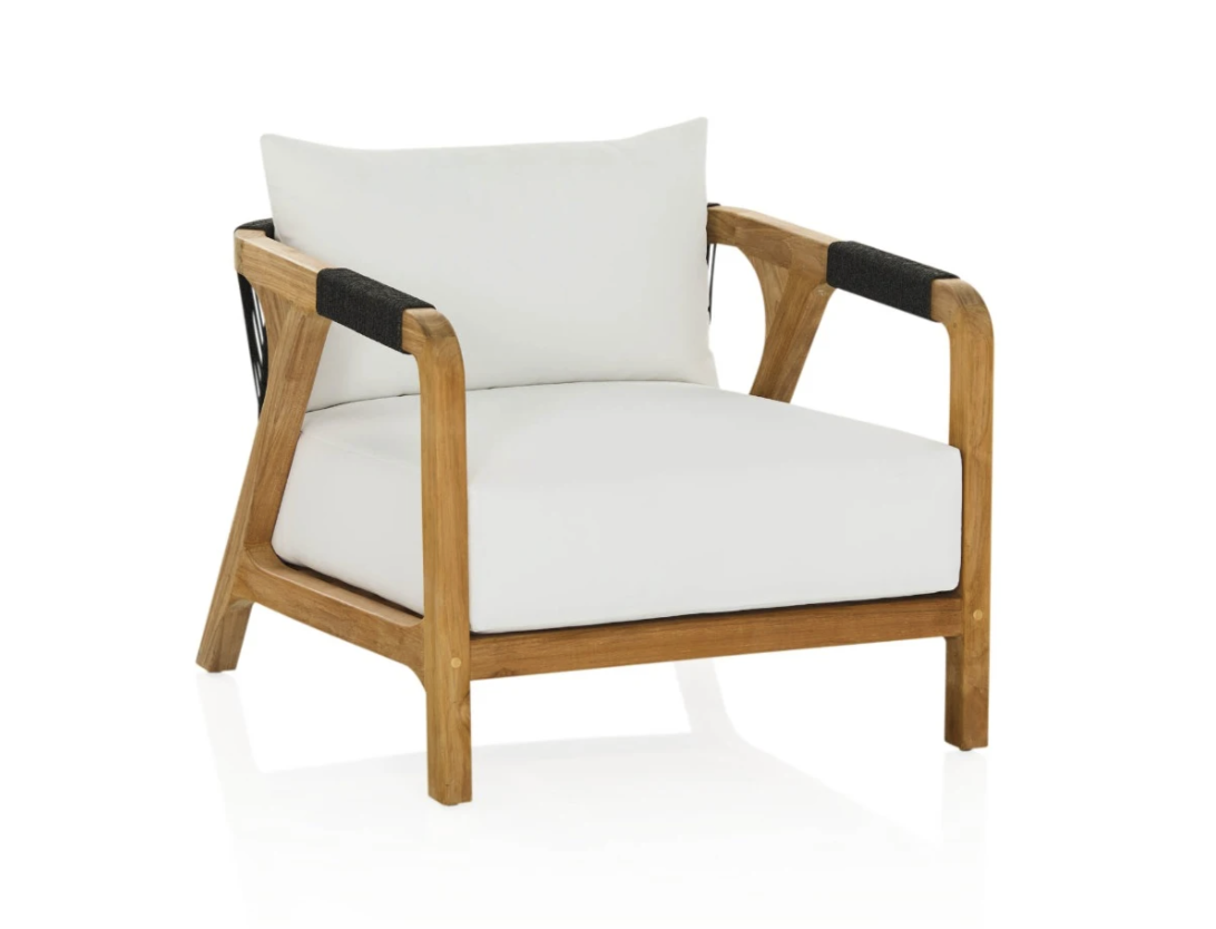
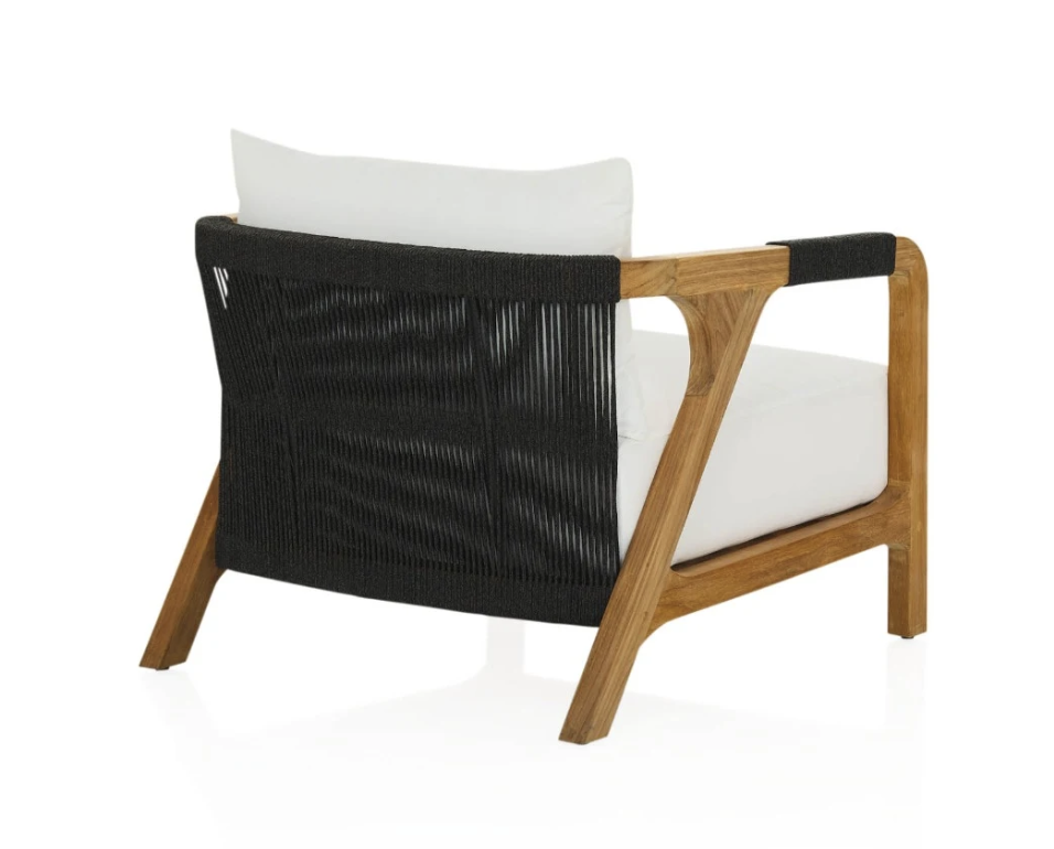
We spoke about it not being necessary to repeat a dining table and chairs option, given the close proximity to the set inside, so I’ve selected this outdoor seating from CoCo Republic, called the Tuci.

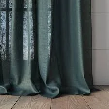
The range is currently on sale at CoCo Republic and the other great thing is that you can purchase covers for the chairs and the sofa to put on when you’re away or when the weather is a punish. But the fabric is specifically for outdoor use and the manufacturer recommends hosing it down or scrubbing with a soft bristled brush and soap, as opposed to removing the covers.

It is elegant and stylish and would be perfect for your deck! I’d recommend the sofa and two chairs plus a coffee table.

Summary:

Robyn, it is so easy for all of us to accumulate as the years go by, a household of ‘things’ and furniture that become rusted on and blind us to the potential of a more curated life. Living becomes more pleasurable when you can enjoy a freshened update and you look around you and see loveliness abounding. Clearing out the things that don’t ‘spark joy’, a phrase coined by Marie Kondo, is a valuable exercise for everyone and I hope that the foregoing will fill you with the inspiration to do so!.

Your house is exceptional - there was a vision in both of its major life moves, its original design in the 1920’s and in its 1960’s reimagining. I hope that this third phase of its life will see you sweep through with a new broom and bring in a new style and coherency that will set you up for many years to come.

I look forward to helping you advance that process.

Henrietta x

Previous
Previous

Merchant House Scope

Next
Next

Mountain Ridge Homestead