

Your Custom Text Here
Greenwich house
Diane and David,
The following Creative Interior Plan is intended to bring to your home a fresh new perspective that has at its core, a botanical theme. It takes into account the heritage of the property, the character of its inhabitants, and the flavours of contemporary living and above all, it honours the good fight by which you have saved it from the jaws of greedy developers!
So let us begin the transformation and reimagining of 8 Anglo Road, Greenwich.
Edits in bold font
The front door
“Our own front door can be a wonderful thing, or a sight we dread; rarely is only a door…'“
Jeanette Winterson got that right - this zone sets the scene for the entire design of the house and so it is important to get it just as right as her wise words! A blend of period features that need to be restored, updated treatments of some of the elements, and a good colour scheme are all essential for number 8.
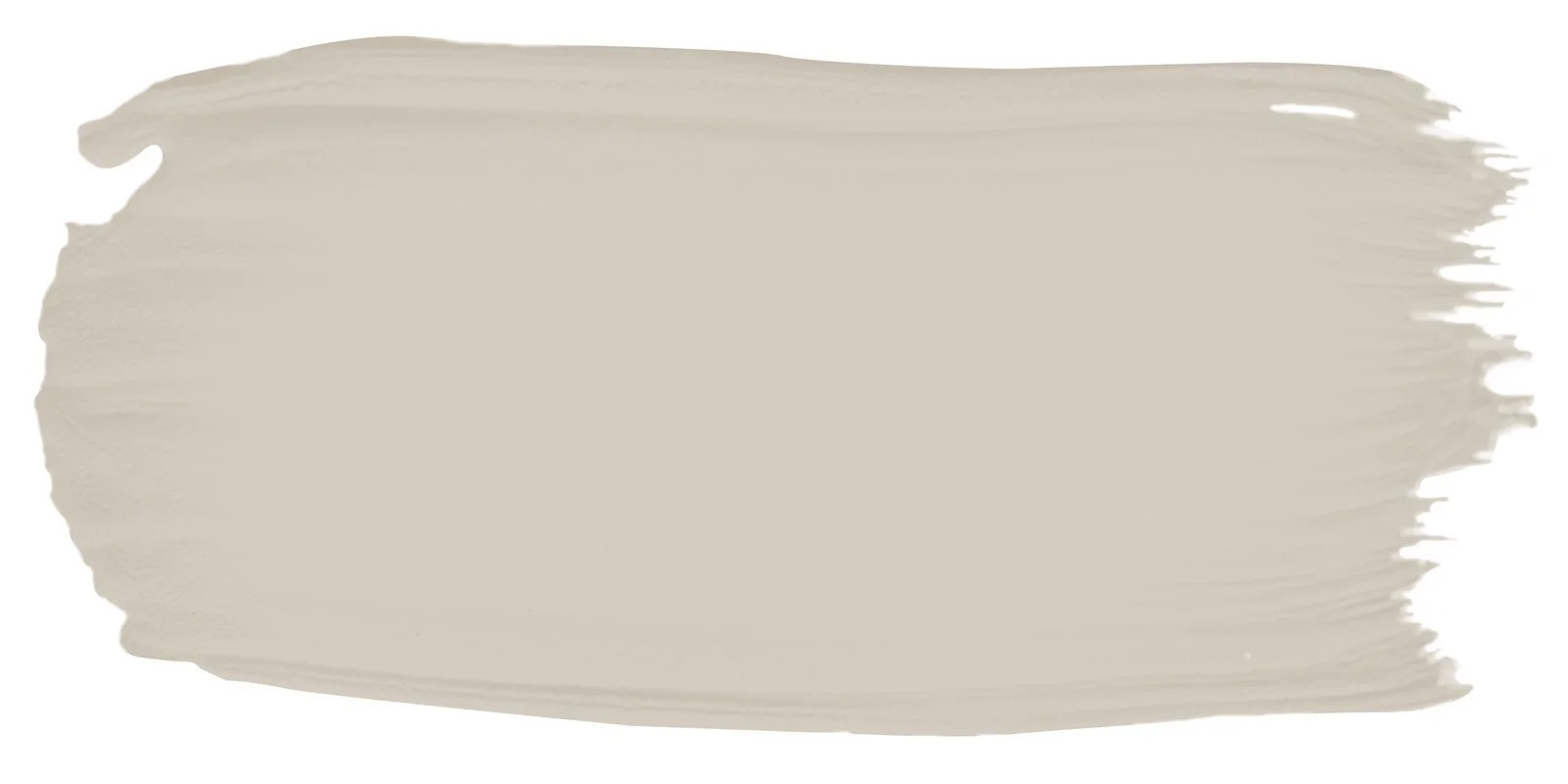
I will start with the paint colour. Diane you mentioned repointing the bricks - you may decide to do this, or, once the roof is replaced, the house could be professionally washed to remove the years of city pollution etc, and you could make the assessment then.
The red of the bricks is a lovely tone and the idea here is to let it do the talking! However, it can be well enhanced by the using different colours for the woodwork and non-brick areas.
Porters Paints Drift

Porters Paints White Rhino

Porters Paints Irish Linen
Porters Paints developed Drift for the AGNSW, a rich, earthy and soft colour to be used in the replaced gable detail, and potentially, on the bricks at the back of the house. You may reject painting the bricks at the back of the house, but I think it would lighten and modernise the back area. Only the original brick would stay unpainted.
A contrasting, darker colour, White Rhino, will be used for all the barge boards, including above the vertical panels on the portico, and for the new security grill and window sills in the front and side.
I discovered an alternate colour, Riverstone, whilst researching in the Porters showroom - I think it provides better contrast than White Rhino especially given your preference to use the lighter colour on the window sills.

Porters Paints, Riverstone

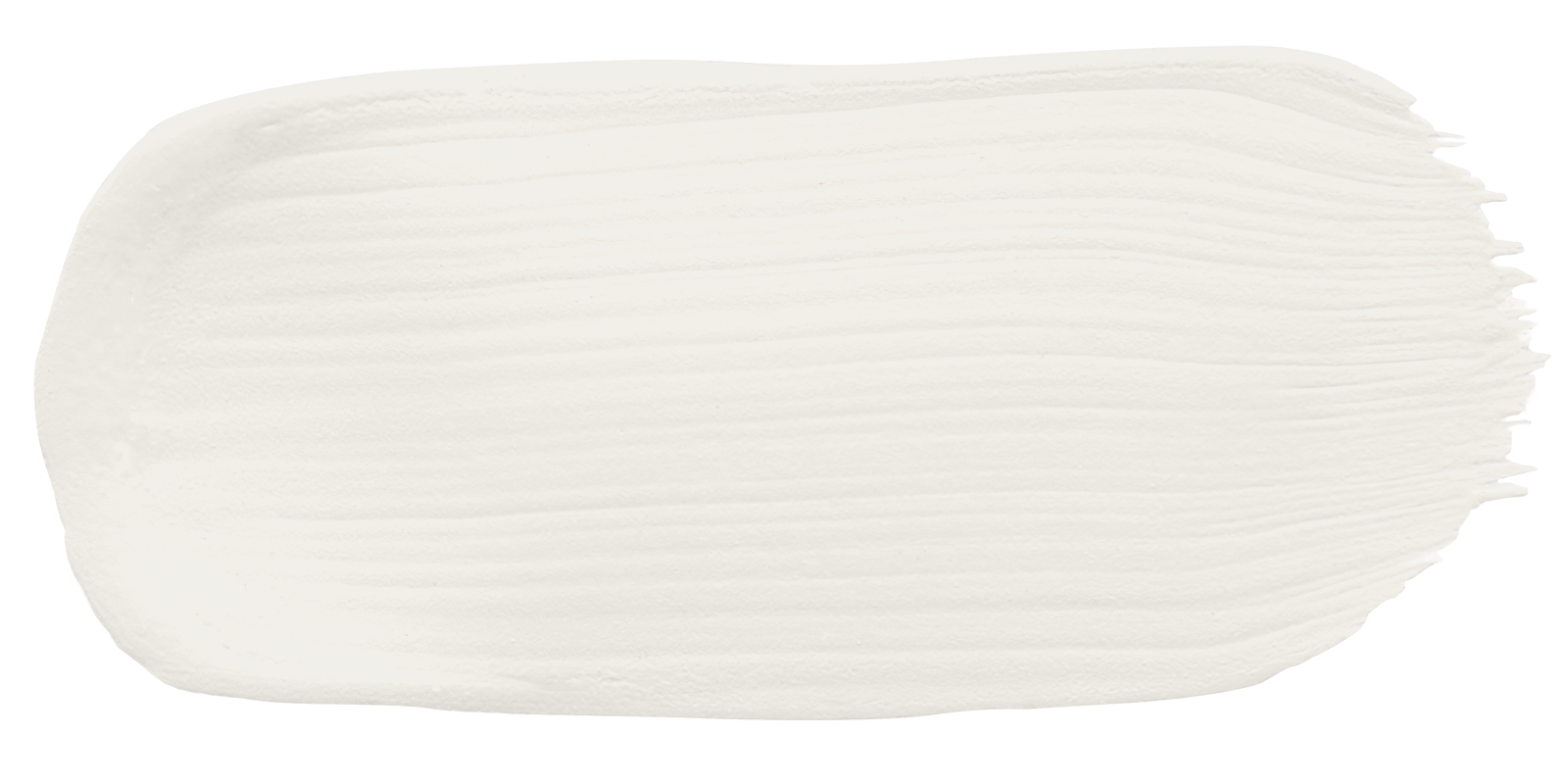
The front door, underside of the portico awning, the windows, french doors and the side gate will be Porter’s Irish linen, which is a white with just a hint of warmth.
The combination of these colours with the red of the house and the green of the soon to be lush front garden, will be stylish, sophisticated and contemporary.

We can assume that earlier in the history of the house, there was a tiled entry, as that was so typical of the era. Rather than reinstating the original federation style, we can give an inherent nod to that tradition with this more contemporary treatment of tiling the portico with a simple design in black and white, with the option of incorporating the street number in the design. Tiling to continue on risers from path and into house.
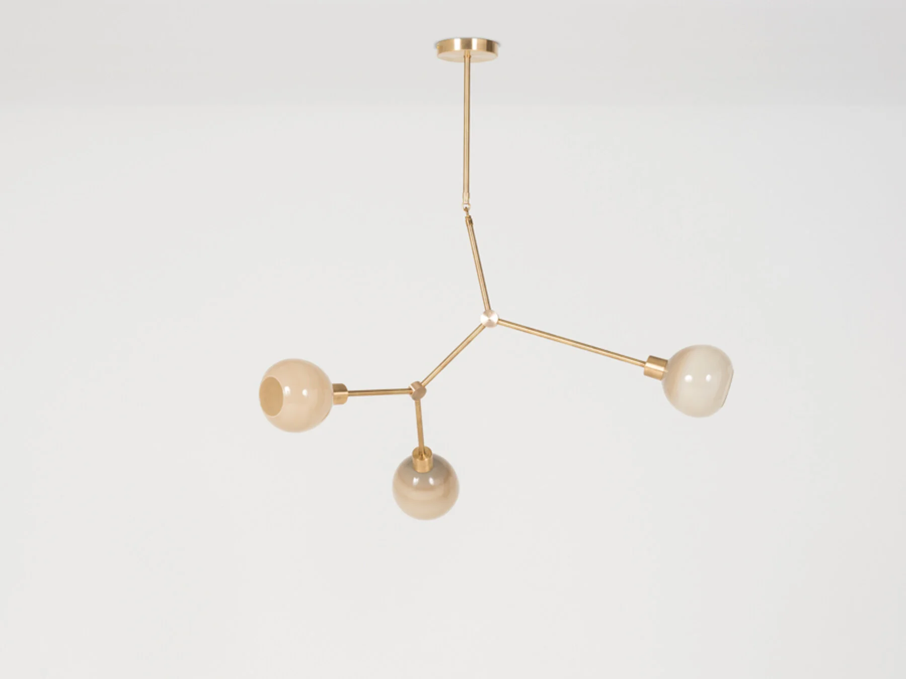
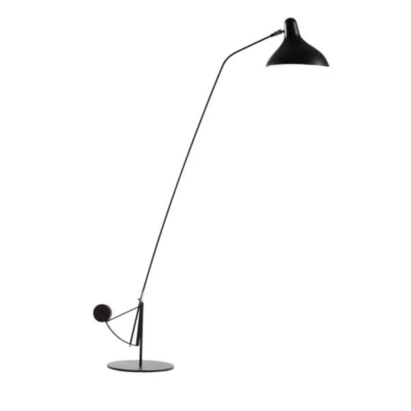
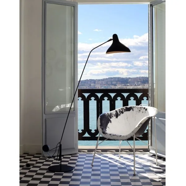
Lighting at the front of the house is also super important, not just for practical reasons, but for beauty! Yvonne will incorporate lighting for the path and front garden in her plan, but for the entrance, a wall light on the right side of the front door would be ideal.
Additionally, we will add two downlights in the ceiling of the portico.
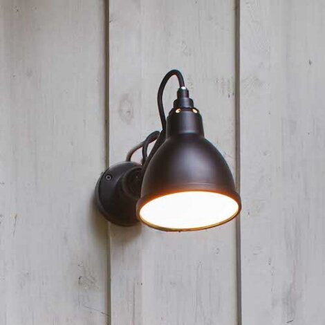

The nice thing about this light from DCW, France, is that it is not trying to compete with the period era of the house. It is almost industrial modern, no fuss, but super cool. It adds further to the old/new balance that is crucial to the renovation of a period house where acknowledging the old without super-imposing the modern is my golden rule.
The glass in the front door…. this too, needs to be contemporised yet still pay homage to an earlier era. Unlike light fittings, which are replaced out of necessity as time passes and units deteriorate, architectural features like a front door have a stronger incentive to stay true to the era. To that end, I suggest we use stained glass, which will need to be custom made and fitted.
I have a supplier who will come to site for a check measure, provide a life size drawing for approval of the design, then make and install for a very reasonable cost. Well worth it!
North Shore Leadlights to come and quote.
Security door to be replaced - refer to your builder.

The Waratah Winning

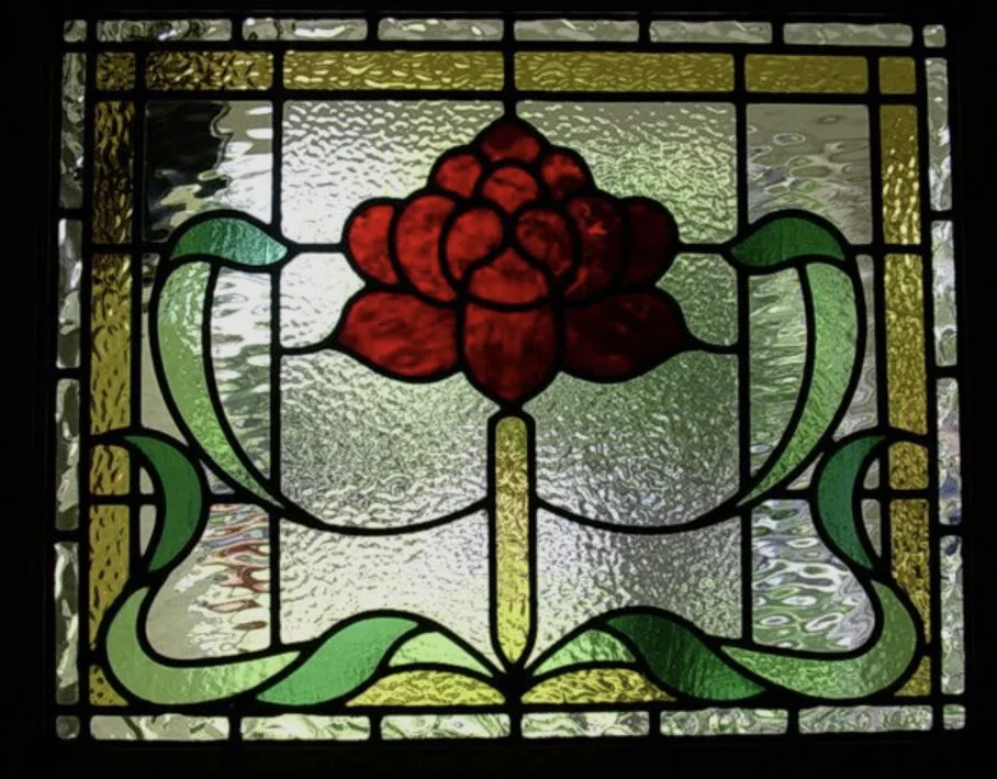
The examples above give a good indication of what is possible. In line with the botanical design inspo, an Australiana motif would fit best. Waratahs are particularly relevant and their red colour would cast a lovely reflection into the hallway, as well as match with the colours of the original glass in other rooms of the house.
North Shore Leadlights to advise on transom.
As mentioned, we will paint the front door Irish Linen as that will really highlight the new window.
The Hallway
And over the threshold we go!
The design for this space came to me first - and it didn’t take long to source the perfect wallpaper! The muted, soft tone of this print is subtle, but a bit brave too, with its contemporary pattern. The mood it will set for the interior is earthy, warm and modern. It’s a Cole & Son print called Cow Parsley and, with its design distinction, will be a cohesive element in the botanical theme.

Cole and Sons wallpaper, Cow Parsley.
This will be used to paper the entire hall and will bring life and light to a space that is not well lit.
Paper is $280 per 10m roll. Builder to measure area and advise quantity/number of rolls. 2 week delivery time.

Oakford Elegance pure wool carpet, Aintree.
Carpet is the natural choice of floor covering in your home, and without doubt, there is no beating pure wool. I have selected this very gentle shade in plush pile and suggest it is used throughout the house, where there is carpet currently.
$125 per square metre installed. Builder to advise meterage, 2 week delivery time.
The ceiling and woodwork will be painted Dulux Natural White.
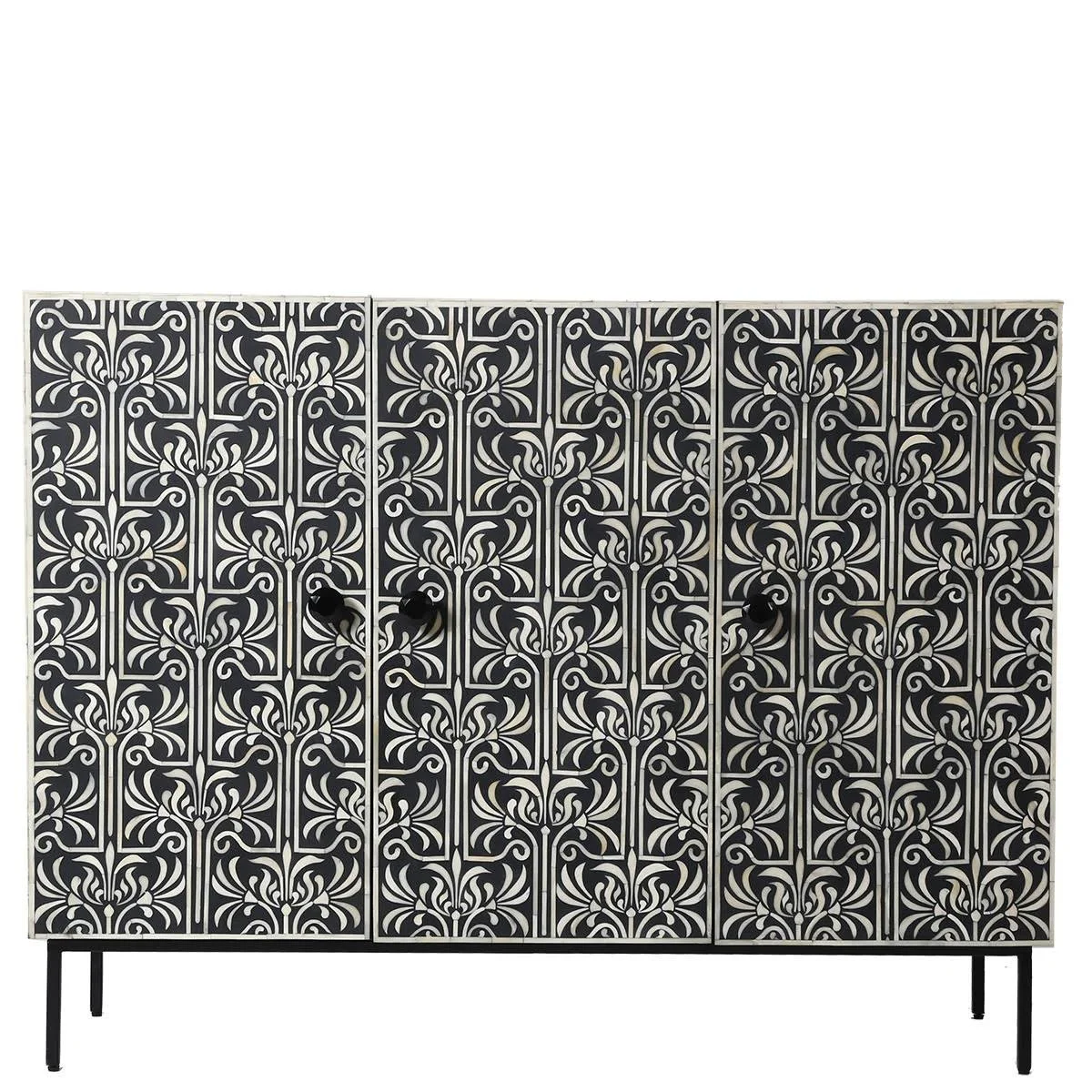
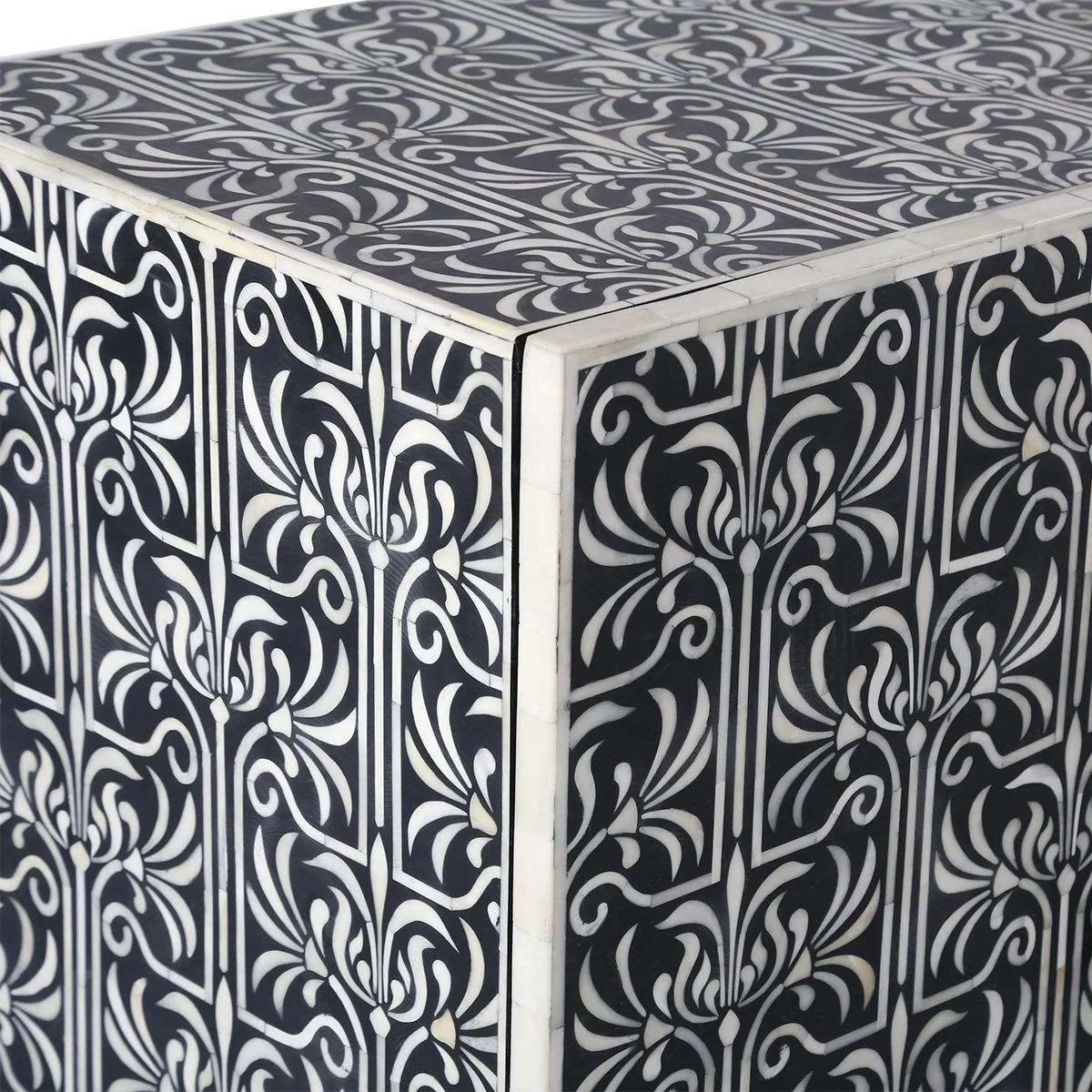
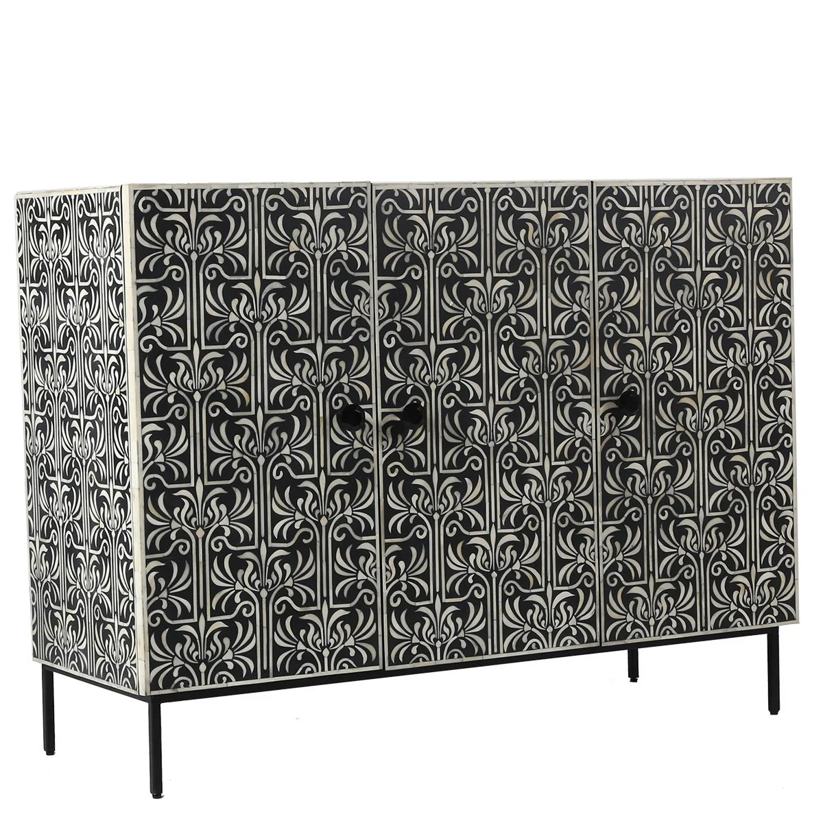
We agree a suitable piece of furniture needs to replace the table currently in the hall. The sideboard below is in a league of its own! From Ruby Star Trader, I feel that this is our jewel in the crown. Being in the entry hall, I believe it sets the tone - it is beautiful, classic and stylish. It is 1200mm wide, 450mm deep and 900 high. More commodious but still a perfect fit for the space. Priced at $2725 plus GST trade (retail is $5995!!!).

As you can see from the images above, I have swapped the plainer arched mirror for this brass one because I think it is a lighter touch with a narrower sideboard. It is designed by Gio Ponti, measures 80cm x 54cm and is available from Finnish Design Shop for $1799. I like the narrower width on the narrower sideboard - more of a sense of space.
Picture a large vase of gum leaves on the dresser, a lovely dish for car keys, and this space, with its beautiful original light fitting, is complete.
Downlights to be added to east/west hall ceiling - assuming three.
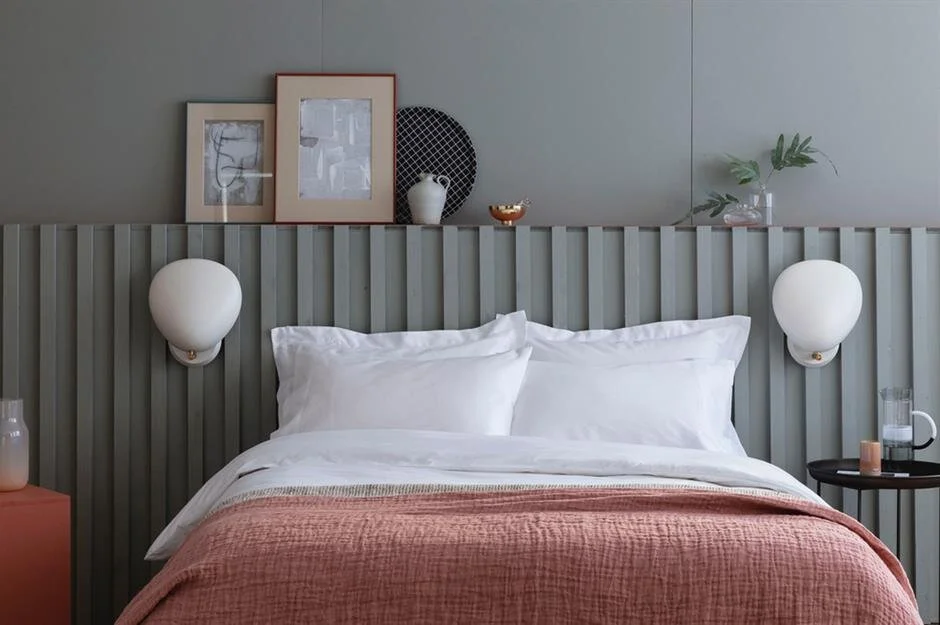
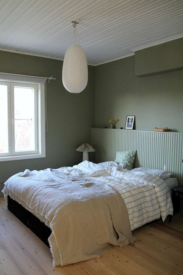
The Bedroom
First and foremost, this room needs light and warmth.
Wallpapers for the bedroom and study were chosen to preserve the impact of the cow pasture paper, but at the same time add warmth and texture to these connected rooms.
Grasscloth fits the bill nicely. A Porters product, the grasspaper has an inherent warmth to it and the subtle colours will blend beautifully with the hall.
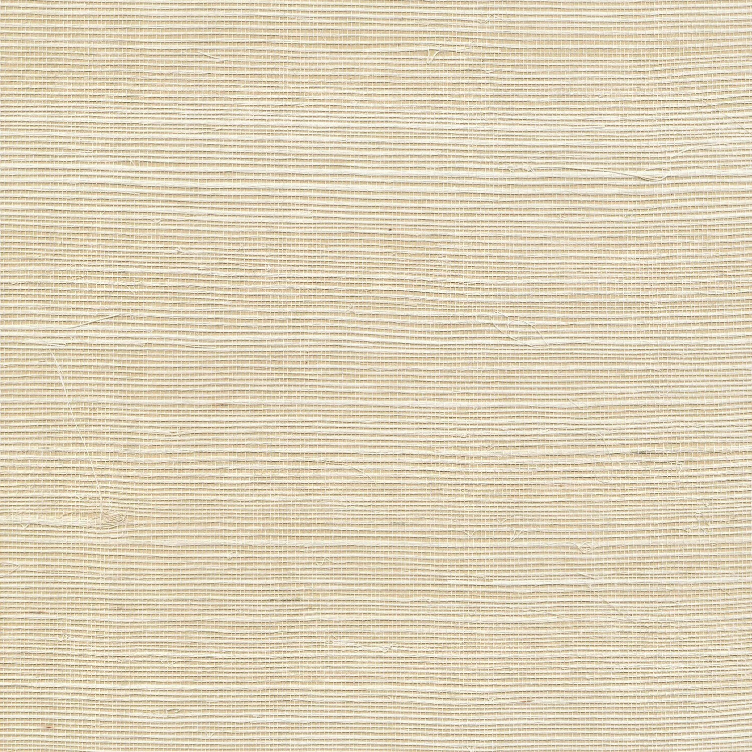
Porters grasscloth, Balsa
Porters Paints Putty

Utopia Goods heavyweight linen, Native Hibiscus Coffee
For the bedroom, I recommend Balsa above on the left, with all woodwork to be painted Dulux Natural White and the bedhead to be constructed, Porters Paints Putty.
Trade price for 10m roll, 91cm wide is $432. Note, due to no repeating pattern, there is no wastage. One week delivery time from order.
Given the smaller space available in this room, bonded blinds would be preferable to curtains, especially as it would allow David’s bed to be closer to the wall. In line with the botanic inspired theme, Utopia Goods have a wonderful selection of fabrics that are floral, but not ‘pretty’. This is the one I’d suggest as it has all the warmth we are looking for and will be beautiful against the paper. I would suggest a pelmet in the same fabric to conceal the roll.
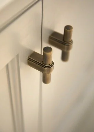
Armac Martin Gaumont Collection,
You mentioned that the built in robe is still fit for purpose, so there seems no point in doing anything but paint it and replace the knobs for a simple and effective makeover.
Brass is a wonderfully evocative material - whilst strong and durable, it also has a lustre that adds warmth and detail that is the perfect solution for the wardrobe doors.
As you’ll see, I use brass a lot for this reason!
I suggest we use these particular handles in other places in the house too, as consistency in all things is my mantra.
I will source these from The English Tapware company.
The objective is to add amenity without adding furniture, which, in a small room, can feel cluttered. But everyone needs a place to put their book, their glasses, a water glass etc.
By building in the bedhead, we also create character and interest in this room.

The idea is to custom make a shallow head that has shelving built in and gives a cohesion to this room by making the two beads read as one. I would specify tongue and groove face with integrated shelving between the beds, and of course the shelf on top. Max to draw this up in consultation with us.
These images are to help you envisage how it might look, although they clearly show one large bed, not two king singles.
You may be concerned about the space it takes at the foot, but without the old beds currently there, there will be little difference in the overall length.
The challenge in this room is that with two beds, there is not much space for anything else - and certainly no room for files!! However, by removing the old timber beds and replacing with two matching size and height bed bases, we can improve the aesthetic and add storage.
And I would specify these lights to be centred on each bed for reading. Again, the brass is a lovely warm addition.
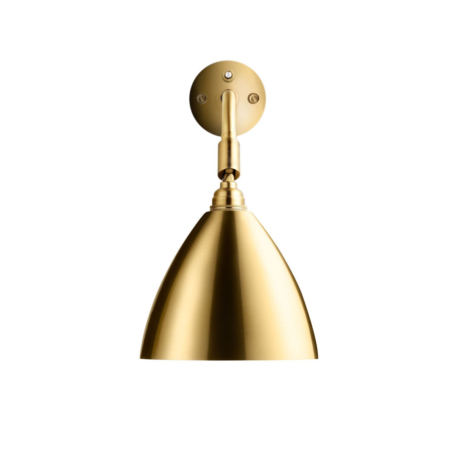
Gubi light - approximately $919 each
Max will draw the plan for the bedhead and it will be 1500mm high and span the wall. It will have shelving between the beds, lamps as pictured above centred on the pillow and high enough not to be in the way of stacked pillows for reading.
The bed below has large drawers beneath that offer fabulous storage for clothes - not files David!!
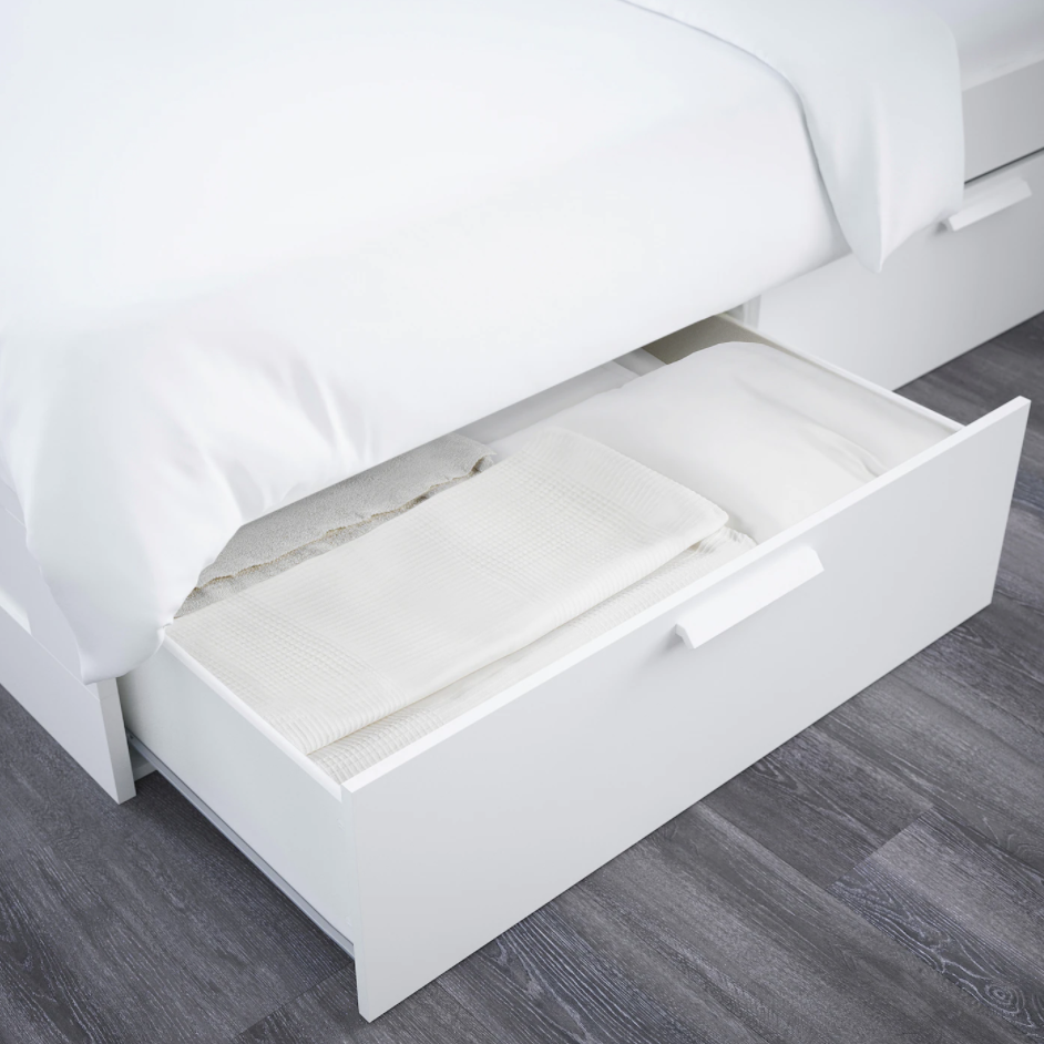

The above solid timber frame bed is made in Sydney by Beds On Sale in Rozelle and is available in king single size, with drawer access optionally on right and left sides. I suggest that an upholstered base is better than the timber look above from IKEA as it is a softer look and doubles as a valance! These beds have a 4-6 week delivery time.
With the warmth of the wallpaper, the colours of the blinds and bedhead with its bedside lights, this feature light for the overhead would be sublime. A NZ company manufacture them at a much lower cost than European equivalents, and I have specified two for your home - one in the bedroom and one in the study. An overhead light fitting is always high impact, so I think choosing something fabulous like this really sets the pace for the room.

Douglas and Bec lights are only available online. The one I have selected for the bedroom is 575mm x 775mm - natural brass with camel glass shades. Cost is approximately $1500.
https://douglasandbec.com/system/spree/products/files/000/000/165/original/Y_03.pdf?1528161285
Bed linen is important because of the obvious - it is the biggest block of colour in the room besides the walls, so it makes a big statement Standard white linen is just that - standard. It totally lacks character and is impractical - and although the notion of turfing it out may cause a certain discomfort, given white linen is what we had all our lives, the beauty of coloured linen is a revelation. Linen is a beautiful fabric to sleep in, it feels cooler in summer and warmer in winter and the available colour palette across a number of brands, is almost limitless. The suggested colours for sheets and pillow cases would be these below, and I would always recommend mixing the colours - be unafraid!


Two pillows per bed and a couple of scatter cushions and a throw at the end will give the room beautiful, curated feel that will really improve your enjoyment of the space - and your sleep quality, I am convinced!!
There are a number of suppliers, some of the better ones have an online presence only - no retail outlet. But others like Cultiver Goods and InBed have stores where you can go and get an idea of colour ranges, look and feel.
We can do the selection together to make sure it is fully complimentary to the broader scheme of the room.
The study
Ah, this room…..
Well, it may have the most challenges currently, but I think the transformation will be at its most dynamic here! The issue is that a great deal is expected from it in terms of its function. It needs to comfortably accomodate both of your work stations and a huge amount of other ‘stuff’!! So it needs to be redesigned and some of the furniture built in because by custom designing it, we can maximise storage capacity, improving comfort, usefulness and beauty.
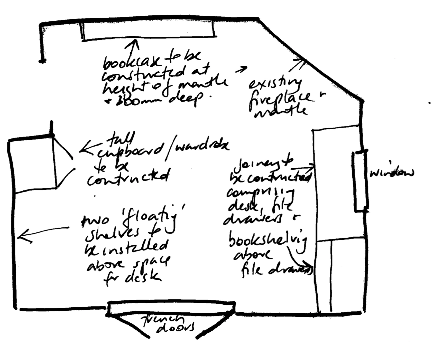
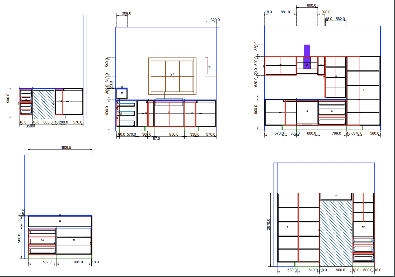
The above drawing is not to scale but it indicates the positioning of the elements we need to incorporate for adequate storage and facility. It puts Diane beside a tall cupboard/wardrobe at a desk to be purchased, with two floating shelves above.
It puts David in the same position he is in currently, but in a less deep, custom designed and constructed desk incorporating shelving above to the right of the window, as hopefully, as many as eight filing drawers below the shelving and either side of the desk unit.
It also adds a bookcase to the right inside the door to be constructed at the same height as the mantlepiece and 300mm deep.
The scheme of this room will be similar to the bedroom in that we will use a grass paper on the walls, Dulux Natural White for the woodwork, and Utopia Goods fabric for a bonded blind and a pair of curtains for the french doors.


This image on the left is Nomad (see pricing under ‘Bedroom’), a slightly richer grasspaper than the bedroom because there is more natural light in this room. I want to really connect it to the front garden and make the room feel fresh and earthy. Again, a Utopia Goods fabric for the blind and a curtains, in a gentle green with banksia pattern, that ties in with the green in the fireplace tiles.
The fireplace is so pretty, but I think the best treatment for it is clearing the files!! A vase of green leaves on the left hand plinth would be all that it requires, to give height and interest to that wall. As mentioned, the woodwork and ceiling once again, to be painted Dulux Natural White, as will be the new built in furniture.
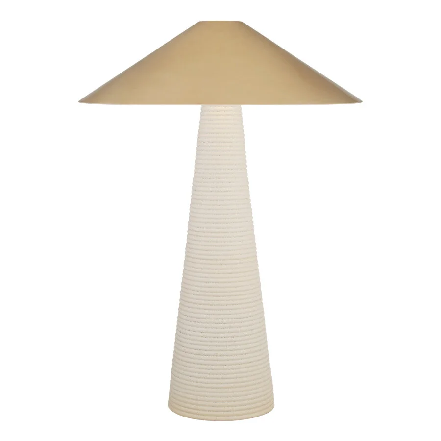
Lighting in this room is similar treatment to the bedroom, utilising a slightly larger version of the pendant for the centre lighting, plus a feature lamp on Diane’s desk and more functional lamp for David’s.
Again, Douglas and Bec are the designers of this pendant from NZ and cost of this larger one is about $2200.
Diane’s lamp
At 84cm, this lamp has a lovely textural and earthy base with a brass shade that makes it a statement piece, whilst David’s is directional and more masculine.
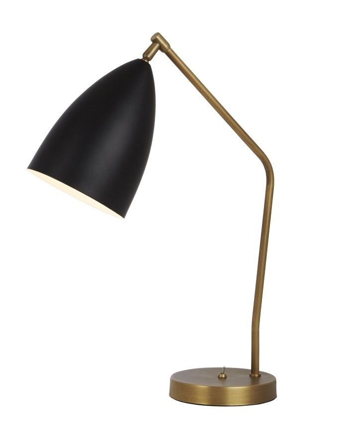
David’s lamp

This is another light by Gubi, designers of the bedroom light. Approximately $1500
As is clear, Diane has less need for storage and she’s so much tidier!!!! Therefore, I suggest we purchase a desk for her and save the bigger outlay for David’s more complicated desk, which we will have built in. I have placed Diane’s desk beneath the window so the room will not feel congested as it does now, with David’s more sprawling set up out of view as you pass the open door.
Both the desks pictured below are from CoCo Republic. I like the fact that although they are simple, there is a detail to them that makes them more than just a table with a drawer!! They’re both slim line and stylish and would be a very attractive focal point in the room, topped with lamp.


Decisions here are pending discussions with Max. If you decide indeed to put Diane in the ‘cupboard, then we could ask Max to custom design and make a stand alone desk with file drawers as required. We can then source a smaller desk for Diane. My suggestion is still to give David the larger space! Into the cupboard with you man!!
The chairs below are a soft and comfortable addition, keeping the colour palette light and organic, with brass finish and boucle fabric. The larger chair would look better with David’s desk, leaving the smaller with the lighter weight desk under the window.


Whilst the chairs above are attractive, I gather perhaps we need to purchase more ‘office-like’ chairs that give greater comfort and functionality. These by Hermann Miller, and others similar, can cost upwards of $1500 from Living Edge.


We have spoken about the loss of cupboard space for other items, but to make this room work better AND look attractive, I think the best option is to really plan the storage in the roof so that it can take up the refugees from this cupboard. I have added the new larger piece of furniture in the hallway, drawers beneath the beds, and I propose a hall cupboard, as you will see later in the plan.
Living Room
"Have nothing in your home that you don't know to be useful or believe to be beautiful." —William Morris
With the second hall door deleted, the changed floor space is going to make this room feel quite different, and much cosier! With its beautiful fireplace, original light fitting and lovely stained glass windows already doing the heavy lifting, what is left for us to do is walls, curtains, furniture and art.
I suggest we paint this room, rather than paper it. I have selected this colour because it has warmth, it transitions from the hallway paper nicely, and it allows the original elements of the room to shine.

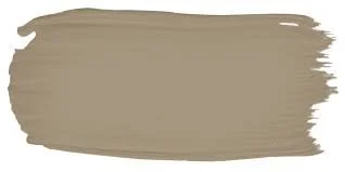
Porters Paints, Safari

Porters Paints, Himalayan Salt

In light of your concerns re Safari, I have found two alternative colours to consider - Himalayan Salt by Porters, and Half Clay Pipe by Dulux. But with this colour, I’m going to suggest something bold - that we paint the WHOLE ROOM that same colour - the walls and all woodwork, including the fireplace (though woodwork of course is in semi gloss enamel) and even the ceiling. Its a beautiful match with the curtain colour and its a very modern technique.

The fabric is another Utopia Goods fabric and I have chosen it to compliment the red tiles in the fireplace. Given it is on the opposing wall, I feel that by using a red fabric, we tie the room together.
I suggest full length curtains in this room for an elegant finish.
The fireplace in this room is really special and I want to feature it by giving the walls a neutral tone. As with all the woodwork in the house, we will use Dulux Natural White as I think it is most effective in highlighting the original features of the house. Painting it the same colour as the walls as I have suggested with Half Clay Pipe will make it stand out even more!
The original light fitting is fabulous - no need to change!! But lamps will be a valuable addition to the lighting in this room, as a ceiling light is not adequate to create mood.
Something that does not compete with the original, and in low profile black will tie in the black notes from the sideboard in the hall and the ceiling lights. This one is by DCW Editions, the same as the outdoor light specified for the entry.
It is called the Mantis and is readily available at around $2200.
Furnishing this room is not without its challenges and I know your preference is for three chairs and no sofa. Can I suggest one other option? I do so because I worry that three chairs will look a bit… empty!!
Would you consider a sofa under the windows and an armchair opposite on the wall to the right hand hand side of the fire place? This would allow us to add the joinery you prefer, to include a tv, on the wall between the fireplace and the corner where the doorway is being deleted. A chair sitting in front will give the room balance without blocking the view of the tv.
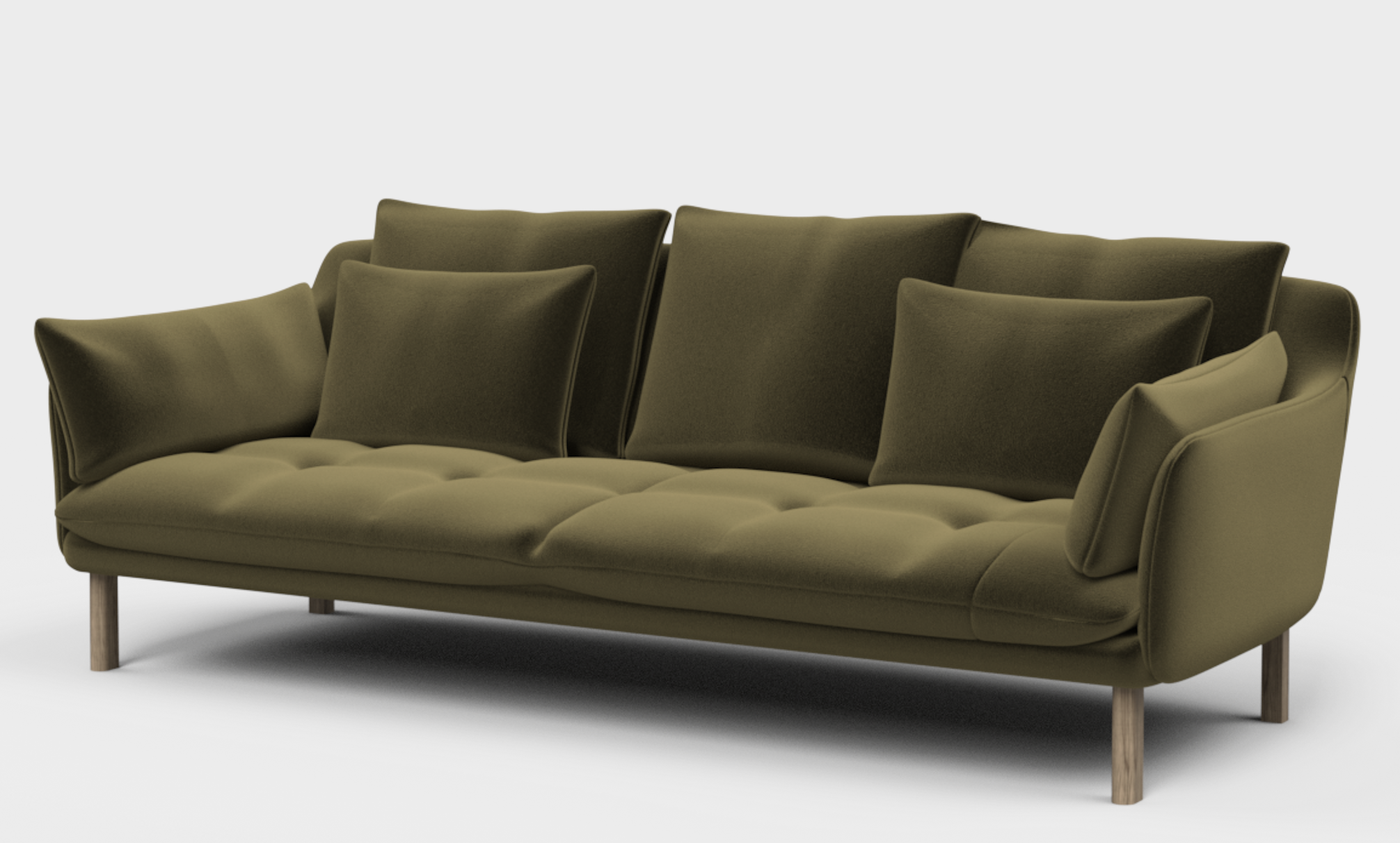
This is Jardan’s, The Andy. It is 1.15m deep and 2.37m long. It would be beautiful in front of the curtains and a very comfy spot to be! The image here is computer generated - so you lose the richness of the velvet, though not the colour. A trip back to Jardan will remedy.
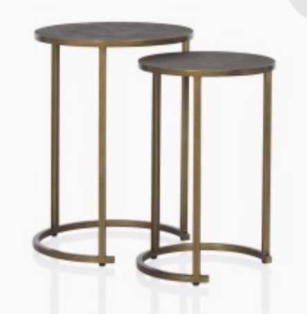
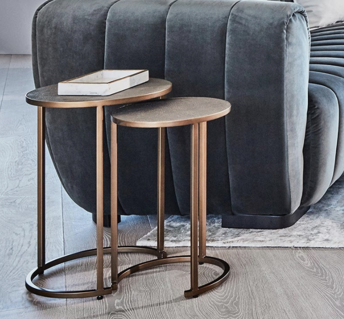
With the lamp on one side and a nest of side tables on the other, it would provide a really lovely feel to the room.
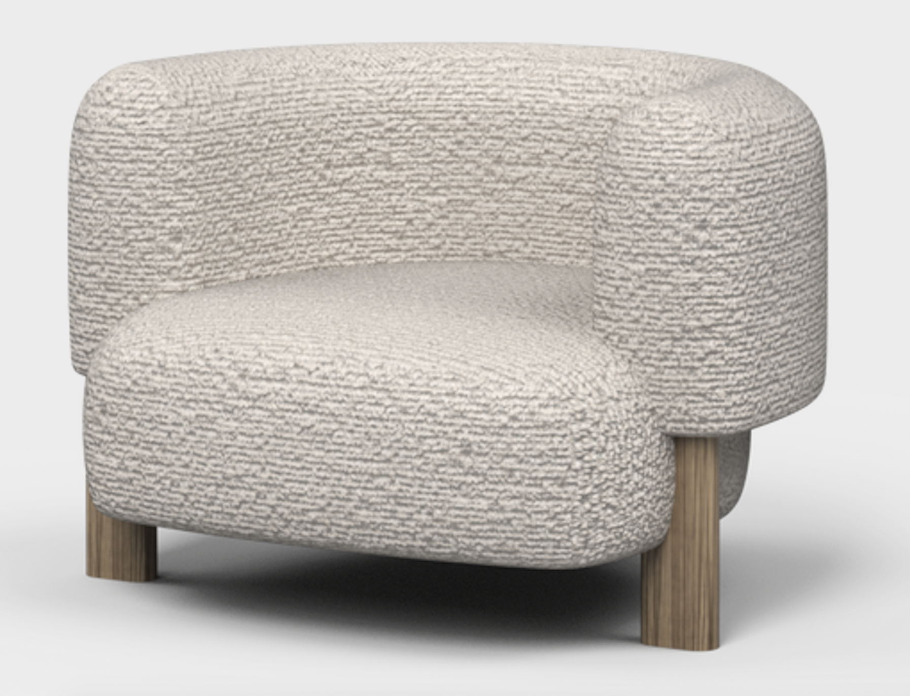
Above is the Lola chair, also by Jardan. It is chunky, yet polite!! It would be a substantial piece, but not too big so as to be hard to move. And that is the trick I think - to balance the room we need the size of the sofa and a single armchair to fill what is a good size room with a rather tricky floor plan.
Coffee table hunting is always fun… but I think these below fit the bill nicely as they are small, with a brass look finish and would be easily moved around as required. Available at Coco Republic as a set of two for $995.
This room needs a built-in joinery unit to be fitted in to where the door is being deleted. Painted the same colour as the wall, we will place the television, books and a select few items on it to enhance that part of the room. we could incorporate discreet strip lighting in the unit to give it further appeal and interest.
bathroom and laundry
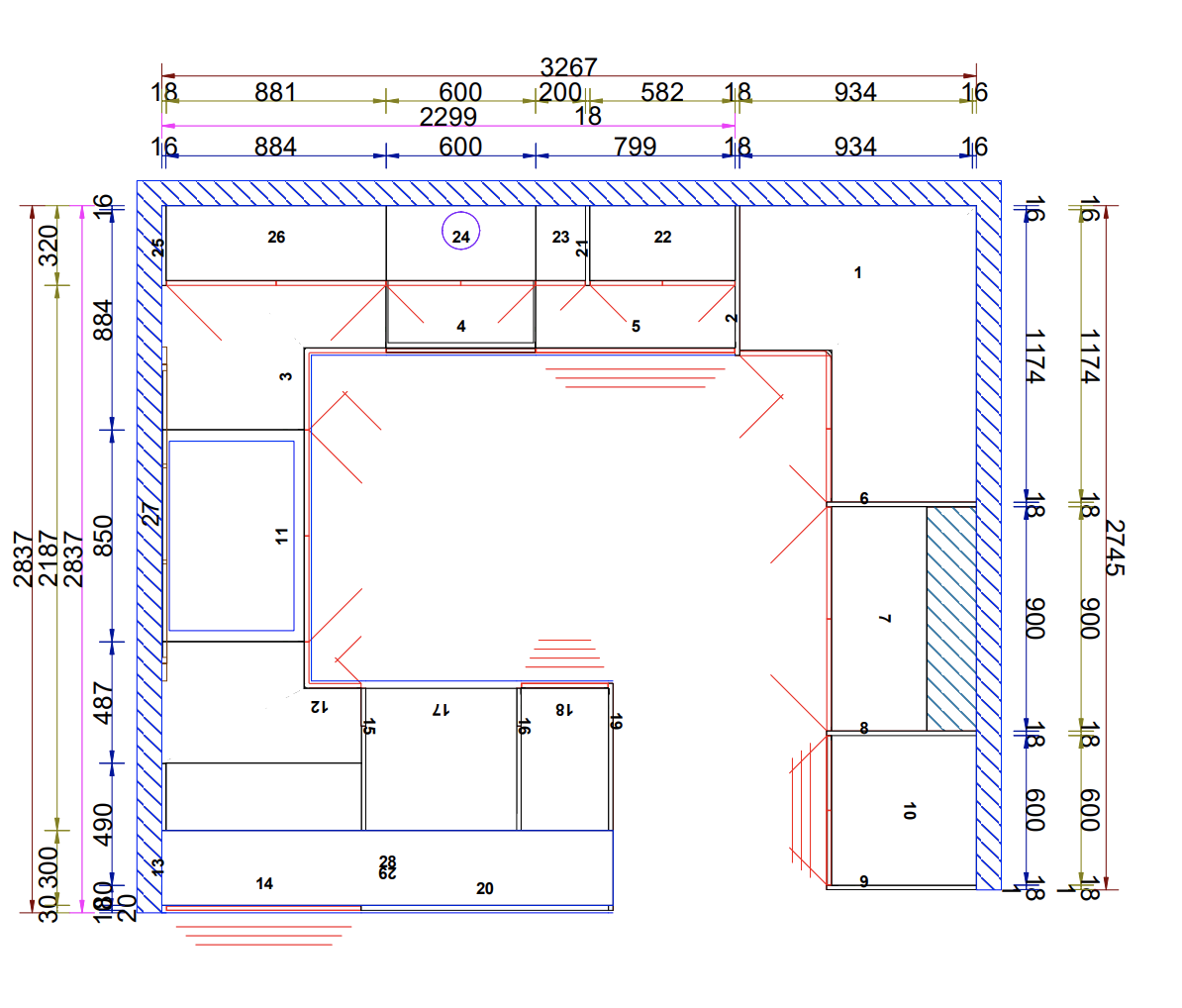
I have redrawn the plan to take into your very accurate observtion that one does not wish to observed sitting on the loo!!!! And also at your request, the addition of a tall cupboard in the laundry. See below.

By including a cupboard accessible from the hall, we can relocate the linen and have a small amount of hanging space to try to take up the excess. Or alternatively, you could allocate the hanging space instead for the vacuum, ironing board, broom and mop.
We discussed budget on the bathroom and laundry and agreed to not make over the top choices regarding tiles etc. But given the floor area is small, I suggest we use a marble penny round for floor tiles, and a more economical tile for the walls.
It is again important to preserve the light and so the tile selection is light! The green of the penny round matches well with the greens on the rest of the house and the small tile format helps make the rooms feel more spacious.

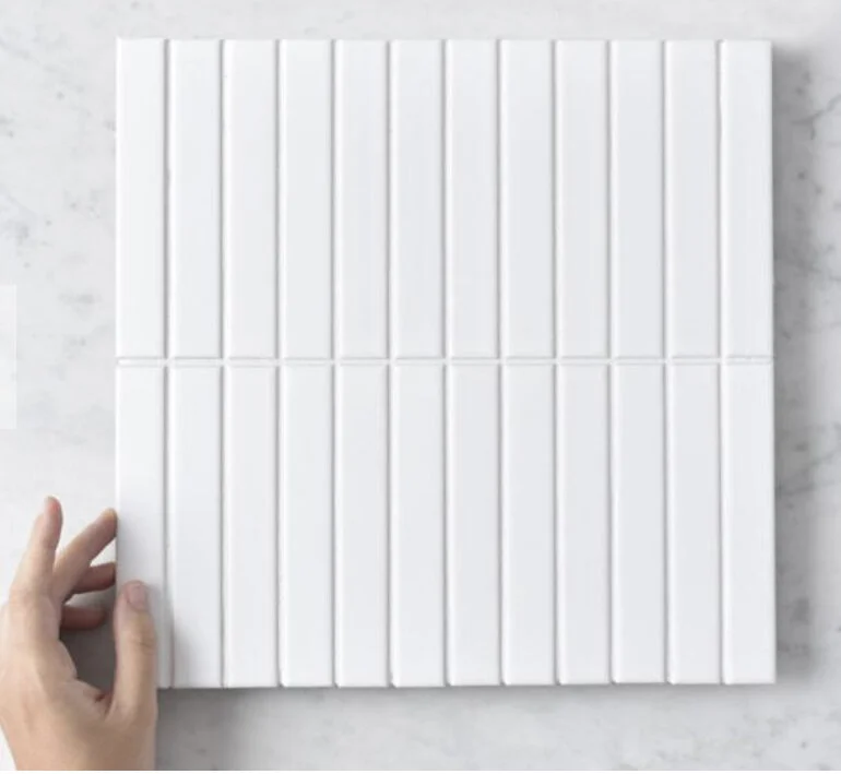
The selection of a baton tile in matte white is a softer choice for the marble, and gives a more organic look and feel to the bathroom and laundry. We don’t need our bathrooms to look like operating theatres, yet this is so often the case! Rather, bathrooms should feel gentle and harmonious - a pleasurable place to be and a matte tile is a far better option than a high gloss.
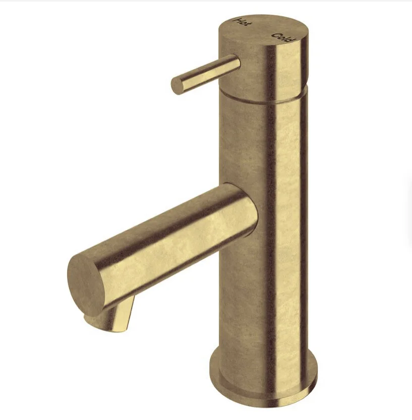
In line with my brass beliefs… I have selected a brass finish for the Scala tap ware from Reece. Although it does add to the cost, it is well worth considering the investment for the style it brings and the addition to that organic sense we are after. I suggest we have a cost comparison done before the decision is made - chrome vs brass, pick your team!!
The Scala range is simple and contemporary and I think blends well with the design of the house more broadly.
We would have the basin taps, shower taps, shower head, towel rails, loo roll holder and guest towel holder all in the tumbled brass finish.
The floor wastes will be tile set-ins.
We would use the same finish for the tap ware in the kitchen and the laundry.
The vanity for the bathroom will be wall-hung, allowing again for that more contemporary look. At 1200cm long, we will have plenty of storage beneath, but will add mirrored shaving cabinets the length of the vanity, above. There will be no shortage of storage in this bathroom!

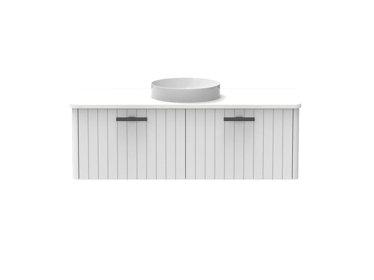
Kado Neue 1200mm alternative.
The vanity above on the left is from an Australian supplier and manufacturer called Timberline and is available in a range of sizes and configurations. I suggest the 1200mm with the choice of drawer/cupboard placement something for you to think about. It has a ceramic white top and the brass taps will look great!
The one on the right is by Kado for Reece and I’ve recently used it in 2 bathrooms in Paddington and I’m a huge fan. I would specify it in white, with white top and black blade handles which run discretely along the top of the drawers (not pictured here). I will supply more info!
As you can see on the sketch, I suggest a single glass fin shower screen - one that does not move! There is space to do this given the bathroom layout and it is always a bonus not to have moving parts if they can be avoided.
The linen cupboard, accessible from the hallway, will have 400mm doors with the same brass knobs as used in the bedroom.
IMPORTANT NOTE - the sketch above needs to be professionally measured and drawn by a draftsman or your architect.
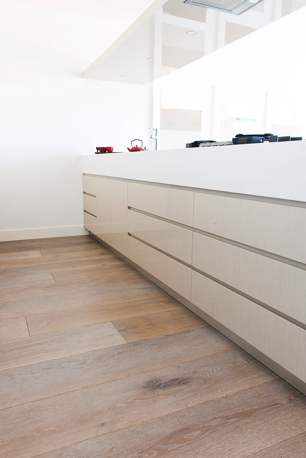
Kitchen
The beating heart of the home
The wall colour for this room is the same as for the living room - Porters Safari. Why? Because it plays a little trick - it will look a slightly lighter shade that in the darker living room, yet it will feel generally like an extension to that room, which of course, it sort of is. These are the living spaces and to use the same colour, we tie them together and build connection and cohesion. And having used this colour a number of times, I know it well and love its heart.

P)orter Paints, Safari

Porter Paints, Rubble
As you can see, the colour swatch of Safari looks much darker than when applied to the wall. As an alternative, Rubble is lighter but still has the warmth.
The room to the right is in a house I did in Paddington where Safari really does the heavy lifting in wall colour.

Max’s plan is below and we will discuss it further with him.
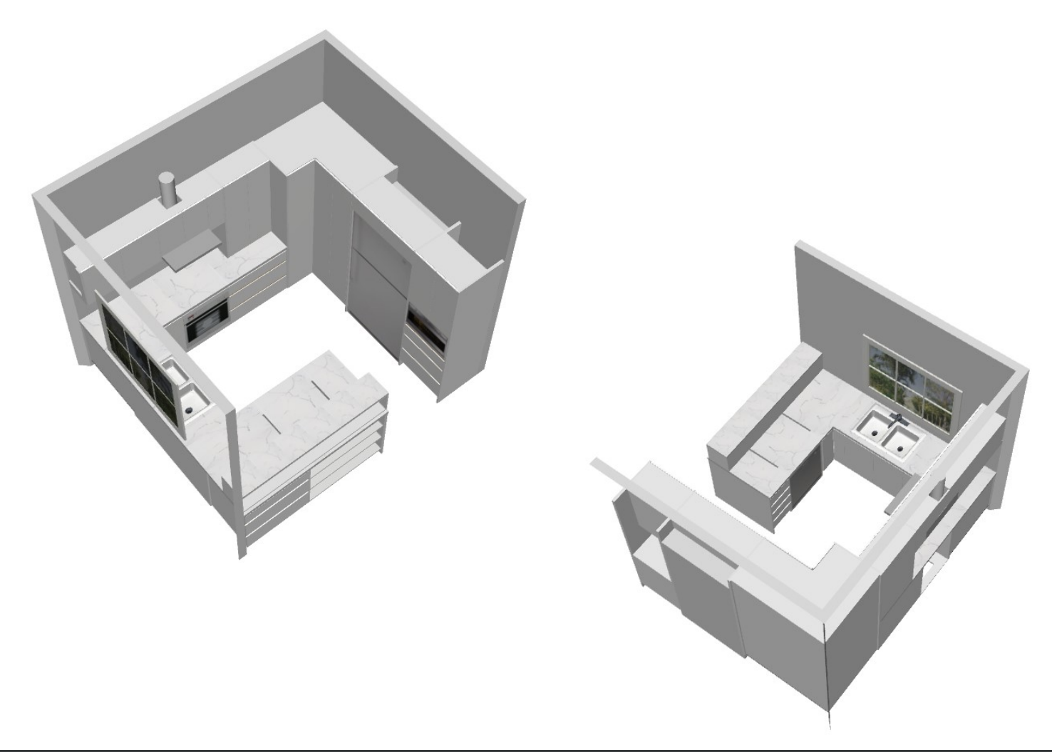
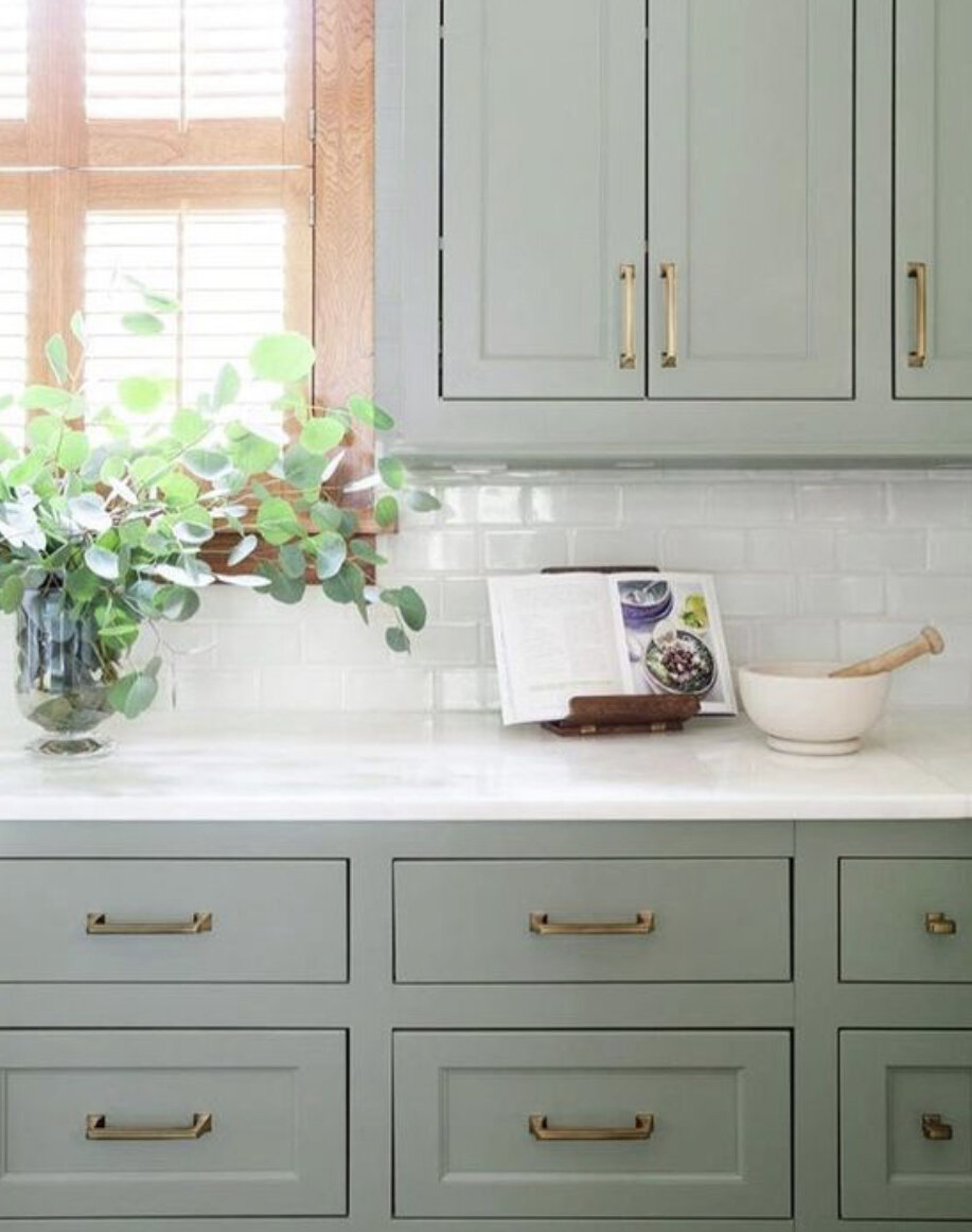
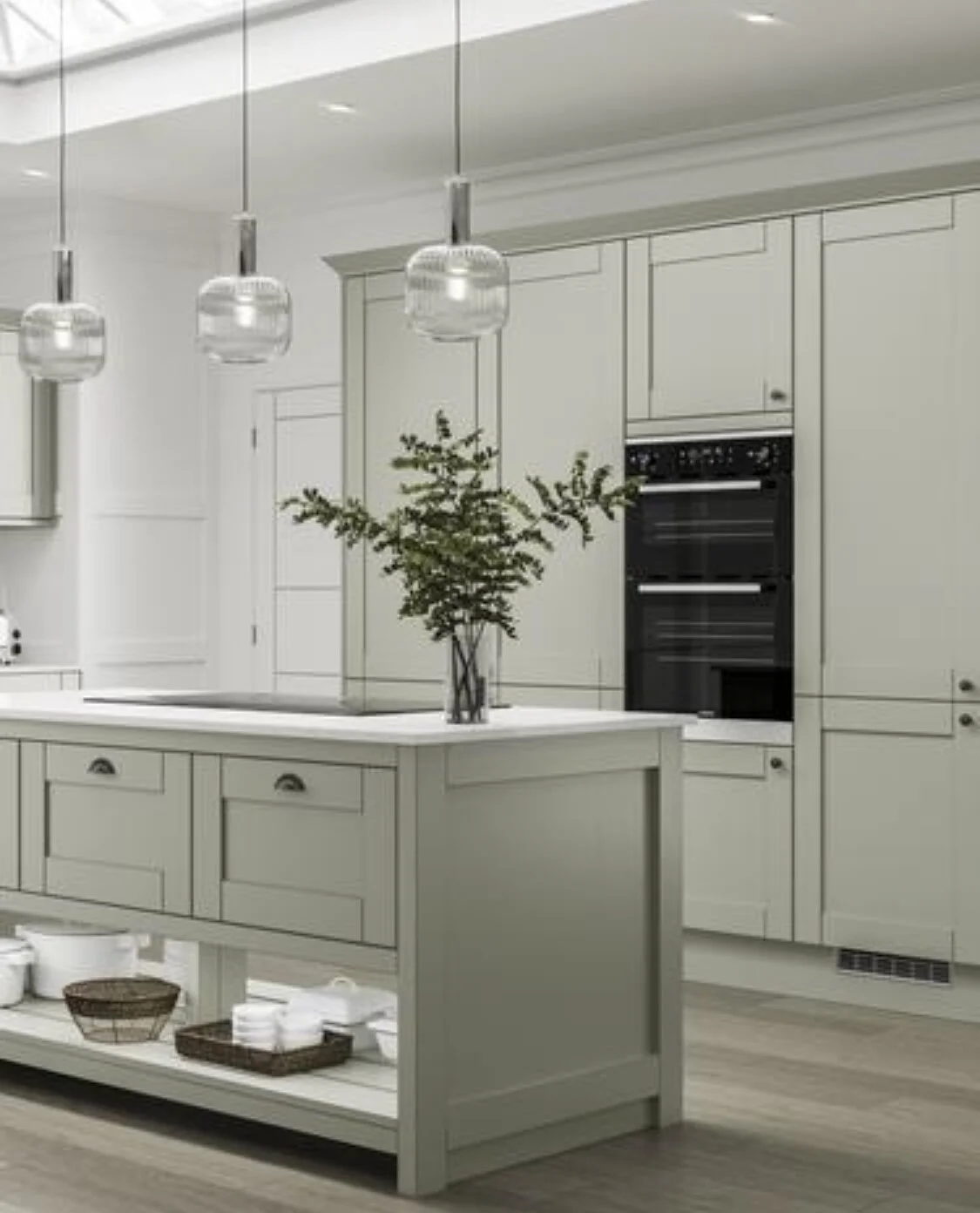
Keeping the kitchen earthy in tone is the best way to connect it to the garden beyond. I understand your reluctance for a timber cupboard front and so I have added here some images of the green tones I’d suggest as an alternative. I would still recommend the caesarstone benchtop.
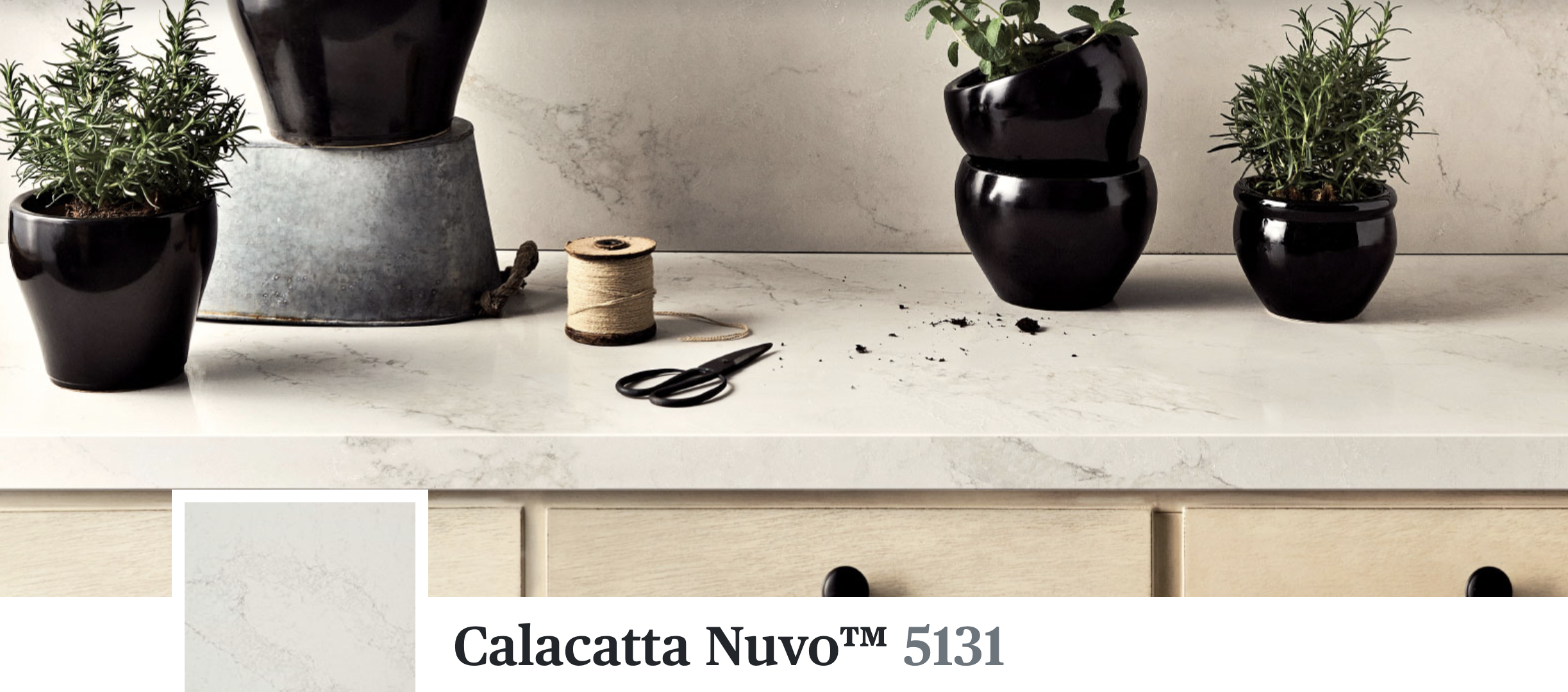
Caesarstone, though controversial, is the best choice for its durability. I love marble most of all but appreciate you may not be interested in the extra cost. However, with caesarstone we can achieve a similar look and feel and I would suggest using it as splash back as well, deleting the need for tiles.
Flooring choice is understandably timber - despite the beauty of the Moroccan tiles!! I have swapped them out for an engineered timber board from Austral Timber Flooring. The colour pictured here is Arctic - but I will show you samples of similar boards. For more detail on the advantages and durability of engineered boards, refer to the link here:
http://www.australflooring.com.au/products/engineered-timber/
I love the warmth in this product and coincidentally, you can see in the image below of the beautiful rug, just how well they match! The green rug really is a hot favourite for my design and on the light timber floor, it will really pop.

A pendant light over the dining table is a feature of this room and I suggest this one because the red relates to the living room and adds an earthy colour to this room.

Gubi, Ronde

An alternative light to the one above is this one, also designed by the German designer Sebastian Herkner Gubi, called the ‘collar pendant’. It is 42cm wide, just a little wider than the Ronde, but it makes less of a statement at 28cm high. Personally, I think the bigger light is much more stylish, but I was conscious of your reticence and so thought I’d add a comparable light for you to consider - and hopefully be convinced of my first choice!!

Gubi, Collar Pendant

The smaller glass pendants below will hang above the bench that divides the kitchen. They are made in Copenhagen and are priced at approximately $285 each. I suggest two.


I suggest two of the lights, despite the image of three!
I have considered the dining table and chairs and suggest two options: we either use the drop side table currently in the hall and have the four chairs you have upholstered in an alpaca velvet, or we bite the bullet and replace the setting with a more modern timber table like the one pictured below from Ethnicraft. We’d do this for consistency in design as I think the overall effect would be more cohesive than if we were to use the existing. It is of course a matter for you!
I am glad you have elected to repurpose your table - I will find a restorer to sand and resurface it with the four chairs, before they are recovered in velvet.
I’d go for a velvet because it is so rich and luscious! I suggest the ochre colour in alpaca velvet as pictured below right.


A comfy ‘reading chair’ is an important inclusion in this end of the kitchen space. I have deleted the Relax chairs in favour of this chair from Coco Republic - currently on sale for $1355. Its dimensions are 600mm wide, as opposed to the Relax chair at 880mm - so it’s more compact, a little more upright and the swivel function adds to its casual charm. A cushion in the burnt orange fabric above left would be fab.

I know you said you didn’t want a blind, but I hope you ,might reconsider as I think it will make the area feel cosier on a winter’s night and add colour and texture.

Mokum linen for the bonded blind.
