Your Custom Text Here

 Karen and Michael,

Ercildoune is facing her rebirth! Time and circumstance have shifted this old beauty into a new chapter and the following is intended to help you visualise the new dawn. The key phrase underpinning the following scheme is gently contemporary. There has been grief and stress in the previous period as Bob made his exit - so we go gently into the new; soft colours and open spaces, textural, organic and modern finishes that redefine the federation era architecture and bring it into 2025 with the upmost care, economy and respect.

So let’s get it started.

Entry Hall

This space needs a very different colour scheme - it needs to warmly welcome you all every time you step through the front door.

Porters Paints, Rubble is a beautifully serene shade that I want you to consider in various strengths. I am keen to explore the potential to use the double strength, so have included sample pots in your pack of half strength, base and double. In design, one of the great tenets is ‘less is more’ and I interpret that as simplifying the elements, keeping continuity, ensuring a logical flow throughout the interior. One way I like to do that is with colour - using the same colour in different strengths.

On the right is an image of Rubble in it’s base strength, but I’m thinking we will try it in double strength for the hallway, making it doubly good!!

It classifies as a neutral, but it has an earthy note that will be transformative. The current yellow and blue are somewhat antithetical through this lens.

For absolutely all the woodwork; skirtings, window frames, doors and architraves throughout the house (except for Louisa’s room), I recommend another Porters colour called Irish Linen, a very soft, warm white. This is it, below left and as an inspirational extra, the image below right shows how a fresh paint job lights up your life!

Colours don’t always replicate so well electronically, so it’s important to see the paint on the wall. And the choice of which white can be a hilariously complex dilemma!! If it helps, I can promise you that this is my 100% go-to white.

I propose leaving the grandfather clock here - almost like a sentinel guarding the integrity of all the home has come to mean over the decades, without being slavish to either memory or style. The rug also, is perfect already - gently contemporary blending of the old with the new.

We spoke about furniture and I will say this again, the generosity of this space may tempt you to add, where really what works, is to subtract. The one thing I would add, however, is three of these hooks on the wall to the right just inside the front door. For hats and coats and bags - it gives the amenity for these items without adding a piece of furniture.

At around $75 each, these are hand cast in bronze by a Sydney designer called Henry Wilson. The natural bronze is amazing, the warm pink hue really lifting the light. They’re quirkily called F.Ace hooks - a line of three mounted onto the wall with a totally functional purpose will look great.

My painter Scott, who started out as a floor sander, tells me your floorboards are Baltic Pine and that they will be a lot lighter and way less yellow once the old polyurethane has been removed. This was music to my ears.

The black dots you see in your floors are from where nails have rusted over the years and this cannot be removed. In my view, this only enhances the character of the floor.

It’s a paler timber and these two examples give an indication of that. So to sand them back to remove the old UV effected polyurethane will lighten the space considerably.

Art for this area of the house is a no brainer - we can select a number of the Fastov works and have them reframed, uniformly, in plain black timber frames. They’ll look stunning - even, gently contemporary! I know it must be hard to imagine this - with so many to choose from and with the weight of the issue of what to do with his works hanging over you for all these months, but I think they’re truly fabulous. You may feel too close to see that right now, but if you’ll allow me to help you reimagine them - I think they’re an absolute winner.

Hugo’s room:

The colour for this room needs to be another earthy one, but I want a tad more power. So this one,(oddly) called Old Stone Wall, by Porters Paints, is going to give just that. It’s still classed as a neutral - but at the deeper end.


The image on the right is of a house I designed in Mosman - the bedroom of my client’s teenage son. It has a great masculine energy about it, but is readily softened by other elements - like the shearling bolster cushion.

Navy and chocolate compliment the colour, and you can see the touch of brass on the side table lamp also really adds something special.

Following on from the hallway, the colours are harmonious and the woodwork, as mentioned, is Irish Linen.

Given the budget considerations, I have specified for both the children’s bedrooms, blockout roller blinds. The blockout backing adds to the privacy they afford, and also keeps the room darker in the early morning and warmer during winter. I would definitely suggest removing the old pelmets that are there as these are a rather dated feature and the room would benefit from their removal.

In an ideal world I’d choose plantation shutters for these rooms, but I think roller blinds are a more economic alternative and I like the tones of this fabric colour, called Fig.

The carpet in this room urgently needs replacing - it has deteriorated over the years as this was clearly a much used room. I considered the option of sanding the floorboards, but this room doesn’t get the same sun as Louisa’s, so I think that carpet will give it warmth it will need, especially in winter.

I have selected the same carpet to be used throughout the house - Rendell Plush by Victoria Carpets in the colour Nile, for which you’ll find the quote in your sample box.


You’ll come to know my frustration with colour replication!! It’s critical you paint the sample colour on the wall so that you can see its true representation and thereby see how tonal these elements are designed to be.

The carpet too, is a neutral, but with kids of all ages, keeping the carpet colour a shade or two darker causes far less stress for everyone!!! This is a good quality wool blend plush pile carpet - it is termed a wool despite the 20% synthetic but it is the carpet most often used in public buildings because of its durability. It is also more cost effective than a pure wool.

There is a quote included in your pack for wardrobes for all three bedrooms. Clearly they’re an essential, but apart from the very practical issue of providing storage for clothes, they’re also a superior option to multiple pieces of furniture that can so easily clutter a space.

Hugo needs ample storage, book shelving, his bed and a desk, possibly also a bedside table. Once completed, this will be an ideal space for him as he moves in the upper years of high school. It’s quiet and spacious - let’s make it look fab too, for when he returns from camp.

Louisa’s room

This room is super sized for the smallest person in the house!! But the colour is very wrong and the curtains need to go. Again, the quote for the wardrobe is available in your pack. She will have ample storage and we can remove those elephantine old cupboards asap!!

So the new colour is here - but I’m going to suggest something a little special for your girl - a small modernising twist.

Instead of a white ceiling, wardrobe doors, window and door frames and bedroom door all being in the Irish Linen, I propose we paint everything, yes ceiling included, the same colour.

Dulux Half Clay Pipe. Obviously we use a low sheen acrylic on the walls and a semi gloss on woodwork and there is a very subtle colour change in these necessarily different paint types - but therein lies the magic. Subtlety.

It is, believe it or not, classed as a neutral / brown but clearly it has that beautiful pinkish tone. It’s feminine but not overly girly and by painting everything in the same colour, it really looks knock-out. I love it so much, I did this in my own house and just love the effect.

As I’ve already said, plantation shutters would be the bomb, but with so many other calls n the budget, blinds are going to be just fine.

I know, it looks exactly the same as Hugo’s blinds, but it isn’t and you’ll see that in the sample pack swatch. It’s lighter and creamier, which will look good in this lovely light room. The name of the colour is Soba - swatch book in your sample box.

The floor boards will be lovely in the scheme too, once they’re de-oranged!! And as discussed, the light fittings are very pretty and given they’re original to the house, it would be a shame to replace them.

So Louisa gets new big wardrobe, new sanded floor and paint job, all she needs now is her bed, a desk and a bedside table and lamp - all of which you no doubt already have.

Linen choice for both the kids might be something we can discuss down the track

I would however, suggest one more thing…

The rug in this room is old and dated. If we are painting and refreshing, I’d suggest we replace it with a very cost effective and utterly fabulous Greek flokati rug.

They used to be fashionable decades ago and have now, as all things do, come full circle. I love the texture of them. You can also purchase a non-slip mat that goes underneath to keep it in place. They’re light and easy to take outside and shake and for the price, you can’t beat them.

They’re 100% pure NZ wool and available in a range of sizes. I’d suggest a reasonably big one as Louisa’s room needs the scale.

There are a couple of lovely pieces of furniture in this room - the two pieces on the window wall are the ones you should keep in here, the lowboy as a bedside and the taller piece on the other side of the room opposite the fireplace. Light fittings are super cute and will look divine with the suggested colour.

Living room and dining room

The old carpet in the living room needs to be pulled up asap and a proper assessment of the floorboards beneath will determine whether or not we put new carpet down or sand and polish the boards. There is no way of knowing what joys might lurk!!

If we get lucky, the floors will be intact and we can then have the uniformity of sanded boards throughout the living areas. I’d definitely suggest a semi gloss finish.

The wall colour, as mentioned, would be either half strength or base Rubble, depending on how the samples look once we’ve painted them on the walls in these areas.

I’m giving this image above full screen because i think it really does convey the beauty of the wall colour. Your living room isn’t wildly light, so I wanted a gentle earthy light colour to work with the natural light in the room. All the woodwork, including the fire places will be Irish Linen.

The benefit of painting both the living room and dining room the same colour is that it increases the sense of the space as a whole. Whether you take my advice and use the dining room as a music room is entirely up to you, but as this room has the propensity to be a little bit of a thoroughfare room, increasing the living room into this area, rather than plonking a dining table in the middle of it, makes sense.

The sideboard in the dining room is really beautiful - I’d leave it where it is. Likewise, the Steinway is a show stopper and needs to fully command the floor!!! So I’d suggest a couple of modern, comfy armchairs either side of the dining room fireplace to give a relaxed and less formal appeal.

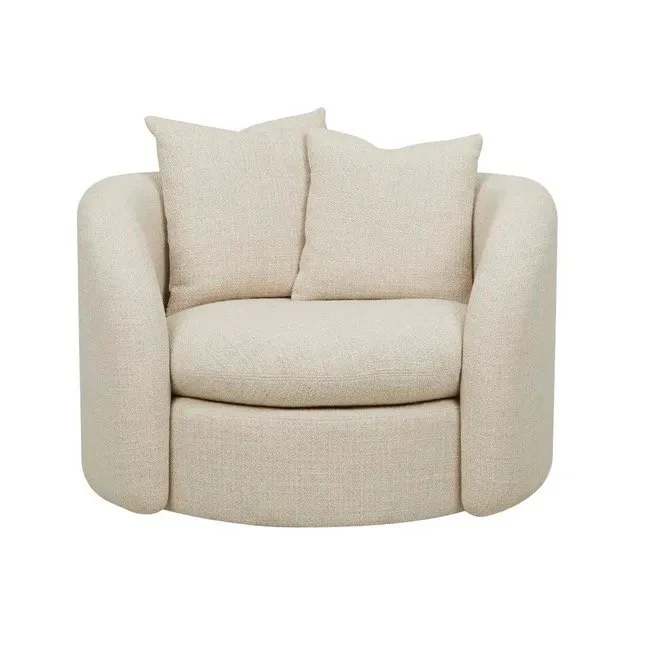
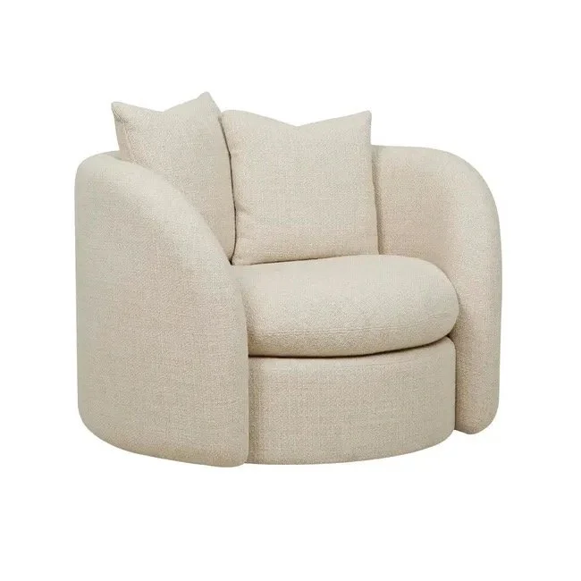
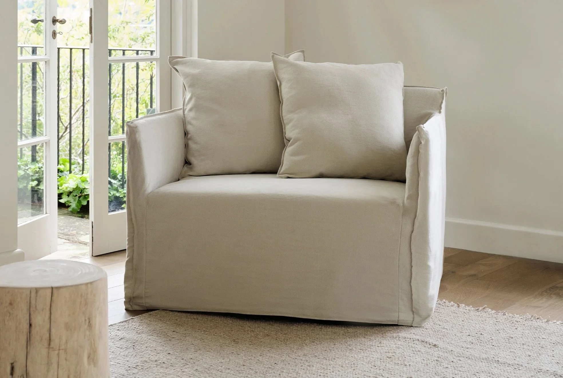
I’ve specified these armchairs in a number of houses as I think they’re super comfy and really well priced. They swivel - such a fun feature! I think two would be great. Parked, as mentioned, either side of the fireplace like they’re specifically for piano listening, gives the room more definition. It says, ‘hey, Im all about the tunes’ rather than, ‘well I’m not really sure what I am or who loves me’!! Dining rooms are a thing of the past - you have a huuuge kitchen - that’s where you’ll want to eat and entertain.

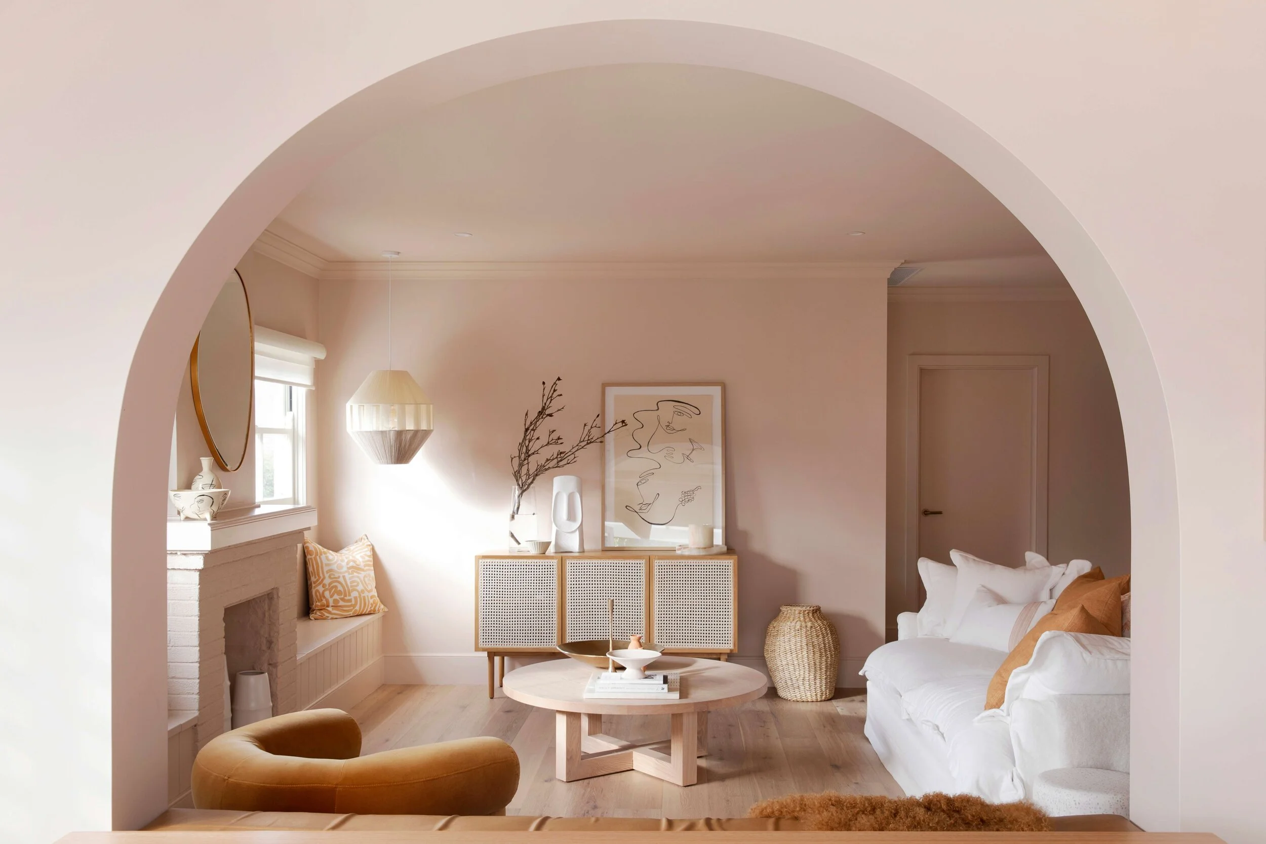
The tough love? The furniture in the living room all has to go. All of it. Nothing is salvageable. Harsh but fair.

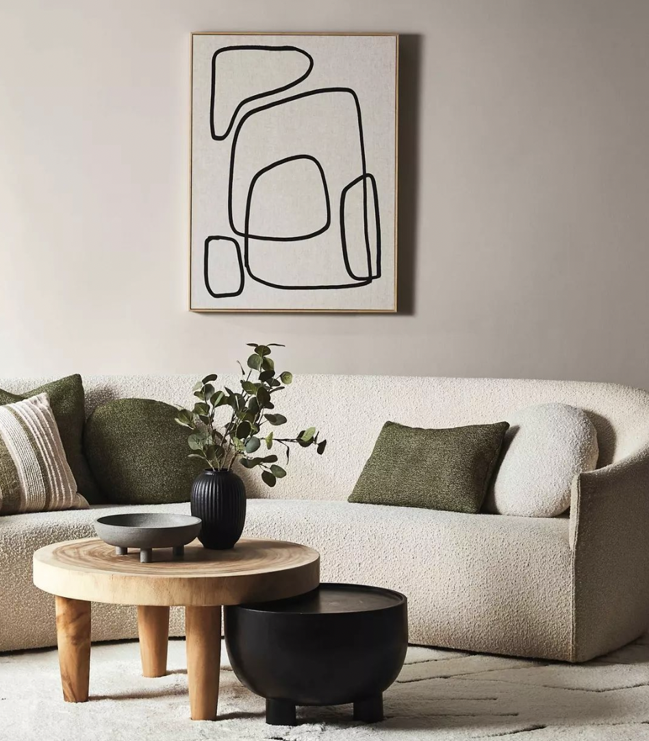
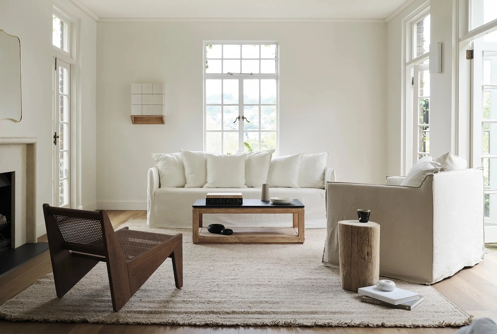
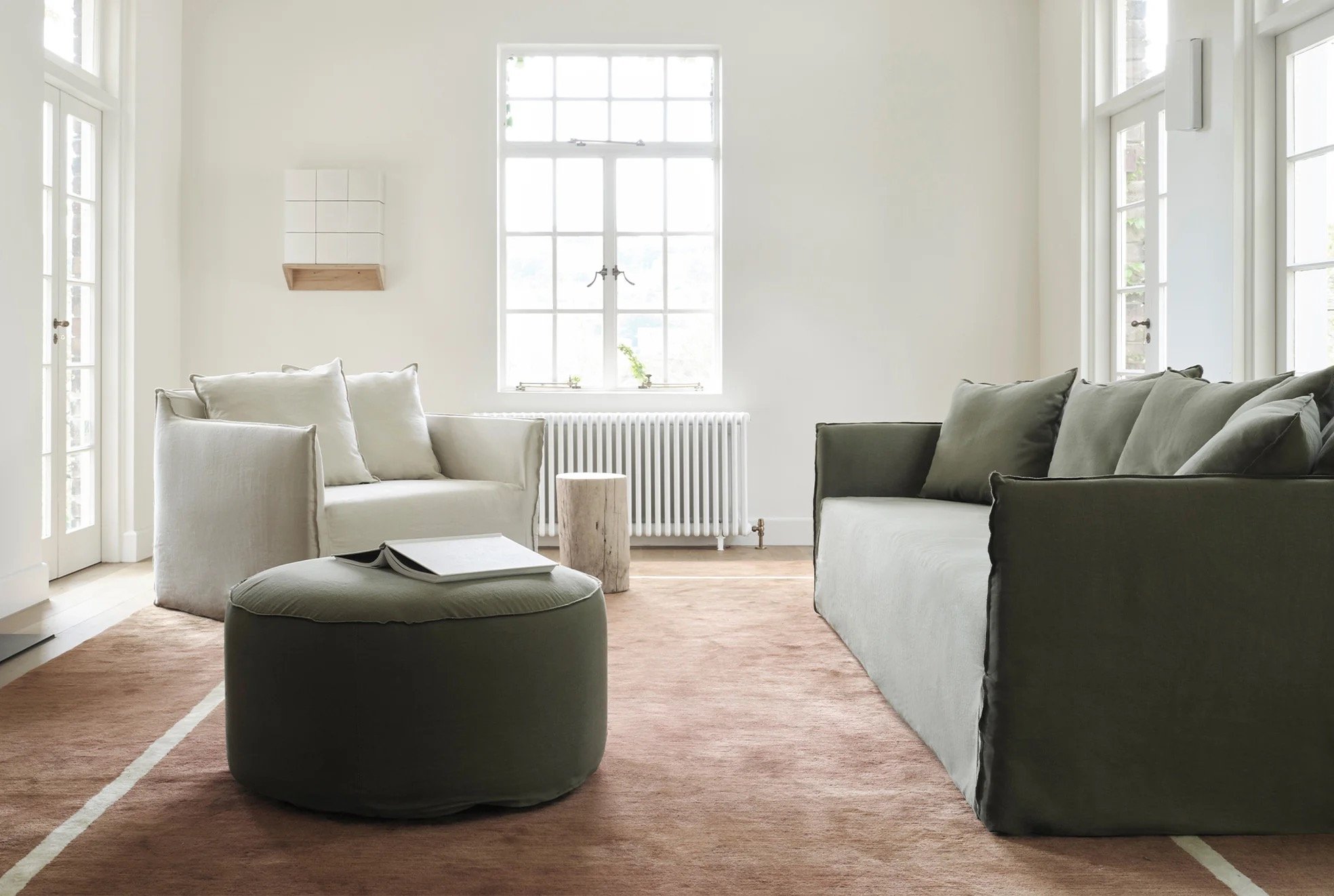
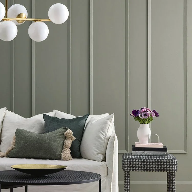
Not so easy to furnish, given the architecture, as there is access to this room on three sides making it hard to configure the furniture in a practical sense. I’d suggest a three seater with its back to the hall, and two armchairs. it’s important to select furniture that doesn’t have big fat arms or deep backs because you want to maximise the seating space, not the furniture space. I know, that doesn’t make much sense written like that - I’ll explain in person.

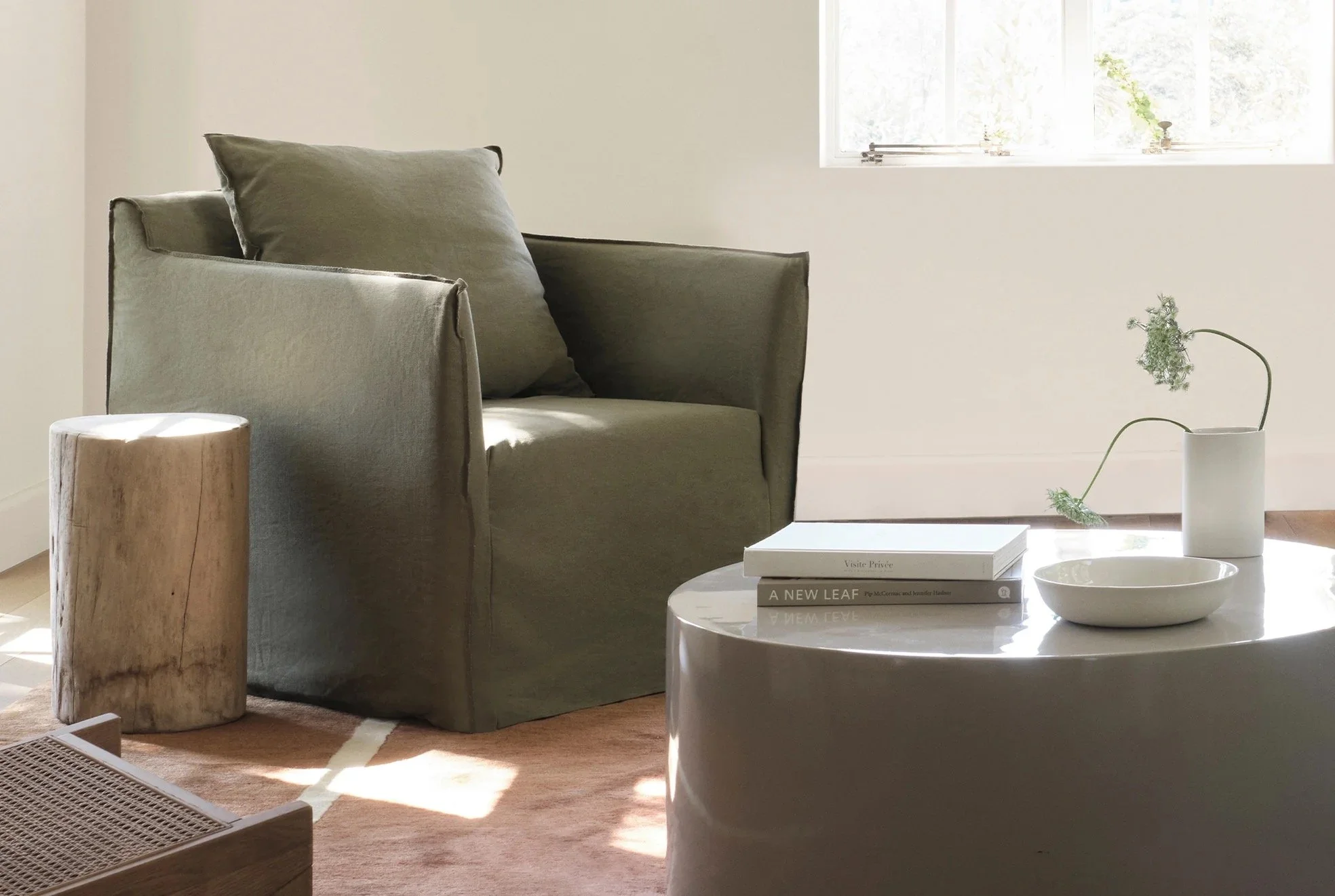
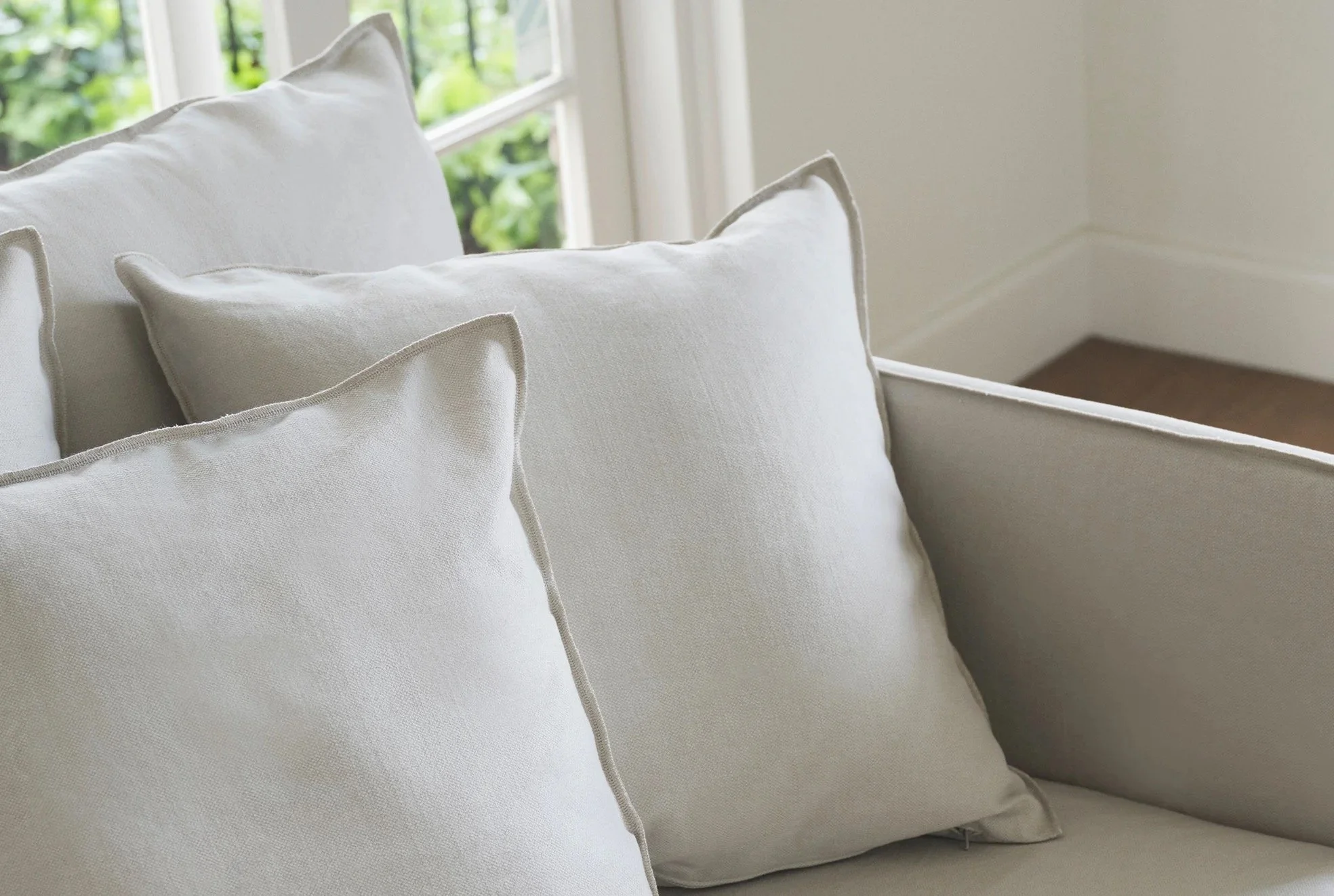
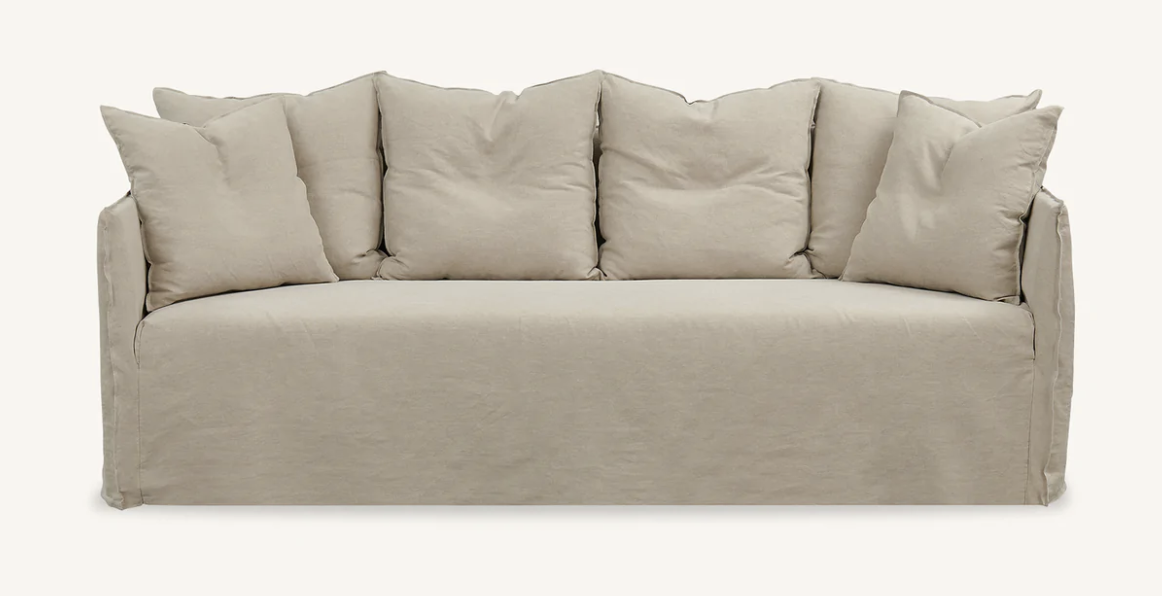
MCM House offer a range called the Joe. it is really simple, relaxed and groovy and the covers are made of Belgian linen and are removable and washable - major bonus.

All of the sofa is for sitting - it doesn’t have the cumbersome weight of old fashioned furniture with wide arms and backs. In a room where size matters for easy navigating, this is the choice.

The three seater would be my suggestion, plus a loveseat, so-called for they’re capacity for two occupants!! They’re really comfy with a friend or without!!

The quality of the linen is top notch and the available colour range is extensive.

A style like this has the added advantage of fitting it with anything. You have a lovely old home with a mix of some antiques and some mid century. Your art is eclectic, with both your grandfather’s work and a number of indigenous pieces needing to find a home together. You need furniture that will bridge all the gaps and know all the languages. Joe is your friend and the price point is especially good either with my trade or by buying at their outlet or even on Facebook Marketplace. It’s very popular so readily available.

Rugs…. I love the one in the hallway and I hope you’re not thinking to move it. It will look even more beautiful on the lighter sanded floor. But the one in the dining room… I wonder what you’d think of hides? I am a total devotee - I love that they’re a by-product of the meat industry, the animal is already slaughtered so we are not guilty!!!

There are so many great things about hide - they’re so much cheaper than rugs, so much more durable (you never see a stained cow!!) and they come in such a variation of colour and texture, I only use block colour - no cow patches for me!! They look so fabulous and they cost comparatively so little, I always like to encourage clients to consider them. Both of my own houses are full of hides.

Some people do not get the hide thang - if you’re unsure, I can always bring some samples to have a look at.

Master bedroom:

This room is relatively easy, if expensive due to bathroom, carpet and a wardrobe solution. It’s such a great space filled with natural light and district perspective. But it was Bob’s bedroom and now it is to be yours - so we really urgently to reinvent the vibes.

So this is what I’m thinking.

Porters Paints, French Green. All the woodwork in Irish Linen, and the curtains in linen in this colour, Eternal Willow by Mokum.

The wall colour and curtain colour are very deliberately similar. I do this because the effect is so serene - very gently contemporary and chic. It allows other elements to shine - the art on the walls, even the view out of the windows is less cluttered, more available to the eye than if you have a range of colours that are not similar.

My curtain guy Tony suggested a fabric made by another supplier, Warwick, that has a blockout backing, rather than a lining. I considered it as a viable alternative but in the end, I decided this is the superior option. A well gathered pencil pleat curtain that doesn’t require blockout lining, unless you especially want it.

I think of this as a warm room - all the heat form the house rises to here and you certainly don’t have a privacy issue, so I’d recommend an unlined linen curtain.

We have discussed the false wall and the wardrobe solution, but I would urge you to replace the aircon unit so that it can be moved and made discreet. I worry this one is not up to it.

With this colour scheme, Japanese paper lanterns would be a strong addition - as pendants either side of the bed in the place of bedside lamps. At less than $100 each, this is pretty fab value.

The carpet is the same as downstairs (for the same reason!!), so apart from the wardrobe installation and the modifications to the existing two wardrobes, the only other thing is bedside tables.

These from Globewest would be ideal and are also at a good pricepoint. I love the green against the wall colour and I’d suggest creamy linens for the bed like these -

All from Hale Mercantile.

With a coverlet like this one -

Ensuite:

We are clear on the design of this bathroom - leaving the shower where it is, removing the bath, turning the niche where the basin currently is into a cupboard and installing a wall hung vanity along the wall opposite the loo. Moving the loo further towards the window will make the bathroom feel a little bigger and allow easier access to the shower.

So what are all the elements!

Tiles - keeping budget at the forefront, these from Tilecloud are a great choice. It is not a big area, so tile quantities are not large.

We use this tile on the floor and along the wall behind the loo to a height of 1.2m. Then it does the shower floor and the facing wall, the opposite walls on both ends of the shower are in a large white tile, sample provided.

Above the vanity, a feature of this tile counterbalances.

Two tiles in one bathroom you might think contradicts all I’ve said about keeping it simple!! But in a bathroom, using one tile throughout gives the effect of closing in on you, hence the two.

And before you think I’m going nuts, the large format white tile in the shower recess is pure economy - you can’t see it until you’re inside the shower, so it makes sense to use the cheaper option.

It’s still a nice tile I hasten to add!!

A wall-hung vanity is a way better option than one that sits on the floor. It looks so much better and is easier to maintain, and given you’ll have a sizeable cupboard, storage is not an issue.

The handles in the image below are NOT what I’d specify - the ones I prefer are called the blaze handle picture below. This is a ore discrete handle that fits along the top of the vanity drawer underneath the bench top - so you sort of don’t see it. Looks cool.

As mentioned, you’re going to have plenty of storage, so I can’t see the value in a shaving cabinet. A mirror is all you need above the basin and it will look better without a cabinet protruding from the wall!

All the tapware, including the handles on the vanity, to be Brushed Nickel - way better than old fashioned chrome.

The taps above are groovy. They’re from TIlecloud and are very reasonably priced. If you like the style, I will do the cost comparison more formally. Obviously these are wall mounted, so we’d need a wall spout too, and a pair of taps and shower head for the shower.

Lastly, the loo. Again, wall mounted with an in-wall cistern is by far the preference when thinking about the space, but a slimline back to wall is also a more economic option.

Downstairs bathrooms 1 and 2:

I won’t go into the detail now as I know these are not the priority at this stage. Bt these are tiles I’d suggest for both downstairs bathrooms:

My pet hate in a bathroom is double basins - who wants to share the teeth brushing experience with a friend??!! Not me. I have included the image above purely for the view it gives of the tile.

The image below is the same vanity as the one in your bathroom but in a lovely bluey-grey colour. This is what I’d specify for both downstairs bathrooms.

Same brushed nickel tapware, same loo.

I’ll add much more detail when you get closer to doing downstairs bathrooms

So this is a lot!!!! And we haven’t talked about kitchen renos. But it seems to me that although dated and bit tired, you can probably leave this until a later date. I’m in for the long haul so when the time comes, I’ll be in like Flynn.

In the meantime, there is a huge amount to work through to make this house sing. So let’s get started!

Henrietta x

Previous
Previous

Fastovsky Steadman House scope

Next
Next

Greenwich House