Your Custom Text Here
Clarynvale CIP
Clarynvale’s time has come to shine.
Nobody could say we haven’t thought long and hard over the plans for Clarynvale. But I think we may be finally landing into the wonders of resolution! The following reflects the process we have travelled to date and documents the brilliance we have together conjured.
The mandate is to focus on interior fixtures and fittings, the general scheme of things, as opposed to moving too many walls. Emphasis will be on styling up, not pulling down. Ultimately, extending the living room is the aim, but in the intervening time, Family Spratt needs a fabulous country home to live and relax in, feel cocooned in and nurtured by. The inspo is, as Carolyn aptly dubbed it, coastal country - with moments of mountain…
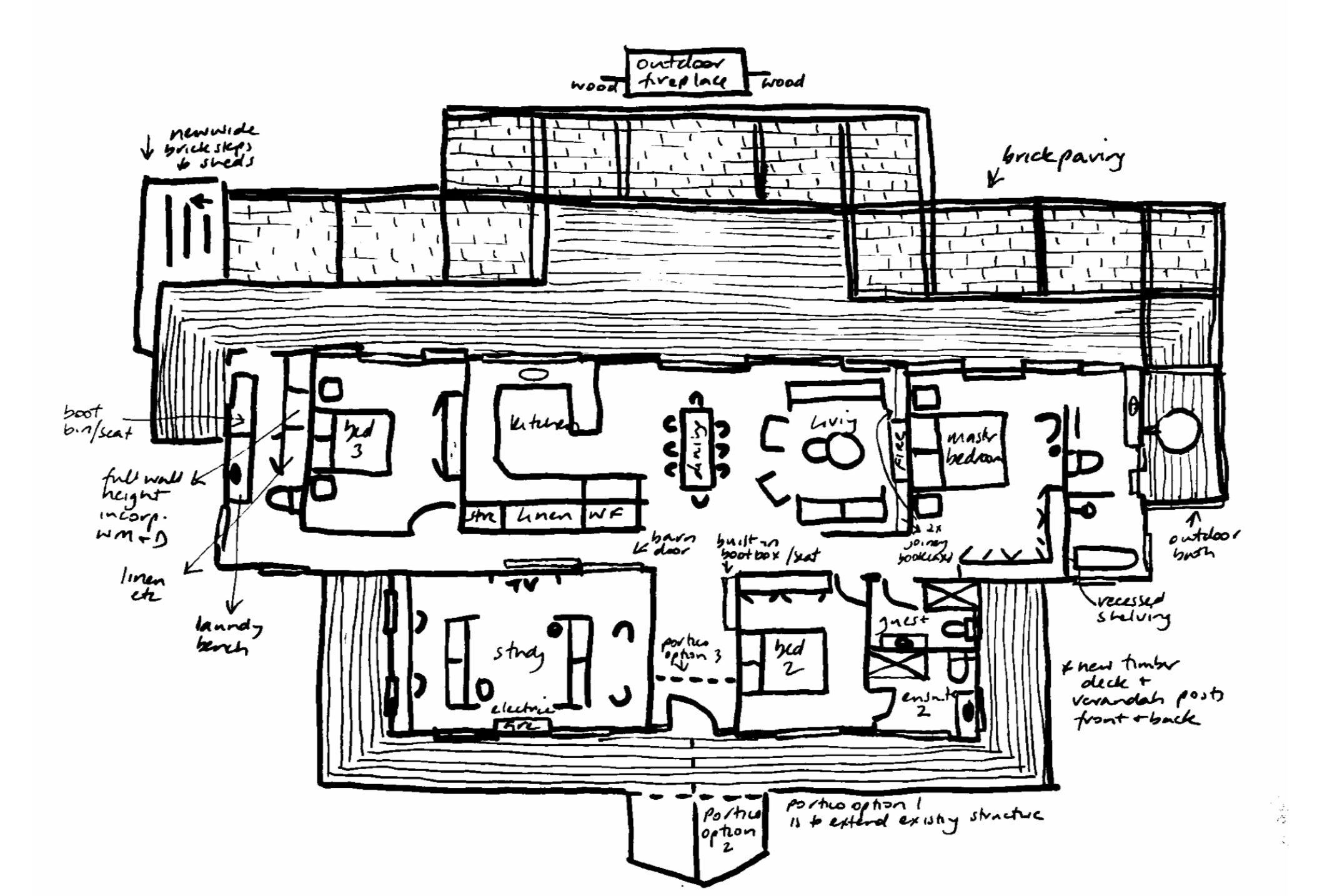
The plan below is more in line with the new approach but is of course always subject to your discretion and changes of any kind, before any work is commenced. As you’ll see, very little structural change, but massive change in the vibe.
Interiors:
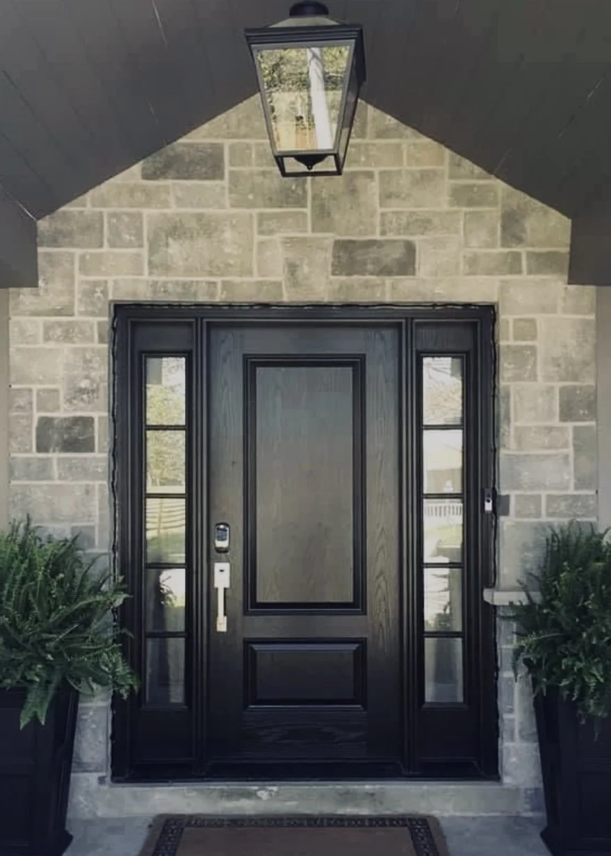
From the moment you enter the front door, Clarynvale is going to embrace you in the warmth and character for which its occupants are known and loved! With your proximity to the ocean, the colour schemes and finishes will reflect the coastal vibe, with notes of earthy tones to compliment the pastural outlooks.
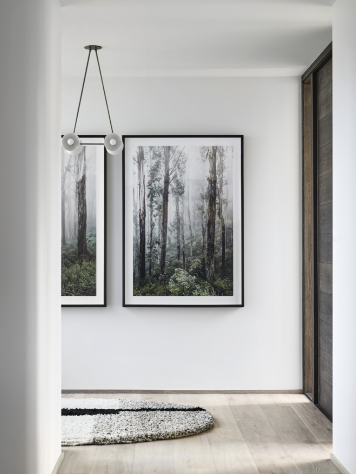
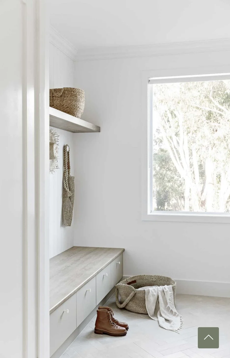
Entry Hall
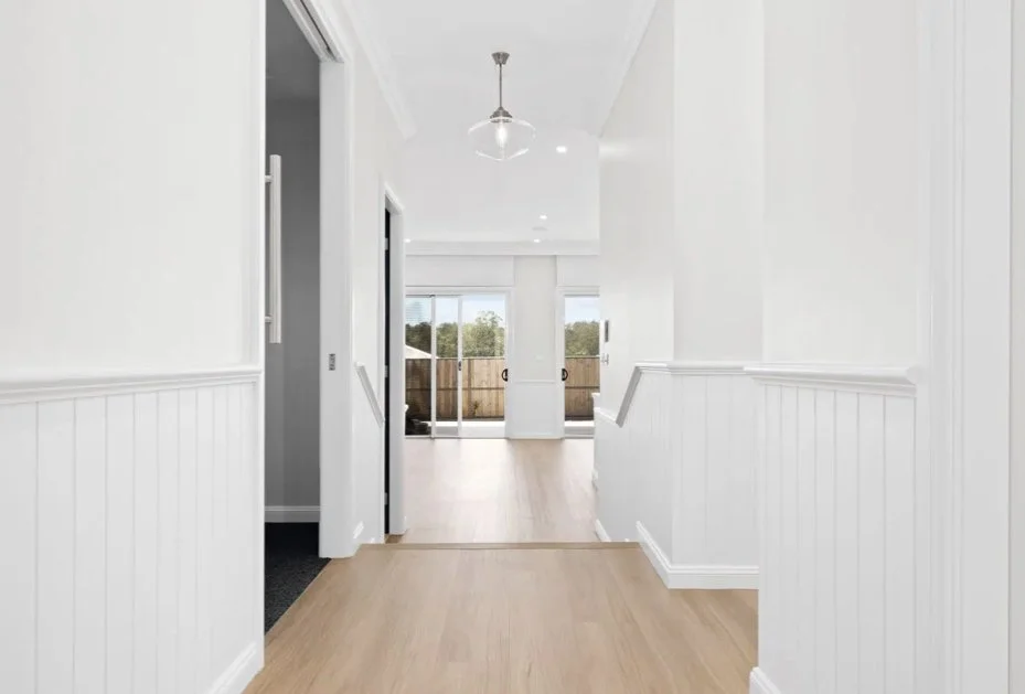
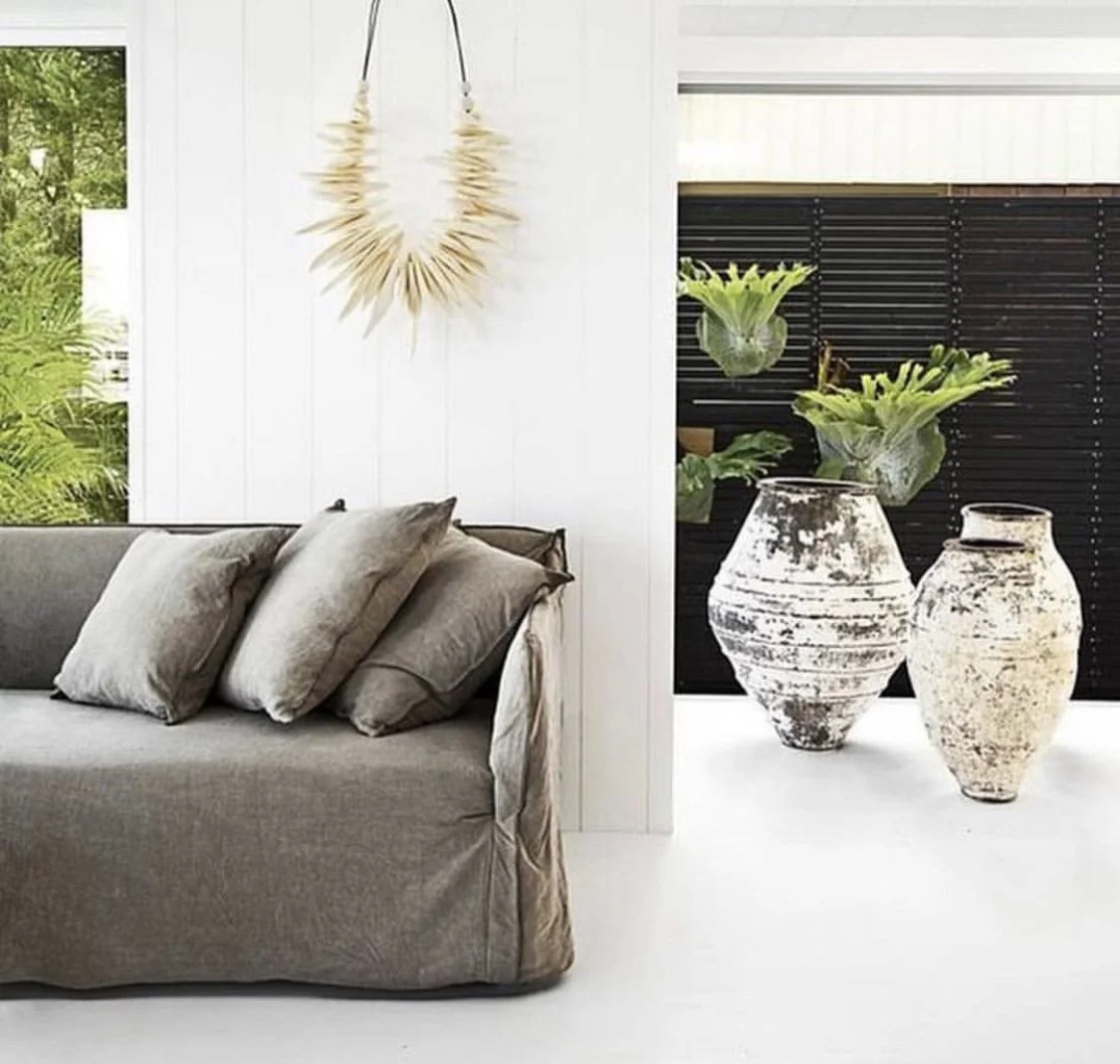
The style of a home is upon you from the moment you cross the threshold; instantly imprinted is the character, the vibe and a sense of who lives here. So it’s nice to think you can direct the traffic somewhat! From that first instant, warmth, texture, character and comfort will fill the hearts and minds of each of those people lucky enough to step foot inside beautiful Clarynvale.
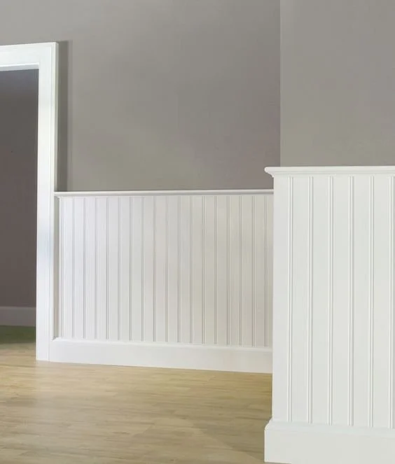
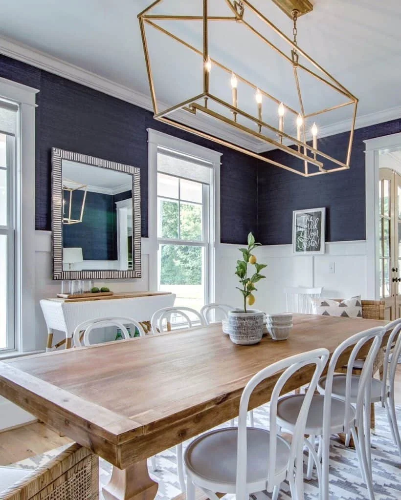
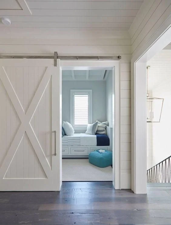
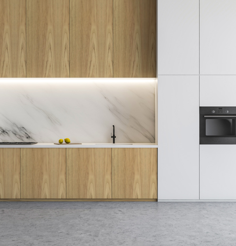
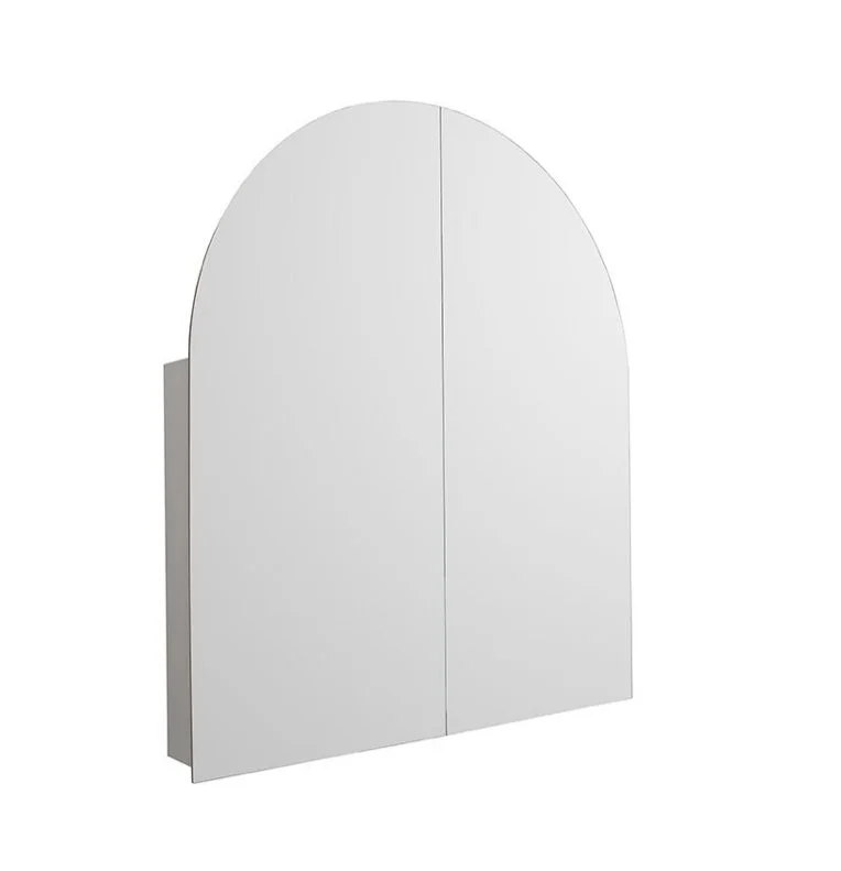
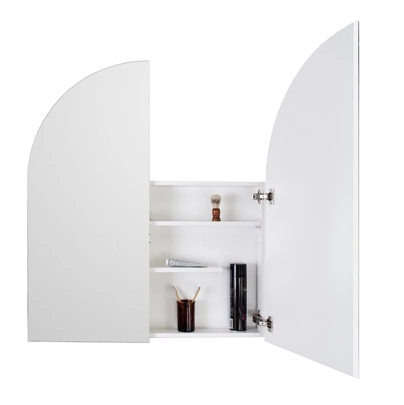
There is currently a bland expanse of gyprock that can be totally transformed with dado. Originally designed to protect plaster walls in high traffic areas from dings and scuffs, dado has over centuries become synonymous with characterful homes, and never more so than in the countryside!
Below are some inspo images of dado walls, which are simply constructed additions to the existing walls. The entry hall will be lined, and will follow left and right down each hallway, and it will also adorn the eastern wall of the living room, which backs the hallway wall.
There are loads of different profiles on the paneling that you can choose from, but the v-join above is the simplest and I think, the nicest for this house.
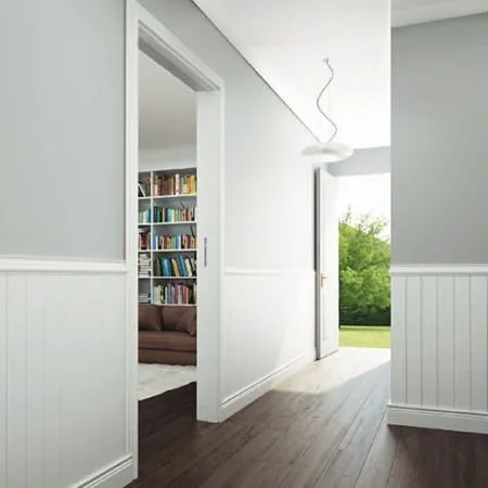
The colour swatch on the right is Dulux Natural White, chosen for its warmth, for all the panelling and woodwork throughout.
It looks a little creamier in the image here than it is, but that is more about the stark white of the computer background than a reflection of reality!
All woodwork to be low sheen enamel.

But what about ABOVE the dado, you cry… MORE MAGIC!
Given the abundance of natural light in the house, and that the dado walls and ceiling will be white, there is opportunity to be quite unique here and really build on the textural beauty and richness of the interiors. Deep breath…
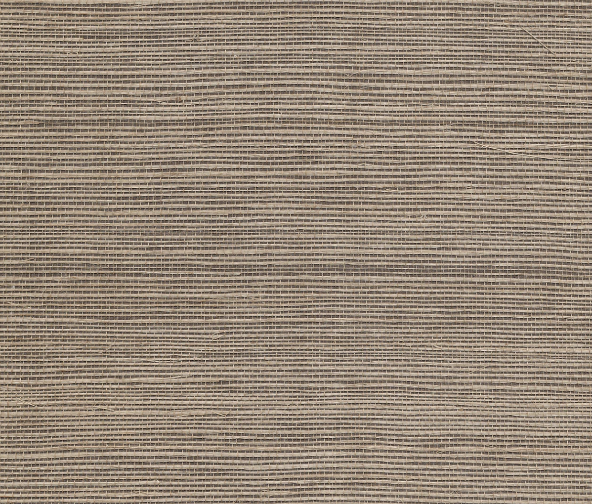
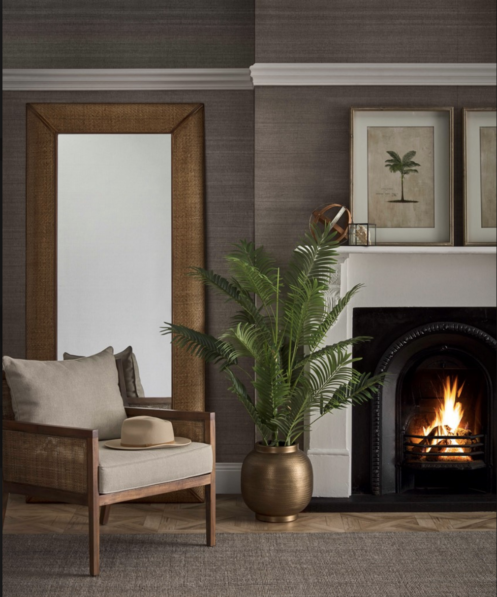
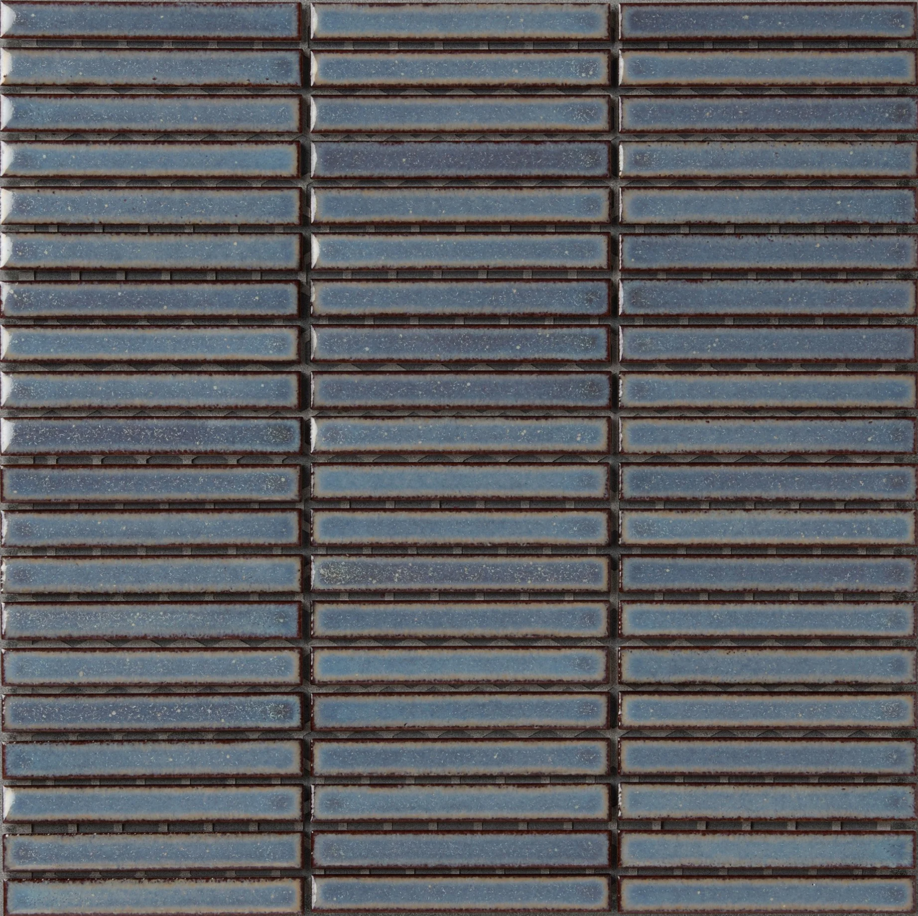
Porters Paints do a range of wallpapers called Grasscloth. I have used them before and every time I do, I am blown away by how MAGIC they truly are. In line with the coastal / Hamptons narrative, a blue was always going to feature, but this one, Harbour (annoyingly!!), has an inky depth to it that makes it particularly special.
Hanging it above the dado in the entry hall and down both halls and on the eastern wall of the living room is what I have in mind.

The colour is not well represented here; you’ll see from the sample in your pack that it is not as dark as the above, taken from the Porters website.
The images here show how stunning the contrast between the white dado and the blue wallpaper look together. Add a range of interesting artworks too, and the combination is winning.
When you consider that the entire wall opposite is glass, looking out at the green pasture and big sky, you can relax about the blue being dark.
What you see is style and charm.
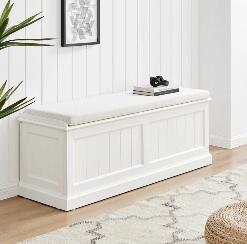
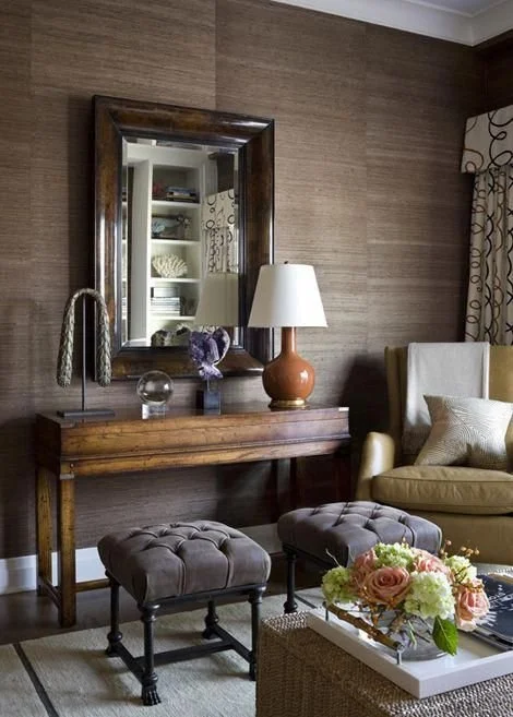
One side of the entry hall will have a console for keys, a vase of flowers, and dare I say, a thousand bits and bobs… and it will have a mirror above. On the opposite side of the entry hall a built-in bench seat with storage underneath, for sitting on to put on or remove shoes. and a coat rack above it. More on that in a moment.
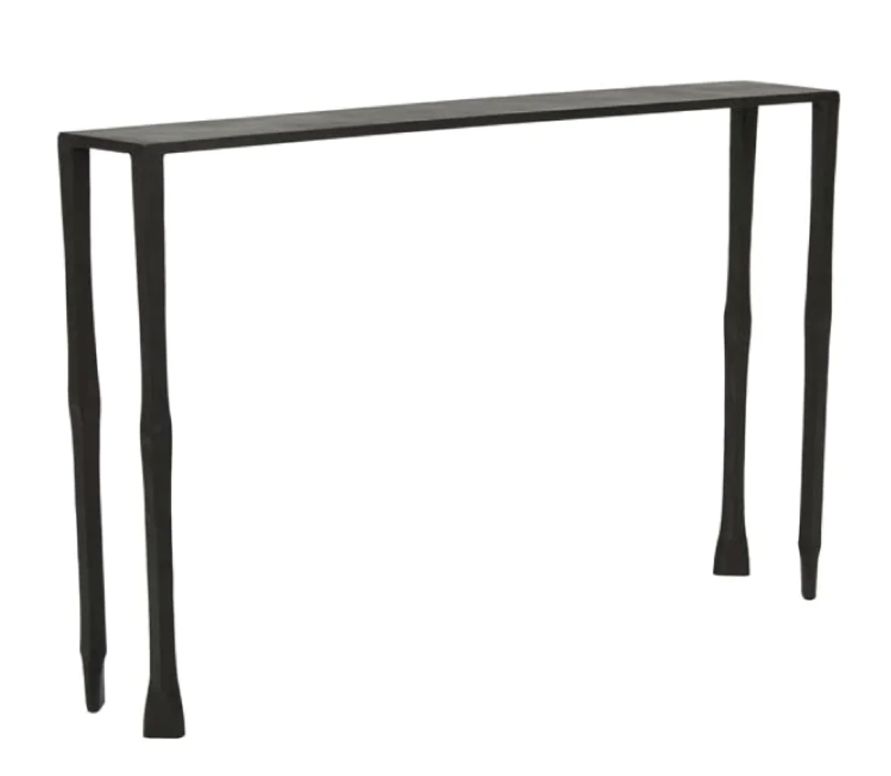
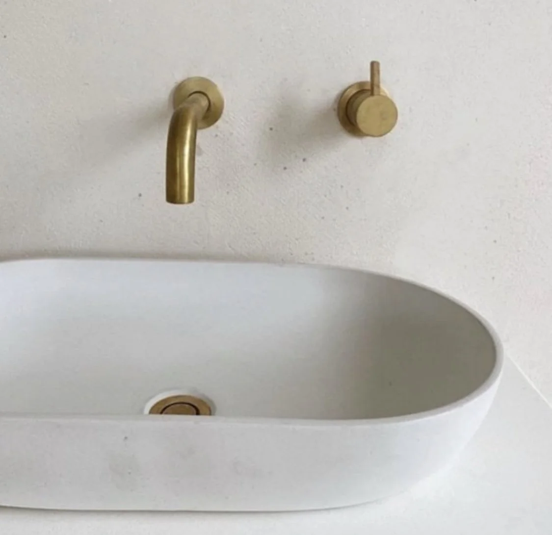
The hammered iron console from Manyara Home pictured above is a great tie-in with the black of the new doors and against the white of the dado wall. It’s sleek and modern and will look outstanding, measuring 1220mm long and 200mm deep - room for a vase of flowers and a brass vessel for keys, etc.
It needs a mirror above it and I propose the one pictured here, from The Finnish Design Shop, as its thin brass frame picks up on the brass hooks we will place opposite
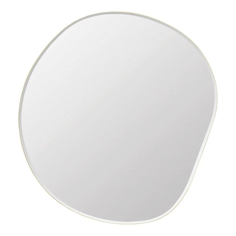
It’s called a Pebble mirror - apparently inspired by the unpredictable movements of flowing water!!!!! I love it for its irregular, irreverent shape that makes it as much a wall mirror as an artwork It measures 92cm x 87cm and can be hung whichever way looks best in situ.

The bowls above are from Tom Dixon and they’re dreamy. Big enough for keys and a lipstick, but not too big to be attention seeking!!
I have included the close up image of the mirror on the right so that you can see the subtle brass edging and the bevel, which make it so perfect for this spot.
We want the hooks, the lights and the bowl to do the serious brassing!

A number of Henry Wilson brass hooks for coats and hats on the wall. These are substantial and very lovely, even if the photographs of them against a chipped wall are not! The organic nature of the brass and the generous sizing of the hooks makes them good for coats and hats, and against the blue wall paper, they’ll be manifique!


So you’ve come in the new door, hung up your coat and hat, popped your keys on the console… now you want to take your shoes off.
The proposal is that a bench seat be constructed, integrated into the dado wall using the same v-join facade, and a custom leather or shearling cushion made to go on top. The ones below give an indication of what I mean - but having one custom built allows us the exact measurement to fit the space and to look more integrated with the dado. With gas-lift fittings on the lids, the storage can be for shoes or whatever, and for extra lush impact, the leather or shearling cushion cover can be custom made for the top.
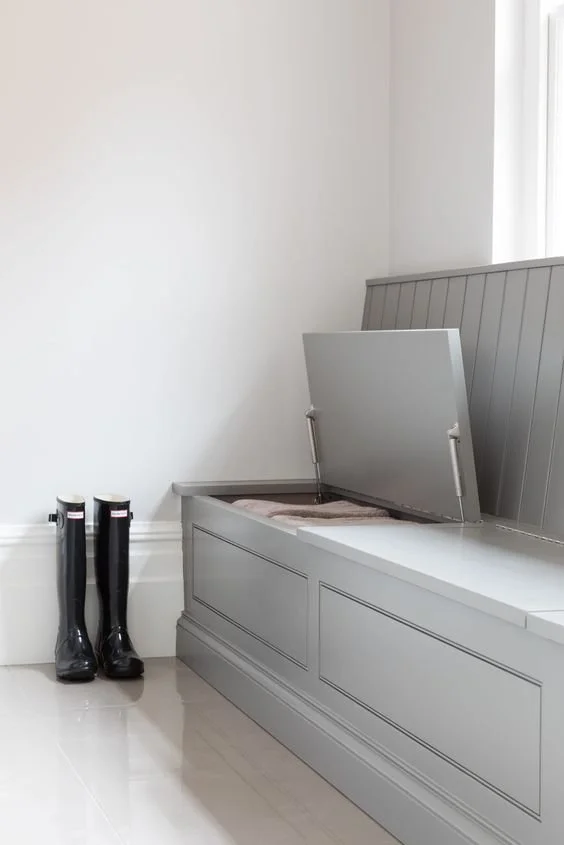
It is hard at times to find images of exactly what I mean, so these are meant as inspo only.
A sketch is a more accurate, though less glossy, reference which a builder will interpret and use as a guide.
The swatch on the right is of a beautiful leather from which the cushion could be made. Leather and sheepskin do so much heavy lifting in interiors and they’re practical, durable and beautiful.

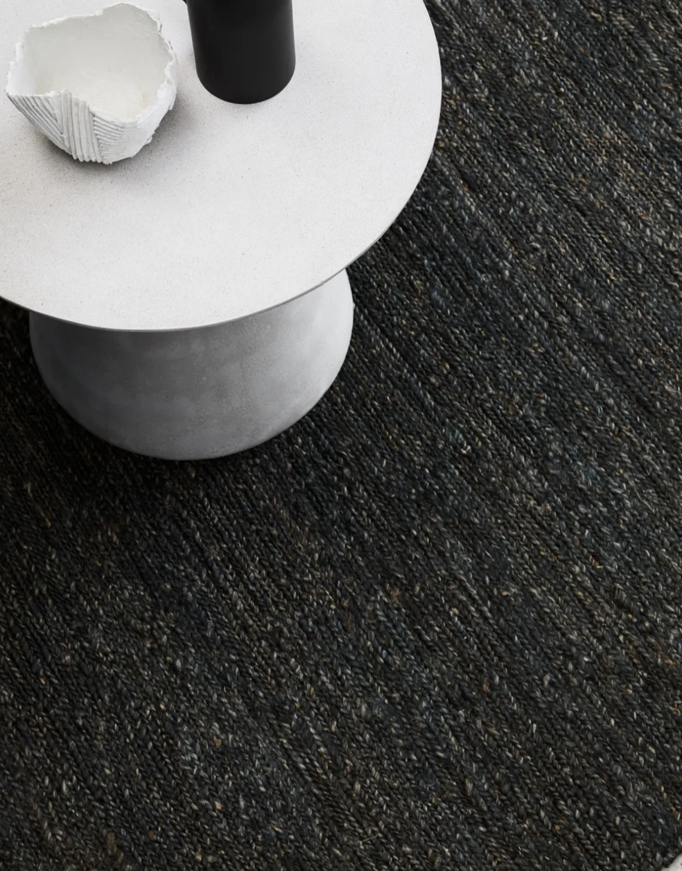
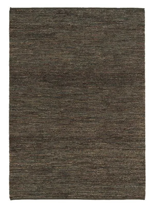
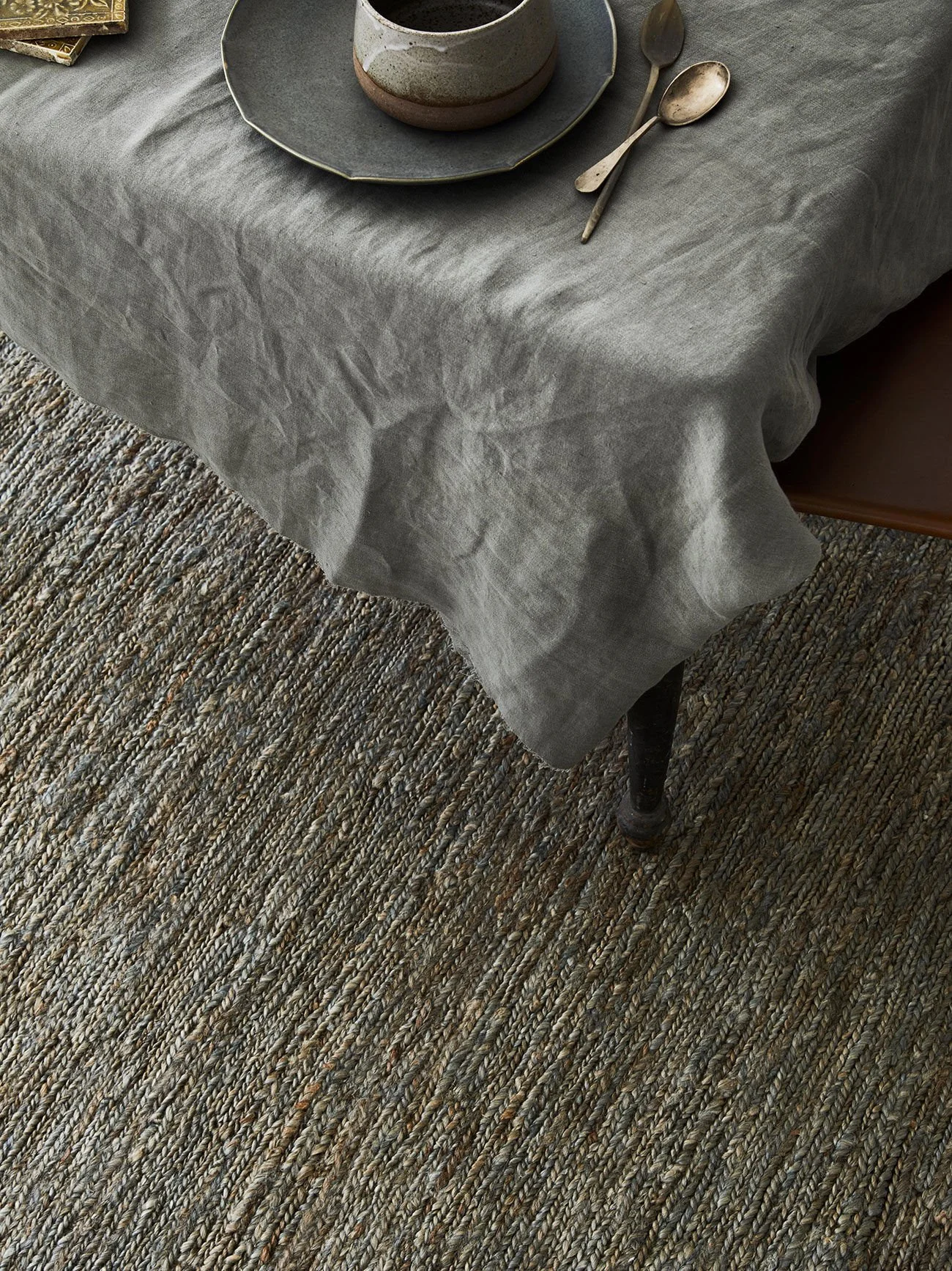
The rug selected for the entry is also very durable and looks sublime - it is the Armadillo Ravine in the colour Coal, and it is 100% jute. Continuing the contrasting here, this rug can be custom cut to fit the entry hall and will have a thick underlay to accentuate the texture, absorb noise and add warmth.
The colour is dark, but the space is not. It will tie the new black door in well and we will repeat it in a larger format under the dining table. And what could be more practical than a rug that will never show stains?! And another fun fact? Jute is super low allergenic!
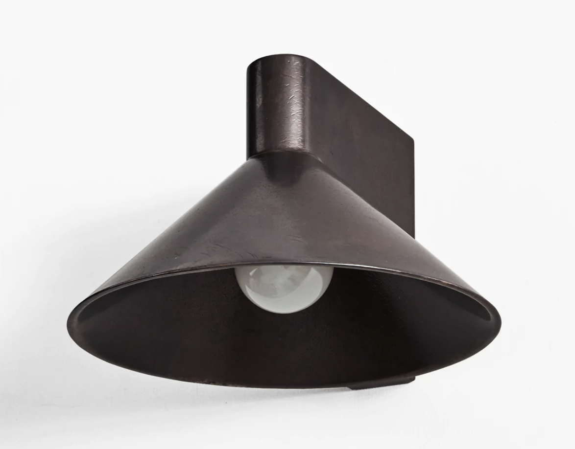
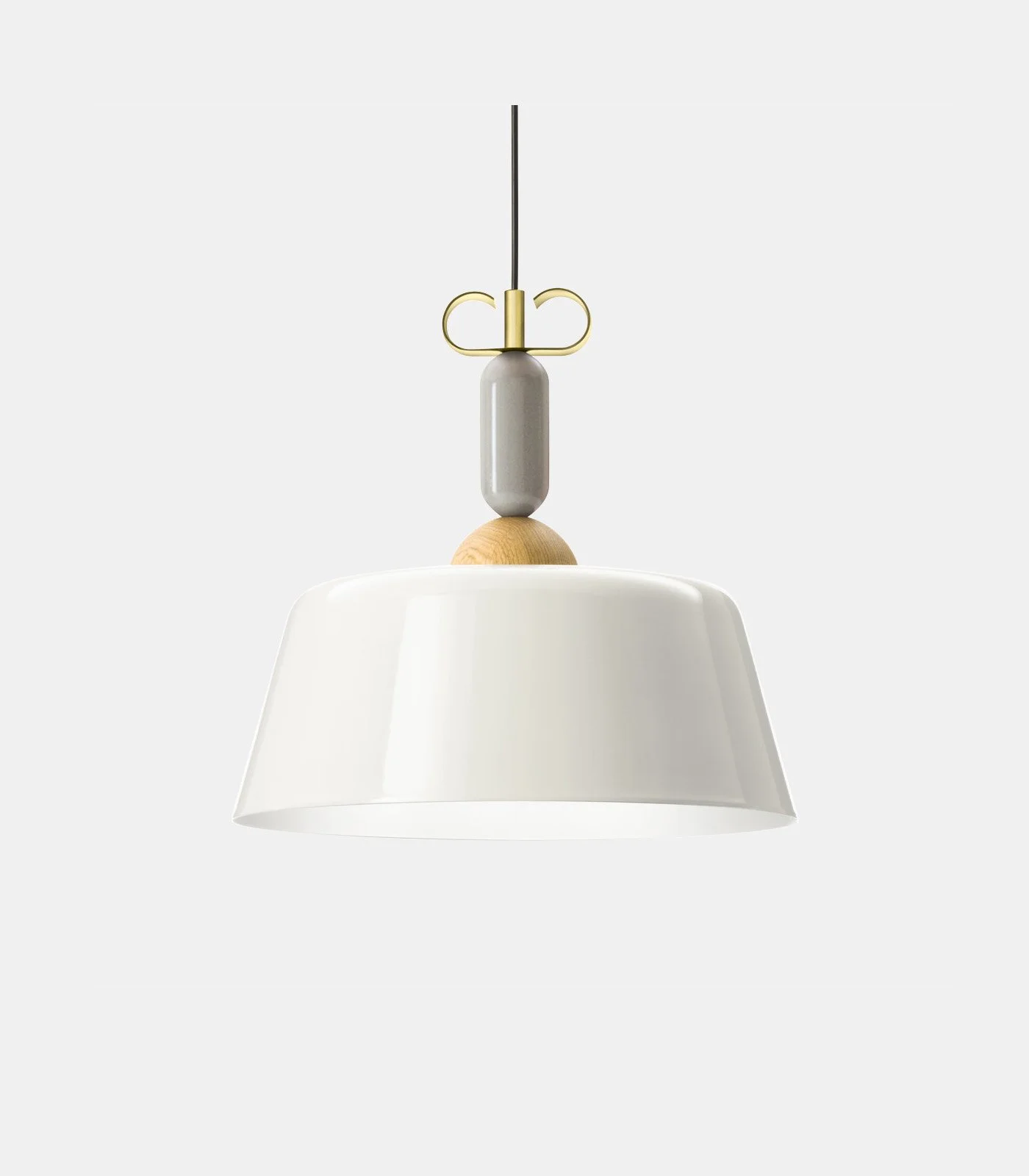
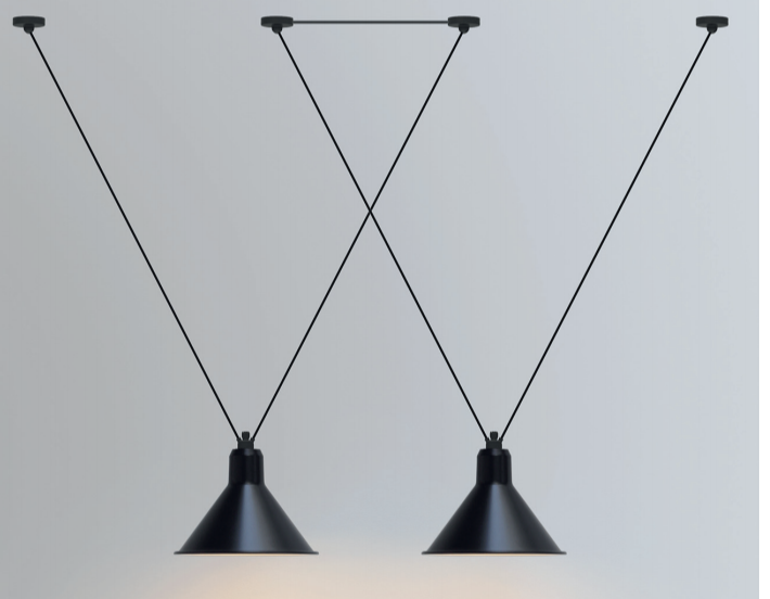
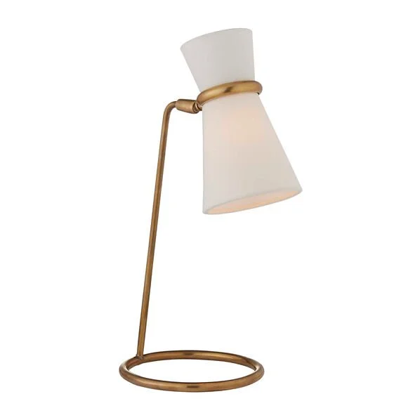
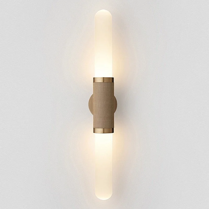
A feature light is always a good idea in an entry because it’s all about the invitation and how can you offer that without seeing the light?!! This can be a windy spot - so as an alternative to a pendant, these sconce lights from Henry Wilson Studio would be divine on the wallpaper, opposite each other towards the dining room end of the entry hallway walls.
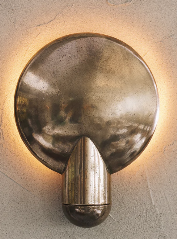
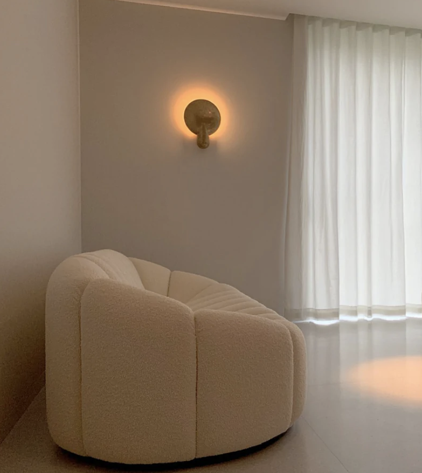
Handmade in Sydney, they’re a really gorgeous and an interesting alternative to a more conventional pendant.
Details are so important - and continuity should be observed so that you have a real sense of flow throughout the house. This isn’t about being fancy or overdone, it’s about creating a zone where there is harmony and logic - because that is fundamental to good design and it makes any living space feel more whole.
By adding these subtle brass notes throughout, its like breathing warms wisps that swirl and twirl and then take a bow….
Dining Room
So you’ve arrived and doffed your coat and hat. Next destination is the dining room.
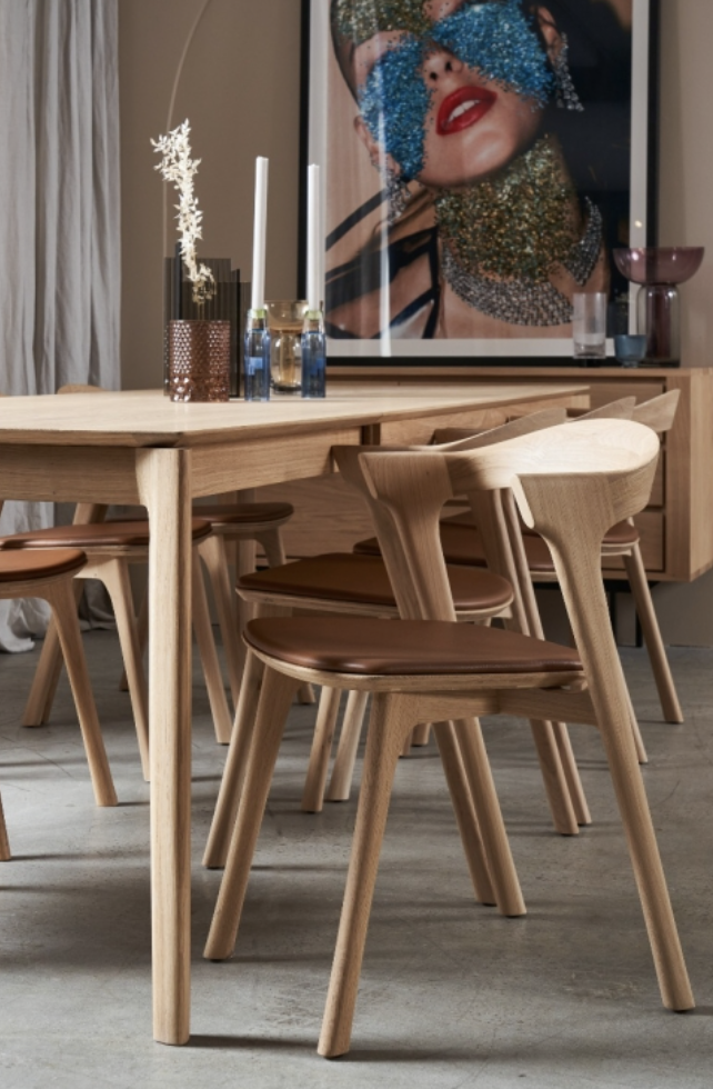
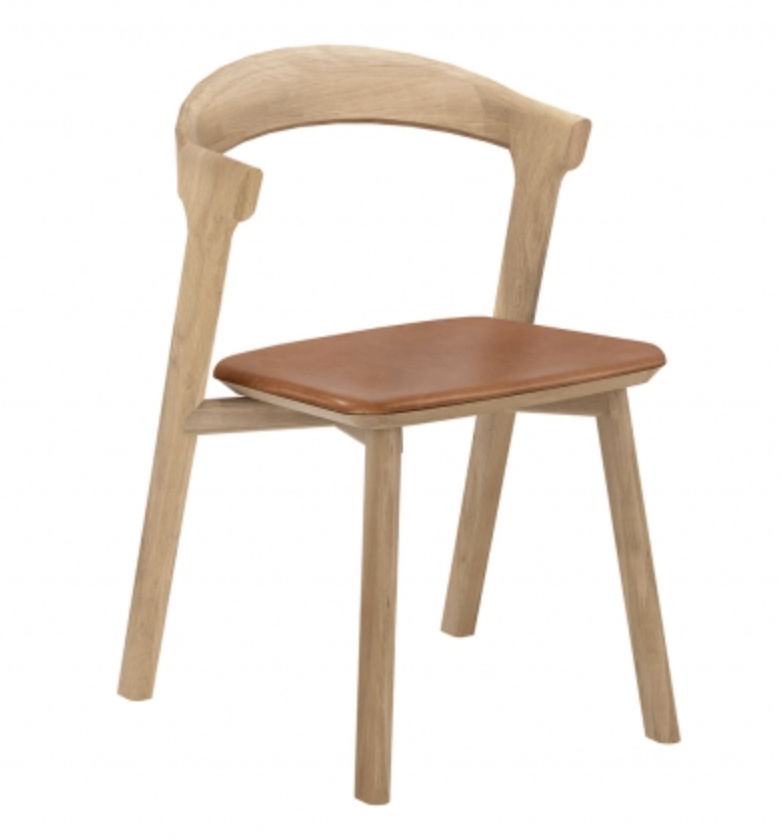
Notwithstanding coastal/country/momentsofmountain is the vibe, we want to avoid a country cliche… I believe a less country table and chairs is the ticket here.
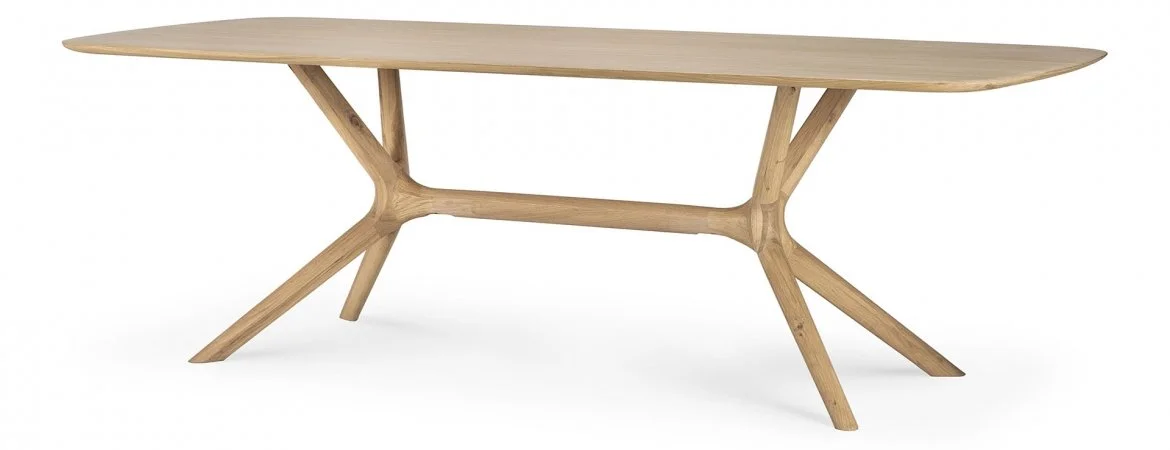
There is something about the smooth sophistication of this one that really appeals - a different vibe to hard core country.
And a stringer is always a winner.
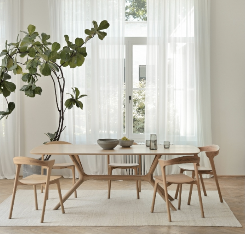
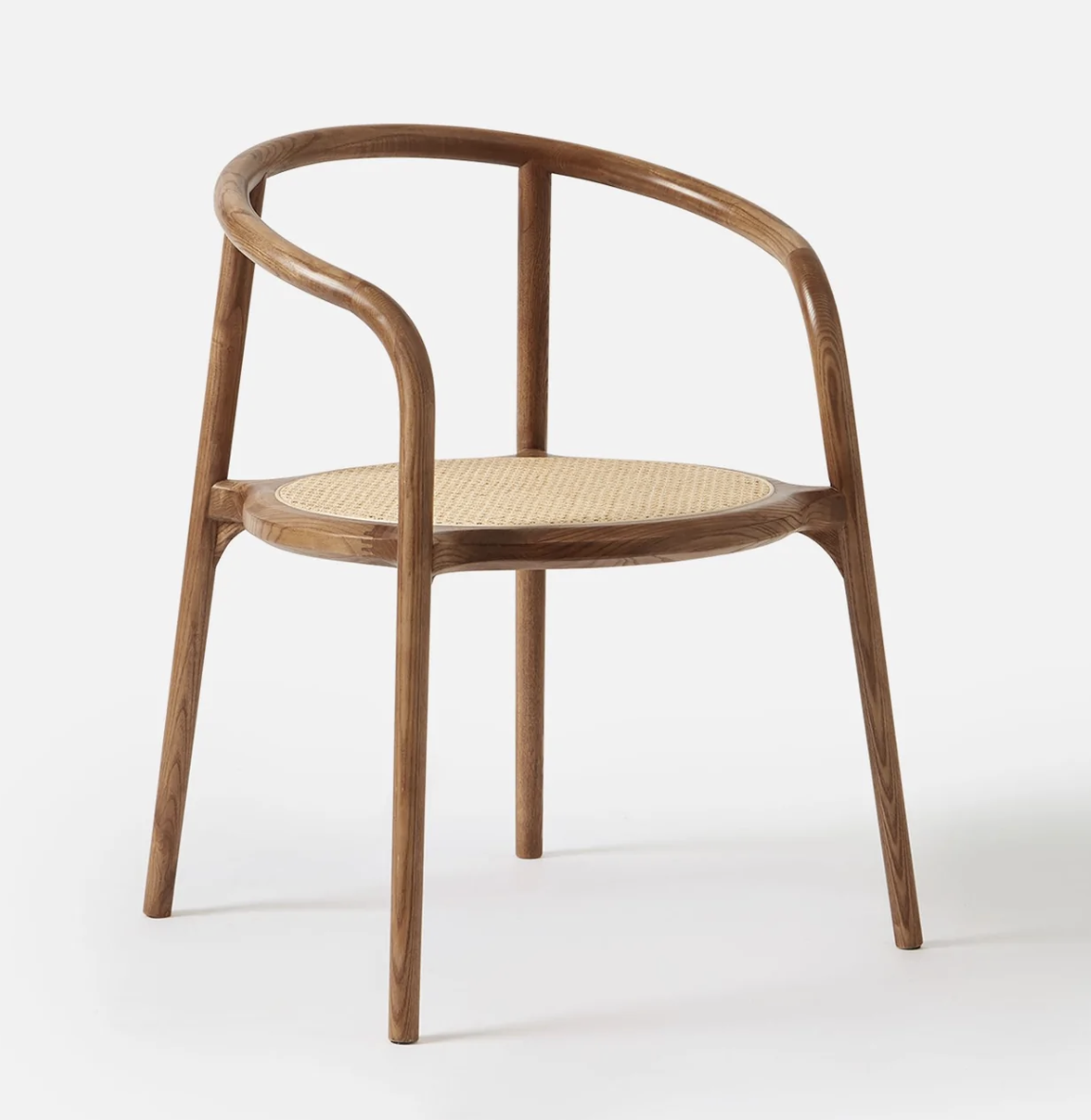
Both the tables above and to the right are by Ethnicraft and have that lovely blend of sleek modern design and the earthiness of the light timber. I have included a couple of chairs to consider, the Bok chair with leather pad is fabulous, but so is the Ivy, which at half the price :) is good value!
You definitely want 8 chairs, but you could deploy 2 in other rooms so that you had 6 around the table day to day and bring the extras in when required - like for family… or FMCC…
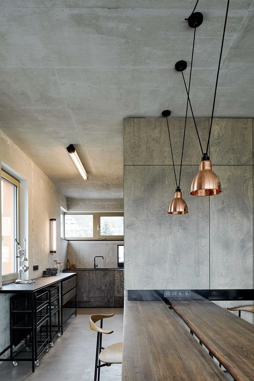
There is no escaping it, the dining setting needs a pendant light over it because no-one has any business eating under bright overheads! More importantly, it looks soooo much better with a lovely light hanging over a dining table, night or day.
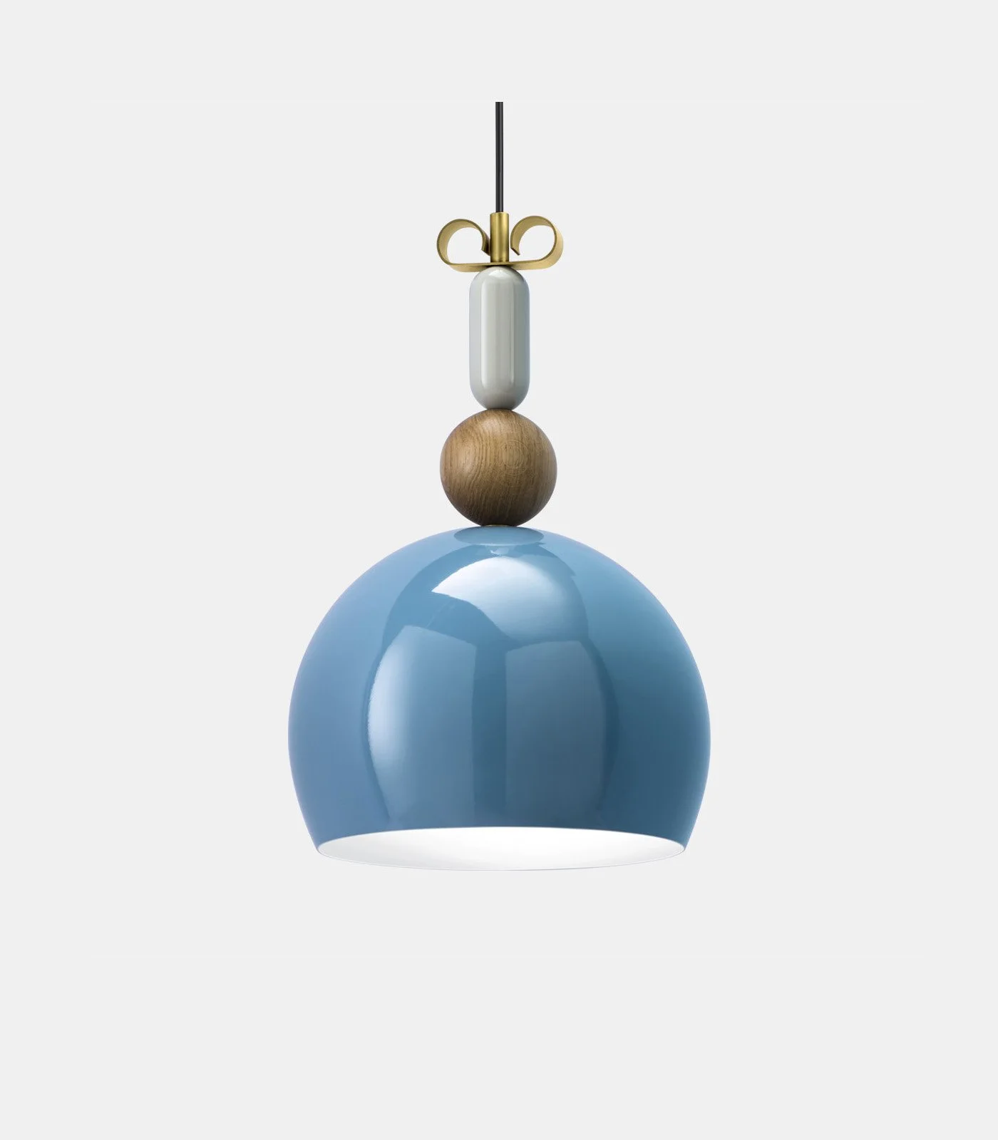
These pendants from Lightco are whimsical and they’d look great with the palette. Having two works because the ceiling is so high and the room is so big, it’s better having two than one!
I like them because they’re different - and if we were to go with the brass sconces in the entry hall, they’d compliment them without competing with the brass.
This is a major move - so I’m giving you some options.
If you were wanting something a little more conventional yet still quite unique, then perhaps something like this would appeal more. Available in brass or black, there is an elegance to them that is really cool when hung in pairs.
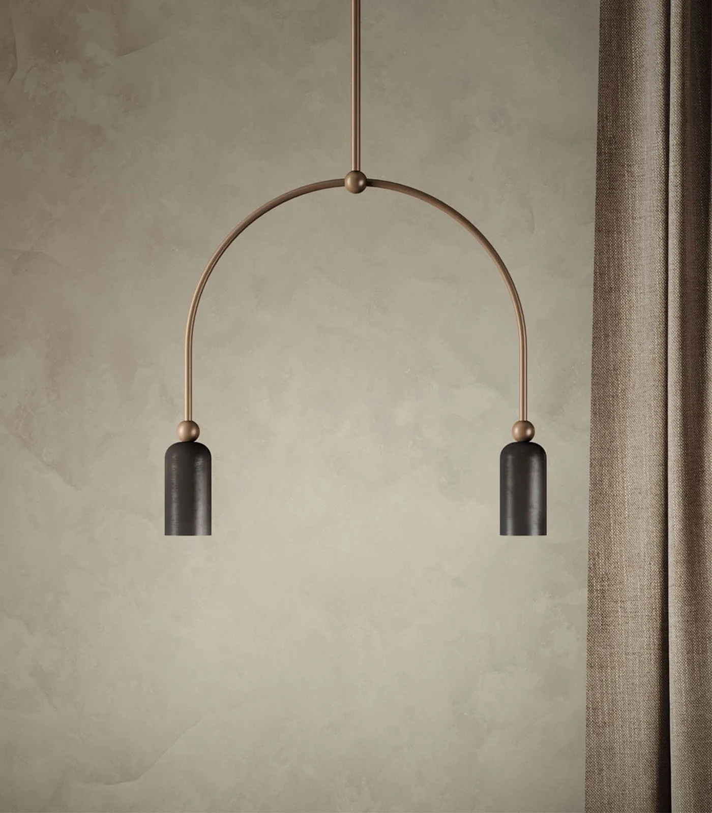
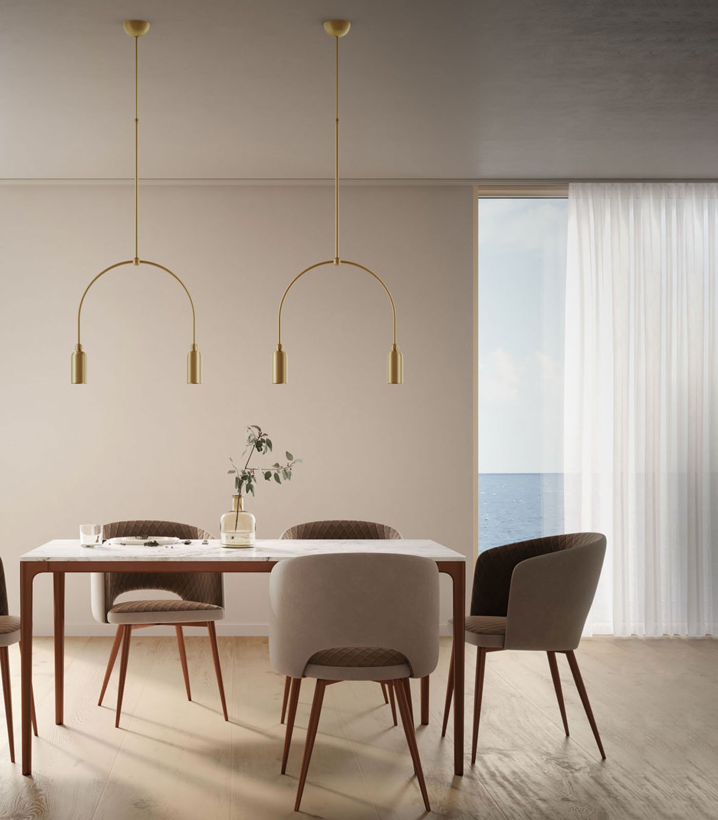
Or then there are these - the french numbers by DCW Editions called the Acrobat.
These are so cool - you can get the shades in a variety of shapes, but I prefer the ones above - and in black. If you decided on the Henry Wilson lights outside on the verandahs (details later in the plan), then these would be a good point of connection (pardon the pun) inside.
I have included the image to the right to show you another installation shot in situ. They’re suspended between two points per light - which would be handy given the wind that can blow in Biissville.
I think that lighting is maybe the thing I bang on about most. I don’t think it matters what you do in a home - if the lighting ain’t right, the living ain’t right. It’s all about seeing the light…
In the plan, you’ll see that the existing hall cupboards that form the back wall of the kitchen will be extended into this area. The dresser will go and in its place, on the new end to the bank of cupboards, will be either built-in wine racks, or a combination of racks and a spiritual space… for the gin not the gods. The idea is that behind this, a wine fridge could front the hall side, which would have it away from the light from the western side. Depending on the depth, we could back the wine fridge in behind the pantry, and the kitchen fridge in the alternate slot, next to the pantry so that fridge don’t butt fridge…
Above is a good example of a built-in shelving unit with a detail I’d love to include - the blue wall paper behind the shelves! I’d also want to include a discreet strip light on the central shelf, as this may be where to park the gin bottles.
The cupboard below is a good storage place for mixers, or whatever, but we could alternatively add wine racks instead.
You might ask why you’d not stick with the sideboard that is in this spot currently, but as we want to lengthen the cupboard bank here, I think we’d be better with this solution and moving the sideboard into the newly created third bedroom.
The image on the right is of a wine fridge - in case you missed it. I love the idea of one like this on the hall wall behind this shelving unit, opposite the sliding barn door to the study, and out of the light of the living room area.
Bloody lovely…

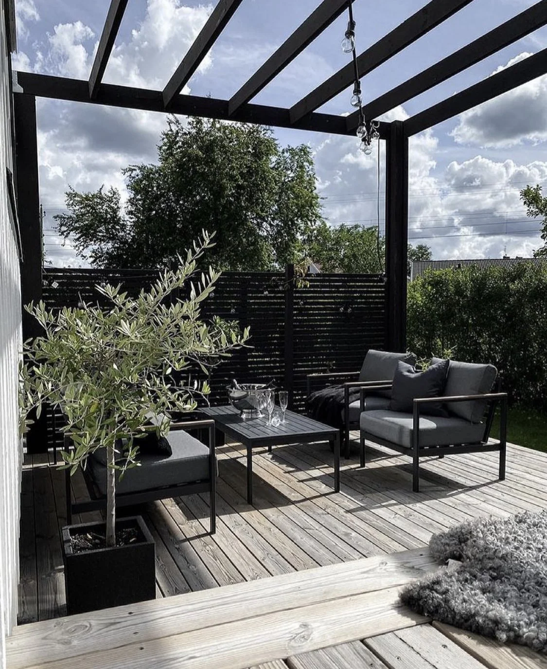
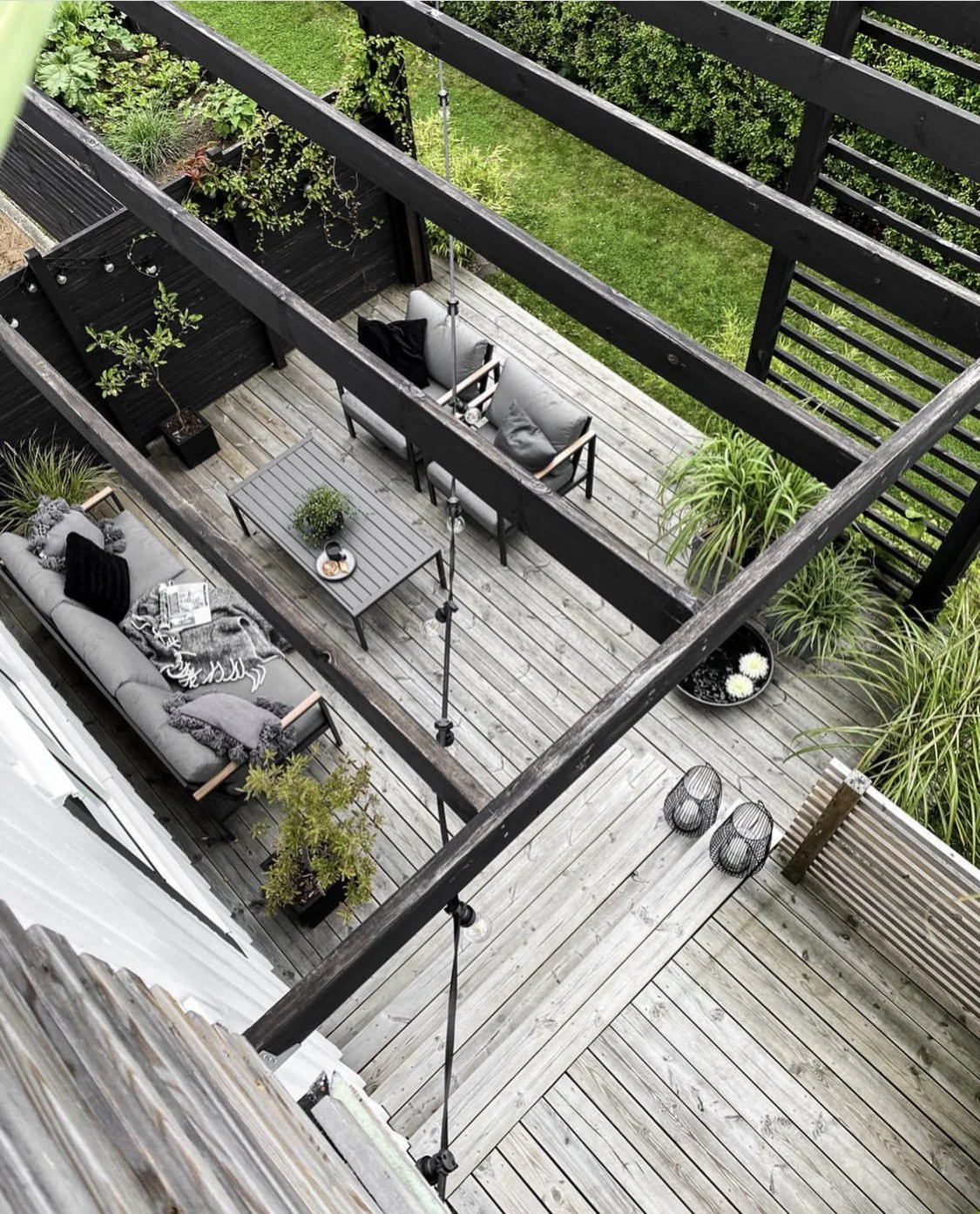
Living Room
The Living room is known historically as the ‘Good Room’ and that is because it is where we host family and friends - so it needs to feel good, look good, be good. So lots of GOOD ideas for this one!
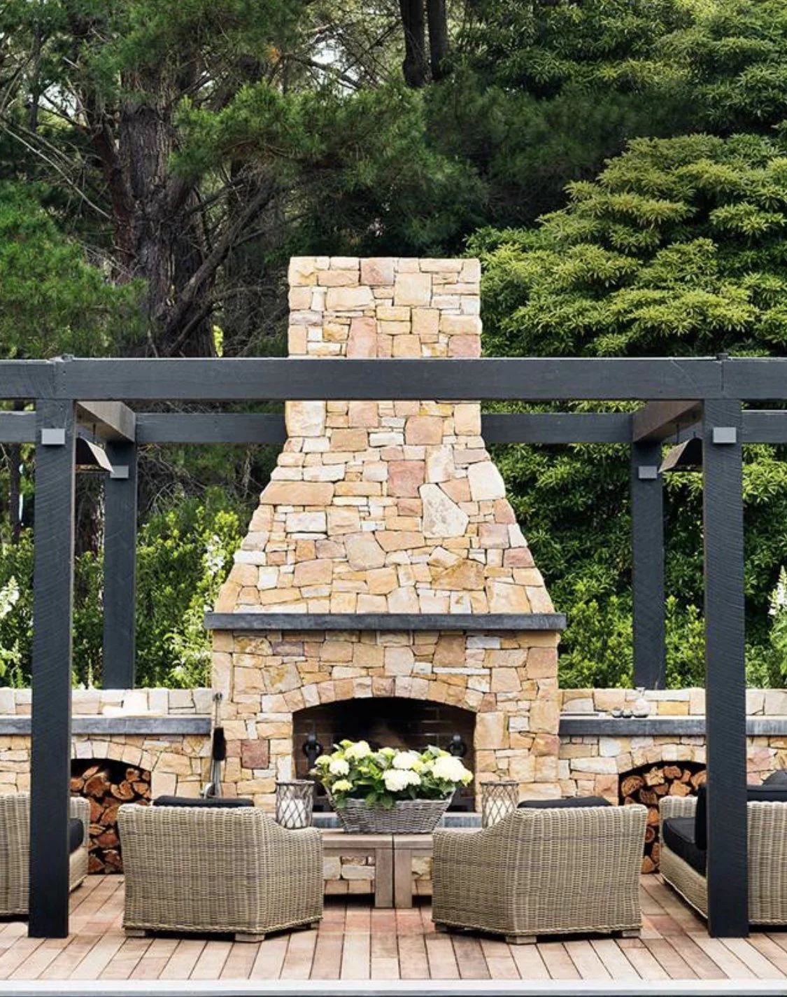
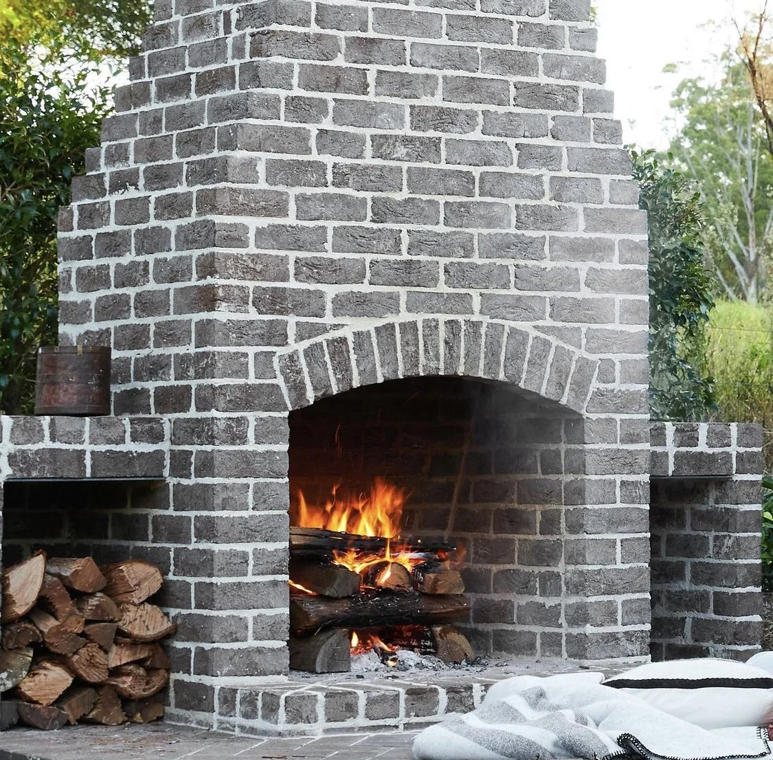
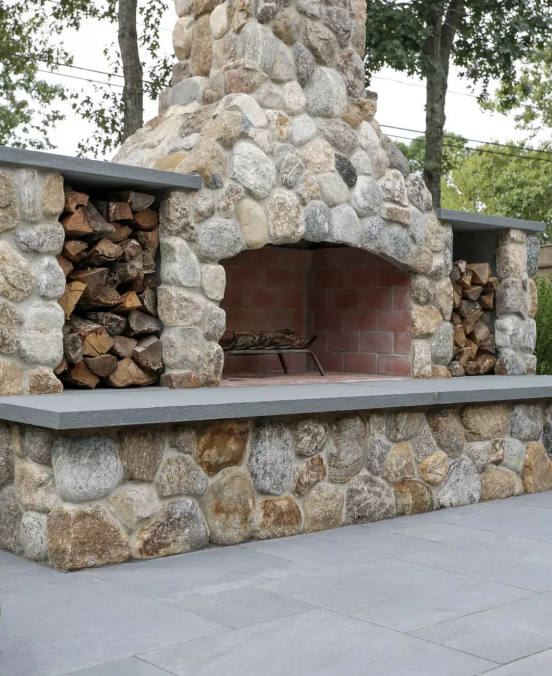
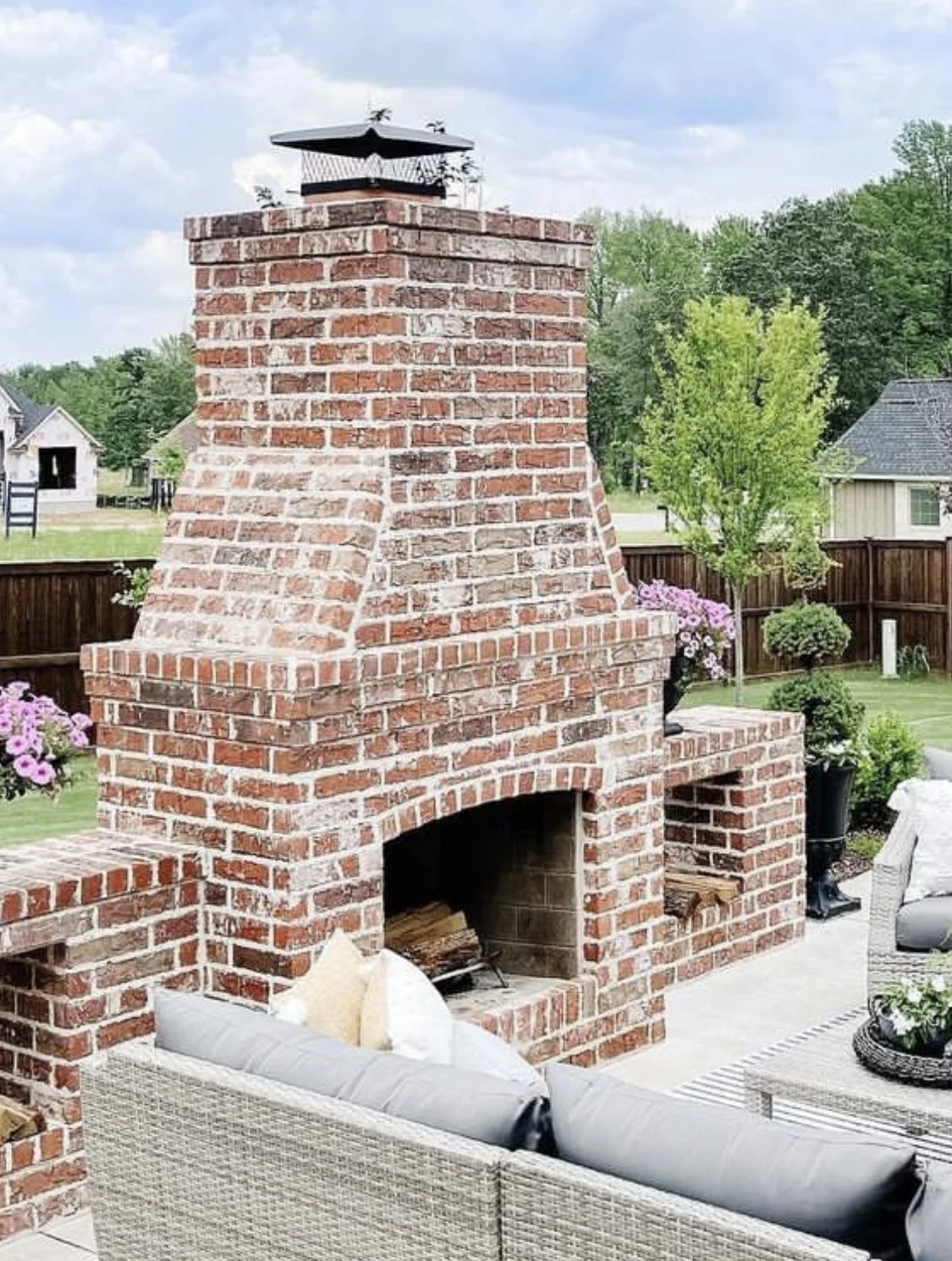
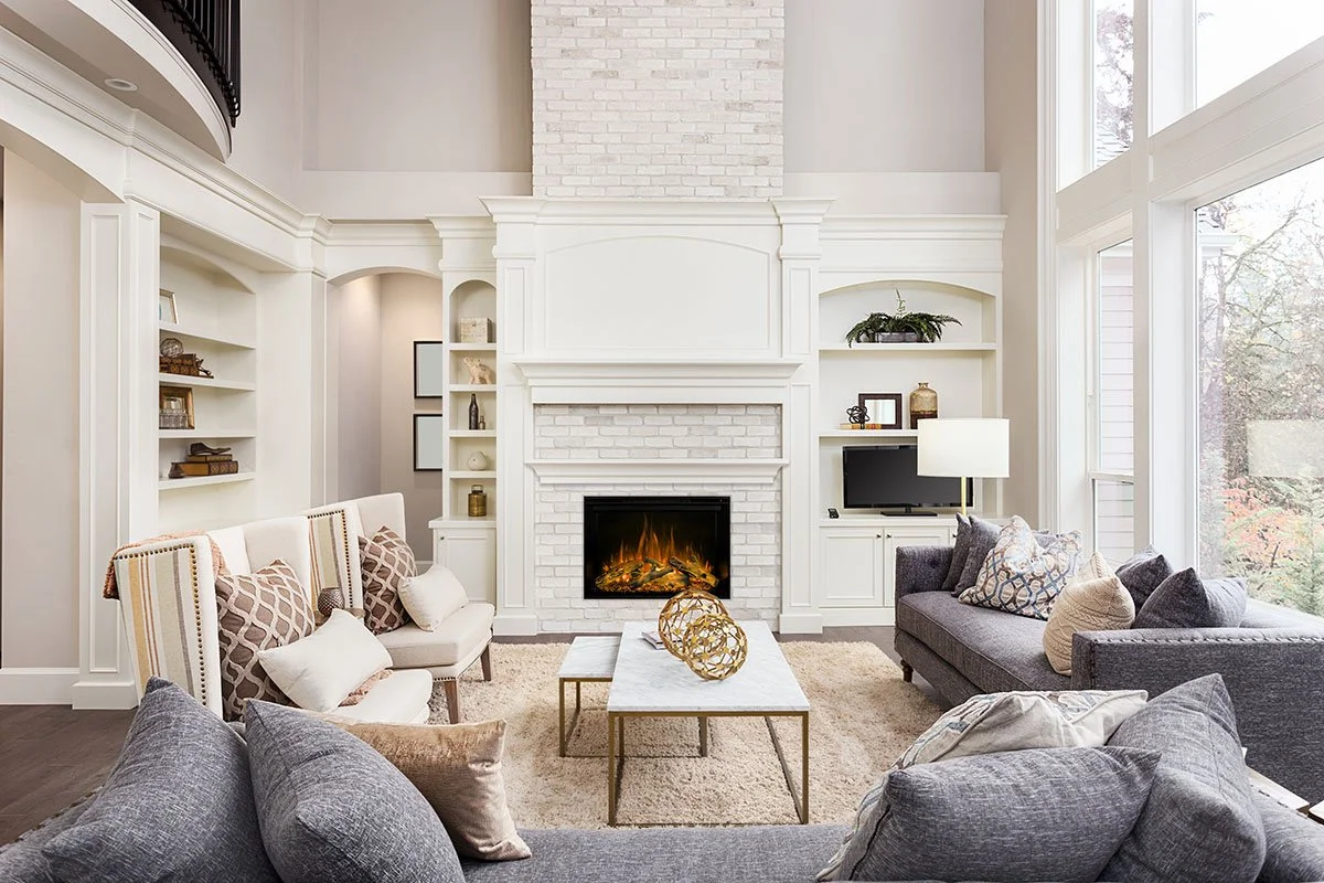
Firstly, the brief was to get a fireplace crackling in here! To do this, I have come up with a solution that adds that critical thermal mass that apparently works with the firebox to truly warm the cockles of you heart. A sand stock brick hearth that doubles as a wood stacker beneath and a bench on which to perch, and a floor to ceiling sand stock brick panel behind the firebox.
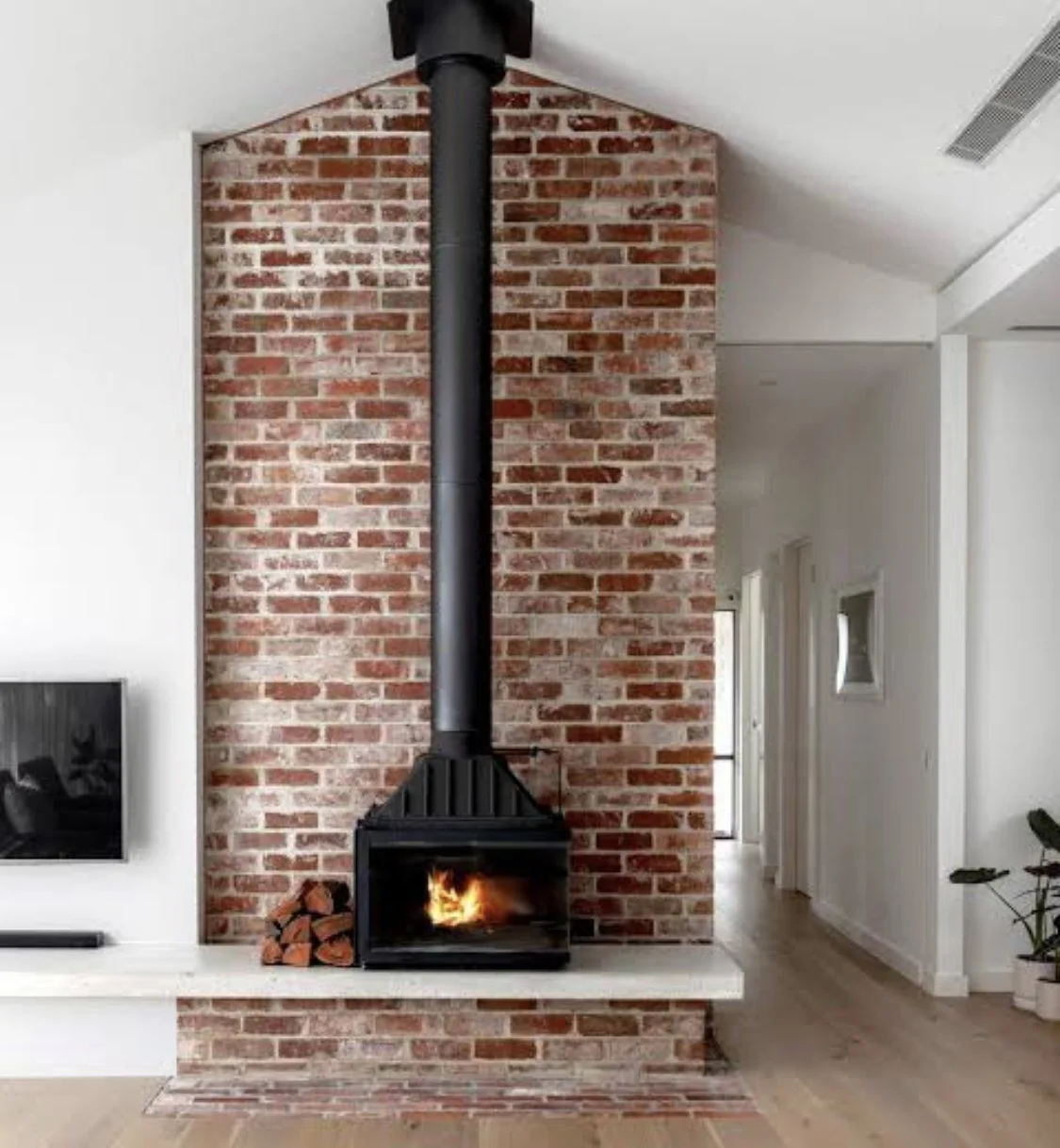
This is the Philippe Cheminee Radiante firebox made from cast iron, from France. Not due in until March 2023, I have pre-emptively asked for an invoice so that if you choose to go ahead, you can pay a deposit and secure one of very few available.

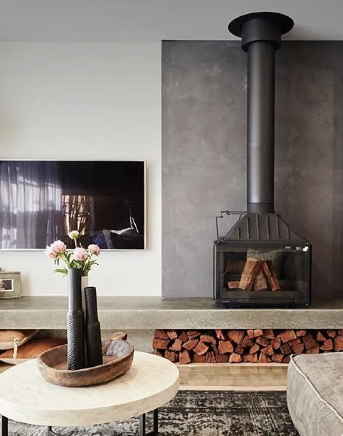
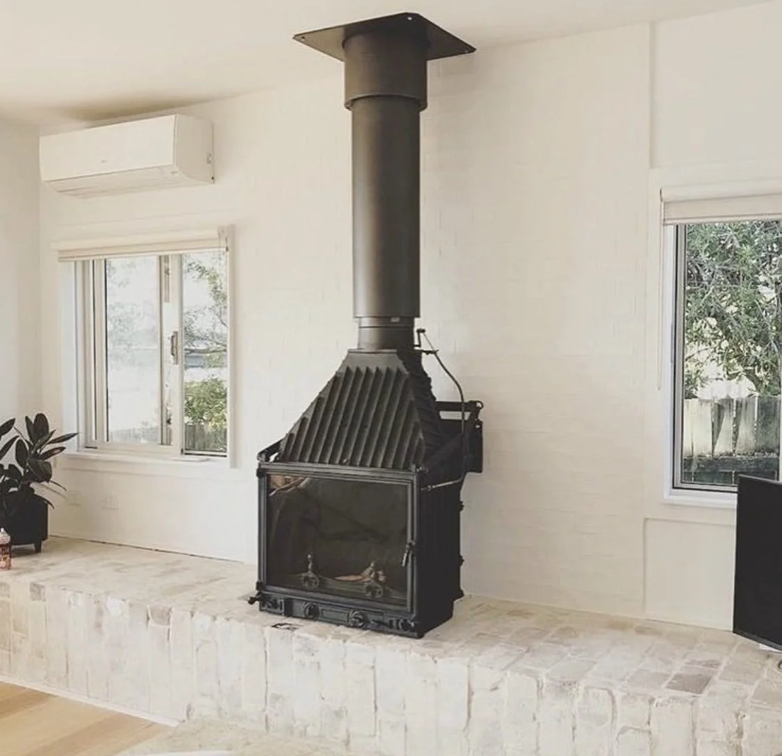
These images all show the beauty of the unit, but you’ve seen it and felt its heat many happy times at SoCo Farm. They’re unbeatable for appeal and effectiveness and with the brick hearth and panel and bookcases either side, your living room is going to sing,
Wood storage under the unit is great, but even better is raising it to accomodate the wood, as it means it is more visible from more of the room. Particularly good sitting at the dining table on a cold night - because if you can see the flames, you can feel the heat.
The images above each have elements of what we will incorporate - the brick backing up the wall, the wood storage, the widened hearth for perching on, the raising of the firebox for safety and aesthetics. So I’m hoping that in the absence of the perfect stock photo, you’ll get the drift, with the aid of the sketch down the track.
As detailed, bookcases either side of the fireplace will add charm and character, as will the wood storage.

The rug you have already in the living room is the right tone and size - but as we need one also in the bedroom, I think we could redeploy it to there and get this one from Armadillo for the living room.
The same richness and texture rule is at work here - making the room feel warm and soft. And it works too with the contrasting dark rug under the dining table nearby.
This rug can also be cut to size, but the 3 x 4m will work well.
Curtains…. I think you need them - to cosy up in winter and to keep your cool in summer. Given the shade of blue in the wallpaper, I have selected this fabric for the curtains as it is a very close match. It’s a linen, so it has that relaxed feel to it, but with appropriate backing, it will have all the thermal qualities we want as well.
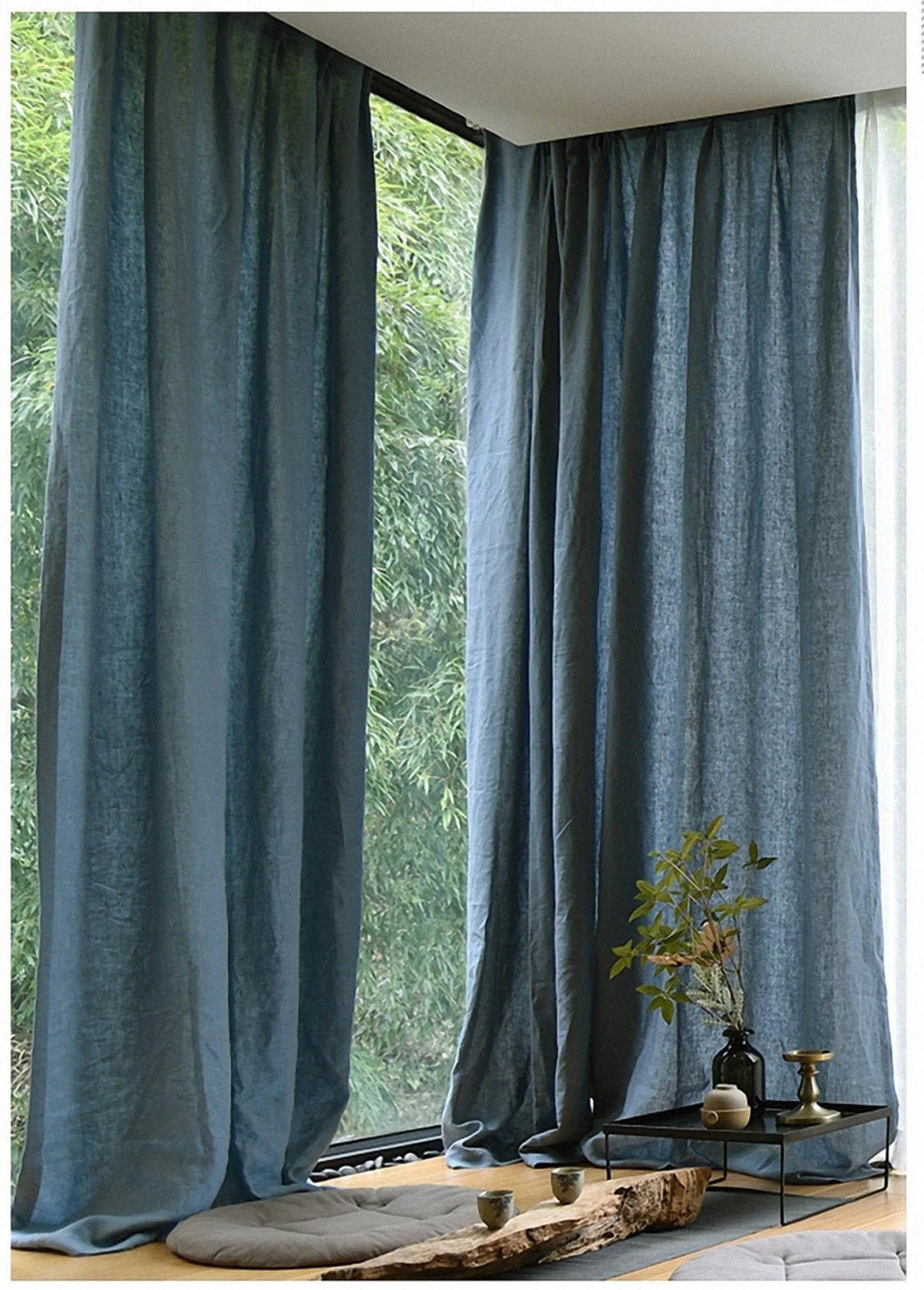

Eternal, Teal
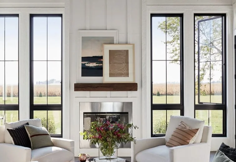
The curtains pictured here on the left are ‘puddled’, which I wouldn’t recommend in a farm house, but you see how fabulous they are against the black frame windows. The curtains will to slide to the right wall, and to the break of solid wall in the middle where the second pair would open. They’d all be full height to the ceiling, to take in the change in heights planned for the middle doors.
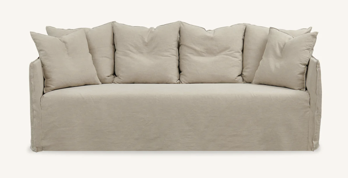
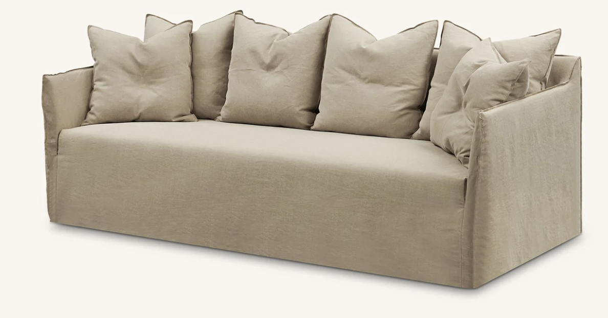
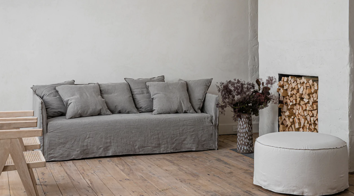
The furniture for this room will ideally be leather, for warmth and durability, and may include a modular and a straight three seater, or alternatively, modular OR straight three seaters. This is a decision you need to make as I know you love the idea of both stretching out in front of the fire, as well as having the right configuration when there are more people in the house! So we need to discuss!

Introducing The Lennon sofa by Franka, Sydney. Made in Melbourne and with a lead time of generally 8-10 weeks, I think they’re great quality and value.
Potentially, the modular could have its back to the windows and a straight three seater could face it, to allow ease of access.
The straight three seater I have selected in the deeper version - at 1050mm, the modular in the standard depth of 950mm. I suggest the Ranch leather, but it is available in a full range of fabrics, should you decide against leather.
I would also specify the set back timber leg in black stain.
With the bricks, linen curtains, chunky woollen rug, bookcases, black firebox and leather sofas, this room is going to be really special. It’s an earthy palette full of texture and warmth. If matching sofas facing each other is your choice, we could add two of the armchairs below, from Globe West.
Globe West, Sidney
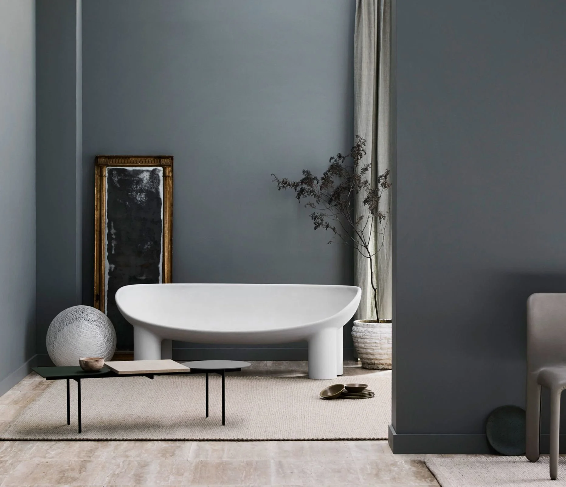
Coffee tables…. these ones, also from Franka, are perfect for the space because they can be arranged together, or separately, depending on how you use them. Available in either the timber or black top, their sleek bases are a good match with the firebox.
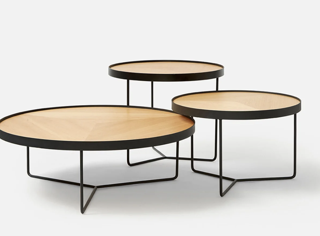
I would strongly recommend the black top, but have included other images so that you can see the options with the range.
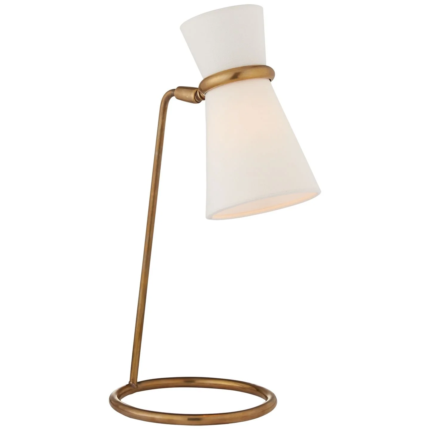
On light fittings, I feel that it may be better to use a standard, clamp or table lamp, rather than another pendant which may interfere with the optics on the fireplace!

This is my absolute favourite - from DCW Editions, a french brand, it has that same light touch that the base of the coffee tables has, and the black once again is a co-ordinated choice. One of these would be fab as nothing beats lamp light. With dimmers on your downlights you can enhance the lovely lamp lit ambience that is so good for the soul.
Study
You’re absolutely right in deciding to delete the wall between the two bedrooms on the eastern side to create the study, as opposed to modifying the existing tv room. It makes much more sense to dedicate spaces to your specific needs and preferences rather than leave intact bedrooms that are so infrequently used, and this new room gives you extra space and a much better perspective of the exteriors - the mountain in particular!
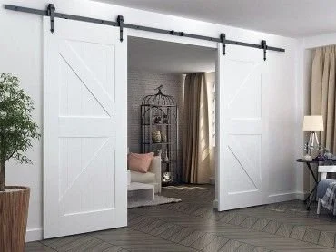
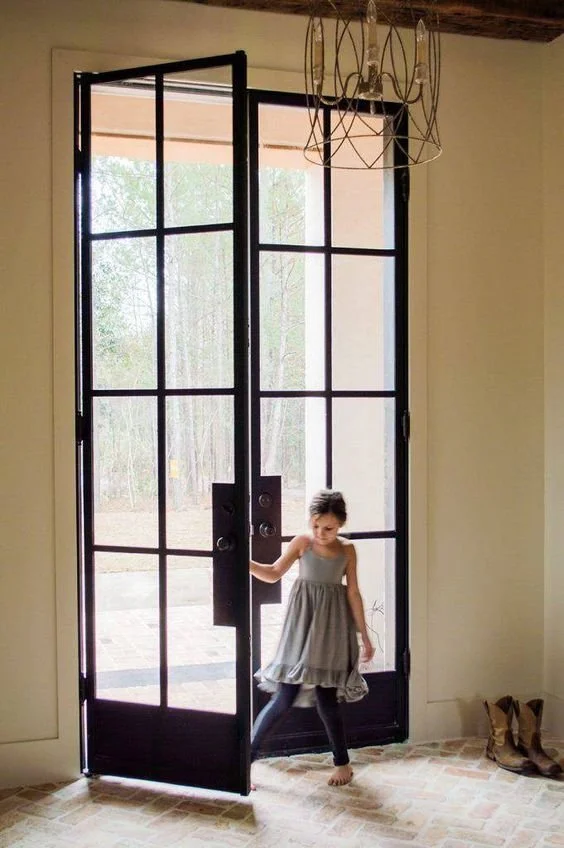
The point of accessing this new double room via an amazing barn door like the ones pictured here, is that it is serves a dual purpose of filling the hall wall with something charsmatic, as well as being a slider that saves space inside the room.
It’s just a really pretty sliding door and I know you love a barn door detail!
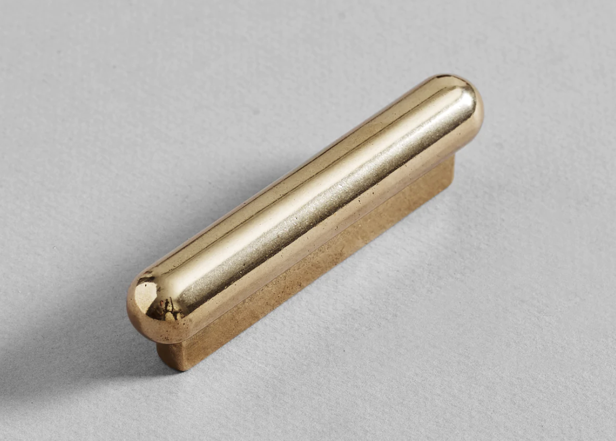
It will be white, on a black track, like this one, with a Henry Wilson brass handle, and as the wall in the hall is papered in the blue, it will look stunning in contrast.
The wall opposite is a bank of white doors for the linen cupboards, as well as the wine fridge as already mentioned.
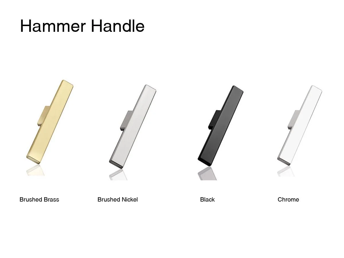
The handle pictured here is the smaller of the range - they don’t have the XL size pictured on the website! Grrr…
The XL is designed for sliding doors, amongst other uses, and it measures 205mm in length and is raised on a plinth so that you can fit your fingers around it.
Again, it’s a relatively subtle addition, but will make the world of difference to the general look and feel of this space to repeat the brass note where and when it is appropriate to do so!
We love a little brass!
Once the dividing wall comes out and the room is expanded into loveliness, I would suggest installing an electric fireplace that has the look and feel of a gas fireplace, but in fact runs off your electricity, costing you zilch!!
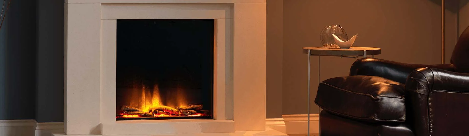
Jetmaster, Polaris
Amalfi
Who would know they’re not gas?? But no ugly LPG tank to refill more frequently, no inhaling harmful fumes, no threat to the environment - all make this a great choice for those nights when you arrive late to the farm or come home too late to bother lighting a fire… or when you’ve forgotten to order more wood - you’re all set to cosy up fireside with a drink, a book, the tv - or best of all, each other.
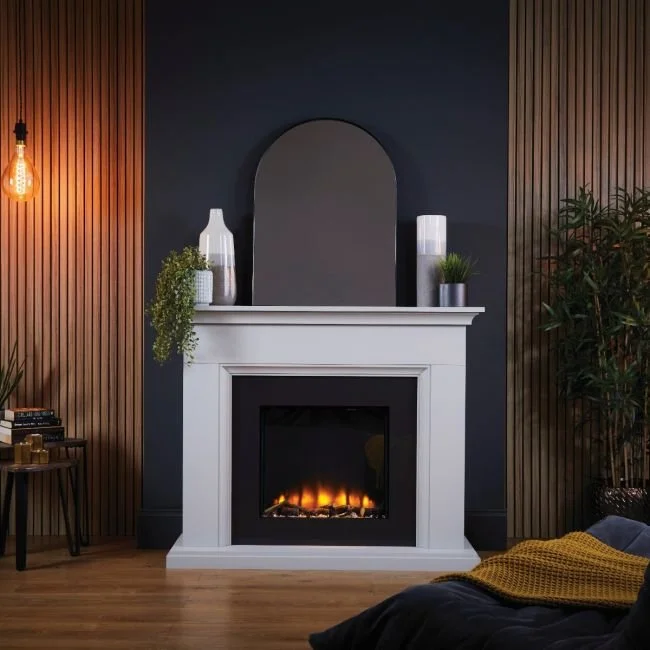
Modern Flame
A simple and elegant fire surround would go in the space between the two windows on the front wall of the house, and the tv would be mounted on the opposite wall, away from the heat of the unit. It would allow for two couches to be placed facing each other, perfect for sprawling out to watch tv, and appreciating the warmth of the fire.
The other game-changing feature of this room, is the long bench that will run along the south wall. This can be used as the craft table Carolyn wants for sewing, puzzling, etc, or as a desk to work at when and if required for other purposes. I would suggest you could use two of the dining chairs at this bench as it gets them out of the dining room when not required, and they’d look divine in this spot.
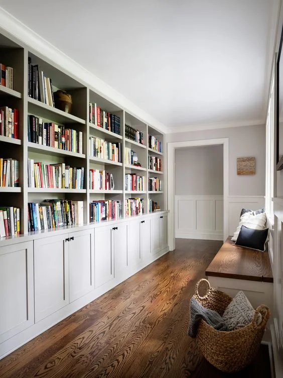
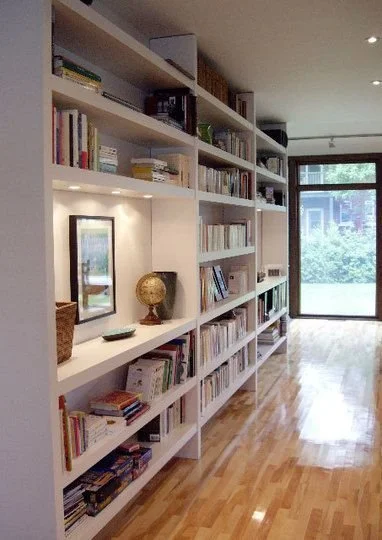
Installing a wall width bookshelf, or ‘library’ on the left as you enter this room would provide loads of storage for all the WOTH books for years to come.
With cupboards beneath like the image above left, you have the additional space for board games or a plethora of other guff you don’t even want to think about, let alone see. So as well as being hugely handy, units like this also add so much texture and interest.
More wallpaper… always more!!! Again, I remind you that consistency is so important when divvying out the design lollies - so it should be in the main living area as discussed, in the study and in the master bedroom.
This wallpaper is another Porters Paints grasspaper, called Hyena, and it looks spectacular with white, black and anything in between! The images on the right are not an exact match as Porters don’t have a lot of imagery on their website, but these are close enough to get a good sense of how the room will feel.

The curtain fabric above is Mokum, another Italian linen called Eternal Sand, perfect with black rods against the wallpaper and the black framed windows, white woodwork and selected linen covered couches.
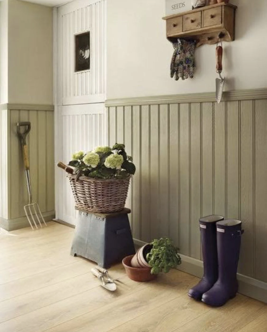
On the southern windows, above the new work bench, plantation shutters will be much more practical. I have specified them in the bathrooms and mudroom too, so it will be a cohesive element throughout and you just cannot beat their versatility in certain applications.
Another Armadillo Ravine rug, chosen again for its texture, durability and colour. It is the same jute as the ones in the entry hall and under the dining table, but this one is in a colour called Quarry.
I love the way this rug reflects light differently - it ranges between a silvery colour to the greens and blues, just like the river. When you see the samples of grasscloth wallpaper and the rug together, you’ll see they compliment each other dynamically. We can have this rug custom cut to fit the size if you’d prefer it larger, otherwise it is available in the 4 x 3m size.
Furniture for this room needs to be good for sprawling on in front of the tv. One option might be to re-home the living room furniture here, but as an alternative, I have selected the Joe range from MCM House. Their Belgian linen slip covers are really practical and great quality and it is recommended that when you purchase them, you get a second set of covers at the same time, so that you can swap them over to wash, or send to the cleaner without worrying you’ll have naked couches while you wait for their return!!
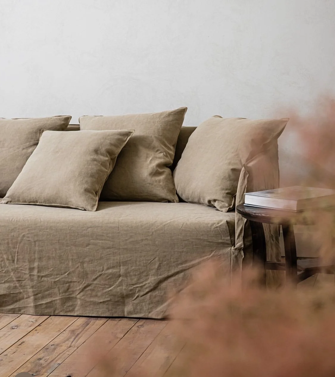
The Joe range is all about relaxed comfort - the feather filled pillows and soft cushioned seats are a winning combo, yet as you can see (and will see when we visit the showroom) they’re economic in size - as in, they don’t take up extra space with wide backs and arms, yet there is no compromise in comfort. It’s all sofa!
I love the range of colours and have selected Buck and Cobble as your suggested options, but I look forward to going to the showroom so that you can see the range of colours before you to confirm. Samples are in your box of tricks.
A round ottoman would complete the look and fit better than the square..
An occasional chair is a beautiful thing - and these Tom Dixon numbers in this delicious green are a case in point. It is a comfortable chair, given its upholstered finish, yet it doesn’t take up room. It can be wheeled out if more seating is required in the living room, or it can be a lovely seat to sit in front of the bookcase, or library wall in the study.


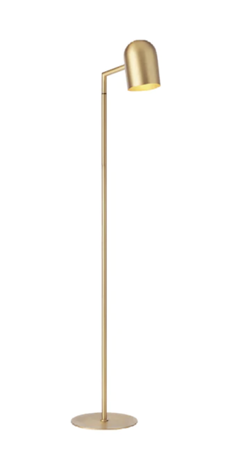
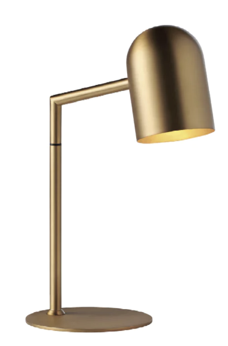
Two lamps, no pendant. These brass lamps from Manyara Home would add a highlight to the room - the floor lamp version beside a reading chair or sofa and the desk lamp on Carolyn’s work bench.
A coffee table for this room is required, but I would suggest placing a round Joe ottoman between the couches and having a small round coffee table for each sofa, just to make the room easier to navigate.
The two below are from Trit House, made of blackened timber. They make for an ideal perch for a book, a drink, or whatever needs a spot to hang. I love that these are different but the same - great with the colour scheme here and great with the vibe!

The study needs to be a place that calls you, a retreat from the world where you can feel totally comfortable and free. It needs to be rich in texture, warm in palette and calm in its spatial arrangement. You are going to love this room.
Master bedroom
If you can think about your bedroom as a unique destination and not as a hindrance to a better view outside, you can begin to bring the focus on to making it as beautiful and lush as you deserve it to be.
Watch out - Wallpaper Lady is back.

Despite the growing popularity of Grasscloth wallpaper, or Seagrass paper as it is sometimes known, there are not many images on the web that I can use here to show Maple. I have just used it in a home in Balmain where it looks so spectacular, but I have yet to photograph that job!
The image on the right is as close a proximation as I can find. It’s the earthy hue I want you to channel. And remember too, with all the cupboards going in - which will be painted white, there is not a huge amount of wallpapering to be done.

The fabric for the curtains is by Mokum, it’s called Ocean and this colour is Linen. I love it for its texture - it is almost reflective! It will be a beautiful compliment to the walls and lend a serenity to this lovely room.
The thought is to hang all the curtains high - above the top of the windows and door, as this adds to the feeling of height and space in the room. The ceilings are high, such an advantage, so the curtains will really show the height with grace!
Obviously the curtains would also be backed with blockout lining so as keep the room darker in summer and warmer in winter.
It’s the little things!!!
By leaving your bed where it is currently, looking north, and by leaving the existing doorway to the dressing room, the rest of the room and ensuite can be configured well without the demolition team moving in. I understand that you don’t want to wake up and look at a bank of wardrobes, so I have softened that blow - now only Chris has that pleasure!!
We can start the wardrobes on the west facing wall and continue the bank around to the wall opposite your bed - but not go all the way to the new ensuite door. This allows for more cupboard space, not less, and you won’t have the feeling that the wardrobes are actually in the bed with you. The addition of a lovely armchair between the end of the wardrobe and the bathroom door will enhance a feeling of spaciousness and also allow for a lovely spot in your boudoir for quiet reflection.

This is a woollen rug from Armadillo is the one I have specified for the living room, but I am adding it here because it is very similar to the one you have, so it is fitting for this exercise!
A light coloured rug will also help to build on the gentle serenity vibe - soft and enveloping, that’s what we need our bedrooms to be!
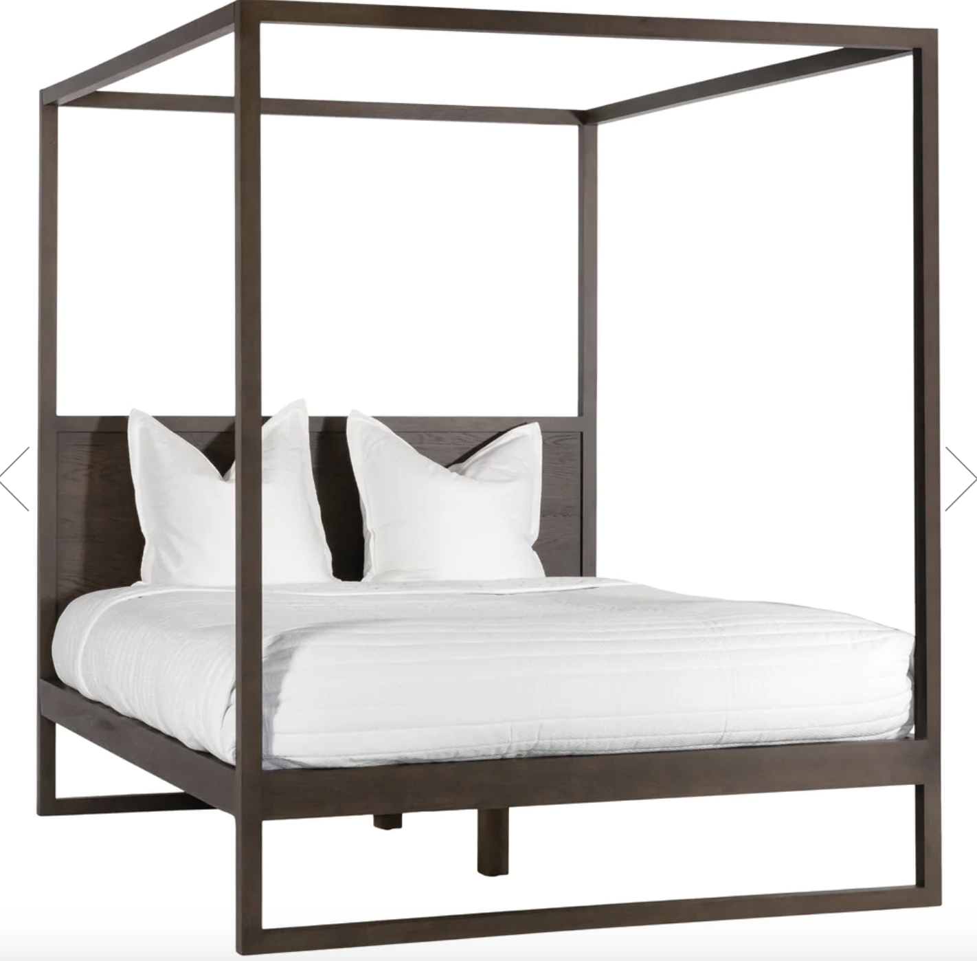
Another idea is a new groovy bed. This one on the left is from Spence and Lyda and is customisable - king or queen size and a choice of timber ranging from dark to lighter. I have enquired about it to ask whether a headboard could replace the rails at the pillow end - and it could be!
The bed pictured below left is 2540mm high which would be incredible in your room as it would really accentuate the high ceiling. A four poster is a romantic and impactful feature that will make a huge difference to the way the room feels - I selected the Spence and Lyda one because of it’s height and the fact that the timbers are not too heavy,
The bed on right is from Ikea - so a very different price point, but I have included it because I really want to convince you that a four poster is such a brilliant idea and if you protest about the cost of the left, I can counter-argue with the cost on the right!!!!! The one in the middle is from Uniqwa and it too is lovely, but neither the ikea one nor the Uniqwa are as high - more like 2m.
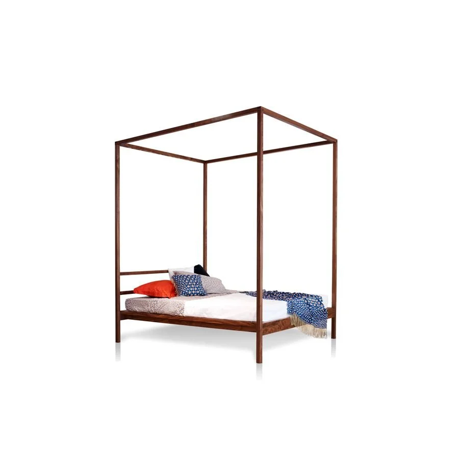
Spence and Lyda, Fineline 2500mm high. Customisable
Uniqwa
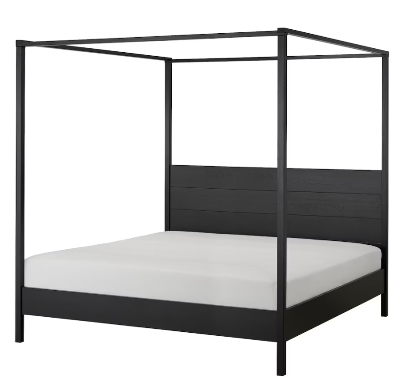
Ikea
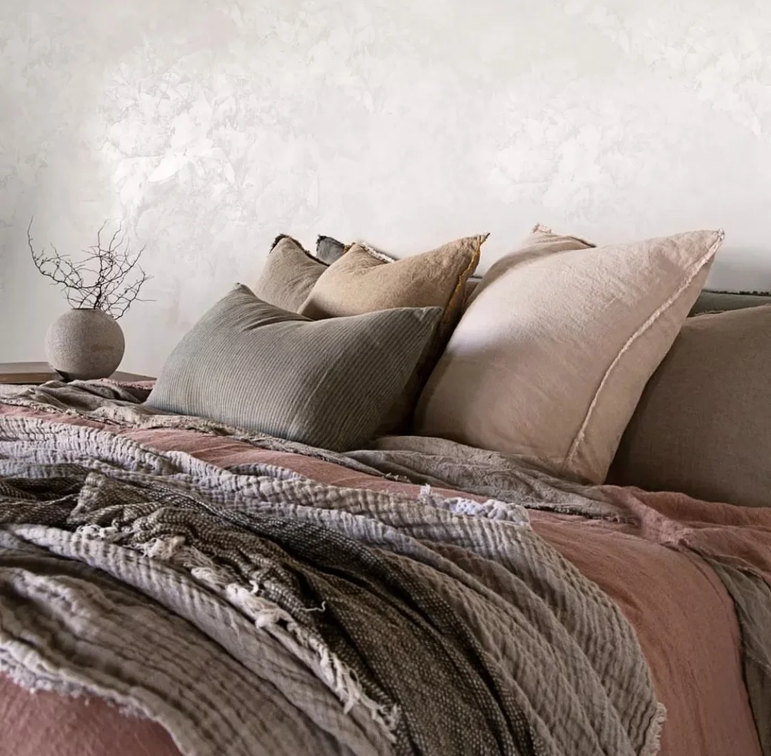
Any bed needs beautiful linen on it, naturally, and given the textures and warmth being advocated here, linen linen linen - is all I’m going to say!
Linen sheets are so superior to sleep in - and the colour palette is heavenly. There is a huge price range again, depending on where you shop, but a mix and match approach is a good idea.
With the beauty of the wallpaper and curtains, plus the white of the wardrobe doors, I think you can get jazzy with colour. This is a mood board array - shopping will be fun!

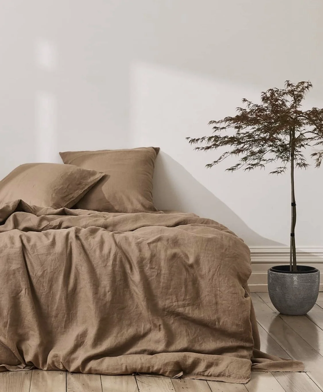


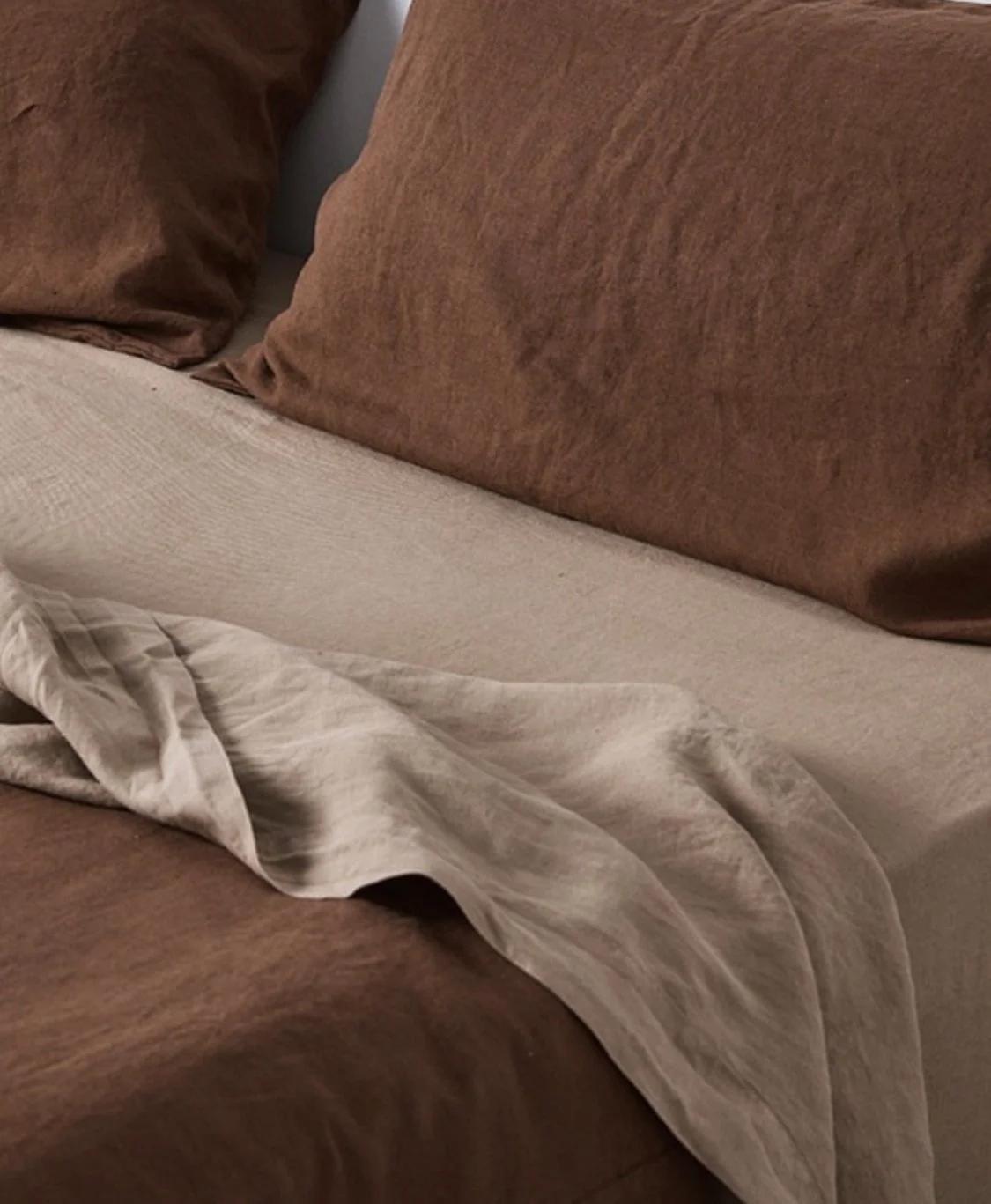
Given that the bed is such a large expanse in the room, it’s really worth approaching it as a central design element - the sheets and blankets take on an important design role.
The earthy tones I’d encourage you to consider will bring happiness to the room and make you never want to leave your bed!!
A bedspread is very much still an option and here I think is where you spend the money as it’s what you’ll see the most of.
Hands down the best is from Society Limonta, an Italian brand available at Ondene in Double Bay. I will take you there and you can see just how divine this range is - and I can promise you, you will not easily leave this store empty handed!!!
We will go back there for Strathfield, too…
Bedside tables and lamps are next - I think we can move the ones you already have to the newly formed bedroom 3, and buy new ones for here that better suit the new design.
The bedside above is from Coco Republic and is made of hardwood and brass, pairing beautifully with the lamp on the left!
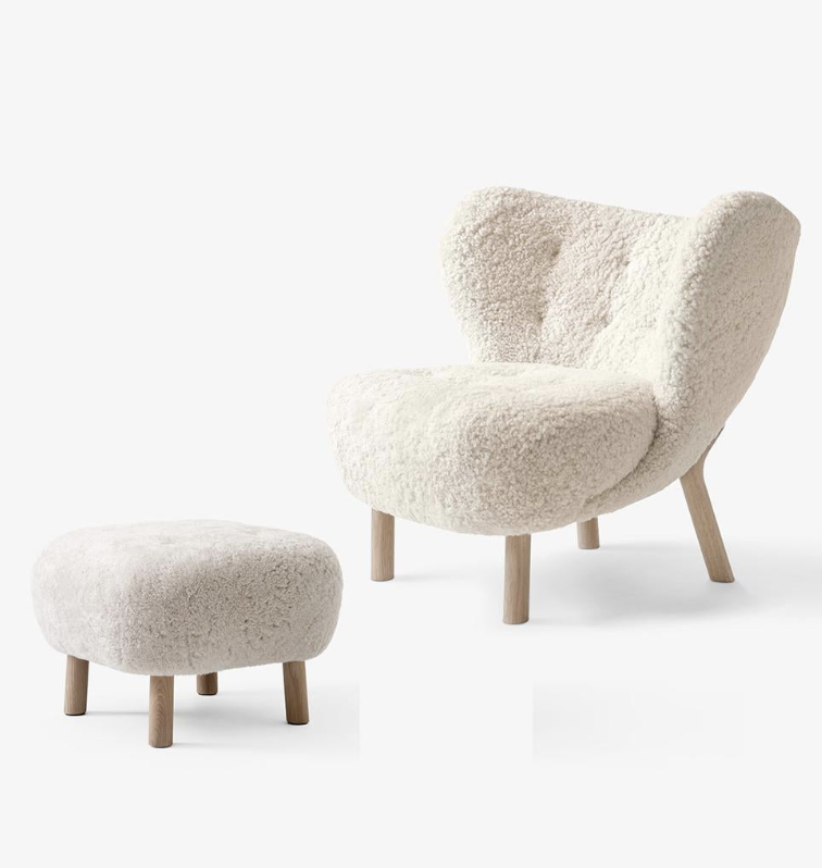
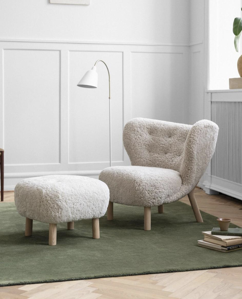
This is my favourite chair in the entire world and I think you deserve one in your bedroom!!! Designed in 1938 by architect Viggo Boesen in Denmark, Little Petra is attributed to the 1930s Scandi aesthetic called Funkis style. The sheepskin touch in the room is in complete sympathy with the elements here and the chair and footstool are relatively compact and utterly magnetic.
You know I’m right…
Master Ensuite:
This room may be still be ‘stealing’ the view, but we can make it all worth it. A beautiful bathroom that opens to an outdoor bath that DOES look to the north… I’m all about solutions!!
The door to the bathroom is the existing walk-in robe door, and the bathroom combines the existing robe and bathroom. With new windows, and plantation shutters for privacy, the room will be light and deliciously airy.
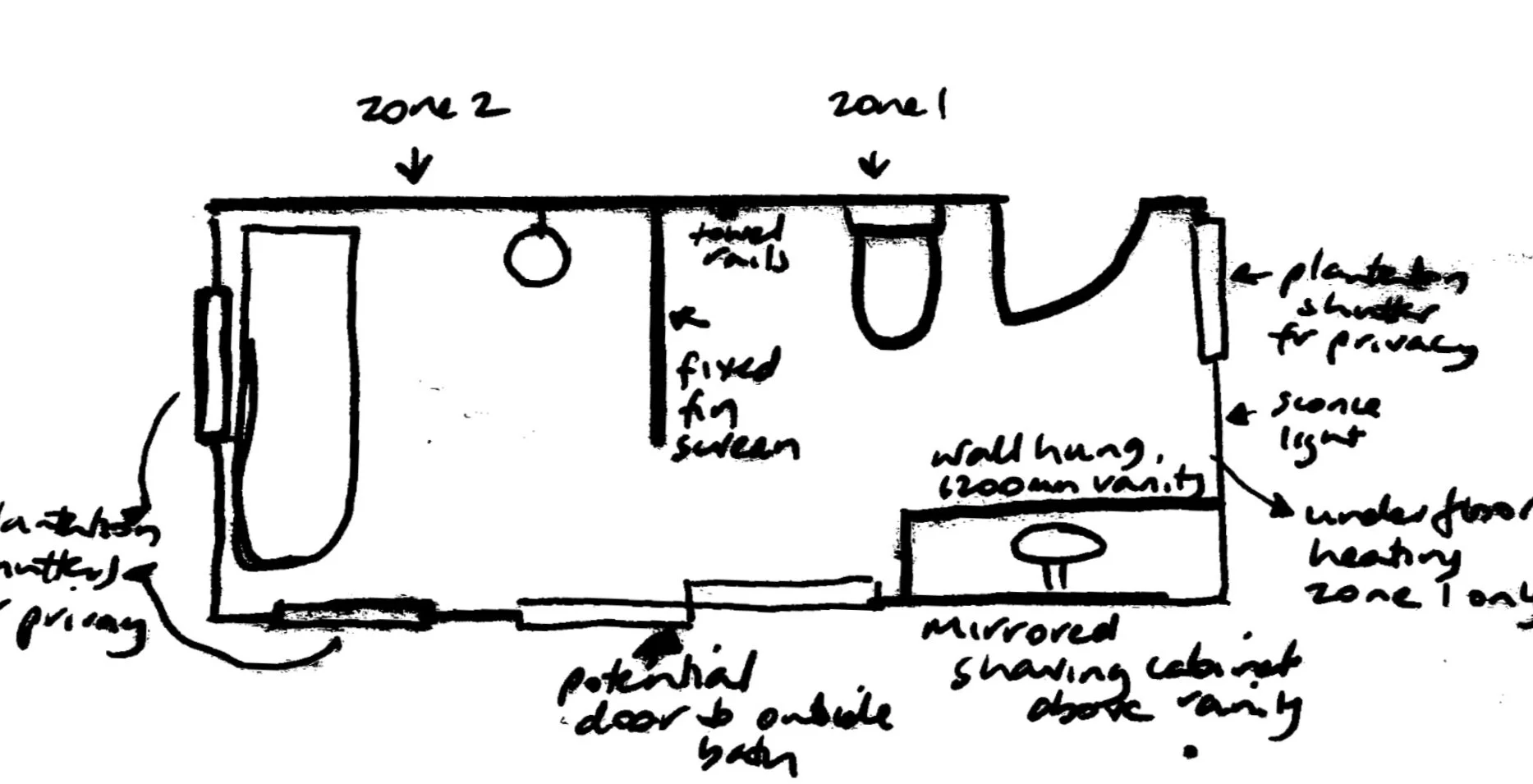
You see from the sketch on the left, I have divided the room into two zones, a vanity and loo in zone one, and a ‘wet room’ in zone 2. The zones are separated by a fixed fin screen.
You can also see, I have marked in a potential sliding door to the proposed outdoor bath area. As this requires the moving of the tank…. it may be a dream only!!! But if we did, we can situate the bath on the existing slab, and the plumbing and waste can be integrated into the bathroom. Brilliant.
For privacy, we make use of the pergola structure and planting, but for privacy security, a trellis could be added in case Jenny or Col and Sue have their binoculars out!!!!
If it was not in the budget to to put a door here, the outdoor bathroom could still be accessed from the bedroom door and around the extended decking. In this event, I would suggest a skylight directly above the shower for added light - so that when you’re not bathing in the moonlight, you can shower with the stars!
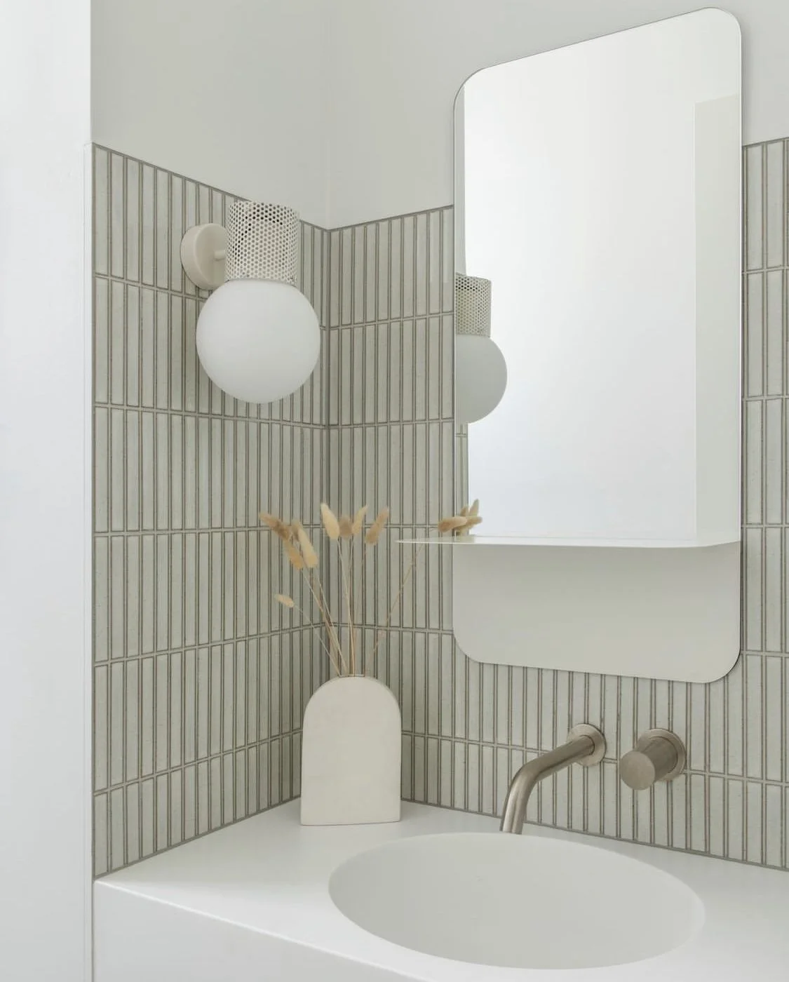
Wall and floor tiles -
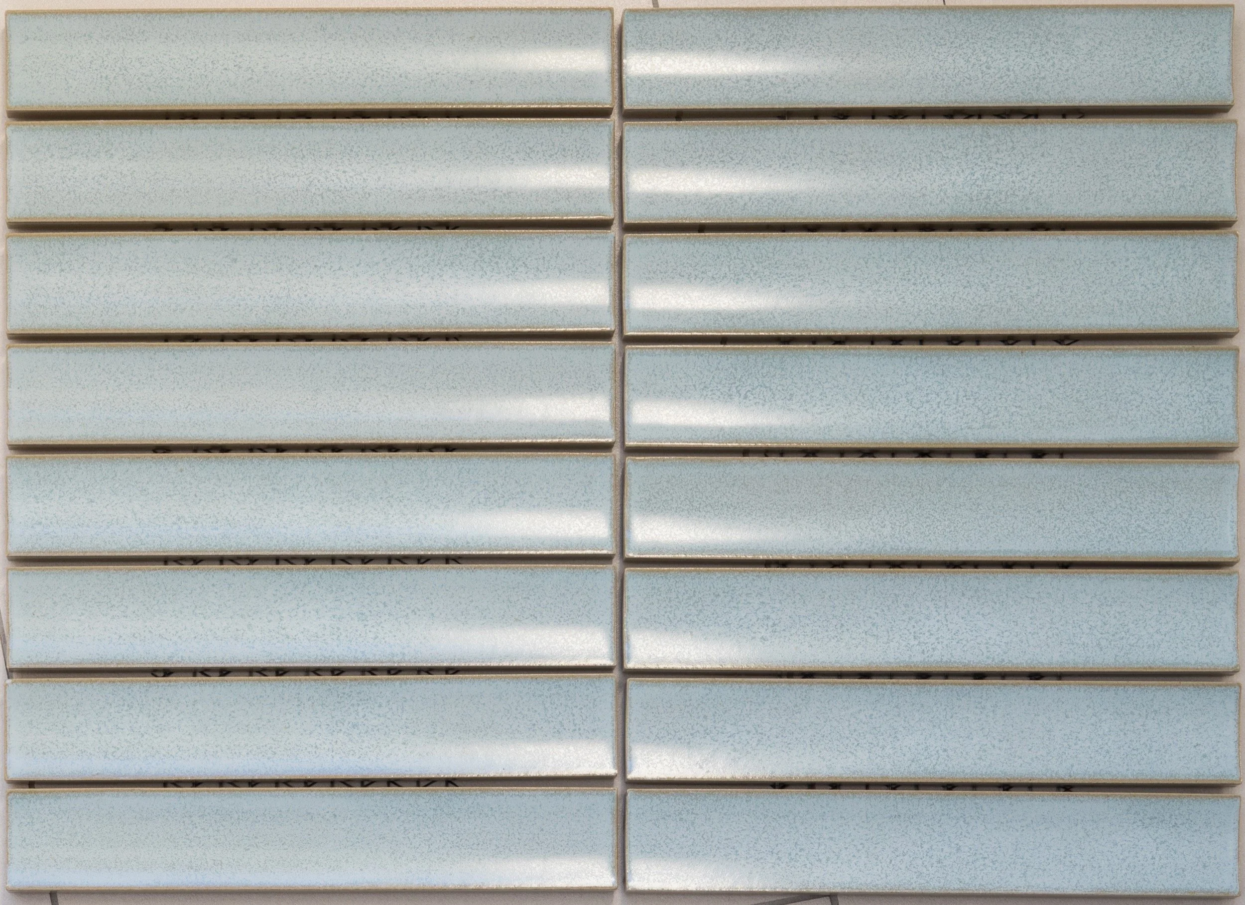
The tile you see below right in subway pattern is Blu Notte, but I would suggest it instead be laid in a vertical pattern, which at a tile length of 395mm, will accentuate the height of the ceiling and increase the sense of space.
The entire south wall of the bathroom will be tiled in Blu Notte, and the opposite wall, or vanity wall, the Blue Notte tiles can be laid three tiles high, bringing the height to 1185mm which will meet the mirror. Above that point, the walls will be painted.
For the floor, the terrazzo below left is from Artedomus, called Rosaio, it is full of warm and earthy tones that tie back to the wall paper in the bedroom, and it will be a lovely balance to the wall tiles. It is suitable for underfloor heating, which can be laid for warmth in zone 1 but may not be required so much in zone 2.
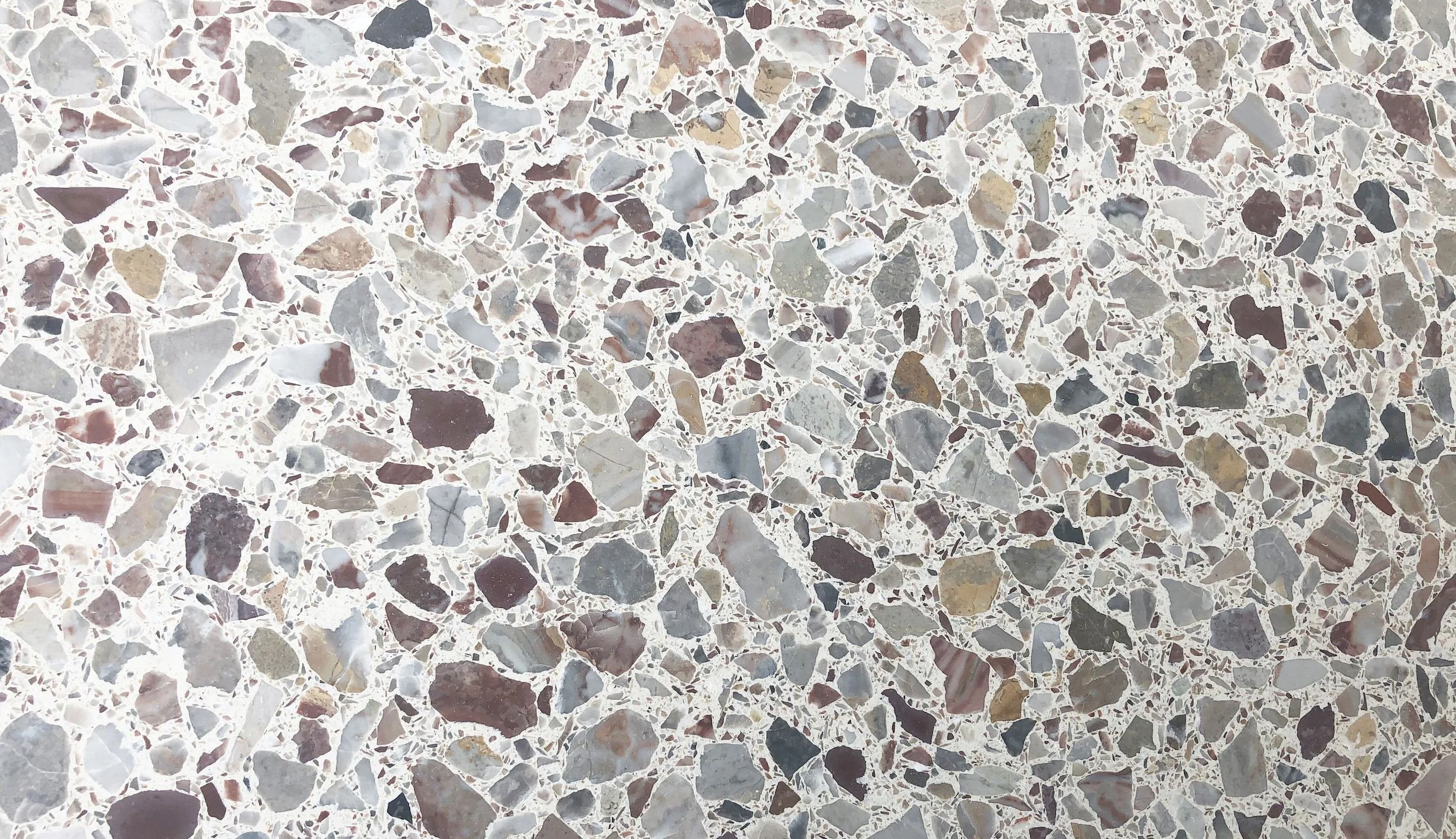

Blue Notte, 395mm x 75mm.

We will paint Porters Donkey Grey, above, along the wall on the left as you enter the bathroom, and above the tile line along the north wall, around the mirror and above the bath. The opposite end of the bathroom, where the bath is, will be full height Blue Notte.
As already mentioned, there will be plantation shutters on the windows for privacy.
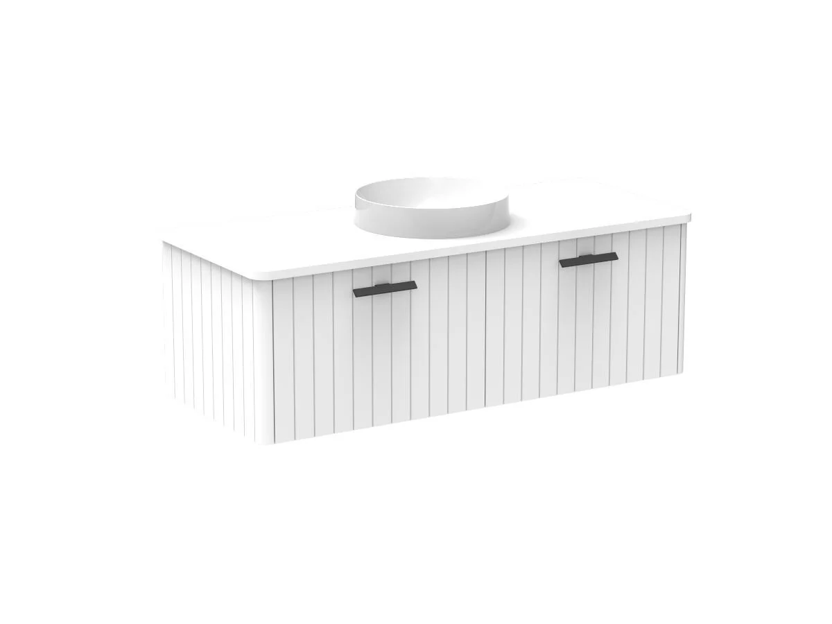
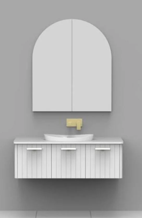
Vanity and shaving cabinet -
A wall hung vanity works best in just about every bathroom as it looks good and it’s easy to clean underneath! I suggest this one in white from Reece with all drawers under and a central, single basin, and with black fin grip handles that are discretely placed at the top of the drawers. A white cherry pie top will be a lovely contrast with the basin and bath.
This configuration but…
with these handles…
in black!
The above vanity is 1200mm wide and a three door shaving cabinet of the same width and 150mm deep will sit above it.
Bath and basin -
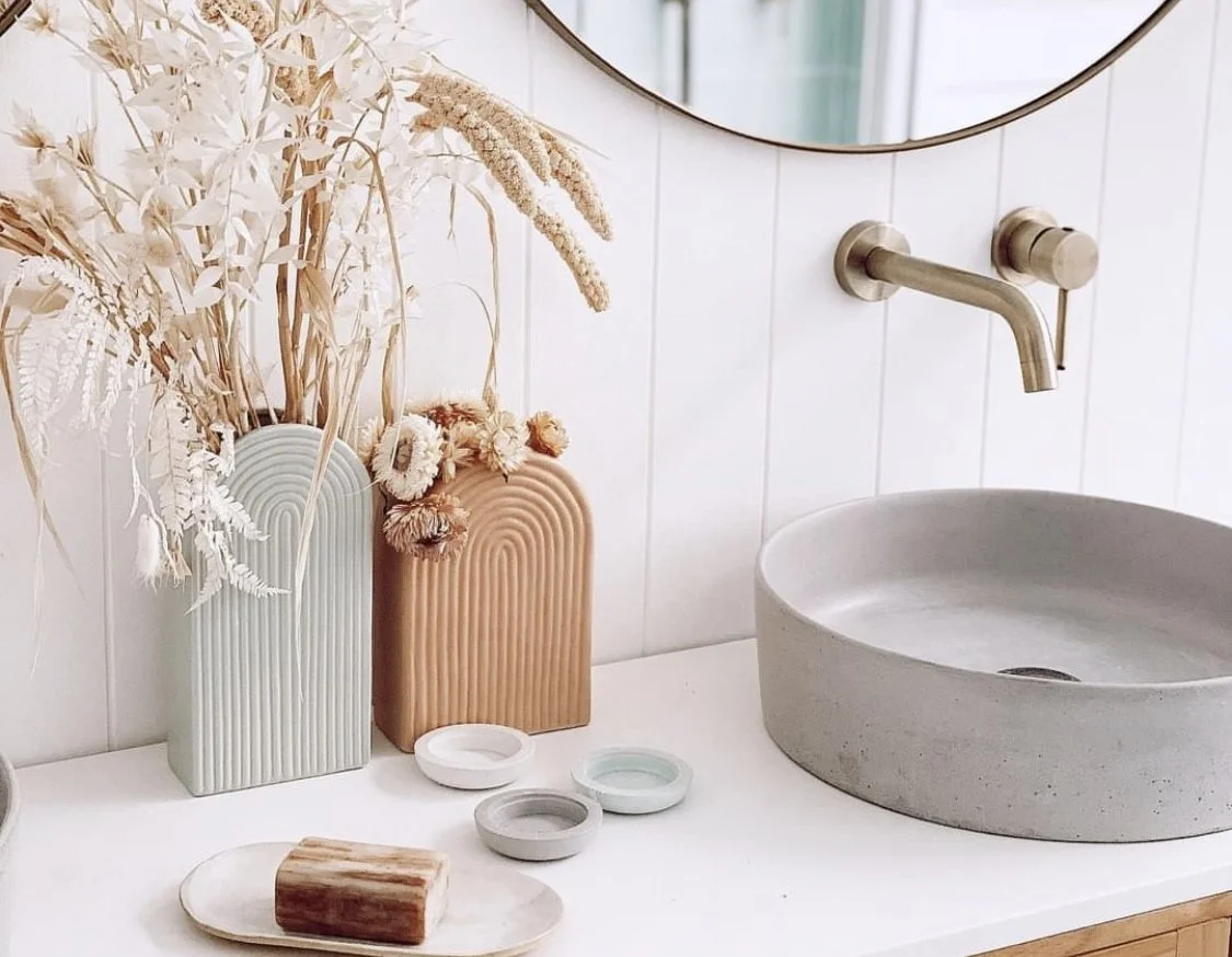
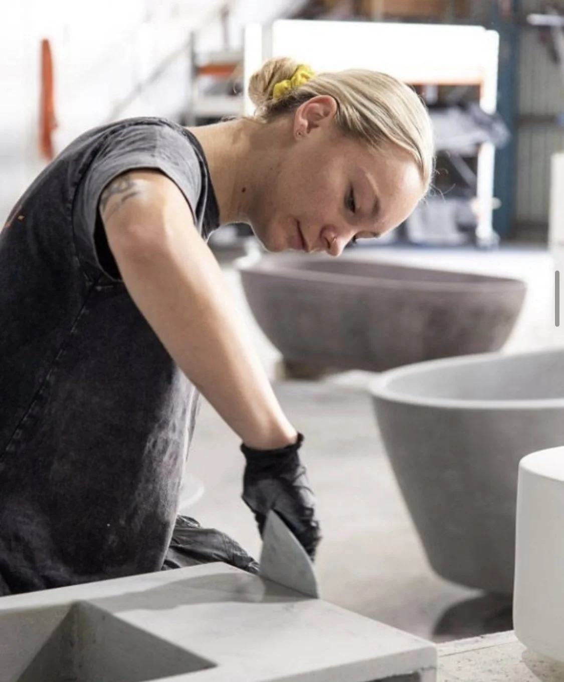
From a company in Queensland called Concrete Nation, this bath and basin set a new standard in the art of bathing. They are so lovely with their patina and organic shape and I think they’re reasonably priced. The bath weighs 280kgs so that counts them out of any upstairs bathrooms in Victorian terraces… but Clarynvale has no such limitations.
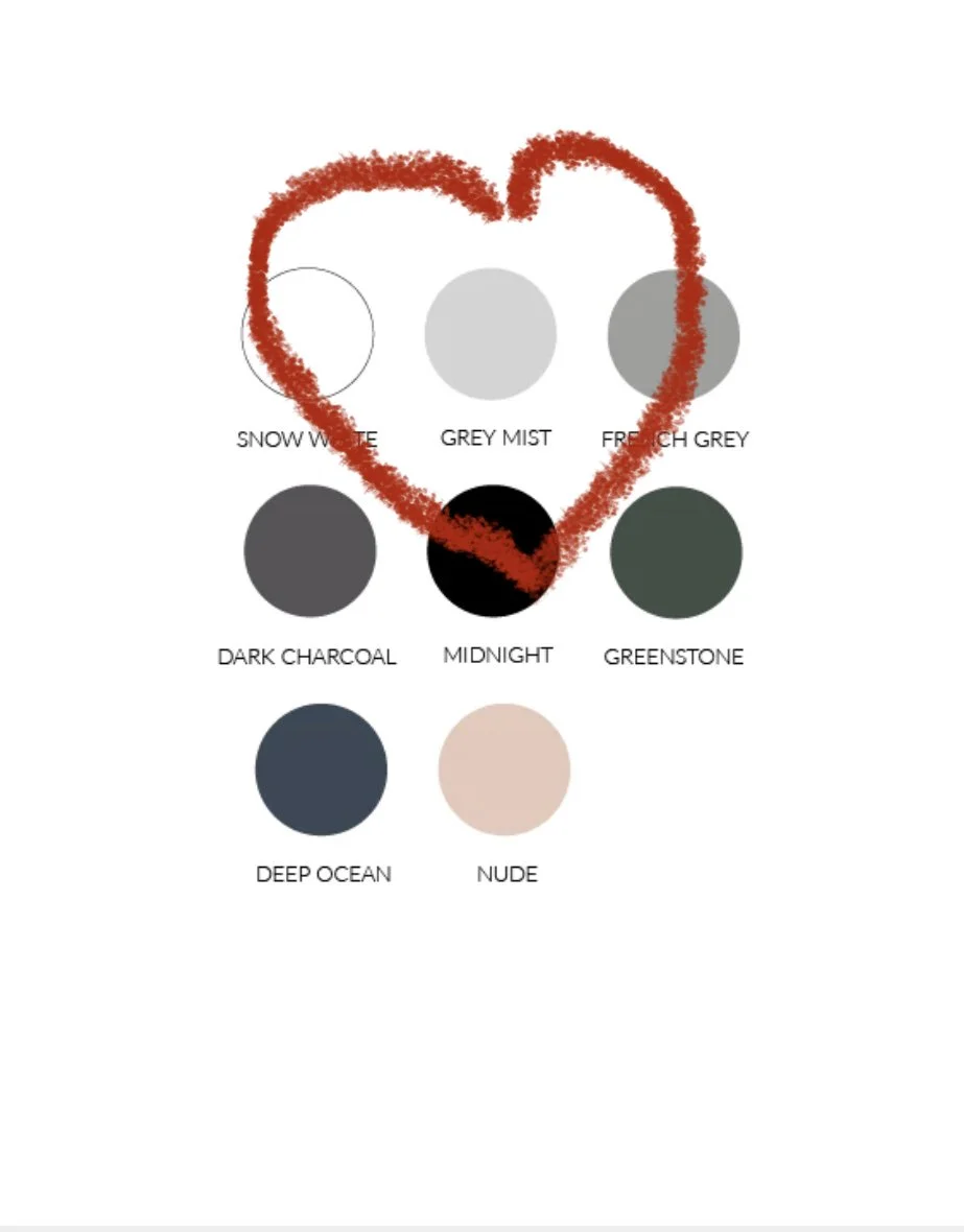
The colour suggestion for you is Grey Mist, sample in your box.
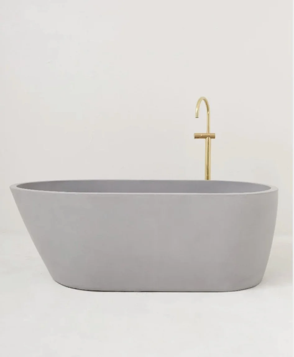
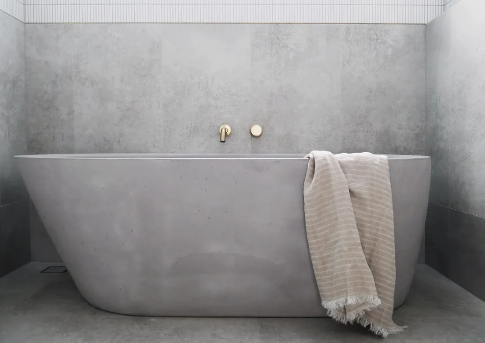
The shape of the bath is made for comfy bathing, yet it sort of reminds me of a really old fashioned tub! It’s a reimagining of the ancient art of a hot soak. The basin is also a lovely shape and will sit well on the vanity above, with wall hung taps.
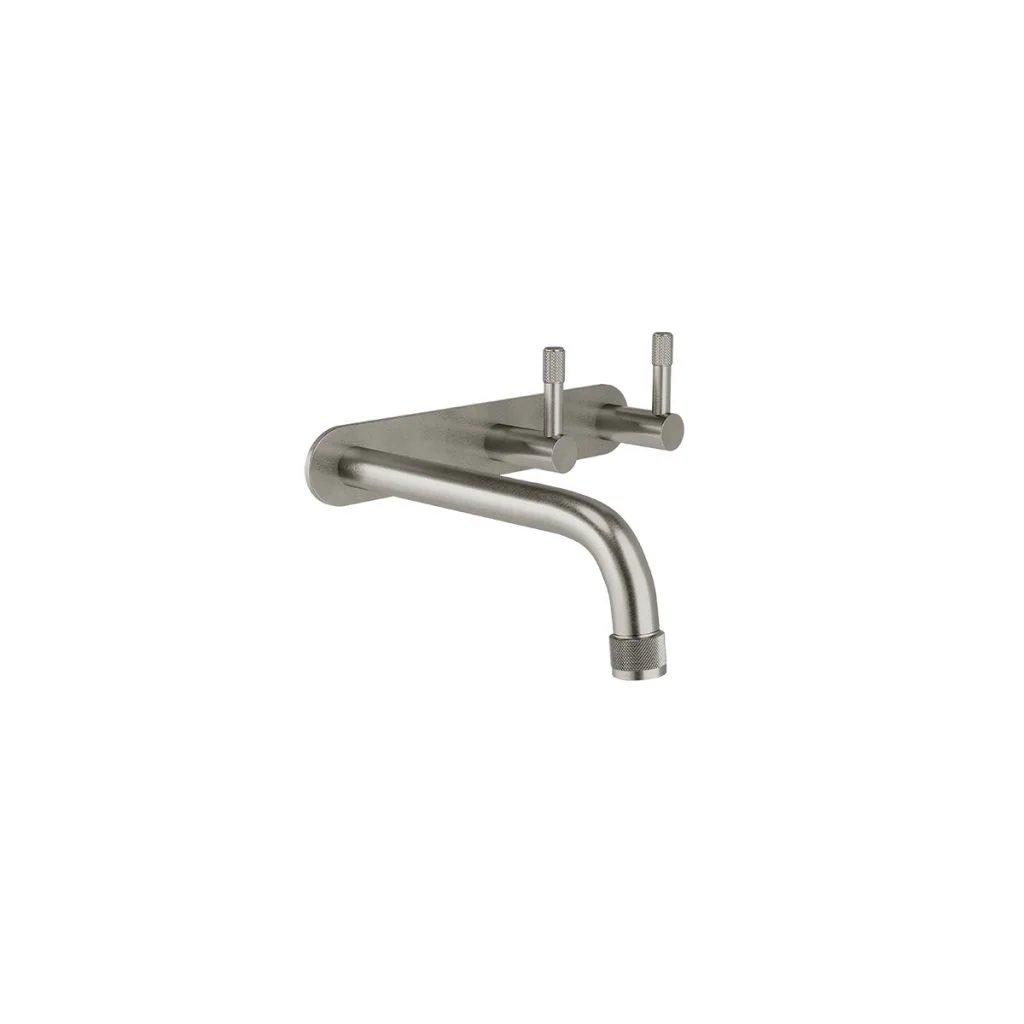
Tapware -
The new approach in designing bathrooms is to move away from operating theatre vibes where everything is stark white, laser lit and metal shiny. The bathroom is a very intimate place, a place to get your nakey on - and for pampering. So why the hard and bright and cold? All the things you DON’T want to feel whilst standing in your birthday suit.
Tapware is of course a part of the palette, so no chrome for Clarynvale!
Brodware is a fabulous Australian manufacturer of quality tapware and their finishes are just what the doctor ordered - or…. would have had we allowed a doctor in!
The collection here is Yokato and the finish is Brushed Swiss Brass, chosen for its warm patina.

The colour of all the taps, shower head, and towel rails, hand towel holder, floor grate and waste, loo roll holder, door hooks - the whole kit and caboodle will all be in this finish. In the other bathrooms, the laundry and the kitchen we will use a brushed nickel finish, but it’s nice to have the luxe in the master ensuite,
The selected options for shower heads below are not displayed in the Brushed Swiss Brass on the website, so you’ll have to use your imagination!!
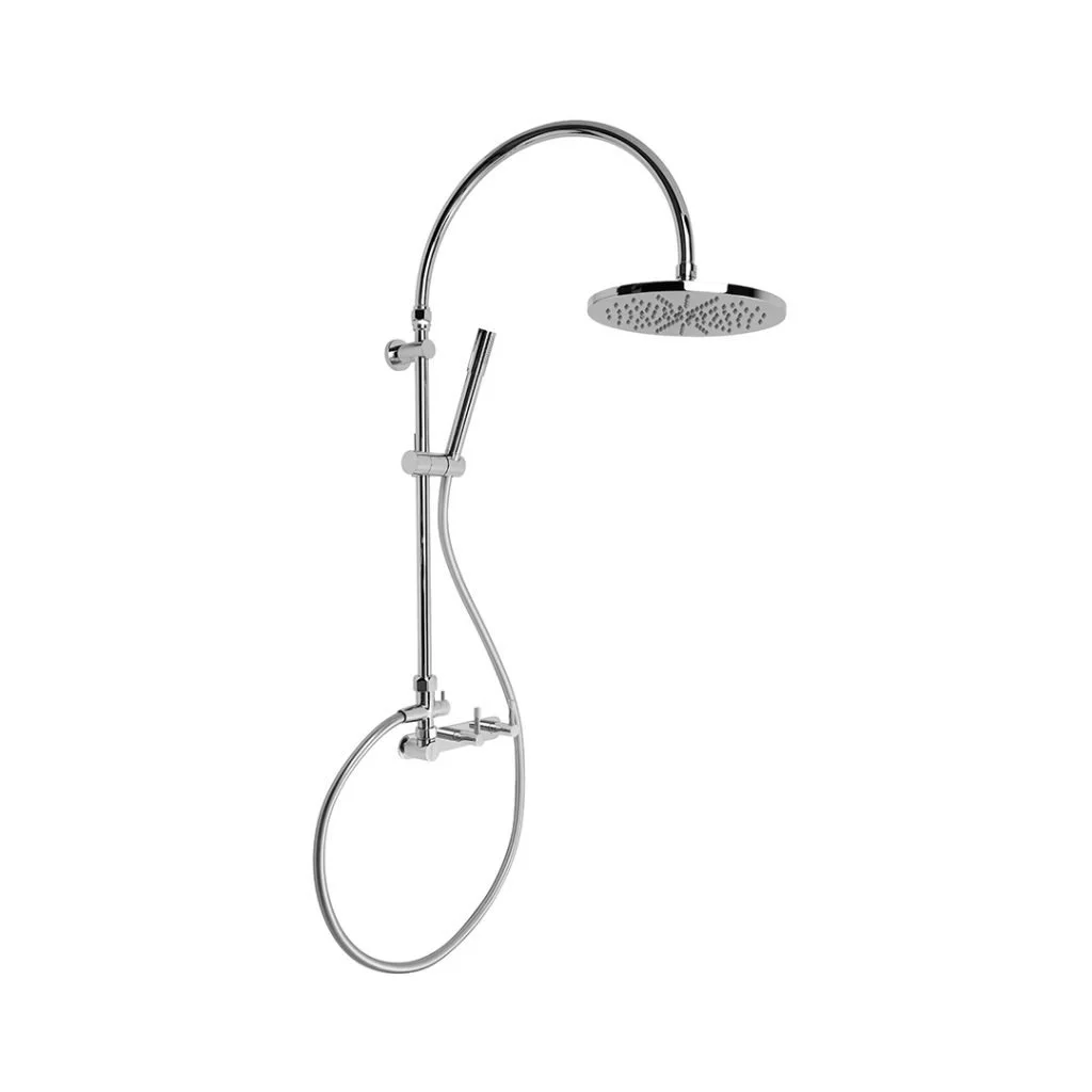

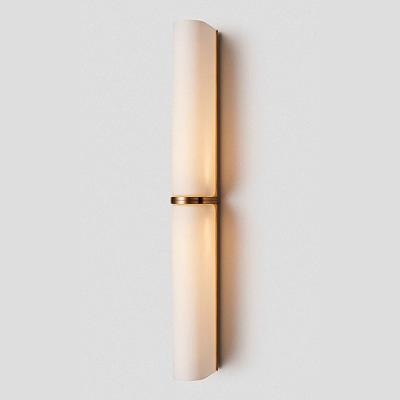
Dimmable downlights are a must - but there is also an opportunity to put a lovely feature sconce light here, inside the door on the left wall next to the window. I would suggest a touch of brass… like either if these Melbourne made lights by Articolo.
A wall hung toilet with an in-wall cistern will be the most compact and most appealing choice - and a single fixed fin shower screen framed in black for zone 2. As the shower is within a wet area, you don’t need to box it in with screen as the excess water will splash onto the bath, not into the room. The benefit of this is that you have a sense of space in the shower rather than being boxed in by the glass screens.
A single fixed fin is one option, but a door can also be added, if preferred. But you see from these images that without a door, there is less clutter, more serenity.
A panelled fixed fin is an attractive alternative.
Making the ensuite bathroom beautiful and dreaming of opening it up to an outdoor bath area is exactly what this exercise is all about - creating a really special retreat for the two of you to indulge yourselves - you bloody deserve it!

This one is by Italian manufacturer Agape, called Cemento. It has some kind of cement skin on it, making it suitable to be installed outside in the weather, and it is available in a range of colours - I think the green is fabulous. It is 1300mm in diameter - room for two! You could have a spa - but this is much more romantic and understated.

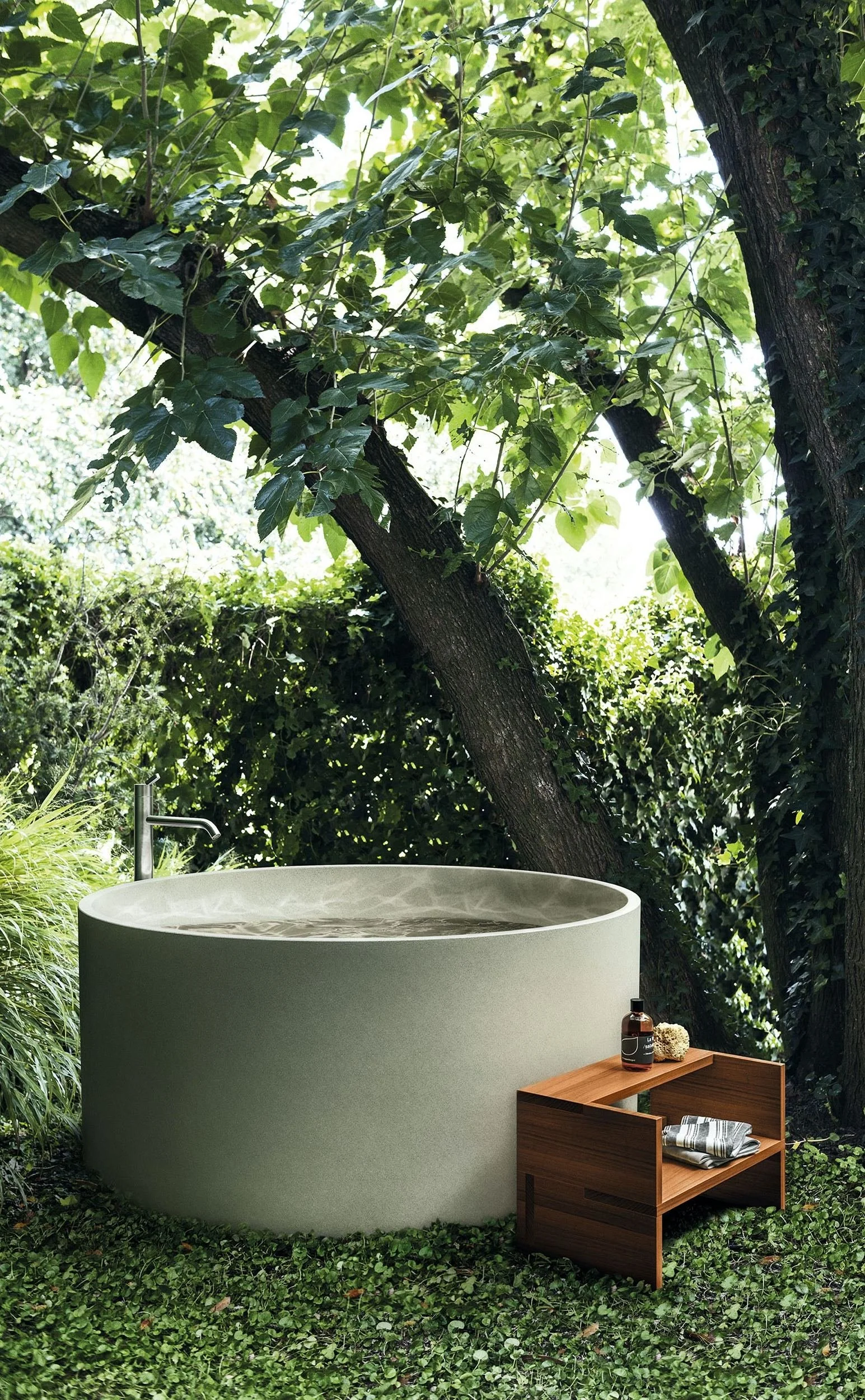
Ensuring privacy is paramount - but it needs to incorporate the planting of shrubs around as well as fencing, without compromising the view north!
Kitchen
I’ve always believed if it ain’t broke, don’t fix it - just renovate it! As it’s better not to argue with a trained chef, and as I know that Chris likes the layout of this kitchen, who am I to disagree??!! However…. a little reno never goes astray.
With the house getting a total makeover, from bathrooms and windows to wallpaper and furniture, leaving the kitchen untouched may prove to be a mistake. All the newness and improvedness (?!) will highlight the 20+ year old kitchen and it may not be flattering.
So this is what I propose.
Extending the central bank of cupboards to incorporate a wine fridge and extra storage, the cornices on the ceiling will need to be adjusted to accomodate the extra length and the new cupboard fronts will need to match the old. And we have a new window going in. Rather than redesigning the layout, we could replace the cabinetry, bench top and tiling, install a new stove and possibly an integrated fridge - and voila - everyone happy. No change to layout, plenty change to style.
Let me run with it a little further…
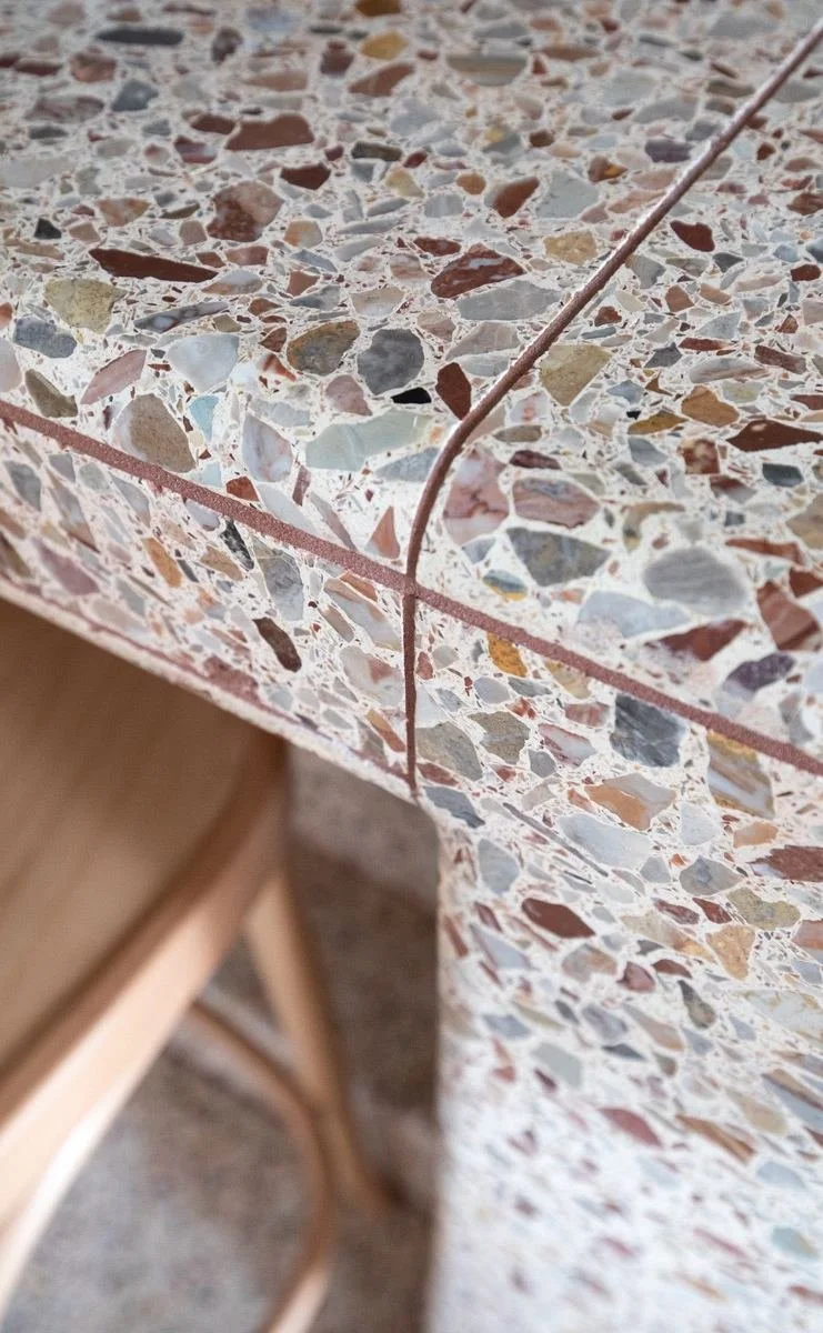
Kitchen cabinetry in a timber veneer, a terrazzo stone bench, and a tiled splash back.
The colour of the cupboard fronts above is a warm tone that does not compete with the richness of the timber floor, and it also blends well with the tile and terrazzo.
Warmth and texture. And brass handles!

The terrazzo is the same as the tiles in your bathroom, only this is in slab form. It’s the continuity of materials that matters here - and I have specified it also for the laundry bench.
Being pretty much a concrete, terrazzo is durable and cost less than caesarstone.
There is a vast array of choice when it comes to appliances for the kitchen, and I suggest we take a trip to Winnings at Waterloo to have a look at their range.
Bedroom 2
This bedroom will have its new windows to feel easy about and to sleep easy with, and it will have its new ensuite to be CRAZY about! So the only added extras are new wall colour and new linen curtains.
The colour scheme here is soft, but still interesting. We could add new linen for the beds, with chunky knit throw, and some new bedside lamps to bring the brass note through. But for now…

Porters Paints, Rubble
And as with the rest of the house, the woodwork will be Dulux Natural White.
The paint and fabric colours here, as in the living space, are very similar in tone and so create a feeling of balance and calm.
With the black framed windows, these neutral shades work brilliantly - and coming off the Harbour wallpapered hall, I think we have it!
It also allows for bed linen choices to go either into the earthy hues, or a little more boldly, into the blues and greens.

Kyoto, Ricepaper
As far as furniture goes in this room, the bed is great, as are the bedside tables. In time you might consider adding a rug and as already mentioned, brass bedside lamps.
Note *
I would encourage young Lachy to maybe get inspired with his camera, as I know he has done in the past, and create some beautiful images for this room and for bedroom 3. The trees on the property and in the district, are great models and with a good camera, art can be made!
The following gives a flavour - a Sydney photographer called Poppie Packa and a Melbourne gal,Katie Carmichael.
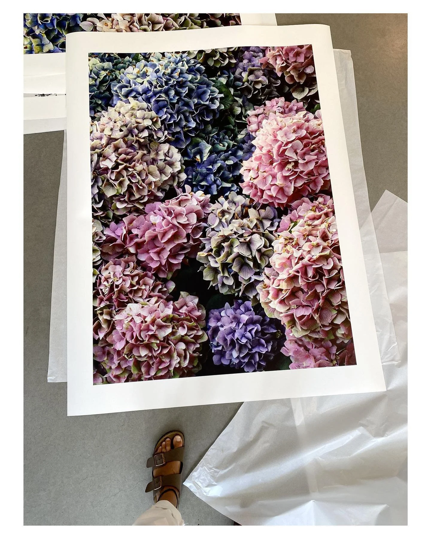

Poppie Pack does fabulous botanicals, as well as iconic Sydney scenes of Bondi, Icebergs, the beach etc, but I love these hydrangeas, printed on quality art paper and framed in black.

Or then these, above, by Katie Carmichael from Melbourne, whose work I so admire and love to support.
Photography is so under rated and under valued, but times are changing. Both of these artists produce work at really reasonable cost (around $2000 framed, 840mm x 1190mm) and the impact of their work, printed on quality art paper and well framed, is amazing value.
Bedroom 2 ensuite and guest bathroom:
As already mentioned, the main bathroom of the house currently is massive and would be far nicer divided into an ensuite and a guest bathroom, as set out in the sketch. The bath has been replaced with a far superior model for the mistress of the house in the master ensuite, and the path is clear for a lovely ensuite created for bedroom 2 as well as a guest bathroom/powder room accessible from the hall.
For both these bathrooms, the terrazzo floor tile is another one from the Artedomus range, this one is called Ziani. The sample in your pack is a more true representation f colour than the image below, which looks a little yellow.
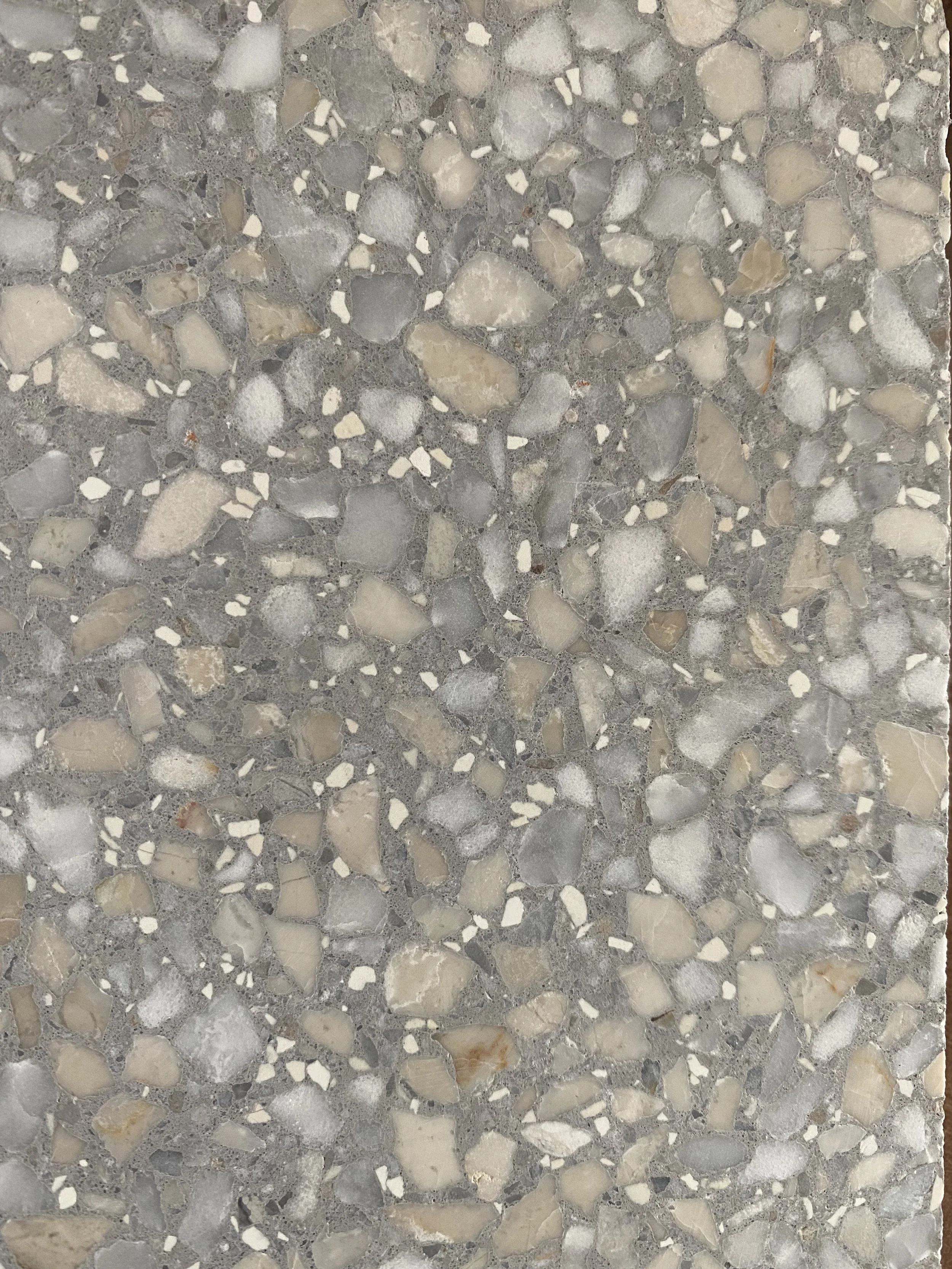
This is a Japanese tile made by Inax, available through Artedomus. Its slight concave surface gives all the feels and the gentle light blue colour picks up the lighter colours in the terrazzo.
As you see in the image below, the tiles look best when laid vertically, they give a better sense if height to the room and makes it therefore feel a little more spacious than laying them horizontally.
The tapware is the same Brodware series as selected for the master ensuite, but instead, in the brushed nickel finish. It’s nice to have that luxe point of difference with the master ensuite.
To be consistent is critical… life depends in it ;-)… and so to that end, I am including here some more Concrete Nation magic in basin form. The colour is Grey Mist, the same as your bathroom, but the basins for these two bathrooms will be round, not oval.
The reason for round over oval is that it again is a point of difference within a consistency of design.
Concrete Nation products are all made by hand by a team of artisans in Burleigh Heads.
They’re awesome.
The vanities for both these bathrooms are also the same as fo the master ensuite, for the same old consistency rule - and because they’re great value! They come in three colours and in a number of different widths and configurations. The mirrored shaving cabinets pictured below are from the same manufacturer and I think will look fab over white vanities with white tops, grey basins and brushed nickel tap ware.
Between the cabinet above and the vanity capacity below, there will be ample storage in both bathrooms, especially when you consider that they are both guest bathrooms.
Wall hung toilets with in-wall cisterns, clear shower screens and plantations shutters complete our bathroom business here!
Bedroom 3
Bedroom three is the newly created bedroom where the tv room used to be. It is a generous sized room and will feel even more so without the need for built-in wardrobes.
My thought is to move the dresser which is currently in the kitchen, to this room and we will put books and nicknacks in the shelves above and storage for blankets or whatever in the cupboards below.
The colour scheme is again soft and neutral, with colour being added in the form of bed linen and throw rug. I would also suggest bringing one of the armchairs currently in the living room, in here. When Len comes to stay, he might like a quiet spot away from his bull-in-a-china-shop son in law!!!

As this room gets a load of sunlight, I have selected a deeper colour for the walls, but actually, you’ll see from the swatch in your pack that the colour represented here is once again a little more intense than it is in reality.
Again, Dulux Natural White for the woodwork.
With the green of the outside being very present in this room through the wall of glass windows and doors, the earthy tone of Navajo will be a lovely balance.
Beautiful linen as pictured below right and a pair of brass lamps on the bedside table pictured below, will be the icing on the cake.

Kyoto, Hemp
I have inserted the lamp above not just because I love it! It’s a place holder to give you all the good feels, but really, you could redeploy the lamps currently in your bedroom to this room as they’d fit well with the decor here.
And the linen too, is arbitrary. I have included luscious linens to inspire you, but your white bedspread could do well here too as it is all white and would look really pretty here with a throw rug in an earthy tone at the foot of the bed,
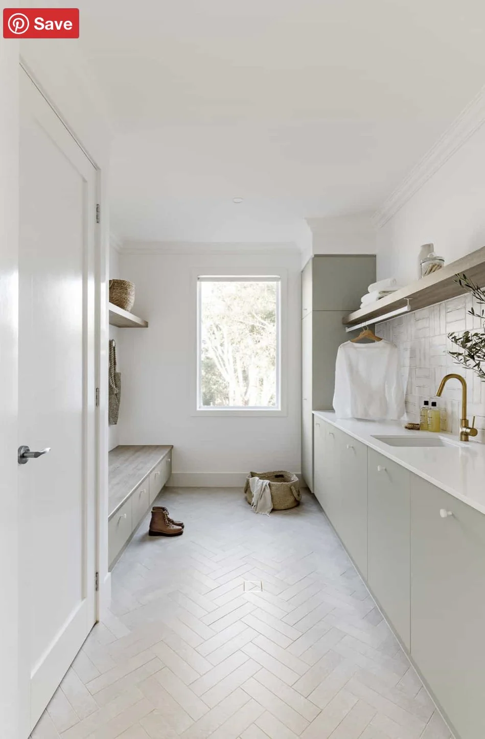
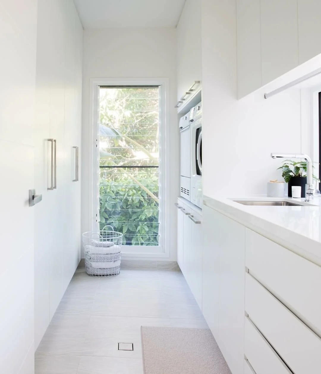
Laundry/mud room
This room is really important to get right as it is a major access point. I think you need to see it for what it is - a utility room. You don’t have to traverse it to get into the house, you can do that more efficiently by going to the central back door, but you want to make this room function well, however you choose to use it on any particular day.
It is a laundry, a ‘mud room’, a loo and a thoroughfare. It will be a storage place, a dumping ground, a work space - a room that works hard. So it would be a big mistake not to give it the respect it will earn. And don’t forget, it is quite visible - it is not a tucked away room in a corner - it is in a highly visual spot with a million dollar view!
Nonetheless, we start with plantation shutters on the windows facing south. The terrazzo in the floor is the same as in the bench and the splash back is the Inax tile pictured below right.

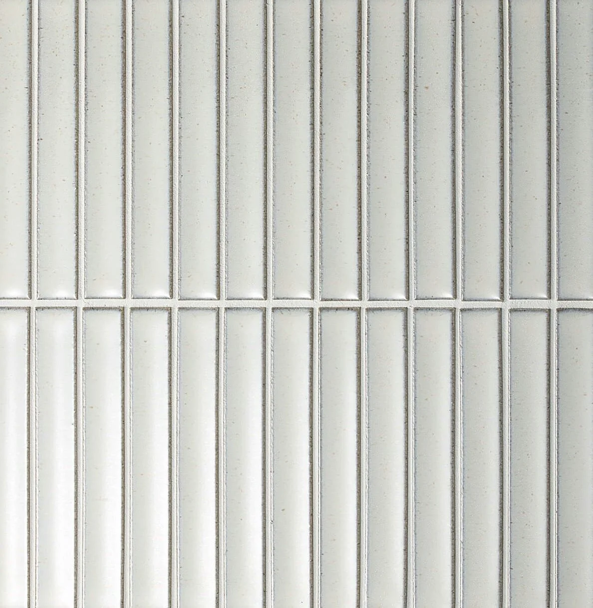
The tapware is the same Brodware brushed nickel and the cupboard fronts are v-join painted Dulux Natural White.
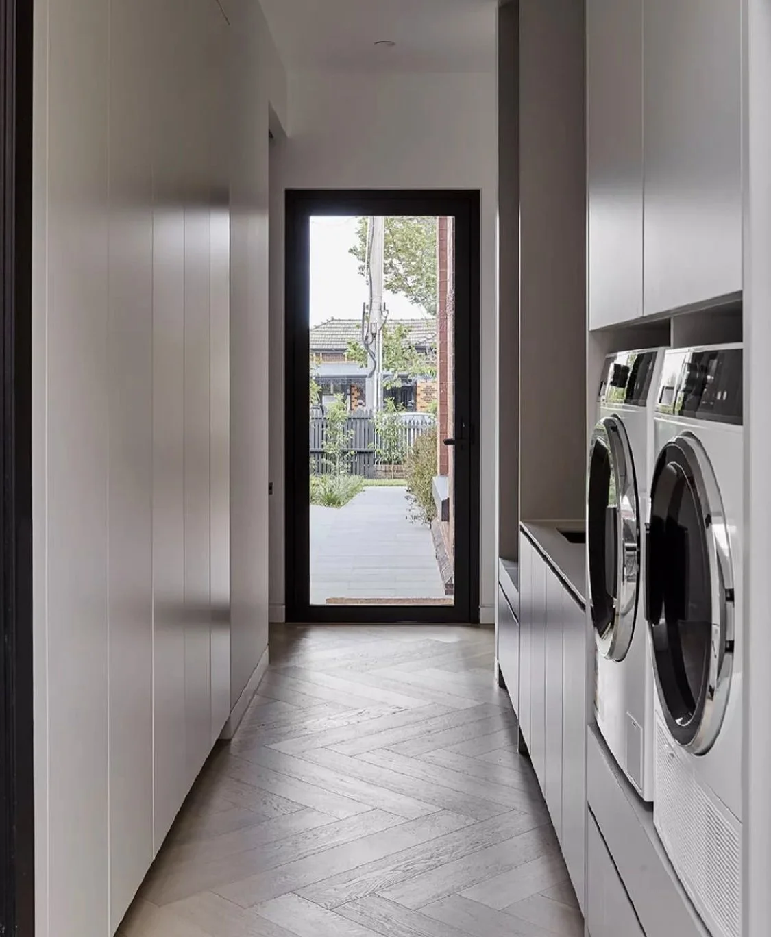
The image above is interesting with its elevated machines - easier on the back and with storage drawers beneath for dirty washing and ironing, it makes loads of sense. If we were to adopt this, the machines would need to be on the northern wall and the bench seat on the southern wall, stepping up to a work bench with tub and a view out the windows, along to the eastern corner.
The Images above give good flavour here - although they don’t accurately depict the layout at Clarynvale,
There is too, a loo! But with the plantation shutters and privacy locks able to be put on both doors, no one will get their knickers in a twist when using the facilities. Deleting the loo was a consideration, but it seems crazy to lose the amenity.
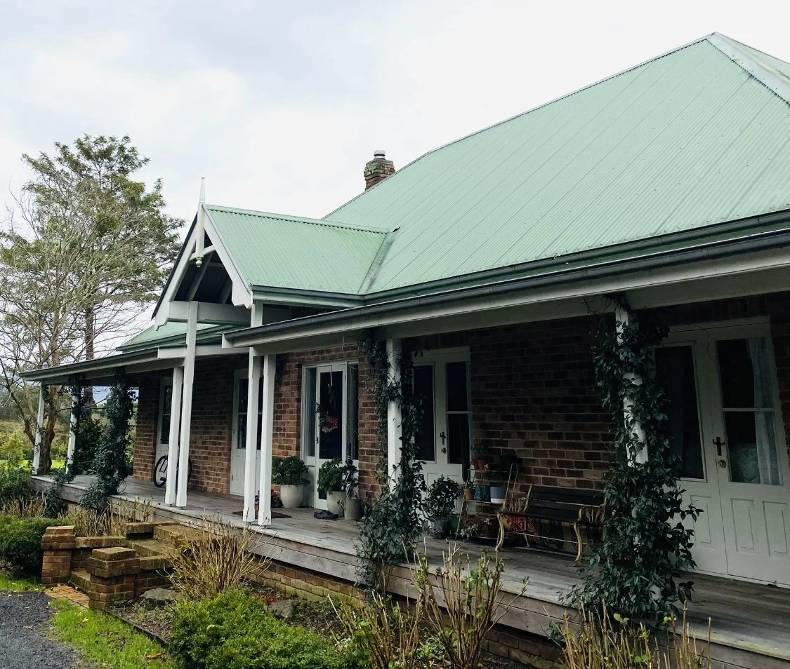
front exterior:
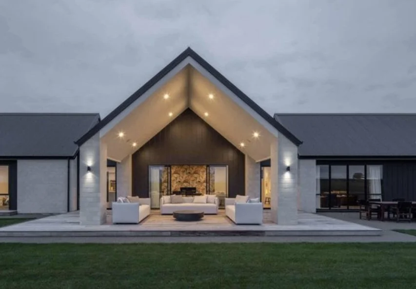
The transformation aspiration of Clarynvale is just as much focussed on outside as it is inside, and discovering the potential has begun! It is important to say that the following is a style guide for further development in consultation with a landscape architect and garden specialist, but to me, these big moves are obvious. Engaging the experts is the next step, but for the purpose of the exercise, this is how I envisage the exteriors.
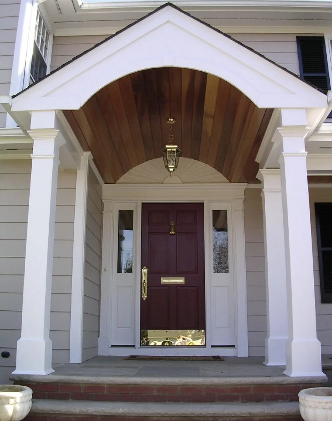
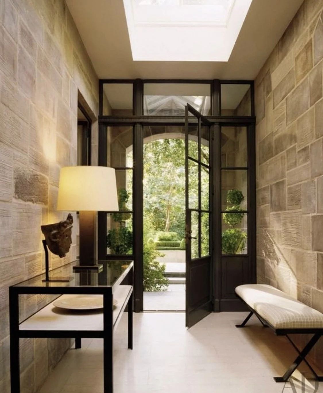
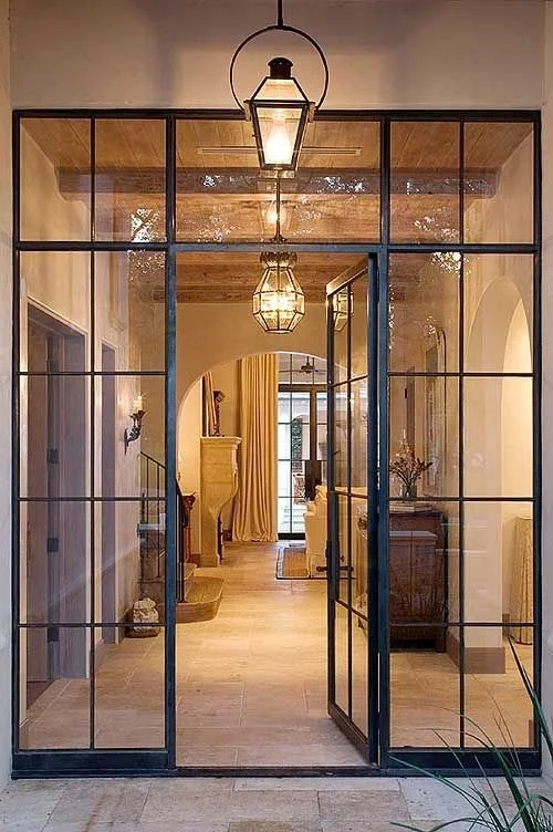
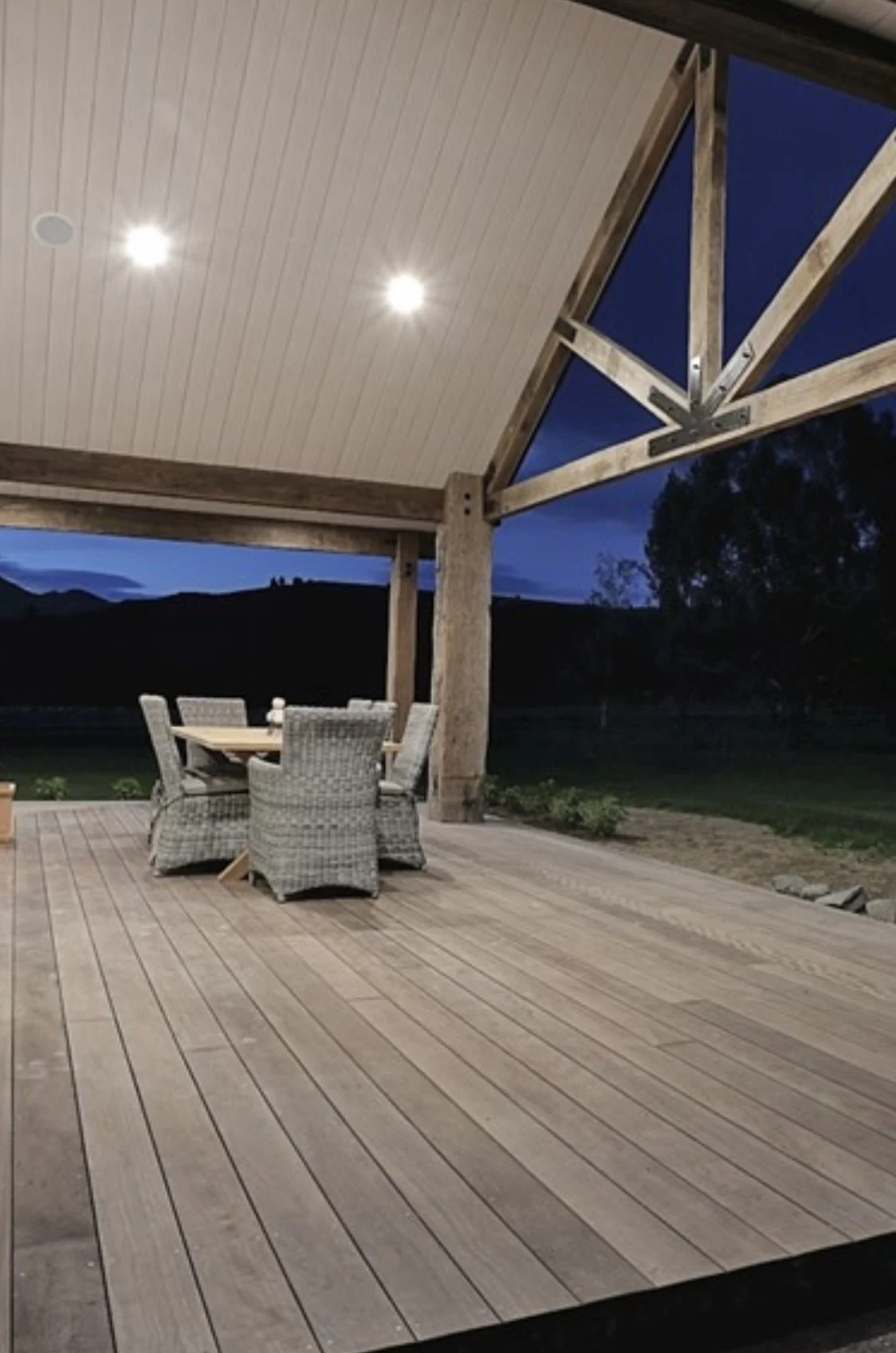
Verandahs and Portico
We have spoken about the improvement to the front of the house with the removal of the lollypops, and the widening out of the entrance in general to be more inviting and more practical. But the problem of the weather hitting the front door remains! There are three options that are worth considering:
Pulling off the front and back verandahs and rebuilding deeper ones
Constructing a portico at the front door
recessing the front door into the entry hall