Your Custom Text Here
Bernard house cip
Sophia and Cameron,
You have a lovely house, almost. The not-so-lovely thing is that you’re not feeling all of the feels! I think that interiors are as much an outward manifestation of emotion as an inward desire to connect with your home at a cellular level. What does that mean? It means the feels have to be a reflection of who you FEEL you are - not an imitation or another person’s interpretation. Working with a designer needs therefore to be a throughly honest relationship so that the result we achieve does just that - connects to your soul. And if that isn’t touchy-feely enough, god help us all!!
I am brutally honest - you can be too. My approach is wholistic which means everything is on the table here - if what I suggest confronts you, then good! It will make you fight for your convictions and in doing so, you can convince us both of your reasoning and that battle scar will become a feature of this whole process.
I’m excited to work on your house with you because I connect with you - a shared sense of humour, a shared prioritising of style, a shared desire to make the absolute most of the environment around us because of the life enhancing power of getting this right.
So let’s get cracking.
Thesis
Inspiration for the design of your home comes from my impressions of you both, your warmth and humour. The scheme I have developed is a reflection of those great qualities and it starts curb-side and goes right the way through to the back fence. Warm, organic textures and colours best reflect the depth and character so evident in the people you are and will be a better, more comforting and embracing than the current grey scheme.
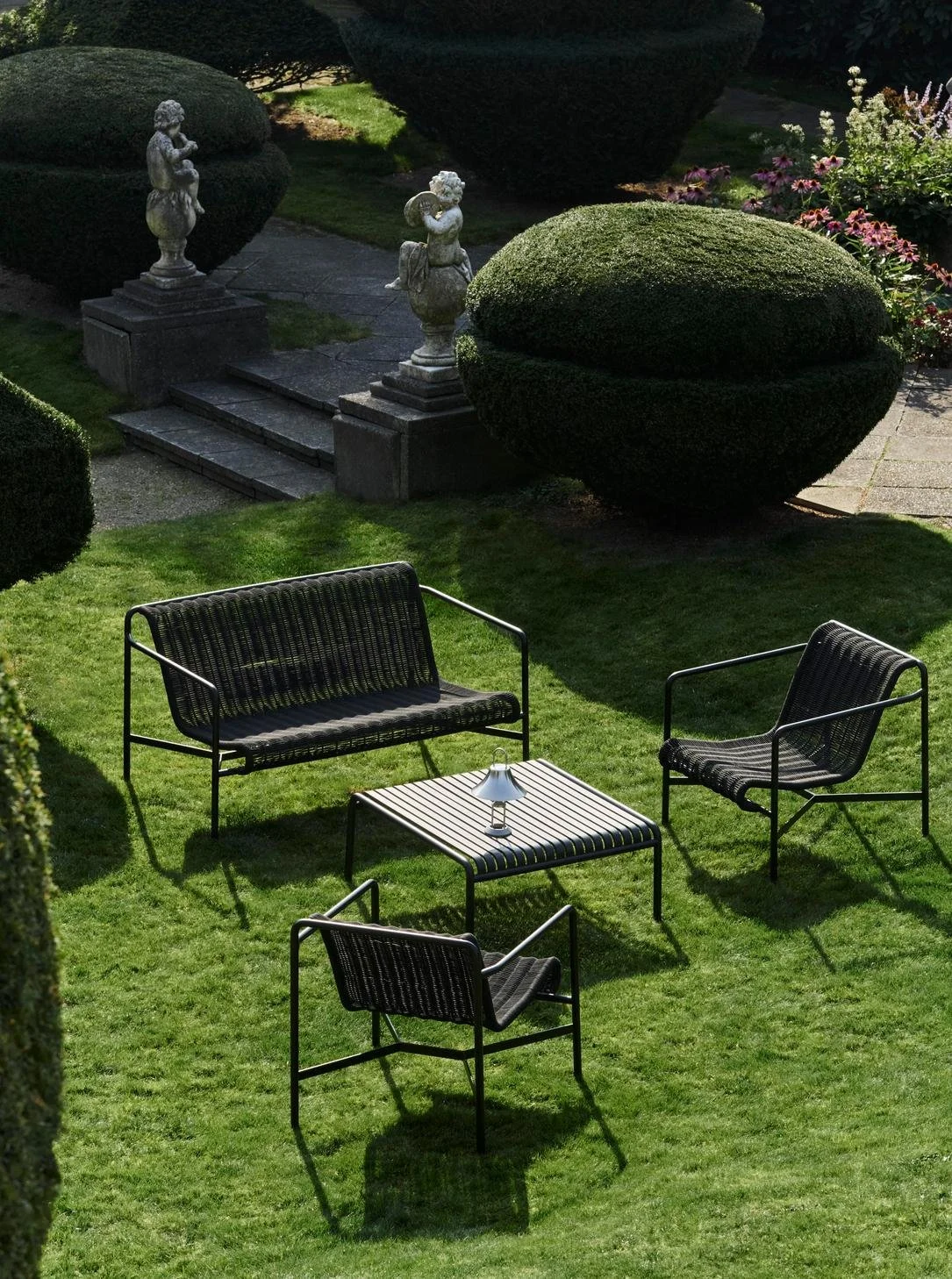
The Front
The view from the street quite literally ‘fronts’ a house and represents to the outside world much of who the inhabitants are and what they value. When you appreciate that perspective, you might look at your house differently. It may not need painting right now, but you know what? A grey, south facing facade is a double cold. So in time, when it DOES need painting, let’s switch out the cold grey in favour of warmth and welcome.
Dulux, Banksia
Dulux, Natural White
These Dulux colours do have warmth and they’ll herald the changes in store for the inside. Everything that is currently grey goes Banksia and everything currently white goes Natural White.
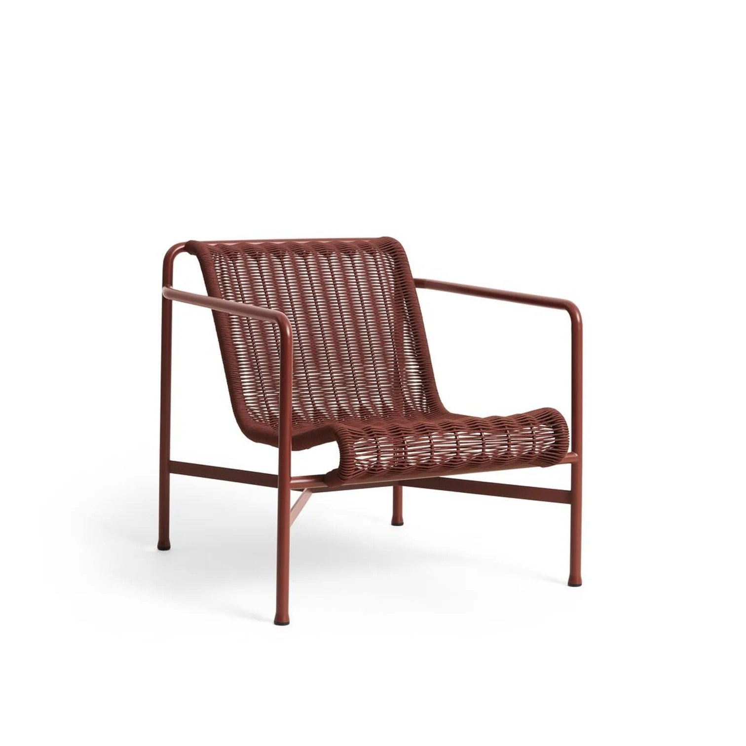
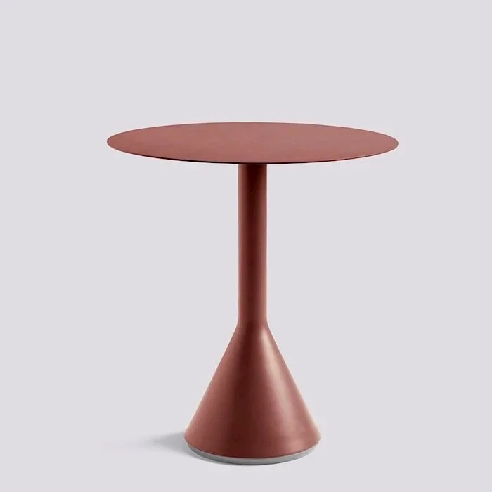
Walking up the front steps to the front door, another opportunity to flag the ethos presents itself - the balcony furnishings! You need to ask yourselves how much you use this space and therefore how much you want to spend here, it faces south and you have a lovely north facing back garden. But you also can’t lose sight of the impact that this space has on not only visitors, but on you guys - you want to come home every single day and think, ‘WOW, I live here!’
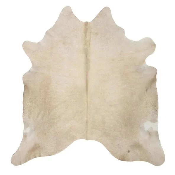
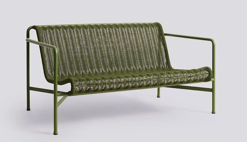
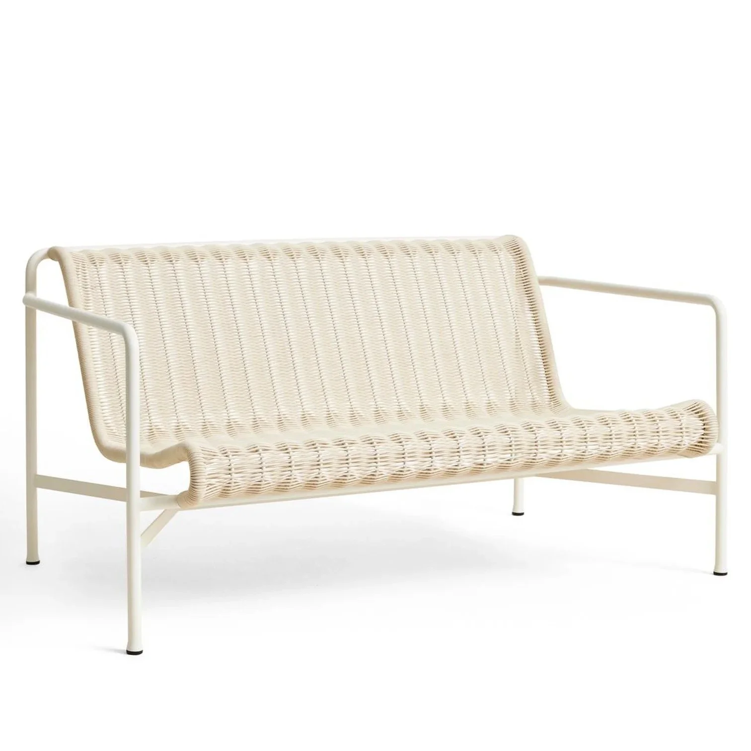
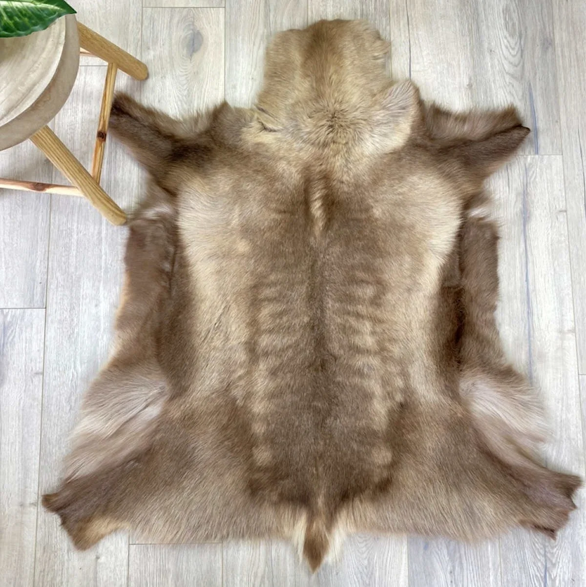
A big favourite of mine, the Hay Palissade range is a practical choice. You don’t need to bother with cushions that, despite the promises, always look mouldy over time. Rather, take a couple of reindeer hides to place on them when you want to sit out here.
A new addition to the range is the Cord, made of recycled polyester cord, it is softer to sit on than the traditional Palissade chair and looks so much more friendly.
I’d suggest an ’Iron Red’ side table and two chairs. We can add cushions if you want, but way better would be reindeer hides - you can’t leave them out, they can be stored inside on the sofas in the living room. This is what they do in Scandinavian countries - and it’s what I do in Cremorne Point!!
New planters with new plants (or revived existing!!) are essential and I love the idea of either the white or terracotta pots. Garden Life is the go-to for beautiful pots AND plants.
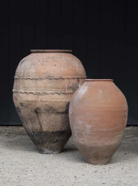
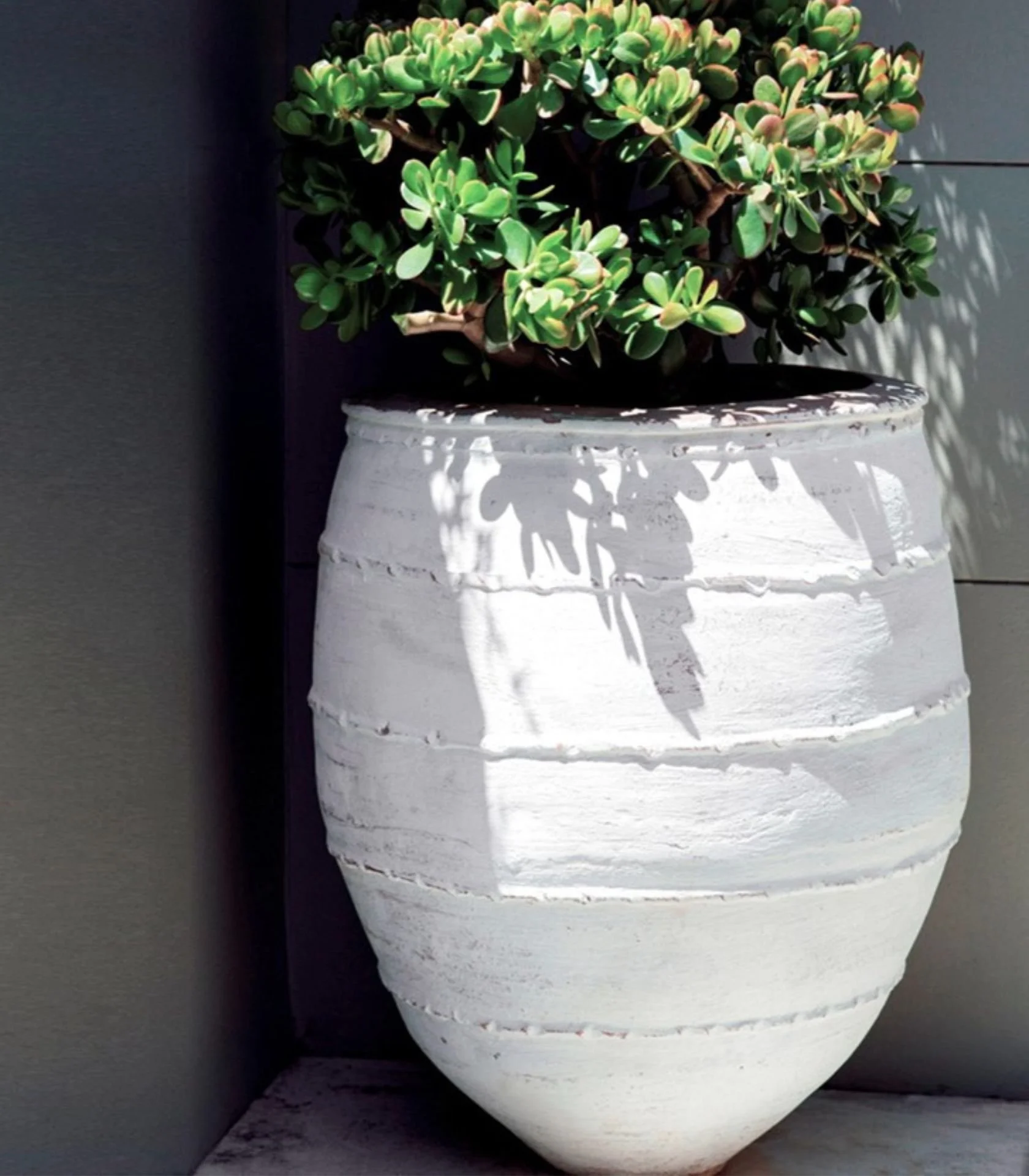
Warm in colour and curvaceous in form, either of these would add much more character and charm to the entrance of your home and give a more indicative flavour of what’s in store within!
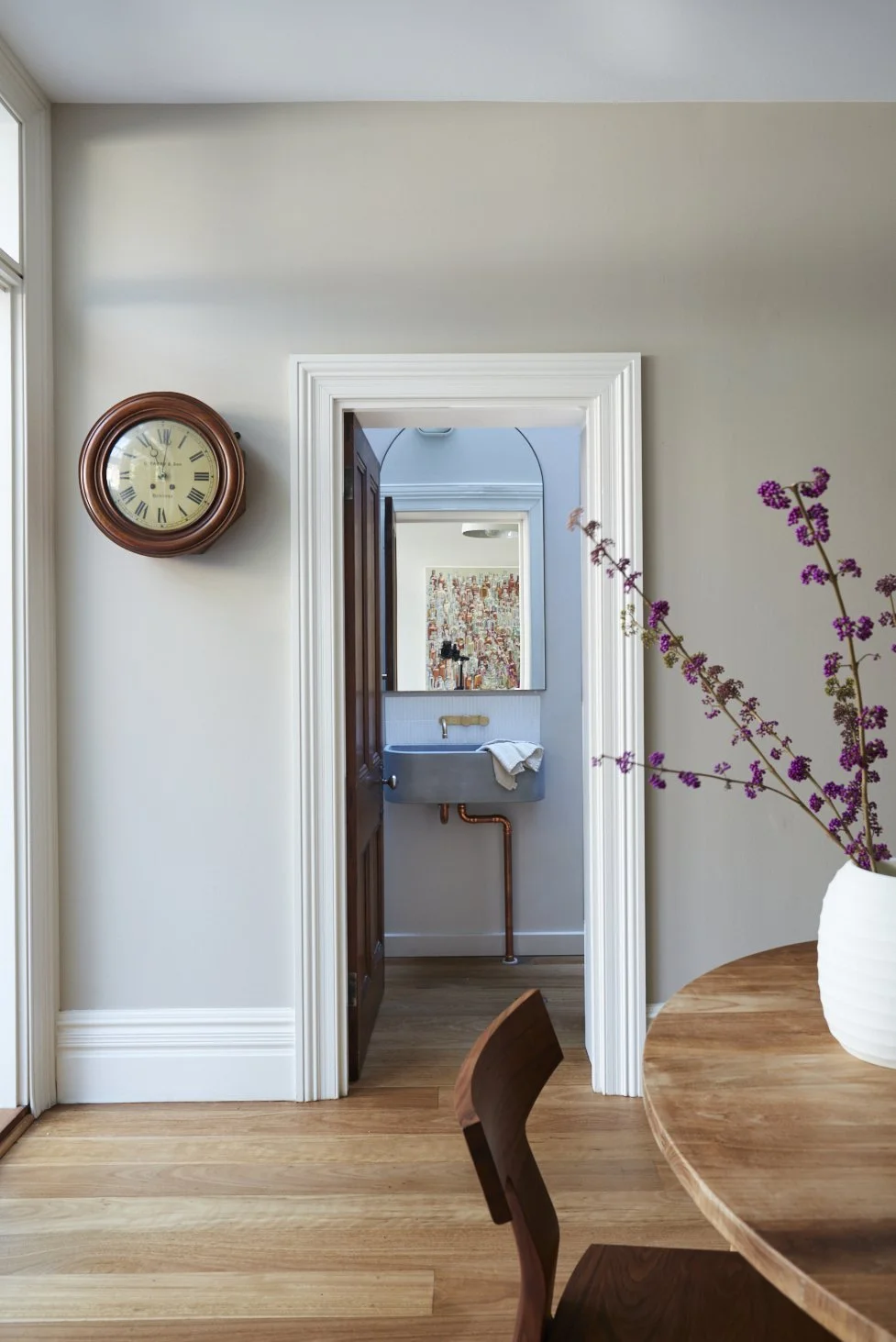
Entrance and hall:
Open the front door and BOOM! This is where Sophia, Cam and Nick live. What do you want the first impression to be? Warmth, humour, character, style. Grey does not cut it.
The new colour scheme is a much softer and earthy alternative.
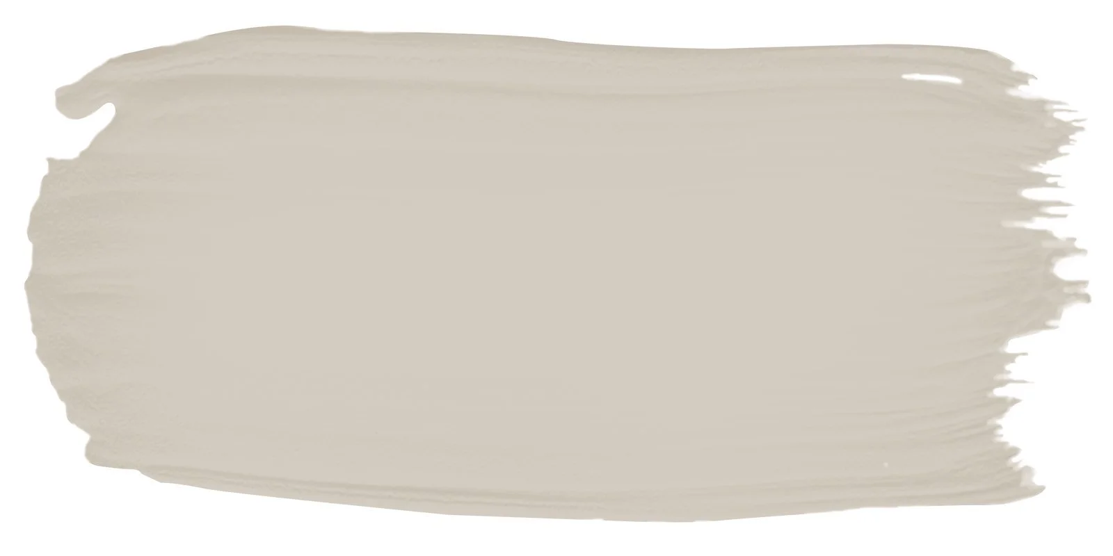
Porters Paints, Drift

Porters Paints, Irish Linen
The colour on the left is the wall colour, it’s called ‘Drift’ and was developed by Porters Paints for the Art Gallery of NSW. It is a full-bodied neutral colour and looks fabulous with the woodwork in the colour on the right, also by Porters called ‘Irish Linen’, my go-to white because it is far superior to all others!!!! So much warmer and more human. I know. I sound mad.
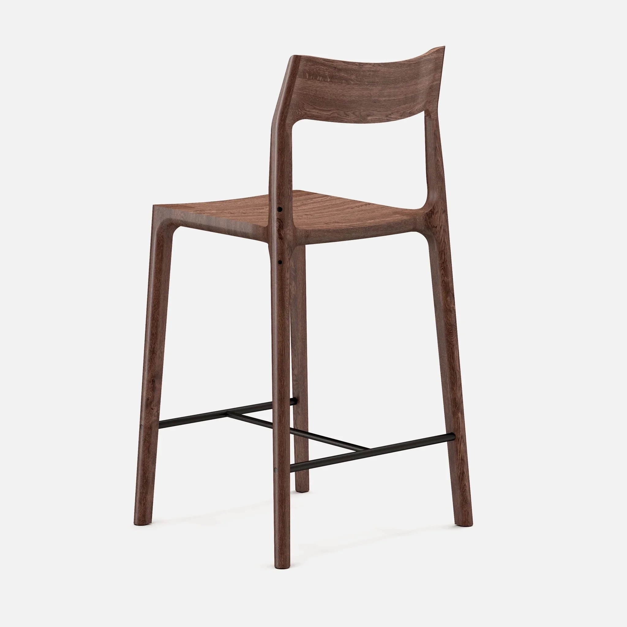
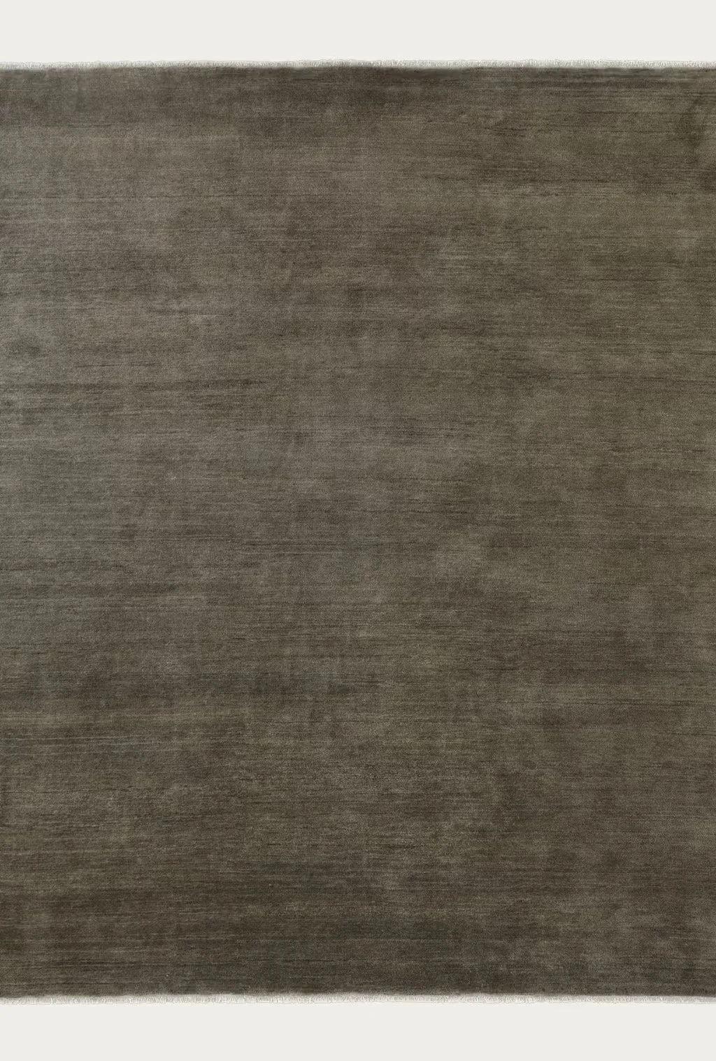
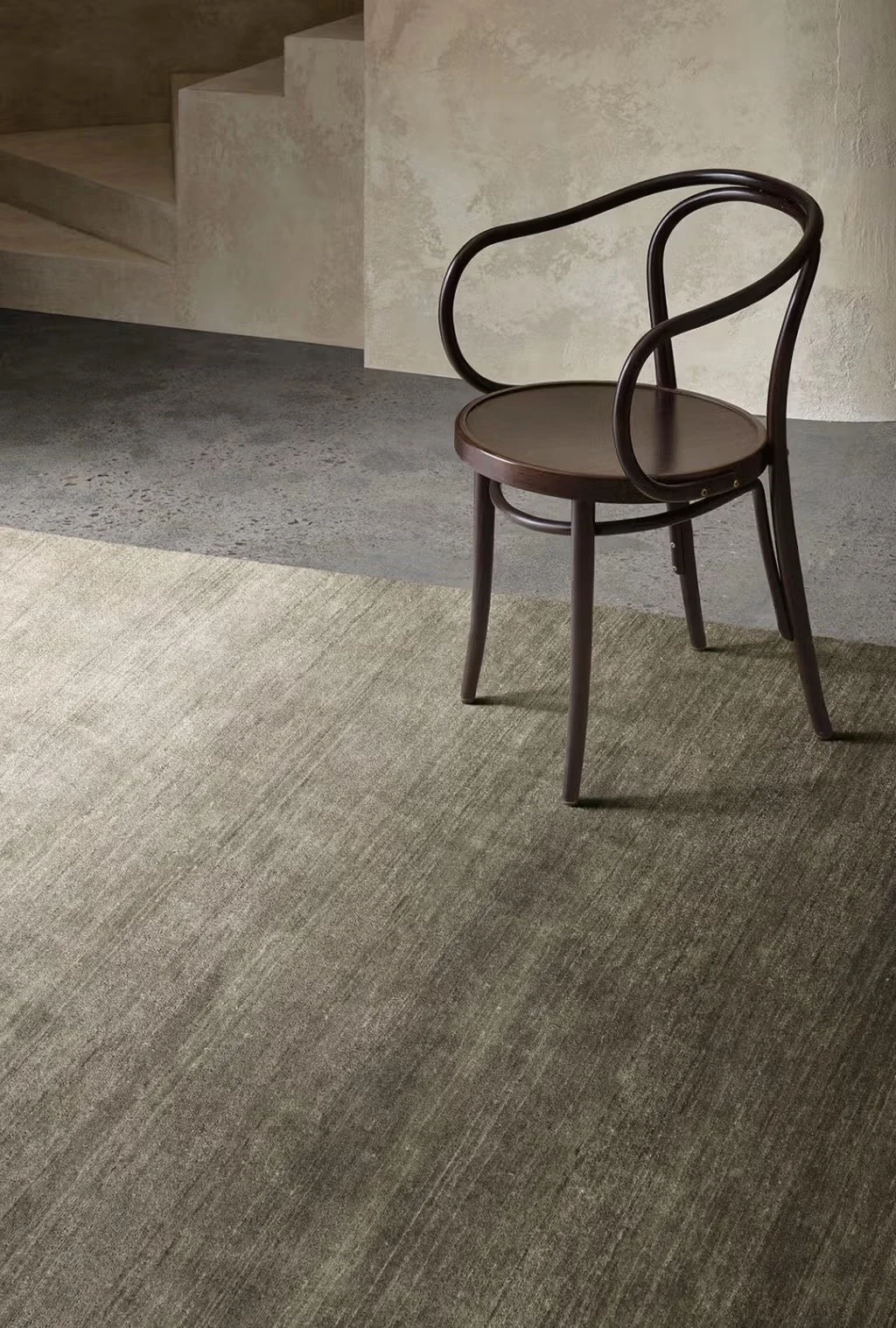
Now for the juicy piece - the hall runner. We need plush. chunky, earthy, pure wool and definitely - Armadillo.
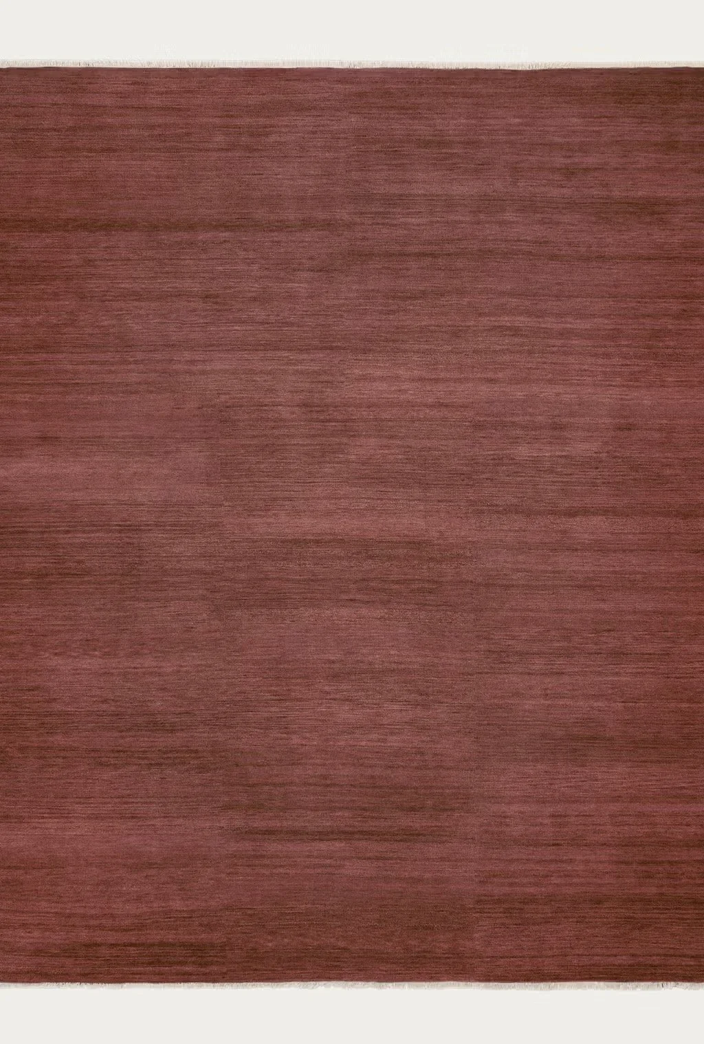
This is a stock colour in the Agra range, it’s called Redwood and you’ll see from the sample in your sample box just how thick and luscious not only the colour is, but the pile too.
As with many Armadillo rugs, you can order them to size and although this takes weeks and weeks, having a runner that is the right size is essential.
The drive for all of this, as mentioned, is to bring the warmth of who you people are to your interiors. The grey and black and white does not reflect any of that warmth. Shoot me now.

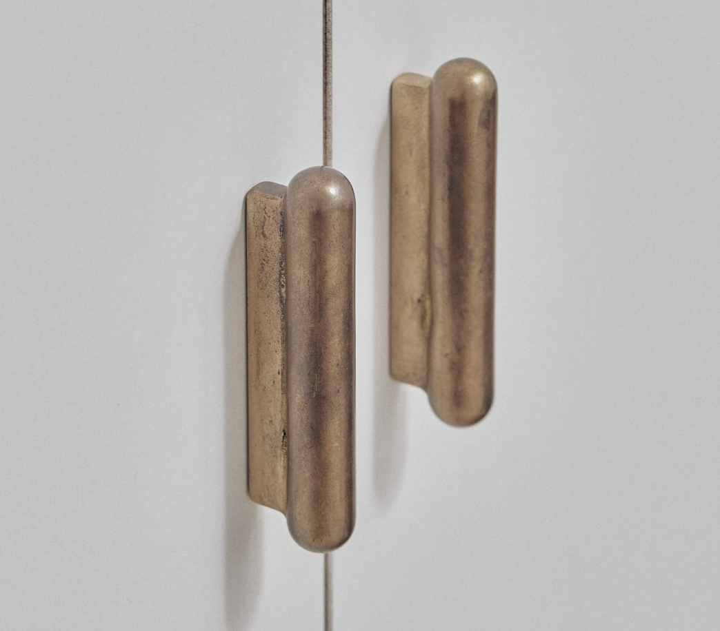
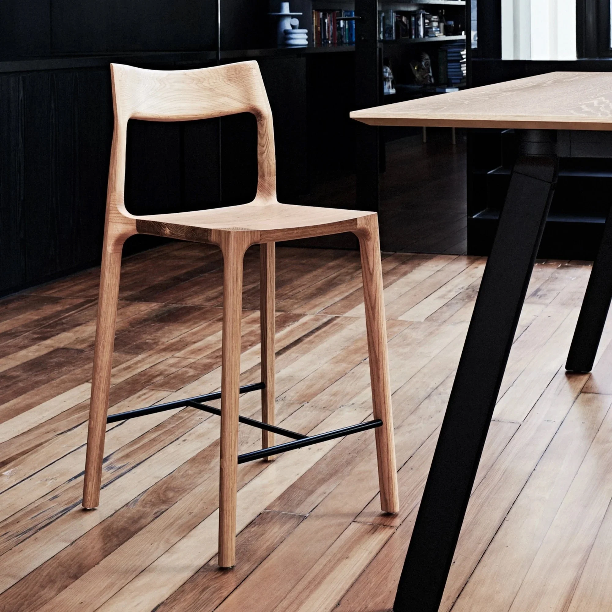
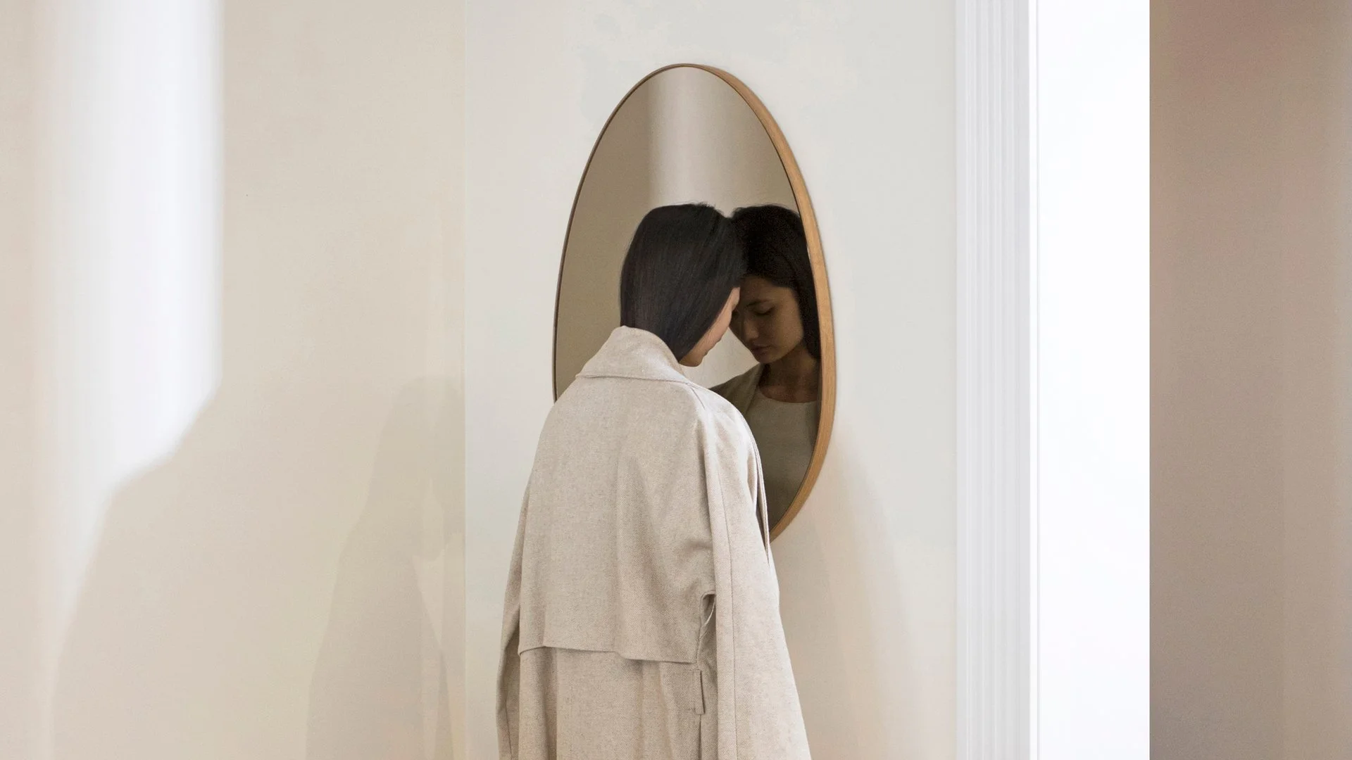
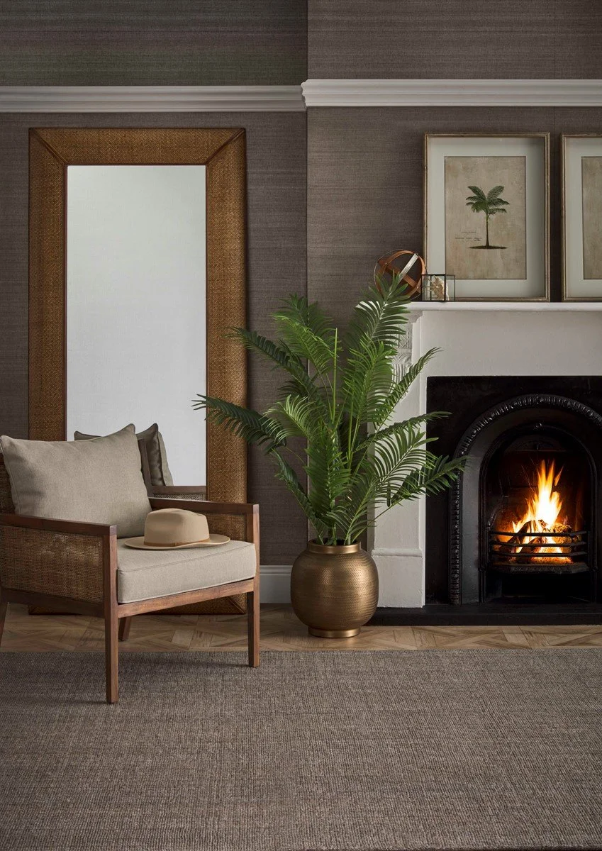
Studio Henry Wilson, a name to know! He’s local designer who uses materials like bronze, brass, aluminium, travertine, marble and timber in the most beautiful, artisnal way.
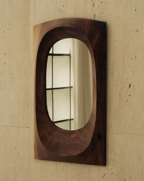
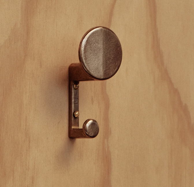
The Brodzki mirror to the left is made of solid walnut and I’m hoping you might fall in LOVE with it when you see it!!!! I’d recommend the larger size, 730mm high. It would hang on the wall where the existing mirror is, with three F.Ace hooks to the right
The F.Ace hook is a legend - it takes a hat and a coat - and looks magnificent with both, either or neither! Three in a row - one each. Depending on spacing with console, they could go on the wall to the left of your bedroom door.
A console… you’ve broken my heart vetoing the Spanish seat - so I’ve had to slink off back to my hunting grounds in search of an alternative.
But firstly, would you consider having a shelf custom made in walnut that would attach to the wall????? My lovely friend and craftsman Tim Noone could possibly do this - can we explore??
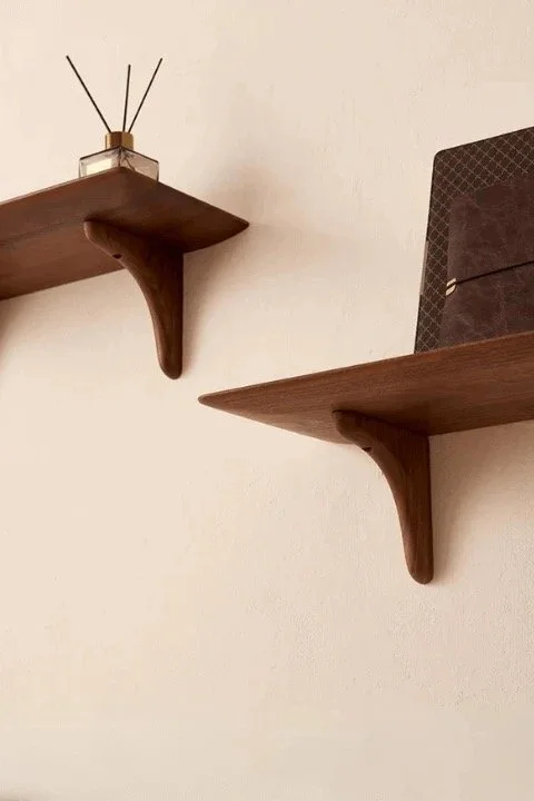
The one above is from Urban Leaf in NZ and the 90cm wide one is under $200. Imagine if we could get a beautifully designed and crafted one - has to be cheaper than a piece of furniture and it won’t get in the way of the rug AND it will look divine with the mirror and the hooks???!!!!
Just found this console from Tigmi in Byron Bay - it’s marble and 120mm wide and 40mm deep
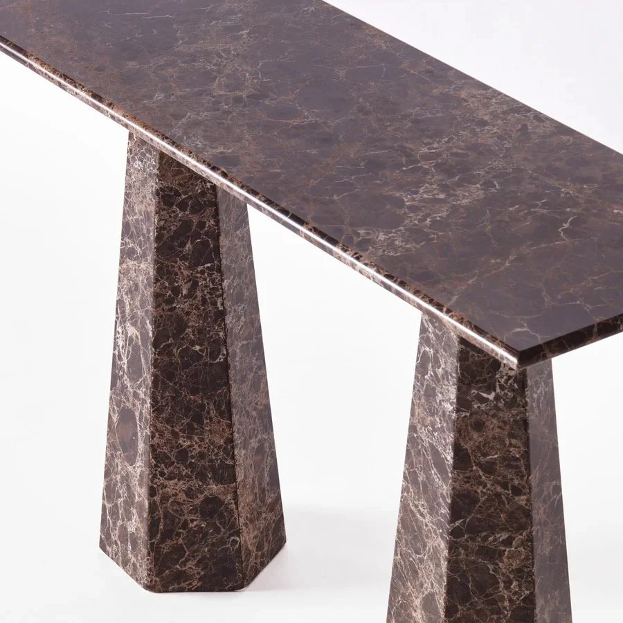
You did reject the Globewest marble option, but this is so much more refined, yet very sturdy and so perfect in colour!
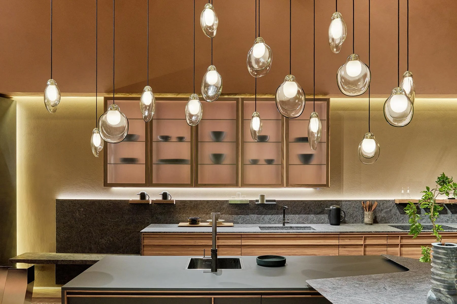
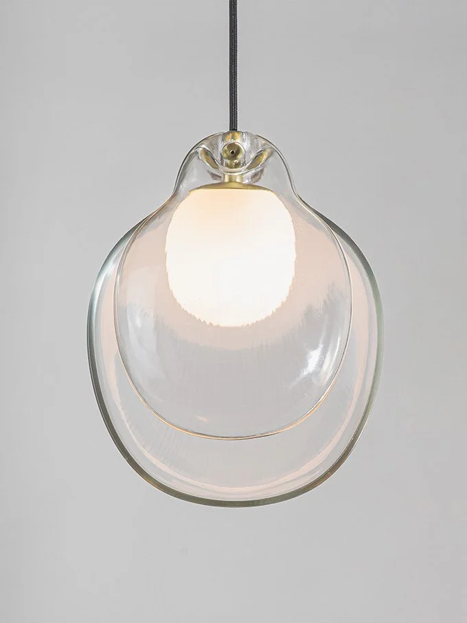
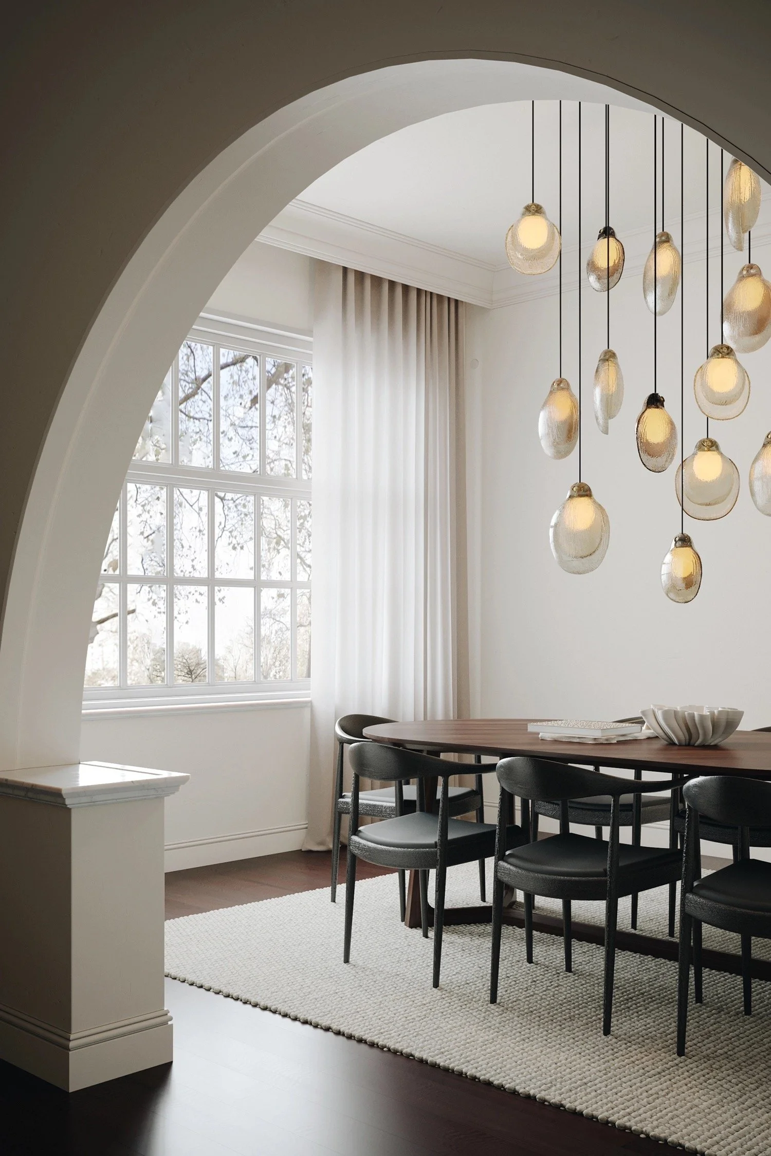
I know you’re reluctant to change the light fittings - but I can’t see them working so well with the new scheme as they are much more formal, whereas I go for soft, organic form.
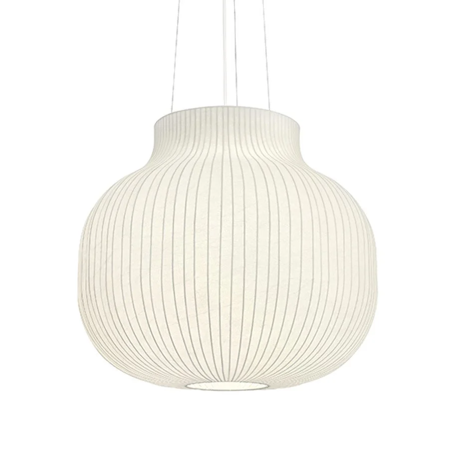
Meet the Muuto Strand pendant, pictured here in the 60cm diameter. Designed by an Englishman, manufactured in Italy for a company in Copenhagen…. it’s quite the piece and very reasonably priced
They’re sort of cloud-like, and with a warm globe, cast a very soft, diffused light. I’m all about it.
We need two for the hallway.
We need to really work with your art collection as you have some really good pieces. But I love using hallways as galleries for family photos because it is one of the most powerful ways to bring out a home in a house!! Something to think about for you, but if you like the idea of a collection of photographs of family, printed and framed in a uniform way, then let’s talk. Halls are not great for good art because you never get the right light without dedicated spot lighting, nor do you get adequate perspective.
So I say, save your art for rooms and your hallways for family or other smaller pieces that benefit from a peering at!!
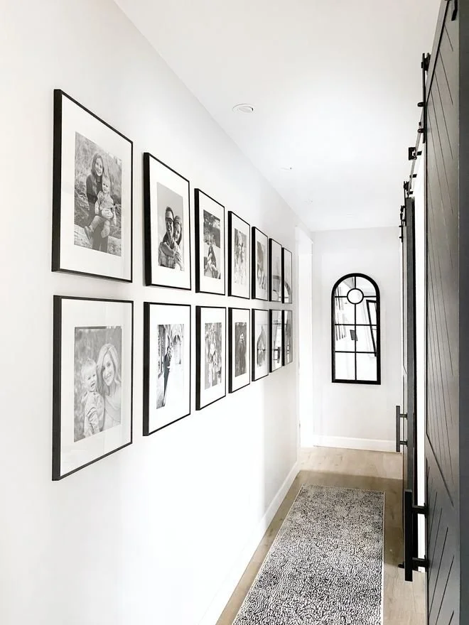
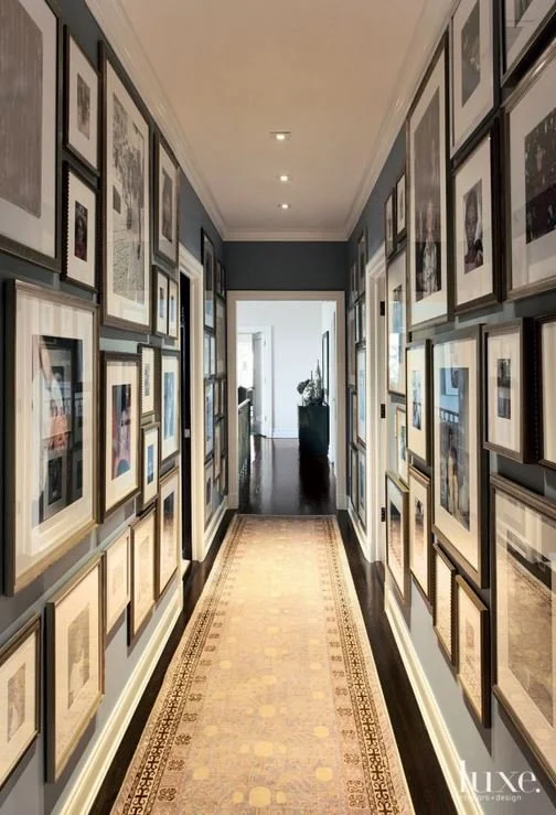
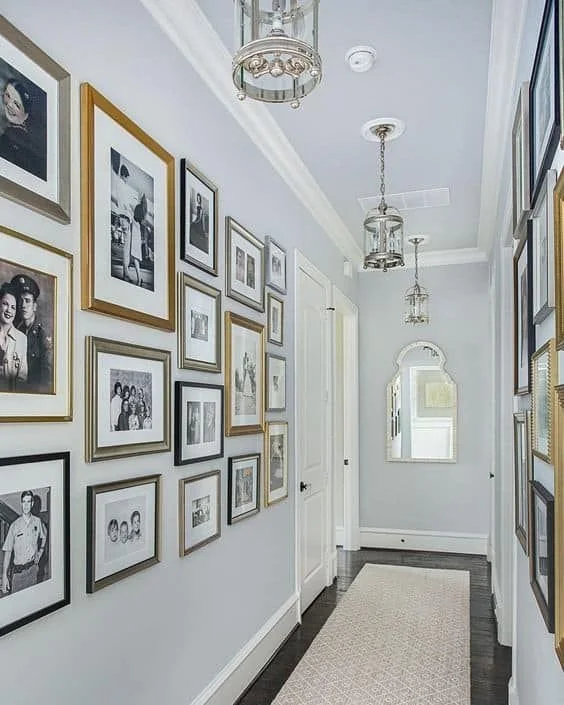
The images above give you a sense of this - the layering of history and of family in a space that is not taking up ideal places to hang art!
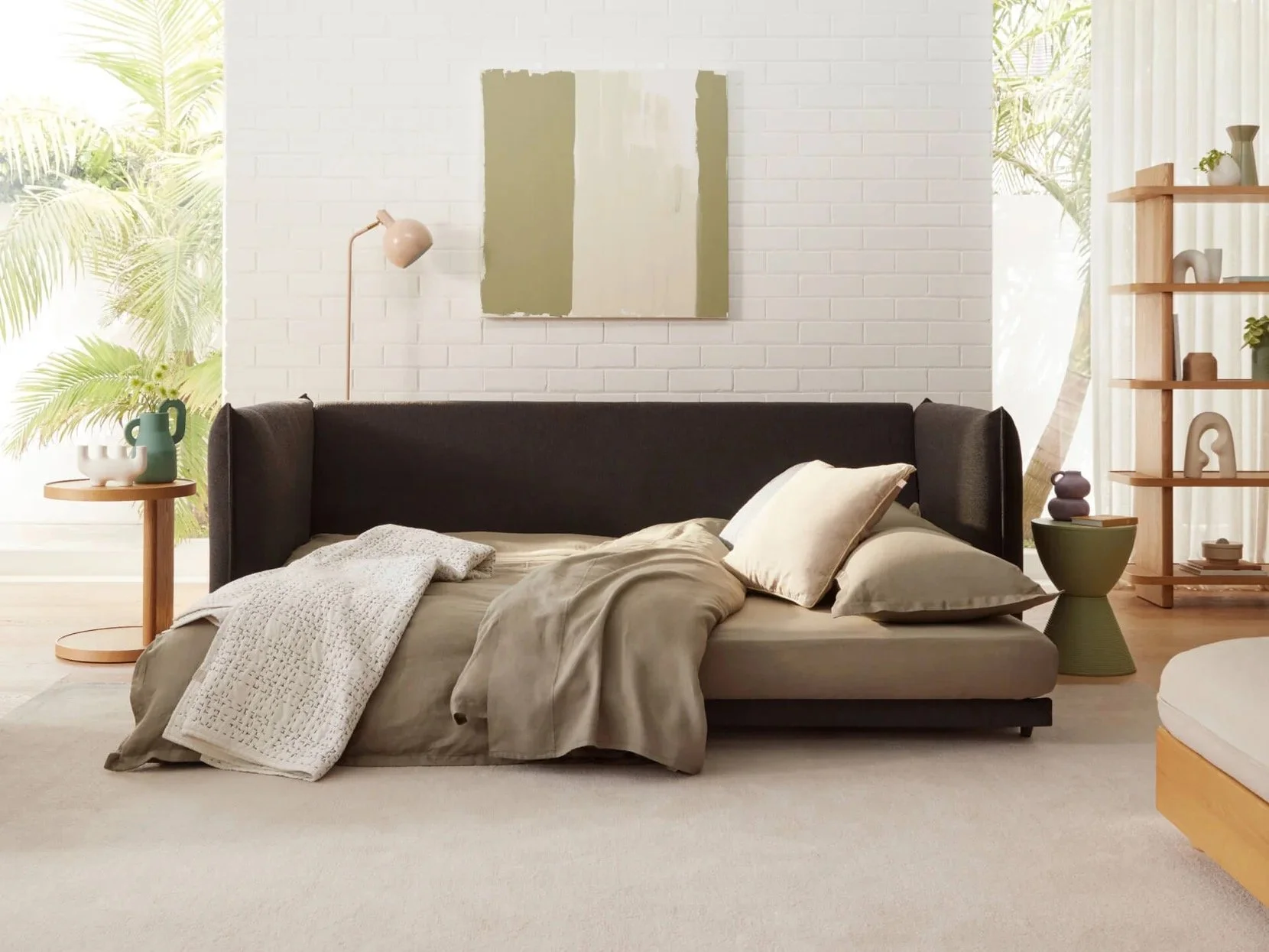
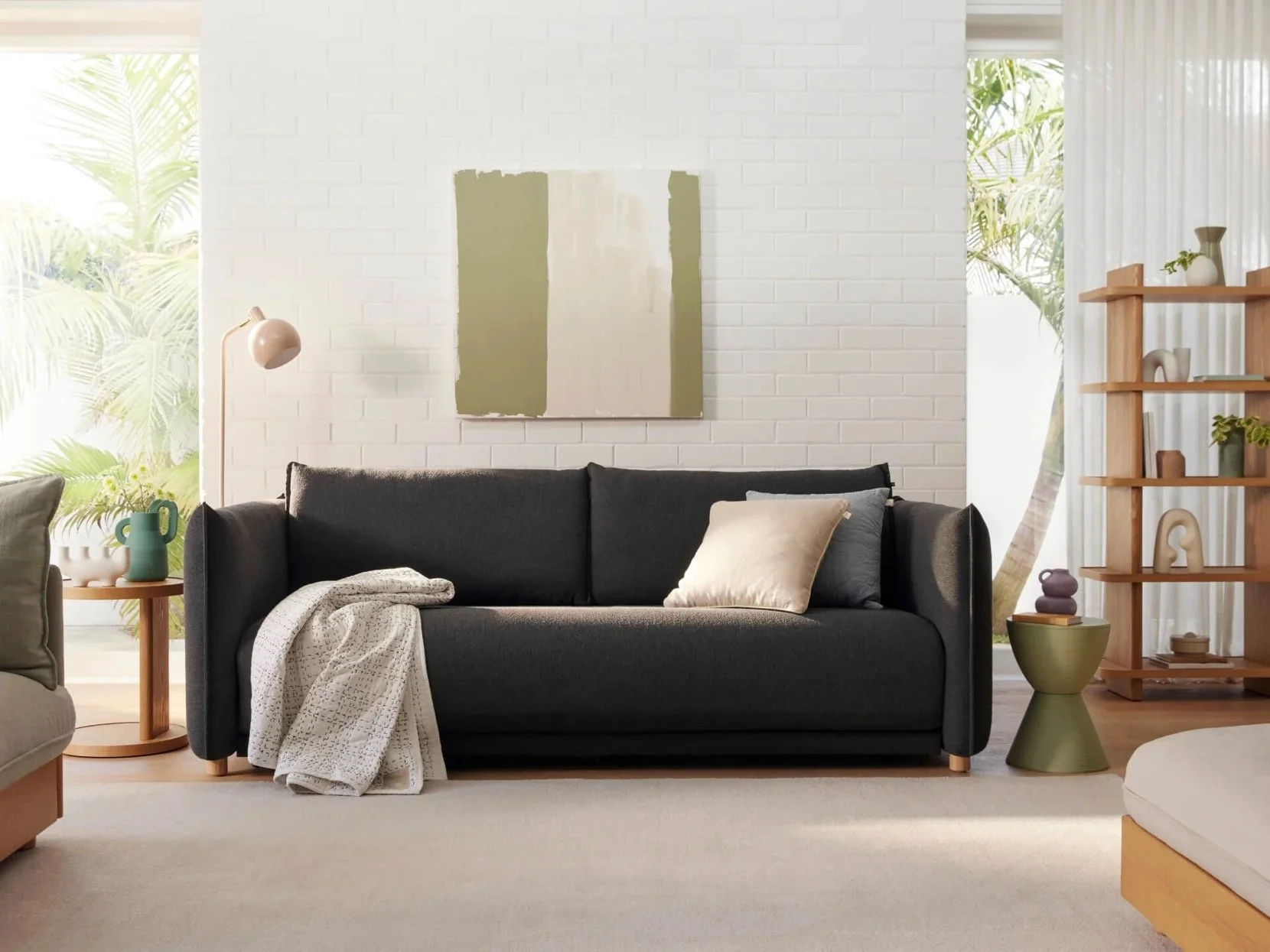
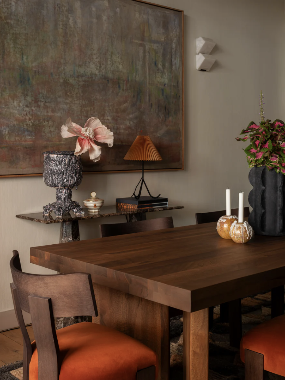
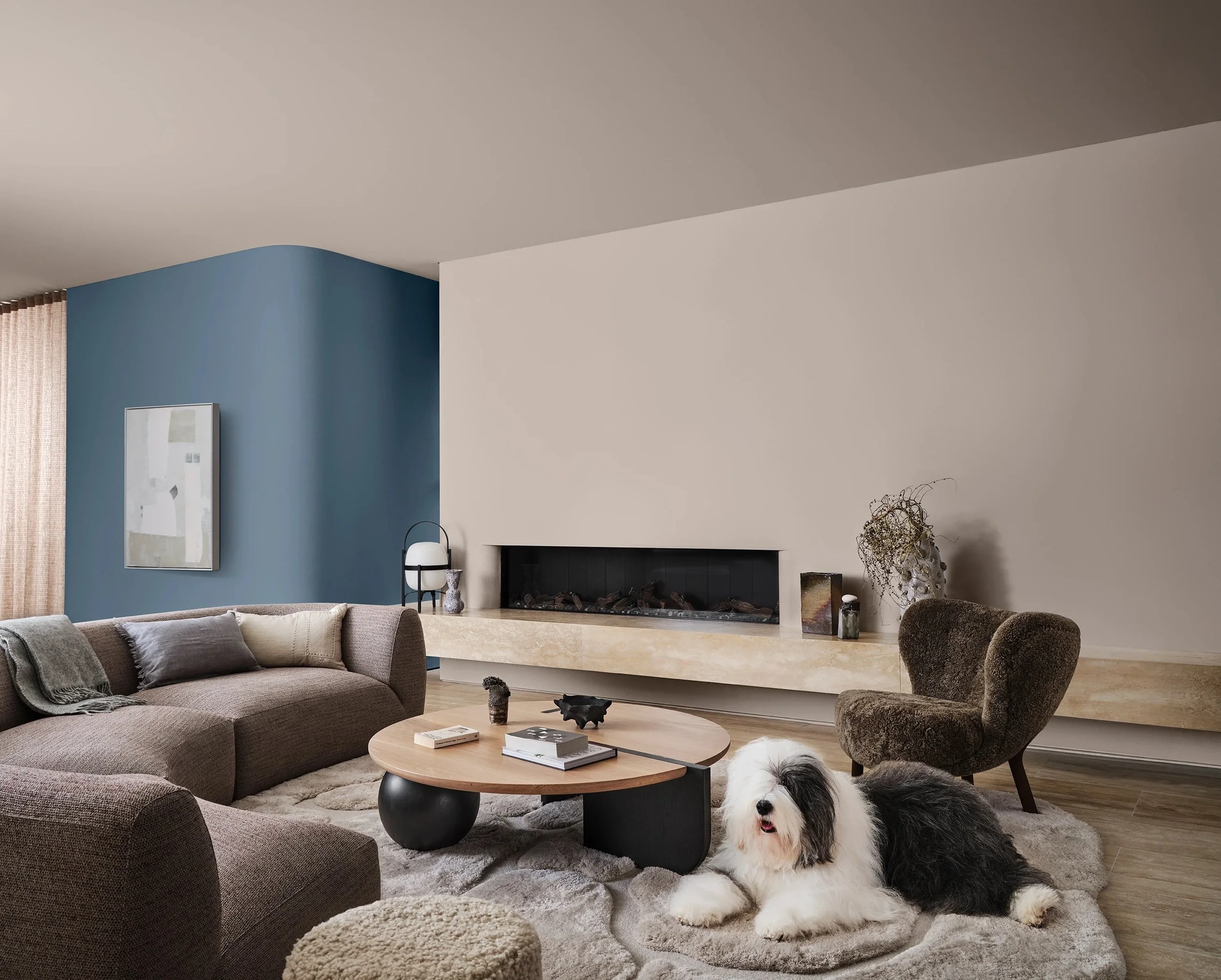
The Living Room:
PP, Old Stone Wall
PP, Irish Linen
Agra, Thistle

Mokum, Cestino Flax

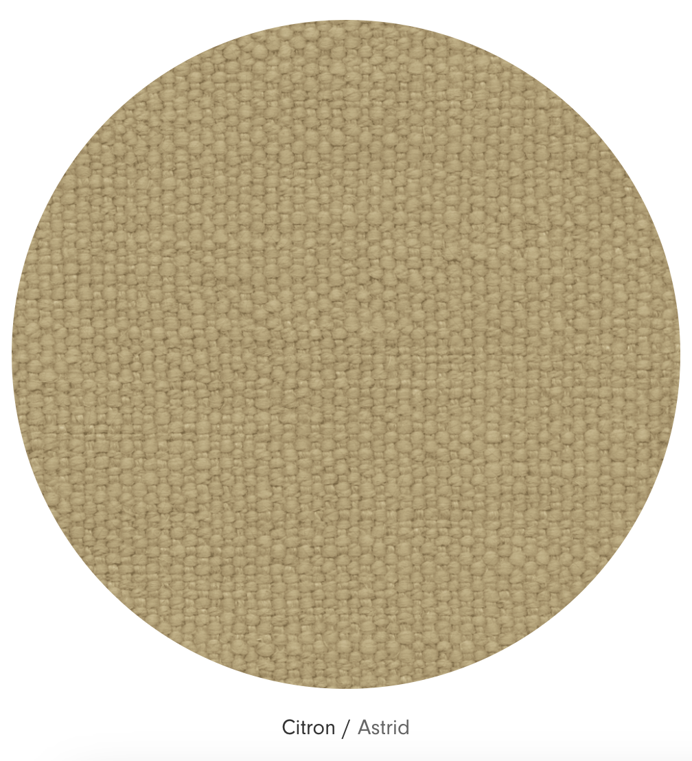
Jardan, Citron
SHW, brass
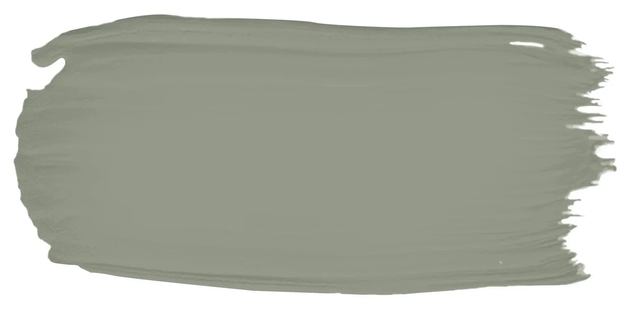
We’re going GREEN!!!
This is two rooms pretending to be one. No other way to say it. So we need to be mindful of bringing unity in all our major and minor moves!
I know you love Old Stone Wall, having painted on the samples - so I’m thinking we use it here.

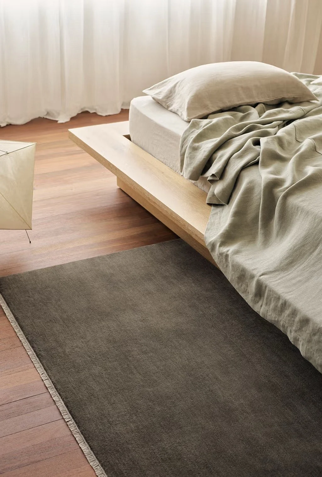
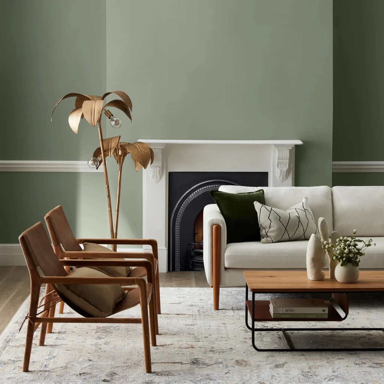
These to in-situ shots show the colour in all its glory - and the pic on the left very handily shows a pretty close match in the colour of the sheet to Old Stone Wall, with the colour of the rug!!!
Why isn’t it always this easy??
There is the great blend in this scheme of colour, warmth and character and I think it will be divine in your living space.
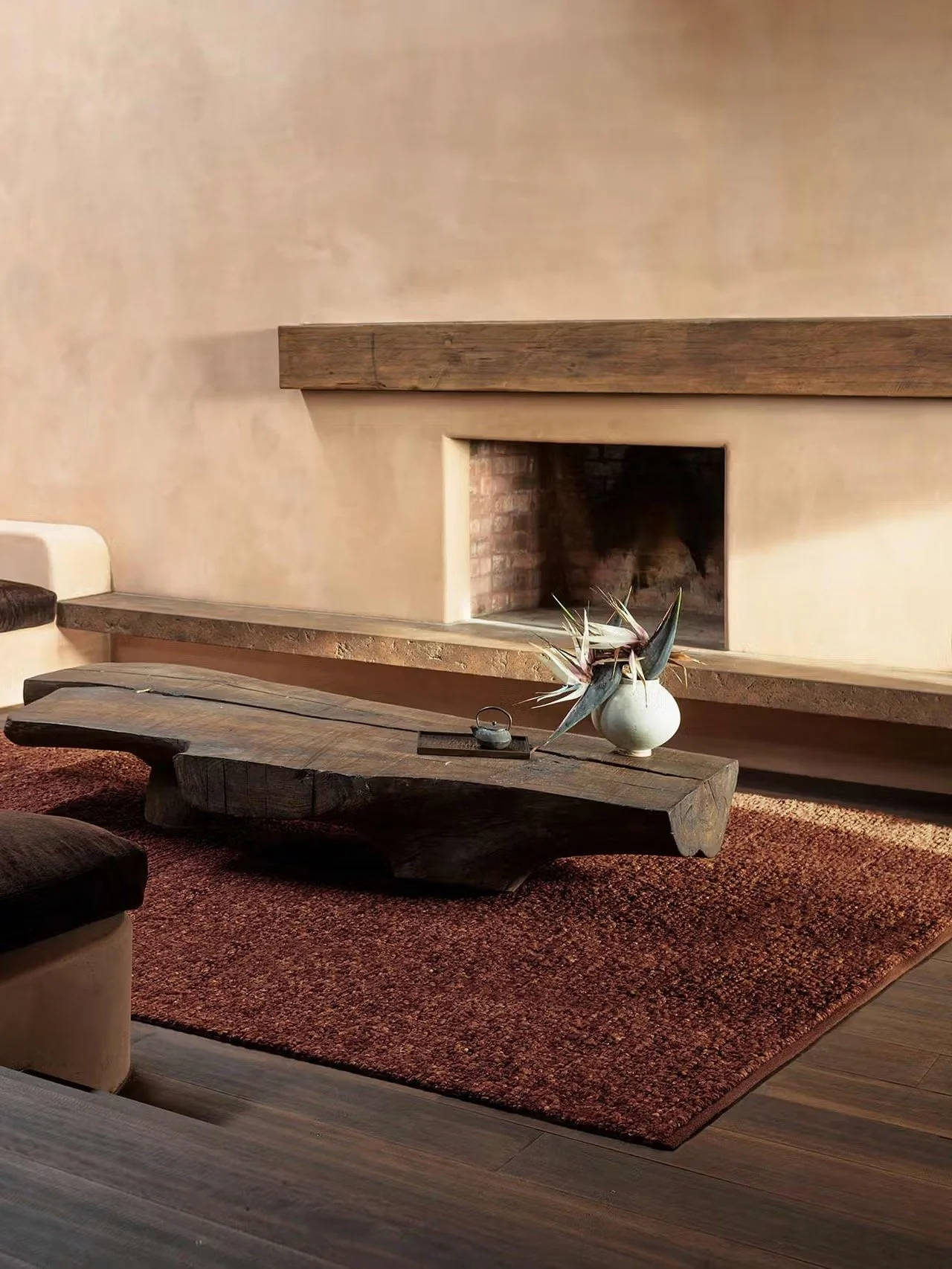
The front half of this double room is the country cousin of the back section - it’s a bit of a Nigel with it’s rather undersized and totally useless fireplace. The best approach as i see it, to treat it much the same as the other fireplace, with a built-in unit of book cases and cupboards either side of the chimney breast.
Filled with books in the shelves above, and grog in the cupboards below, this area becomes a library-ish or clubby spot to sit and read or to entertain. It needs to have a destination vibe, a proper identity in order for it to hold up its end of the living space bargain!
We will get to furniture, but let’s finish the base elements first.
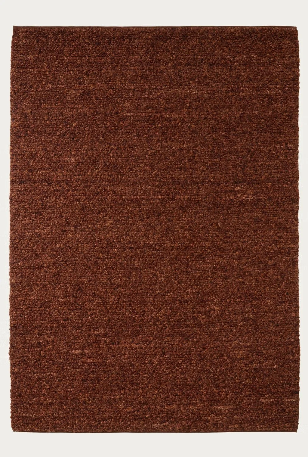
One of my guiding design principles is to always be mindful of keeping consistency as well as a certain simplicity. What makes a home feel curated and serene is to carry certain design elements through from room to room. The runner in the hall is an Agra rug from Armadillo, and as mentioned above, I want to use another Agra, in a new shade called Thistle for the living spaces.

The Agra rugs have an opulence about them, they’re thick and luxurious underfoot and the variations in the colours within each rug give them that organic feel. Patterned rugs have far too much to say…
The light fittings - I know, I know, you said you were ok with the existing.
But…. Can’t stop, won’t stop… I’m leaving these in as reference but totally understand the reasons for not changing. Btw, I think the green scheme will be a better match for the black and white fittings than Clay Pipe Half
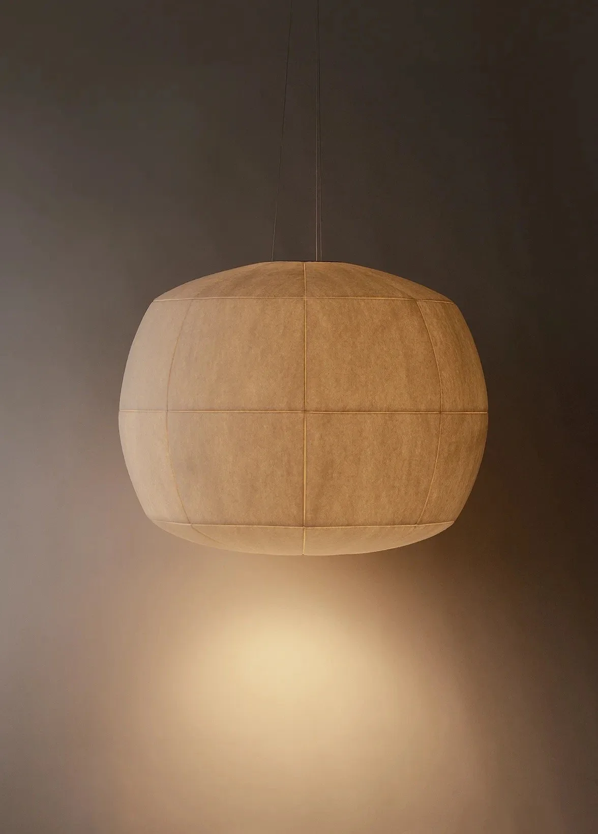
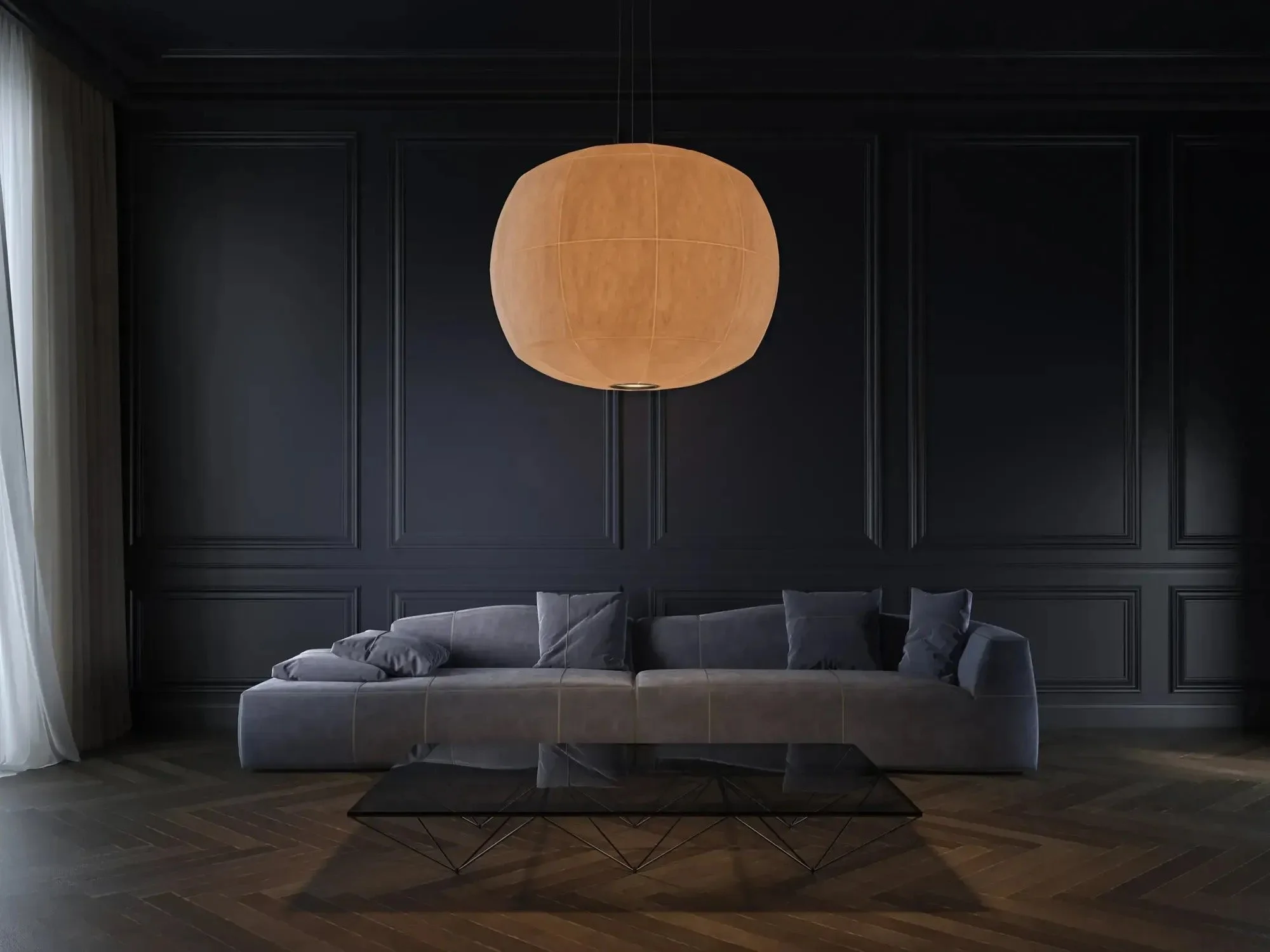
My architect son brought these to my attention recently and I have to say, I think they’re sublime.
Australian designed and supported by Woolmark and wholly made in Victoria by Studio Truly Truly, these shining moon-like orbs are said to, “whisper of sun-drenched memories and the embrace of home, no matter where life takes us." Who could say no?
I’m thinking one for each half of the room.
Whether or not you decide in favour of the new joinery as suggested, a mirror above the fireplace will help to make the space feel deeper. Actively looking for ways to increase the breadth of this whole space will help with our quest to unify the double act of these two rooms and mirrors are our friends.
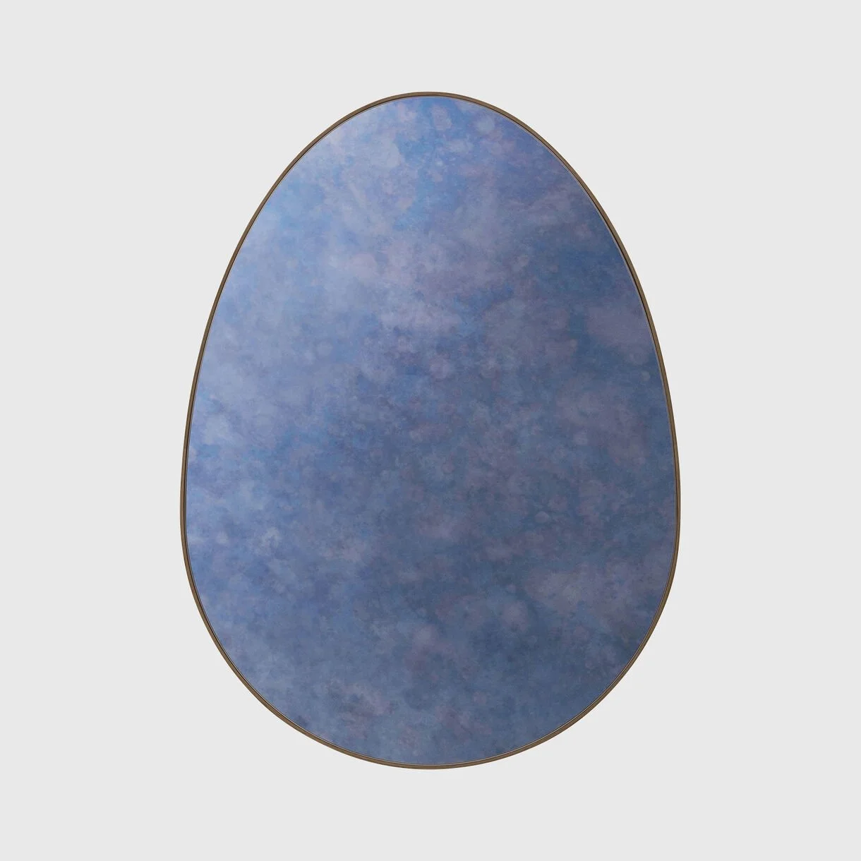
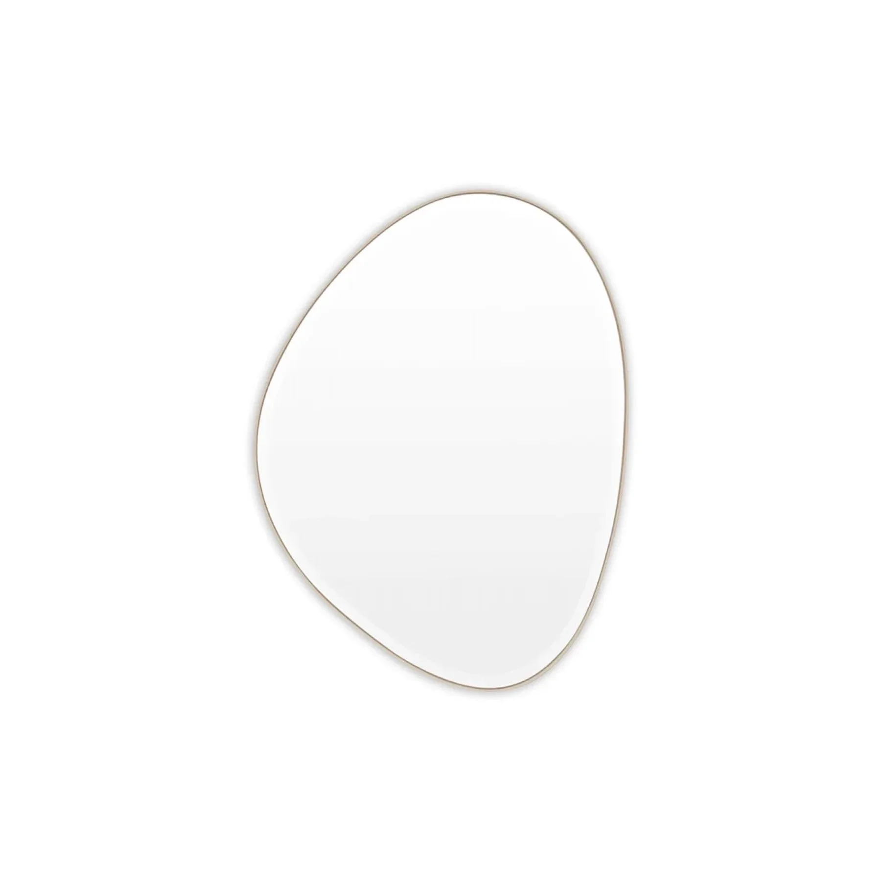
This is a beauty - the Egg Mirror made in NYC with a walnut edge, so perfect for this space. Living Edge is the supplier and it can be customised re mirror tint, size etc. But the walnut is so ideal!
Ok so the girl above appears to be having one of those days, but don’t be distracted!!
At 610 x 813mm, the shape of this mirror is beyond perfect.
The one below from Melbourne father/ daughter design duo Middle of Nowhere, is a quirky, humorous form that is at once organic and at the same time, interestingly disarming!! It measures 70 x 90cm and weighs over 10kgs and the timber frame is painted in gold leaf to look like antique brass. It is cheaper than the Egg Mirror but given the prominence of the position the mirror will hold, it might be a case of the heart choice winning the spot!

We have agreed, the new mirror will go above the black fireplace and we will remove the round mirror above the gas fireplace and replace it with a painting.
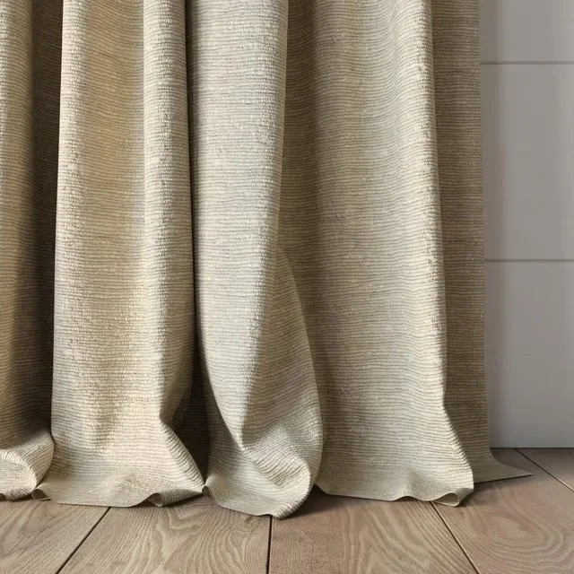
Curtains - again this may make you cross BUT! You’re no doubt not surprised that PURE WHITE curtains don’t really fit the bill in this warm scheme. But the rod can stay…

Very textural and yet light, this fabric conforms with the scheme wonderfully. It’s chunky and organic and has a lovely earthy softness - beautiful with everything!
It’s by Mokum and it’s called Cestino in the colour Flax.
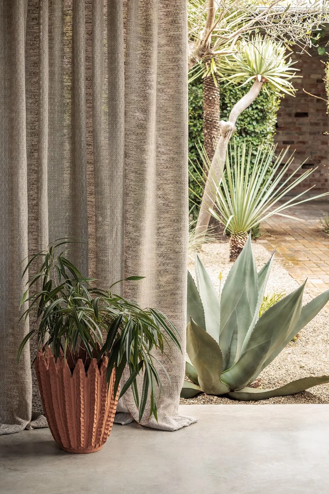
The plantation shutters do a great job of filtering light and blocking views - so you can relax, I have no desire to upset you by suggesting removing them!!!
And the furniture….
We are going to keep the couch from Cult in the interests of marital bliss… but for the library end, this from Jardan, originally specified to replace the Cult one.
It’s called the Nina modular and it has very sexy lines. Most of the photographs of it are in chartreuse - a violent colour that i do NOT understand!! But in the showroom in Paddington it is showcased in a much ore acceptable colour, so I’d advise a visit in store. So this is the only pic on the website that isn’t in the frightening chartreuse…
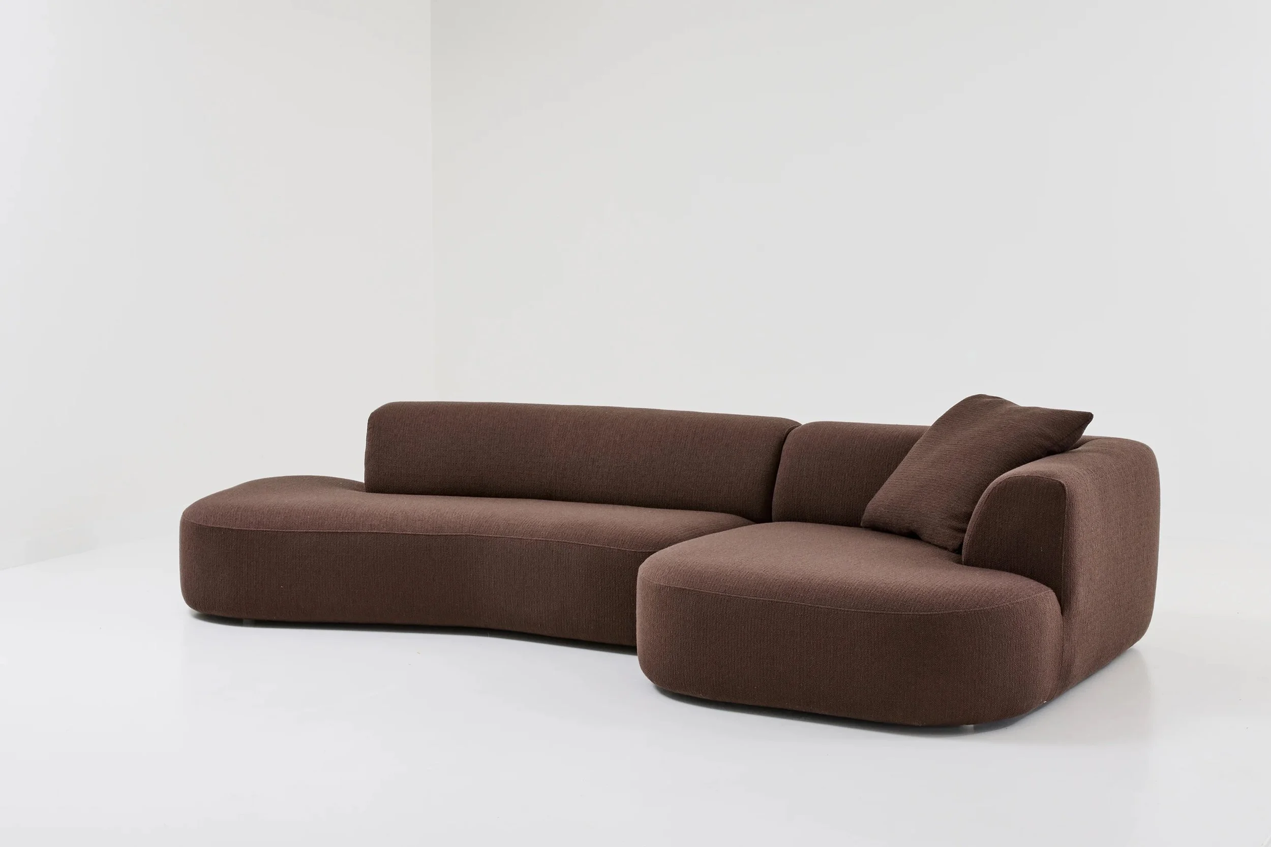
The spec sheet is in your sample box, so you can see which of the components would be the best fit, but as we discussed, having the reverse of the above would be great - the chaise on the right instead of the left side of the corner piece.
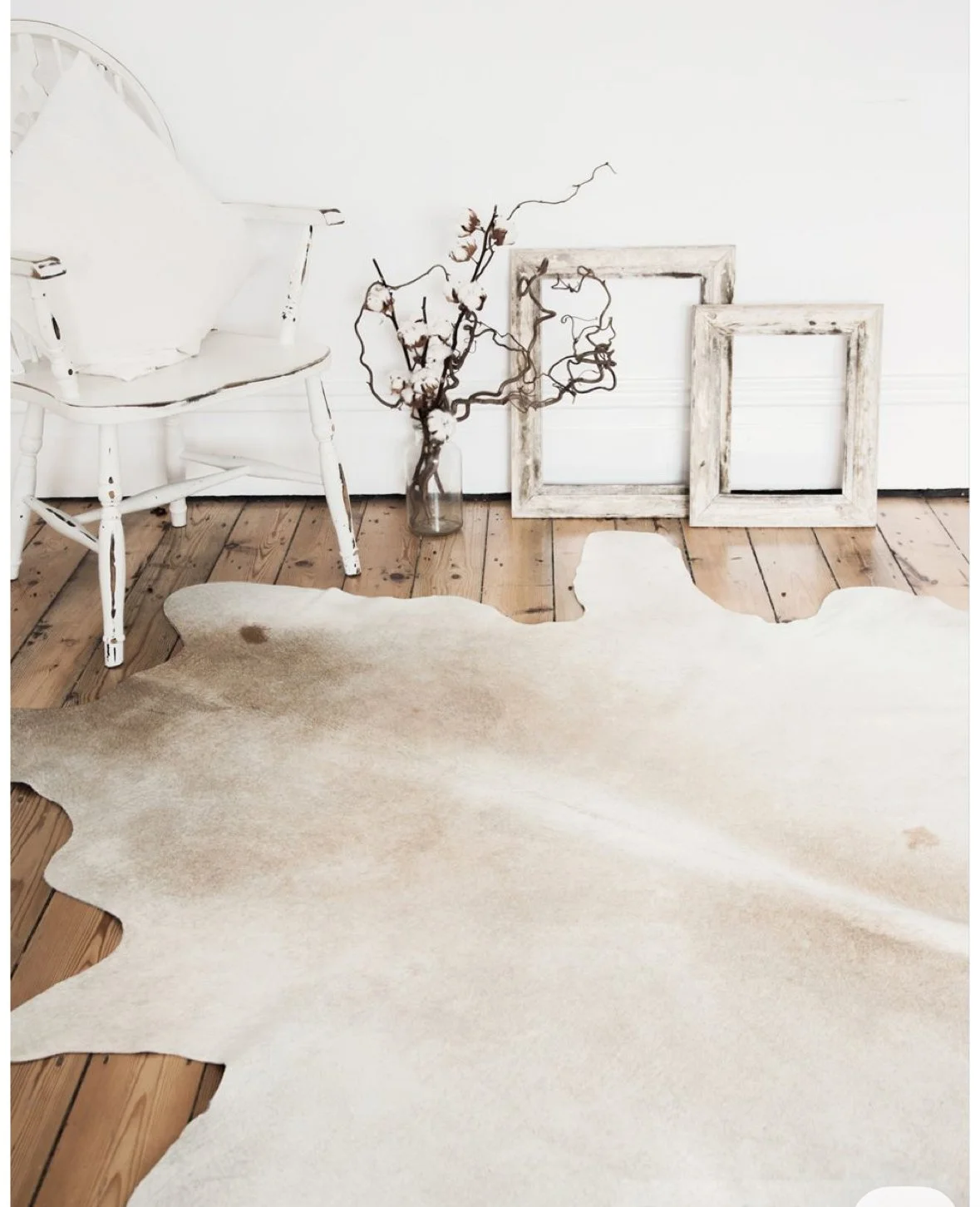
The fabric I’d suggest s this, a buttery shade that will bring warmth and calm and with a reindeer hide and a chunky woollen throw rug draped nonchalantly… well, you’ll become a couch potato before you know it.
We are loving the coffee table you have already, but we need more. So I’m showing you these beauties, again walnut, by Tom Fereday who is an Australian designer
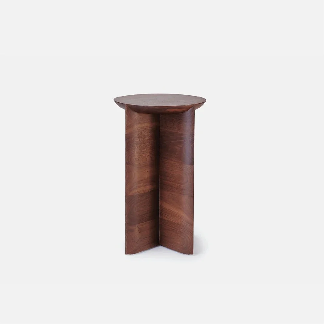
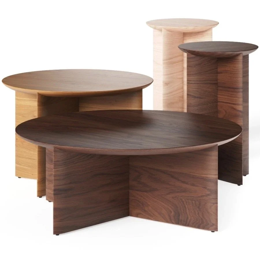
The coffee table situ is an issue. We need a taller one to sit on the right of the Cult couch and a couple of smaller one to be at the ready - a total of three newbies.
A lamp for the table beside the Cult sofa… it needs to be statement!!!
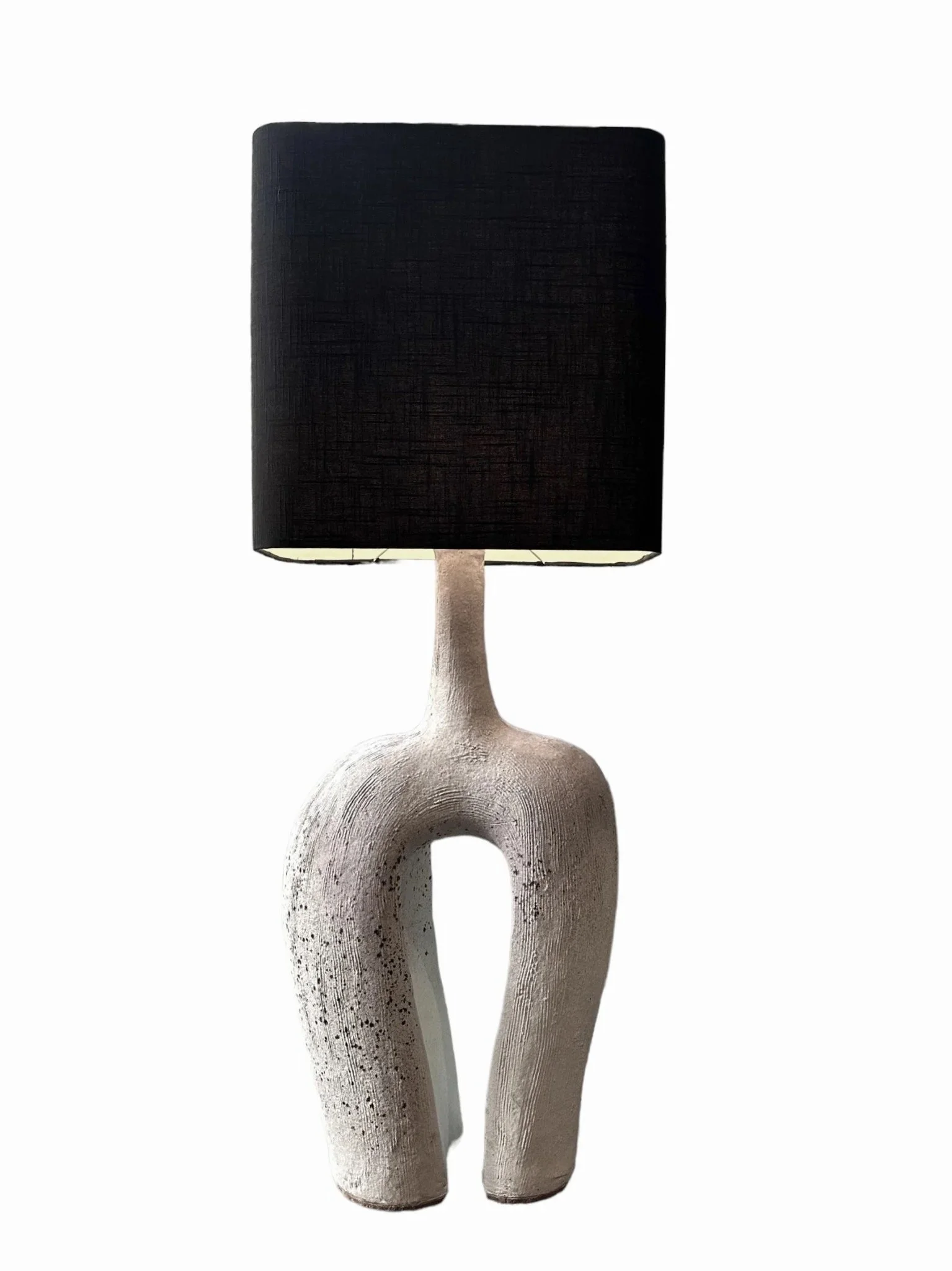
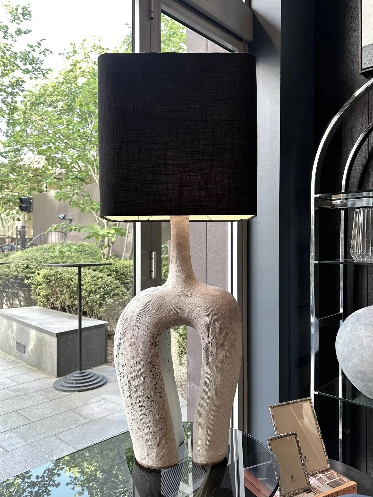
This one above is by a Tambourine Mountain artist Michael Jones and it has a beautiful textured ceramic base. The black and white speaks to the Gubi pendants but adds that organic interpretation!! I love this lamp - it stands a metre high from top to bottom and it would look really knock out in this spot.
Another fav lighting designer is Californian Kelley Wearstler and this lamp, the Miramar is spectacular -
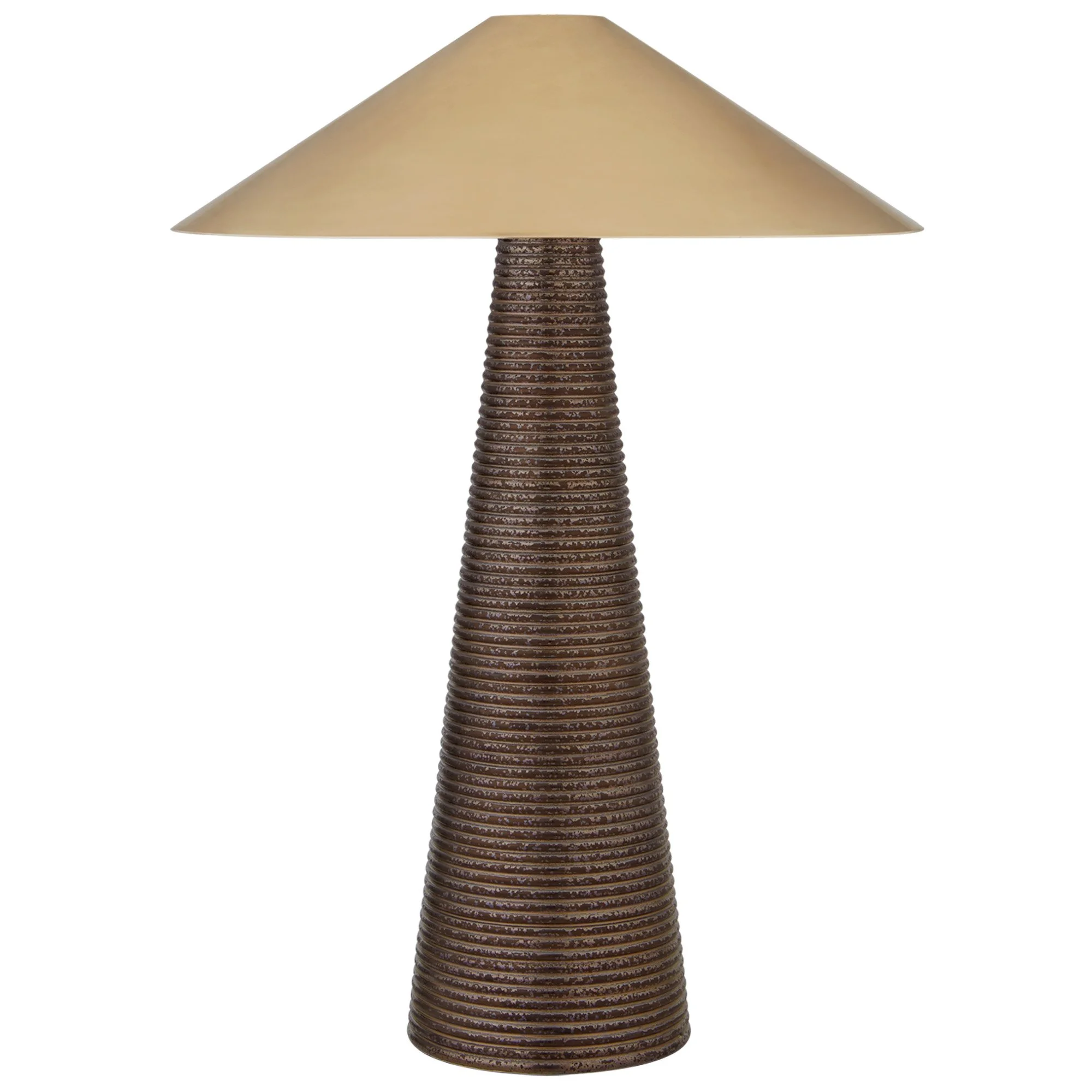
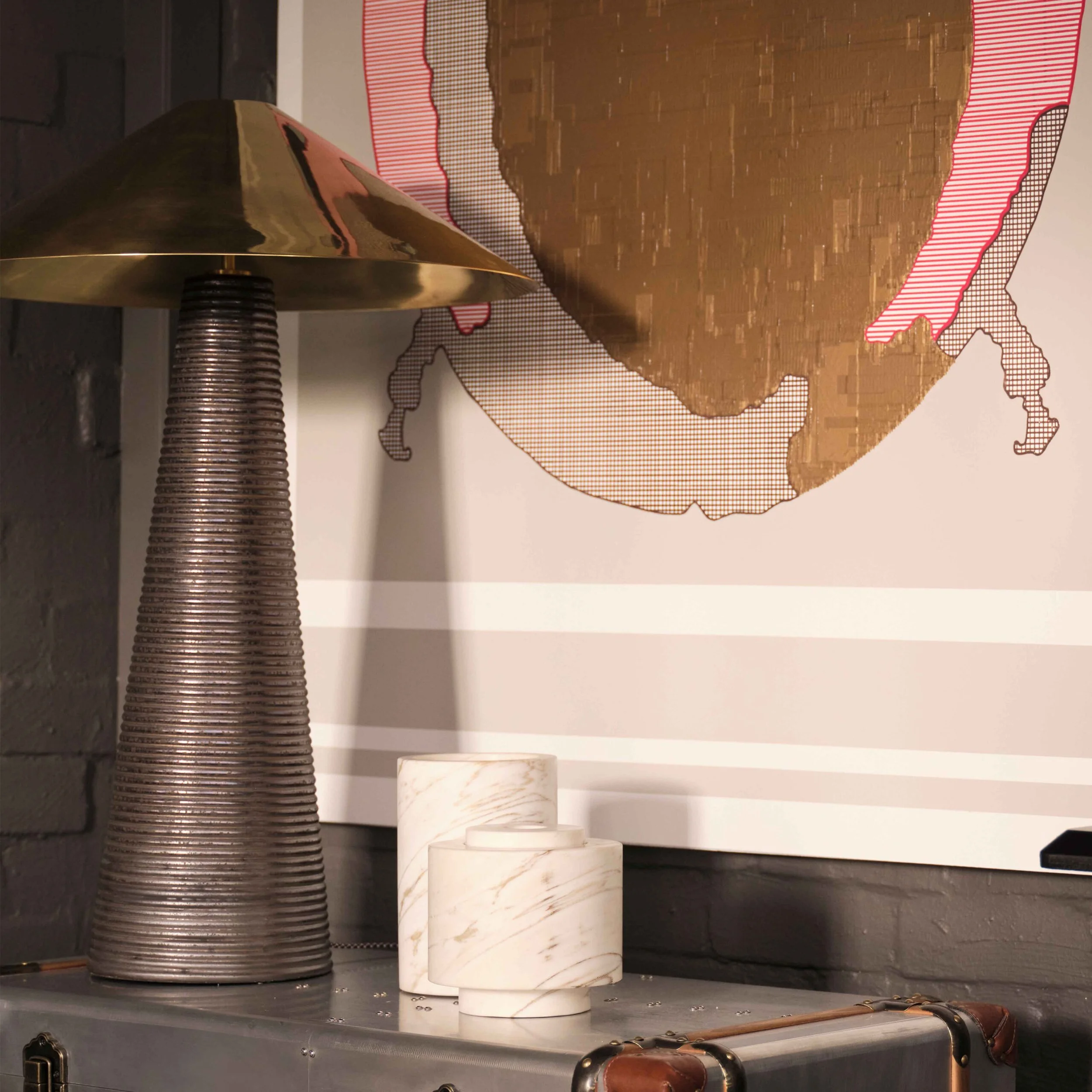
Again, that textured base really adds a humanity to the scheme and I just love the polished brass shade! I have had this priced and I think it is reasonable - but the delivery time not so much!! Due November!!!
I absolutely love the lines of the armchair you already have. What would you say to having it reupholstered in shearling???? It would look so fabulous!!! I’d have to get it costed but I have great suppliers and I buy shearling from them all the time. It could be a bit of a passion project, but sooooooo worth it. To discuss.
* I have been in to Jardan and shown them a photograph of your chair and they’re going to quote on reupholstering it. I will also have it costed in shearling by my upholsterer - but either way, I think it needs to be off white to blend with the Citron colour of the Nina as well as the grey of the Cult.
My upholsterer has come back to me - $1600 ballpark to cover in shearling, $1300 approx in fabric. This obviously doesn’t include either shearling or fabric, but gives a good indication. 5m is required. To discuss further.
The joinery in this room works well and you’ve done a good job of styling the shelves. Adding a couple of brass notes to this would work well to again bring in that consistency in a very subtle way and swapping out the mirror for one of your paintings will really work to brig warmth to the space.
I love this Bone bowl by Tom Dixon, English design guru -
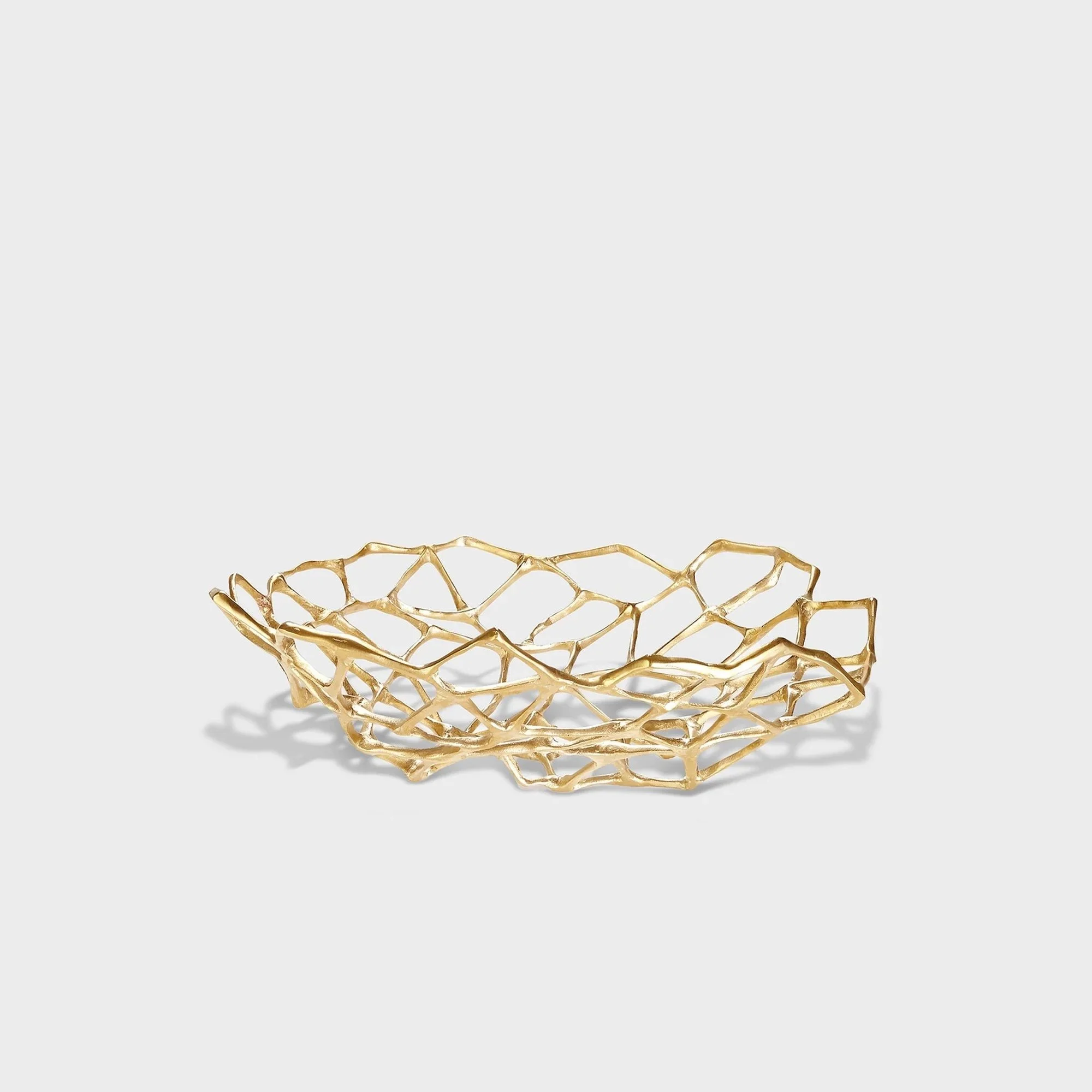
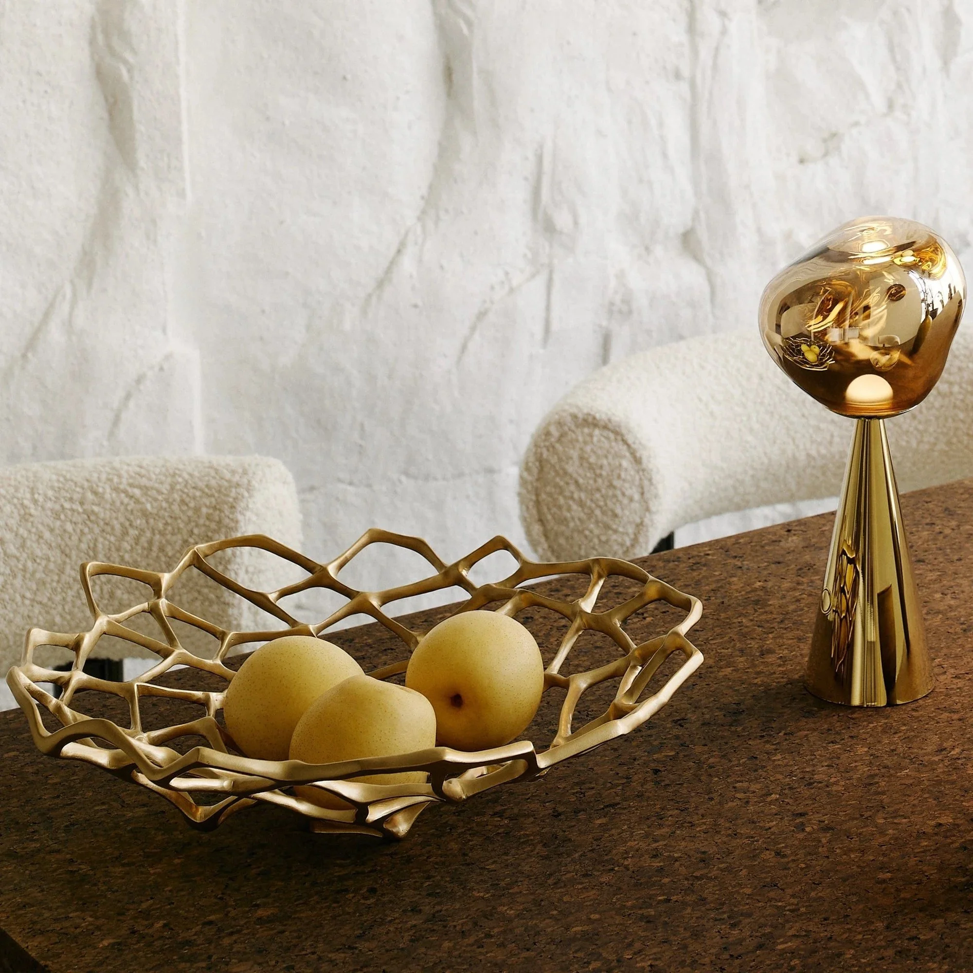
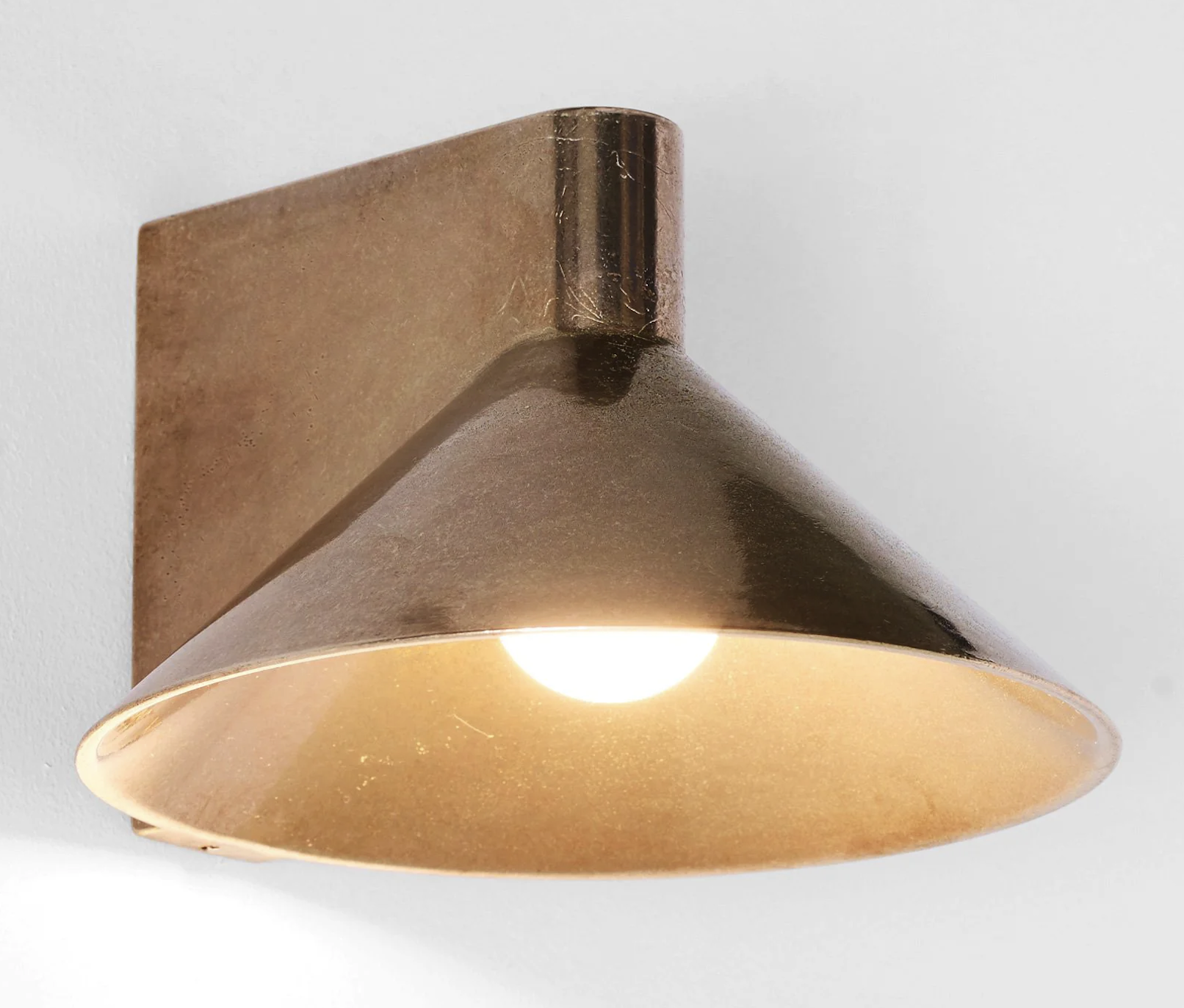
Another option to add the brass note could be more of the Studio Henry Wilson magic -

Hints rather than statements, the odd brass or bronze object sitting quietly on a shelf is enough to keep the faith - that connection throughout the house, it’s what design is all about. Not silos where one room is about one thing and another is entirely seperate, We want consistency. Brass is a subtle flash, it’s a little spark that catches the eye, it’s very grounding,
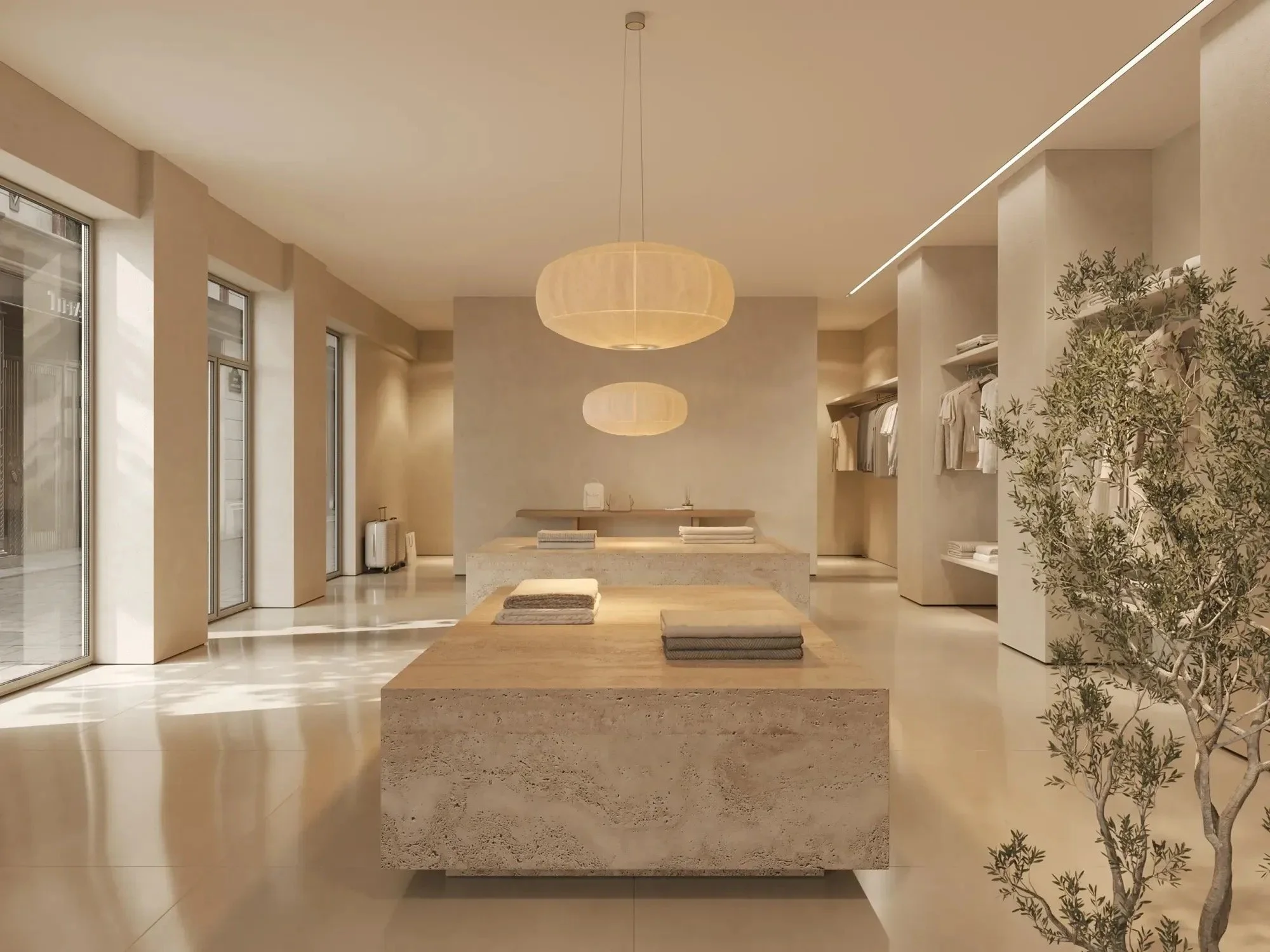
Studio Henry Wilson now has a store in Paddington and you might be sorry i told you because if you’re like me, which I think you might be, you’ll want have every single item!!
It is important that you see this CIP as a roadmap for change. It is not an order!! There will be things you may want to change, change you might want immediately, and change that will percolate a while before actioning at a later date. But you will by now have a good idea of the design unfolding and I very much hope that you are feeling inspired! Change isn’t easy and it is expensive - but as you said, you can grumble about a mis-step forever, or you can be brave and leap into a whole new interior world.
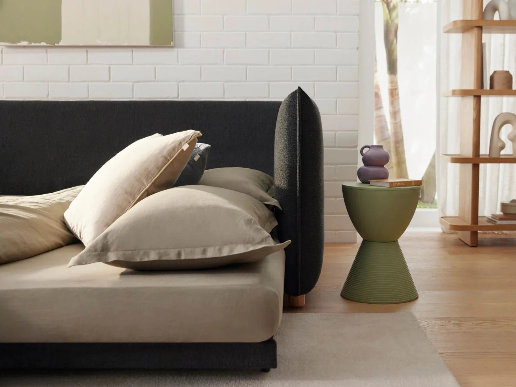
Master Bedroom:
It would be a shame to warm up the rest of the house and leave the boudoir out in the grey cold.
It PAINS me to tell you this, but the colour I’ve chosen veers away from the overly ‘pink’ hue of Dulux Half Clay Pipe, but it has a really UNSEXY name…. Dulx Mellow Beige. I mean, shoot me now!!!
The woodwork would be the Porters Paints, Irish Linen which we have used already on the woodwork in the hallway.
The fabric selected is by Catherine Martin for Mokum Textiles and it’s called Tennessee Raffia - (I can’t say why, I’ve learnt not question). I had this in the living room, but now feel, with this modification, it would be the perfect fabric for your bedroom

Mellow Beige will be a fabulous transition from the Drift in the hall, too, keeping everything very calm and quiet. And the curtain fabric I have found is so gorgeous, by Mokum called Adobe in the colour Flax.
Bedside tables are often underrated or overlooked. Given that there is generally not a lot of furniture in a bedroom, and given that one of those pieces is a big expanse of BED, paying attention to the design input possible pays big rewards. You Hated, loathed and detested the Rachel Donath ones…. I’ll get over it… so how about these from Cult.
These are by Gubi and it does not get groovier! Yes, they’re wide at 800mm and higher than a standard bedside at 890mm, but impossibly gorgeous and the drawers and generous dimensions are highly (pun) practical.
The lamps you showed me with the flamingoes are not right for this scheme but I think they’re fun and so would not recommend getting rid of them! Yamba??
I think slim line lamp is so much better for a bedside and these ones designed by Australian Leah Martin are glorious. And at a trade price of $350 +GST, they’re a bargain. They’re 60cm tall and the base is 20cm, which means they have a stateliness in their height, but they don’t take up valuable real estate on the bedside table. They are able to be swivelled so can be directional, not just atmospheric.
Have a read of this article -
https://www.australiandesignreview.com/interiors/designer-leah-martin-reveals-the-remmy-collection-a-bauhaus-inspired-lighting-range/
The top shot on the right gives you an idea of the space they use and the shade is directional, so all the better for adjusting from mood to reading purpose. And again, that touch of brass that is like a little spark creating consistency with the other brass sparks!!!
Bed linen is SOOOOO important because of the visual impact that a 2m square platform, ie, your bed, takes up! White sheets are for hospitals and hotels and in my view, the only way to go is colour. Hale Mercantile is a fabulous Australian company doing great things in a world of really ordinary quality manchester!
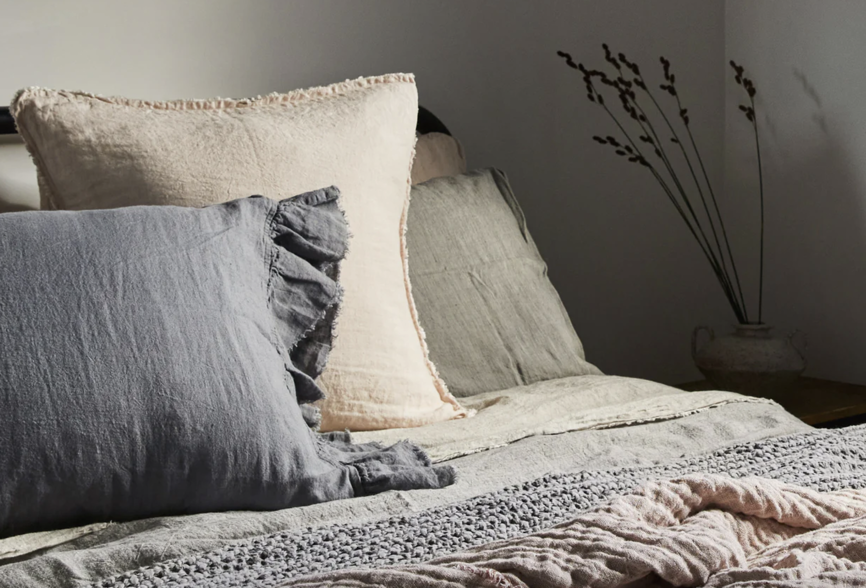
The quality is so good - the colours are divine and the price point is a the higher end of Australian made linen, but not as high as the Italian masters, Society Limonta! This is great value and an essential investment
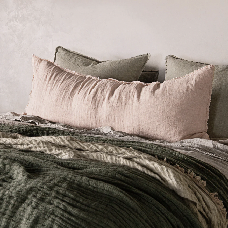
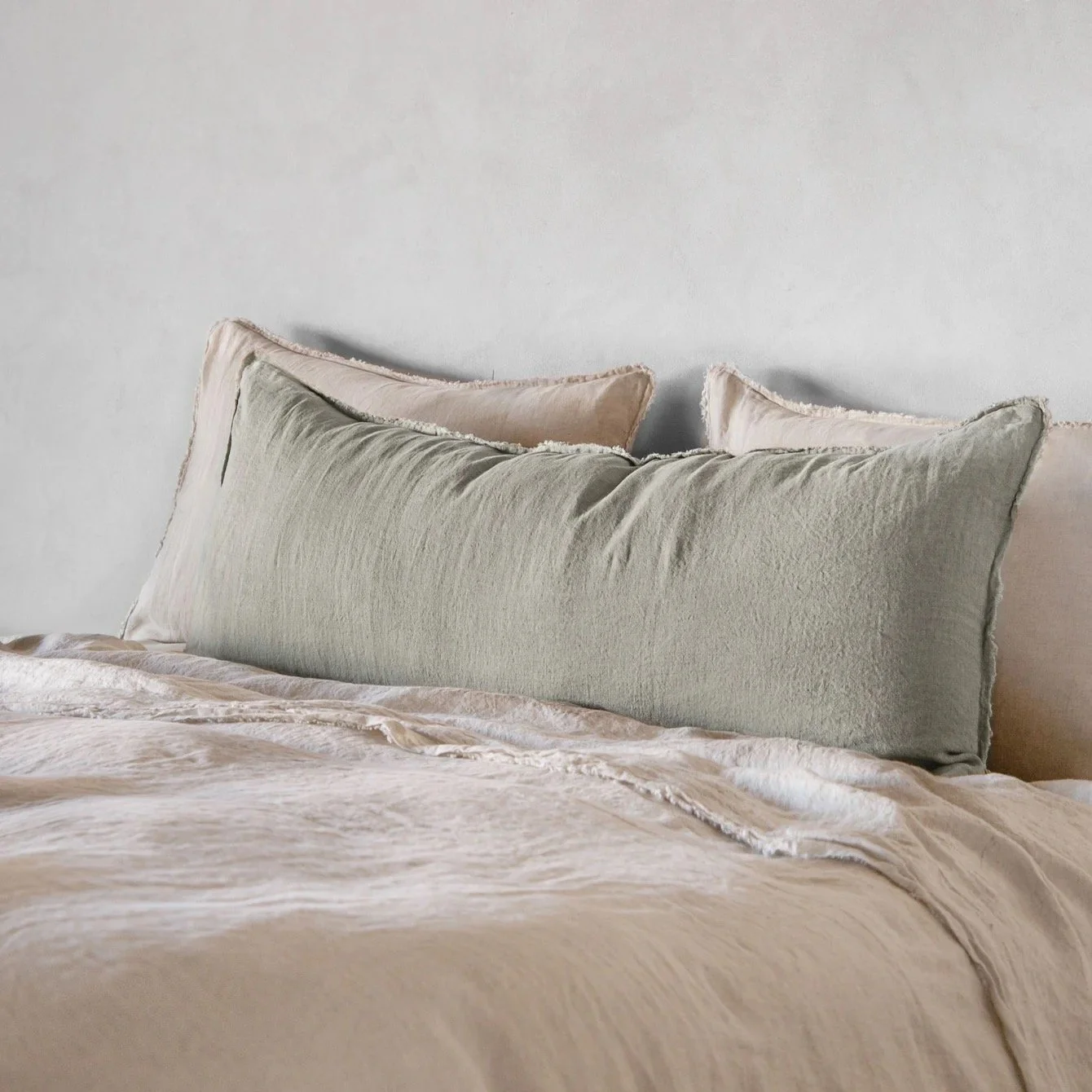
The range is absolutely beautiful and like I said, I really rate the quality. It’s a question of choosing the colours yo love and that look good with the colours of the room, and mixing and matching the sheets. All the colours look luscious together, so it really doesn’t matter which ones you put together, though steering towards the greens, pinks and earthy tones would be the best for the wall colour.
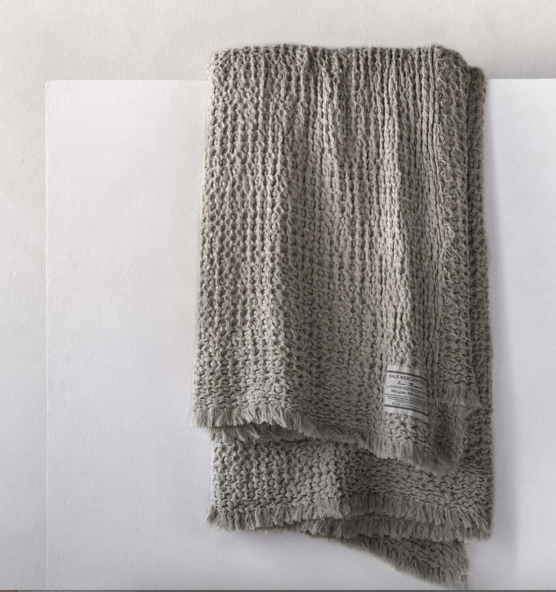
Like fashion, there is much to said for layering and a bed is no different. Lovely sheets, a stack of pillows and a long body pillow at the head of the bed and then a yummy throw like the one above middle, is winning,
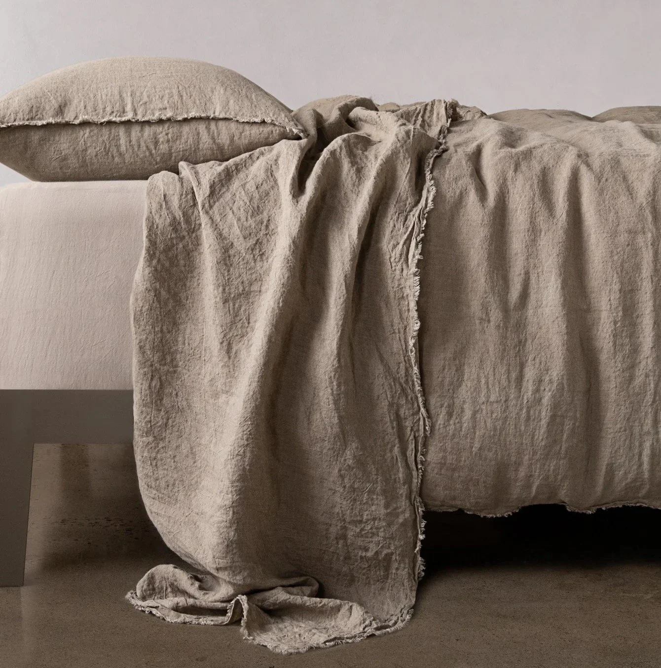
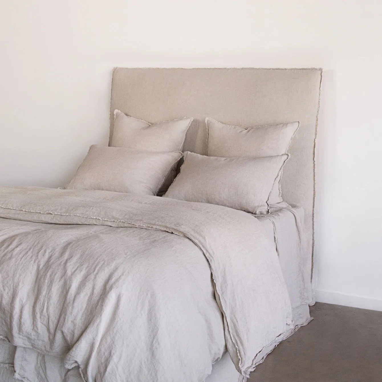
I’d strongly recommend a new bedhead, too, and I’d suggest this from Hale also -
Hale Mercantile Flocca Bedhead in Sable
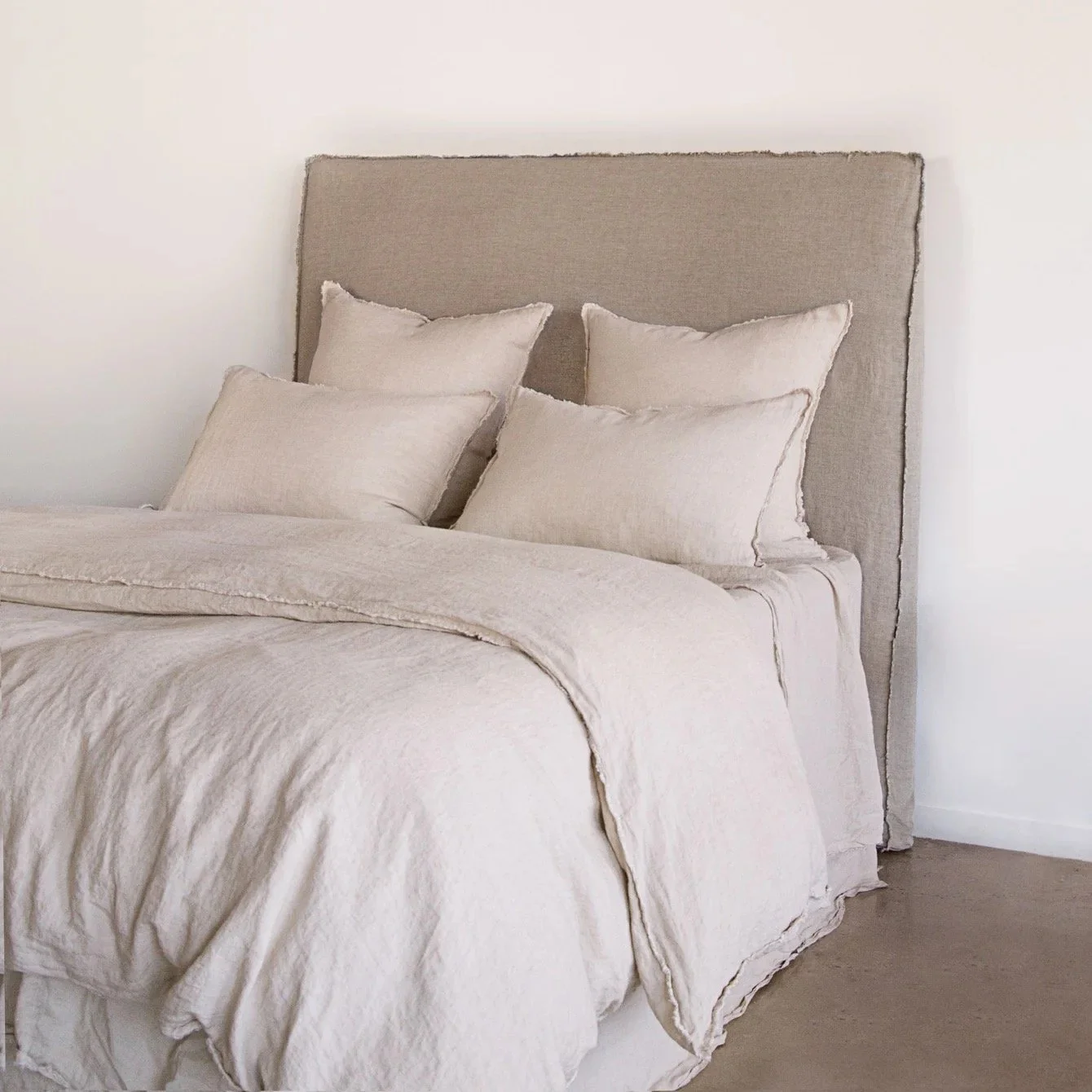
and in the colour Cep
Unfortunately the bedhead doesn’t photograph as well as it should. Partly, I think it’s because they use what looks to be a king single instead of a queen or king. But you’ll get the idea from these photos of the relaxed and informal nature of the bedhead, which is in contrast to the more formal buttoned one you currently have.
The little velvet chair really is a treasure and the pink shade will go wonderfully well with all of this.
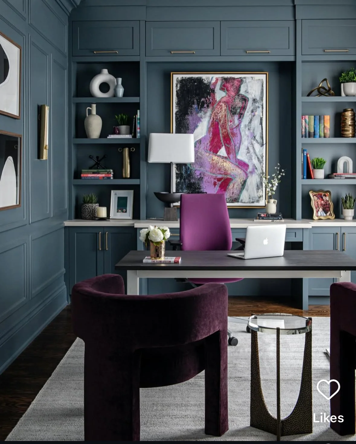
Sophia’s Study:
Soph, this is the critical piece for you now that the stairs are in and Nick has his space well on the way to getting sorted. It is a small room, but it is the engine room. It needs to be good.
The idea has been to make this work space really rich in texture and colour and for it to really reflect your personality. I think we are going to do that primarily through the joinery design, which is a work in progress, but there are a couple of other super important elements to also think about that determine the style.
Walls, lighting, furniture (other than desk) -
I am a huge fan of grasscloth wallpaper. Porters Paints are the supplier and this new colour Jasmine Tea is a cracker.

The colour is not replicating well here and it’s looking more grey than green. But you love it in person and know that the actual colour definitely has a green hue, which will work with the general vibes we have evolved.
There is not sufficient imagery on the net to replicate here - but the standout feature of this wallpaper is the very organic and textural nature of it. It comes in 900mm wide rolls and each new roll is NOT designed to line up in any way with the previous. So you get this fabulous effect of it being NOT uniform and stitched up.
This paper will make the room feel clubby and interesting and without doubt, unique. We will wall paper the back of the shelving, as discussed.
The design of the joinery is going to take place now that the lay of the room is clear. The inspo shots below can give a flavour, but the guiding principle for a home office is that the space feels like home in a very businesslike way! You want to feel totally ‘at home’ in terms of your mental state, but you also want to project a sense of who you are to the wider, professional sense.

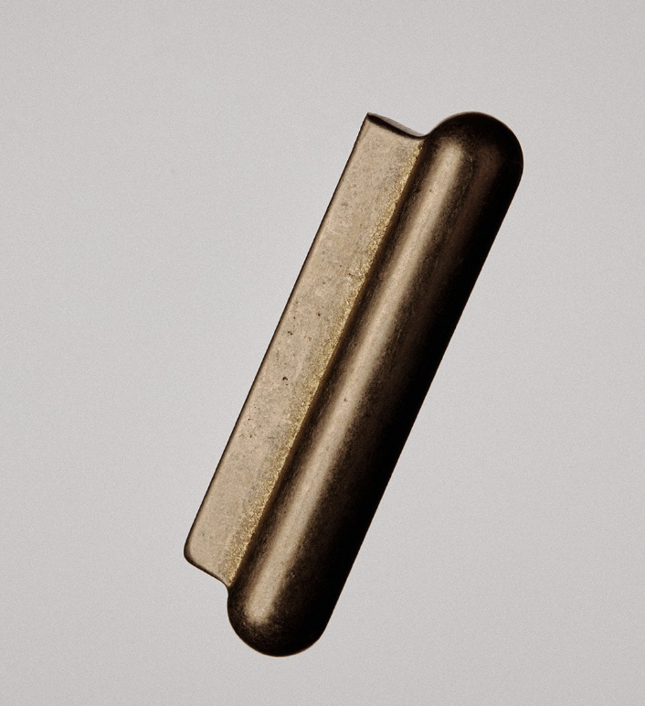
And in steps Studio Henry Wilson again - with his HEROIC brass PSL handle.
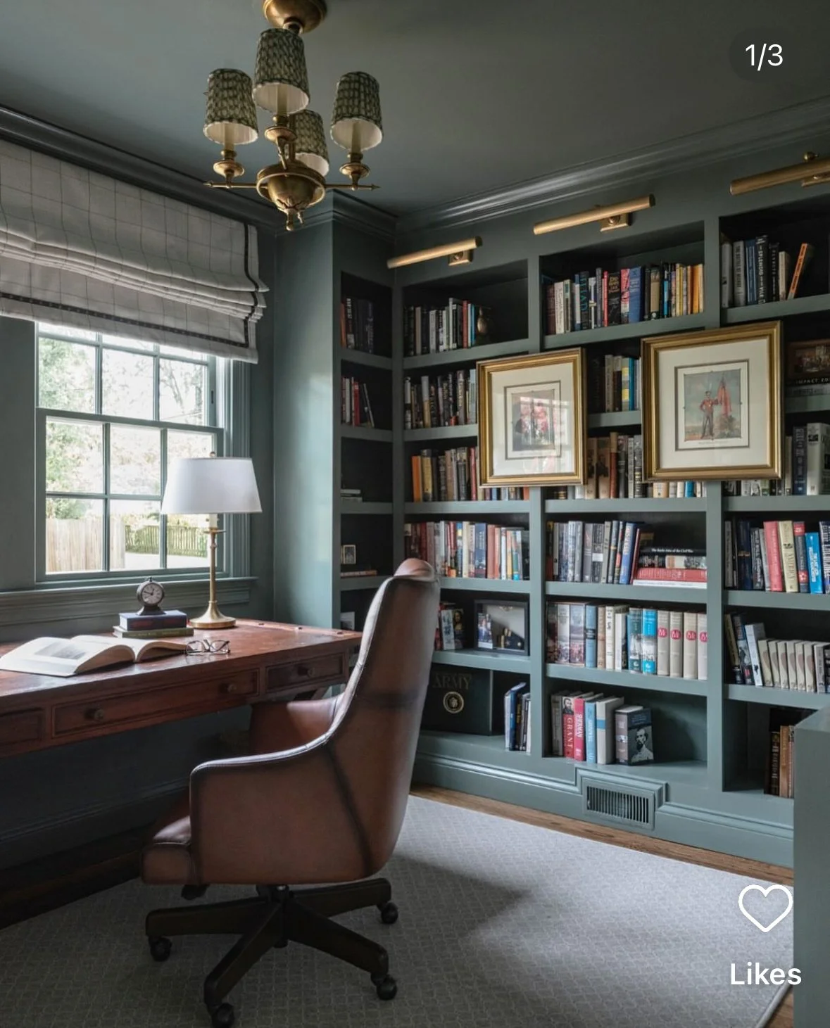
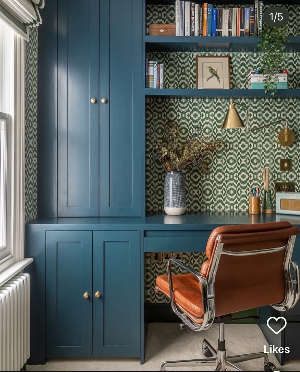
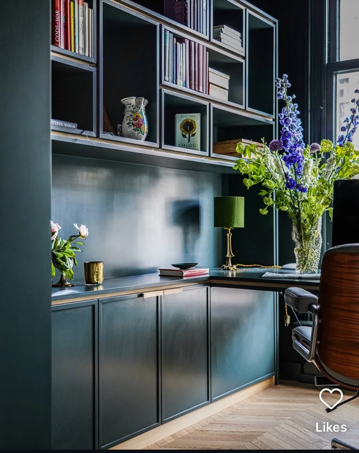
In my opinion, the greatest interior decoration piece, the standout hero of home, is the humble book. Shelves of ‘em. Your office has excellent light and although the space be small, the feels be not. The idea is to build the layers of interest and colour in the way that these images demonstrate.
The other piece we need is an armchair. At the risk of completely destroying you and your budget, I just have to show you this from Cult.
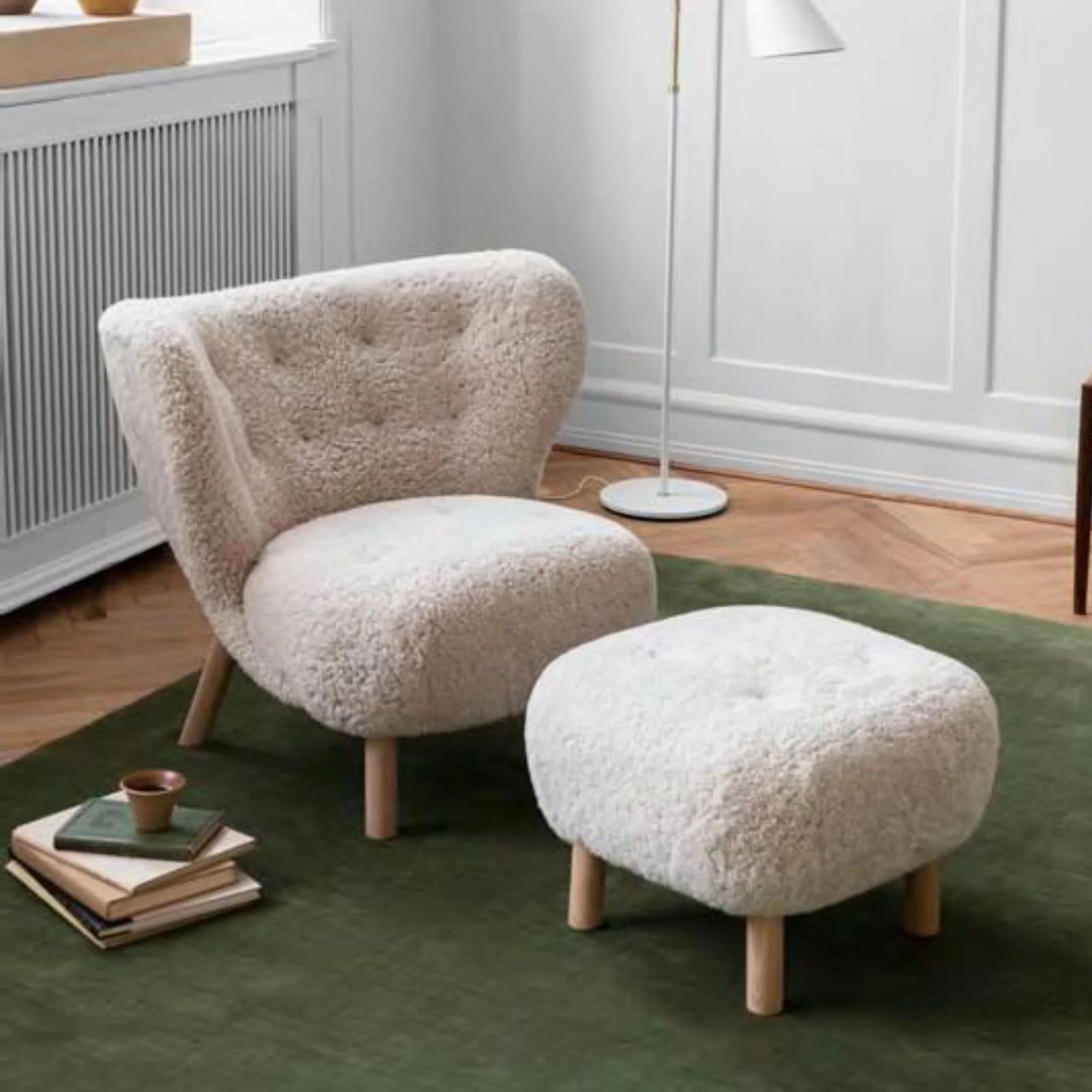
Part of the Funkis era of the 1930s, this beauty was designed by a Danish architect called Viggo Boesen who named his new chair Little Petra after his mother in law. Wise guy.
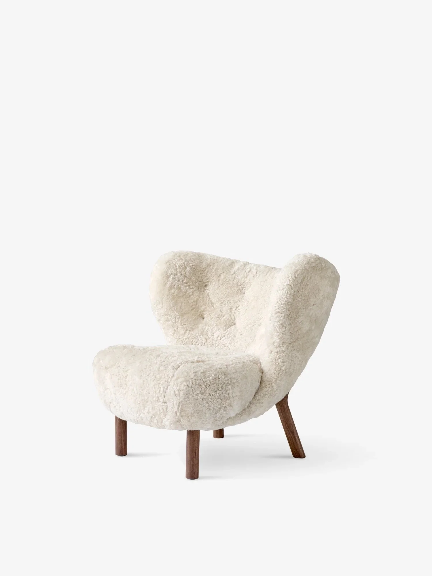
It is available in shearling which is so incredible I can’t even tell you - and the legs are walnut.
I feel the armchair above did not land in your lap of have-to-haves…. so here’s an alternative below.
What we know for sure is that this chair is a critical resource! It needs to be comfortable and roomy for you to drape your legs over when reading, for a much bigger human, ie Cam, to also feel comfortable in. And I know you love a swivel. I do not believe you should scrimp in choosing the absolute right chair.
I know you love this design because you have a repro in the kitchen - so it clearly resonates with your design eye. But this one is the real thing and the leather is the luxe icing on the chair cake.

Imagery of the chair was only available with the silver base, but I’d defs recommend the black base, as with the footstool pictured below.


This is an investment piece and for that reason, it’s important that you take your time in deciding. A trip to the BoConcept store in St Leonards is essential, but I can thoroughly endorse the Imola chair and footstool, they’re iconic, stylish, wildly comfortable and totally perfect.
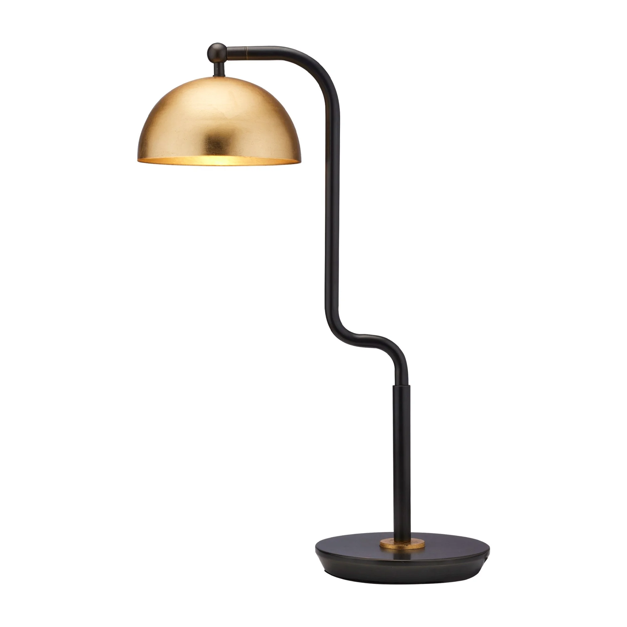
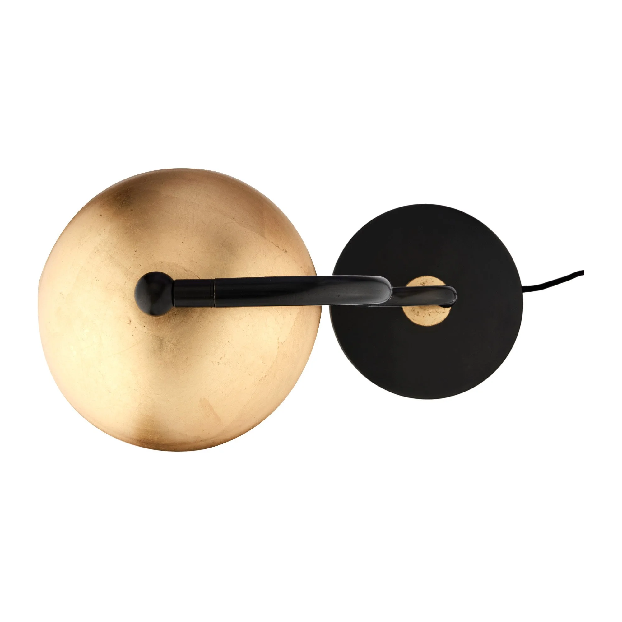
On lighting, we agreed to leave the ceiling downlights, and remove the pendant in favour of a standard lamp. This is also a critical piece - it needs to look stylish, but not make too much noise. It needs to be adjustable, directional, discreet. Here are some options -

Gubi, Bestlite

Gubi, Grasshoppa

DCW Editions, Mantis